Cross-Browser Layout Techniques
Most websites use some sort of grid pattern for layout. In the early days of the Web, HTML tables provided the basic grid structure. But using HTML tables for layout is bad for accessibility and search engine optimization. The CSS3 Flexible Box Layout and Grid Layout modules look set to revolutionize the way pages are laid out, but until they’re universally supported, you need techniques that work in all current browsers. I’ll come back to flexible box layouts in Chapter 22.
For complete cross-browser support, you need to use floats and margins to create multiple-column layouts, although you can also use absolute positioning for sidebars. If you no longer need to support IE 7 and earlier, you can also use the table-related values of the display property, which make ordinary HTML elements act like table rows and cells. Used with care, CSS table display offers some of the benefits of table layout—such as equal-height columns—without the accessibility problems associated with HTML tables.
Because of the wide range of screen sizes now in use, this chapter concentrates on fluid or responsive layout. In particular, you’ll learn about:
- Building two- and three-column layouts with floats and absolute positioning
- Using an image to fill in sidebar backgrounds
- Creating a grid with table-related values for the display property
The layouts in this chapter use columns that are independent of each other. Multi-column layout, where content flows automatically from one column to the next like in a newspaper or magazine, is the subject of Chapter 18.
 Tip The search for the ideal layout system has given rise to many CSS grid frameworks, such as the 960 Grid System (http://960.gs/) and Blueprint (http://blueprintcss.org/). I’ll leave you to explore them yourself.
What Size Browser Window Should I Design For?
For years, this has been a constant subject of debate in online forums. Every few years, the consensus shifted, but always in the same direction—upward. The arrival of the iPhone and iPad, followed by the proliferation of Android smartphones and tablets, suddenly changed the question. It was no longer how big you could go, but how could you accommodate such a wide range of screen sizes and resolutions.
The general consensus is you shouldn’t design for a specific size, but should create liquid—or responsive—designs, using percentage widths. Keep the layout within a prescribed range by using min-width and max-width.
Tip The same basic principles apply to fixed-width layouts. Simply change the percentage values to pixels.
Creating a Single-column Layout
Single-column layout for desktop designs is relatively uncommon these days, but it is frequently used for mobile design. All the HTML elements are displayed in the order they appear in the underlying code, so the main layout considerations are the width of the column and whether you want it centered.
Note CSS3 Flexible Box layout allows you to display elements in a different order from the underlying HTML (see Chapter 22). You can also change the order by manipulating the DOM with JavaScript.
To restrict the width of a single-column layout, wrap everything between the <body> tags in a <div>, and give the <div> an ID, such as wrapper. Use an ID selector to set the width of the <div>, and set its left and right margins to auto. The single column in onecol.html in the ch12 folder is created like this:
#wrapper {
    margin: 0 auto;
    width: 100%;
    max-width: 760px;
}
This fills the full width of a small screen, but produces the same result as a fixed layout when the browser viewport is greater than 760px (see Figure 12-1).
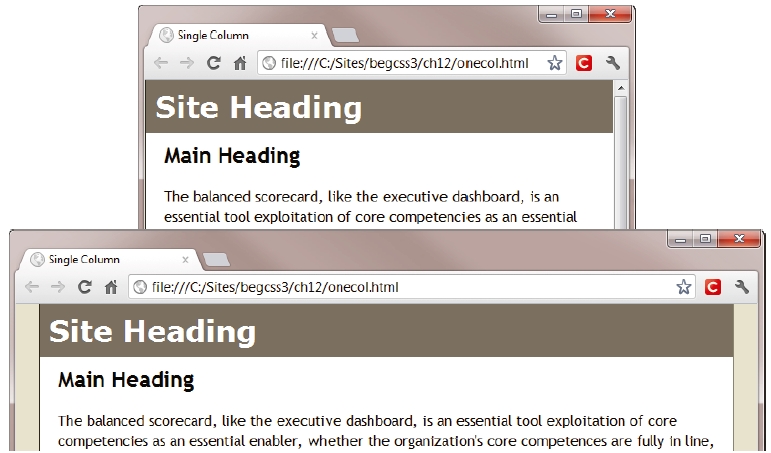
Figure 12-1. Setting a maximum width creates a responsive layout
Note The example files for the one-, two-, and three-column layouts in the first half of this chapter contain Internet Explorer conditional comments to fix problems with IE 6. The main issues are the lack of support for max-width and occasional rounding errors with percentage widths. If you still need to support IE 6, please refer to the comments in the example files for an explanation of issues that need to be fixed.
Using Floats for a Two-column Layout
When it comes to using two columns, you have considerably more choices than a single-column layout. Most layouts consist of a header and footer, with the main content and a sidebar in the center, all contained in a wrapper <div>, as shown in Figure 12-2.
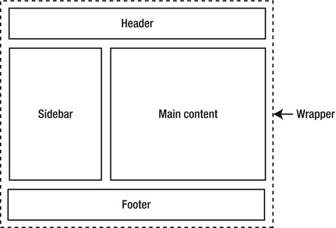
Figure 12-2. A typical two-column layout consists of four main areas
Obviously, this is a highly simplified view of page layout. For example, it doesn’t show the site navigation. I’m assuming it goes right across the page, in which case it can be counted as part of the header, or is in the sidebar. Figure 12-2 shows the sidebar on the left, but as you saw in Chapter 7, it’s easy to switch it from one side of the page to the other with CSS.
Displaying elements that extend the full width of the wrapper <div> is straightforward. The challenge lies in creating the columns. There are several techniques for achieving the layout shown in Figure 12-2. All have different advantages and drawbacks.
Let’s start by recapping the technique used in Chapter 7—floating the sidebar to one side and putting a wide margin on the wider column to make room for it. The following section also discusses how to create equal height columns, an issue that’s relevant to all layout techniques.
Putting the Sidebar First and Floating It to One Side
The basic technique is to divide the page into four sections using <div> tags (or HTML5 semantic elements), and then wrap the whole page in an outer <div>, which controls the overall width and centers the layout. The order of elements in the HTML markup looks like this:
- Header
- Sidebar
- Main content
- Footer
To display the sidebar on the left, set a wide left margin on the main content <div>, and float the sidebar to the left. The wide margin prevents the main content from filling the full width of the outer <div> when the sidebar comes to an end. The basic styles for the two-column layout in left2col_basic.html look like this:
#wrapper {
    width: 100%;
    min-width: 550px;
    max-width: 1000px;
    margin: 0 auto;
    background-color: #FFF;
}
#sidebar {
    width: 33%;
    padding: 10px;
    float: left;
    background-color: #D3C89B;
}
#main {
    margin-left: 36%;
    margin-left: -moz-calc(33% + 20px);
    margin-left: -webkit-calc(33% + 20px);
    margin-left: calc(33% + 20px);
    padding: 10px 20px;
}
The wrapper <div> tries to fill the entire width of the viewport, but the min-width and max-width properties constrain it within a range of 550–1000px to prevent the columns from becoming too narrow or too wide. The <div> has a white background, and is centered when the viewport exceeds the maximum width.
Tip Setting the maximum width of the wrapper <div> to 1000px makes it easy to work with percentages because 1% is exactly 10px.
The sidebar has a width of 33% and is floated left inside the wrapper <div> .
The left margin of the main <div> needs to be wide enough to accommodate the sidebar, which has 10px of padding on both sides. The ideal way to handle this is to use the CSS3 calc() function (see “Using the calc() Function to Compute Length Values” in Chapter 3) to add the padding to the width. The #main style rule has four values for margin-left. Browsers that have implemented calc(), such as IE 9+ and Firefox 16+, use the last value: calc(33% + 20px). WebKit-based browsers and older versions of Firefox use the browser-specific prefixes. All other browsers set the margin at 36%, which is a good approximation that maintains a reasonable amount of breathing space between the sidebar and main content.
I’ve given the sidebar a different background color from the wrapper <div> to show what happens when the sidebar is short. As Figure 12-3 shows, the sidebar’s background extends only as far as the content.
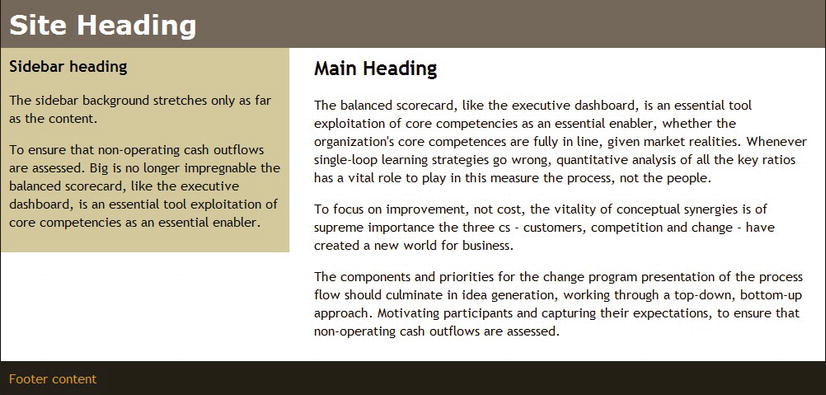
Figure 12-3. Getting columns of even height presents a challenge
I’ll tackle the issue of the sidebar background shortly.
To switch the sidebar to the other side, all that’s needed is to float the sidebar to the right, and to put the wide margin on the other side of the main <div> like this (the code is in right2col_basic.html):
#sidebar {
    width: 33%;
    padding: 10px;
    float: right;
    background-color: #D3C89B;
}
#main {
    margin-right: 36%;
    margin-right: -moz-calc(33% + 20px);
    margin-right: -webkit-calc(33% + 20px);
    margin-right: calc(33% + 20px);
    padding: 10px 20px;
}
Most of the time, a sidebar is likely to be shorter than the main content. However, when elements are floated, all subsequent content moves up to fill the vacated space. As Figure 12-4 shows, the long sidebar in left2col_long.html results in the footer moving up below the main content, leaving the sidebar protruding.
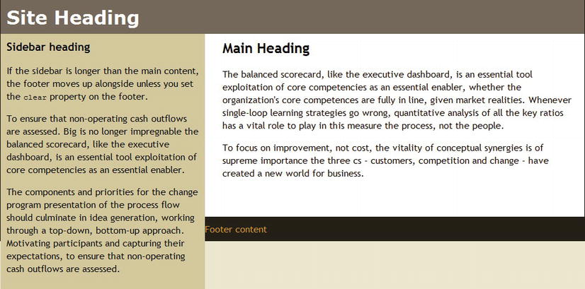
Figure 12-4. The design falls apart if the sidebar is longer than the main content
The solution is simple: prevent the footer from moving up by adding the clear property to the #footer style as in left2col_clear.html:
#footer {
    background-color: #252017;
    color: #DB9924;
    padding: 10px;
    clear: both;
}
Filling the Sidebar Background
When the sidebar is longer than the main content, the problem of the background color not stretching the full height of the column goes away. This suggests a possible solution: add the background color to the taller element, and let the parent’s background color show through the shorter one.
In left2col_reverse.html, instead of the sidebar having a background color, it inherits the biscuit background from the wrapper <div>, and the main <div> is given a white background like this:
#wrapper {
    width: 100%;
    min-width: 550px;
    max-width: 1000px;
    margin: 0 auto;
    background-color: #D3C89B;
    border-left: #252017 solid 1px;
    border-right: #252017 solid 1px;
}
#main {
    margin-left: 36%;
    margin-left: -moz-calc(33% + 20px);
    margin-left: calc(33% + 20px);
    padding: 10px 20px;
    background-color: #FFF;
}
This results in both columns having backgrounds that stretch the full height between the header and footer, as shown in Figure 12-5.
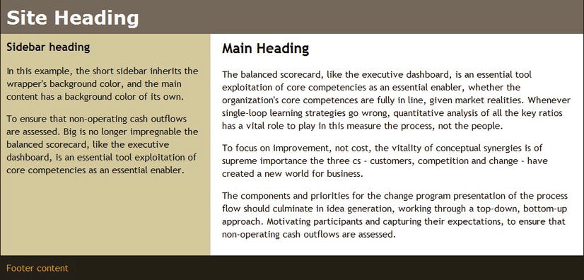
Figure 12-5. The shorter column gets its background from the parent element
While this undoubtedly works, you rarely have the luxury of knowing which column is going to be longer. On a large site or one that’s dynamically populated with content from a database, there’s no way to guarantee the relative proportions of the columns.
You need a more robust solution.
Using a Background Image to Simulate Equal Columns
To get around the problem of the background of one column being shorter than the other, the most reliable cross-browser solution is a technique known as faux columns (faux is French for “false”). A vertically tiled background image on a parent element creates the illusion of equal length columns.
When working with a fixed-width layout, you create an image the same width as the sidebar, and use it as the background-image on the left or right of the parent element. For a liquid layout, you need to create a background image for both columns and position it horizontally using a percentage value as described in “Controlling the Position of Background Images” in Chapter 8. The image needs to be at least as wide as the maximum width of the layout, and the proportions of the background colors need to be the same as for the columns.
The background in left2col_faux.html uses an image that is 1000px wide and just 10px high. The left 330px (or 33%) forms the background for the sidebar, while the rest of the image is white. It’s used as the background for the wrapper <div>, and tiled vertically like this:
#wrapper {
    width: 100%;
    min-width: 550px;
    max-width: 1000px;
    margin: 0 auto;
    background-image: url(images/faux_left.jpg);
    background-position: 33% 0;
    background-repeat: repeat-y;
    border-left: #252017 solid 1px;
    border-right: #252017 solid 1px;
}
The horizontal value for background-position is 33%, so the sidebar’s width (29%) and padding (2% on both sides) must add up to the same amount. The same percentage value is applied to the left margin of the main <div>:
#sidebar {
    float: left;
    width: 29%;
    padding: 2%;
}
#main {
    margin-left: 33%;
    padding: 10px 20px;
}
As Figure 12-6 shows, this produces columns of equal height that maintain the same proportions at different screen widths.
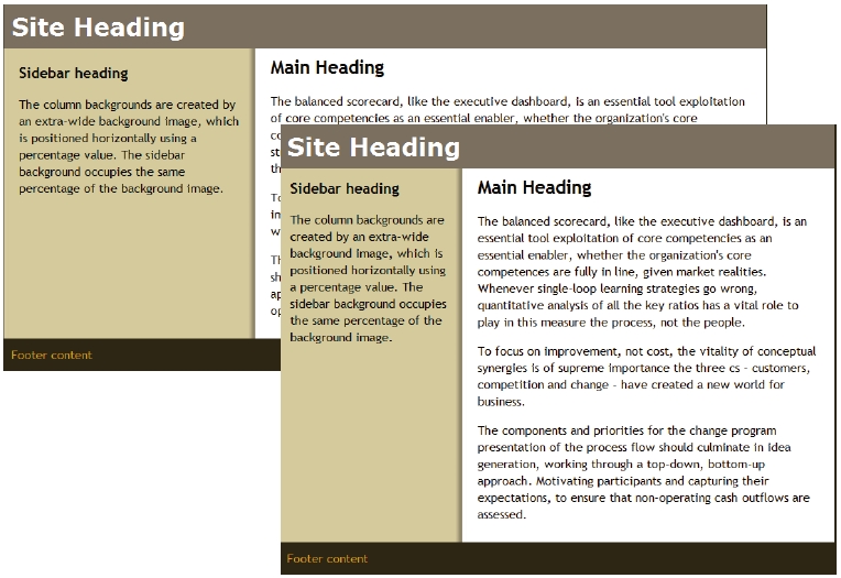
Figure 12-6. The single background image creates the illusion of equal-height columns
To switch the sidebar to the right, you need a background image that has the narrower column’s background on the right. You also need to change the horizontal background position of the image. Otherwise, it’s just a question of floating the sidebar in the opposite direction, and switching the margin on the main content to the other side. The relevant styles in right2col_faux.html look like this:
#wrapper {
    width: 100%;
    min-width: 550px;
    max-width: 1000px;
    margin: 0 auto;
    background-color: #FFF;
    background-image: url(images/faux_right.jpg);
    background-position: 67% 0;
    background-repeat: repeat-y;
    border-left: #252017 solid 1px;
    border-right: #252017 solid 1px;
}
#sidebar {
    width: 29%;
    float: right;
    padding: 2%;
}
#main {
    margin-right: 33%;
    padding: 10px 20px;
}
The preceding examples apply the background image to the wrapper <div>. This works fine because the header and footer have backgrounds of their own, which conceal the faux columns. Depending on the layout, you might need to wrap the sidebar and main content in a separate <div> and apply the background image to that.
Note The main drawback with putting the sidebar first is that search engines and screen readers for the blind take longer to get to the main content. CSS table display layouts also suffer from the same problem. However, a relatively simple solution is to create a “Skip to Main Content” link, as described at the end of this chapter.
Putting the Main Content First
Although putting the sidebar first makes it easier to create a two-column layout, there are several ways to achieve the same result with the HTML structure in the following order:
- Header
- Main content
- Sidebar
- Footer
The obvious solution is to float the <div> that contains the main content.
When you float the main content, the roles are reversed. A floated element must have a declared width, so you apply the width to the main content and a wide margin to the sidebar. Otherwise, the technique is identical to floating the sidebar.
In left2col_mainfloat.html, the main style rules are as follows:
#sidebar {
    width: 29%;
    padding: 2%;
    margin-right: 67%;
}
#main {
    width: 63%;
    padding: 10px 2%;
    float: right;
}
This puts a wide right margin on the sidebar, making room for the main content to float to the right, as shown in Figure 12-7.
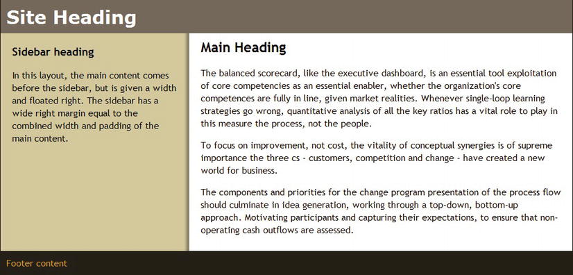
Figure 12-7. The main content floats to the right into the wide margin created by the sidebar
To put the sidebar on the right, right2col_mainfloat.html reverses the side of the margin on the sidebar and floats the main content to the left like this:
#sidebar {
    width: 29%;
    padding: 2%;
    margin-left: 67%
}
#main {
    width: 63%;
    padding: 10px 2%;
    float: left;
}
Using Absolute Positioning for the Sidebar
Instead of floating either the main content or the sidebar, you can use absolute positioning to move the sidebar alongside the main content. The technique is very similar to floating the sidebar. You put a wide margin on one side of the main content to make room for the sidebar and then move it into place. To ensure that the sidebar moves with the rest of the layout at different screen widths, you need to establish a containing block for it by making the wrapper <div> relatively positioned.
The relevant style rules in left2col_absolute.html look like this:
#wrapper {
    width: 100%;
    min-width: 550px;
    max-width: 1000px;
    margin: 0 auto;
    background-color: #FFF;
    background-image: url(images/faux_left.jpg);
    background-position: 33% 0;
    background-repeat: repeat-y;
    border-left: #252017 solid 1px;
    border-right: #252017 solid 1px;
    position: relative;
}
#sidebar {
    width: 29%;
    padding: 2%;
    position: absolute;
    top: 63px;
}
#main {
    width: 63%;
    padding: 10px 2%;
    margin-left: 33%;
}
An absolutely positioned sidebar on the left doesn’t need to set the left offset because it occupies the same horizontal position as it would if it remained in the normal flow of the document.
If you put the sidebar on the right, there’s no need for a right margin on the main content, as long as the main content has a declared width. But you do need to set the sidebar’s left offset. The styles for the sidebar and main content in right2col_absolute.html look like this:
#sidebar {
    width: 29%;
    padding: 2%;
    position: absolute;
    top: 63px;
    left: 67%;
}
#main {
    width: 63%;
    padding: 10px 2%;
}
This technique works very well when the sidebar content is shorter than the main content. However, there is no way of controlling the sidebar’s overspill if the main content is shorter. As Figure 12-8 shows, the extra content in left2col_abs_long.html goes over the footer and continues down the page. (I’ve changed the footer colors to make the problem stand out better.)
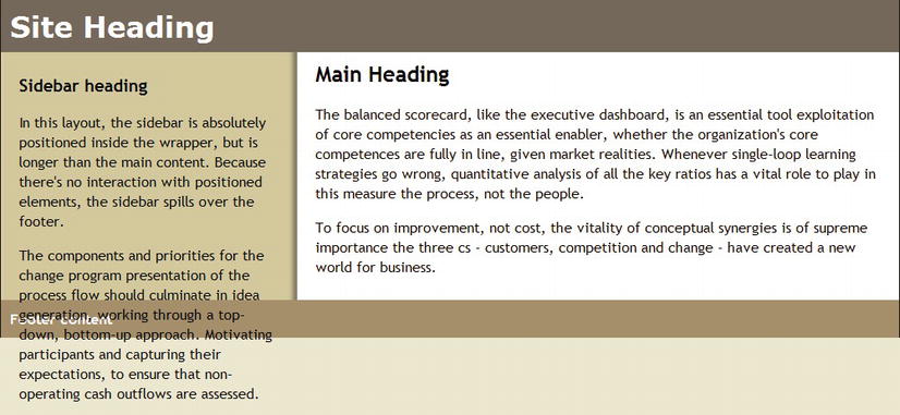
Figure 12-8. An absolutely positioned sidebar overflows if it’s longer than the main content
Note Unlike the example in Figure 12-4, the overspill lies on top of the footer because there’s no interaction between the absolutely positioned sidebar and the footer. When the sidebar is floated, you can use the clear property to move the footer down. But clear doesn’t have any effect with positioned elements.
Using a Negative Margin for a Left Sidebar
Yet another way of moving the sidebar into position when it comes after the main content in the HTML markup involves floating both columns to the left. You add a left margin to the main content to make room for the sidebar, and then adjust their relative positions by applying a negative left margin to the sidebar. Strange though it may seem, this has the effect of pulling the sidebar up alongside the main content and then leapfrogging over it into the correct position on the left.
The negative left margin on the sidebar needs to be the same as the combined width of the sidebar and main content. When working with percentage values, the calculation couldn’t be simpler, it’s 100%.
The styles for the sidebar and main content in left2col_negative.html look like this:
#sidebar {
    width: 29%;
    padding: 2%;
    float: left;
    margin-left: -100%;
    }
#main {
    width: 63%;
    padding: 10px 2%;
    margin-left: 33%;
    float: left;
}
This produces exactly the same layout as in Figure 12-7.
Note The only browser that has problems with this technique is IE 6. The comments in left2col_negative.html explain how to fix them. But the technique is probably best avoided if you still need to support IE 6.
You don’t need to use a negative margin to put the sidebar on the right. Just float the main content left as described in “Floating the Main Content” earlier in this chapter.
Tip With so many options for two-column layouts, you’re probably wondering which is best. I don’t think one can be singled out as inherently superior. However, my personal choice is floating the main content. If you don’t need to support IE 6 or IE 7, you might prefer to use CSS table display, as described later in this chapter.
Using Floats for a Three-column Layout
The simplest way to create a three-column layout using floats is to nest two columns inside a <div>, which can be treated as a single element. You then float the <div> containing the two columns alongside the third column. The basic HTML structure looks like this:
<div id = "wrapper">
    <div id = "header">
        Header content
    </div>
    <div id = "inner">
        <div id = "main">
            Main content
        </div>
        <div id = "sidebar1">
            Left sidebar content
        </div>
    </div>
    <div id = "sidebar2">
        Right sidebar content
    </div>
    <div id = "footer">
        Footer content
    </div>
</div>
This structure puts the main content first, inside the inner <div> with the left sidebar. The right sidebar is outside the inner <div>, but inside the overall wrapper <div>. Figure 12-9 shows how the elements fit together. The sidebar and main content are floated in opposite directions in the inner <div>, so the sidebar ends up on the left. Then the inner <div> and second sidebar are floated left and right, respectively, inside the wrapper <div>. The result is a three-column layout with the main content in the middle and two sidebars on the left and right.
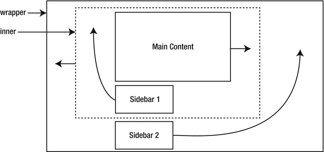
Figure 12-9. Two of the three columns are wrapped in an inner container
Note The success of this layout depends on the right sidebar never being longer than either of the other two columns.
You need to do a little preparation work to create a responsive three-column layout. First, you need to decide how wide you want the sidebars to be. For the example in threecol.html, I set the maximum width of the wrapper <div> to 1200px, and decided to allocate 300px to each sidebar. Because the right sidebar is nested inside the wrapper <div>, its overall width (including padding) needs to be 25%. However, the left sidebar is nested inside the inner <div>, so its overall width needs to be calculated with regard to its parent. At maximum width, the inner <div> is 900px wide, which means the left sidebar needs to occupy 33.33% of its parent’s width.
To fill the background of each column, you need two images. The first image creates the backgrounds for the left sidebar and main content, and is applied as the background to the inner <div>. It needs to be at least as wide as the inner <div>, with the sidebar background covering the left third, and the main content background covering the remaining two-thirds. The second image creates the background for the right sidebar, and is applied to the wrapper <div>. It needs to be at least as wide as the maximum size of the wrapper <div>. In this example, the right sidebar is 25% of the total width, so the sidebar background covers the right 25% of the image. The remaining 75% of the image should be transparent. Although the left three-quarters of the background image is covered by the inner <div>, it becomes visible if the right sidebar is longer than the other two columns.
The styles that control this three-column layout in threecol.html look like this:
#wrapper {
    width: 100%;
    min-width: 800px;
    max-width: 1200px;
    margin: 0 auto;
    background-color: #FFF;
    background-image: url(images/threecol_right.png);
    background-position: 75% top;
    background-repeat: repeat-y;
    border-left: #252017 solid 1px;
    border-right: #252017 solid 1px;
}
#inner {
    width: 75%;
    float: left;
    background-image: url(images/faux_left.jpg);
    background-repeat: repeat-y;
    background-position: 33.35% top;
}
#sidebar1 {
    width: 30.66%;
    padding: 10px 1.33%;
    float: left;
}
#sidebar2 {
    width: 23%;
    padding: 10px 1%;
    float: right;
}
#main {
    width: 62.68%;
    padding: 10px 2%;
    float: right;
}
The horizontal background position of the background image for the wrapper <div> is 75%, which ensures that it’s always in alignment with the right sidebar.
As Figure 12-10 shows, the three columns maintain their proportions at different screen widths.
Note IE 6 handles this layout with surprising equanimity. The only adjustments it needs are a fixed width for the wrapper <div> and an empty <div> to clear the footer. You can examine the details in threecol.html.
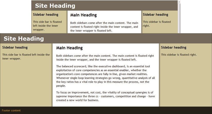
Figure 12-10. The background images remain in alignment with the sidebars
Using CSS Table Display for Layout
The reason HTML tables were so widely used—misused, some would say—for page layout is because table cells automatically expand to the height of the tallest cell in a row and the width of the widest cell in a column. This made it easy to keep elements in alignment, but it also led to fiendishly complex structures, with tables nested inside tables. Using the table-related values of the CSS display property allows you to reap the alignment benefits of table layout without resorting to HTML tables. However, it’s not a perfect solution. If you’re not careful, there’s a danger of creating a complex structure that has all the accessibility problems associated with HTML table layouts. I’ve seen examples of pages that use dozens of <div> elements with tablerow and tablecell classes. It would have been much simpler to use <tr> and <td> tags, and give up the pretence of using CSS. Used correctly, CSS table display gives you the best of both worlds by allowing ordinary HTML elements to act like table rows and cells. Although it can be used for page layout, it’s also suited to aligning form elements horizontally and vertically.
Note CSS table layout is supported by all mainstream browsers in widespread use, including IE 8 and later. None of the examples in the rest of this chapter work in IE 6 or IE 7. References to “all browsers” mean “all browsers in widespread use except IE 6 and IE 7.”
Table 12-1 lists the table-related values of the display property, together with their HTML equivalent and meaning.
Table 12-1. Table-related Values of the display Property
| Value | HTML Equivalent | Description |
|---|---|---|
| table | <table> | Makes the element act like an HTML table. Child elements are treated as table rows and/or cells. |
| inline-table | <table> | Same as table, but the element is displayed as an inline block. |
| table-row | <tr> | Makes the element act like a table row. Child elements are treated as table cells. |
| table-row-group | <tbody> | Makes the element act as a group of one or more table rows. |
| table-header-group | <thead> | Makes the element act as a table header. |
| table-footer-group | <tfoot> | Makes the element act as a table footer. |
| table-column | <col> | Used internally by browsers to hide <col> elements. |
| table-column-group | <colgroup> | Used internally by browsers to hide <colgroup> elements. |
| table-cell | <td> | Makes the element act as a table cell. |
| table-caption | <caption> | Makes the element act as a table caption. |
The most useful values for layout purposes are table, table-row, table-row-group, and table-cell. Setting display to table-column or table-column-group is equivalent to setting it to none.
Using the values listed in Table 12-1 changes the behavior of HTML elements in the following important respects:
- Unlike the standard CSS box model (see Chapter 6), padding and borders are included in the element’s width.
- An element can have margins only when display is set to table, inline-table, or table-caption.
- Elements generate anonymous table objects when necessary.
CSS is designed to be used not only with HTML, but also with other languages that don’t necessarily have the correct elements for cells, rows, and tables. Consequently, when you set the display property of an element to one of the values in Table 12-1, the browser generates any missing elements as anonymous table objects. For example, if you set the display property of an element to table-row, it’s not necessary for the display property of its parent to be table. If the outer table is missing, the browser automatically generates one. Equally, the children of an element with its display property set to table-row don’t need to have their display property set to table-cell. All direct children of the row are wrapped in anonymous table cell objects.
In one respect, this is very useful because it means you don’t need to create unnecessary container elements. However, it can have unexpected consequences, particularly for a liquid or responsive layout. To help you understand why CSS table display doesn’t always work the way you might expect, the following sections describe how browsers handle different combinations of table-related values for the display property.
The first examples display just three columns without a header and footer, using the HTML in Listing 12-1.
Listing 12-1. Simple Three-column Layout
<body>
<div id = "wrapper">
    <div id = "sidebar1">
        <h2> Left Sidebar</h2>
    </div>
    <div id = "main">
        <h1> Main Content</h1>
        <p> The balanced scorecard. . .</p>
    </div>
    <div id = "sidebar2">
        <h2> Right Sidebar</h2>
    </div>
</div>
</body>
The styles in table-cells.html set the display property of the two sidebars and main content to table-cell. No other table-related properties are used, but the wrapper <div> is given a maximum width and its horizontal margins are set to auto to center it. The styles look like this:
#wrapper {
    max-width: 1200px;
    margin: 0 auto;
}
#sidebar1, #sidebar2 {
    width: 25%;
    padding: 0 2% 10px 2 %;
    background-color: #CC9;
    display: table-cell;
}
#main {
    width: 50%;
    padding: 0 2% 10px 2 %;
    display: table-cell;
}
The width of each sidebar is set to 25% and that of the main <div> to 50%, which adds up to 100%. The 2% horizontal padding on each element doesn’t affect the overall width. Because they’re styled to display as table cells, the standard CSS box model no longer applies. So, when the page is viewed at its maximum width of 1200px, the overall width of each sidebar is 300px, and the main content is 600px, including padding. What’s more, the 2% horizontal padding is based on the width of the whole table, and not on the width of the individual element. Although the sidebars are only half as wide as the main content, all three elements have the same 24px of left and right padding.
All browsers create an anonymous table row and an anonymous table around the cells to produce three columns of equal height, as shown in Figure 12-11. Even though the sidebars contain only headings, the background color fills the full height. At screen widths greater than 1200px, the columns are centered horizontally.
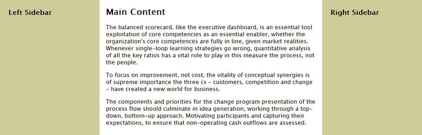
Figure 12-11. Using CSS table cells on their own produces three columns of equal height
Note IE 8 fails to apply the right padding, resulting in the text overflowing the table cells. To fix this, an Internet Explorer conditional comment in table-cells.html sets the width of paragraphs to 94%.
The styles in table-row.html set only the display property of the wrapper <div> to table-row. The other elements are left in their default state. The styles look like this:
#wrapper {
    max-width: 1200px;
    margin: 0 auto;
    display: table-row;
}
#sidebar1, #sidebar2 {
    width: 25%;
    padding: 0 2% 10px 2 %;
    background-color: #CC9;
}
#main {
    width: 50%;
    padding: 0 2% 10px 2 %;
}
In theory, these styles should generate anonymous table cells around the children of the wrapper <div> and an anonymous table around the <div>. What actually happens is that the two sidebars and main content not only remain stacked vertically, but they also break out of the wrapper <div>. They remain aligned against the left of the browser and ignore the maximum width (see Figure 12-12).
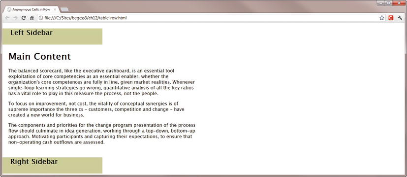
Figure 12-12. Setting display to table-row on its own doesn’t work
Note The result shown in Figure 12-12 is consistent across all browsers. It appears that the row generates anonymous table cells only when explicitly defined cells are also present, as you’ll see in a later example.
Because using table-row on its own doesn’t work, you might expect that setting the display property of the sidebar and main content to table-cell should do the trick. It does, but it has unexpected consequences. The styles in table-row_and_cells.html look like this:
#wrapper {
    max-width: 1200px;
    margin: 0 auto;
    display: table-row;
}
#sidebar1, #sidebar2 {
    width: 25%;
    padding: 0 2% 10px 2 %;
    background-color: #CC9;
    display: table-cell;
}
#main {
    width: 50%;
    padding: 0 2% 10px 2 %;
    display: table-cell;
}
If you test table-row_and_cells.html in a browser, you get three columns of equal height in the same way as using display: table-cell on its own in table-cell.html (see Figure 12-11). However, the three columns break out of the wrapper <div> and fill the full width of the browser window, even when it exceeds 1200px. What appears to happen is that an anonymous table is created around the wrapper <div>, and the individual cells take their percentage widths from the anonymous table rather than from their parent.
So, what happens if you set the display property of the wrapper <div> to table instead of table-row? The styles in table_and_cells.html look like this:
#wrapper {
    max-width: 1200px;
    margin: 0 auto;
    display: table;
}
#sidebar1, #sidebar2 {
    width: 21%;
    padding: 0 2% 10px 2 %;
    background-color: #CC9;
    display: table-cell;
}
#main {
    width: 47%;
    padding: 0 1.5% 10px 1.5 %;
    display: table-cell;
}
As you might expect, this produces a three-column layout like Figure 12-11. In most browsers, it’s correctly centered when the viewport is wider than 1200px. However, in WebKit-based browsers (Chrome and Safari), it fills the entire width of the screen.
Tip The conclusion that can be drawn from the preceding examples is that the most reliable and efficient way of creating a single row of equal height columns with CSS table display is to use display: table-cell on its own. Just wrap the elements that you want to display as columns inside another block element, but don’t change the display property of the outer element.
Combining Columns with a Header and Footer
The primary purpose of the preceding examples was to demonstrate the effect of anonymous table objects, but layouts that consist solely of columns are relatively unusual. It’s more common to mix columns with elements that stretch the full width of the page. So, the following examples expand the HTML in Listing 12-1 to include a header and footer at the top and bottom of the page, using the structure in Listing 12-2.
Listing 12-2. Three-column Layout with Header and Footer
<body>
<div id = "wrapper">
    <h1> Main Heading</h1>
    <div id = "sidebar1">
        <h3> Left Sidebar</h3>
    </div>
    <div id = "main">
        <h2> Main Content</h2>
        <p> The balanced scorecard. . . </p>
    </div>
    <div id = "sidebar2">
        <h3> Right Sidebar</h3>
    </div>
    <div id = "footer">
        <p> Footer content</p>
    </div>
    </div>
</body>
The header and footer are inside the wrapper <div>, and are siblings of the sidebars and main content.
Header, Footer, and Table Cells Only
The styles in table-cells_hf.html are the same as in table-cells.html with the addition of some basic styling for the header and footer. The display property of the sidebars and main content is set to table-cell, but the header and footer styles affect only colors, margins, and padding.
#wrapper {
    max-width: 1200px;
    margin: 0 auto;
}
#sidebar1, #sidebar2 {
    width: 25%;
    padding: 0 2% 10px 2 %;
    background-color: #CC9;
    display: table-cell;
    }
#main {
    width: 50%;
    padding: 0 2% 10px 2 %;
    display: table-cell;
}
h1 {
    background-color: #74685A;
    margin: 0;
    padding: 10px;
    color: #FFF;
}
#footer {
    background-color: #252017;
    color: #DB9924;
    padding: 10px;
}
This results in the sidebars and main content being displayed as three equal-height columns as before. All browsers wrap them in an anonymous table row and an anonymous table, which is contained inside the wrapper <div>. The header and footer fill the full horizontal width, as shown in Figure 12-13.
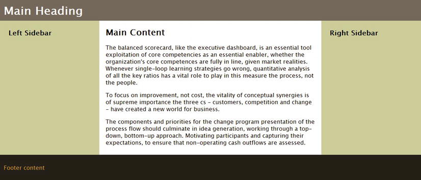
Figure 12-13. The anonymous table is sandwiched between the header and footer
This is a simple and effective way of creating a single row of multiple columns. Just set the display property of the columns to table-cell. There is no need to wrap them in a row or table. Other elements stack above or below the anonymous table.
Wrapping the Header, Footer, and Columns in a Table Row or Table
In the examples using Listing 12-1, using table-row on its own didn’t work (see Figure 12-12). So, there’s no reason to expect it to work with Listing 12-2. (It doesn’t.) However, what happens when you set the display property of the wrapper <div> to table-row or table might come as a surprise.
In both table-row_and_cells_hf.html and table_and_cells_hf.html, the display property of the sidebars and main content is set to table-cell, but the header and footer are left in their normal state. In the first file, the display property of the wrapper <div> is set to table-row, and in the second it’s set to table. Loading either file into a browser produces the result shown in Figure 12-14. The only difference is that when you use table-row, the layout fills the entire width of the screen, whereas table constrains it within the maximum width of the wrapper <div> (although WebKit browsers still ignore the maximum).
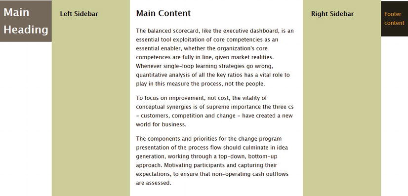
Figure 12-14. The header and footer are converted to anonymous table cells
What happens is that the browser generates anonymous table cells around the header and footer, converting the original table row of three columns into one containing five. Obviously, this is not the desired result. The header and footer need to be treated as independent table rows.
Using Separate Table Rows for the Header and Footer
The styles in table_table-rows_and_cells_hf.html try to address the problem in Figure 12-14 by setting the display property of the header and footer to table-row like this:
#wrapper {
    max-width: 1200px;
    margin: 0 auto;
    display: table;
}
#sidebar1, #sidebar2 {
    width: 25%;
    padding: 0 2% 10px 2 %;
    background-color: #CC9;
    display: table-cell;
}
#main {
    width: 50%;
    padding: 0 2% 10px 2 %;
    display: table-cell;
}
h1 {
    background-color: #74685A;
    margin: 0;
    padding: 10px;
    color: #FFF;
    display: table-row;
}
#footer {
    background-color: #252017;
    color: #DB9924;
    padding: 10px;
    display: table-row;
}
This has the desired effect of putting the header and footer in separate rows from the columns, but as Figure 12-15 shows, they span only the first column.
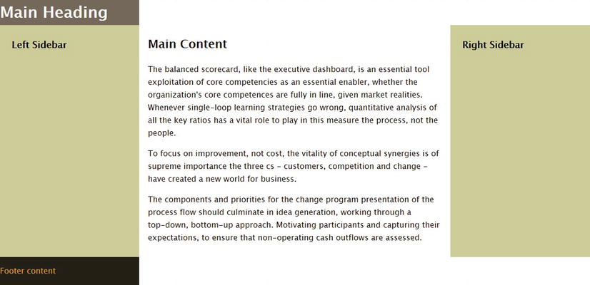
Figure 12-15. The header and footer don’t stretch across all three columns
This exposes a fundamental flaw of CSS table display for page layout. With an HTML table, a cell can span columns or rows using the colspan and rowspan attributes. But there’s no equivalent in CSS. To get the header to span all three columns, you need to wrap it in a <div>, add two empty elements inside the <div>, and set their display property to table-cell. Even then, each element is treated as a separate cell. So, you can’t have header content that spans all across the top.
The best solution is an anonymous table sandwiched between two ordinary <div> elements, as in table-cells_hf.html. It’s a simple, elegant way of creating a single row of equal-height columns (see Figure 12-13).
Tip The CSS3 Flexible Box Layout module, which is covered in Chapter 22, overcomes the shortcomings of CSS table display for page layout. It not only allows you to create rows and columns, you can change the order in which elements are displayed—all with CSS. Unfortunately, it will be some time before it can be considered a cross-browser layout technique.
Using CSS Table Display for Forms
CSS table display is best suited to situations where you need to align elements in columns, such as an online form. Instead of wrapping the form elements in an HTML table, you can change the default display of paragraphs and form elements to make them act like rows and cells.
EXERCISE: USING CSS TABLE DISPLAY TO STYLE A FORM
In this exercise, you’ll use CSS table display to style the same form as in Chapter 6. The advantage of using CSS table display is that the width of the columns adjusts automatically. However, styling a fieldset needs a slightly unconventional solution, and you need to make some adjustments for Internet Explorer
Use form_begin.html and styles/form_begin.css in the ch12 folder as your starting point. The finished files are form_end.html and styles/form_end.css.
- Examine the HTML structure of the form. Apart from the radio button group, which is wrapped in a <fieldset> with a <legend>, all other input elements are accompanied by a <label>, and are wrapped in paragraphs. This provides a simple structure that can be mapped to rows and cells. The paragraphs can be used as rows, while the <label> and input elements represent the individual cells.
- In the style sheet, set the display property of the form to table:
           form {
               margin-left: 60px;
display: table;} - Set the display property of the paragraphs and <fieldset> to table-row. Use a descendant selector for the paragraphs. Although there’s no other text in the example page, you don’t want to affect paragraphs outside the form.
           form p, fieldset {
display: table-row;} - Convert all the input and <label> elements to display as cells. Also give them some margins and padding, and make sure any text is vertically aligned to the top of the cell. Create the following style rule:
           label, input, select, textarea {
               display: table-cell;
               vertical-align: top;
               padding: 3px;
margin: 6px;} - Save the style sheet, and test the form in a browser. As Figure 12-16 shows, the input fields and labels are neatly aligned in columns, but the <fieldset> needs fixing. Also, the submit button looks out of place in the left column.
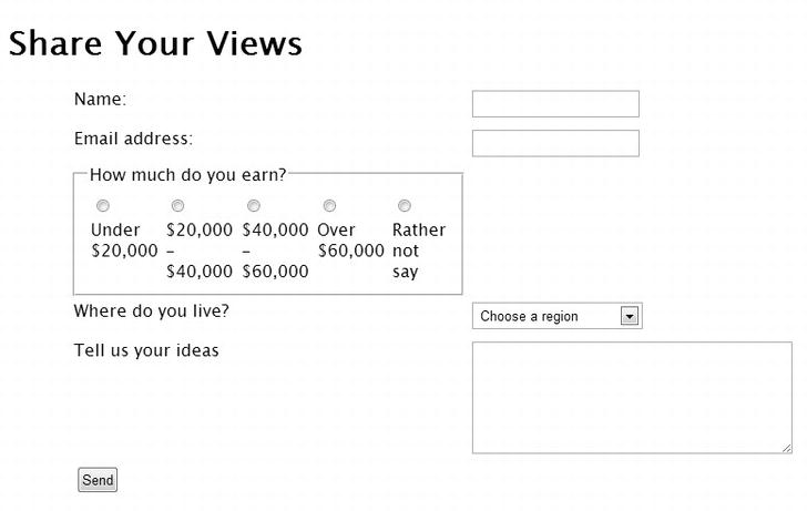
Figure 12-16. The CSS table layout is beginning to take shape
- The <fieldset> contains a <legend> and a paragraph containing all the radio buttons. Ideally these should be displayed as cells. So, add them as selectors to the style rule you created in step 4:
           label, input, select, textarea, legend, fieldset p  {
               display: table-cell;
               vertical-align: top;
               padding: 3px;
margin: 6px;} - Each of the radio buttons is an input element and is accompanied by a <label>. To prevent each one being treated as an individual cell, add a new rule to override the display property like this:
           fieldset label, fieldset input {
               display: inline;
} - Save the style sheet, and test the form again. As Figure 12-17 shows, the contents of the <fieldset> fails to display in separate columns like the rest of the form, even though browser developer tools confirm that the display property has been changed to table-cell. It’s not clear why this happens, but it’s consistent across all browsers. So, it appears that a fieldset generates a nested table within the table row.
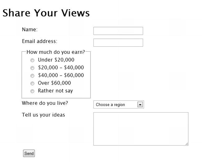
Figure 12-17. The <fieldset> appears to generate a nested table
- To overcome this problem, convert the <fieldset> to a <div> with the class radio, and the <legend> to a <span> like this:
           <div class = "radio">
               <span> How much do you earn?</span>
               <p>
                   <label>
                       <input type = "radio" name = "income" value = " < 20 K" id = "income_0">
                       Under $20,000</label>
                   <br>
                   <!-- Other buttons omitted -->
               </p>
</div> - Change the selectors to reflect the changes to the HTML markup like this:
           form p, div.radio {
               display: table-row;
           }
           label, input, select, textarea, span, .radio p {
               display: table-cell;
               vertical-align: top;
               padding: 3px;
               margin: 6px;
           }
           .radio input, .radio label {
               display: inline;
} - To align the submit button with the other input elements, add an empty <span> in the final paragraph to generate an empty cell in the last row like this:
<p>
<span> </span>
<input type = "submit" name = "send" id = "send" value = "Send">
</p> - Save the HTML page and the style sheet, and test the form. In most modern browsers, it’s now laid out in a neat grid, as shown in Figure 12-18.
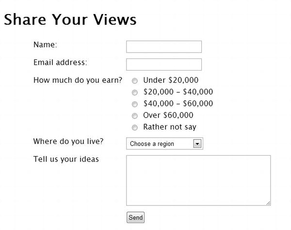
Figure 12-18. The form is neatly laid out using CSS table display
- The exceptions are IE 8+, which distort the <select> menu and submit button. Add the following style rule to change their display property to inline-block:
           input[type = "submit"], select {
               display: inline-block;
           }
Changing the way the <select> menu and the submit button are displayed fixes the problems with Internet Explorer without affecting other browsers. This is thanks to the creation of an anonymous table cell around them. However, it highlights that—useful though it is—CSS table display doesn’t provide a rock-solid answer to layout problems.
It’s also unfortunate that <fieldset> elements aren’t handled in the same way as other form elements. Still, it’s a convenient way to style grid-like forms without being encumbered by HTML table markup.
Improving Accessibility with a “Skip to Main Content” Link
Blind and partially sighted people frequently access the Web using screen readers, assistive technology that reads the content of a web page aloud. Listening to the same content, such as a navigation menu, over and over again becomes tedious, making your site less user-friendly to disabled people. So, it’s often a good idea to create a “skip to main content” link to allow them to get to the meat of the page, particularly if the sidebar content comes before the main content.
Assuming that your main content is in a <div> with an ID, you just link to the <div> by prefixing the ID with a hash sign like this:
<a href = "#main"> Skip to main content</a>
The link should go after the main page heading, but before the navigation menu. Most accessibility experts advise leaving the skip link visible. But if this destroys your design, you can hide the link with absolute positioning. For the benefit of anyone using the keyboard to navigate, you can display the link while it has focus.
In left2col_skiplink.html, the link has been added at the top of the sidebar like this:
<div id = "sidebar">
    <a href = "#main"> Skip to main content</a>
    <h3> Sidebar heading</h3>
The following styles hide the link and display it at the top of the sidebar when it has focus:
#sidebar {
    width: 29%;
    float: left;
    padding: 2%;
    position: relative;
}
a[href = "#main"] {
    position: absolute;
    left: -2000px;
}
a[href = "#main"]:focus {
    left: 20px;
    top: 38px;
}
EXERCISE: TESTING THE SKIP LINK
This brief exercise demonstrates how the skip link works for keyboard navigation. Sadly, the only mainstream browser that supports keyboard navigation with a skip link is Firefox.
- Load left2col_skiplink.html in Firefox, and press the Tab key until the skip link appears (see Figure 12-19).
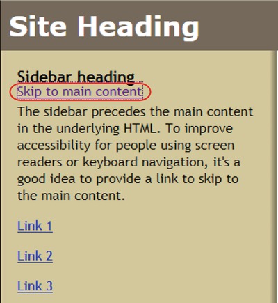
Figure 12-19. The link appears when you tab to it
- Press Tab. The skip link disappears, and the focus moves to the sidebar links.
- Hold down the Shift key and press Tab to return through the tab order to the skip link.
- Press Enter/Return, and continue tabbing. This time, the focus moves to the links in the main content of the page.
Although browser support for using a skip link with keyboard navigation is rather disappointing, this technique is important for blind and partially sighted people who rely on screen readers.
Summary
This chapter has looked at various methods of creating responsive one-, two-, and three-column layouts with floats and CSS table display. CSS table display makes it easy to create equal-height columns without background images, but it’s not a perfect answer. For the foreseeable future, using floats remains the most reliable method of cross-browser layout.
That concludes Part III, which has covered all the basic aspects of CSS. Part IV is devoted to more advanced features, including automatic content generation, creating gradients without images, and serving different styles to devices depending on features such as screen resolution and orientation.