
 Note Everything in HTML fits in a box and knowing how to control the format and layout of these boxes is paramount to a solid understanding of CSS.
Box properties are the properties of an HTML element that describe things like its size, fill, border, and spacing.
We’ll look into element size and spacing as well as all the fill and border colors that make these elements look good and make them act as they should when the view state changes. It’s one thing to get a single view working just right, but what happens when the user rotates their device to a portrait orientation? If an elements’ box properties aren’t set right then the whole layout can be adversely affected. The properties that we’re going to look at in this chapter are critical to getting your Windows 8 app to look as it should. Figure 5-1 shows some Windows 8 apps designed according to the Microsoft design principles.
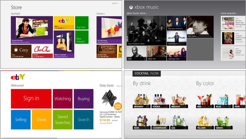
Figure 5-1. A few Windows 8 apps designed according to the Microsoft design principles
A whole lot of design, thought, and testing went in to the design language that guides the look and feel of Windows 8. Everything from the size of the touch targets to the spacing between them has a place in the design principles. In Figure 5-1, notice the consistent space above, below, and to the left of the content. Notice that the content is not packed on the screen but granted a bit of breathing room. And notice how there are very few visual elements for interaction or navigation besides the content itself. All of these are part of the design language and a ton more.
To implement these principles you will have to rely heavily on the box model and on various layout techniques. This chapter covers the box model and Chapter 7 will cover layout. To get a thorough understanding of the box model, you’ll have to understand sizing, margins, borders, and padding. We’ll take some more time to cover gradients and shadows since they can sometimes complement your core graphics and add value to your design.
You must understand the box model if you are to understand the margin, border, padding, and background properties on their own. Be sure the terms shown in Figure 5-2 are committed to memory.
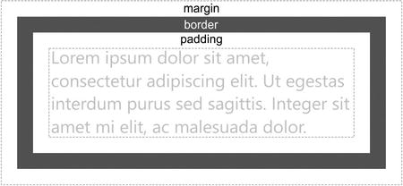
Figure 5-2. The HTML/CSS box model
The space labeled margin is space between the element and everything around it. The border is shown here as a gray line, but it can actually be any of a variety of styles, colors, and thicknesses. The space between the border and the actual content inside the box is called the padding.
The content is represented here as text, but keep in mind that your content may be text or it may be more elements nested as children.
I need to define some more terms that are based on this box model. The border box is the area of the diagram that includes the border area, the padding area, and the content, but excludes the margin. The padding box is the rectangular area that includes the padding area and the content area (excludes the margin and the border). And the content box is just the content area. You’ll see why these terms are significant in just a moment.
HTML container elements can be defined with no sizing information specified and left to react to the size of their parents or the size of their content, but you can also explicitly declare what size they should be. It’s especially helpful in a Windows 8 app to specify the size because the visual artifacts will show up on a variety of devices and some of the devices will actually have system-level scaling applied to maintain a consistent and touchable user experience. In other words, unlike existing iterations of Windows design environments, things like buttons will not get smaller as the user cranks their resolution up.
Most HTML elements can have width and height properties specified to determine their explicit size. Besides this absolute value, it is also possible to specify minimum and maximum values for each. Here’s a list of the properties available: width, min-width, max-width, height, min-height, max-height.
The minimum and maximum properties are extremely helpful in creating good adaptive layout. A min-width value of 80px will allow the target element to grow larger than 80 pixels in width (if a user is typing into the element, for instance) but never narrower.
Before setting a width and height on an element always ask yourself if you should be using a minimum or maximum property instead. Should your element be an absolute size or should it be able to adapt and get either smaller or larger in certain circumstances? Values of both properties should be a standard unit of length, as we’ve discussed already. Listing 5-1 shows you how element sizing can be specified in a variety of units.
Listing 5-1. A div with five children of varying widths
<!-- HTML snippet -->
<div id="parent">
    <div></div>
    <div></div>
    <div></div>
    <div></div>
    <div></div>
</div>

/* CSS snippet */
#parent { width:200px; border: 1px solid black;}
    #parent > div { background:green; height: 20px; margin:2px; color:white; }
    #parent div:nth-of-type(1) { width: 10px; }
    #parent div:nth-of-type(2) { width: 50%; }
    #parent div:nth-of-type(3) { width: 100px; }
    #parent div:nth-of-type(4) { width: calc(100% - 10px); }
    #parent div:nth-of-type(5) { width: 1in; }
There are some things you should note about Listing 5-1.
- Notice the indentation of all but the first line. This is an example of the convention mentioned earlier for indicating hierarchy.
- Notice the fourth child’s width uses the calc() function to indicate that the width should be “10 pixels short of 100%”.
- Notice the use of the :nth-of-type() pseudo-class. This is a great way to define style rules for a sequence of like elements in order. Because the :nth-of-type() is used instead of :nth-child, we could add a header above the sequence of div elements at a later time and not have any effect on their style.
Listing 5-1 results in rendered HTML that looks like Figure 5-3. You can see the different widths relative to one another.
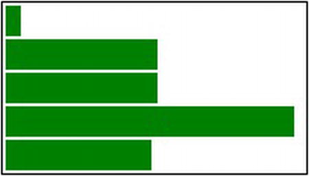
Figure 5-3. Various sized rectangles illustrate the width properties
Until CSS3, when the width and height of an object were set, the specified value affected the width and height of the content area (see the box model). This may be an intuitive approach in some cases, but it is also cause for some consternation. As one example, setting the width of a div to 100% would cause it to take the width of its parent, but then adding some padding and border would cause it to appear wider than its parent. So even though this method of measuring a box is often frustrating, it has remained the W3C standard.
CSS3 also introduced two enhancements that drastically improve our sizing scenarios. The first we’ve already discussed, which is the calc() method for specifying widths like calc(100% - 20px). The second is the box-sizing property. The box-sizing property takes a value of either border-box or content-box (default). Specifying border-box indicates that width and height should be translated to be the width and height of the entire box (including padding and border) and not just the content.
Let’s look at the example in Listing 5-2 to be sure we’re clear on this behavior.
Figure 5-4. A div with a 50-pixel border that clearly appears more than 200 pixels overall in width
Listing 5-2. A 200-pixel box using the default content-box sizing method
<!-- HTML snipppet -->
<div id="box"></div>

/* CSS snippet */
#box {
    margin: 50px;
    padding: 50px;
    border: 50px solid gray;
    width: 200px;
    height: 200px;
}
Now, if I told you that the border in that resulting box is 50 pixels thick, would you believe that the entire box is 200 pixels wide by 200 pixels tall? It would seem to add up to more. Using the standard sizing method, the content is 200 pixels wide and the padding and borders of 50 pixels each add the entire apparent width of the box up to 400 pixels!
Listing 5-3 repeats the same CSS but introduces one more property and look at the dramatically different result.
Listing 5-3. A 200 pixel box using the border-box sizing method
<!-- HTML snipppet -->
<div id="box"></div>

/* CSS snippet */
#box {
    margin: 50px;
    padding: 50px;
    border: 50px solid gray;
    width: 100px;
    height: 100px;
    box-sizing: border-box;
}
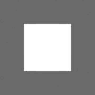
Figure 5-5. A div that has set its sizing method via box-sizing and truly appears to be 200 pixels overall in width now
The box model with its sizing, its margin, and its padding gives you good control over the shape of all the containers on the page. The whole point of these containers on the page is to contain your app’s content and very often that content will be too large or too long to fit. The container’s behavior in this case is what we call overflow.
If a div element, for example, is tall enough to show 10 lines of text, and there are more than 10 lines of text in it, then we have some overflow.
You use the overflow property to control this behavior. Valid values are visible (and that one is the default), hidden, scroll, and auto.
- visible determines that the overflowing content should be visible. Even though it is visible, it does not affect the layout of any elements it may collide with.
- hidden makes any overflowing content invisible.
- scroll adds a scrollbar to the element so the user can choose to scroll to the overflowing content.
- auto only adds the scrollbars if there is reason to do so.
The overflow property is actually a shorthand property for overflow-x and overflow-y, so you can control the way the container behaves in both axes independently.
Listing 5-4 shows the example I mentioned of a div that is sized to show 10 lines of text but contains more. The overflow property has not been set, so the default value of visible is being used, and in fact the extra text is clearly visible in the result. One interesting behavior of this overflowing text that may or may not be intuitive to you is that it does not push other content around. The containing div acts as a block level element pushing subsequent content down, but its overflowing text has no further effect on the position of anything else on the page.
Listing 5-4. A div with overflowing content does not specify its overflow
<!-- HTML snippet -->
<div id="container">
    <p>Lorem ipsum dolor sit amet ... </p>
</div>

/* CSS snippet */
#container {
    height: 220px;
    width: 300px;
    border: 1px solid gray;
    margin: 10px;
    padding: 10px;
}
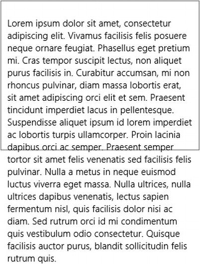
Figure 5-6. By default overflow is visible as you can see
Let’s have a look at that same HTML with different values of overflow applied. In Listing 5-5 you can see that we can eliminate this visible overflow by setting the overflow property to hidden.
Listing 5-5. An overflow value of “hidden” should change the behavior
<!-- HTML snippet -->
<div id="container">
    <p>Lorem ipsum dolor sit amet ... </p>
</div>

/* CSS snippet */
#container {
    height: 220px;
    width: 300px;
    border: 1px solid gray;
    margin: 10px;
    padding: 10px;
    overflow: hidden;
}
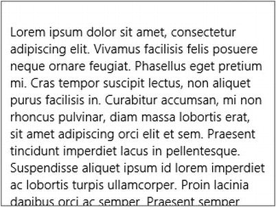
Figure 5-7. Overflowing content is now hidden, but there is no way to access it
That leaves us with no way to view the hidden text, though. Listing 5-6 improves on this by setting the overflow-y to auto, which results in the div remaining the same size but suddenly taking on the ability to scroll. You might wonder why I didn’t choose the scroll value instead of auto. The scroll value forces the container to always be in scroll mode, but the auto value is intelligent enough to only render the scroll bar when there is actually overflowing content that needs scrolling. Note that in Windows 8, the system determines whether the user is currently working with a mouse or with touch and renders the scrollbar accordingly. When using the mouse, a user will see a traditional scrollbar, but when using touch, a user will see a cleaner, smaller scroll position indicator that is informative without having to be interactive.
Listing 5-6. Setting overflow to “auto” causes content to be scrollable
<!-- HTML snippet -->
<div id="container">
    <p>Lorem ipsum dolor sit amet ... </p>
</div>

/* CSS snippet */
#container {
    height: 220px;
    width: 300px;
    border: 1px solid gray;
    margin: 10px;
    padding: 10px;
    overflow-y: auto;
}
Adding that one property overflow-y: auto; will cause a container to render a vertical scroll bar when its content overflows. Figure 5-8 illustrates this and highlights the difference in the look of the scroll bar when the user is using mouse versus touch.
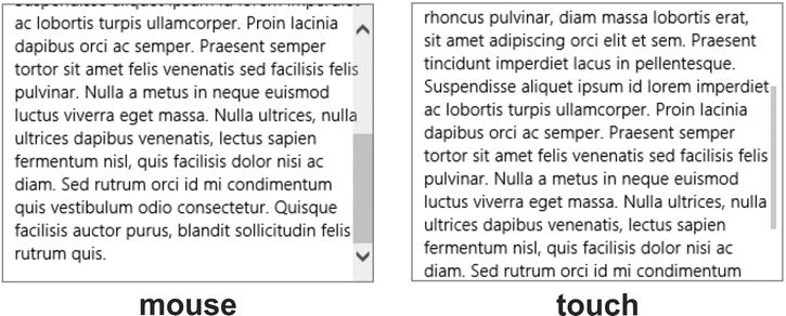
Figure 5-8. The scrollbars are rendered differently when using a touch versus a mouse
The visibility of an element can be modified to determine whether the element appears or not.
There are two different style properties that affect an element’s visibility: visibility and display.
The visibility property can be set to visible, hidden, or collapse. The default value is visible and obviously sets an element to appear. The hidden value makes the element completely invisible. Even when an element is hidden, it will still affect layout, so if you set it to be 100 pixels high, then it’s still going to take up 100 pixels of vertical space. Finally, the collapse value works much like the hidden value except that for table rows and columns it also collapses the row or column so it doesn’t take up the space it otherwise would.
The display property can be set to a lot of different things, but most of them have more to do with the target element’s layout than its visibility. One of the possible values, however, is none. Setting display to none will not only hide the target element, but will effectively pull it out of the DOM so that it no longer affects the layout.
Some libraries such as jQuery provide functions (in jQuery they are show() and hide()) that make modifying these properties and showing or hiding elements much easier. In Appendix A, I’ll discuss a number of CSS related libraries and how they can be used in your Windows 8 app.
An element’s margin is the amount of space outside and around the element. Elements are rectangular and have properties for each side, so we have the following properties: margin-top, margin-right, margin-bottom, and margin-left.
To illustrate margins, let’s create three elements one on top of the other and then apply some margins to them to see the effect. Listing 5-7 contains the HTML and the initial CSS without any styles that pertain to margin.
Listing 5-7. Some div elements with no margins applied
<!-- HTML snippet -->
<div id="parent">
    <div></div>
    <div></div>
    <div></div>
</div>

/* CSS snippet */
#parent > div {
    width: 200px;
    height: 80px;
    border: 1px solid black;
}
These three div elements placed one after another result in the three boxes in Figure 5-9 which are also placed one after another.
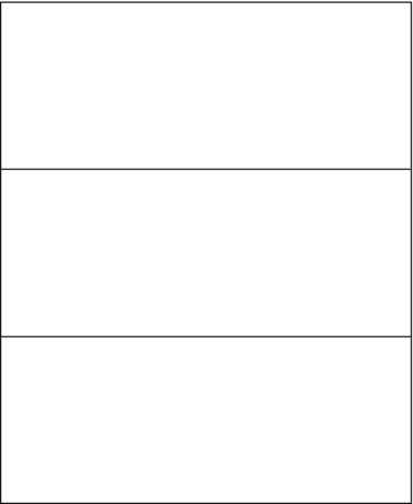
Figure 5-9. The div elements butt right up to each other and may look crowded
You can see that the div elements are immediately next to one another. In fact they even appear to share the same border. Now let’s put a little bit of space between these elements. To do so, we can add some margin to the bottom of each, to the top of each, or a little bit of both. According to the Windows 8 design principles, we should have 10 pixels of space between tiles, let’s just add a 5-pixel margin all the way around each of our elements. Listing 5-8 shows how to accomplish this using CSS. The HTML would be the same as the previous listing.
Listing 5-8. Some div elements with a 5-pixel margin applied
/* default.css */
#parent > div {
    width: 200px;
    height: 80px;
    border: 1px solid black;
    margin: 5px;
}
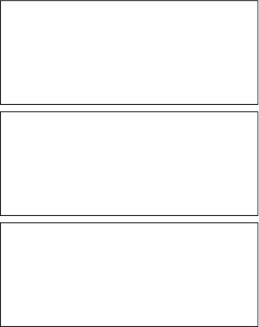
Figure 5-10. The div elements now have a little bit of room in between
That’s what 10 pixels between elements looks like. There’s nothing difficult about that. Just for fun, Listing 5-9 adds varying levels of left margin to those elements.
Listing 5-9. The same 5-pixel margin still specified and now some extra left margin
/* default.css */
#parent > div {
    width: 200px;
    height: 80px;
    border: 1px solid black;
    margin: 5px;
}

    #parent > div:nth-child(1) {
        margin-left: 5px;
    }

    #parent > div:nth-child(2) {
        margin-left: 50px;
    }

    #parent > div:nth-child(3) {
        margin-left: 100px;
    }
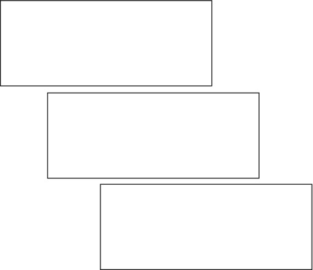
Figure 5-11. The margin between elements is still visible; as is the extra left margin
The margin shorthand property makes the setting of all four at once a bit easier though. The shorthand property will take any of the following forms.
- Margins on all four sides can be indicated by specifying each of the top, right, bottom, and left margins in that order and separated by spaces as in margin: 10px 8px 7px 2px;
- Margins that are symmetrical horizontally and vertically can take a single value that represents the top and bottom and another that represents the left and right as in margin: 20px 5px; In that case, the top and bottom margins would be set to 20px and the left and right to 5px.
- Finally, margins that are the same all the way around can take a single value as in margin: 10px; which would create 10px of space on all four sides.
The margin property is an extremely useful one for spacing of all kinds. It’s used to control spacing above or below paragraphs in a text block and between groups of tiles in a list. It’s also used to follow the Windows 8 design principles and add 120 pixels of space on the left side of each view. In fact, to accommodate this left margin, if you use the Navigation App project template to create your project then every time you create a new page, your CSS file will look something like the style rule in Listing 5-10.
Listing 5-10. The default style sheet for a new Page Control in Visual Studio
/* CSS snippet */
.pageTitle p {
    margin-left: 120px;
}
This rule sets 120 pixels of left margin for the “content goes here” paragraph that a page gets by default. I don’t find this too helpful, since I quickly replace that stock paragraph and seldom end up with a single p tag in my main section! So replacing this rule with the following works quite well by setting a left margin for anything I drop in the main section (that is, the section with a role of main) as in Listing 5-11.
Listing 5-11. A better way to set the standard left margin to affect everything in the main section
/* CSS snippet */
.pageTitle section[role=main] > * {
    margin-left: 120px;
}
If you create a new Windows 8 project using the grid project template, your app looks like Figure 5-12 right away, and you can already see the characteristic 120 pixels of left margin already programmed into that project template.
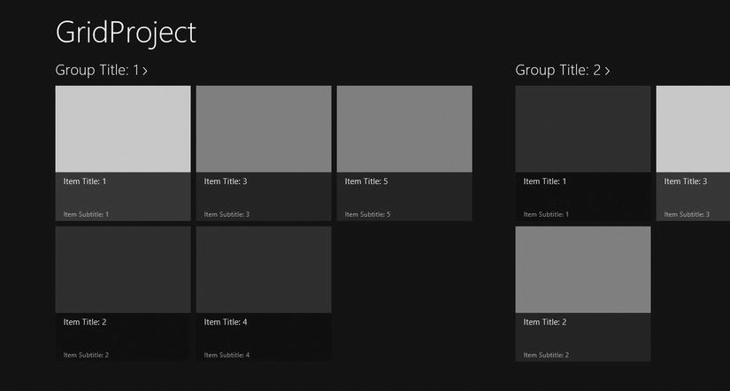
Figure 5-12. The 120-pixel left margin that’s typical of Windows 8 app is apparent in the grip project template. Recommended, standard margins also delineate list items and groups
Borders are the lines that surround an element. Again, we get a shorthand property of border—this time to give us a break from typing border-width, border-style, and border-color each time. Listing 5-12 shows how to create a thin, black border around a div.
Listing 5-12. A thin, black border around a div
/* CSS snippet */
div {
    border: 1px solid black;
}
You can use any unit of length you wish for the border-width. The border-style has values of dashed, dotted, double, groove, hidden, inset, none, outset, ridge, and solid. The border-color can take any of the myriad ways to define a color that I laid out in Chapter 3.
Listing 5-13 shows a few more combinations of border properties.
Listing 5-13. Some border property combinations
/* CSS snippet */
.border1 { border: 1px solid red; } /* thin red */
.border2 { border: 8px solid rgb(0,255,0,.5) /* partially transparent, thick, green */
.border3 { border: 3px double black; }
Just as margin determines the space outside an element, padding determines the space inside an element (but outside its content). Just like the margin property, padding is a shorthand property to make it easier than using padding-top, padding-right, padding-bottom, and padding-left every time and setting it works exactly the same as margin too.
Listing 5-14 shows a simple div with a black border and containing a paragraph of text. The padding of the div is set to 50px and you can see the effect of that much padding in the result.
Listing 5-14. A padding of 50 pixels gives text some room to breathe inside its border
<!-- default.html -->
<!DOCTYPE html>

<html lang="en" xmlns=" http://www.w3.org/1999/xhtml ">
<head>
    <meta charset="utf-8" />
    <title></title>
</head>
<body>
    <div>
        <p>Lorem ipsum dolor sit amet...</p>
    </div>
</body>
</html>

/* default.css */
div {
    border: 1px solid black;
    padding: 50px;
    width:50%;
}
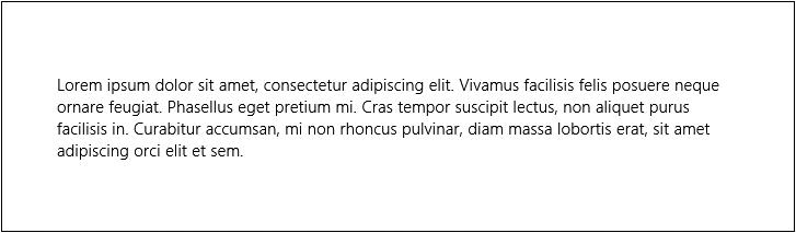
Figure 5-13. Some exaggerated breathing room added around a paragraph of text
When you want to affect the background of an element with a color or an image, you turn to the background properties. They are background-color, background-image, background-size, background-repeat, background-position-x, background-position-y, background-origin, background-clip, and background-attachment.
The background property is available as a shorthand property for background-image, background-repeat, and background-color, and background-position is available as a shorthand property for background-property-x and background-property-y.
You can set the color using all of the standard color property values we’ve discussed. If you look back to the box model that we discussed, the background-color (as well as the background-image) will fill the content, padding, and border areas. It renders behind the content, the padding, and the border. If you set your border to be somewhat transparent, you will see the background showing through.
The value for background-image should be either an absolute or relative link to one or more images, each wrapped with url(“”) and delimited with commas. Including multiple images results in the images being stacked and those images declared first are layered on top.
Listing 5-15 shows an example of the Windows 8 logo being used as a background image behind a div element.
Listing 5-15. An image (the Windows 8 logo) specified as the background-image of a div
<!—HTML snippet -->
<div id="container"></div>

/* CSS snippet */
div#container {
    width:600px;
    height:400px;
    border:1px solid gray;
    background-image: url('/images/win8logo.png'),
}
Figure 5-14. The image appears in the background of the div element, but as you can tell it’s too big
The Windows 8 logo that we set as the background of the dev element in Figure 5-14 needs to be sized to correctly fit in the div, and that job belongs to the background-size property.
The background-size property value can be a pair of lengths or percentages that represent the width and height. In place of a width or height value the keyword auto can be used to let the length value be determined based on the images’ aspect ratio and the other dimension, and specifying auto for both width and height is the same as not setting the property at all.
In addition to specifying the size of the background image explicitly, the cover or contain values can be used to resize the image in a clever and helpful way. The cover value shrinks the image to fit perfectly into the container, and the contain value grows it to fit. In either case, the image is resized, but its aspect ratio is maintained.
If more than one background image exists then the size affects all of them alike. Let’s use this property in Listing 5-16 to resize our Windows 8 logo to fit better in our div element.
Listing 5-16. A background-size property is added to control the size of the background image
<!—HTML snippet -->
<div id="container"></div>

/* CSS snippet */
div#container {
    width:600px;
    height:400px;
    border:1px solid gray;
    background-image: url("/images/win8logo.png");
    background-size: auto 100px;
}
Figure 5-15 shows the effect of adding the background-size property.
Figure 5-15. The background image has been properly resized, but it’s not exactly the effect we had in mind
The image in Figure 5-15 is 100 pixels tall as we specified, but it is repeating and tiling the entire background. This is the default behavior of background images, and to override it we need to use the background-repeat property.
Tip The functionality that the cover and contain values provide for fitting a background image to its container is expanded in a WinJS control called the ViewBox. A ViewBox affects any single element even if that element contains a complex hierarchy of content. This is a tremendously powerful implement for adapting content dynamically to the size and shape of the screen it’s currently on. You will read more about ViewBox controls in Chapter 7.
Repeating backgrounds by default makes sense considering their original and primary intent was to wallpaper the background with continuous image tiles. This behavior is very customizable, however. The background-repeat property offers some pretty slick functionality. It can take the values of no-repeat, repeat, repeat-x, repeat-y, round, or space.
The default value is repeat and to turn that behavior off entirely you would use no-repeat. If you want the image to repeat just in the x direction then use repeat-x and likewise with repeat-y. The round value will actually repeat the image in both directions but will not allow clipping if the element size is not a clean multiple in size. The images that do fit are then scaled up to fit the element. The space value is similar but instead of scaling the resulting images up it adds space between them to fill the space.
Listing 5-17. A background-repeat property is added with a value of no-repeat
<!—HTML snippet -->
<div id="container"></div>

/* CSS snippet */
div#container {
    width:600px;
    height:400px;
    border:1px solid gray;
    background-image: url('/images/win8logo.png'),
    background-size: auto 100px;
    background-repeat: no-repeat;
}
Figure 5-16. The background image no longer repeats
CSS also gives us control over where in the containing element the background image should be rendered. If you turn the repeating off and just have a single image, you can use the background-position property with value combinations like left top, right center, or center bottom. You can also use a pair of length units or percentages to indicate the position in the x and y directions respectively.
Using this technique to set a relatively dim image to appear in the lower-right corner of your view is an excellent way to add your brand. Regardless of how the user scrolls the content, the image will remain in that corner.
Listing 5-18 adds the background-position property to our container.
Listing 5-18. A background-repeat property is added with a value of no-repeat
<!—HTML snippet -->
<div id="container"></div>

/* CSS snippet */
div#container {
    width:600px;
    height:400px;
    border:1px solid gray;
    background-image: url('/images/win8logo.png'),
    background-size: auto 100px;
    background-repeat: no-repeat;
    background-position: center center;
}
The result that you see in Figure 5-17 is starting to actually look like something we meant to do!
Figure 5-17. The background image is centered both horizontally and vertically
Here, we’ve opted to center the image using the center keywords, but we could just as easily have placed the image absolutely using something like background-position: 100px 100px, which would have set the logo 100 pixels from the top and left of the container.
The background-origin is used to determine where the background-position coordinates originate. The default value is padding-box, so a background-position of 0% 0% or 0px 0px or left top would mean that the background image originates aligned with the top and left side of the padding (even though by default the background image actually extends underneath the border as well).
I mentioned earlier that an element’s background affects the area under the content, the padding, and the border, but the background-clip property gives us a bit of control over that. This property takes the same values as background-origin: border-box, padding-box, and content-box. Omitting it will mean it is using its default value which is border-box. Clipping to the border box means that the background sits underneath that entire area under the content, the padding, and the border. Setting the background-clip property to a value of padding-box, however, will effectively clip the portion under the border so that the background is only visible under the padding and the content. Finally, a value of content-box will clip it inside even the padding so that it sits only under the content.
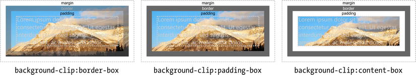
Figure 5-18. The background image is clipped to a specific area of the box model
The background-attachment property determines how your background image should behave when the foreground contents are scrolling.
A value of fixed attaches the background image to the viewport (usually the entire window) which has the effect of keeping it fixed to the page.
A value of scroll affixes the background image to the document, so if the entire contents of the body overflow the page and forces scrolling, then a background image will scroll along with it.
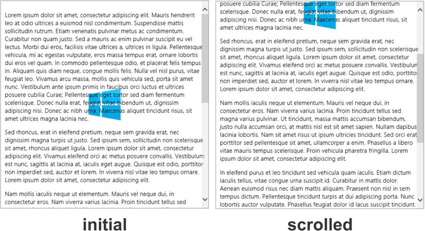
A third value of local was introduced in CSS3 which attaches the background image of an element to the content in that element. Only with the introduction of this value are we able to scroll a background image with the content of a scrolling div.
As an example, look at Listing 5-19. A div containing three sizeable paragraphs of text is assigned a CSS style rule that, among other things, sets it to have a small background image rendered in its center. The overflow-y makes it scrollable, but we’ll discuss that property soon. The property to note is the background-attachment of local. This will cause the background image to be scrolled with the rest of the content, as you can see in the results.
Listing 5-19. A background-attachment value of local is used to stick the background image to the scrolling container that it’s inside of
<!—HTML snippet -->
<div>
    <p>Lorem ipsum dolor sit amet... </p>
    <p>Sed rhoncus, erat in eleifend... </p>
    <p>Nam mollis iaculis neque ut... </p>
    <p>In eleifend purus et leo... </p>
    <p>Sed quis sapien vitae elit... </p>
</div>

/* CSS snippet */
div {
    padding: 10px;
    border: 1px solid gray;
    width: 500px;
    height: 500px;
    background: url('/images/win8logo.png') no-repeat;
    background-position: center center;
    background-attachment: local;
    background-size: 80px 80px;
    overflow-y: scroll;
}
Adding this single property to our target element effectively pins the background image to the scrolling portion of the containing element.
If you come from a web-development background, you know full well the hack that’s been used to give a document a color gradient across its width or height. The hack I’m referring to is an image containing the desired gradient that is only one pixel in the direction perpendicular to the gradient. The image is then set as the background image and allowed to repeat across the page. It works, but it’s not elegant and it has some drawbacks. One that I’m thinking of is the case where a user scrolls to the edge of the gradient or upgrades to a higher resolution screen and is presented with the abrupt edge of the gradient. It’s embarrassing for the web designer, but the issue is gone now with the advent of CSS3 gradients.
I’d like to include a soft caution here against using gradients without consideration. Gradients can be helpful, but subtlety is the key. Superfluous graphical artifacts in general tend to violate the Microsoft design principles that use things like color and shape as information and not just eye candy. That said, a subtle gradiated background can be just right in some cases.
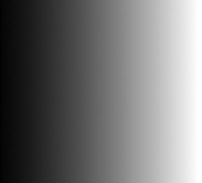
Gradients are implemented within the background-image property by using either the linear-gradient() function for a linear gradient or the radial-gradient() function for a radial gradient.
The linear-gradient() function accepts the gradient direction and then at least two color stops. Listing 5-20 shows a gradient that goes from black to white from left to right.
Listing 5-20. A linear gradient defined as the background to a div
<!-- HTML snippet -->
<div class="gradient"></div>

/* CSS snippet */
.gradient {
    width:400px;
    height:400px;
    background-image: linear-gradient(to right, black 0%, white 100%)
}
Adding color stops is easy too. Listing 5-21 alternates between black and white every 20%.
Listing 5-21. A linear gradient with alternating color stops
<!-- HTML snippet -->
<div class="gradient"></div>

/* CSS snippet */
.gradient {
    width:400px;
    height:400px;
    background-image: linear-gradient(to right, black 0%, white 20%, black 40%,
        white 60%, black 80%, white 100%);
}
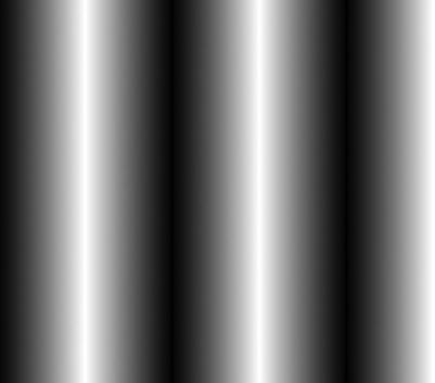
The first argument that indicates the direction can accept a side (left, right, top, bottom), a corner (top left, top right, bottom left, bottom right), or a custom degree like 45deg or 320deg.
You can find a lot more information on the implementation of the linear gradient on Microsoft’s site by visiting http://msdn.microsoft.com/en-us/library/windows/apps/hh453527.aspx.
The function for creating a radial gradient is a bit more involved, and I’m only going to show an example and encourage you once again to visit Microsoft’s documentation on the subject at http://msdn.microsoft.com/en-us/library/windows/apps/hh453718(v=vs.85).aspx when you’re ready to implement it yourself. Listing 5-22 will create a gradient that starts in the center with black and radiates out to the farthest corner as white.
Listing 5-22. Radial gradient from center to farthest corner
<!-- HTML snippet -->
<div class="gradient"></div>

/* CSS snippet */
.gradient {
    width:400px;
    height:400px;
    background-image: radial-gradient(circle at 50% 50%, black 0%, white 100%);
}
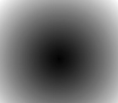
Figure 5-22. A radial gradient from black in the middle to white on the outside
Web designers have come up with all sorts of tricks for creating drop shadows over the years, because no provisions have existed in the standard-until now. Now implementing a drop shadow is easy, but better even than that is the fact that it’s standard.
I would issue the same soft caution against the use of drop shadows as I would for gradients. It is a visual adornment. A shadow is a skeuemorphic artifact in that it attempts to make some element in your app look like it’s in the real world. But it’s not in the real world, is it? It’s in the digital world and the design principles in Windows 8 suggest that we design our apps to be authentically digital without taking all of the dependencies and constraints that real world effects can bring.
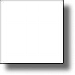
Recommended or not, box shadows are very easy to implement. Listing 5-23 shows a small white box with a simple drop shadow. The values represent the horizontal offset, vertical offset, blur radius, spread distance, and shadow color.
Listing 5-23. A box-shadow definition on a div element
<!-- HTML snippet -->
<div class="shadow"></div>

/* CSS snippet */
.shadow {
    width: 100px;
    height: 100px;
    background-color: white;
    border: 1px solid black;
    box-shadow: 10px 10px 10px 0px hsla(0,0%,0%,.5);
}
One interesting thing about shadows is that they can be used to create more than just shadows. Listing 5-24 shows two examples. In the first, a shadow is added with no horizontal or vertical offset to create a glow effect. In the second, a solid shadow is used to apparently extend the box out and under a dashed border to make it appear that the element has sewing stitches around it.
Listing 5-24. Two alternative uses for the box -shadow property
<!-- HTML snippet -->
<div class="flex">
    <div class="glowBox"></div>
    <div class="stitches"></div>
</div>

/* CSS snippet */
.flex {
    display:-ms-flexbox;
    -ms-flex-pack:distribute;
    -ms-flex-align:center;
    height:200px;
    width:600px;
}

.glowBox {
    border:1px solid gray;
    width:100px;
    height:100px;
    box-shadow: 0px 0px 40px 10px hsla(0,0%,0%,.5);
}

.stitches {
    background-color: lightgray;
    border:2px dashed black;
    box-shadow: 0 0 0 4px lightgray;
    color: black;
    padding: 10px;
    border-radius: 4px;
    width:100px;
    height:100px;
}
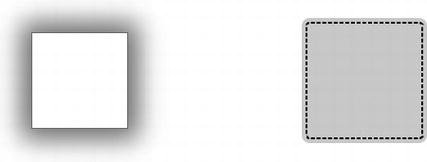
Figure 5-24. Two div elements-one glowing and the other apparently stitched all the way around
Summary
In this chapter, we’ve learned all about the properties that affect the rectangular model of any HTML element (what we call the box). We define CSS properties that affect the size (width and height), the margin (space outside), the border, the padding (space inside), and more. We learned about setting relative or absolute values for width and height for content to determine its rendered size. We also learned how to handle element contents that are too large big for their space and overflow. We learned about defining the left, right, top, and bottom margins of an element separately or all together. We learned about using line style, size, and color to determine what the border of our element might look like. We learned about defining padding to give our content a little bit of breathing room inside its frame.
We also looked at setting backgrounds within an element that may be a solid color, an image, or even a linear or radial gradient. Finally, we learned about box shadows and using them to give our elements some apparent depth and a little bit of creative interest. It’s important to understand these concepts before biting off subsequent concepts, especially the advanced layout concepts in Chapter 7.
Now that we have a basic understanding of the box properties, we’ll move on to the transformation and animation of elements. Instead of determining the static appearance of elements, we’ll determine their transitions and animations and really bring our Windows 8 apps to life.