

CHAPTER 9
Adaptable Content
If you’ve paid any attention to the Web the past couple years, chances are you’ve heard a lot of opinions about responsive and adaptive design—from the fawning to the illuminating to, occasionally, the nay-saying. Amid all the hype, though, one thing is clear: we need websites that users can access from a range of devices with a range of capabilities—and these approaches are one way to get there.
While this trend often seems like a design-and-dev problem, it’s much more than that—because all this reshaping and reflowing gives plenty for us content wonks to consider as well, as we first touched on in the Starbucks example in Chapter 5, “Designing Content Systems.” From which content takes priority to how different elements combine into a single column, responsive and adaptive designs put our content challenges front and center, making it harder than ever to hide messy content behind pretty designs.
TIP RESPONSIVE OR ADAPTIVE?
While responsive and adaptive designs have a lot in common—including many of the same content considerations—these two terms are not quite interchangeable. Adaptive design is a more general term, denoting all the things you can do to make an interface adapt to a user’s device. It’s often seen as an extension of progressive enhancement—the concept that a site’s core functionality works on even the most basic devices, and the experience gets progressively better on those devices that can accommodate it. Adaptive design, then, can include many things, including changes to markup and JavaScript and support for assistive technology devices. Responsive design, on the other hand, implies a more specific set of practices: fluid grids, fluid images, and media queries that allow a site to reflow gracefully for different screen sizes. For more, check out Aaron Gustafson’s book, Adaptive Web Design, and Ethan Marcotte’s Responsive Web Design, the seminal titles on both subjects.
In this chapter, we’ll give these and other issues around content for responsive and adaptive experiences a closer look—and see how we can use these approaches to make the most of our content.
Looking Beyond Layout
Media-queried responsive and adaptive sites afford us the ability to re-architect content on a page to fit its container, but with this exciting new potential come equally exciting challenges. Web designers will have to look beyond the layout in front of them to envision how its elements will reflow and lockup at various widths while maintaining form and hierarchy.
—Trent Walton1
Walton, a designer and partner in Texas-based firm Paravel, may have written this post for other designers, but it hits at the heart of what we’re trying to accomplish with structured, well-architected content as well: to move beyond the limitations of pages and documents and start embracing the content itself—in whatever form it needs to be displayed.
In this way, adaptive and responsive design provide the perfect backdrop for rethinking your content. Because as you stop being able to dictate precisely where a piece of information will be displayed on a given page, you’re forced to instead start thinking in terms of systems and packages of information—packages that could look different depending on where and how they’re being viewed.
Of course, things were never actually fixed and immutable. Even during those brief sweet years after Web standards took off but before people started trading in their desktops for mobile devices, you never really knew what a user’s display would look like. Low bandwidth, accessibility devices, old monitors, outdated browsers, and myriad other circumstances could easily turn your perfectly crafted experience into something that looked radically different.
Back then, it was simply easier to pretend otherwise—to act as if every element on a page was super-glued into place. After all, if you worked online, you were pretty likely to have a modern desktop machine and a decent Internet connection, so you might never see how your site looked to those in less desirable circumstances.
Now, those alternate realities are difficult to avoid, even for those of us who immediately adopt all the latest gadgets and have endless budget for bandwidth: whether you’re spying a site on an iPhone or attempting to book tickets on some hotel’s interminably slow Wi-Fi, odds are good you’ll face a less-than-desirable experience pretty regularly.
While responsive and adaptive design is still relatively new—and practitioners are developing smart additions and tweaks to their methodologies nearly every day—Walton’s vision for content has begun to become reality, as have a number of other approaches to handling content in smart, flexible, appropriate ways. Let’s dive into a few of them.
Intermixing Content
Letting go of control is scary, but there’s also a beauty in looking beyond layout—in dismantling notions about pages and documents. When you do, you uncover something messier, but also quite powerful: meaning.
But many of the responsive websites you see today simply stack their content, slipping sidebars below “main” content like in our Starbucks example in Chapter 5, rather than taking their meaning and message into account. While this solution is more usable and useful than doing nothing for your mobile customers, it’s a one-size-fits-all approach—and one I think we can do better than.
Thankfully, there’s another way to think about shifting content for varied screen sizes: intermixing it, or what Trent Walton refers to as “interdigitation.” When you interdigitate content, you fold it in, weaving bits of one piece of content in between parts of another, rather than just plopping it to the bottom of the page, as shown in Figure 9.1.
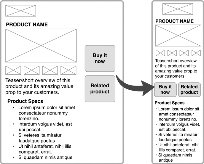
FIGURE 9.1
An example of how product content might reflow at small screen sizes. When you interdigitate content, key elements, like calls to action, can retain their emphasis at any display size.
When dealing with several smaller content modules that need to coexist alongside a longer one—such as relating a quick facts sidebar to a long feature story, or featuring a food product you sell alongside the recipe in which it’s used—you might find that simply allowing those small little modules to end up below a long, involved content piece throws off the story, displaces useful information, or otherwise breaks the user’s ability to understand, use, or enjoy the content.
Instead, interdigitating the content allows you to keep the narrative, persuasive, or informational structure of the content intact by placing content pieces where they make sense, in between the longer bits, thus offering valuable and useful information at the right time.
One place this sort of thinking has been implemented is the Boston Globe’s responsive site, which launched in the fall of 2011 to great anticipation (and perhaps even greater praise). One of the first large-scale responsive sites to launch, the project required the team—which included Ethan Marcotte and the folks at Filament Group—to think about how complex content would work in an experience that was also ad-supported. That is, while the new bostonglobe.com is all about showcasing premium journalism, it can’t do it at the expense of those paying to appear there. Shuffling advertising content to the end of a story, at the bottom of the page, below a story, certainly wasn’t a solution for small screens.
Instead, Filament Group developed a JavaScript approach that has since been polished up and shared with the world as AppendAround. It works like this: You create multiple containers in different sizes for each chunk of content you have, and then configure your CSS to only display one container for each content chunk at a time. As a result, a piece of content can easily change its location or priority at different screen sizes, depending on which container it’s told to use.
This solution worked well for the Globe’s advertising, as shown in Figure 9.2. But it’s also a way to get other kinds of content to move around the page to meet your strategic priorities and user needs—if you have modular content, that is.

FIGURE 9.2
Advertising appears in the right-hand sidebar on the desktop version of the new Boston Globe site, but is reconfigured to tuck between elements as you scroll down the page in the smartphone-sized version.
Content Layering
Remember how we saw Starbucks’ responsive design place long-form copy and a whole mess of reviews above the button to buy coffee—as well as its critical tasting notes? Well, one way folks are looking to solve this problem is with layering content for smaller screens, making some items minimized—but easily expandable—in order to keep the page manageable for skimming and scrolling.
Take the University of Notre Dame, which launched a new responsive version of ND.edu in early 2012, as shown in Figure 9.3. On desktops and tablets, main content areas like “About” and “Academics” are anchor-linked sections on the homepage, available by either using the navigation or simply scrolling down the homepage. But on smartphones, as shown in Figure 9.4, that content is tucked into interior pages—clearly available, but just a click away—to keep the homepage a bit more manageable.
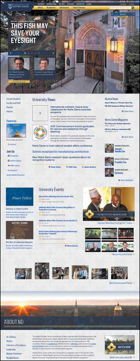
FIGURE 9.3
On larger screen sizes, the University of Notre Dame’s main navigation anchor links to content further down the homepage, like the “About” section shown here (the rest of the items scrolled too far down to include in this shot).

FIGURE 9.4
In contrast to Figure 9.3, on the iPhone, Notre Dame’s “About” section is layered a level deeper, on its own page, rather than anchor-linked on the homepage.

FIGURE 9.5
Brad Frost’s future-friendly demo site, showing some of the latest mobile capabilities. See how review content is obviously available, yet tucked a tap away instead of taking over the entire page.
Mobile designer and developer Brad Frost has been working on similar ways to layer some content for small screens with a demo project, which he’s calling the Future Friendly online store—a fake ecommerce site. Here, reviews (which we saw take up reams and reams of space on the Starbucks site) are cleverly tucked into an expandable area, with only the overall star rating and number of reviews for each item visible at first, as you can see in Figure 9.5.
In this example, Frost uses an approach called an AJAX include pattern for modular content that allows the site to conditionally load content—that is, to load mandatory content quickly in a lightweight manner that doesn’t rely on JavaScript, something not all devices can support. That experience is then enhanced with nice-to-have features on more capable devices, without slowing down the initial page load.
What makes this approach work is that content isn’t missing or hard to find; it’s right there, where you’d expect it—just behind an easy tap. Given that a study from Google at the end of 2010 found that 70 percent of smartphone owners say they use their phones in stores to help make purchase decisions,2 keeping product reviews easy to find and quick to skim seems like a logical move. And because key information is pulled out—the number of reviews and average rating—many users likely won’t even need to see more. Those who do want detail, or who are looking for answers to specific questions, can easily get it.
Much of this sort of solution relies on how the page is designed and developed, but there’s a clear reason for content and IA folks to be included in these discussions—because you can help make smart decisions about how much content (and which bits) can reasonably be tucked away behind a tap, versus which ones need to be expanded at all times.
Of course, in order to layer content, that content needs to be structured—written and stored in such a way that parts can be exposed and parts hidden based on business rules and conditions. Typically, this happens pretty naturally with reviews, because reviews are submitted one at a time, so each review necessarily ends up stored separately. But what other types of content could you organize in this way, if you had structure behind them?
Removing Content
“No one will ever want to do that on their phone!”
Sound familiar? You may have heard it a lot in discussions about mobile, but the truth is, people do all kinds of things on all kinds of devices—sometimes out of necessity, sometimes convenience, sometimes preference. And it’s really hard to anticipate when, where, or how they’ll want to do it.
In fact, as of February 2012, nearly half of all Americans owned a smart-phone, according to a Pew Internet research report—up from only one in three just 10 months prior to that date. And according to a 2011 Pew report, about one-fourth of those who own smartphones use them as their primary Internet access device—and this is particularly true in low-income populations.3
In light of this landscape, it’s nearly impossible to say what a user will or won’t want to do from her mobile device. We’ve all seen people browse websites while watching TV, settle bets at the bar with a quick Wikipedia lookup, or pay bills and play games during a long flight layover. Luke Wroblewski has noted that thousands of cars are purchased on eBay using mobile devices each week.4 Hell, there’s probably even a person out there reading a Russian novel while standing in an interminable DMV line right now.
The more you assume what people will and won’t want or need, the more you put artificial limitations on your content—limitations you’re going to have to undo later, when smartphone ownership reaches total saturation and your user population simply demands it.
Take our example of ASU Online from Chapter 1, “Framing the New Content Challenge.” When the ASU team started working with Happy Cog, it had a hard time believing anyone would apply for college on a smartphone. They were wrong. Once the site functioned well on mobile devices, admissions applications from smartphone users started rolling in.
It’s precisely this that makes responsive and adaptive design so powerful: because it allows us to serve users complete content in a way that feels unified with, even when different from, the desktop experience. And it builds trust in the experience, creating an expectation that this is not “the mobile site,” but rather, the site.
Once you set this expectation, though, you need to deliver—not skimp on the details because you assumed no one on a smartphone would ever make it that far. That is, building a site that acts responsively, but limits the content available to mobile users, simply won’t cut it.
On the other hand, if you do have a clear use case for providing mobile users profoundly different content than desktop ones, then you may have a great reason to build an app. The key difference here is that native applications—those that are installed, versus navigated to—allow users to self-identify and select services based on their needs. For example, when someone downloads the Facebook Camera app, he’s saying “I want to easily take photos and post them to Facebook.” When he downloads the NPR Music iPhone app, he’s saying, “I want quick access to music-related content.”
On the other hand, when a user simply visits your site from a smartphone, you can’t be sure what he’s there for—which makes limiting the content he can access from that device highly problematic. After all, a customer doesn’t care what the average user wants on mobile. He only cares about the needs of one person: himself. That’s why a site that can offer complete content on any device makes a lot of sense, and should likely be your baseline mobile offering.
Making Content Lightweight
Some types of content trimming do make sense, though—such as cutting excess fat to boost site performance. Visual content can be especially weighty, hungrily consuming your users’ data connection and creating painful, frustratingly long page loads.
According to a KISS Metrics study in 2011, nearly half of mobile users expect a page to load within two seconds, and 40 percent say they’ll abandon a site that doesn’t load within three seconds5—meaning it’s imperative to keep close tabs on any content that could weigh down an experience.
To accommodate this, lots of designers are implementing conditionally loading content, often called lazy loading, like Brad Frost did in his Future Friendly store demo: once the core content has loaded, the non-essential bits are requested using some JavaScript.
But guess what? You’ll find it rather hard to conditionally load or strip out content unless the content you want to treat differently is also structured in such a way that it’s extractable. If it’s all in one big blob, yet again, you’re stuck with very few options.
While lazy-loading content or removing some images may sometimes make sense for small screens, this approach to solving the load time problem also begs another question: Should that content be there in the first place?
Boston-based designer and developer Mat Marquis once answered that query on Twitter, tongue firmly planted in cheek: “Mobile users want to see our menu, hours, and delivery number. Desktop users definitely want this 1mb png of someone smiling at a salad.”
Oftentimes, as Marquis alludes to, the stuff we cram into the desktop versions of our sites is just that: stuff. Not content that’s actually communicating anything valuable or enriching our users’ experiences. It’s just a large, bandwidth-sucking stock photo of someone grinning blandly at a bowl of lettuce.
In this way, considering all the different devices on which your content may be displayed forces you to focus—to take stock of what’s really important, and to get rid of the things that aren’t. As Luke Wroblewski notes: “If you design for mobile first, you can create agreement up front on what matters most. You can then apply the same rationale to the desktop (and any other) experience of your web product.”6
Simplicity from the Start
Those who don’t design for readers may soon not be designing for anyone.
—Jeffrey Zeldman7
The more time we spend trying to fit flashy desktop experiences onto tiny little devices, the more we must ask ourselves: What’s all this stuff doing here, anyway? Do we need another sidebar? What’s the point of shoveling 17 content elements into a single template? Do our users really want a thousand glittering options shoved down their throats all at once?
Whereas some mobile-optimized experiences simply eliminate the junk from small-screen applications (while leaving desktop users knee-deep in flashing banners and screen takeovers), responsive design doesn’t let you off the hook so easily. Instead, because it’s attempting to offer parity of experience across devices, it can force you to focus—to separate the wheat from the chaff of your content, and to allow your poor users, regardless of device, to rest their tired, abused little retinas on just one thing at a time. When you let them simply read the article, follow the directions, or experience a story, then maybe—just maybe—they’ll then actually want to read more when they’re done. No sleazy pageview-generating tactics needed.
Jeffrey Zeldman did just that in May of 2012. His long-running personal site, Zeldman.com, suddenly started sporting a single column of text, featuring a Georgia typeface displayed with surprising size on the desktop version, as shown in Figure 9.6.
Some folks cheered; some folks jeered. Zeldman himself wrote a manifesto about the subject, telling readers that is was an experiment in putting readers first, and in removing anything and everything extraneous from the page—regardless of the size of the browser on which it was being displayed.
It’s a “content first” approach taken to the extreme, and one I can’t help but get excited about. Of course, it’s not for everyone, nor for everything. When you start stripping experiences down to their core—the content—it’s critical to also remember: You are not Jeffrey Zeldman (and chances are, your client’s ecommerce site or your boss’ new pet project are even further removed from someone once dubbed the “King of Web Standards” by Businessweek). Your organization might have more complex needs than simply wanting users to read a post. And your users may well be interested in doing more than immersing themselves in a single piece of content.

FIGURE 9.6
Jeffrey Zeldman’s redesigned website, showcasing his 2012 manifesto post where he explains the new approach. The page scrolls further, but really, this is about it: content, content, content.
Last, but most certainly not least, you may be dealing with an advertising-supported revenue model, and those advertisers aren’t about to look the other way as you squeeze them further and further into the margins of your design. (And, of course, if you eliminate them entirely, they’re pretty unlikely to keep paying you.) While the online advertising model has some serious problems—and deserves an analysis too detailed for the scope of this book—your redesign project may not be an effective time to try to solve them.
Ultimately, responsive design doesn’t answer a single one of these questions. It only makes the questions themselves more obvious, and more necessary to start considering. Wherever the balance of your project lies—between offering readers focus or offering them options; between serving ads or serving substance—you’ll have a better chance at finding it when you embrace an adaptive mindset, considering what you’re trying to communicate rather than just designing the space you’re going to do it in.
Adding Content
One of the most exciting modes of thinking to come out of the mobile movement is this: while devices like tablets and smartphones can have very different capabilities, it’s oversimplified to claim a modern mobile device is “less capable” than its desktop cousin. After all, can you point your desktop screen east and see which restaurants are currently open in that direction? Can your desktop guide your driving, turn by turn?
Despite their small screens, today’s smartphones and other location-aware, Internet-enabled devices can also be seen as more capable than desktops, because they have all kinds of contextual tools built in: touch screens, accelerometers, GPS, and the like. And that means they give us the opportunity to add special features and functions that only make sense on mobile.
Because of this, mobile advocate Stephen Hay has long argued that content should be platform-agnostic—that is, everyone can access all the same content, no matter what. However, the experience itself should be platform-aware, where the device’s unique capabilities are taken into account, and enhanced features are included to support them.
How might that affect your content? Well, consider the case of a university like Notre Dame, which wants to attract top students. While sweeping imagery of the lush, historic campus might help persuade a teen searching from her home to consider the school, it’s not going to do much for a prospective student already on a campus visit. But you know what might help seal the deal? Convincing that student to take a group tour, where she’ll gain a better feel for the university and meet some of her prospective classmates.
In fact, Notre Dame is now considering ways to help make that happen by creating location-aware features that can notify visiting prospects about upcoming tours, and then give them step-by-step directions to the tour’s starting location—effectively enhancing their experience in ways that would be impossible on a traditional desktop website.
Responsibly Responsive
Ultimately, responsive and adaptive websites aren’t about guessing what users might want—or deciding what they should want—on different devices. They’re about ensuring people can easily and enjoyably access whatever they need. And there’s no one right way to make them work.
Whether you choose to fold in modules, collapse content elements, or strip your content assets down to essentials, your content’s structure will help you—both strategically and functionally. Because you’ve taken a close look at your content and considered its meaning, relationships, and priorities, you’re prepared to make otherwise tough decisions about what goes where, when, and why. And because you’ve structured and stored your content in pieces and parts, you can extract the content you need in lots of different ways, reshaping and recombining elements to create the layout that makes the most sense for all parties involved.
Best of all, your close attention to content means you’ve got key information your design and development team might otherwise be missing—and there’s no better time to start sharing it with them, making the end result better for all parties.