
CHAPTER 5
Designing Content Systems
Metadata is the new art direction.
—Ethan Resnick1
Quipped over dinner and immediately Tweeted by Karen McGrane, this gem from Resnick, an NYU student and general Internet smarty-pants, sums up so much in its six little words. As you work to publish in more places more often, designing each page manually becomes less and less viable. But instead of giving up editorial and artistic control altogether, there’s another way: using your content’s structure and meaning—its metadata, as Resnick puts it—to build rules that dictate how, when, and where it appears.
That’s not to say we can’t have nice things. The craft of manual art direction is far from dead, and will still be critical in many projects. But if you want to publish a substantial amount of content with any frequency—or maintain content that changes regularly—across many channels and devices, then it seems like rules must become, well, the rule.
In other words, when it comes to large amounts of content, we’re simply going to have to let the robots do some of the work. The best we all can do is focus our limited stock of human care and attention toward designing systems that help them do it better—not obsessing over individual pages for individual platforms.
That’s what this chapter is about: building a framework for establishing the business rules and corresponding conditional statements that support your content model and will help you keep as much editorial and presentational control as possible, while saving your limited time for manual decisions about placement and prioritization to where they’ll have the most impact.
To get there, we’ll break down what logic and rules really are and why they’re important, and then see how they can be used in different circumstances, such as when shifting layouts in responsive design—something you’re likely already working with, or at least considering. These rules will also help you create better programmatically related content and content packages that cross channels and devices. We’ll then use what we’ve learned from each of those examples to develop a framework for evaluating your own content and determining what sorts of business rules and conditions you need.
When we’re done, you’ll have the tools to design your own systems of logic and relationships—tools you’ll use as you work with people like developers, CMS technologists, product managers, and designers to turn your content models into ecosystems that effectively support and reveal the relationships between information.
What Are Rules?
In the previous chapters, we’ve talked about breaking content down, analyzing its elements, and designing structures to support those elements. While these content chunks are much more useful than big blobs for things like searching and sorting information and designing templates—and, if you’ve been involved in IA, you may have already been building some of those content chunks—their usefulness goes far beyond just that. From each of those elements, you have the ability to systematically build logic and rules that will help your content thrive.
Rules, also called conditions, are simply the logical statements that dictate how, when, and where something will occur. If you’ve done much with math, you might remember writing if-then statements: If this occurs, then that should occur as well.
The rules you’ll need to make your modular content work are no different. If a page is about puppies, then display content from the pet category in the sidebar. If a user has a screen smaller than 480px wide, then remove the summary module from the sidebar and slide it between the headline and the lead in the main area. If content is made available to third parties, then only let them access content elements A, B, and D—allow C for internal use only.
Rules Create Systems
The great thing about incorporating rule-based content is that it allows you to work in systems: sets of typical circumstances and resulting content needs, rather than endless one-off decisions about placement and priority. But it’s important to note that you can’t create a system unless your content is systematic as well—and that means, typically, relying on modular chunks that are consistent across all your content, rather than trying to build rules off freeform metadata (e.g., tags).
What’s the problem with freeform tags? Well, when you allow authors to tag content with whatever words they choose and use that as a major form of metadata, you’re going to have lots of inconsistencies: tags that were used once, tags that are similar to one another but written differently, tags that are so popular they’re used for everything.
Freeform tags—often visualized as a tag cloud, as shown in Figure 5.1—can be useful for classifying large amounts of information for user retrieval or even defining what your controlled vocabulary should be in the first place, but they often won’t serve your needs when creating content systems that are interconnected and rule-based, like we’re doing today. Because in order to build logic around a tag, that tag must be used consistently across the entire system—something this anything-goes approach is notoriously bad at.

FIGURE 5.1
A tag cloud, the visual representation of freeform tagging, shows how little structure this approach provides, because there’s no consistency in usage. Tags like these tend to work independently, rather than as a system.
Rules Are Intrinsic
Instead of relying on the metadata you get from freeform tags, a more scalable, and reliable, way to build rules is to base your logic on one or more of the actual semantic elements within your content—the meaningful chunks you already determined in Chapter 4, “Creating Content Models,” such as the location of an event, a publication date, or the author’s name. Alternately, you might also base your rules off a taxonomic system, such as service or product categories.
Taxonomies can and do change over time (for example, scientific discovery has made our modern Kingdom-Phylum-Class-Order animal classification system substantially different from the original 18th century version), but they don’t change often—making them more reliable for building automatic systems upon than more freeform styles of tagging.
The more you can use the semantic chunks that are inherent to the content itself, or taxonomies that rarely change, rather than relying on a set of classification options that’s more fluid and unreliable, the more likely they are to be consistent across all your content, and to remain relevant through changes in things like trends, campaigns, and content authors.
Why Rules Matter
In Part III, “Putting Structured Content to Work,” we’ll be taking a deeper look at how structure and rules are enabling organizations to do all sorts of things, from determining how content appears in mobile devices to what happens when it’s shared with third parties to how collections of content are deeply linked and interconnected. But to understand the importance of your content attributes right now, let’s take a quick look at why rules matter in making content go further.
Related and Contextual Content
Content that appears in sidebars or other related areas often falls into one of three rather limiting categories:
- Static and hard-coded into the page or template.
- Dynamically displayed based on one or two metadata elements, such as content type and recency (for example, “show most recent three press releases”).
- Manual, entered and maintained by hand at the page level.
In the face of both your users’ needs and your business goals, all three of these options fall flat, either offering too little relevance to users, failing to drive people toward desired actions, or simply taking too much time and resources to manage and maintain.
By relying instead on the elements within a piece of content to create thematically linked, automatically updated related items, you can sustainably manage collections of content that are more useful for users and easier on your budget.
Let’s look at an example. Remember the Arizona Office of Tourism from Chapter 1, “Framing the New Content Challenge”? Based on analytics data like search engine keywords, users’ site search terms, and most-visited pages, I knew AOT’s audience wanted to look up a city they’d be visiting and see what was around it. But the city database didn’t include much content—and, on its own, produced lifeless, less-than-useful listings, like that page about Sedona we looked at.
Despite making huge improvements to consistency, style, topic breadth, and SEO during the site redesign, the content was broken at a structural level. All the time improving copy in the world couldn’t fix it.
So what did my team do? We went back to our site architecture. The site’s structure, while logical at a high level, disintegrated quickly into page stacks, never fully documenting the content’s depths. Moreover, the system was purely hierarchical, as shown in Figure 5.2: “Places to Visit” branched into regions and cities. “Things to Do” branched into activity categories and business listings. Land-marks—like state and national parks, natural spaces, and historical sites—were in the “places” section, but stored in another database entirely.
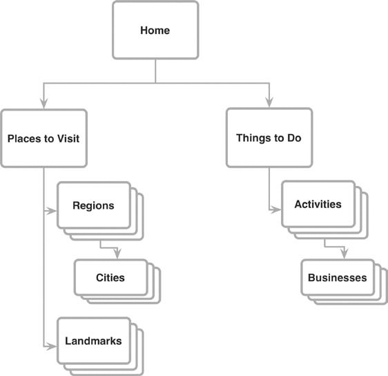
FIGURE 5.2
An excerpt of the Arizona Office of Tourism’s original site structure: all hierarchy, no relationships between information.
Meanwhile, the site’s editorial content, including itineraries and feature articles written by professional travel writers for the state’s monthly e-newsletter, were treated as basic pages, added in big content blocks with a WYSIWYG editor whenever necessary. Without structure to these stories, there was no systematic way to tie them to the cities where they’d be most relevant, nor for a user to search and sort for similar stories that piqued her interest. So there sat a handful of rich, engaging features about Sedona’s romantic restaurants, healthy spa retreats, and local vineyards—disconnected, forgotten, and not doing their job of getting users excited and helping them plan trips. In a site with tens of thousands of pages and nearly 400 cities to manage, no one was about to add (much less maintain) text links for all of them.
If AOT was going to offer governable, useful, and compelling content to meet one of its users’ top tasks, then I needed to solve this disconnect. I did this by breaking down previously unstructured content like articles and itineraries and building a structure that revealed and strengthened the relationships already inherent within them, as shown in Figure 5.3. This allowed us to tie everything together with rules that were based on shared attributes—namely, the city or cities to which each piece of content was related.
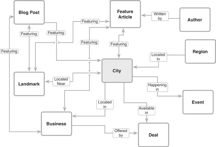
FIGURE 5.3
This high-level model showed the different types of content the system would support, as well as the content elements that would be required to connect them.
What’s this mean? Take, for example, that page about Sedona shown in Figure 5.4. It, along with pages for each of Arizona’s nearly 400 cities, is now bolstered by rich, related information, including listings for local, state, and national parks, city-specific travel deals and events, and, of course, those detailed feature articles and itineraries.
Across the site—and especially in these top pages—content has become more connected and relevant. And because relationships are based on rules, such as a landmark’s proximity to a city, it requires little manual management of tags and links. When new businesses or articles are added, they simply appear all the places they’re supposed to.
Solving problems like these may seem time-consuming, but here’s the silver lining: Because you’ve already figured out your content types, elements, and priorities, you’re intimately familiar with what you have to work with—which means you’ll have a much easier time determining how to build rules based off them and even refine them based on new business needs, content performance, or user feedback.
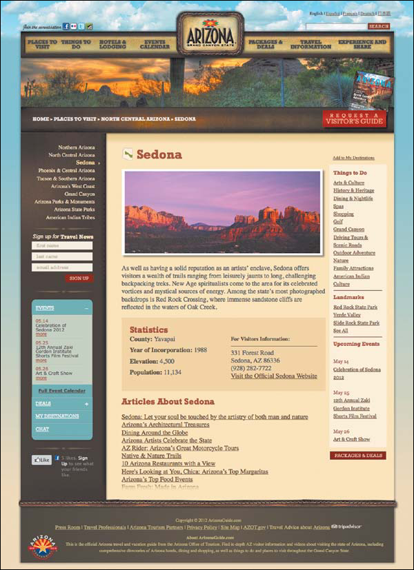
FIGURE 5.4
The new page for Sedona, where conditions dictate the content that appears—for example, displaying landmarks like national parks and monuments whose ZIP codes are within a defined radius of Sedona’s.
Content Rules for Responsive Designs
Responsive design has been a wildly popular topic in recent years, with organizations of all sizes rushing to redesign their sites to flex for different devices. As Ethan Marcotte writes, the movement is all about “embrac[ing] the flexibility inherent to the web, without surrendering the control we require as designers.” 2
Sounds a lot like what we’re trying to accomplish with content, right?
To do this, responsive design calls for building sites using flexible grid layouts, flexible images and media, and CSS3 media queries. Together, this allows the site’s layout to shift on the fly based on the display size of a user’s device. The result is a single website that responds to the device you’re on, delivering the same content in a way that’s optimized for that device’s display.
While flexible grids, flexible images, and media queries may be the functional backbone of going responsive, there’s more to it than that. Because as layouts shift and change, it’s critical to keep your focus on what’s important for your users—and to ensure the priorities and relationships between content stay intact.
On a small scale, for a site that’s just a few pages or only supports one kind of content, this might be simple. And that’s why some of the most striking responsive design samples have come from places like blogs and personal websites. But once you scale up to include corporations, online publications, universities, government offices, and other organizations with large swaths of content to account for, things get a bit trickier.
Take Starbucks, for example, which launched a sparkly, new, responsive website in early 2012, as shown in its three main configurations in Figure 5.5.

FIGURE 5.5
Starbucks was one of the first big brands to go responsive in early 2012. Here’s their site rendered on a laptop, an iPad, and an iPhone.
But how does priority shift as screen size changes? Let’s look at a couple examples.
Say a user is interested in the Clover—a super-fancy coffee machine company that Starbucks bought a few years back and now operates in select stores. She’ll find a thorough page about the Clover pretty easily, as shown in Figure 5.6.
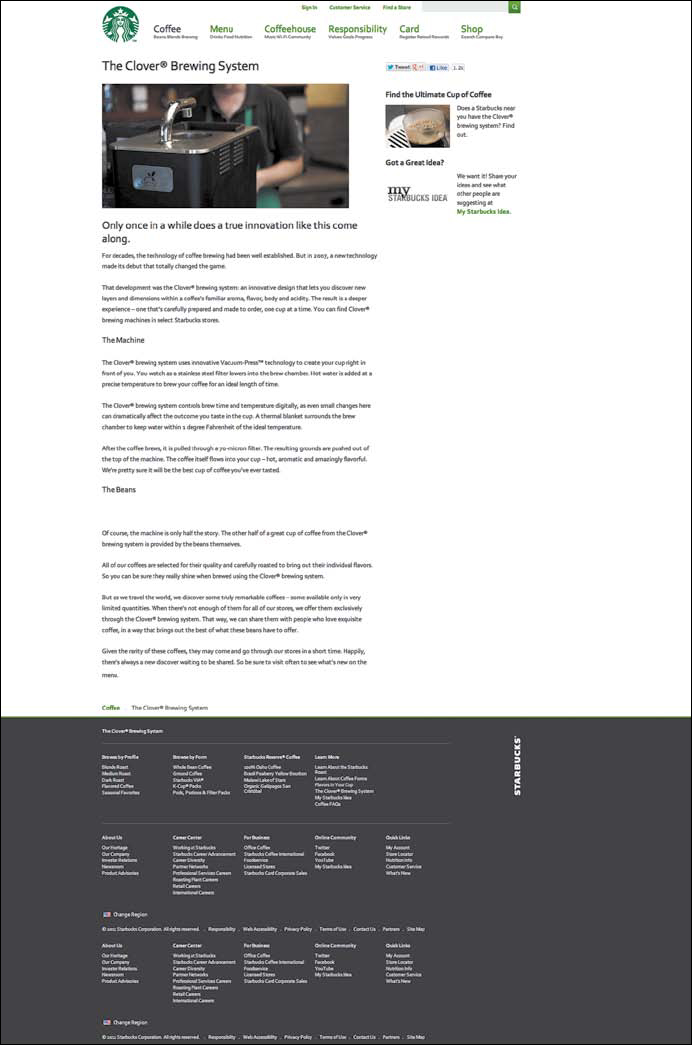
FIGURE 5.6
Starbucks’ desktop-sized page about its Clover coffee machine, available only in select stores. Click the right-hand module to find out which ones.
On the desktop, the visual priority’s pretty clear: overview, where you can find a store with a Clover, and then deeper content about the machine and why it brews such a phenomenal cup of coffee. But look again at that smartphone-sized version shown in Figure 5.7, and all you’ll see is the image, headline, and 400 words of marketing copy: about the machine, the process, and even a long digression about the quality of Starbucks’ beans. Only then—far, far down the page—do you get a link to actually find out where you can get a cup of Clover coffee.
Why is the Clover-equipped store finder so separated from the content at the top of the page? Two reasons. First, the main content is written in one big copy blob, so there are no “chunks” where you can divide the content into parts and insert an element in the middle. The second is a lack of logical rules.
Spend some more time around Starbucks’ site, and you’ll find that pretty much all their templates work the same way: desktop- and tablet-sized layouts include a right-hand sidebar, and smartphone-sized displays simply plop that content onto the bottom of the page.
Sometimes, it works just fine—like when the sidebar features information unrelated to the page, such as entering Starbucks’ Idea Challenge. But let’s see what happens when you check out some fancy beans to brew, as shown in Figures 5.8 and 5.9.
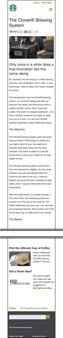
FIGURE 5.7
The same page displayed on an iPhone. Note how much harder it is to figure out where you can buy a dang cup of Clover coffee.
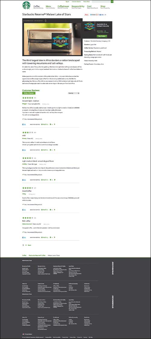
FIGURE 5.8
The desktop-sized page for Starbucks Reserve Malawi Lake of Stars coffee. See how easy it is to skim the beans’ stats and click to buy it?
Malawi Lake of Stars? Floral notes and spicy-chocolaty flavor? Don’t mind if I do. But wait: Where’d my “buy now” button go on mobile? Where are the fast facts about this bean’s provenance? Again, Starbucks’ rule is to bump the sidebar to the bottom—and this time, it might be affecting their sales.
Starbucks’ responsive site brings the company a long way toward future-friendliness. But couldn’t these content decisions make the site stronger and keep the company’s message better intact?
In other words: getting responsive isn’t just a design-and-dev problem. It’s a content problem.
Thankfully, it’s one you’re now prepared to solve. Rather than building every template off the same rule—that the sidebar flips below main content as the screen size narrows—Starbucks, and the many other organizations currently relying on this in their responsive designs, could take a more meaningful approach, making different decisions about how layout should shift for each type of content.
This is why it’s so important to have meaningful structure and the right rules to match—because without it, you might turn a beautiful responsive site into a lost opportunity for your organization and a frustration point for your users.
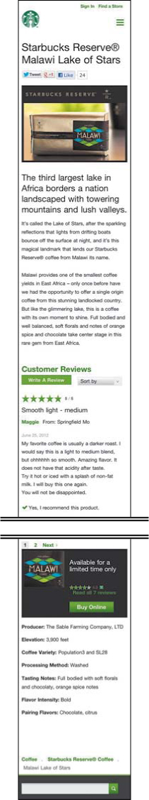
FIGURE 5.9
But on a smartphone, once again that content gets buried—this time below a near-endless scroll through marketing copy and buyer reviews. Don’t they want to sell the beans?
Many Ways to Make a Whole
Adopting this thinking about rules, relationships, and priorities can help you do even more complex things than switch layouts or create smarter related items. It will help you build a system that’s ready to deliver multiple combinations of content elements to different devices, products, or channels.
Let’s see this in action with our friends at NPR. Unlike a responsive website or related items on a single site, NPR uses content models and rules to publish the same story using different combinations of its content elements across various presentation layers—such as the NPR website, NPR Music, NPR iPhone app, NPR iPad app, and affiliate station websites, as we talked about way back in Chapter 2, “Building a Way Forward.”
To accomplish this, NPR had to make major decisions not just about which content elements would exist in its CMS templates, but also how those content elements would be combined and displayed for different products in a way that would offer the best content for each platform while also respecting the meaning and message of that story.
So how did NPR decide what stays and what goes, and which content elements would create the right shape for a given presentation? They did this by handing editorial control to each platform, where someone familiar with that platform’s strengths and weaknesses—and its target users—could determine which content elements made sense within that experience. For example, your local member station might want to include the full-length written version of a story on their site, while those running the NPR.org Player could opt to only include the title, teaser, date, and audio.
That doesn’t mean NPR’s control over content is completely decentralized. Whereas a wire service, like the Associated Press, allows members to use chunks of content any way they want as long as they attribute the story properly, NPR keeps its content connected by limiting the ways that platforms can slice content apart.
But this approach was only possible when NPR stopped labeling its content chunks by their location on the page—such as “sidebar”—and started labeling them in a more semantic way, calling them names like “timeline” or “quick facts.” Because only then could NPR know what each element was doing on the page and whether it was needed.
A Framework for Rule-Making
If you’re typically most comfortable considering your content in terms of Word documents and webpages, this kind of thinking—about rules and conditions, chunks and logic—will be a bit of a shift. But now that you’ve spent the time to break your content into parts and design meaningful models for it, it’s just one more step to get comfortable with conditional statements.
Depending on your specific industry or project, you might also want to start thinking more like a product designer: for each output of your content, you’re delivering a product—be that a website, a mobile app, an ebook, or even a printed piece. In this context, your decisions all align around the goal of making each product the strongest and most useful it can be, incorporating content in the way that will best support it.
In order to make rules that respect your communication goals, your products’ capabilities and restraints, and, of course, the people who will be consuming your content, you need to do some thinking about what role each micro element in your content model should play in creating a whole—because only once you know what a piece of content needs to do can you decide where it needs to go.
To do this, you’ll need to start considering how your content elements support your communication goals—and your users—by evaluating each of those carefully crafted chunks in three key areas: meaning, priority, and relationships. Let’s look at each.
Meaning
As we first talked about in Chapter 4, each element should be contributing something specific to the overall piece of content—or it shouldn’t be there at all. To assess a specific element’s meaning, begin by asking questions like:
- What does communicating this information do for the audience? For the organization?
- What meaning is lost if this element goes away? Are there users this will affect most?
- How critical is this element to making the content feel whole? Does it need to exist at all times, or could we afford to drop it in some contexts?
Priority
When you understand the relative importance of a content element to the others it appears with, you can better gauge how it should be prioritized on any given layout. To gauge its priority, ask yourself several questions:
- How—and how much—does this element contribute to the content’s purpose?
- Does this element drive sales or contribute to business goals in some way?
- Does it provide access to a key user task?
- Is this element more important for users in certain contexts, such as on an app, and less important for those in others, such as on a mobile-optimized site? Which contexts, and how do you know? Can you test this?
Be careful about assumptions here, though. It’s easy to say “smartphone users are on the go, so detail isn’t important to them,” but are you sure that’s true? As we’ll discuss in depth in Chapter 8, “Findable Content,” you need to be pretty confident about what’s important to your users before scrapping content on small screens.
Relationships
Content elements don’t stand alone. They work with one another to form meaning and tell stories. When you assess your content’s relationships, you discover which pieces need to work together, and how—or you risk breaking narratives or interrupting the buying process, as we saw Starbucks’ responsive site do. You can avoid these problems by asking questions like:
- What relationships exist between this element and others? Are those relationships hierarchical, like parent and child; interdependent, like spouses; or complementary, like friends? For example, an image and its caption may be interdependent and impossible to split, while a timeline sidebar may be a child story related to its larger parent feature and easier to break off.
- Can this element appear alone and still provide value to users, or does it become meaningless? If not, what other elements must be kept with it to keep the meaning intact?
- If this element changes or disappears, what other elements are affected?
Meaning. Priority. Relationships. All right, you have the questions. But what might the answers look like?
To find out, let’s return to our Epicurious example from Chapter 3, “Breaking Content Down.” As we conjectured then, Epicurious is a publisher that makes money on ad revenue, which typically comes from increased impressions generated through page views. Meanwhile, users want to find something to cook that meets their dietary, meal type, or ingredient requirements. As a result, an Epicurious recipe is likely designed to be compelling, specific, and connected—so users want to make it, can easily tell whether it meets their needs, and want to visit additional Epicurious content.
Let’s say that Epicurious wanted to continue meeting these macro goals on a new mobile-optimized site or responsive redesign, and you’re trying to figure out the best way to make it so. How would you determine what rules to put in place? By keeping these business and user goals in mind, you could begin to make plenty of decisions about how each element of content will function. Here are just a few potential outcomes:
Meaning
- The image doesn’t help users make the recipe, but it provides an instant point of reference for them. If you tease the recipe sans image, it might reduce users’ interest in cooking, and therefore clicking, it. Therefore, it’s essential to keep an image thumbnail alongside the title at all times.
- Teaser copy adds a pleasant spin to the recipe, providing users with a rich sense of what this dish is like. How much does this copy affect users’ understanding of, and interest in, this recipe? If the description strikes an emotional or physical connection with the food that the recipe alone cannot, then you might make a rule that keeps it intact across platforms. This should be tested with users.
Priority
- Smaller screen sizes shouldn’t be served recipes without related items to reduce clutter, because it will decrease Epicurious’ page views and threaten the business model.
- Wine pairings and related menus are corollary to the recipe—great for specialty situations, but not critical to the recipe itself. If analytics data says readers don’t use them often, then consider linking to them on smaller screens, rather than displaying them on the page. However, related recipes should stay because readers use this feature regularly.
Relationships
- Ratings influence whether users want to make the recipe, so this content should always connect to the recipe title and teaser. If the sidebar were to get pushed below main content for smaller screens, the rating would be much harder to find, and potentially frustrating. Instead, ratings must follow recipe titles in layouts, and never be pushed below ingredients and directions.
- When split from the teaser description, this title is very descriptive and may be able to stand alone, but is this consistent across recipes? If not, then teasers should always appear with their titles.
As you can quickly see, simply pushing a sidebar to the bottom or removing all but the most basic recipe elements is unlikely to meet anyone’s needs here. Instead, there are a range of considerations and a whole host of potential outcomes for Epicurious—and likely for your own content, too.
While some of these decisions should lead to testing and user research, the content alone—when you get close enough—has more answers than you may think. And, just as important, it reveals plenty of interesting questions as well.
Implementing the Rules
How your content’s rules and conditions will be implemented will vary: Some may be built into your CMS’s modules. Others might be implemented via CSS and media queries in a responsive design. And still others might be on the other side of an API—a solution more and more organizations are adopting to publish content to multiple sites, devices, and experiences that we’ll talk about at length in Chapter 7, “Making Sense of Content APIs.”
But with this framework, you should be prepared to begin evaluating what sorts of logic you’ll need to make your content ecosystem work—and be ready to talk about markup, the bit of code that your content elements might need before they’re ready to travel. In Chapter 6, “Understanding Markup,” we’ll talk about what markup is, how it works, and the types of markup you might encounter as you’re working to make your content more flexible.