
![]()
Pie Charts with D3
In the previous chapter, you have just seen how bar charts represent a certain category of data. You have also seen that starting from the same data structure, depending on your intentions you could choose one type of chart rather than another in order to accentuate particular aspects of the data. For instance, in choosing a normalized stacked bar chart, you wanted to focus on the percentage of income that each sector produces in its country.
Very often, such data represented by bar charts can also be represented using pie charts. In this chapter, you will learn how to create even this type of chart using the D3 library. Given that this library does not provide the graphics which are already implemented, as jqPlot does, but requires the user to build them using basic scalar vector graphics (SVG) elements, you will start by looking at how to build arcs and circular sectors. In fact, as with rectangles for bar charts and lines for line charts, these shapes are of fundamental importance if you are to realize pie charts (using circular sectors) or donut charts (using arcs). After you have implemented a classic example of a pie chart, we will deepen the topic further, by creating some variations. In the second part of the chapter, you will tackle donut charts, managing multiple series of data that are read from a comma-separated values (CSV) file.
Finally, we will close the chapter with a chart that we have not dealt with yet: the polar area diagram. This type of chart is a further evolution of a pie chart, in which the slices are no longer enclosed in a circle, but all have different radii. With polar area diagram, the information will no longer be expressed only by the angle that a slice occupies but also by its radius.
The Basic Pie Charts
To better highlight the parallels between bar charts and pie charts, in this example you will use the same CSV file that you used to create a basic bar chart (see the “Drawing a bar chart” section in Chapter 4). Thus, in this section, your purpose will be to implement the corresponding pie chart using the same data. In order to do this, before you start “baking” pies and donuts, you must first obtain “baking trays” of the right shape. The D3 library also allows you to represent curved shapes such as arches and circular sectors, although there actually are no such SVG elements. In fact, as you will soon see, thanks to some of its methods D3 can handle arcs and sectors as it handles other real SVG elements (rectangles, circles, lines, etc.). Once you are confident with the realization of these elements, your work in the creation of a basic pie chart will be almost complete. In the second part of this section, you will produce some variations on the theme, playing mainly with shape borders and colors in general.
Drawing a Basic Pie Chart
Turn your attention again to data contained in the CSV file named data_04.csv (see Listing 5-1).
Listing 5-1. data_04.csv
country,income
France,14
Russia,22
Japan,13
South Korea,34
Argentina,28
Now, we will demonstrate how these data fit well in a pie chart representation. First, in Listing 5-2, the drawing area and margins are defined.
Listing 5-2. Ch5_01a.html
var margin = {top: 70, right: 20, bottom: 30, left: 40},
    w = 500 - margin.left - margin.right,
    h = 400 - margin.top - margin.bottom;
Even for pie charts, you need to use a sequence of colors to differentiate the slices between them. Generally, it is usual to use the category10() function to create a domain of colors, and that is what you have done so far. You could do the same thing in this example, but this is not always required. We thus take advantage of this example to see how it is possible to pass a sequence of custom colors. Create a customized example by defining the colors to your liking, one by one, as shown in Listing 5-3.
Listing 5-3. Ch5_01a.html
var margin = {top: 70, right: 20, bottom: 30, left: 40},
    w = 500 - margin.left - margin.right,
    h = 400 - margin.top - margin.bottom;

var color = d3.scale.ordinal()
    .range(["#ffc87c", "#ffeba8", "#f3b080", "#916800", "#dda66b"]);
Whereas previously you had bars built with rect elements, now you have to deal with the sections of a circle. Thus, you are dealing with circles, angles, arches, radii, etc. In D3 there is a whole set of tools which allow you to work with these kinds of objects, making your work with pie charts easier.
To express the slices of a pie chart (circle sectors), D3 provides you with a function: d3.svg.arc(). This function actually defines the arches. By the term “arc,” we mean a particular geometric surface bound by an angle and by two circles, one with a smaller radius (inner radius) and the other with a larger radius (outer radius). The circular sector, i.e., the slice of a pie chart, is nothing more than an arc with an inner radius equal to 0 (see Figure 5-1).
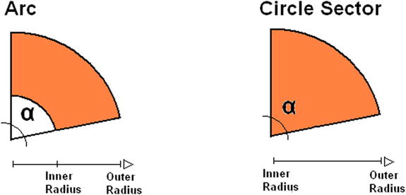
Figure 5-1. By increasing the inner radius, it is possible to switch from a circle sector to an arc
First, you calculate a radius which is concordant to the size of the drawing area. Then, according to this range, you delimit the outer radius and inner radius, which in this case is 0 (see Listing 5-4).
Listing 5-4. Ch5_01a.html
...
var color = d3.scale.ordinal()
    .range(["#ffc87c", "#ffeba8", "#f3b080", "#916800", "#dda66b"]);

var radius = Math.min(w, h) / 2;
var arc = d3.svg.arc()
    .outerRadius(radius)
    .innerRadius(0);
D3 also provides a function to define the pie chart: the d3.layout.pie() function. This function builds a layout that allows you to compute the start and end angles of an arc in a very easy way. It is not mandatory to use such a function, but the pie layout automatically converts an array of data into an array of objects. Thus, define a pie with an iterative function on income values as shown in Listing 5-5.
Listing 5-5. Ch5_01a.html
...
var arc = d3.svg.arc()
    .outerRadius(radius)
    .innerRadius(0);

var pie = d3.layout.pie()
    .sort(null)
    .value(function(d) { return d.income; });
Now, as seen in Listing 5-6, you insert the root element <svg>, assigning the correct dimensions and the appropriate translate() transformation.
Listing 5-6. Ch5_01a.html
...
var pie = d3.layout.pie()
    .sort(null)
    .value(function(d) { return d.income; });

var svg = d3.select("body").append("svg")
    .attr("width", w + margin.left + margin.right)
    .attr("height", h + margin.top + margin.bottom)
    .append("g")
    .attr("transform", "translate(" +(w / 2 + margin.left) +
          "," + (h / 2 + margin.top) + ")");
Next, for the reading of data in CSV files, you use the d3.csv() function, as always. Here too you must ensure that the income is interpreted in numeric values and not as strings. Then, you write the iteration with the forEach() function and assign the values of income with the sign ‘+’ beside them, as shown in Listing 5-7.
Listing 5-7. Ch5_01a.html
...
    .append("g")
    .attr("transform", "translate(" +(w/2+margin.left)+
          "," +(h/2+margin.top)+ ")");

d3.csv("data_04.csv", function(error, data) {
    data.forEach(function(d) {
      d.income = +d.income;
    });

});
It is now time to add an <arc> item, but this element does not exist as an SVG element. In fact, what you use here really is a <path> element which describes the shape of the arc. It is D3 itself which builds the corresponding path thanks to the pie() and arc() functions. This spares you a job which is really too complex. You are left only with the task of defining these elements as if they were <arc> elements (see Listing 5-8).
Listing 5-8. Ch5_01a.html
d3.csv("data_04.csv", function(error, data) {

    data.forEach(function(d) {
       d.income = +d.income;
    });

    var g = svg.selectAll(".arc")
        .data(pie(data))
        .enter().append("g")
        .attr("class", "arc");

    g.append("path")
        .attr("d", arc)
        .style("fill", function(d) { return color(d.data.country); });

});
If you analyze the SVG structure with Firebug, you can see in Figure 5-2 that the arc paths are created automatically, and that you have a <g> element for each slice.
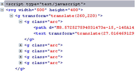
Figure 5-2. With Firebug, you can see how the D3 library automatically builds the arc element
Moreover, it is necessary to add an indicative label to each slice so that you can understand which country it relates to, as shown in Listing 5-9. Notice the arc.centroid() function. This function computes the centroid of the arc. The centroid is defined as the midpoint between the inner and outer radius and the start and end angle. Thus, the label text appears perfectly in the middle of every slice.
Listing 5-9. Ch5_01a.html
d3.csv("data_04.csv", function(error, data) {
    ...
    g.append("path")
       .attr("d", arc)
       .style("fill", function(d) { return color(d.data.country); });

    g.append("text")
      .attr("transform", function(d) {
          return "translate(" + arc.centroid(d) + ")"; })
      .style("text-anchor", "middle")
      .text(function(d) { return d.data.country; });

});
Even for pie charts, it is good practice to add a title at the top and in a central position (see Listing 5-10).
Listing 5-10. Ch5_01a.html
d3.csv("data_04.csv", function(error, data) {
    ...
    g.append("text")
       .attr("transform", function(d) {
          return "translate(" + arc.centroid(d) + ")"; })
       .style("text-anchor", "middle")
       .text(function(d) { return d.data.country; });

    var title = d3.select("svg").append("g")
        .attr("transform", "translate(" +margin.left+ ", " +margin.top+ ")")
        .attr("class", "title")

    title.append("text")
        .attr("x", (w / 2))
        .attr("y", -30 )
        .attr("text-anchor", "middle")
        .style("font-size", "22px")
        .text("My first pie chart");
});
As for the CSS class attributes, you can add the definitions in Listing 5-11.
Listing 5-11. Ch5_01a.html
<style>
body {
    font: 16px sans-serif;
}

.arc path {
    stroke: #000;
}
</style>
At the end, you get your first pie chart using the D3 library, as shown in Figure 5-3.
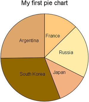
Figure 5-3. A simple pie chart
Some Variations on Pie Charts
Now, you will effect some changes to the basic pie chart that you have just created, illustrating some of the infinite possibilities of variations on the theme that you can obtain:
- working on color sequences;
- sorting the slices in a pie chart;
- adding spaces between the slices;
- representing the slices only with outlines;
- combining all of the above.
In the previous example, we defined the colors in the scale, and in the preceding examples we used the category10() function. There are other already defined categorical color scales: category20(), category20b(), and category20c(). Apply them to your pie chart, just to see how they affect its appearance. Listing 5-12 shows a case in which you use the category10() function. For the other categories, you only need to replace this function with others.
Listing 5-12. Ch5_01b.html
var color = d3.scale.category10();
Figure 5-4 shows the color variations among the scales (reflected in different grayscale tones in print). The category10() and category20() functions generate a scale with alternating colors; instead, category20b() and category 20c() generate a scale with a slow gradation of colors.

Figure 5-4. Different color sequences: a) category10, b) category20, c) category20b, d) category20c
Sorting the Slices in a Pie Chart
Another thing to notice is that, by default, the pie chart in D3 undergoes an implicit sorting. Thus, in case you had not made the request explicitly by passing null to the sort() function, as shown in Listing 5-13.
Listing 5-13. Ch5_01c.html
var pie = d3.layout.pie()
    //.sort(null)
    .value(function(d) { return d.income; });
Then, the pie chart would have had looked different, as shown in Figure 5-5.

Figure 5-5. A simple pie chart with sorted slices
In a pie chart, the first slice is the greatest, and then the other slices are gradually added in descending order.
Adding Spaces Between the Slices
Often, the slices are shown spaced out between them, and this can be achieved very easily. You just need to make some changes to the CSS style class for the path elements as shown in Listing 5-14.
Listing 5-14. Ch5_01d.html
.arc path {
    stroke: #fff;
    stroke-width: 4;
}
Figure 5-6 shows how the pie chart assumes a more pleasing appearance when the slices are spaced apart by a white gap.
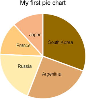
Figure 5-6. The slices are separated by a white space
Representing the Slices Only with Outlines
It is a little more complex to draw your pie chart with slices which are bounded only by colored borders and empty inside. You have seen similar cases with jqPlot. Change the CSS style class, as shown in Listing 5-15.
Listing 5-15. Ch5_01e.html
.arc path {
    fill: none;
    stroke-width: 6;
}
In fact, this time you do not want to fill the slices with specific colors, but you want the edges, defining them, to be colored with specific colors. So you need to replace the fill with the stroke attribute in the style definition of the SVG element. Now it is the line which is colored with the indicative color. But you need to make another change, which is a little bit more complex to understand.
You are using the borders of every slice to specify the colored part, but they are actually overlapped. So, the following color covers the previous one partially and it is not so neat to have all the slices attached. It would be better to add a small gap. This could be done very easily, simply by applying a translation for each slice. Every slice should be driven off the center by a small distance, in a centrifugal direction. Thus, the translation is different for each slice and here you exploit the capabilities of the centroid() function, which gives you the direction (x and y coordinates) of the translation (see Listing 5-16).
Listing 5-16. Ch5_01e.html
var g = svg.selectAll(".arc")
    .data(pie(data))
    .enter().append("g")
    .attr("class", "arc")
    .attr("transform", function(d) {
      a = arc.centroid(d)[0]/6;
      b = arc.centroid(d)[1]/6;
      return "translate(" + a +", "+b + ")";
    })

g.append("path")
    .attr("d", arc)
    .style("stroke", function(d) { return color(d.data.country); });
Figure 5-7 illustrates how these changes affect the pie chart.
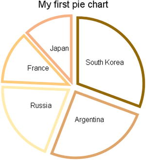
Figure 5-7. A pie chart with unfilled slices
But it does not end here. You can create a middle solution between these last two pie charts: get the slices with more intensely colored edges and fill them with a lighter color. It is enough to define two identical but differently colored paths, as shown in Listing 5-17. The first will have a uniform color which is slightly faint, while the second will have only colored edges and the inside will be white.
Listing 5-17. Ch5_01f.html
var g = svg.selectAll(".arc")
    .data(pie(data))
    .enter().append("g")
    .attr("class", "arc")
    .attr("transform", function(d) {
       a = arc.centroid(d)[0]/6;
       b = arc.centroid(d)[1]/6;
       return "translate(" + a +", "+b + ")";
    })

g.append("path")
    .attr("d", arc)
    .style("fill", function(d) { return color(d.data.country); })
    .attr('opacity', 0.5);

g.append("path")
    .attr("d", arc)
    .style("stroke", function(d) { return color(d.data.country); });
Figure 5-8 shows the spaced pie chart with two paths that color the slices and their borders.
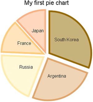
Figure 5-8. A different way to color the slices in a pie chart
As the pie chart is to the bar chart, so the donut chart is to the multiseries bar chart. In fact, when you have multiple sets of values, you would have to represent them with a pie chart for each series. If you use donuts charts instead, you can represent them all together and also compare them in a single chart (see Figure 5-9).
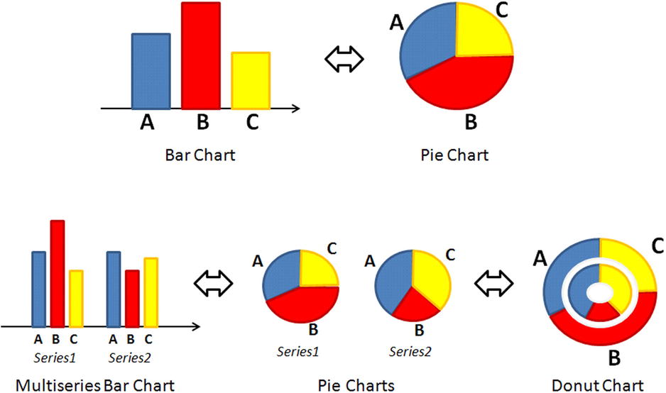
Figure 5-9. A diagram representing the parallelism between pie charts and bar charts both with one and with multiple series of data
Begin by writing the code in Listing 5-18; we will not provide any explanation because it is identical to the previous example.
Listing 5-18. Ch5_02.html
<!DOCTYPE html>
<html>
<head>
<meta charset="utf-8">
<script src="http://d3js.org/d3.v3.js"></script>
<style>
body {
    font: 16px sans-serif;
}
.arc path {
    stroke: #000;
}
</style>
</head>
<body>
<script type="text/javascript">
var margin = {top: 70, right: 20, bottom: 30, left: 40},
    w = 500 - margin.left - margin.right,
    h = 400 - margin.top - margin.bottom;

var color = d3.scale.ordinal()
    .range(["#ffc87c", "#ffeba8", "#f3b080", "#916800", "#dda66b"]);

var radius = Math.min(w, h) / 2;

var svg = d3.select("body").append("svg")
    .attr("width", w + margin.left + margin.right)
    .attr("height", h + margin.top + margin.bottom)
    .append("g")
    .attr("transform", "translate(" +(w/2+margin.left)+
          "," +(h/2+margin.top)+ ")");

var title = d3.select("svg").append("g")
    .attr("transform", "translate(" +margin.left+ ", " +margin.top+ ")")
    .attr("class", "title");

title.append("text")
     .attr("x", (w / 2))
     .attr("y", -30 )
     .attr("text-anchor", "middle")
     .style("font-size", "22px")
     .text("A donut chart");
</script>
</body>
</html>
For an example of multiseries data, you will add another column of data representing the expense to the file data_04.csv as shown in Listing 5-19, and you will save this new version as data_06.csv.
Listing 5-19. data_06.csv
country,income,expense
France,14,10
Russia,22,19
Japan,13,6
South Korea,34,12
Argentina,28,26
You have added a new set of data. Differently from the previous example, you must, therefore, create a new arc for this series. Then, in addition to the second arc, you add a third one. This arc is not going to draw the slices of a series, but you are going to use it in order to distribute labels circularly. These labels show the names of the countries, providing an alternative to a legend. Thus, divide the radius into three parts, leaving a gap in between to separate the series as shown in Listing 5-20.
Listing 5-20. Ch5_02.html
var arc1 = d3.svg.arc()
    .outerRadius(0.4 * radius)
    .innerRadius(0.2 * radius);
var arc2 = d3.svg.arc()
    .outerRadius(0.7 * radius )
    .innerRadius(0.5 * radius );
var arc3 = d3.svg.arc()
    .outerRadius(radius)
    .innerRadius(0.8 * radius);
You have just created two arcs to manage the two series, and consequently it is now necessary to create two pies, one for the values of income and the other for the values of expenses (see Listing 5-21).
Listing 5-21. Ch5_02.html
var pie = d3.layout.pie()
    .sort(null)
    .value(function(d) { return d.income; });
var pie2 = d3.layout.pie()
    .sort(null)
    .value(function(d) { return d.expense; });
You use the d3.csv() function to read the data within the file as shown in Listing 5-22. You do the usual iteration of data with forEach() for the interpretation of income and expense as numerical values.
Listing 5-22. Ch5_02.html
d3.csv("data_06.csv", function(data) {

    data.forEach(function(d) {
       d.income = +d.income;
       d.expense = +d.expense;
    });

});
In Listing 5-23, you create the path elements which draw the various sectors of the two donuts, corresponding to the two series. With the functions data(), you bind the data of the two pie layouts to the two representations. Both the donuts must follow the same sequence of colors. Once the path element is defined, you connect it with a text element in which the corresponding numeric value is reported. Thus, you have added some labels which make it easier to read the chart.
Listing 5-23. Ch5_02.html
var g = svg.selectAll(".arc1")
    .data(pie(data))
    .enter().append("g")
    .attr("class", "arc1");

g.append("path")
    .attr("d", arc1)
    .style("fill", function(d) { return color(d.data.country); });

g.append("text")
    .attr("transform", function(d) {
       return "translate(" + arc1.centroid(d) + ")"; })
    .attr("dy", ".35em")
    .style("text-anchor", "middle")
    .text(function(d) { return d.data.income; });

var g = svg.selectAll(".arc2")
    .data(pie2(data))
    .enter().append("g")
    .attr("class", "arc2");
g.append("path")
    .attr("d", arc2)
    .style("fill", function(d) { return color(d.data.country); });

g.append("text")
    .attr("transform", function(d) {
       return "translate(" + arc2.centroid(d) + ")"; })
    .attr("dy", ".35em")
    .style("text-anchor", "middle")
    .text(function(d) { return d.data.expense; });
Now, all that remains to do is to add the external labels carrying out the functions of the legend as shown in Listing 5-24.
Listing 5-24. Ch5_02.html
g.append("text")
    .attr("transform", function(d) {
       return "translate(" + arc3.centroid(d) + ")"; })
    .style("text-anchor", "middle")
    .text(function(d) { return d.data.country; });
And so you get the donut chart shown in Figure 5-10.
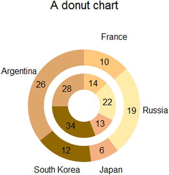
Figure 5-10. A donut chart
Polar area diagrams are very similar to pie charts, but they differ in how far each sector extends from the center of the circle, giving the possibility to represent a further value. The extent of every slice is proportional to this new added value (see Figure 5-11).
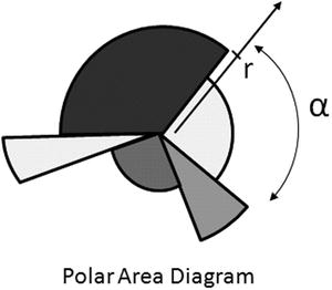
Figure 5-11. In a polar area diagram, each slice is characterized by a radius r and an angle
Consider the data in the file data_04.csv again and add an additional column which shows the growth of the corresponding country as shown in Listing 5-25. Save it as data_07.csv.
Listing 5-25. data_07.csvl
country,income,growth
France,14,10
Russia,22,19
Japan,13,9
South Korea,34,12
Argentina,28,16
Start writing the code in Listing 5-26; again, we will not explain this part because it is identical to the previous examples.
Listing 5-26. Ch5_03.html
<!DOCTYPE html>
<html>
<head>
<meta charset="utf-8">
<script src="http://d3js.org/d3.v3.js"></script>
<style>
body {
    font: 16px sans-serif;
}
.arc path {
    stroke: #000;
}
</style>
</head>
<body>
<script type="text/javascript">
var margin = {top: 70, right: 20, bottom: 30, left: 40},
    w = 500 - margin.left - margin.right,
    h = 400 - margin.top - margin.bottom;

var color = d3.scale.ordinal()
    .range(["#ffc87c", "#ffeba8", "#f3b080", "#916800", "#dda66b"]);

var radius = Math.min(w, h) / 2;

var pie = d3.layout.pie()
    .sort(null)
    .value(function(d) { return d.income; });

var svg = d3.select("body").append("svg")
    .attr("width", w + margin.left + margin.right)
    .attr("height", h + margin.top + margin.bottom)
    .append("g")
    .attr("transform", "translate(" +(w/2-margin.left)+
       "," +(h/2+margin.top)+ ")");

var title = d3.select("svg").append("g")
    .attr("transform", "translate(" +margin.left+ ", " +margin.top+ ")")
    .attr("class", "title");

title.append("text")
     .attr("x", (w / 2))
     .attr("y", -30 )
     .attr("text-anchor", "middle")
     .style("font-size", "22px")
     .text("A polar area diagram");
</script>
</body>
</html>
In Listing 5-27, you read the data in the data_07.csv file with the d3.csv() function and make sure that the values of income and growth are interpreted as numeric values.
Listing 5-27. Ch5_03.html
d3.csv("data_07.csv", function(error, data) {
    data.forEach(function(d) {
       d.income = +d.income;
       d.growth = +d.growth;
    });
});
Differently to the previous examples, here you define not only an arc, but an arc which will vary with the variation of data being read; we will call it arcs, since the outerRadius is no longer constant but is proportional to the growth values in the file. In order to do this, you need to apply a general iterative function, and then the arcs must be declared within the d3.csv() function (see Listing 5-28).
Listing 5-28. Ch5_03.html
d3.csv("data_07.csv", function(error, data) {
    data.forEach(function(d) {
       d.income = +d.income;
       d.growth = +d.growth;
    });
    arcs = d3.svg.arc()
      .innerRadius( 0 )
      .outerRadius( function(d,i) { return 8*d.data.growth; });
});
Now, you just have to add the SVG elements which draw the slices with labels containing the values of growth and income (see Listing 5-29). The labels reporting income values will be drawn inside the slices, right at the value returned by the centroid() function. Instead, as regards the labels reporting the growth values, these will be drawn just outside the slices. To obtain this effect, you can use the x and y values returned by centroid() and multiply them by a value greater than 2. You must recall that the centroid is at the very center of the angle and in the middle between innerRadius and outerRadius. Therefore, multiplying them by 2, you get the point at the center of the outer edge of the slice. If you multiply them by a value greater than 2, then you will find x and y positions outside the slice, right where you want to draw the label with the value of growth.
Listing 5-29. Ch5_03.html
var g = svg.selectAll(".arc")
    .data(pie(data))
    .enter().append("g")
    .attr("class", "arc");

g.append("path")
    .attr("d", arcs)
    .style("fill", function(d) { return color(d.data.country); });

g.append("text")
    .attr("class", "growth")
    .attr("transform", function(d) {
       a = arcs.centroid(d)[0]*2.2;
       b = arcs.centroid(d)[1]*2.2;
       return "translate(" +a+", "+b+ ")"; })
    .attr("dy", ".35em")
    .style("text-anchor", "middle")
    .text(function(d) { return d.data.growth; });

g.append("text")
    .attr("class", "income")
    .attr("transform", function(d) {
       return "translate(" +arcs.centroid(d)+ ")"; })
    .attr("dy", ".35em")
    .style("text-anchor", "middle")
    .text(function(d) { return d.data.income; });
One thing you have not yet done to the pie chart is adding a legend. In Listing 5-30, we define, outside the d3.csv() function, an element <g> in which to insert the table of the legend, and inside the function we define all the elements related to the countries, since defining them requires access to the values written in the file.
Listing 5-30. Ch5_03.html
var legendTable = d3.select("svg").append("g")
    .attr("transform", "translate(" +margin.left+ ", "+margin.top+")")
    .attr("class", "legendTable");

d3.csv("data_07.csv", function(error, data) {
...
var legend = legendTable.selectAll(".legend")
    .data(pie(data))
    .enter().append("g")
    .attr("class", "legend")
    .attr("transform", function(d, i) {
      return "translate(0, " + i * 20 + ")"; });

legend.append("rect")
      .attr("x", w - 18)
      .attr("y", 4)
      .attr("width", 10)
      .attr("height", 10)
      .style("fill", function(d) { return color(d.data.country); });

legend.append("text")
      .attr("x", w - 24)
      .attr("y", 9)
      .attr("dy", ".35em")
      .style("text-anchor", "end")
      .text(function(d) { return d.data.country; });
});
Finally, you can make some adjustments to the CSS style classes as shown in Listing 5-31.
Listing 5-31. Ch5_03.html
<style>
body {
    font: 16px sans-serif;
}
.arc path {
    stroke: #fff;
    stroke-width: 4;
}
.arc .income {
    font: 12px Arial;
    color: #fff;
}
</style>
And here is the polar area diagram (see Figure 5-12).
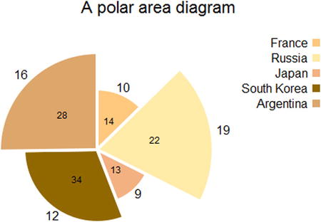
Figure 5-12. A polar area diagram
Summary
In this chapter, you learned how to implement pie charts and donut charts using the D3 library, following almost the same guidelines as those provided in the previous chapters. Furthermore, at the end of the chapter you learned how to make a polar area diagram, a type of chart which you had not met before and which the D3 library allows you to implement easily.
In the next chapter, you will implement the two types of Candlestick chart which you had already discussed in the first part of the book covering the jqPlot library, only this time you will be using the D3 library.