
Chapter 3
Examining Continuous Variables
Normality is a myth; there never was, and never will be, a normal distribution.
Roy Geary (“Testing for Normality”)1
Summary
Chapter 3 looks at ways of displaying individual continuous variables.
3.1 Introduction
A continuous variable can in theory take any value over its range. (In practice data for continuous variables are generally rounded to some level of measurement accuracy.) Many different plots have been suggested for displaying data distributions of continuous variables and they all have the same aim: to display the important features of the data. Some plots emphasise one feature over another, some are very specialised, some require more deciphering than others. Perhaps the reason there are so many is that there are so many different kinds of features that might be present in the data.
Two possible approaches are to use a range of different plot types or to use a variety of different plots of the same type. In this book the latter approach is mostly favoured and the plots in this chapter are primarily histograms and boxplots. Readers should use what they feel most comfortable with and what works for them. For any plot types you do use, make sure you have plenty of experience in interpreting them. Look at examples of your plots for all kinds of different datasets and get to know both the ways the kinds of features you are interested in are represented and what kinds of structure are emphasised. Textbooks rarely have the space for showing a wide variety of graphics, you have to draw your own.
Figure 3.1 shows a histogram of the percentage share of the vote won by Die Linke in each of the 299 constituencies in the 2009 Bundestag election. Amongst the German political parties there are two on the left of the political spectrum, the SPD, similar to the Labour party in the UK, and Die Linke, literally ‘The Left', a party even further to the left. Before drawing the histogram, a new variable is calculated to give the percentage support in each constituency. The binwidth is chosen to be 1 to give bins that are easy to interpret. Thus the height of each bin shows the number of constituencies with a particular percentage of Die Linke supporters. Although they are a party on the left, they are usually given a purple colour in displays of results, as red is used for the SPD.

Percentage support by constituency for Die Linke party in the German election of 2009. The graphic suggests a division of the constituencies into two distinct groups. Further investigation revealed that the constituencies where Die Linke did poorly are all in the old Western Germany, including West Berlin, but excluding Saarland, where the party leader was based.
The party had little support in most of the country, but managed over 10% in a fifth of the constituencies. The areas where they did well turned out to be in the new Bundesländer (the old East Germany), in East Berlin, although not in West Berlin, and in the small Bundesland called Saarland, where their party leader in that election was based, Oscar Lafontaine. You might have guessed at a pronounced regional distribution given the form of the histogram, but not that the country would be so precisely divided up.
data(btw2009, package = "flexclust")
btw2009 <- within(btw2009, Linke2 <- 100*LINKE2/valid2)
ggplot(btw2009, aes(Linke2)) + geom_bar(binwidth = 1,
fill = "mediumpurple") + ylab("") +
xlab("Percentage voter support for Die Linke in 2009")
3.2 What features might continuous variables have?
There might be
Asymmetry the distribution is skewed to the left or right, for instance distributions of income.
Outliers there are one or more values that are far from the rest of the data.
Multimodality the distribution has more than one peak, e.g., both variables in the Old Faithful geyser data.
Gaps there are ranges of values within the data where no cases are recorded. This can happen with exam marks, where there are no cases just below the pass mark.
Heaping some values occur unexpectedly often. Birthweights are a good example [Clemons and Pagano, 1999]. Perhaps there are more important things to do than to weigh the newborn baby to the nearest gram or ounce ...
Rounding only certain values (perhaps integers) are found, e.g., age distributions.
Impossibilities values outside the feasible range, for instance negative ages. There is a version of the Pima Indians dataset discussed in 1.3 in the UCI machine learning repository [Bache and Lichman, 2013] in which there are blood pressure and skin thickness measurements of zero.
Errors values that look wrong for one reason or another. In a German car insurance dataset there were drivers whose year of birth gave them ages of less than 16, so they could not have a licence. It was suggested that this might be possible, as insuring someone who never drove would enable them to build up a history of several years of no claims!
Graphics are good for displaying the features that make up the shapes of data distributions. They can provide more and different kinds of information than a set of summary statistics. Obviously it is best to use both approaches.
With a single variable the mean is usually the most important statistic and perhaps no statistical test is used as often as the t-test for testing means. A t-test can be used if the underlying data are from a normal distribution. For small datasets (and the t-test is intended specifically for small samples) data from a normal distribution can look very non-normal, which is why tests of normality have low power and provide little support for t-tests. Fortunately the t-test is fairly robust against non-normality. This should not prevent anyone from at least checking whether the data have some seriously non-normal feature before carrying out analyses. That can best be done graphically.
3.3 Looking for features
This section discusses a number of different datasets, mainly using histograms, to see which features might be present and how they can be found. Whichever display you favour, it is important to study lots of examples to see the various forms of the graphic that can arise and to get experience in interpreting them.
Galton's heights
data(galton, package="UsingR")
ht <- "height (in)"
par(mfrow=c(1,2), las=1, mar=c(3.1, 4.1, 1.1, 2.1))
with(galton, {
hist(child, xlab=ht, main="Children", col="green")
hist(parent, xlab=ht, main="Parents", col="blue")})
Galton famously developed his ideas on correlation and regression using data which included the heights of parents and children. The dataset galton in the package UsingR includes data on heights for 928 children and 205 ‘midparents'. Each parent height is an average of the father's height and 1.08 times the mother's height. The daughters' heights are also said to have been multiplied by 1.08. Note that there is one midparent height for each height of a child in thisdataset, so that many midparent heights are repeated. (For anyone interested in investigating a detailed dataset with full family information, including the sex and order of the children, see[Hanley, 2004] and that author's webpage.) Figure 3.2 shows default histograms of the two variables.

Histograms of child and midparent heights with default binwidths. The plots have been drawn separately, so the scales are different. Both distributions are roughly symmetric and there is more spread amongst the children. The binwidth has been set to 1 inch. If the data were in cms, then another binwidth would be more suitable, perhaps 2.5 cms.
Both distributions are vaguely symmetric and there appear to be no outliers. It is difficult to compare the histograms as the scales in the two plots are different. Although the histograms appear to have different binwidths they are actually the same, thanks to R looking for sensible breaks, in this case integers, and only drawing bins for the range of the data. To look for gaps or heaping, it can be useful to draw histograms with very thin bins. Barcharts would also work, although not for large datasets with many individual values. Dotplots are good for gaps, although not for heaping.
From Figure 3.3, histograms with binwidths of 0.1, we can see that only a limited number of values are used for height (and if you go to the source of this version of the dataset given in the R help you find that the data were taken from a table, so individual values are not provided). In both histograms there appear to be narrower gaps between values at the boundaries. Drawing up tables of the ‘raw' data confirms this and reveals the curiosity that the parent values almost all end in .5 while the child values almost all end in .2. It would be better to use Hanley's version of the dataset. The function truehist was used for Figure 3.3, as the binwidth can be set directly. (hist uses the number of cells.) As it regards histograms as density estimates, the y-axis scale no longer shows the frequencies.
par(mfrow=c(1,2), las=1, mar=c(3.1, 4.1, 1.1, 2.1))
with(galton, {
MASS::truehist(child, h=0.1)
MASS::truehist(parent, h=0.1)})
Histograms of child and midparent heights drawn with a narrow bin-width to demonstrate how few height values actually occur. Clearly the data were aggregated or reported to a limited level of precision. The plots have been drawn separately, so the scales are different.
To actually compare the distributions a number of plots could be drawn, for instance parallel boxplots. Keeping with the histogram theme, Figure 3.4 displays the histograms one above the other with equal scales and binwidths. The x-axis scale limits were chosen to include the full range of the data and the y-axis limits were chosen by inspection.

Histograms of child and midparent heights drawn to the same scale and with medians marked in red. Parents' heights are spread less and their median is slightly higher.
In interpreting the data it should be borne in mind that, as Hanley points out, Galton obtained the data “through the offer of prizes” for the “best Extracts from their own Family Records” [Hanley, 2004], so the sample is hardly a random one; that the data have been rounded for tabulation; and that family sizes vary from 1 to 15, so that one midparent data point occurs 15 times in the dataset and 33 points occur only once. The medians have been marked by red vertical lines. Although the means are very similar, the parents' distribution is clearly less variable. This is because each parent value is an average of two values. Interestingly (and perhaps even suspiciously) the standard deviation of the children, 2.52, is almost exactly √2 times the standard deviation of the parents, 1.79.
You might think that if the individual parent values were available and the genders of the children were known, as is the case with the full Galton data set available on Hanley's webpage, then the height data distributions would be neatly bimodal with one peak for females and one for males. They are not. Apparently height distributions are rarely like that, as is discussed in [Schilling et al., 2002], which includes some nice photographic examples of putative bimodal height distributions constructed by getting people to stand in lines according to their heights.
c1 <- ggplot(galton, aes(child)) + geom_bar(binwidth=1) +
xlim(60, 75) + ylim(0, 225) + ylab("") +
geom_vline(xintercept=median(galton$child),
col="red")
p1 <- ggplot(galton, aes(parent)) + geom_bar(binwidth=1) +
xlim(60, 75) + ylim(0, 225) + ylab("") +
geom_vline(xintercept=median(galton$parent),
col="red")
grid.arrange(c1, p1)Some more heights—Pearson
There is another dataset of father and son heights in the UsingR package. This stems from Karl Pearson and includes 1078 paired heights. His paper with Alice Lee [Pearson and Lee, 1903] includes a detailed description of how the data were collected. Families were invited to provide their measurements to the nearest quarter of an inch with the note that “the Professor trusts to the bona fides of each recorder to send only correct results.” The dataset was used in the well-known text [Freedman et al., 2007] and a scatterplot of the data is on the book's cover. As the data are given to five decimal places and as each one of the father's heights is a unique value (even though we know there must have been repeats), someone must have jittered the data.
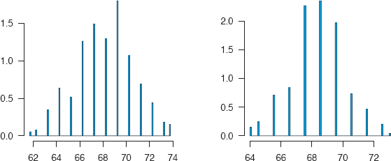
The father and son height distributions can be displayed as histograms with overlaid density estimates (Figure 3.5). Densities can only be successfully overlaid when the histogram scales are densities instead of frequencies, which is why y=..density.. is needed. Both distributions look fairly normal, as we might expect, and, if anything, an initial look would suggest that the heights of the sons look more normal than the heights of the fathers.
data(father.son, package="UsingR")
c2 <- ggplot(father.son, aes(sheight)) +
geom_histogram(aes(y = ..density..), binwidth=1) +
geom_density() + xlim(58, 80) + ylim(0, 0.16) +
xlab("ht (inches)") + ylab("") + ggtitle("Sons")
p2 <- ggplot(father.son, aes(fheight)) +
geom_histogram(aes(y = ..density..), binwidth=1) +
geom_density() + xlim(58, 80) + ylim(0, 0.16) +
xlab("ht (inches)") + ylab("") +
ggtitle("Fathers")
grid.arrange(c2, p2, nrow = 1)
Histograms and overlaid density estimates of the heights of fathers and sons from the father.son dataset in the UsingR package. Both distributions look fairly normal. For comparison purposes the plots have been common-scaled.
You have to be careful about jumping to conclusions here, or as Pearson put it in his 1903 paper with Lee: “It is almost in vain that one enters a protest against the mere graphical representation of goodness of fit, now that we have an exact measure of it.” Whether we would regard Pearson's test as an “exact measure” nowadays is neither here nor there. For the time, he was justified in his polemically demanding both graphical and analytic approaches. Since those early days, analytic approaches have often been too dominant, both are needed.
If you really want to look at normality, then Q-Q plots are best (Figure 3.6). These suggest that the fathers' heights are more normal than the sons'! Comparing these graphical impressions with some tests (shapiro.test for Shapiro-Wilk and the further five normality tests in nortest) gives a range of p-values for the fathers from 0.42 to 0.20 (so none are significant) and for the sons from 0.07 to 0.01 (where four of the six tests are significant).
par(mfrow=c(1,2), las=1, mar=c(3.1, 4.1, 1.1, 2.1))
with(father.son, {
qqnorm(sheight, main="Sons", xlab="",
ylab="", pch=16, ylim=c(55,80))
qqline(sheight)
qqnorm(fheight, main="Fathers", xlab="",
ylab="", pch=16, ylim=c(55,80))
qqline(fheight)})
Q-Q plots of the heights of fathers and sons from the dataset father.son with lines added going through the 25% and 75% quantiles. The distribution of the fathers' heights now looks more normal than the distribution of the sons' heights, because of the deviations in the upper and lower tails for the sons.
It is curious that these two famous datasets on heights of parents and children, galton and father.son, have been altered in opposite ways: Some heights in galton have been rounded and some heights in father.son have been jittered. It is always better to make the raw data available, even if they need to be amended, ‘just in case'.
Scottish hill races (best times)
The hills dataset in the package mass contains record times from 1984 for 35 Scottish hill races. The total height gained and the race distance are also included. The dataset is well known, as it is used in the introductory chapter of [Venables and Ripley, 2002]. The daag package includes some later hills data with more races in various datasets. Figure 3.7 shows a boxplot of the record times for the races in the original dataset. Four races required much longer times than the others and the distribution is skewed to the right (look at the position of the median in the box). If you look at three histograms produced by some default histograms, you will find that the truehist default is poor, the hist default is a little better, although it still does not pick out the outliers clearly, while the qplot histogram (a so-called quick option in ggplot2) does direct your attention to the outliers, while at the same time being too detailed for the races with faster record times. Formulating default settings for histograms is hard and it is simpler and more informative to draw a range of histograms with different settings.
par(mfrow=c(1,1), mar=c(3.1, 4.1, 1.1, 2.1))
with(MASS::hills,
boxplot(time, horizontal=TRUE, pch=16, ylim=c(0, 220)))
A boxplot of the record times for the hills dataset. The distribution is skew to the right with a few high outliers, races which must have been more demanding than the others.
How are the variables in the Boston dataset distributed?
The Boston housing data is a dataset from 1978 that has been analysed many times. There are two versions in R, the original one in MASS and a corrected one in DAAG, in which 5 median house values have been ‘corrected'. There are 14 variables for 506 areas in and around Boston. The main interest lies in the median values of owner-occupied homes by area and here we will use the original dataset. Default histograms (drawn with either hist(medv) or truehist(medv)) hint that there might be some interesting structure and that other binwidths or graphics might be useful, while Figure 3.8, drawn with ggplot, highlights two features: there are surprisingly many areas in the final bin and there is a sudden drop in the counts round about the middle. A binwidth matching the data units, say 1 or 2, would be better.
ggplot(MASS::Boston, aes(medv)) + geom_bar() + ylab("") +
xlab("Median housing value (thousands of dollars)")
A histogram of the median values of owner-occupied homes in the Boston dataset. The large frequency of the final bin is unusual and there appears to be a sharp decline in the middle.
At this stage you really need to examine the data directly, either with a table or with a histogram with a narrow binwidth. A table (table(medv)) is not so helpful in this case, but at least it tells us that the data are reported to one decimal place (in thousands of dollars). A histogram with a binwidth of 1 (say with truehist(medv, h=1)) confirms that there are very many values in the last bin at 50, but does not tell us much more about the break around 25.
In a full analysis it would now be a good idea to look at the rest of the dataset to see if features observed in the median values variable are related to features in other variables. That will be done in a later chapter, but in the meantime consider Figure 3.9, which displays histograms of all the variables. You can readily see the variety of possible forms a histogram may take and thinking about what each might mean is the subject of Exercise 2 at the end of the chapter. The binary variable chas has been included, not because histograms are good for binary variables, but because it is coded numerically. It is easier to leave it in, and the histogram does show the information that only a few areas have a river boundary.

Histograms of 14 variables from the Boston housing dataset. There are several different histogram forms, each telling a separate story. Default binwidths, dividing each variable's range by 30, have been used. Other scalings could reveal more information and would be more interpretable.
The code needs some explanation. The melt function creates a new dataset with all the data in one variable called BostonValues and a second variable called BostonVars defining which of the original variables a value comes from. The second line of code draws a set of histograms, one for each of the original variables, using facetting, where the option scales="free" ensures that each display is individually scaled.
library(tidyr)
B2 <- gather(MASS::Boston, BosVars, BosValues, crim:medv)
ggplot(B2, aes(BosValues)) + geom_histogram() + xlab("") +
ylab("") + facet_wrap(~ BosVars, scales = "free")Plots like these are not ideal. In particular, the default scaling of 30 bins works better for some than for others. Nevertheless, this is a quick and easy way to get an overview of the data and you can always redraw any individual plots which you think deserve a closer look. Note that the vertical scales vary from maxima of 40 to over 400. If you plot the histograms individually, choosing binwidths and scale limits are the main decisions to betaken. Occasionally the anchorpoint, where the first bin starts, and whether the bins are open to the left or to the right can make a difference. The latter becomes an issue if many points lie on bin boundaries. Compare the two histograms produced by default by hist (open to the left) and truehist (open to the right) for the variable ptratio.
with(Boston, hist(ptratio))
with(Boston, truehist(ptratio))Histograms of datasets with rounded values need to be checked for these effects. And in case you are wondering, ggplot is open to the left like hist.
It is worth considering what other plots of the variable medv might show. Here are some you could look at:
- Boxplots
boxplot(Boston$medv, pch=16)
- Jitterered dotplots
stripchart(Boston$medv, method="jitter", pch=16)
- Stem and leaf plots
stem(Boston$medv)
- Average shifted histograms
library(ash)
plot(ash1(bin1(Boston$medv, nbin=50)), type="l”)
- Density estimates with a rugplot
d1 <- density(Boston$medv)plot(d1, ylim=c(0,0.08))rug(Boston$medv)lines(density(Boston$medv, d1$bw/2), col="green")lines(density(Boston$medv, d1$bw/5), col="blue")
Some of these work much better than others in revealing features in the data. There is no optimal answer for how you find out information, it is only important that you find it. Note that what density estimates show depends greatly on the bandwidth used, just as what histograms show depends on the binwidth used, although histograms also depend on their anchorpoint. One graphic may work best for you and another may work best for someone else. Be prepared to use several alternatives.
Hidalgo stamps thickness
The dataset Hidalgo1872 is available in the package MMST, which accompanies the textbook “Modern Multivariate Statistical Techniques” [Izenman, 2008]. The dataset was first discussed in detail in 1988 in [Izenman and Sommer, 1988]. A keen stamp collector called Walton von Winkle had bought several collections of Mexican stamps from 1872-1874 and measured the thickness of all of them. The thickness of paper used apparently affects the value of the stamps to collectors, and Izenman's interest was in looking at the dataset as a mixture of distributions. There are 485 stamps in the dataset and for some purposes the stamps may be divided into two groups (the years 1872 and 1873-4). We shall examine the full set here first.
The aim is to investigate what paper thicknesses may have been used, assuming that each shows some kind of variability. Figure 3.10 displays a histogram with a binwidth of 0.001 (the measurements were recorded to a thousandth of a millimeter) and two density estimates, one using the bandwidth selected by the density function and one using the direct plug-in bandwidth, dpik, described in [Wand and Jones, 1995], used in the kde function of package ks.

A histogram and two density estimates of stamp thicknesses from the Hidalgo1872 dataset. Both the histogram and the red density estimate suggest there are at least 5 modes, implying different production runs or locations.
The histogram suggests there could be many modes, seven or even eight, depending on how you interpret the three peaks to the left of the distribution. The density estimate from density suggests there are two, and the estimate from kde suggests perhaps seven. In Izenman and Sommer's 1988 paper they found seven modes with a nonparametric approach and three with a parametric one. This is a complex issue and it underlines the value of looking at more than one display.
library(KernSmooth)
data(Hidalgo1872, package="MMST")
par(las=1, mar=c(3.1, 4.1, 1.1, 2.1))
with(Hidalgo1872, {
hist(thickness,breaks=seq(0.055,0.135,0.001), freq=FALSE, main="", col="bisque2", ylab="")
lines(density(thickness), lwd=2)
ks1 <- bkde(thickness, bandwidth=dpik(thickness))
lines(ks1, col="red", lty=5, lwd=2)})How long is a movie?
Most of the datasets in R are not very big. Examples provided by package authors are more for illustration and for showing how methods work than for carrying out full scale data analyses of large datasets. The effort involved in preparing and making available a large dataset in a usable form should never be underestimated.
Nevertheless there are some largish datasets to be found, for instance the dataset movies in ggplot2 with 58,788 cases and 24 variables (which on no account should be confused with the small dataset of the same name in UsingR with 25 cases and 4 variables, nor indeed with the larger more up-to-date version with 130,456 films in the package bigvis). Strangely, rather modestly, the help page says there are only 28,819 cases. One of the variables is the movie length in minutes and it is interesting to look at this variable in some detail, starting with the default histogram (Figure 3.11) and boxplot (Figure 3.12) using ggplot2.
ggplot(movies, aes(length)) + geom_bar() + ylab(“”)

A histogram of film length from the movies dataset. There must be at least one extreme outlier to the right distorting the scale.

A boxplot of film length from the movies dataset. (An artificial x aesthetic, here “var”, is needed when drawing single boxplots with ggplot2.) There are two very long films, longer than two days, and many that are much longer than the average film.
The histogram is hopeless, except that it does imply there must be at least one very high value to the extreme right, even if the resolution of the plot is not good enough to see it (with over 58,000 cases in the single bar on the left, one case is never going to be visible on its own, a typical problem for large datasets).
The boxplot does what boxplots do best, telling us something more about the outliers. It appears there are two particularly gross ones, one implying a film length of over three and a half days and the other with a length of about two days. Although you would think these would have to be errors, it is always best to check, if possible. With the help of something like
s1 <- filter(movies, length > 2000)
print(s1[, c("length", "title")], row.names=FALSE)
ggplot(movies, aes("var", length)) + geom_boxplot() +
xlab("") + scale_x_discrete(breaks=NULL) + coord_flip()you can find out the titles of the films and their length and then check if they really exist by Googling them. It turns out they do! Slightly bizarrely, the second longest film in the dataset is called “The Longest Most Meaningless Movie in the World”. It must have been a shock for the makers to discover that their film wasn't. Incidentally, this version of the dataset is no longer up-to-date and there are now some even longer films.
Clearly the extreme outliers should be ignored, and for exploring the main distribution of movie lengths it makes sense to set some kind of upper limit. Over 99% are less than three hours in length, so we will restrict ourselves to them. Having got rid of the outliers, another boxplot does not make a lot of sense and a stem and leaf plot or a dotplot (whether jittered or not) is clearly out of the question. A density estimate could be interesting, but might miss possible heaping or gaps, if these features are present. Figure 3.13 shows a histogram with the natural binwidth of 1 minute. (Any other value might miss some feature of the raw data and with such a large dataset there can be no concerns about having too many bins, you just have to ensure that the plot window is wide enough.) Several features now stand out:
- There are few long films (i.e., over two and a half hours).
- There is a distinct group of short films with a pronounced peak at a length of 7 minutes.
- There is, unsurprisingly, a sharp peak at a length of 90 minutes. Perhaps we would have expected an even sharper peak.
- There is clear evidence of round numbers being favoured; as well as a length of 90 minutes, you also find 80, 85, 95, 100, and so on.
ggplot(movies, aes(x = length)) + xlim(0,180) +
geom_histogram(binwidth=1) +
xlab("Movie lengths in minutes") + ylab("")
A histogram of film lengths up to 3 hours from the movies dataset. The most frequent value is 90 minutes and values are often rounded to the nearest 5 minutes. The most frequent time for short films is 7 minutes.
3.4 Comparing distributions by subgroups
When a population is made up of several different groups, it is informative to compare the distribution of a variable across the groups. Boxplots are nearly always best for this, as they make such an efficient use of the space available. Figure 3.1 showed the voting support of Die Linke party in Germany and claimed that the form was due to regional differences. Figure 3.14 shows boxplots of the support by Bundesland and you can see that apart from Berlin, which divides into East and West, the boxplots split into two distinct groups, basically the new Bundesländer plus Saarland (higher support) and the old Bundesländer minus Saarland (lower support). Although the boxplots convey a lot of information in a limited space, they have two disadvantages: If a distribution is not unimodal (e.g., Berlin), you can't see that, and it is difficult to convey information on how big the different groups are. Neither is serious, but you need to be aware of them. The option varwidth sets the boxplot widths proportional to the square root of the number of cases. Another alternative is to draw an accompanying barchart for the numbers in each group (cf. Figure 4.1).
btw2009 <- within(btw2009, Bundesland <- state)
btw2009 <- within(btw2009, levels(Bundesland) <- c("BW", "BY", "BE", "BB",
"HB", "HH", "HE", "MV", "NI", "NW","RP", "SL", "SN", "ST", "SH", "TH"))
ggplot(btw2009, aes(Bundesland, Linke2)) + geom_boxplot(varwidth=TRUE) + ylab("")
Boxplots of Die Linke support by Bundesland. Standard abbreviations for the Bundesländer have been added to the dataset to make the labels readable. In the old East (BB, MV, SN, ST, TH) Die Linke were relatively strong, in the old West they were weak, apart from in Saarland (SL). Berlin (BE), made up of East and West, straddles both groups. Boxplot widths are a function of Bundesland size.
3.5 What plots are there for individual continuous variables?
To display continuous data graphically you could use a
histogram grouping data into intervals, and drawing a bar for each interval, shows the empirical distribution.
boxplot displaying individual outliers and robust statistics for the data, useful for identifying outliers and for comparisons of distributions across subgroups.
dotplot plotting each point individually as a dot, good for spotting gaps in the data.
rugplot plotting each point individually as a line, often used as an additional plot along the horizontal axis of another display.
density estimate plotting an estimated density of the variable's distribution, so more like a model than a data display.
distribution estimate showing the estimated distribution function, useful for comparing distributions, if one is always ‘ahead' of another.
Q-Q plot comparing the distribution to a theoretical one (most often a normal distribution).
And there are other possibilities too (e.g., frequency polygon, P-P plot, average shifted histogram, shorth plot, beanplot).
R's default for plot is to draw a scatterplot of the variable against the case index. This can be useful (e.g., showing if the data have been sorted in increasing order or that the first few values or last few values are different from the others), mostly it is not. Different analysts may favour different kinds of displays, for instance I like histograms and boxplots. Pronounced features will probably be visible in all plots.
For more subtle effects the best approach in exploratory analysis is to draw a variety of plots. There is some general advice to follow, such as histograms being poor for small datasets, dotplots being poor for large datasets and boxplots obscuring multimodality, but it is surprising how often even apparently inappropriate graphics can still reveal information. The most important advice remains—which is why it is now repeated—to draw a variety of plots.
If data are highly skewed it may be sensible to consider transforming them, perhaps using a Box-Cox transformation. Graphical displays can help you appraise the effectiveness of any transformation, but they cannot tell you if they make sense. You should consider the interpretation of a transformed variable as well as its statistical properties.
3.6 Plot options
- Binwidths (and anchorpoints) for histograms
There is an intriguing and impressive literature on the data-driven choice of binwidths for histograms. [Scott, 1992] and articles by Wand (for example, [Wand, 1997]) are reliable sources. In practice there are often good reasons for choosing a particular binwidth that is not optimal in a mathematical sense. The data may be ages in years, or times in minutes, or distances in miles. Using a non-integer binwidth may be mathematically satisfying, but can conceal useful empirical information. It is important to remember that histograms are for presenting data; they are poor density estimators. There are far better approaches for estimating a possible density generating the data. And it is worth bearing in mind that methods for determining optimal histogram binwidth assume a given anchor-point, i.e., the starting point of the first bin. Both display parameters should really be used for optimisation. In his package ggplot2 Wickham does not attempt to find any ‘optimal' choice, but uses 30 bins and prints a message explaining how to change the binwidth. That is a practical solution.
- Unequal binwidths
When they introduce histograms, some authors like to point out the possibility of using unequal binwidths. While the idea is theoretically attractive, it is awkward to apply in practice and the displays are confusing to interpret. If you still want to do it, consider a variable transformation instead.
- Bandwidth for density estimates
Binwidth is crucial for histograms and bandwidth is crucial for density estimates. There are many R packages offering different bandwidth formulae and it is not obvious which to recommend. It is more effective to experiment with a range of bandwidths. Since you can overlay several density estimates on a single plot, it is easy to compare them, just use different colours to make them stand out.
- Boxplots
Tukey's definition of a boxplot distinguishes between outliers (over 1.5 times the box length away from the box) and extreme outliers (over 3 times the box length away from the box), while many boxplot displays do not. In fact, there are frustratingly many different boxplot definitions around, so you should always confirm which one is used in any plot. Some do not mark outliers, some use standard deviations instead of robust statistics, there are all sorts of variations.
A set of boxplots in the same window can be either boxplots for the same variable with one for each subgroup or boxplots for different variables. It is necessary to know which type you have in front of you. Boxplots by group must have the same scale and could be drawn with their width a function of the size of the group. Boxplots of different variables may have different scales and each case appears in each boxplot (apart from missing values), so that there is no need to consider different widths.
3.7 Modelling and testing for continuous variables
- Means
The most common test for continuous data is to test the mean in some way, either against a standard value, or in comparison to the means of other variables, or by subsets. Mostly a t-test is used. It would be invidious to select a reference here as there are so many texts covering the topic. Alternatively medians may be tested, especially in conjunction with using boxplots.
- Symmetry
[Zheng and Gastwirth, 2010] discusses several tests of symmetry about an unknown median and also proposes bootstrapping to improve the power of the tests.
- Normality
There are a number of tests for normality (e.g., Anderson-Darling, Shapiro-Wilk, Kolmogorov-Smirnov). These have low power for small samples and may be rather too powerful for really large samples. A large sample will tend to have some feature that will lead to rejection of the null hypothesis. There is a book on testing for normality [Thode Jr., 2002] and there is an R package nortest which offers five tests to add to the Shapiro-Wilk test offered in the stats package that comes with R. Tests assess the evidence as to whether there has been some departure from normality, while graphics, especially Q-Q plots, help identify the degree and type of departure from normality.
- Density estimation
There are too many packages in R which offer some form of density estimation or other for it to be possible to list them all. They fit density estimates, but do not test. Choose the one (or ones) that you think are good and use it (or them). Bear in mind that densities for variables with strict boundaries (e.g., no negative values) need special treatment at the boundaries. At least one of the R packages, logspline, offers an option for this problem. Most do not.
- Outliers
The classic book on outliers [Barnett and Lewis, 1994] describes many tests for outliers, mostly for univariate distributions and individual cases. How useful they may be depends on the particular application. As the book counsels, you need to watch out for both masking (one group of outliers prevents you recognising another) and swamping (mistaking standard observations for outliers).
- Multimodality
Good and Gaskin introduced the term ‘Bump-Hunting' for looking for modes in an oft-cited article [Good and Gaskins, 1980]. The dip test for testing for unimodality was proposed in [Hartigan and Hartigan, 1985] and it is available in R in the appropriately named package diptest.
Main points
- There are lots of different features that can arise in the frequency distributions of single continuous variables (e.g., Figure 3.9).
- There is no optimal type of plot and no optimal version of a plot type. Look at several different plots and several different versions of each (cf. §3.3).
- Natural binwidths based on context are usually a good choice for histograms (e.g., Figures 3.1 and 3.13).
- Histograms are good for emphasising features of the raw data, while density estimates are better for suggesting underlying models for the data (e.g., Figures 3.5 and 3.10).
- Boxplots are best for identifying outliers (Figure 3.12) and for comparing distributions across subgroups (Figure 3.14).
Exercises
- Galaxies
The dataset galaxies in the package MASS contains the velocities of 82 planets.
- (a) Draw a histogram, a boxplot, and a density estimate of the data. What information can you get from each plot?
- (b) Experiment with different binwidths for the histogram and different bandwidths for the density estimates. Which choices do you think are best for conveying the information in the data?
- (c) How many plots do you think you need to present the information? Which one(s)?
- Boston housing
The dataset is called Boston from the package mass.
- (a) Figure 3.9 displays histograms of the 14 variables. How would you describe the distributions?
- (b) For which variables, if any, might boxplots be better? Why?
- Student survey
The data come from an old survey of 237 students taking their first statistics course. The dataset is called survey in the package MASS.
- (a) Draw a histogram of student heights and overlay a density estimate of the data. Is there evidence of bimodality?
- (b) Experiment with different binwidths for the histogram and different bandwidths for the density estimates. Which choices do you think are best for conveying the information in the data?
- (c) Compare male and female heights using separate density estimates that are common scaled and aligned with one another.
- Movie lengths
The movies dataset in the package ggplot2 was introduced in §3.3.
- (a) Amongst other features we mentioned the peaks at 7 minutes and 90 minutes. Draw histograms to show whether these peaks existed both before and after 1980.
- (b) One variable, Short says whether a film was classified as a ‘short' film (‘1’) or not (‘0’). What plots might you draw to investigate which rule was used to define ‘short' and whether the films have been consistently classified? (Hint: make sure you exclude the high outliers from your plots or you won't see anything!)
- Zuni educational funding
The zuni dataset in the package lawstat seems quite simple. There are three pieces of information about each of 89 school districts in the U.S. State of New Mexico: the name of the district, the average revenue per pupil in dollars, and the number of pupils. This apparent simplicity hides an interesting story. The data were used to determine how to allocate substantial amounts of money and there were intense legal disagreements about how the law should be interpreted and how the data should be used. Gastwirth was heavily involved and has written informatively about the case from a statistical point of view, [Gastwirth, 2006] and [Gastwirth, 2008]. One statistical issue was the rule that before determining whether district revenues were sufficiently equal, the largest and smallest 5% of the data should first be deleted.
- (a) Are the lowest and highest 5% of the revenue values extreme? Do you prefer a histogram or a boxplot for showing this?
- (b) Having removed the lowest and highest 5% of the cases, draw a density estimate of the remaining data and discuss whether the resulting distribution looks symmetric.
- (c) Draw a Q-Q plot for the data after removal of the 5% at each end and comment on whether you would regard the remaining distribution as normal.
- Non-detectable
The dataset CHAIN from the package mi includes data from a study of 532 HIV patients in New York. The variable h39b.W1 records, according to the R help page, ‘log of self reported viral load level at round 6th (0 represents undetectable level)'. Using the function table(CHAIN$h39b.W1) you can find out that there are 188 cases with value 0, i.e., with undetectable levels. Further examination of the dataset (using mi.info(CHAIN), for instance) reveals that additionally 179 cases have missing values for h39b.W1. What plots would you draw to show the distribution of the variable CHAIN$h39b.W1?
- (a) with the 0 values?
- (b) without the 0 values?
- Diamonds
The set diamonds from the package ggplot2 includes information on the weight in carats and price of 53,940 diamonds.
- (a) Is there anything unusual about the distribution of diamond weights? Which plot do you think shows it best? How might you explain the pattern you find?
- (b) What about the distribution of prices? With a bit of detective work you ought to be able to uncover at least one unexpected feature. How you discover it, whether with a histogram, a dotplot, a density estimate, or whatever, is unimportant, the important thing is to find it. Having found it, what plot would you draw to present your results to someone else? Can you think of an explanation for the feature?
- Intermission
Albrecht Dürer's preparatory drawing Praying Hands is in the Albertina Museum in Vienna. Could the person whose hands are portrayed have worked several years in a mine? What does that say about the story of the origin of the picture circulating on the web?
1He added “This is an overstatement from the practical point of view... “ [Geary, 1947]