
9 VISUAL DESIGN
What a thing is and what it means are not separate … The perception of what a thing is and the perception of what it means are not separate, either.
James J. Gibson (1982)
INTRODUCTION
In previous chapters, we have stressed the importance of avoiding premature commitment to visual details when sketching and prototyping interfaces. Yet there comes a point in the development of any interface where visual design inevitably becomes the focus of attention.
Visual design is a specialist skill, which takes years of training and practice to acquire to a professional level. A thorough mastery of it is a very long way beyond the scope of this book. However, we can at least introduce some of the basic concepts that underpin visual designers’ work, and which can potentially be used by anyone to improve the layout of an interface in a simple way. In this chapter we examine the ideas of proximity, alignment, repetition and contrast. We discuss the use of metaphors in visual design. Finally, we consider the place of eye-tracking techniques in evaluating visual design, and introduce some of the key terminology.
LEARNING OBJECTIVES
After reading this chapter you will be able to:
|
Remember |
|
|
Understand |
|
WHAT IS VISUAL DESIGN?
As we discussed in Chapter 3, the term ‘design’ is used in a variety of senses, and even ‘visual design’ suffers from the same problem. For this reason, the syllabus for the BCS Foundation Certificate in User Experience adopts a very specific definition listing four elements:

Definition: visual design
The practice of devising grids, laying out pages, choosing colour palettes and developing icons
The syllabus includes some details about the first two items, but not the last two. For more information on all these topics, see Williams (2014) and some of the more specialised texts referenced in the ‘Further reading’ section at the end of this chapter. A related subject, not explicitly mentioned in the definition, is typography – the art of choosing or designing typefaces – which is also covered by Williams (2014) and others.
To the non-specialist, visual design can seem a mysterious craft – ‘creative’ and therefore somehow not governed by the same sort of rational calculations that we have described elsewhere. It is important to remember that one of the key goals of the visual designer is, or should be, the same as that of the interaction designer: to help the user to find, understand, remember and use the resources offered by the system.
PRINCIPLES OF LAYOUT AND FORMATTING
Robin Williams (2014) describes four principles of layout and formatting, which are effective and universally applicable because they are fundamentally rooted in the way that human beings perceive things. They are proximity, alignment, repetition and contrast.

PARC
The four basic principles of layout and formatting can be remembered using the mnemonic PARC:
P proximity
A alignment
R repetition
C contrast
PARC also happens to stand for the Palo Alto Research Center, where the GUI was invented. Other memorable arrangements of the same four letters are possible – for example, CARP.
Proximity
Proximity is about things being close to each other. When we see things located close together, we perceive them as a group and tend to assume, rightly or wrongly, that they are related to each other. When things are not close together, we assume that they are not connected. We can exploit this feature of human perception when designing an interface. Grouping related items together and putting plenty of negative space between unrelated groups of things makes it easier for the user to see the relationships and discern the inherent structure of the information. Following this principle should result in a screen with a handful of clearly separate groups of information. This makes it more likely that the user will find the information they need and remember it.
A common mistake of inexperienced designers is to leave insufficient negative space on the page, which makes the groupings of content less evident.
Alignment
We see the alignment principle at work every time we read a newspaper or a book. Every item on the page should be placed in such a way that at least one of its edges is aligned with other elements on the page. For example, each paragraph on this page is aligned with the other paragraphs along both its left and its right edges. This creates a strong sense of clarity and organisation. It allows the reader to focus on the meaning of the words, rather than on trying to find a visual structure. If a layout has no apparent structure, a portion of our mental energy will be dissipated uselessly in trying to find one.
When a screen has been organised with attention to this principle, invisible but nevertheless very clear lines demarcating the areas of content will be apparent to the user. In fact, designers lay out pages with these lines, as defined by grid systems.
Another common ‘rookie error’ is to over-use centred text. A centred layout has no clear alignment. This makes the content harder to read and understand.
Repetition
Whereas alignment creates harmony by organising the edges of items on the screen in an orderly way, repetition creates unifying threads or motifs that run through the entire visual design. If you look at any well-designed website you will see many examples of repetition, for example:
- The headings and subheadings use a consistent typeface and font size.
- The normal text uses a consistent typeface and font size.
- Margins around individual items and around the main display are a consistent width.
- A small set of colours is used consistently.
- ‘Glyphs’ or small images that form part of the text formatting (such as the bullet points in this list) all look the same.
- Lists of items use the same format for each separate item, whether it is a short word or phrase in a navigation control, or a relatively complicated item with its own internal structure, perhaps including an image, a subheading and so on.
Contrast makes a display interesting and attractive, unlike the dull and unappealing interfaces that the users of desktop software were used to for many years. Contrast is achieved, for example, by using headings and subheadings that are not just slightly larger than normal text, but much larger and a different colour; or by having areas of the screen that invert the colour scheme so that the foreground and background colours are reversed.
A third common mistake of inexperienced designers is to be too timid about the contrast between the size of headings and the size of normal text. As Williams (2014) says, ‘If two items are not exactly the same, then make them different. Really different.’
VISUAL METAPHORS
An important part of designing a system’s conceptual model (see Chapter 7) is the selection of one or more appropriate metaphors for the system. A metaphor helps the user to understand a system by using concepts that they can easily relate to. The metaphor may be based directly on objects in the task domain, or alternatively it may simply be chosen because it provides a strong, unifying idea that is well suited to modelling the task domain. For example, an ecommerce website may use the metaphor of a shop, or a workflow system may use terms relating to an assembly line.
Sometimes a metaphor is effective even though it does not seem to provide a very good mapping of the task domain. For example, the best-known metaphor to many computer users is the ‘desktop’ metaphor, which conjures up a physical desktop that includes such unlikely ideas as folders within folders, a trash can or waste bin that sits on the desktop, and windows that can appear and disappear on top of it. Conversely, following a real-world metaphor too closely can undermine its effectiveness and try the user’s patience. The best metaphors sometimes take a single idea from the real physical world, such as a pin-board in Pinterest, but do not treat it too literally.
Similar considerations apply when we think about the visual representation of concepts in the system. A visual metaphor can be a helpful way of making information easier to see and understand. Icons are an example of this, provided that they are used to supplement textual labels rather than to replace them. The power of an icon is a function of its distinctiveness and familiarity, rather than its direct relevance to the topic. Many common icons are stylised versions of physical objects in an old-fashioned or obsolete form, such as a floppy disk icon for the ‘Save’ function.
When designing an interface for use by an international audience, it is tempting to sidestep language translation issues by using icons instead of textual labels. An example of this can be seen in the iconography used at airports, for example. However, caution is needed. Icons do not always translate well across cultures. For example, a ‘thumbs-up’ indicates approval to a British or American person, but is an offensive gesture in some cultures.

Too much metaphor
When a real-world object is being used as a visual metaphor, its physical attributes should not be slavishly reproduced on a digital display. This is known as skeuomorphism, and can be seen, for example, in Apple’s iOS6, where some applications carefully mimic the grain of a wooden bookshelf or the stitching in a leather-bound notebook. These details are distracting and clutter the user interface for no good reason. A computer is a computer, after all, and digital displays should not pretend to be something else.
EYE TRACKING
Although using the layout and formatting principles discussed above will go some way towards making sure that the user can locate the information that they need without too much trouble, sometimes we need experimental data that will tell us exactly how well our layout supports the user’s needs. To do this, the best approach is often to use a straightforward task-based evaluation as described in Chapter 11. To give an extra level of empirical data, we can carry out eye-tracking, which uses special-purpose equipment to measure where the user is looking at any given moment, and where they look next.
Only a very small area in the centre of our visual field allows us to see clearly, with so-called foveal vision. This means that, although we are not usually aware of it, we move our eyes quite often, typically three to four times a second, in order to focus on different things. These small movements are called saccades. Eye-tracking equipment directs infrared light at a user’s eyes and measures the reflection of it from different parts of the eye to determine exactly where they are looking – the point of gaze – and to identify the saccades that occur.
In a UX context, there are two types of output that are commonly derived from an eye-tracking experiment. The first is a gaze plot as shown in Figure 9.1, which shows what is displayed on the screen and superimposes on it a representation of the different points of gaze recorded during one user’s session with the interface.
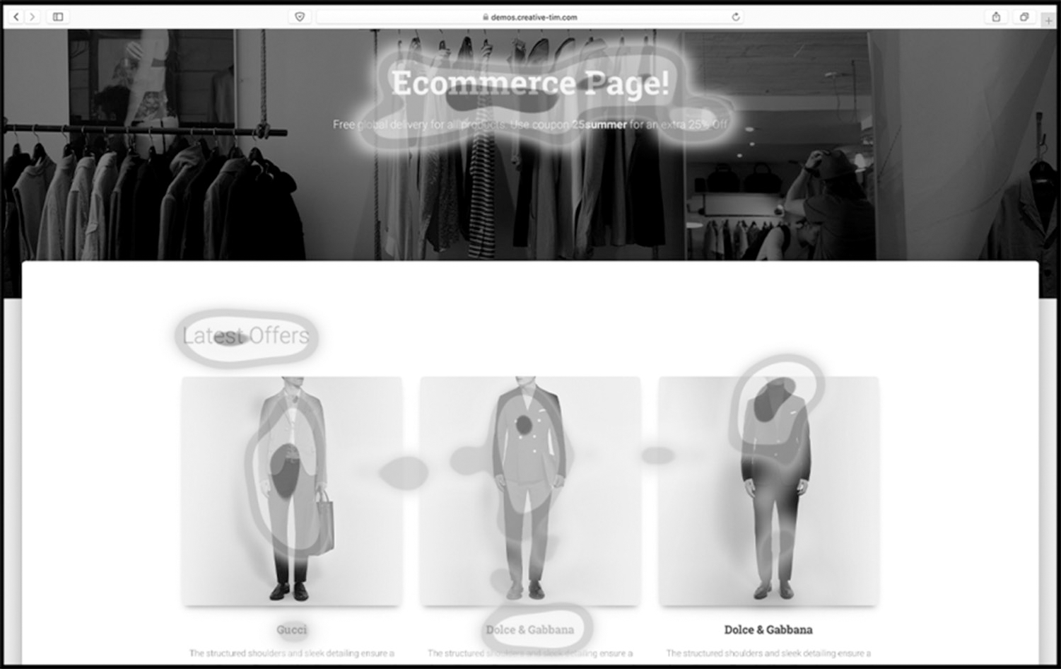
The second type of output is a heat map, as shown in Figure 9.2. This can show findings from a single user or an aggregation of all the findings from many users, and shows us which parts of the display were looked at for the longest time.
Gaze plots and heat maps can give us valuable information about parts of a layout that attract, or fail to attract, the user’s attention at appropriate or inappropriate moments. One well-known general finding from eye-tracking research (Nielsen, 2006) tells us that visitors to a web page tend to look at it in an F-shaped pattern. First, they read across the top of the main content (not the page header). Then their gaze shifts down a little and again goes from left to right, but this time not so far across. Finally, they scan vertically down the left-hand side of the page content. These three movements make the shape of a capital F. In response to this, not only should we place important information in the first two paragraphs of a page, but key words should be right at the beginning of the sentences that start those paragraphs.
Figure 9.1 Gaze plot (Image courtesy of Tobii AB)
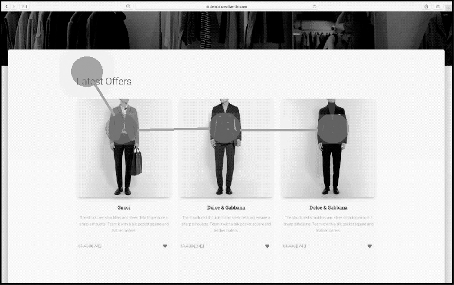
Figure 9.2 Heat map (Image courtesy of Tobii AB)
It is likely that the F pattern has its basis in the reading order naturally imposed by languages such as English, which are read from top to bottom and from left to right. Consequently, it is particularly relevant when the page’s content is mainly textual. Some research (e.g. Djamasbi et al., 2011) suggests that where images form the main part of the content, readers can be encouraged to make better use of the whole screen by distributing images evenly over its area. A similar effect may be achieved with text by formatting it into self-contained boxes spread across the screen. Other findings include the following:
- Long paragraphs are often not read, wherever they are placed.
- Images tend to divert the viewer’s attention away from text.
- Photographs of people’s faces attract attention particularly strongly.
- However, content (especially images) that the reader judges to be an advertisement will usually be ignored – this is referred to as banner blindness.
- Text and other content that is not relevant to the user’s immediate goal will tend not to be noticed.
SUMMARY
Visual design is about devising grids, laying out pages, choosing colour palettes and developing icons.
The layout of any page, in terms of the user’s ability to perceive its structure and content, can potentially be improved by using the elements of the mnemonic PARC:
- Proximity: group related items together and put plenty of space between unrelated groups of things.
- Alignment: line up the edges of text blocks, images and other content, particularly at the top and left.
- Repetition: make things look the same as each other, so that any differences can be seen more clearly.
- Contrast: when two items serve a different purpose, make them look clearly distinct from each other.
A metaphor based on a simple, real-world idea like a desktop or a playlist can make an interface easier to grasp by providing a powerful unifying concept. Metaphors work best when they are not overdone. Icons need to be clear and distinctive rather than realistic, and can be subject to culture-specific interpretation.
We can get accurate data on exactly where test participants are looking at any one time by using eye tracking. A user can only look at one small area at a time – this is the point of gaze. The small involuntary movements of the eye from one point of gaze to another are called saccades. A gaze plot shows the sequence of these eye movements during a user’s session. A heat map can show the areas of the page that attracted users’ attention for the longest periods. A website user’s typical approach to reading a page of text is to read the top few rows and then down the left-hand site in an F pattern.
Djamasbi, S., Siegel, M. and Tullis, T. (2011) Visual hierarchy and viewing behavior: An eye tracking study. In International Conference on Human-Computer Interaction (pp. 331-340). Springer, Berlin, Heidelberg.
Gibson, J.J. (1982) The affordances of the environment. In Reed, E.S. and Jones, R. (eds), Reasons for Realism: Selected Essays of James J. Gibson. Lawrence Erlbaum Associates, Inc, Hillsdale, NJ.
Nielsen, J. (2006) F-Shaped Pattern for Reading Web Content. Nielsen Norman Group, Fremont, CA.
Pernice, K. (2017) F-Shaped Pattern of Reading on the Web: Misunderstood, But Still Relevant (Even on Mobile). Nielsen Norman Group. Available from: https://www.nngroup.com/articles/f-shaped-pattern-reading-web-content/
Williams, R. (2014) The Non-Designer’s Design Book: Design and Typographic Principles for the Visual Novice. Pearson Education, San Francisco.
FURTHER READING
Albers, J. (2013) Interaction of Color. Yale University Press, New Haven, CT.
Bergstrom, J.R. and Schall, A. (eds) (2014) Eye Tracking in User Experience Design. Elsevier, Waltham, MA.
Bojko, A. (2013) Eye Tracking the User Experience: A Practical Guide to Research. Rosenfeld Media, Brooklyn, NY.
Golombisky, K. and Hagen, R. (2013) White Space Is Not Your Enemy: A Beginner’s Guide to Communicating Visually through Graphic, Web & Multimedia Design. Taylor & Francis, Burlington, MA.
Jarrett, C. and Gaffney, G. (2008) Forms That Work: Designing Web Forms for Usability. Morgan Kaufmann, Burlington, MA.
Leborg, C. (2006) Visual Grammar. Princeton Architectural Press, New York.
Lidwell, W., Holden, K. and Butler, J. (2010) Universal Principles of Design, Revised and Updated: 125 Ways to Enhance Usability, Influence Perception, Increase Appeal, Make Better Design Decisions, and Teach through Design. Rockport Publishers, Beverly, MA.
Lupton, E. (2014) Thinking with Type: A Critical Guide for Designers, Writers, Editors, & Students. Chronicle Books, San Francisco, CA.
Lynch, P.J. (2008) Web Style Guide. Yale University Press, New Haven, CT.
Mullet, K. and Sano, D. (1995) Designing Visual Interfaces: Communication Oriented Techniques. Prentice-Hall, Inc, Englewood Cliffs, NJ.
Tufte, E. (1983) The Visual Display of Quantitative Information. Graphics Press, Cheshire, CT.
Wroblewski, L. (2008) Web Form Design: Filling in the Blanks. Rosenfeld Media, Brooklyn, NY.
1. In a usability study, a researcher needs to understand where the user’s point of gaze is directed while completing an on-screen form. Which technique is MOST appropriate?
a. A retrospective protocol
b. A/B testing
c. Eye tracking
d. A summative usability test
2. Eye-tracking research shows that users’ gaze patterns when reading web content tend to form what kind of shape?
a. An L shape
b. An F shape
c. A W shape
d. A C shape
3. The practice of creating strong lines that keep the viewer focused and cause the page to look elegant exploits which principle of visual design?
a. Contrast
b. Repetition
c. Proximity
d. Alignment
4. Match the following terms to their definitions.
1. Saccade
2. Gaze plot
3. Heat map
4. Fixation
W. A representation of the different areas of the screen where the user has spent the most time looking
X. A pause of the eye movement on a specific area of the visual field
Y. A moment-by-moment representation of a user’s eye movement across the screen
Z. Rapid eye movements
a. 1X, 2W, 3Y, 4Z
b. 1X, 2Y, 3W, 4Z
c. 1Z, 2Y, 3W, 4X
d. 1Z, 2W, 3Y, 4X
1. The correct answer is (c).
(a) is sometimes used in combination with eye tracking to understand why the user was looking in a particular place, but on its own it will not provide the answer the researcher needs. (b) is the wrong answer because A/B testing is a technique used to compare two alternative designs with a large number of users and provides no details on eye tracking. (d) is the wrong answer because a summative usability test is used to measure effectiveness, efficiency and satisfaction and provides no details on eye tracking. This leaves (c) as the correct answer.
2. The correct answer is (b).
The evidence for the F shape is from Pernice (2017). Although it doesn’t form a perfect ‘F’, it certainly doesn’t look like a W, L or C. So option (b) is the correct answer.
3. The correct answer is (d).
(a) is wrong: the purpose of contrast is to organise the screen and make it more interesting. (b) is wrong because the purpose of repetition is to create consistency and to add visual interest. (c) is wrong because the purpose of proximity is to organise and group the various parts of the UI. This leaves (d) as the correct answer.
4. The correct answer is (c).
These terms are clearly defined in the eye-tracking literature but students sometimes confuse ‘fixation’ with ‘saccade’ and ‘gaze plot’ with ‘heat map’ so the answers have been carefully ordered to test for this confusion. (c) is the only correct answer.