
7 INFORMATION ARCHITECTURE
The most important component to design properly is … the user’s conceptual model. Everything else should be subordinated to making that model clear, obvious and substantial. That is almost exactly the opposite of how most software is designed.
David Liddle, lead designer of the Xerox Star system (1996)
INTRODUCTION
This chapter defines the discipline of information architecture and discusses some of its key concepts. We examine five different ways in which information can be organised and present the LATCH mnemonic for remembering them. We describe how to do card sorting, an objective method for ensuring that we organise the content and functions of a user interface in a way that makes sense to users. We discuss three different types of models of a system – the mental model, conceptual model and implementation model – and define the concept of affordance.
LEARNING OBJECTIVES
After reading this chapter you will be able to:
|
Remember |
|
|
Understand |
|
|
Apply |
|
WHAT IS INFORMATION ARCHITECTURE?
Chapters 8 and 9 discuss aspects of detailed design – the nuts and bolts of what makes a user interface usable or otherwise. But there is no point paying attention to the details if we do not also think about the big picture – how the user thinks about the product or service as a whole, and how they find information and functionality. These are the concerns of the information architecture (IA) discipline: ensuring that users can understand the interface and find the functions, features or content they need to achieve their tasks.

A user’s interaction with a product, system or service is a conversation that progresses through a series of stages. We can think of the conversation as a two-way flow of information. At each stage, the user has to make sense of what the system is about, what resources and options are being offered, and what action and information is expected from them in order to reach the next stage. We must design the system so that the user always has sufficient information to understand the current state of the conversation and to proceed to the next stage.
For this to happen,
- The resources available via the interface must be organised in a way that is adapted to the kinds of task that the users will be carrying out. The next section, ‘Organisational schemes for Information’, describes a way of making sure that we take a broad view when thinking about this.
- Not only should the organisational scheme be objectively suitable for carrying out the tasks, it should also match the way that the users think about them. The ‘Card sorting’ section presents a technique that helps with this.
- The way that the system appears to work should match the way that users expect it to work, and both should match the way it actually does work. We use the terms conceptual model, mental model and implementation model to denote these three things, as described under ‘Mental, conceptual and implementation models’, below.
At a more detailed level, the elements of the user interface must be presented in a way that makes their purpose evident, as described under ‘Affordances’, below.
ORGANISATIONAL SCHEMES FOR INFORMATION
How exactly do you come to be reading this particular page of this book? Maybe you are reading it from cover to cover, and this is the point you have reached in that sequential journey. Perhaps there was a bookmark or sticky note indicating this page, allowing you to go directly to it. Perhaps you looked up a term such as ‘information architecture’ in the Index. Or maybe you browsed through the list of headings in the Contents and decided to dip in here. These all represent time-honoured alternative ways of accessing the same information in a printed book. Equally, when we design a service or information system of any sort, we need to provide a carefully chosen set of ways for people to understand what they are dealing with, to grasp its scope and structure, and to find information and functionality in various circumstances.
Richard Saul Wurman (2000) proposes a taxonomy of organisational schemes for information and offers the acronym ‘LATCH’ for remembering them.
- Location: A list of headings indicating towns, countries or other geographical areas organises information according to location. A map not only does that, but it makes it possible to see and explore geographical or spatial relationships. When the user is looking for a resource relating to a given location, a map is the natural way of showing an overview of possibilities. If the device is location-aware, it can automatically show a map of the resources closest to the user’s current location. A display based on a smaller scale can help the user to explore a complicated structure, such as a machine or biological organism.
- Alphabet: Alphabetical order is a good default scheme when no other scheme seems to suggest itself, especially when there is a large amount of data to sort.
- Time: Time, or date, is often a natural way of ordering a list of information items that represent past or future events. For example, a list of email messages could be ordered by ‘Time Sent’. Using time as an organisational scheme and mapping it onto a spatial representation makes it possible to display and compare information about sequence, duration and frequency in a graphical form.
- Category: For any given set of items that needs to be organised and presented, there is likely to be a choice of various attributes, types or categories that could be used. For example, the same list of email messages could be filtered or searched by ‘Subject’ or ‘Sender’.
- Hierarchy: It might have been more appropriate to name this item ‘Rank’, but that would not make a good acronym. Wurman does not mean a ‘hierarchical’ arrangement like the structure of a chart showing reporting lines within a company. He is instead referring to any organisational scheme based on comparative ranking, such as ‘Price’, ‘Size’ or ‘Rating’. Hierarchy in the more common sense is also used as an organisational scheme – for example, as described in the discussion on card sorting below.
CARD SORTING
A very popular organisational scheme used for both the pages of websites and the functionality of software applications is a hierarchical arrangement, where the individual pages or commands are organised into named groups. In its simplest form, this leads to a two-level navigation structure consisting of the group names on the first level, with the items themselves on the second level. When there is a lot of content, the groups themselves are organised into higher-level groups, resulting in a hierarchy with three or more levels. However, it is generally the case that the more levels there are, the more likely users are to become disorientated and fail to achieve their intended goal.
How can we decide what names to give the groups in such a way as to maximise the chances of the user finding what they are looking for? The answer is to use card sorting, another wonderful user research technique for making decisions on the basis of objective evidence about users, rather than the designer’s opinion. There are two types of card sort:
- An open card sort, where participants decide on the groups for themselves.
- A closed card sort, where participants assign each item to one of a predefined set of groups.
The two techniques can be used in conjunction with each other, with an open sort followed by a closed sort. The steps in this method are as follows, as summarised in Figure 7.1.
Figure 7.1 Key steps in conducting a card sorting exercise
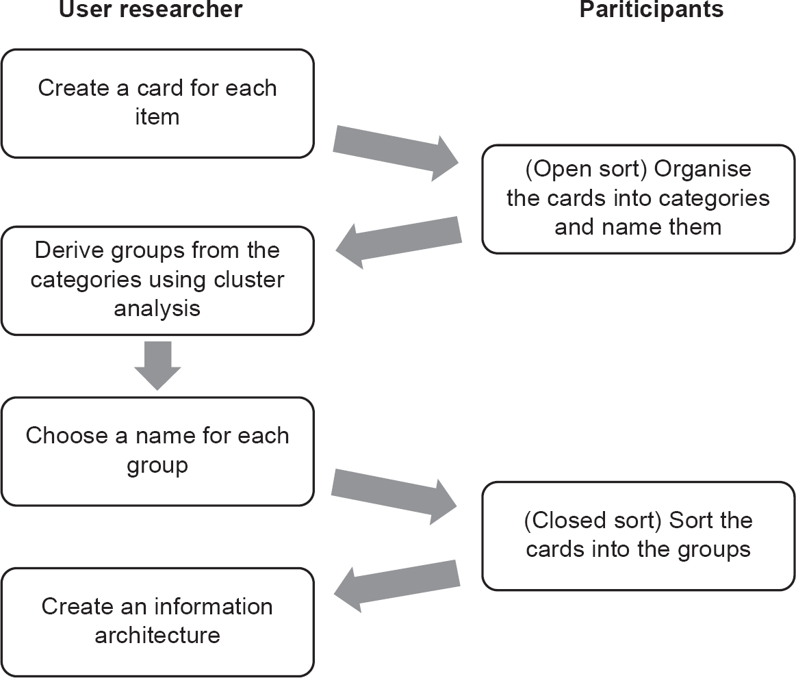
1. The user researcher creates a card for each item: Create a set of cards (or pieces of paper), one set per participant. These should be roughly the size of index cards or A6. Print on each card the name or description of the item. This should be expressed in clear, neutral language as concisely as possible. You should be prepared to explain the meaning of the item names to participants if they ask. If this happens, make a note of it.
2. (Open sort) The participants organise the cards into categories and name them: Ask the users to put the cards into as many groups as they think appropriate. Once they have finished, ask them to use a blank card to write a name for each group that they have created. The name does not necessarily have to be concise: it just has to clarify what this group of items have in common. Record all the information on the groups in a spreadsheet or special-purpose software tool.
3. The user researcher derives groups from the categories using cluster analysis: The next stage is to come up with a set of groups that represents the consensus view on the most appropriate set of groups. There is a mathematical technique for this called monothetic agglomerative cluster analysis, which identifies which cards are most often assigned to the same group as each other. In most cases, there will be a reasonably clear consensus. If two or more different schemes emerge as equally strong contenders, there may be a case for providing alternative navigation schemes.
4. The user researcher chooses a name for each group: For each item, we need to identify the most effective trigger word that will be noticed and automatically associated with the relevant subject matter by the maximum number of people. Ideally, the group names written by the open card sort participants will do most of this work.
5. (Closed sort) The participants sort the cards into the groups: We now need to test the set of groups that the cluster analysis has given us, to ensure that it does actually work. This can be done by running a closed sort with a different set of participants, where we use the same card deck but ask the participants to place the cards into the groups that we have defined. If there are any discrepancies at this point, it will be necessary to revisit some of the previous steps.
6. The user researcher creates an information architecture: the final step is to create the real information architecture on the basis of the research.
When doing ‘real world’ face-to-face card sorting, it is most efficient to have several participants in the room simultaneously, as this cuts down on the time needed for briefing and debriefing them. Each individual should carry out the task without communicating with the others, however, as that would compromise the authenticity of the results. Card sorting can also be done online, which allows all the data collection and analysis to be done automatically.
MENTAL, CONCEPTUAL AND IMPLEMENTATION MODELS
Card sorting is effective because it enables the researcher to see, in a simple way, the thought processes of users. This information is immensely valuable. One of the biggest obstacles to designing usable systems is the difficulty that designers have in understanding the user’s mental model.
Although cognitive scientists disagree about the details, it is generally agreed that people have a representation in their mind of any system that they interact with. This is a kind of model that they use to understand and predict the behaviour of the system. If the user’s mental model is accurate, they will be good at using the system. If not, then the result will be ineffective use and frustration.
By contrast, the conceptual model is the model that the designers create when defining and refining the solution hypothesis. This is a small but coherent set of ideas about ‘how the system works’, reflecting the designers’ conclusions on the best way of emphasising some concepts and hiding others, and also reflecting the nature of the users’ perception of their tasks in the structure of what they see, hear and feel when using the product. This is a two-way process: the system design needs to reflect the user’s perception of the task domain, with the objects and actions that it contains; but equally, the model presented to the user will influence that perception. For example, an email system might:
- Display email messages by default either as a straightforward list, or as a list of ‘threads’ or conversations.
- Make it easy for users to send and receive messages from multiple email addresses by navigating through the main parts of the interface, or alternatively, make it possible to do this by changing various settings, or make it impossible by restricting users to using one email address only.
- Make it easy or difficult to choose from different email addresses for the same person, or see the email address associated with a person’s name.
- Allow users to ‘recall’ messages they have sent within the same organisation, thus giving the impression that this is possible with email in general.
- Allow users to create an ‘appointment’ for a meeting with another user, sending an email notification and creating a diary entry simultaneously, thus giving the impression that these two different actions are a single action.
The options that the designers take will be informed by their understanding of what will be useful for the users, and will also shape the users’ understanding of how email ‘works’.
Finally, the implementation model is the model that the system architects and developers bring into being when turning the design into reality. For example, the implementation model underlying an email system is partly defined by the standards that specify how messages are processed using protocols such as POP3, IMAP and SMTP, and partly by the technical designers’ approach to implementing these in software. This will include concepts that are alien to most users’ mental models of email, such as ports and mailboxes, and might make no reference to user-oriented concepts such as message threads or email accounts.
Software designers and developers may document the implementation model using visual techniques such as class diagrams, state charts and interaction diagrams.

Not all conceptual and mental models are equal
The distinction between the terms ‘conceptual model’ and ‘mental model’ presented here follows the example of Johnson and Henderson (2002). In their language, ‘conceptual model’ refers to a design tool, a description created by the system’s designer(s) of how it works. They stress that ‘the conceptual model is not the users’ mental model of the system’. It follows that the term ‘mental model’ should be reserved for talking about the user’s model.
The terms are not always used in such a specific way. David Liddle (1996) talks about the ‘user’s conceptual model’, which he defines as ‘what the user is likely to think, and how the user is likely to respond’. Don Norman (1986) uses both ‘conceptual model’ and ‘mental model’ to denote the designer’s model and the user’s model equally. He distinguishes between them by using ‘design model’ and ‘user’s model’ respectively, and refers to the perceptible aspects of the implemented system as the ‘system image’.
As Don Norman (1986) describes, for a system to be usable there must be harmony between the user’s mental model, the designers’ conceptual model and the developers’ implementation model. The product’s user interface is the main lever available for the designers to ensure this is the case.
UX conceptual models are not data models
Business architects and analysts can find the idea of a conceptual model in UX hard to grasp. After all, isn’t ‘conceptual model’ a very general term? Aren’t data models, class models, data flow models, business process models and so on all different types of conceptual model? If this is your reaction, be aware that in UX the term is used with a specific, design-oriented meaning. Analysts’ models are intended as representations of abstract information system elements (concepts) that the design must address. When designers talk about a ‘concept’, they are referring primarily to the design itself.
If your background includes enterprise architecture (EA), you will be familiar with an equally specific, but different, use of the term, to refer to a very high level data model. A UX conceptual model is not the same thing – an EA model is based on abstract business data concepts, whereas a UX model is oriented towards a creative idea in relation to users’ thought processes.
That said, it is true that data modelling techniques such as entity modelling and Unified Modeling Language (UML) class models can be helpful tools when documenting a conceptual model.
AFFORDANCES
Information architecture is about making it obvious (or as obvious as possible) how to find what you want in a user interface. A key concept here is affordance.

Definition: affordance
The properties of an object that suggest to people how the object can be interacted with; the kind of interaction that is so suggested
In his landmark book The Design of Everyday Things (2013), Don Norman uses the example of door handles to demonstrate this. If we approach a door and see that it has no handle but only a smooth metal plate, we assume that we should not try to pull the door towards us, but push it using the metal plate. The door affords pushing; it does not afford pulling. Conversely, if we see a handle that affords gripping, we assume that we should pull rather than push.
This is crucial when designing user interfaces. For example, if it is possible to take an action by clicking on a web page element, such as a piece of text or an image, then the object should afford clicking. The object should look ‘clicky’. This may mean that textual links should be underlined, for instance. We can extend the idea by saying that the object should not only afford clicking, but it should afford taking the kind of action that we want to take. This may mean using familiar icons or textual labels. Conversely, if a page element is currently disabled because it is irrelevant to the user’s current task, it should be made unobtrusive so that it does not afford clicking, by using some technique such as ‘greying out’ (see the Delete Profile button in Figure 8.1 for example). It may be better to remove the element from the display altogether.
Conceptual models and affordances are closely related to the idea of metaphors in a user interface, which we discuss further in Chapter 9.
SUMMARY
In use, a system presents options and provides resources (functionality and content) to the user. It imposes requirements on the user to provide certain information and take certain actions in order to choose options and access resources. The system’s designer must recognise what is being required of the user at each stage, take care that it is understandable, and ensure that what is being offered meets the user’s needs.
There are several ways in which information in a user interface can be organised to support users’ tasks. These can be remembered with the acronym LATCH – location, alphabet, time, category, hierarchy.
A good technique for finding out how to organise functionality or content is card sorting. An open card sort involves asking the users to group items into whatever categories they see fit and name the categories. A closed card sort asks the users to group items into predefined categories.
A system can be understood in terms of three different models, which should be in tune with each other for the system to be usable. The system’s conceptual model is its structure and logical architecture as envisaged by the designer. The mental model is the version of it that is in the user’s mind. The implementation model is the developers’ view of the system, as may be represented in technical diagrams.
Elements of the user interface that are presented to the user need to make their purpose clear. An element’s affordances are its properties that suggest to people how it can be interacted with.
REFERENCES
Johnson, J. and Henderson, A. (2002) Conceptual models: begin by designing what to design. interactions, 9(1), 25–32.
Liddle, D. (1996, April) Design of the conceptual model. In Bringing Design to Software (pp. 17–36). ACM, New York.
Norman, D.A. (1986) Cognitive engineering. In Norman, D.A. and Draper, S.W. (eds), User Centered System Design: New Perspectives on Human-Computer Interaction. Lawrence Erlbaum Associates, Hillsdale, NJ.
Norman, D.A. (2013) The Design of Everyday Things: Revised and Expanded Edition. Basic Books, New York.
Wurman, R.S. (2000) Information Anxiety 2. QUE, Indianapolis, IN.
FURTHER READING
Beyer, H. and Holtzblatt, K. (1997) Contextual Design: Defining Customer-Centered Systems. Morgan Kaufmann, San Francisco, CA.
Hudson, W. (2014) Card sorting. In Soegaard, M. and Dam, R.F. (eds), The Encyclopedia of Human-Computer Interaction. The Interaction Design Foundation, Aarhus, Denmark.
Krug, S. (2014) Don’t Make Me Think, Revisited. New Riders, Berkeley, CA.
Redish, J.G. (2007) Letting Go of the Words: Writing Web Content that Works. Morgan Kaufmann, San Francisco, CA.
Rosenfeld, L., Morville, P. and Arango, J. (2015) Information Architecture: For the Web and Beyond. O’Reilly Media, Sebastopol, CA.
Spencer, D. (2009) Card Sorting: Designing Usable Categories. Rosenfeld Media, Brooklyn, NY.
EXAMPLE EXAMINATION QUESTIONS
1. What might you analyse with monothetic agglomerative cluster analysis?
a. The distribution of task times in a usability test
b. The transcripts from a contextual inquiry
c. Participant ratings in a usability questionnaire
d. The data from a card sorting session
2. Which of the following are accurate descriptions of card sorting?
1. With a closed card sort, participants aim to complete the activity within a fixed amount of time
2. With an open card sort, participants organise cards into groups that make sense to them
3. With a closed card sort, participants organise cards into predefined groups
4. With an open card sort, participants work in pairs to gain consensus on the group names
5. With a closed card sort, participants are drawn from a closed group of expert users
6. With an open card sort, participants can create as many or as few groups as they wish
a. 2, 3 and 5 only
b. 2, 3 and 6 only
c. 1, 4 and 6 only
d. 1, 4 and 5 only
3. What is ‘affordance’?
a. The practice of creating strong lines that keep the viewer focused and cause user interface screens to look elegant
b. A question where the participant has to choose their answer from among a proposed list of responses. No answer other than the ones proposed is allowed
c. A visual design technique where the object of attention is made very different from the other elements that surround it
d. The properties of an object that suggest to people how the object can be interacted with
4. A website that sells organic food organises its produce by the area of the country from where the food originates. What organisational scheme is it using?
a. Time
b. Category
c. Location
d. Hierarchy
1. The correct answer is (d).
This statistical technique is used to assign cases to groups (clusters) and so makes sense only for answer (d).
2. The correct answer is (b).
(1) is incorrect because participants do not work to a time limit. (4) is incorrect because participants do not work in pairs: you are after an individual’s insights and you then get the ‘consensus’ through data analysis. (5) is a distracter that makes no sense: closed card sorts are not for expert users only. Option (b) is the only answer that has the three not discounted above.
3. The correct answer is (d).
All of the options are definitions such as those in the Glossary. The terms given are:
a. Alignment
b. A closed question
c. Contrast
d. Affordance
Thus option (d) is the required answer.
4. The correct answer is (c).
(c) is the correct choice because area of the country is a location-based scheme. (a) and (d) are wrong because area of the country has no relationship to time or hierarchy. It could only be a category scheme (option b) if it used a finite list of locations, but (c) is the best answer.