
Now that we have some practical guidelines to building views, it is time to create our application interface. A user must be able to log on successfully to work with the application, so let's start with the logon window.
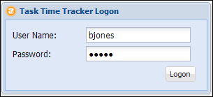
The Task Time Tracker Logon window is the first thing a user will see, which is shown in the following screenshot:
The logon window definition follows the given code:
Ext.define('TTT.view.LogonWindow', {
    extend: 'Ext.window.Window',
    xtype: 'logonwindow',
    closable: false,
    iconCls: 'logo-small',
    width: 300,
    bodyPadding: 10,
    title: 'Task Time Tracker Logon',
    requires: ['Ext.form.field.Text'],
    initComponent: function() {
        var me = this;
        Ext.applyIf(me, {
            items: [{
                xtype: 'textfield',
                fieldLabel: 'User Name',
                name: 'username',
                allowBlank: false,
                validateOnBlur: true,
                emptyText: 'Enter a Username'
            }, {
                xtype: 'textfield',
                name: 'password',
                fieldLabel: 'Password',
                inputType: 'password',
                validateOnBlur: true,
                allowBlank: false
            }, {
                xtype: 'toolbar',
                ui: 'footer',
                layout: {
                    pack: 'end',
                    type: 'hbox'
                },
                items: [{
                    xtype: 'button',
                    text: 'Logon'
                }]
            }]
        });
        me.callParent(arguments);
    }
});
This window definition extends the Ext.window.Window and adds the two text fields and logon button. The LogonWindow class is namespaced to view and will hence reside in the app/view directory. The defined xtype property is the lowercase version of the class name and will be used in the controller to reference the LogonWindow instance.
Note
An xtype property is a symbolic name (alias or shortcut) for a class. The xtype property is a powerful concept in Ext JS that allows components to be configured, but not rendered, until the owning container deems it necessary. A full explanation of components' lazy initialization by xtype can be found here http://docs.sencha.com/extjs/4.2.2/#!/guide/components.
The MVC design pattern encourages Ext JS 4 developers to implement business logic in the controller layer, leaving the views as dumb objects. The only meta logic we are applying in this window is the allowBlank:false property combined with validateOnBlur:true. This will give the user a visual clue if moving off the field without entering text.
The initComponent function is a template function that is invoked by the constructor during object creation. The template design pattern allows subclasses to define specific behavior without changing the semantics of the base class processing algorithm. A detailed explanation of this pattern can be found here: http://en.wikipedia.org/wiki/Template_method_design_pattern. Ext JS uses the template design pattern to allow developers to specify logic during certain well-defined phases in the component's lifecycle. The initComponent function is probably the most used but there are many other template hooks that can be implemented. A full list of component template functions can be found here: http://docs.sencha.com/extjs/4.2.2/#!/guide/components.
The initComponent function is used to initialize data, set up configurations, and attach event handlers to the component. The recommended usage pattern for this function (or any template function) includes:
- Reference the current scope as a local closured variable using
var me = this. Use themereference everywhere in the function when referring to the object instance. This will help with correct JavaScript closure for complex objects by ensuringmeandthisrefer to the correct object scope. - Use
Ext.applyIfto add class-specific properties to the configuration. Note that we are not usingExt.apply, which will override properties that are already defined; only new properties that do not exist inmewill be copied. This ensures that xtype-based configuration properties take precedence. - Complete the
initComponentfunction by calling the parent function with the supplied arguments usingme.callParent(arguments).
These three points outline some advanced concepts that may be a bit beyond the intermediate reader. Don't despair if some of this doesn't make sense yet; follow the design pattern and things will become clearer with experience!
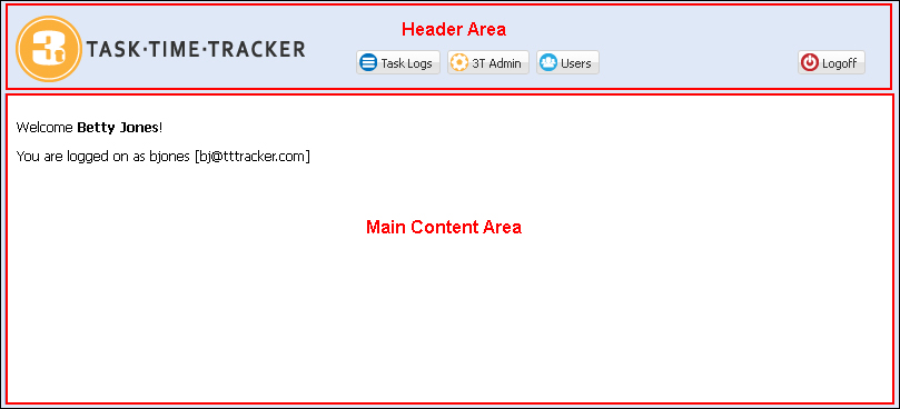
The Viewport view uses a vbox layout to split the view into two regions, the header and the main content areas, as shown in the following screenshot:
We could have used a border layout to achieve the same visual result but the vbox layout is a lighter weight component. Only use the border layout if your application needs additional functionality such as expandable/collapsible regions or resizable split views.
The Viewport definition is as follows:
Ext.define('TTT.view.Viewport', {
    extend: 'Ext.container.Viewport',
    cls: 'x-border-layout-ct',
    requires: ['TTT.view.MainHeader', 'TTT.view.MainCards', 'Ext.layout.container.VBox'],
    padding: 5,
    layout: {
        type: 'vbox',
        align: 'stretch'
    },
    items: [{
        xtype: 'mainheader',
        height: 80
    }, {
        xtype: 'maincards',
        flex: 1
    }]
});
There are two views that now need to be defined: one for the main header, the second for the main region card layout.
The MainHeader defines and positions the 3T logo and buttons as shown in the following code:
Ext.define('TTT.view.MainHeader', {
    extend: 'Ext.container.Container',
    xtype: 'mainheader',
    requires: ['Ext.toolbar.Toolbar'],
    layout: {
        align: 'stretch',
        type: 'hbox'
    },
    initComponent: function() {
        var me = this;
        Ext.applyIf(me, {
            items: [{
                xtype: 'container',
                cls: 'logo',
                width: 300
            }, {
                xtype: 'toolbar',
                flex: 1,
                ui: 'footer',
                layout: {
                    pack: 'end',
                    padding: '20 20 0 0',
                    type: 'hbox'
                },
                items: [{
                    xtype: 'button',
                    itemId: 'taskLogsBtn',
                    iconCls: 'tasklog',
                    text: 'Task Logs'
                }, {
                    xtype: 'button',
                    itemId: 'taskAdminBtn',
                    iconCls: 'admin',
                    hidden: !TTT.getApplication().isAdmin(),
                    text: '3T Admin'
                }, {
                    xtype: 'button',
                    itemId: 'userAdminBtn',
                    hidden: !TTT.getApplication().isAdmin(),
                    iconCls: 'users',
                    text: 'Users'
                }, '->',
                {
                    xtype: 'button',
                    itemId: 'logoffBtn',
                    iconCls: 'logoff',
                    text: 'Logoff'
                }]
            }]
        });
        me.callParent(arguments);
    }
});
Each button defines an itemId property to help uniquely identify the button when using selectors in the controller. The two administrative buttons use the hidden property to hide the button if the user is not an administrator. The TTT.getApplication().isAdmin() function has not been defined as yet but this will be added to the Application.js function in the section ahead.
The MainCards component is a card layout container that holds all the components that will be rendered in the main content area as shown in the following code:
Ext.define('TTT.view.MainCards', {
    extend: 'Ext.container.Container',
    xtype: 'maincards',
    requires: ['Ext.layout.container.Card', 'TTT.view.Welcome', 'TTT.view.user.ManageUsers'],
    layout: 'card',
    initComponent: function() {
        var me = this;
        Ext.applyIf(me, {
            items: [{
                xtype: 'welcome',
                itemId: 'welcomCard'
            }, {
                xtype: 'manageusers',
                itemId: 'manageUsersCard'
            }]
        });
        me.callParent(arguments);
    }
});
We will be adding items to the MainCards as we build our functionality. For this chapter we will focus on the Welcome and ManageUsers components.
The Welcome panel uses an XTemplate to render a simple welcome message based on the logged-on user. The user data is retrieved from the application using the TTT.getApplication().getUser() function that will be added to the Application.js function after a successful logon.
Ext.define('TTT.view.Welcome', {
    extend: 'Ext.panel.Panel',
    xtype: 'welcome',
    requires: ['Ext.XTemplate'],
    initComponent: function() {
        var me = this;
        var tpl = new Ext.XTemplate('<tpl for=".">', '<p>Welcome <b>{fullName}</b>!</p>', '<p>You are logged on as {username} [{email}]</p>', '</tpl>'),
        var welcomeHtml = tpl.apply(TTT.getApplication().getUser());
        Ext.applyIf(me, {
            items: [{
                xtype: 'container',
                padding: 10,
                html: welcomeHtml
            }]
        });
        me.callParent(arguments);
    }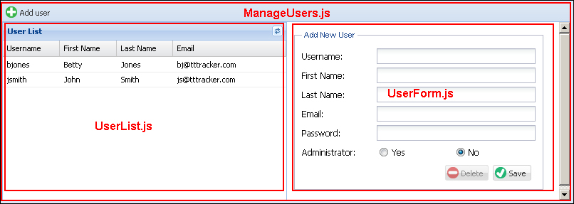
});The user management interface consists of three view files as shown in the following screenshot:
In addition to the views we will also need to define a user store that manages the data displayed in the user listing.
The ManageUsers file is a simple hbox layout that displays the UserList and UserForm. The toolbar contains the single Add User button. This file has a very simple definition, which is as follows:
Ext.define('TTT.view.user.ManageUsers', {
    extend: 'Ext.panel.Panel',
    xtype: 'manageusers',
    requires: ['Ext.toolbar.Toolbar', 'TTT.view.user.UserList', 'TTT.view.user.UserForm'],
    layout: {
        type: 'hbox',
        align: 'stretch'
    },
    initComponent: function() {
        var me = this;
        Ext.applyIf(me, {
            dockedItems: [{
                xtype: 'toolbar',
                dock: 'top',
                items: [{
                    xtype: 'button',
                    itemId: 'addUserBtn',
                    iconCls: 'addnew',
                    text: 'Add user'
                }]
            }],
            items: [{
                xtype: 'userlist',
                width: 400,
                margin: 1
            }, {
                xtype: 'userform',
                flex: 1
            }]
        });
        me.callParent(arguments);
    }
});This UserForm.js file displays the user details as shown in the following code:
Ext.define('TTT.view.user.UserForm', {
    extend: 'Ext.form.Panel',
    xtype: 'userform',
    requires: ['Ext.form.FieldSet', 'Ext.form.field.Radio', 'Ext.form.RadioGroup', 'Ext.toolbar.Toolbar'],
    layout: {
        type: 'anchor'
    },
    bodyPadding: 10,
    border: false,
    autoScroll: true,
    initComponent: function() {
        var me = this;
        Ext.applyIf(me, {
            items: [{
                xtype: 'fieldset',
                padding: 10,
                width: 350,
                fieldDefaults: {
                    anchor: '100%'
                },
                title: 'User',
                items: [{
                    xtype: 'textfield',
                    name: 'username',
                    fieldLabel: 'Username'
                }, {
                    xtype: 'textfield',
                    name: 'firstName',
                    fieldLabel: 'First Name'
                }, {
                    xtype: 'textfield',
                    name: 'lastName',
                    fieldLabel: 'Last Name'
                }, {
                    xtype: 'textfield',
                    name: 'email',
                    fieldLabel: 'Email'
                }, {
                    xtype: 'textfield',
                    name: 'password',
                    inputType: 'password',
                    fieldLabel: 'Password'
                }, {
                    xtype: 'radiogroup',
                    fieldLabel: 'Administrator',
                    items: [{
                        boxLabel: 'Yes',
                        name: 'adminRole',
                        inputValue: 'Y'
                    }, {
                        boxLabel: 'No',
                        name: 'adminRole',
                        inputValue: 'N'
                    }]
                }, {
                    xtype: 'toolbar',
                    ui: 'footer',
                    layout: {
                        pack: 'end',
                        type: 'hbox'
                    },
                    items: [{
                        xtype: 'button',
                        itemId: 'deleteBtn',
                        iconCls: 'delete',
                        text: 'Delete'
                    }, {
                        xtype: 'button',
                        itemId: 'saveBtn',
                        iconCls: 'save',
                        text: 'Save'
                    }]
                }]
            }]
        });
        me.callParent(arguments);
    }
});
Each button has an itemId property defined to allow us to uniquely identify them in the controller. Each field name in the form exactly matches the field name in the User model defined in the previous chapter. This will allow us to easily load a user model instance into the form.
The UserList file is a grid panel with the following definition:
Ext.define('TTT.view.user.UserList', {
    extend: 'Ext.grid.Panel',
    xtype: 'userlist',
    store: 'User',
    title: 'User List',
    viewConfig: {
        markDirty: false,
        stripeRows: false
    },
    initComponent: function() {
        var me = this;
        Ext.applyIf(me, {
            tools: [{
                type: 'refresh',
                tooltip: 'Refresh user list'
            }],
            columns: [{
                xtype: 'gridcolumn',
                dataIndex: 'username',
                flex: 1,
                text: 'Username'
            }, {
                xtype: 'gridcolumn',
                dataIndex: 'firstName',
                flex: 1,
                text: 'First Name'
            }, {
                xtype: 'gridcolumn',
                flex: 1,
                dataIndex: 'lastName',
                text: 'Last Name'
            }, {
                xtype: 'gridcolumn',
                flex: 2,
                dataIndex: 'email',
                text: 'Email'
            }]
        });
        me.callParent(arguments);
    }
});
The grid columns use the flex config property to define the relative width of each column. The email column will hence be twice the width of the other columns.
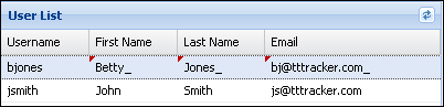
The markDirty:false in the viewConfig is used to remove the dirty cell indicator when a cell value is modified. Without this property the grid would render changed cell values as shown, even after the record has been successfully saved:
The User store is yet to be defined, so let's add it now.
The User store loads users from the ttt/user/findAll.json URL. which is mapped to the UserHandler.findAll method. Readers should recall that the ttt/ prefix URL corresponds to the servlet mapping specified in the com.gieman.tttracker.web.WebApp.getServletMappings() method in Chapter 7, The Web Request Handling Layer. Each user record in the JSON array will result in the creation of a TTT.model.User model instance. The store definition is explained in the following code:
Ext.define('TTT.store.User', {
    extend: 'Ext.data.Store',
    requires: ['TTT.model.User'],
    model: 'TTT.model.User',
    proxy: {
        type: 'ajax',
        url: 'ttt/user/findAll.json',
        reader: {
            type: 'json',
            root: 'data'
        }
    }
});
The User model was defined in the previous chapter and currently looks like the following:
Ext.define('TTT.model.User', {
    extend: 'Ext.data.Model',

    fields: [
        { name: 'username', type: 'string' },
        { name: 'firstName', type: 'string' },
        { name: 'lastName', type: 'string' },
        { name: 'fullName', type: 'string' },
        { name: 'email', type: 'string' },
        { name: 'password', type: 'string' },
        { name: 'adminRole', type: 'string' }
    ]
});
Ext JS 4 models are a key part of the MVC framework and we will now spend some time learning about these important objects.