
The 3T administration interface will require us to build the components displayed in the following screenshot. The ProjectForm and TaskForm views are not visible and will be displayed when required in a card layout:
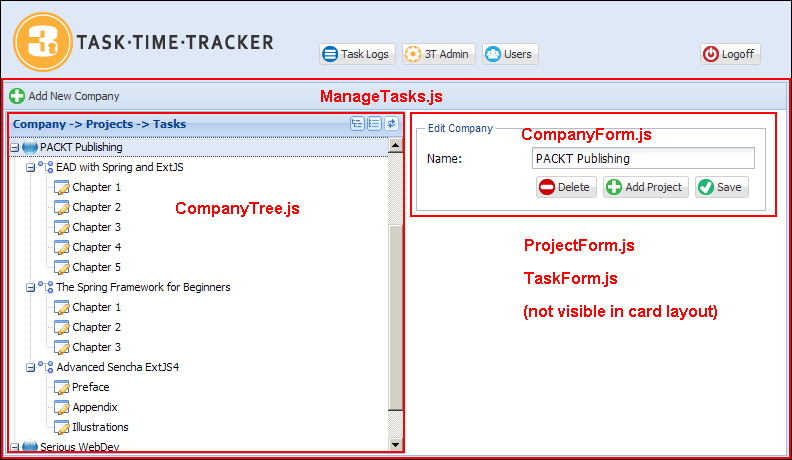
The ManageTasks view is an hbox layout that equally splits the left and right parts of the screen. The toolbar contains a single button to add a new company, while the region to the right is a card layout containing the CompanyForm, ProjectForm, and TaskForm views. Let's now look at each component in detail.
The ManageTasks view defines the toolbar with the Add New Company button and splits the view into an hbox layout. The companytree panel and container defined with the card layout are configured by xtype. The card layout container contains the CompanyForm, ProjectForm, and TaskForm. The ManageTasks view is defined as follows:
Ext.define('TTT.view.admin.ManageTasks', {
    extend: 'Ext.panel.Panel',
    xtype: 'managetasks',
    requires: ['TTT.view.admin.CompanyTree', 'TTT.view.admin.TaskForm', 'TTT.view.admin.ProjectForm', 'TTT.view.admin.CompanyForm', 'Ext.toolbar.Toolbar',
        'Ext.layout.container.Card'],
    layout: {
        type: 'hbox',
        align: 'stretch'
    },
    initComponent: function() {
        var me = this;
        Ext.applyIf(me, {
            dockedItems: [{
                xtype: 'toolbar',
                dock: 'top',
                items: [{
                    xtype: 'button',
                    itemId: 'addCompanyBtn',
                    iconCls: 'addnew',
                    text: 'Add New Company'
                }]
            }],
            items: [{
                xtype: 'companytree',
                flex: 1,
                margin: 1
            }, {
                xtype: 'container',
                itemId: 'adminCards',
                activeItem: 0,
                flex: 1,
                layout: {
                    type: 'card'
                },
                items: [{
                    xtype: 'container',
                    padding: 10,
                    html: 'Please select an item from the tree...'
                }, {
                    xtype: 'companyform'
                }, {
                    xtype: 'projectform'
                }, {
                    xtype: 'taskform'
                }]
            }]
        });
        me.callParent(arguments);
    }
});
Note the use of a simple container as the first item of the card layout to display the Please select an item from the tree... message.
The CompanyForm view has a very simple interface that only has one data entry field: companyName. This can be seen in the following lines of code:
Ext.define('TTT.view.admin.CompanyForm', {
    extend: 'Ext.form.Panel',
    xtype: 'companyform',
    requires: ['Ext.form.FieldSet', 'Ext.form.field.Text', 'Ext.toolbar.Toolbar'],
    layout: {
        type: 'anchor'
    },
    bodyPadding: 10,
    border: false,
    autoScroll: true,
    initComponent: function() {
        var me = this;
        Ext.applyIf(me, {
            items: [{
                xtype: 'fieldset',
                hidden: false,
                padding: 10,
                width: 350,
                fieldDefaults: {
                    anchor: '100%'
                },
                title: 'Company Entry',
                items: [{
                    xtype: 'textfield',
                    name: 'companyName',
                    fieldLabel: 'Name',
                    emptyText: 'Enter company name...'
                }, {
                    xtype: 'toolbar',
                    ui: 'footer',
                    layout: {
                        pack: 'end',
                        type: 'hbox'
                    },
                    items: [{
                        xtype: 'button',
                        iconCls: 'delete',
                        itemId: 'deleteBtn',
                        disabled: true,
                        text: 'Delete'
                    }, {
                        xtype: 'button',
                        iconCls: 'addnew',
                        itemId: 'addProjectBtn',
                        disabled: true,
                        text: 'Add Project'
                    }, {
                        xtype: 'button',
                        iconCls: 'save',
                        itemId: 'saveBtn',
                        text: 'Save'
                    }]
                }]
            }]
        });
        me.callParent(arguments);
    }
});
Note the initial state of the Delete and Add Project buttons are disabled until a valid company is loaded.
The layout and structure of the ProjectForm view is very similar to the company form we have just defined:
Ext.define('TTT.view.admin.ProjectForm', {
    extend: 'Ext.form.Panel',
    xtype: 'projectform',
    requires: ['Ext.form.FieldSet', 'Ext.form.field.Text', 'Ext.toolbar.Toolbar'],
    layout: {
        type: 'anchor'
    },
    bodyPadding: 10,
    border: false,
    autoScroll: true,
    initComponent: function() {
        var me = this;
        Ext.applyIf(me, {
            items: [{
                xtype: 'fieldset',
                hidden: false,
                padding: 10,
                width: 350,
                fieldDefaults: {
                    anchor: '100%'
                },
                title: 'Project Entry',
                items: [{
                    xtype: 'textfield',
                    name: 'projectName',
                    fieldLabel: 'Project Name',
                    emptyText: 'Enter project name...'
                }, {
                    xtype: 'toolbar',
                    ui: 'footer',
                    layout: {
                        pack: 'end',
                        type: 'hbox'
                    },
                    items: [{
                        xtype: 'button',
                        iconCls: 'delete',
                        itemId: 'deleteBtn',
                        disabled: true,
                        text: 'Delete'
                    }, {
                        xtype: 'button',
                        iconCls: 'addnew',
                        itemId: 'addTaskBtn',
                        disabled: true,
                        text: 'Add Task'
                    }, {
                        xtype: 'button',
                        iconCls: 'save',
                        itemId: 'saveBtn',
                        text: 'Save'
                    }]
                }]
            }]
        });
        me.callParent(arguments);
    }
});
Once again the initial state of the Delete and Add Task buttons is disabled until a valid project is loaded.
The TaskForm view is again similar to the previous forms but will only need two buttons that are defined as follows:
Ext.define('TTT.view.admin.TaskForm', {
    extend: 'Ext.form.Panel',
    xtype: 'taskform',
    requires: ['Ext.form.FieldSet', 'Ext.form.field.Text', 'Ext.toolbar.Toolbar'],
    layout: {
        type: 'anchor'
    },
    bodyPadding: 10,
    border: false,
    autoScroll: true,
    initComponent: function() {
        var me = this;
        Ext.applyIf(me, {
            items: [{
                xtype: 'fieldset',
                hidden: false,
                padding: 10,
                width: 350,
                fieldDefaults: {
                    anchor: '100%'
                },
                title: 'Task Entry',
                items: [{
                    xtype: 'textfield',
                    name: 'taskName',
                    fieldLabel: 'Name',
                    emptyText: 'Enter task name...'
                }, {
                    xtype: 'toolbar',
                    ui: 'footer',
                    layout: {
                        pack: 'end',
                        type: 'hbox'
                    },
                    items: [{
                        xtype: 'button',
                        iconCls: 'delete',
                        itemId: 'deleteBtn',
                        disabled: true,
                        text: 'Delete'
                    }, {
                        xtype: 'button',
                        iconCls: 'save',
                        itemId: 'saveBtn',
                        text: 'Save'
                    }]
                }]
            }]
        });
        me.callParent(arguments);
    }
});
Once again, the initial state of the Delete button is disabled until a valid task has been loaded.
The final view is the CompanyTree view that represents the relationship between the company, project, and task.
This view is defined as follows:
Ext.define('TTT.view.admin.CompanyTree', {
    extend: 'Ext.tree.Panel',
    xtype: 'companytree',
    title: 'Company -> Projects -> Tasks',
    requires: ['TTT.store.CompanyTree'],
    store: 'CompanyTree',
    lines: true,
    rootVisible: false,
    hideHeaders: true,
    viewConfig: {
        preserveScrollOnRefresh: true
    },
    initComponent: function() {
        var me = this;
        Ext.applyIf(me, {
            tools: [{
                type: 'expand',
                qtip: 'Expand All'
            }, {
                type: 'collapse',
                qtip: 'Collapse All'
            }, {
                type: 'refresh',
                qtip: 'Refresh Tree'
            }],
            columns: [{
                xtype: 'treecolumn',
                dataIndex: 'text',
                flex: 1
            }]
        });
        me.callParent(arguments);
    }
});
The CompanyTree view extends Ext.tree.Panel that requires a specialized Ext.data.TreeStore implementation which manages tree nodes and the relationship between items. The Ext JS 4 tree is a very flexible component and we recommend you become familiar with the core tree concepts at http://docs.sencha.com/extjs/4.2.2/#!/guide/tree.
The Ext.data.TreeStore class is the default store implementation used by Ext.tree.Panel. The TreeStore function provides many convenient functions for loading and managing hierarchical data. A TreeStore function may be defined with a model but this is not required. If a model is provided, it is decorated with the fields, methods, and properties of Ext.data.NodeInterface that are required for use in the tree. This additional functionality is applied to the prototype of the model to allow the tree to maintain the state and relationships between models.
If a model is not provided, one such model will be created by the store in a way that it implements the Ext.data.NodeInterface class. We recommend you browse the NodeInterface API documentation to see the full set of fields, methods, and properties available on nodes.
Our CompanyTree store definition for use in our tree is as follows:
Ext.define('TTT.store.CompanyTree', {
    extend: 'Ext.data.TreeStore',
    proxy: {
        type: 'ajax',
        url: 'company/tree.json'
    }
});
All the tree stores consume data that is in a hierarchical structure, either in JSON or XML format. We will generate JSON data in our request handling layer with the following structure:
{
    "success": true,
    "children": [
        {
            "id": "C_1",
            "text": "PACKT Publishing",
            "leaf": false,
            "expanded": true,
            "children": [
                {
                    "id": "P_1",
                    "text": "EAD with Spring and ExtJS",
                    "leaf": false,
                    "expanded": true,
                    "children": [
                        {
                            "id": "T_1",
                            "text": "Chapter 1",
                            "leaf": true
                        },
                        {
                            "id": "T_2",
                            "text": "Chapter 2",
                            "leaf": true
                        },
                        {
                            "id": "T_3",
                            "text": "Chapter 3",
                            "leaf": true
                        }
                    ]
                },
                {
                    "id": "P_2",
                    "text": "The Spring Framework for Beginners",
                    "leaf": false,
                    "expanded": true,
                    "children": [
                        {
                            "id": "T_4",
                            "text": "Chapter 1",
                            "leaf": true
                        },
                        {
                            "id": "T_5",
                            "text": "Chapter 2",
                            "leaf": true
                        },
                        {
                            "id": "T_6",
                            "text": "Chapter 3",
                            "leaf": true
                        }
                    ]
                }
            ]
        }
    ]
}
This structure defines the core properties used by any tree including id, children, text, leaf, and expanded.
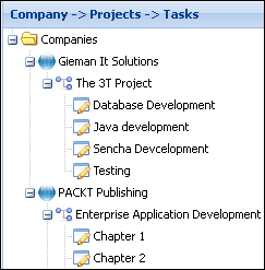
The children property defines an array of nodes that exist at the same level and belong to the same parent. The top-level children in the structure belong to the root node and will be added to the root level of the tree. The tree panel property, rootVisible:false, will hide the root level from the view, displaying only the children. Enabling root-level visibility by setting the property to rootVisible:true will display the root node as defined in the TreeStore class. For example, adding the following definition to the tree store will result in the Companies node being displayed as shown in the following screenshot:
root: {
    text: 'Companies',
    expanded: true
}
We wish to display each company at the top level of the tree and hence will be hiding the root node from the view.
The id property is used internally to uniquely identify each node. There can be no duplicates for this property within the tree structure, and we will hence prefix the id value with the type of node. A node representing a company will be prefixed with C_, a project node with P_, and a task node with T_. This id format will allow us to determine both the node type and the primary key of the node. If an ID is not provided, the store would generate one for us.
The ID can also be used to dynamically assign an iconCls class to the node. We do this through the use of the append listener of the store and define this later in the controller. Note that we could just as easily define the iconCls property in JSON itself:
{
    "success": true,
    "children": [
        {
            "id": "C_1",
            "iconCls": "company",
            "text": "PACKT Publishing",
            "leaf": false,
            "expanded": true,
            "children": [
                {
                    "id": "P_1",
                    "iconCls": "project",
                    "text": "EAD with Spring and ExtJS",
                    "leaf": false,
                    "expanded": true,
                    "children": [ etc…
However, we are now combining data with the presentation, and the Java method that generates JSON should not be concerned with how data is displayed.
The text field of the JSON tree is used to display the node's text. For simple trees, without multiple columns, this is the default field name if not explicitly set with a column definition (tree columns will be discussed later in this chapter).
The leaf property identifies whether this node can have children. All the task nodes have the "leaf":true setting. The leaf property defines whether the expand icon is shown next to the node.
The last property of interest is the expanded property that indicates whether the node should be displayed in an expanded state. This property must be set to true on each node that has children if we're loading an entire tree at once; otherwise, the proxy will attempt to load children for these nodes dynamically when they are expanded. Our JSON data will contain the entire tree, and hence we set the expanded property to true for each parent node.