
A custom tab is used to display the object data or other contents embedded in the application. Custom tabs have a unique tab style. We can choose the color and icon for the tab.
The following screenshot shows the different types of tabs:
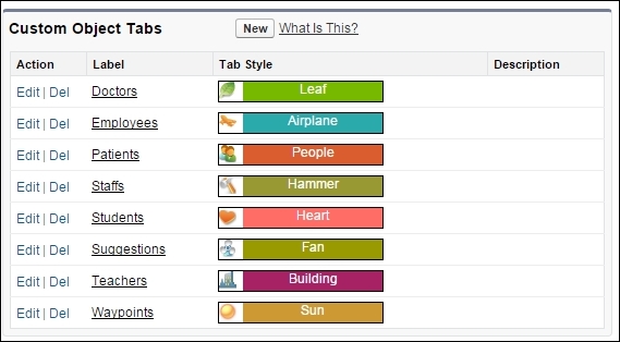
We cannot create tabs for standard objects. There are three types of custom tabs:
- Custom Object tabs:
- These tabs display the custom object data.
- They provide the options to Create, Read, Update, and Delete (also called CRUD rights) an object.
- The plural name of the object is given to the tab by default.
- Users can see the buttons to
EDIT,DELETE, or addNEWrecords on the page layouts, depending on their permissions to the object. We will learn how to control the user settings in Chapter 7, Application Administration.
- Web tabs:
- Visualforce tabs:
Visualforce is a component-based user interface framework of the Force.com platform. It is a tag-based markup language used to create visual interfaces that are completely flexible. We can also embed client-side JavaScript, such as Angular JS and AJAX components, and create custom UIs. Using Visualforce tabs, we can make these custom user interfaces accessible to the users.
- Lightning Page tabs:
The lighting page tabs are used to display single-page lighting apps for smartphones. These tabs are auto-created from the lighting process builder. These apps are not available in the full Salesforce site and do not show up in the All tabs page when we click on the (+) icon. Lighting page tabs are only available in the navigation menu of the Salesforce1 mobile app.
In the library management system, we have so far created different objects to collect data on media and customers. In this exercise, we will continue working on the same application and create tabs for the objects.
Create object tabs for all the objects created in Chapter 2, Creating a Database on Force.com. To create a Custom Object tab, perform the following steps:
- Go to Setup | Create | Tabs.
- Click on New in the Custom Object Tab section to open the New Custom Object Tab wizard, as shown in the following screenshot:
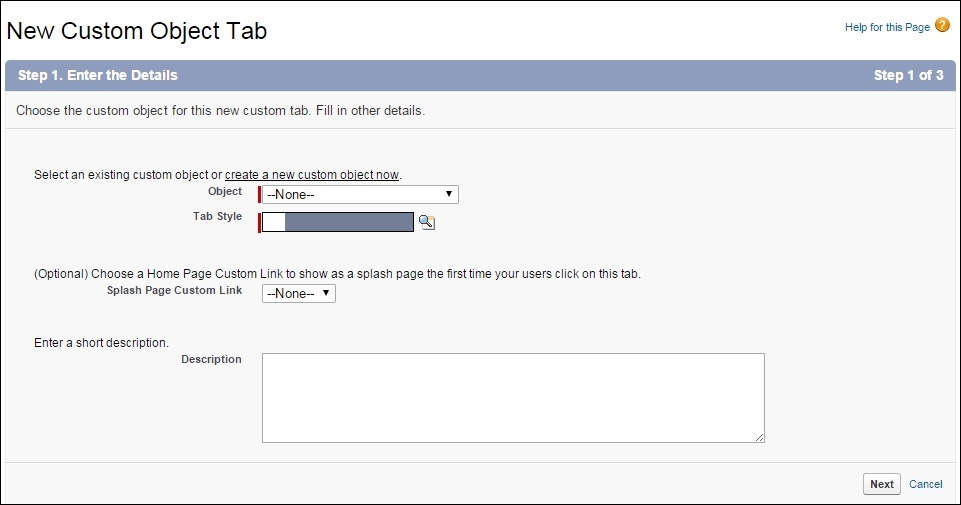
- Select the Object in the Object dropdown. Note that if there are no objects in the Org, the dropdown will have no values.
- We can choose the color combination and icon for the tab in the Tab Style field. Click on Next.
- On the next page, we can select who the tab should be visible to. Every user will have a profile associated with their account. On this screen, we can specify the visibility of the tab on each profile:
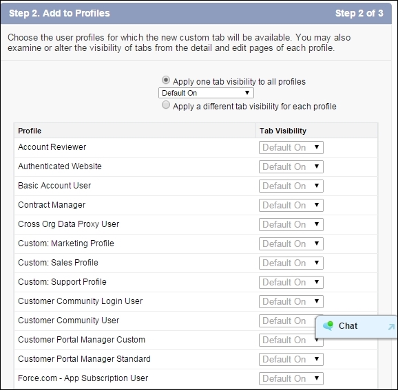
- There are three types of Visibility that we can set on the tab:
- Default on: If the tab is set to Default On, it is visible on the UI on the App of the user.
- Default off: This tab is not shown in the UI; however, the user can see the tab in the All Tabs layout and, therefore, can customize it on their app.
- Tab Hidden: When you hide this tab for a profile, the user does not have access to that tab at all. Note that this is by no means a way to prevent the user from accessing the object. It merely prevents the user from seeing the UI of that object. They can still access the object from the API and data loader. We will discuss the security considerations in Chapter 7, Application Administration.
- In the last step, we select the app to include the tab. As a word of caution note that you should never include the tab in the other applications as it may affect multiple users. Even if we do not include the tab in an application, if the tab isn't hidden for the profile, the users can still customize their tabs by going to the All Tabs layout.
The tabs will be the starting point for the user in the journey of that object. When the user logs in to Salesforce, they will navigate to the object tab and come across the List View of their recently viewed records.
The following screenshot shows the list view layout of the Opportunity object:
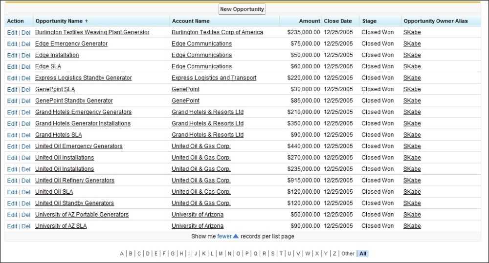
We can choose the fields that are displayed on the list view and remove the unnecessary ones. The list view gives a glimpse of multiple records at a time; it is important to show valid and relevant data, which the users can further drill down after they click on the name.
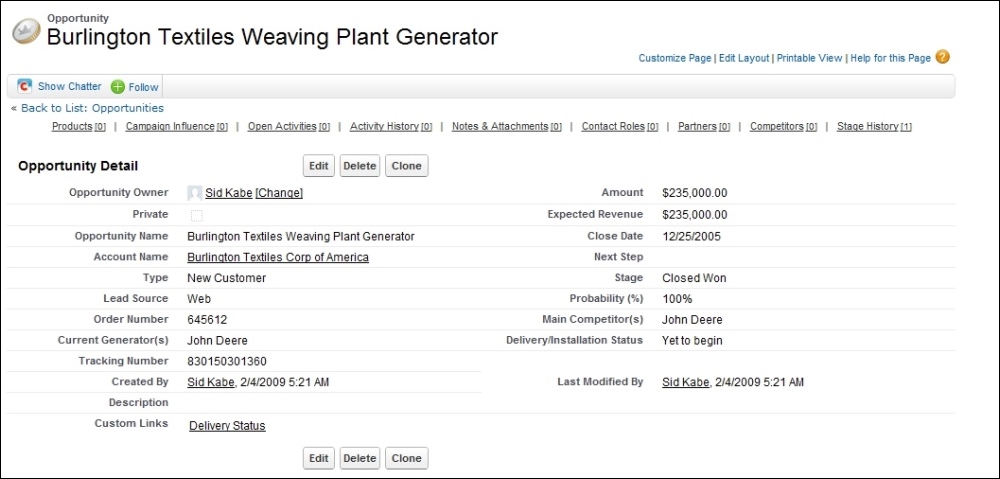
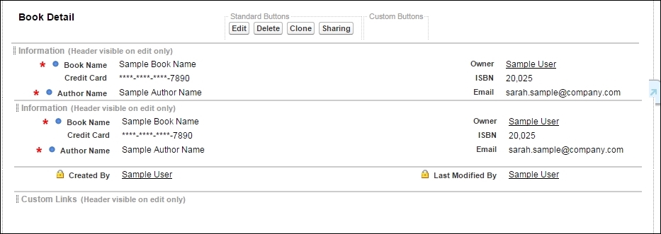
When the users click on the name of the record, they are shown the Detail View of the record. The following screenshot shows the detail page for sample records:
We will take a look at the layout editor in detail in the next section.
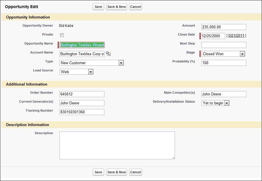
When the user clicks on the Edit button on the detail view, they are taken to the edit view of the record. The edit view provides an input form for different types of fields. The edit view follows the pattern of the detail view and only editable fields are shown in this view. The edit view cannot be customized separately from the detail view.
The following screenshot shows the edit view for the same opportunity:
Using the page layout editor, we can customize the data they can see on the Detail View. We can highlight the important data at the top of the page for easy access. We can logically group different fields in sections so that it all looks aesthetically pleasing. Using the page layout editor, we can also mark a few fields as read-only for users. However, we need to keep in mind that the page layout editor can only hide or show fields on the UI. The user can still access the field from the API and data loader if they have access to it.
To open the page layout editor, go to Setup | Create | Objects | Custom Object name | Page Layouts.
Normally, every object will be assigned a single default page layout that is accessible to all the people. Some standard objects have multiple page layouts, for example, the case object has a separate Close Case Layout. The account object has separate page layouts for marketing, sales, and service. To modify a page layout, make sure that you identify which profile the page layout is accessible from to prevent data visibility problems. The following screenshot shows the enhanced page layout editor:
At the top of the page, we will see the panel that contains the elements that can be added to the page:
The sidebar on the left-hand side allows us to select from the different categories of elements, and the main panel on the right-hand side lists the elements that can be added on the page.
We can select between Fields, Buttons, Action, Expanded Lookups, Related Lists, and Report Charts. All the elements have a specific position on the page layout, which we will see in the next section.
To add a new element to the page, simply drag it from this panel onto the layout; the relevant section is highlighted in green.
We will take a look at each of them in detail in the upcoming sections.
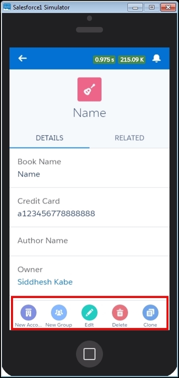
The next part of the page layout editor is the highlight panel. We can drag the quick actions onto the highlight panel. These actions are visible on the Salesforce1 Mobile view:
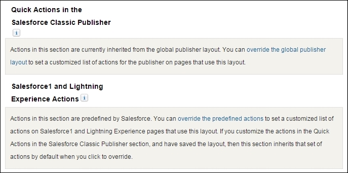
The quick actions are available in the Salesforce classic view, and the Salesforce1 actions will be visible in the new Lightning Experience, as shown in the following screenshot:
The main panel displays the fields in two columns and is grouped together by sections. We can add multiple sections that can logically group the fields for convenience and better user experience. The blue dot on the field indicates that the fields are required to save the record. A red star against the field indicates that the fields are required on the page layout.
We can create the field as required on the page layout that was not previously marked as required during field creation. However, doing so will make the fields required only on this particular page layout and the user will be able to insert the record without any data in the field. The lock item indicates that the field is uneditable on the page; this field will not be displayed on the Edit layout:
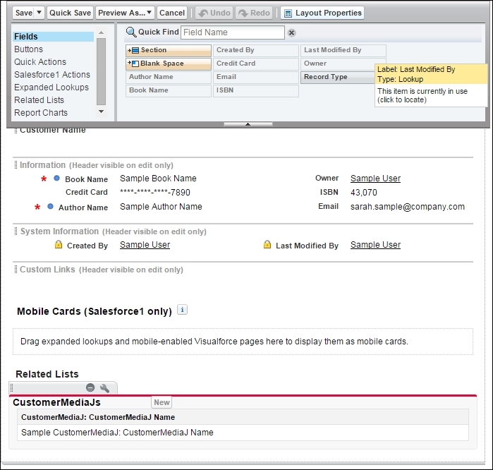
Apart from adding Fields and Buttons, the advance page layout editor also helps us group different fields in sections and add blank spaces for the alignment. The following screenshot shows Section and Blank Space in the editor:
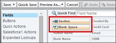
Section and Blank space are explained as follows:
- Section: We can create a logical or functional grouping of fields for the ease of the user. For example, we can group the contact information, such as the address field, phone number, and e-mail address under one section.
The following screenshot shows Section Properties:
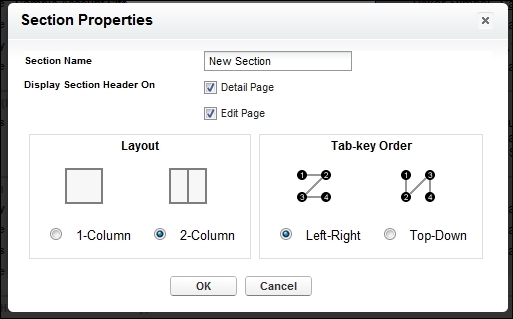
A section can have a 1-Column or a 2-Column layout. In a two column layout, fields are arranged in two separate columns. We can control the Tab-key order and set it to Left-Right or Top-Down.
- Blank Space: A blank space can be added to align the fields properly in the section. This is used if we need to add a blank space intentionally on the page layout:

When we add fields on the page layout, they can be made Required or Read-Only by setting their properties. The Field Properties dialog box shown in the following screenshot can be accessed by clicking on the wrench symbol on the desired field:
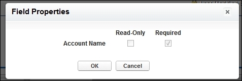
As shown in the preceding screenshot, we can set the field to Required or Read-Only on the page layout. As mentioned in the previous chapter, if the field is not universally required (set as required during the creation of the field), it can be made required on the page layout.
Note
It should, however, be noted here that a field marked as required will be required only on this page layout; it will not be required if the data is filled from the backend or through the API or any other page layout. This option is useful if we have a single page layout that requires this field.
We can also set the field as read-only in the same option. The field appears uneditable on the page only and the user can still fill the value from the other page layouts or the backend.
We can add the custom buttons and links to the record. Buttons and links have actions attached to them referring to the functionality they are achieving. For example, a Save button saves the data filled in the application to the server. The buttons are also differentiated based on their placement on the application.
We can create three types of custom button or link:
- Detail Page Link:
- We can create a detail page link that can be added in the Custom Links Section, as shown in the following screenshot:
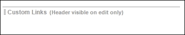
- The Custom Links Section is a special type of section on the page layout that organizes all the custom links in one place. As with any other section, it can be dragged around and placed before and after any other section. By default, it is placed at the bottom of the page layout.
- We can create a detail page link that can be added in the Custom Links Section, as shown in the following screenshot:
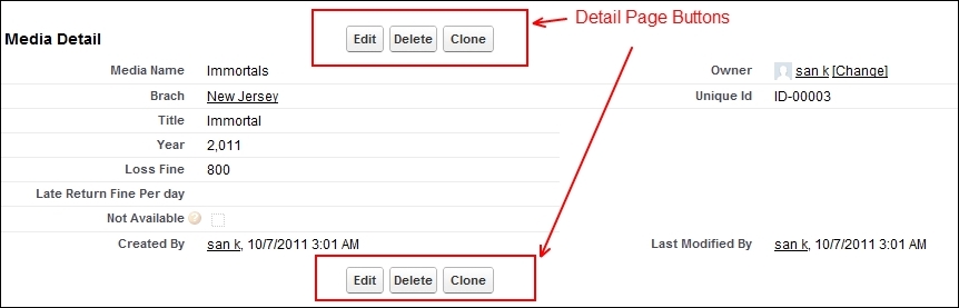
- Detail Page buttons:
- Detail Page Buttons are added at the top and bottom of the page in the center, as shown in the following screenshot:
- The button can open a JavaScript, which points to Visualforce or opens a URL.
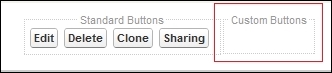
- We can add Custom Detail page buttons in the Custom Buttons section on the detailed page layout, as shown in the following screenshot:
- Detail Page Buttons are added at the top and bottom of the page in the center, as shown in the following screenshot:
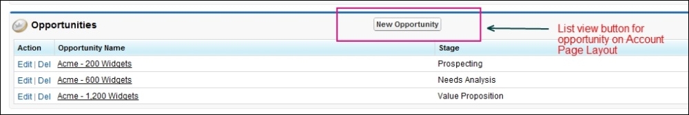
- List View Button:
- The List View button can be added to the tab page or the related list of the object. The following screenshot shows the List View button on the related list for Opportunity. The List View button is the only type that can be added to the related list of the object and not on the detail page layout:
- We cannot add any buttons or links to the Edit page of the record.
- The List View button can be added to the tab page or the related list of the object. The following screenshot shows the List View button on the related list for Opportunity. The List View button is the only type that can be added to the related list of the object and not on the detail page layout:
Let's create a custom button in Contact layout that will automatically Google the person when you click on it:
To create a new button, perform the following steps:
- Go to Setup | Custom Object Name | Custom Buttons and Links | New, as shown in the following screenshot:
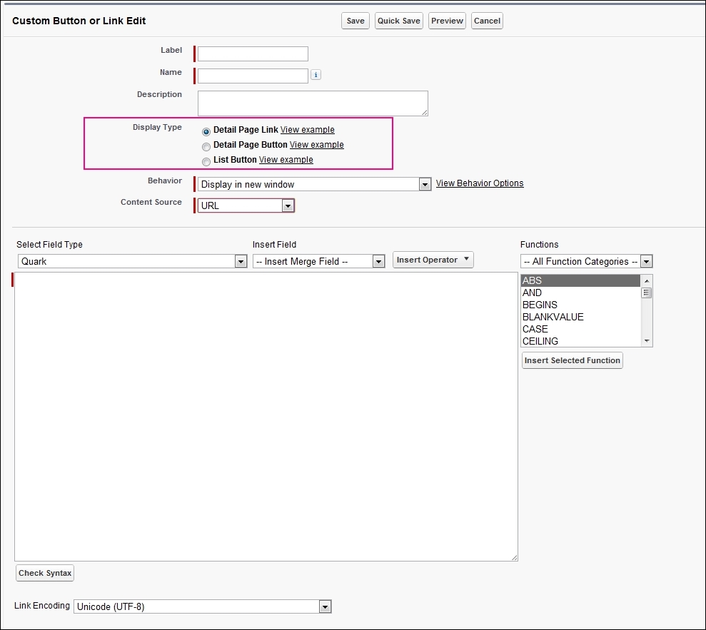
- Choose the Detail Type as Detail Page Button.
- We can choose one of the following display behaviors:
- Display in new window
- Display in the existing window with a sidebar
- Display in the existing window without a sidebar
- Display in the existing window without a sidebar and header
- Excecute JavaScript
- For the purpose of the exercise, choose Display in new window.
- Choose the content source as the URL.
- In the formula field, enter the following formula:
http://www.google.com/search?q={!Contact.Name} - Save the custom button.
After the button is created, go back to the advanced page layout editor and drag the button from the top panel to the page layout, as explained in the previous section.