7.6 Normal Probability Plots
It can be difficult to see if data are normally distributed in a histogram, especially if the sample is small. Normal probability plots, or normal plots for short, are complementary graphical tools that can be used for this purpose. Apart from checking the normality of the data they can also point to individual values that do not originate from a normal distribution. This is why they will be important when we introduce experimental design in Chapter 9. In experimental data, some part of the variation is due to measurement error and some part to our deliberate experimentation. We hope that at least some effects of the experiment are greater than the measurement noise. Such effects do not follow the normal distribution of the error and normal plots can thereby be used to detect them.
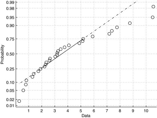
In normal plots the data are essentially plotted against a theoretical normal distribution. If the data are normally distributed they will plot on an approximately straight line. Figure 7.10 shows such an example. The x-axis represents the data in the sample, roughly scattered between zero and 35 with most values in the middle of this interval. The y-axis represents the cumulative probabilities of a theoretical normal distribution. To aid the eye, the figure also contains a straight line drawn through the upper and lower quartiles. Figure 7.11 shows a normal plot of a right-skewed sample. Recall that the distribution of such a sample has a tail extending to the right. Since the frequency of low values in this sample is higher than would be expected from a normal distribution, the slope of the data is steeper on the left and shallower on the right. Conversely, a left-skewed sample would be steeper on the right.
Figure 7.10 Normal plot of a normally distributed sample.
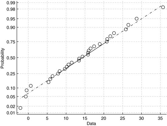
Figure 7.11 Normal plot of a right-skewed sample.
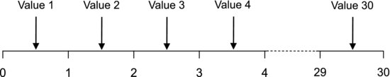
Since it is important to understand the principles of the normal plot we are going to look at how the cumulative probabilities on the y-axis are determined. There are thirty observations in the sample plotted in Figure 7.10. Imagine that you have thirty intervals on an axis. Sort the observations from the smallest to the largest and put them in the middle of these intervals, as shown in Figure 7.12. Each interval now represents one thirtieth of the data. If it is a random sample each observation occurs with equal probability. The cumulative probability of the first value is then P1 = (1 – 0.5)/30, or about 0.017. We subtract 0.5 because the value is in the middle of the interval. The cumulative probability of the second value is P2 = (2 – 0.5)/30 = 0.05, and so on to the thirtieth value, P30 = (30 – 0.5)/30, which is about 0.98. Comparing these probabilities to the values on the y-axis in Figure 7.10, we see that they are the same. So, the y-axis simply shows the expected cumulative probabilities of thirty values that are sampled at random from a normal distribution. By ordering our data and plotting them against normal probabilities, we will see how their distribution compares with the normal distribution. You may have noted that the probability scale in Figure 7.10 is not linear. If it were, the curve would resemble the cumulative distribution function in Figure 7.7. In order for normal data to produce a straight line the probabilities have been compressed around 50% on the y-axis. This is called a normal probability scale.
Figure 7.12 Sorting values in a sample, from the smallest to the largest, into intervals on an axis to determine their expected cumulative probabilities.
When working with small samples, a normal probability plot often gives a better idea about the normality of the data than a histogram. This is because all the values are plotted, whereas a histogram collects the values into bins. Still, a reliable assessment of the normality of a sample requires a large sample.
Example 7.4: Since we are going to use normal plots in later chapters it is important to learn how to make them. Actually, making one will also improve our understanding of how they work. It is recommended that you carry out all the steps in this example yourself. It is easiest done using computer software with statistical functions. I am using Excel here, as most readers are likely to have access to this software, but the corresponding functions are of course available in MATLAB and other packages. The exercise can also be carried out using the table of standard normal probabilities in the Appendix.
Let us look at the following sample, drawn from a normal distribution:
![]()
The first step is to sort the data from the smallest to the largest value. Do this by writing them into a column in an Excel worksheet, selecting the values and then clicking the button “Sort A-Z”. The ordered values are used as x-values in our plot.
Next, we want to obtain something that represents our cumulative probabilities, preferably without needing to generate the exotic normal probability scale. You may recall that the standard normal cumulative distribution function translates a normally distributed variable Z on the x-axis into cumulative probabilities on the y-axis, as the arrow in Figure 7.7 indicates. The inverse of this function goes from the y-axis to the x-axis (imagine reversing the arrow in Figure 7.7 to go from cumulative probabilities back to the Z-variable). Z is, of course, normally distributed with values more densely scattered around the mean and sparser toward the edges. So, plotting a normally distributed sample against Z in a clever way will produce an approximately straight line.
The inverse of the standard normal cumulative distribution is easily obtained using the Excel function NORMSINV(P). P is a cumulative probability and the returned Z-value is called a normal score. We can use this function to produce our normal plot as follows. Each value in our sample should first be assigned an index by writing numbers from one to ten in the column next to the ordered data. This corresponds to sorting them into intervals as in Figure 7.12. From these indexes we calculate cumulative probabilities as explained above, by writing a worksheet function into the cell next to the index. If the first index is in cell B1, the expression “= (B1 − 0.5)/10” should be written into cell C1. When we press RETURN the calculated probability, 0.05, occurs in place of the formula. The formula can then be applied to all the indexes by selecting the cell that contains the formula and simply double-clicking its fill handle. Finally, we want to calculate the normal scores. Write the expression “=NORMSINV(C1)” into cell D1 and apply it to all the probabilities in column C by double-clicking the fill handle. We should now have a table with the following values:
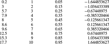
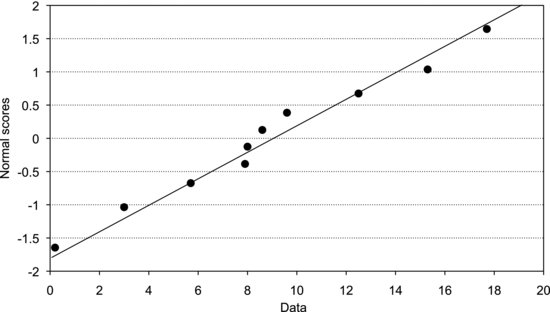
The first column contains the ordered data, the second their indexes, the third their cumulative probabilities, and the last contains their normal scores. The last step is simply to plot the ordered data against the normal scores (Figure 7.13). The line is drawn through the upper and lower quartiles, which are easily obtained using the worksheet function QUARTILE.
Note that the normal scores are measured in standard deviations. Reading the values on the x-axis that correspond to the locations where the normal scores equal plus or minus one, we see that they are about five units from the mean. Quite right, the calculated standard deviation of the sample is 5.3, as obtained using the worksheet function STDEV.![]()
Figure 7.13 Normal plot of the sample in Example 7.4.