
9.9 Continuous Factors: Regression and Response Surface Methods
In many important cases the factors of an experiment are not categorical but continuous, numerical variables. When these are varied the result is often a smoothly varying response that can be described by a curve equation. With two continuous factors the response turns from a curve into a two-dimensional surface, which is often called a response surface. Such surfaces can often be described by second-degree polynomials, as the one in Equation 8.13. When more factors are investigated the dimensionality of the polynomial increases but it is still called a response surface. Fitting surface models to experimental data has many advantages over simply plotting the measurements. Firstly, the regressors, or coefficients, of the equation are very closely related to the effects previously introduced. Just looking at the equation thereby gives a quantitative measure of the importance of the factors, interactions and other terms that appear in it as predictors. Secondly, the equation is a predictive model, at least within the range where the factors have been varied. This means that we can analyze and optimize the response mathematically. We can, for instance, take the derivative of a fitted polynomial to find a potential optimum just as we can with any other equation. This makes it possible to handle data even from very complex systems analytically.
When a system is under the simultaneous influence of several factors it is often difficult to get an intuitive understanding of their effects. The combination of orthogonal test matrices and regression analysis makes this much easier. This approach is also very efficient compared to trial-and-error experimentation or the conventional method of varying one variable at a time. Considering how expensive and time consuming it can be to run experiments it is odd to note that, in many important areas, design of experiments is never applied. To give just one example, I once heard the British statistician Tony Greenfield mention a discussion about superconductors in a conference speech [3]. Superconductivity usually occurs at temperatures below 100 K or so, but certain combinations of materials are capable of raising the temperature limit. Researchers believe that a specific combination of seven or eight metals may reach up to the magic 293 K. Since room temperature superconductivity would allow massive energy savings across the world, this would be a momentous breakthrough. Greenfield was surprised to hear that the researchers tried to find the optimum combination by varying one parameter at a time. When he met the director of the superconductivity research laboratory at an internationally renowned university, he suggested that they might discuss the design of experiments. The scientist replied that it would not work because “in physics research, we have everything under control. That means we must study only one variable at a time to reach a full understanding of its behavior. And that is why it will take a very long time.” In his speech, Greenfield commented “His logic escaped me” [3].
When varying one factor while holding all the others constant we assume that there are no interactions between them. We bluntly assume that the effect of one factor is simply added to that of another. Figure 9.11 illustrates how dangerous this assumption can be. The contour plot shows a response to variation in two variables x and y, which has a maximum in the middle of the plot. Imagine that we do not know what this response surface looks like. Setting out to find the maximum by varying one factor at a time, we may start by fixing y at 19 and taking measurements at the x settings marked by plus signs in the diagram. This will give us the impression that the optimal setting of x is 19.5. Now, keeping x fixed at this value we continue by sweeping y as indicated by the circles in the vertical direction. We find that the response can be increased a little if y is also set to 19.5, but looking at the contours this is obviously not the maximum. What is worse is that if we had made the initial sweep in x at another setting of y – say, at 20.5 – we would have ended up at another “maximum”. The end result, in other words, depends on the starting point.
Figure 9.11 Response surface based on nine measurements. Two single-variable sweeps are represented by plus signs and circles. The response surface provides more complete information than the sweeps and reveals the interaction between the two variables x and y.
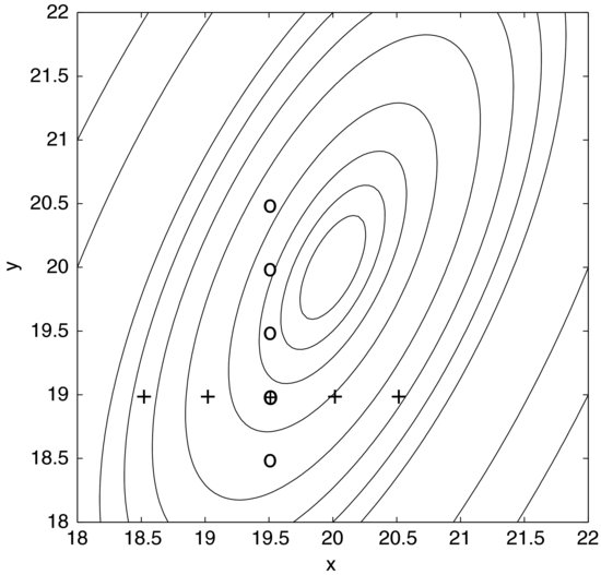
You might argue that you would not stop at this point but continue by iteratively sweeping x and y until you felt that you were close to the peak. It would still require luck to find the true optimum but the important point is that it can be done more economically and most likely with greater precision using a response surface method; that is, by combining design of experiments and regression modeling. The contours in Figure 9.11 are based on nine measurements and, apart from showing the true optimum, they give much more information about the response than the nine measurements in the two sweeps.
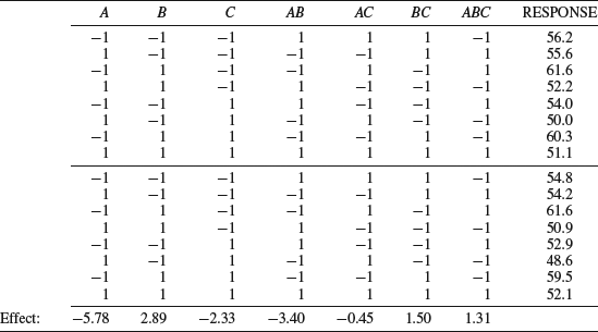
We will start by making a regression model of the data in Table 9.8. It contains the same data as the full factorial experiment in Table 9.3 but a replicate run has been added in the lower half. Due to the experimental error the replicated responses are a little different from the original ones, which is why the calculated effects differ slightly from those in Table 9.3. We will, for the moment, pretend that the factors are numerical instead of categorical; otherwise a regression model would make no sense. The regression model is easily obtained by the Excel worksheet function LINEST, which provides least squares estimates of the coefficients. The first input argument to this function is the response column. The second input is the range of columns corresponding to the factors and interactions. We also need to specify if the constant term in the polynomial should be zero or not; that is, if the response surface is to be forced to go through the origin. Finally, we can request the function to calculate regression statistics.
Table 9.8 The experiment in Table 9.3 with a replicate run.
After entering Table 9.8 into an Excel sheet, the first step is to write “=LINEST(Y, X, TRUE, TRUE)” into a cell, where Y should be replaced with the cell references for the response column and X with the references of the seven columns from A to ABC. The first “TRUE” means that the constant is to be calculated normally and not forced to be zero. The second “TRUE” makes the function return regression statistics. Pressing enter will return a single coefficient. To obtain the others we must turn the formula into an array formula, which is done exactly as with the MMULT function described before. Firstly, select a range of cells that has five rows and the same number of columns as Table 9.8. The LINEST expression should be in the top left cell. After this, press F2 and then CTRL+SHIFT+ENTER (or, in Mac OS X, CTRL+U followed by CMD+RETURN). We now obtain the numbers in Table 9.9, which will be explained presently.
Table 9.9 Output from the LINEST function; model coefficient and regression statistics.
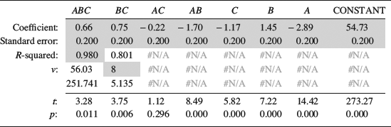
The numbers between the lines in Table 9.9 are the output from LINEST. Cells that are relevant to this example have been shaded. The first row contains the coefficients of the polynomial, but as seen in the header they are presented in reverse order to the columns in Table 9.8. If you look carefully you will find that the coefficients are exactly half the effect values calculated in Table 9.8. Recall that an effect is the average change in the response when the factor is switched from −1 to +1. Since the coefficients are slopes, they measure the change in response per unit change in the factor. As each factor changes by two units, the coefficients are the effects divided by two. The constant is just the mean of all responses, according to the principles explained in connection with Figure 8.11. Using these coefficients the response, Y, can now be described as:
The following are the most important parts of the rest of Table 9.9. The second row of the table contains the standard errors of the coefficients. These are measures of the uncertainty in the coefficient estimates. The shaded cell on the third row shows R2 (the coefficient of determination), which was discussed in Chapter 8. It shows that the model is quite good, accounting for 98% of the variation in the data. Finally, we find the number of degrees of freedom, ν, on the fourth row. If you are interested in the other regression statistics, they are explained in the help section about LINEST in Excel.
We are now able to calculate t-statistics for the coefficients to estimate how useful they are in predicting the response. The observed t-value is simply the coefficient divided by its standard error. It is given for each coefficient below the table. These, in turn, can be used to calculate p-values using the TDIST function. As explained in the last chapter, writing “=TDIST(t;ν;2)” into a cell returns the p-value, which is the probability of obtaining a coefficient of at least this magnitude under the assumption of the null hypothesis that the factor has no effect on the response. In the expression, t is the observed t-value of the coefficient, ν the number of degrees of freedom, and the last entry makes it a two-tailed test. The p-values are given at the bottom of the table where only the AC coefficient has p > 0.05. Applying a significance level of 5% we would consider the others to be statistically significant.
It is crucial to note that a two-level factorial design is only appropriate for categorical factors. With continuous, numerical factors, the design in Table 9.8 suffers from a serious drawback, since a design that only tests two settings for each factor is incapable of detecting curvature. Any non-linearity in the response will thus go unnoticed. This example illustrated how effects and coefficients are related but to detect curvature we need more information. One method is to add a treatment where all factors are centered in the test matrix, a so-called center point. If there is curvature, the response in the center point will deviate from the constant term in the model.
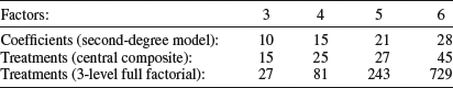
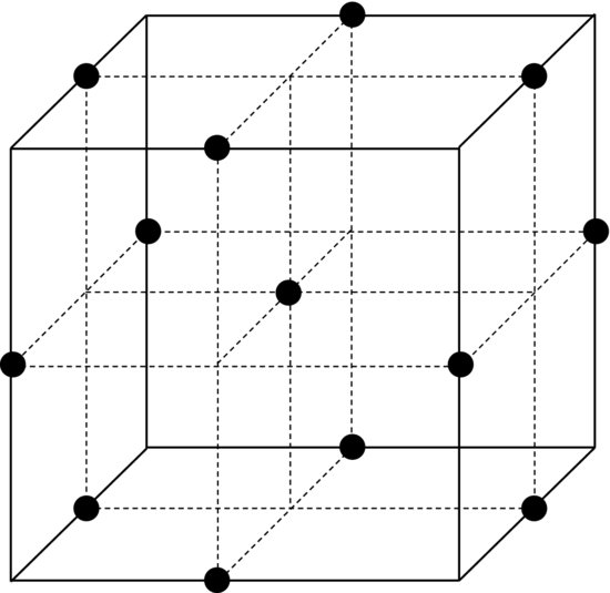
However, a center point is not sufficient for fitting a polynomial with quadratic terms to the data. This is because estimating the coefficients of these terms requires several additional degrees of freedom. In general, we need at least as many treatments as the number of coefficients that we wish to estimate. A three-level factorial design could be used but it actually provides unnecessary many degrees of freedom. It is more efficient to add axial points to the two-level design. Figure 9.12 shows an example of such a design. Axes are drawn through the center of the cube and the axial points are, in this case, located at the faces of the cube. This type of design is a composite of a two-level factorial design (full or fractional), the center point and the axial points. For this reason it is called a central composite design. It provides full support for a quadratic model while using fewer treatments than a three-level factorial design. Table 9.10 clearly shows how economic this design is compared to a three-level full factorial design, especially when the number of factors increases. Comparing Figure 9.12 to the three-level full factorial design in Figure 9.3 we see that they are similar but that the points on the edges of the cube are missing.
Figure 9.12 Central composite design with three factors. The axial points here are centered on the faces of the cube.
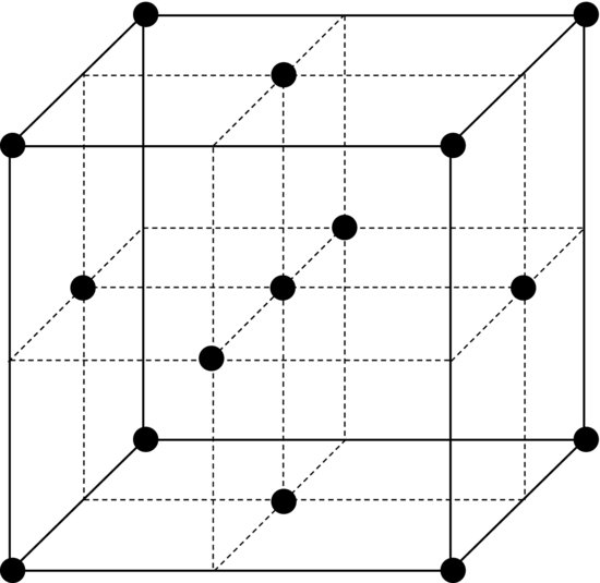
Table 9.10 Number of treatments for central composite designs and the corresponding three-level full factorial designs. The number of model coefficients to be estimated is also given for various numbers of factors.
The axial points could also be located at other distances; for example, so that all points in the design are at equal distances from the center point. This produces a rotable design. The advantage of this is that, for reasons beyond the scope of this book, the precision of the model will depend only on the distance to the origin, giving equal precision in all coefficient estimates. A potential drawback is that the factors must be set to five levels instead of three, which may make the experiment more difficult to run.
Since central composite designs contain more treatments than two-level designs, replicates become more expensive. For this reason, it is common to replicate only the center point but to do it several times. Apart from providing the necessary degrees of freedom for estimating the experimental error, these replicates can be used to detect drift in the experimental conditions if they are well distributed in time. This is especially useful in cases when it is difficult or even impossible to use a fully randomized run order. We should note that using center points to estimate the error rests on the rather optimistic assumption that the error is constant over the entire range of the factors, which is frequently not true. Many systems become unstable when several factors are set to extreme values in the corner points; this will increase the error locally.
Table 9.11 Central composite design applied to a diesel engine.
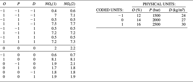
To proceed with analyzing a central composite experiment, Table 9.11 shows data from an experiment on a diesel engine. The measured response is the level of nitrogen oxides (NOx) in the exhausts, which is to be reduced. Three factors are of interest. NOx is often reduced by diluting the intake air with exhaust gases. This reduces the oxygen concentration in the intake, represented by the factor “O” in the table. The other factors are the fuel injection pressure (“P”) and the gas density in the cylinder after compression by the piston (“D”). The second response column contains replicates of the entire test plan. Although the measurements were randomized, they are presented here in standard order for clarity. The upper part of the table is the familiar 23 full factorial design, followed by the center point (0, 0, 0) and the axial points. The latter are easily identified as all factors except one are set to zero on each row. Beside the test matrix there is a table showing the factor settings in physical units. There are two reasons for using coded units with the settings −1, 0 and 1 in the test matrix. Firstly, they make it is easier to see the structure of the design. Secondly, it facilitates comparison of the effects. This is because the magnitudes of the coefficients in the polynomial will depend on the units of the predictor variables.
To illustrate why this is so, imagine that you are baking cookies and want to determine whether the baking temperature or the baking time is more important for the result. Say that you measure the temperature in Kelvin. Depending on whether you measure the time in seconds or hours, its numerical value will vary by four orders of magnitude. As the estimated coefficient for time is a slope, it too will vary by four orders of magnitude. The coefficient for the temperature may therefore be either smaller or greater than the coefficient for time, depending on which unit you use. This makes it difficult to estimate the relative importance of the two factors. With coded units this difficulty is avoided since the physical units are removed. Instead, the coefficients are determined from non-dimensional, normalized factors.
Now, let us return to our diesel engine. To analyze this experiment in Excel, the replicate runs should be entered below the test plan to obtain a table with 30 rows and a single response column. A column should also be added for each term that is to be included in the model. In this case we are interested in the interactions (OP, OD, PD, and OPD) as well as the quadratic terms (OO, PP and DD). These columns are obtained by multiplying the factor columns with each other as previously described. Using LINEST we obtain the regressors and statistics, and from these we can calculate the p-values just as before. The result is shown in Table 9.12.
Table 9.12 Regression output for the diesel engine data in Table 9.11.
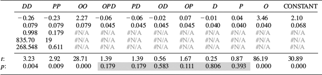
The R2-value shows that the model is good, accounting for 99.8% of the variation in the data. Looking at the p-values, however, we see that a number of coefficients are small in comparison with the noise level (shaded cells). When discussing regression in Chapter 8 we said that removing such terms would give us a more parsimonious model that more clearly illustrates the relationships in the data. However, removing the “insignificant” D and P factors would also remove the higher order terms where they appear. Since all the quadratic terms are important, this would not result in a useful model. If we want to trim the model we could try to remove the interaction terms and see if the model remains useful.
Figure 9.13 Pareto plot of the model terms obtained from the diesel engine experiment.
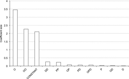
Looking at the coefficients we see that the oxygen concentration has the largest effect on NOx, and that there is a strong curvature in the response to this factor. There are no apparent interactions between the factors, making the interpretation more straightforward. It is useful to make a Pareto plot of the coefficients to obtain a graphical overview of the effect sizes. Figure 9.13 shows such a plot, where bars sorted in declining order represent the absolute values of the coefficients. Clearly, the oxygen terms represent nearly all the variation in the response, followed by the quadratic terms for density and injection pressure.
Having obtained the model, we are, of course, interested in how well it predicts the response. Making prediction calculations is quite straightforward in Excel, albeit a bit laborious. It is easiest to copy the coefficients from the LINEST output and paste them into a separate worksheet. Make sure to use “Paste Special” and select “Paste Values”, and to label the coefficients so you know which term they belong to. Then make three factor columns, labeled O, P and D, and an output column. Enter the input values you are interested in into the factor columns. In the output column, you enter the formula for the fitted polynomial. This is done as follows:
Start by typing an equals sign into the first cell of the output column. Then add the terms of the polynomial one by one. The first term is the cell reference for the constant, which is obtained by simply clicking that cell. Add a plus sign followed by the second term, which is the cell reference for the O coefficient multiplied by the cell reference for the first cell in the O factor column. Continue in the same manner until you have all the terms in place. Now, lock the references for the coefficients by typing a “$” sign before the letter and number of their cell references. For example, if the constant is in cell C3, the cell reference should read “$C$3”. After this, mark the first output cell and double-click the fill handle to apply the calculation to all the cells of the output column.
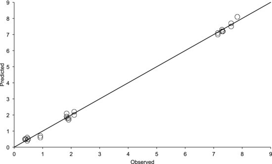
As a first step, it is useful to enter the test matrix into the factor columns. The output column will then contain the modeled predictions of all the measured values. If we plot these values versus the observed ones we obtain the diagram in Figure 9.14. The model is obviously good since the points fall on a straight line with a slope of one. The residuals are small and are randomly scattered about the line. If the points plot off the straight line, you could have made a mistake when entering the formula into the spreadsheet. It could also be due to a poor model, but that would be reflected in a low R2 value.
Figure 9.14 Observed responses plotted versus the predicted ones utilizing data from the diesel engine experiment.
Since the model contains three input variables, the response surface is a three-dimensional “surface”. This is, of course, difficult to visualize but we can, for instance, display one-dimensional sections through the origin. Figure 9.15 shows two such curves, of NOx as function of the density and oxygen concentration, respectively. They are obtained by putting a range of values between −1 and +1 into the factor column of interest, putting zeros in the other two, and plotting the output column versus the interesting factor. The observed values are also shown for comparison. The left-hand diagram in Figure 9.15 shows that, although the linear density term D was insignificant, the model nicely captures the curvature due to the quadratic density term DD. The right-hand diagram shows that the dominant oxygen factor also produces a curved response.
Figure 9.15 Modeled NOx response as function of density and oxygen. Measured values are shown as a reference.
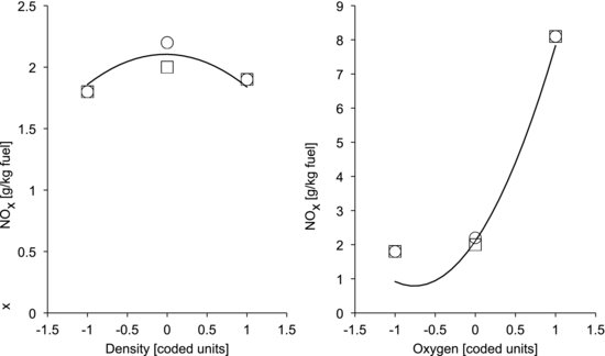
Figure 9.16 Contour plot of the response surface model from the diesel engine experiment showing the combined response to variations in density and oxygen.
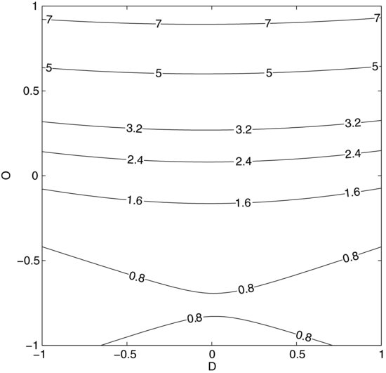
Though the R2 value is high the model is a bit off at the low oxygen setting. All models are approximations and this deviation is most likely due to an inherent limitation of quadratic models: they can only represent quadratic types of curvature. In this case the response resembles an exponential curve and, as explained in Chapter 8, the model could possibly be improved by a variable transformation, replacing O with an exponential function of O. Experimenting with variable transformations and trimming the model by removing unimportant terms are standard measures for obtaining the most useful model of your data, but recall from Chapter 8 that p-values are not entirely objective. You should not mindlessly remove terms just because they fall below an arbitrary significance level. When manipulating the model you should also make residual plots (see Figure 8.15) to confirm that the model behaves as intended.
It is also possible to show a two-dimensional section through the surface (Figure 9.16). This contour plot shows the combined response to the two factors in Figure 9.15, with the third factor P set to zero. It provides a convenient overview of the response's behavior that contains more information and can be more useful than plots of sweeps of single factors. A drawback is that it is difficult to plot the measured values in contour plots to illustrate the model error.
If we were interested in minimizing the NOx emissions from the engine we could now do this by taking derivatives with respect to the input variables and finding a zero point, if one exists. If you are working with response surface methods for optimization, however, you will probably use special software for this. In many important cases there are several response variables to be optimized and they may have conflicting dependencies on the factors. It is often impossible to find an unambiguous optimum, as the preferred setting may involve trade-offs between different responses. In such applications, software for multi-objective optimization is indispensable. It should also be mentioned that, if optimization is your main objective, it is of course more convenient to use physical units in the model. Otherwise the coded units must be “uncoded” to obtain the preferred setting in useful numbers.
One of the great advantages of central composite designs is that they are suited to sequential experimentation. We may start with a fractional factorial design for screening, using a center point to detect potential curvature. When we have found the interesting factors, we may simply add the axial points to the design and, in just a few extra runs, we obtain sufficient data to build a quadratic response surface model.
In areas where design of experiments and response surface methods are not widely used, prediction plots such as those in Figure 9.15 may be met with some skepticism. People who are used to sweeping single factors may think that three measurement points are insufficient to obtain a precise curve. It should be noted that these curves are just sections through a response surface fitted to 30 measurements. Although the plot only shows three measurement points, the model is based on all the measurements. If you are working in a field where design of experiments is not common, your audience may be confused if you present your results in effect plots and prediction plots. The approach still has the valuable advantages of detecting interactions while separating the effects, and of providing a basis for reliable multidimensional response models. If you worry about the skeptics, add a couple of measurement points on each axis through the cube. You can then plot the data as if the factors were swept through the center point. Be sure to keep the corner points of the factorial part of the design, however, as they are an indispensable foundation for the interaction terms of the regression model.
The experimental precautions used in connection with response surface methods are essentially the same as those for factorial designs. There are two main pitfalls involved: discerning effects from the noise and avoiding the influence of background factors. We assess the noise level by replicating measurements – either all of them or only the center point. Background factors are attended to by randomization. Some factors can be difficult to vary and it is often tempting not to randomize the run order of such factors. Non-randomized experiments can be hazardous but, if we are familiar with the system under study and are sure that it behaves in a repeatable manner, they can sometimes be justified. If a potential background factor is identified, its effect can be assessed in the experiment by blocking. It is useful to confirm that there is no drift by plotting replicates and residuals versus time. Another possibility in non-randomized experiments is to use run orders that are orthogonal to the time trend.
Figure 9.17 Box–Behnken design with three factors.
A practical drawback of central composite designs is that the corner points test extreme combinations of factor settings. As previously mentioned, a process may become unstable, unsafe, or even impossible to run at such extreme conditions. In those cases, Box–Behnken designs are practical alternatives. Apart from the center point they only include points on the edges of the cube (Figure 9.17). Box–Behnken designs thereby avoid setting all factors to extreme settings at once. Another advantage is that they are rotable or nearly rotable while only using three factor levels. A drawback is that they are not suited for sequential experimentation, since they use a set of treatments that is complementary to those of the screening designs.
Before finishing the chapter off it should be stressed that designing experiments is one thing and analyzing them is another. The orthogonal designs introduced here help the experimenter to collect data in a way that makes it possible to separate the effects of several factors while also assessing the interactions between them. Regression analysis is a separate activity from the design. It can be applied to any set of continuous data but the regression models become more reliable if the test matrix is orthogonal. Any deviation from orthogonality will introduce collinearity between factors and make the model less straightforward to interpret.
Most practitioners of design of experiments work in dedicated software packages. This may be convenient but is by no means necessary. When knowing about common designs it is easy to generate test matrices that are appropriate for our needs. After collecting the data, regression analysis can be carried out in a program like Excel. If it is to be done on a regular basis it is probably more convenient to write scripts in MathWorks MATLAB®, R, or a similar environment. In MATLAB, regression models and statistics can be obtained using the functions REGSTATS or REGRESS and it is quite easy to write scripts that automatically generate residual plots, prediction plots, contour plots and so forth. MATLAB even has an optimization toolbox with a graphical user interface. For those who prefer dedicated software, Minitab®, JMP® and Umetrics’ MODDE® are some common packages, each with its own advantages. In contrast to the others, JMP is available also for Mac OS X. These packages support more advanced designs than the ones introduced in this chapter. A notable example is the so-called D-optimal design, which can be used when experimental constraints make a completely orthogonal design impossible.
Let us finish the chapter with a summarized workflow for choosing designs and evaluating data from them. If the factors are categorical, two-level designs are appropriate. With continuous factors, such designs should at least be supplemented with center points to detect potential curvature. If a second-order model is to be fitted to the data, additional treatments are needed and central composite or Box–Behnken designs become suitable alternatives. Before actually collecting any data the orthogonality of the design should be investigated and confounding patterns established. After fitting a model to the data a number of diagnostic checks are made. The residuals should be normally distributed and have equal variance. This can be assessed using the residual plots introduced in Chapter 8. Non-normal residuals can often be amended by variable transformations. We should also confirm the absence of undesired time trends by plotting the replicates and the residuals versus time. After this the model is trimmed by removing unimportant terms while not letting R2 decrease too much. This results in a more parsimonious model that shows the important relations in the data more clearly than the maximum model. If coded units are used the coefficients expose the relative importance of the factors. It is often useful to make a Pareto plot of the coefficients to obtain a graphical overview of the effect sizes. Finally, the model is used to plot, analyze and optimize the response.