
14. Advanced Interface Techniques
What’s New in the Interface World
Arguably, the biggest event in the world of computer interfaces occurred on April 3, 2010 when Apple shipped the first iPad. Although the iPhone actually pioneered many of the interface changes that reached fruition in the iPad, the size and shape of the iPad quickly got people to think that this wasn’t a new kind of phone but rather a new kind of computer. Compared to existing computers, the iPad was as powerful (or even more powerful) than many of them. What’s more, the iPad’s powerful battery meant that it was more portable than even laptop computers, which had seemed so svelte only a few years before.
People also noticed what the iPad did not have that desktop and laptop computers did: connections for external drives, expandable memory, ports to connect devices such as digital cameras, and the like. Rather than limit the iPad’s usability, Apple’s focus on its core functionality was arguably a wise choice.
One of the most important parts of the desktop computer interface—menus—was also missing on the iPad. The iPad caught on very quickly, and people soon used it for a wide variety of tasks. For most people, it just worked, but others examined the interface thoroughly and noticed differences from previous interfaces. (Many of these differences were based on Apple’s Human Interface Guidelines.) As you’ll see in the list that follows, many of the key features of the new interface are old news to FileMaker users:
• There are fewer buttons. Many things on the iPad happen automatically. For example, popovers present choices and information that on OS X might have been presented in a dialog with an OK and a Cancel button. There is no Cancel button in a popover; you just tap anywhere outside the popover and it disappears. With FileMaker, triggers implement automatic behaviors eliminating the need for buttons in many cases. (In the Projects Starter Solution, a pop-up menu lists layouts you can choose. There’s no Go button next to the pop-up menu: instead, an OnObjectModify trigger takes you to the layout automatically.)
• In most apps, there is no Save command. Saving is done for you automatically. This behavior has carried back to the Mac with OS X 10.7 (Lion). FileMaker saves data automatically and has done so for years (as do many databases).
• Information structures are flattened. To set values, instead of a sequence of windows as you might have on a desktop, you often have a view with tabs or other controls that let you see data from various sources and relationships all in a single layout.
• Finally, apps are very attractive. In everything from icons to the apps themselves, Apple has placed a high premium on appearance. Because the company approves all apps sold in the App Store, it can enforce that premium.
 For more information on interface design, see Apple’s iOS Human Interface Guidelines and Mac OS X Human Interface Guidelines at developer.apple.com.
The next section discusses the themes that were implemented in FileMaker Pro 12.
 Note
NoteIn practice, it appears that without having to take much action, Apple has been able to encourage developers to improve the look of their apps just by letting them know that esthetics will factor into the decision of accepting an app into the App Store. Many FileMaker solutions are beautiful and elegant to look at because they have been created by talented designers using the very flexible FileMaker layout tools. Other FileMaker solutions are not quite so beautiful to look at.
Working with Themes
Themes provide you with a variety of designs for your FileMaker solutions. They start you off with colors, fonts, field borders, and other graphic elements that are coordinated for the theme. Most important, themes are interchangeable.
If you create a new database, you will find that you have a table and a layout created for you automatically. Both carry the name of the database file. Thus, in Figure 14.1, you see a new database called UIDatabase and its UIDatabase layout. No records are present in the database.
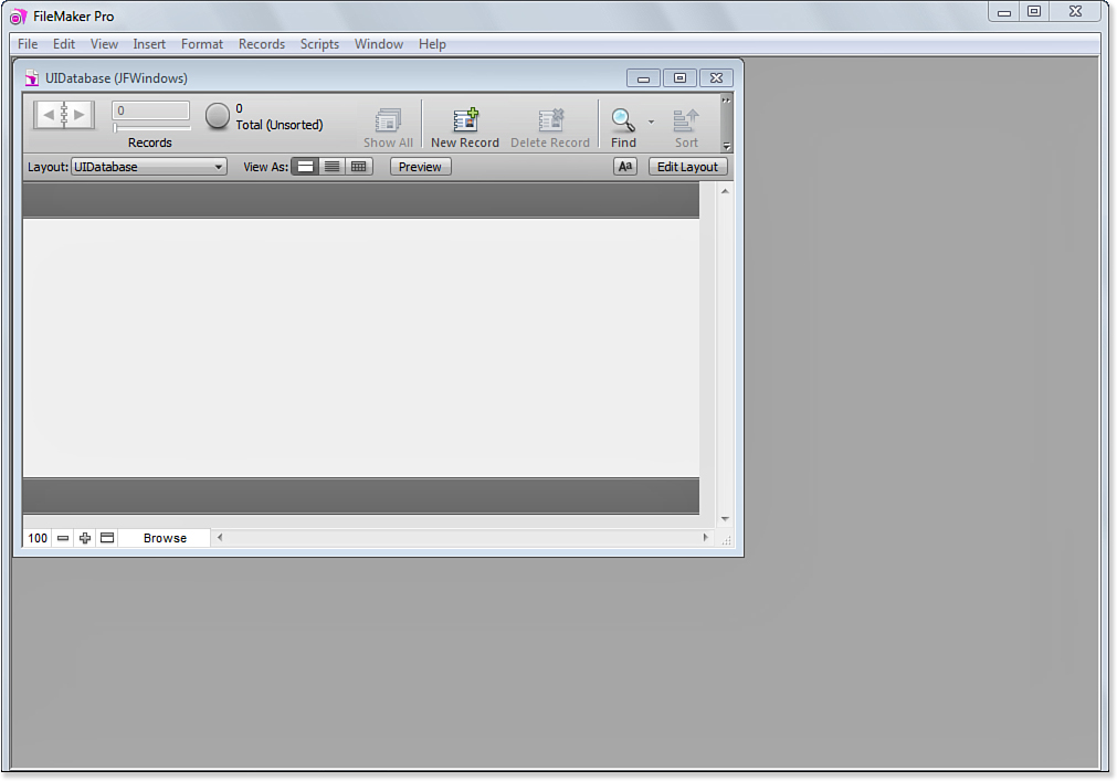
Figure 14.1. Create a new database.
The underlying table is also named UIDatabase. The Manage Database dialog shown in Figure 14.2 lets you see the table as well as the fact that no fields are yet defined for it.
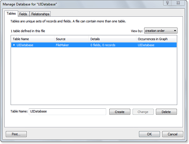
Figure 14.2. Review the database.
Changing a Theme
Not only do themes give you a head start on the design of your layouts, but they are changeable. The layout created in Figure 14.1 uses a default theme called Cool Gray. You can examine the current theme in Layout mode by selecting Layouts, Change Theme, as shown in Figure 14.3.
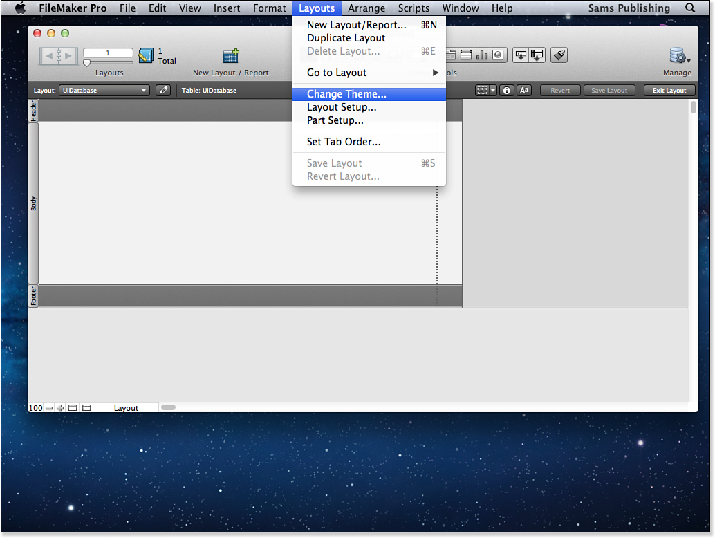
Figure 14.3. You can change themes.
As you can see in the Change Theme dialog shown in Figure 14.4, you have a lengthy list of themes from which to choose. They are grouped together in several collections. As you select various themes from the list, the sample layout at the right of the dialog changes so that you can get a general idea of the effect. However, until you actually start laying out the fields and other interface elements you will be using, you won’t be able see exactly what your layout will look like in this preview.
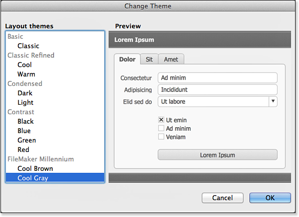
Figure 14.4. Choose themes and see previews.
At the top of the list of themes, in the Basic group, you find the Classic theme along with two variations of it in the Classic Refined group: Cool and Warm. Figure 14.5 shows the Classic theme selected. If you have used FileMaker in versions prior to FileMaker 12, you will recognize the default fonts and styles.
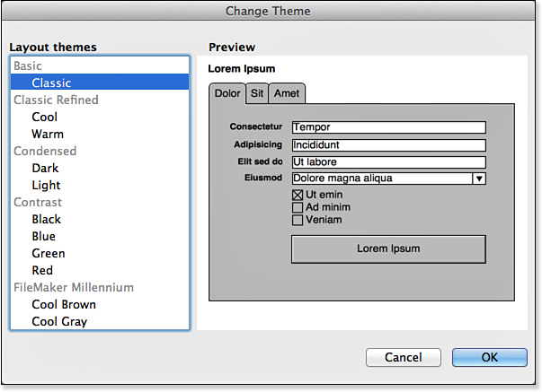
Figure 14.5. Change a theme.
As you explore the themes, you will note that some of them are designed specifically for touch devices. For example, just below Cool Gray you will find Cool Gray Touch, as shown in Figure 14.6. Note that the buttons and fields are larger in this theme.
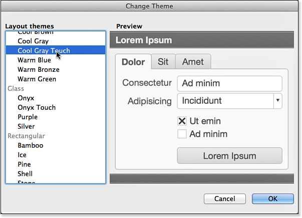
Figure 14.6. Explore touch themes.
Exploring Themes
To demonstrate themes in action, Figure 14.7 implements a few additions to the database:
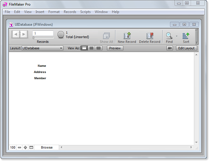
Figure 14.7. Add fields to the database.
• The text fields Name, Address, and Member are added to the table using File, Manage, Database.
• Default fields and labels are automatically added by FileMaker.
• A value list called YesNo, with the values Yes and No, is added using File, Manage, Value Lists. (It is not yet visible in Figure 14.7.)
• Using the Inspector, the Member field is changed to a radio button set that uses the YesNo value list, as you see in Figure 14.8.
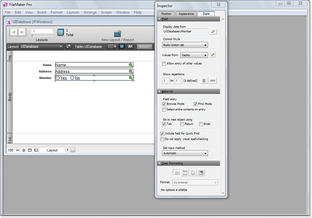
Figure 14.8. Change a field to a radio button set.
You can now change the theme. Use Layouts, Change Theme to change your theme back to Cool Gray, which was shown originally in Figure 14.1 before the fields were added.
 Tip
TipIf you look closely, you will see that when the fonts change for the added fields, the spacing is a little off. This is because when you modify a theme, such as by adding a field to the layout, those modifications are not reflected when you subsequently change themes.
As you can see in Figure 14.9, if you add a new field to the database and a new field to the layout, the new field reflects the sizing of the theme. At the left, the Name field has a height of .236 while at the right, the City field has a height of .306. The font (Tahoma) and size (12) are the same in both versions. If you have followed the steps in this section, the Name field (along with Address and Member) was created with the Classic theme. Classic uses Arial 12 for text fields, so the .236 height of the fields works out well. However, because Tahoma 12 is slightly larger than Arial 12, that text field height is no longer satisfactory when the theme is changed to Cool Gray.
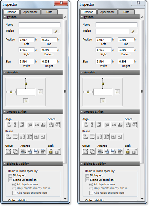
Figure 14.9. Compare field sizes with different themes.
Because you might have to make some adjustments after you change a theme, it is a good idea to experiment with themes using a few layout fields without bothering with the tweaks to field sizes. Select the theme you want, and then either tweak the existing fields or delete them and create new ones in the new theme.
Using Styles and States
Along with themes, FileMaker Pro 12 has implemented styles and states in the Inspector and design surface. These features enable you to build more sophisticated layouts that respond in more ways to user actions. You adjust styles and states in the top part of the Appearance tab of the Inspector, as shown in Figure 14.10.
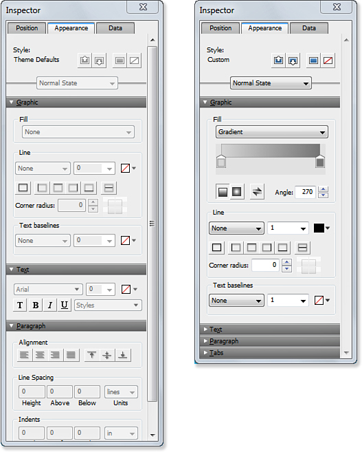
Figure 14.10. Adjust styles and states.
Using Styles
The Style section in the Inspector, shown on the left in Figure 14.10, is disabled there. No interface elements are selected and the theme defaults are used. That is not something that happened prior to FileMaker Pro 12. Before FileMaker Pro 12, changes to attributes, such as fonts and graphic fills that were made when no field was selected, were applied to what is now the theme. The new settings took effect for the next objects that were created. With the advent of themes and styles, this behavior no longer exists.
Instead, you can select an object in the layout and set its styles and states: You can no longer set attributes for objects that have not yet been created (that is the role of themes). The right side of Figure 14.10 shows the Appearance tab of the Inspector when an object in the layout is selected. Note that the Style section is now enabled.
The left side of Figure 14.10 shows that the style that will be used for new objects is Theme Defaults. All objects in a newly created layout start with the theme’s default style. You can change attributes for the specific objects in your layout using the Inspector.
If you change the theme with Layouts, Change Theme, the style at the top of the Inspector is displayed as Theme Defaults. Objects you had customized before changing the theme (that is, objects with custom styles rather than Theme Defaults) now revert to Theme Defaults rather than the custom styles you created. Figure 14.11 shows a field that had been customized as it appears after a theme change.
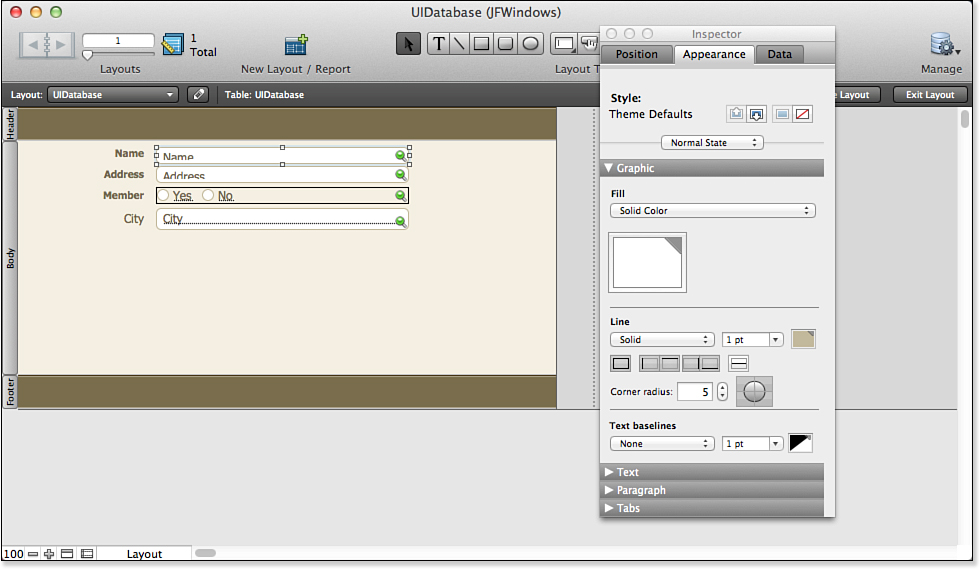
Figure 14.11. After a theme change, styles revert to theme defaults.
Often, this is the correct behavior: You want to adopt the theme in its entirety. However, sometimes you want to keep your customized styles for objects. To do that, use the Edit, Undo Styles command. Your previous customized styles will appear back, as you see in Figure 14.12.
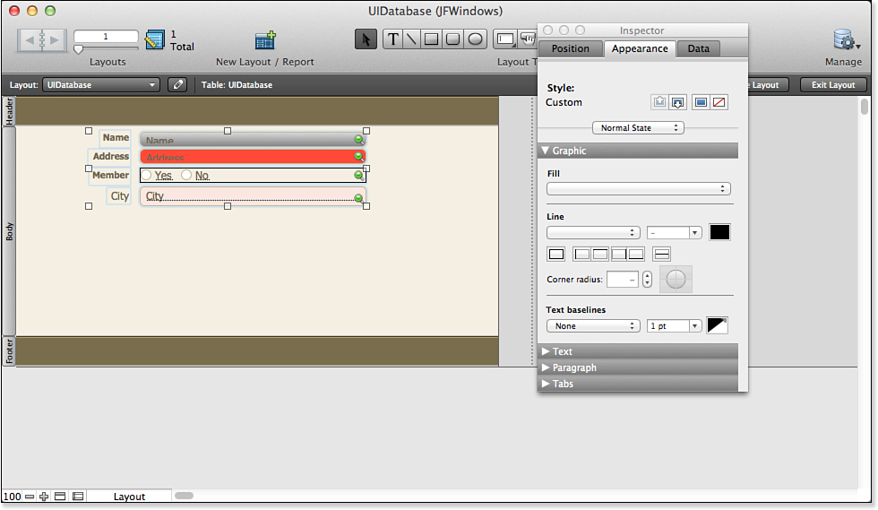
Figure 14.12. Use Undo Styles to revert to your previous customized styles.
You can use Edit, Undo Theme to revert to your previous theme if you want. What you can see from this behavior is that the theme and your customizations are changed in two separate tasks in the Change Theme command. They are done together, but you can undo them separately using the commands or the standard undo keyboard shortcut (Cmd-Z)[Ctrl-Z] twice.
Using States
States let you specify attributes for the selected interface element using the Inspector. These let you change the appearance of the selected element(s) based on what the user is doing in the interface. The pop-up menu shown in Figure 14.13 enables you to set four separate sets of state attributes:
• Normal State
• In Focus—This state is used when you have entered a field with a mouse click or tap, the Tab key, or the Go to Object script step.
• Hover—This state is unavailable on iOS devices because there no such thing as hovering.
• Pressed
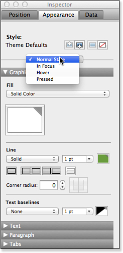
Figure 14.13. Set state attributes.
The undo mechanism described in the previous section is frequently used with states. If, for example, you have created a pressed state attribute for a button, you might want that appearance to be brought over to the new theme. Just change the theme, which will revert to the Theme Defaults, but immediately after that use Edit, Undo Styles to bring over your pressed-state style. Do not use Edit, Theme after that so that you get the new theme together with the old state appearance.
Experiment with styles for the various states, but also observe how apps behave. Often, very subtle changes are sufficient to let the user know that the button has been pressed. Remember, your FileMaker Pro solution is about the solution and its data rather than a never-ending parade of visual effects. Often, in usability labs, users will emphatically deny that anything about an object’s appearance has changed with a change to state. The subtle (and often best) distinctions might not even register consciously, but users see and respond to them. Finding the right balance between subtle yet perceptible and grotesque state appearances can take a good deal of testing, but it can make your solution look better and be easier to use.
Copying Styles
When an object is selected in Layout mode, four buttons at the top of the Appearance pane may be enabled (they are just to the right of the style text—either Theme Defaults or Custom). They correspond to four commands in the Edit menu in Layout mode:
• Copy Object Style
• Paste Object Style
• Apply Theme Style
• Remove Styles
Copy Object Style
This command is available if you have set a custom style for the selected object (that means it is not available if the object’s style is Theme Defaults). Copying the object’s style with the menu command or the button at the top right of the Inspector copies all the attributes for all the states of the object.
Paste Object Style
This button and the corresponding menu command are enabled if you have copied an object’s style and have also selected an object to edit. If so, the attributes for all the styles are pasted to the selected object.
Apply Theme Style
If an object is selected, this command or button will set the attributes to the theme’s style.
Remove Styles
This removes the styles whether you customized them or you are using the theme’s styles. Fill, Line, and Baseline are set to None, for example.
Using FileMaker Formatting Tools
FileMaker Pro provides several tools to help you format the appearance of layouts and objects. A few of the most useful tools are described in the following sections.
Conditional Formatting
Using styles and states, you can adjust the appearance of layout objects based on the state of the interface. Conditional formatting lets you adjust the appearance of an object based on its content.
In Layout mode, select the field or text object to which you want to apply conditional formatting, and choose the Conditional command from the Format menu to open the dialog shown in Figure 14.14.
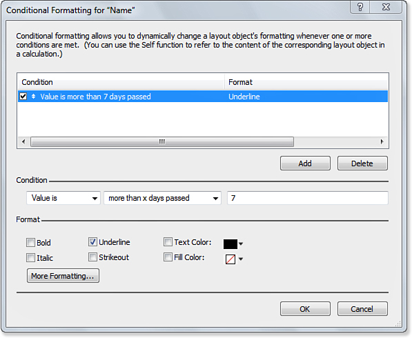
Figure 14.14. Use conditional formatting to provide user feedback.
You can set two choices. One is to set the condition based on the value of the field. To do this, select the test shown in Figure 14.15 and type in a value to use in the test.
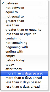
Figure 14.15. Select the test to perform.
You also can specify a formula to evaluate, as shown in Figure 14.16.
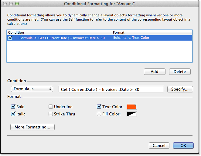
Figure 14.16. You can supply a formula for the test.
To learn about the basics of calculation functions, see Chapter 8, “Getting Started with Calculations.”
For detailed examples of text-formatting functions, see Chapter 15, “Advanced Calculation Techniques,” and Chapter 19, “Debugging and Troubleshooting.”
Setting the Layout Width
In addition to themes and styles, FileMaker Pro 12 introduces the ability to set the width of a layout. Until now, you did not worry about the width of a layout: It automatically was sized to be wide enough for all the objects you placed on it. In other words, the right side of the layout was the right side of the rightmost object in the layout.
You now have the ability to explicitly set the layout width. As you see at the right of Figure 14.17, you can drag the right edge of the layout from side to side. Objects that are placed entirely beyond the layout’s right edge are not visible in Browse mode, but they are still there and you can reference them in scripts if you want to.
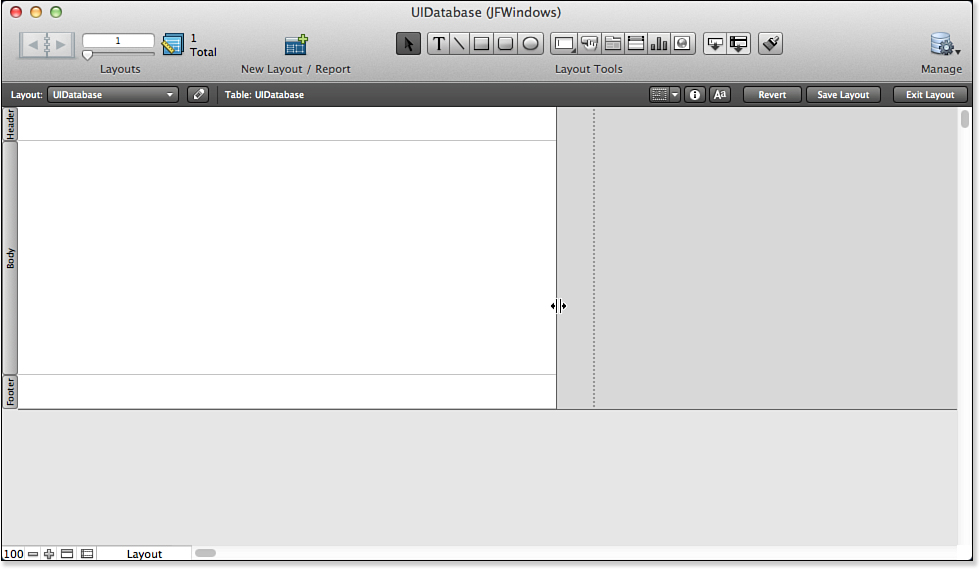
Figure 14.17. Adjust the layout width.
Using Grids
To help position interface elements consistently, you can turn on grids in Layout view. Use View, Grid, Show Grid and View, Grid, Snap to Grid to control the behavior of the grid. As shown in Figure 14.18, show rulers (View, Rulers) and set the units to inches, centimeters, or points.
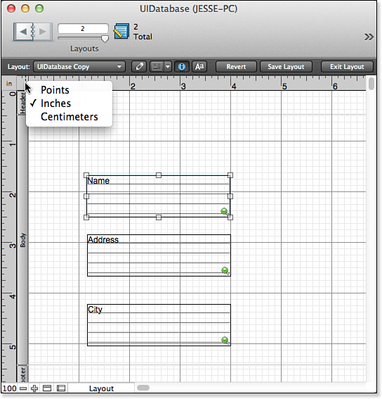
Figure 14.18. Choose grid units.
Note that beginning with FileMaker 12, the use of pixels as a measurement is deprecated in favor of points. Pixels are not a stable unit to use in the world of resolution independence. (See the “Points Versus Pixels” sidebar, later in this chapter.)
If you choose View, Grid, Snap to Grid, objects snap to the grid as you drag them. If you position them by nudging them with the arrow keys or by setting their location with the Inspector, the grid does not come into play.
Using Guides
Guides let you set a vertical or horizontal location to use as a reference point. You create a guide by dragging from the ruler at the left or top of the design surface in Layout view. Position it where you want regardless of whether it is a grid unit. You can control behavior for guides just as you do with grids. The commands are View, Guides, Show Guides and View, Guides, Snap to Guides. Just as with grids, snapping applies to dragging objects rather than nudging them or setting their location with the Inspector.
Using Dynamic Guides
Turn dynamic guides on and off with View, Dynamic Guides in Layout view. As you move objects, guides appear when they are aligned with adjacent objects based on an edge or the middle, as shown at the left in Figure 14.19. In that case, the lower text field (Address) is being moved. The dynamic guide shows when it is aligned with the middle of the Name field above it.
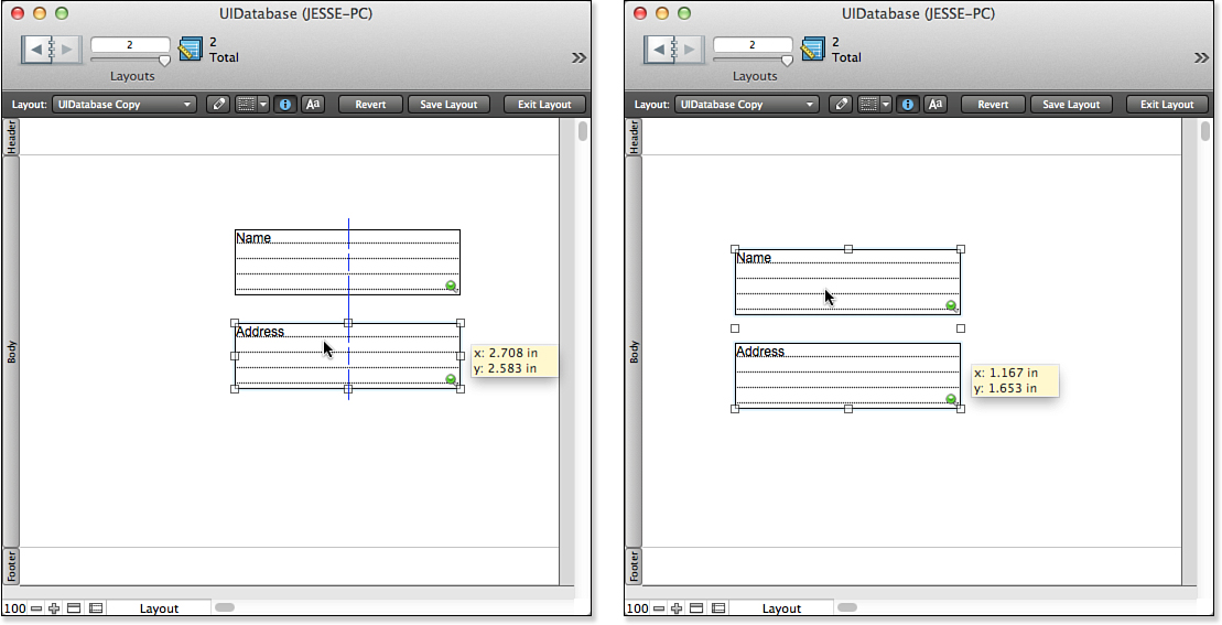
Figure 14.19. Use dynamic guides.
If you select multiple objects, they move as a group, as you see at the right of Figure 14.19. As you drag, the position of the grouped objects appears. Furthermore, you can drag any of the resizing knobs to resize all the selected objects.
Using Screen Stencils
In addition to the guides and grid discussed previously, beginning with FileMaker Pro 12, you can use screen stencils to help you design your layouts.
In Layout mode, you can turn screen stencils on or off from the layout bar as shown in Figure 14.20. There are two controls. The one shown in Figure 14.20 lets you turn the provided stencils on and off. Just to its left, the button lets you show or hide stencils.
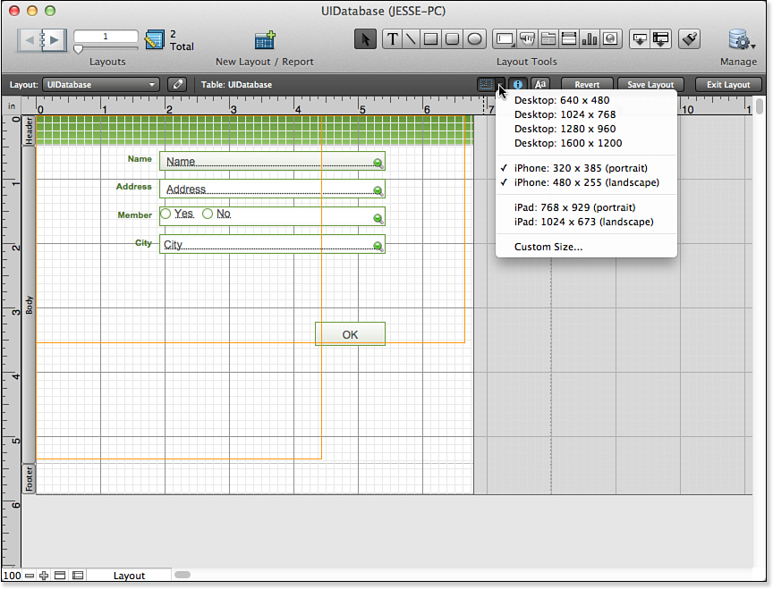
Figure 14.20. Use screen stencils.
The stencils are yellow lines that appear over all your layouts in Layout mode until you turn them off. As you see in Figure 14.20, eight stencils are built in to FileMaker; you can add one more for a total of nine.
It is important to note that the dimensions in the names of the built-in stencils are represented in points rather than the commonly used pixels. You can verify this if you open the Custom Size dialog, as shown in Figure 14.21.
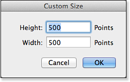
Figure 14.21. Create a custom screen stencil.
Using GetLayoutObjectAttribute
The GetLayoutObjectAttribute function lets you interrogate layout objects about their current state. Many times you know this information already because you set these objects. However, for other objects, such as the Web Viewer, you do not necessarily know what page the user has navigated to.
The GetLayoutObjectAttribute function requires two parameters; it may take two additional ones. The first parameter is the name of the object, as set in the Inspector. Remember that FileMaker enforces the uniqueness of layout object names within a layout.
This is not a Get function in the sense of Get ( ScriptParameter ). The name of the function is GetLayoutObjectAttribute (with no space after Get).
The second parameter is the attribute you want returned. Table 14.1 shows the various attributes you can query and what the results are. All measurements are in points.
Table 14.1. Attributes for GetLayoutObjectAttribute


One of the common uses of this function is to get the HTML that is currently displayed in a Web viewer page to which the user has navigated.
Working with Custom Menus
To modify the menu sets in FileMaker, you have to develop using FileMaker Pro Advanced; however, anyone working with FileMaker Pro (or a bound runtime solution) can utilize the custom menus you create. The custom menus feature dramatically alters the user interface landscape for FileMaker: Developers can now control menus beyond simply turning them off and can drive a great deal of application logic.
Suppose that you have built a solution with a section for customers and another for orders. Assume that the system is somewhat complex and that you, as a developer, do not want users creating new order records or new customer records by selecting New Record from the Records menu in FileMaker—perhaps new record creation needs also to create child records in parallel or do some other bookkeeping within your system. Instead, you want scripts that you’ve written to manage the creation of these important records.
Using custom menus enables you to do the following:
• Change the names of menus or menu items
• Override or extend the functionality of native FileMaker menu items with your own scripts
• Change or add keyboard shortcuts to existing or new menu items
• Disable or remove individual menu items or entire menus
• Load custom menu sets on demand or tie menu sets to particular layouts, modes, or operating systems
In FileMaker Pro Advanced, you can create your own menu set and control at the most granular level when menu items appear, how they work, and even what keyboard shortcuts they use. Such customizations, if made, apply throughout the FileMaker interface, affecting contextual menus, the close box on Windows systems, and potentially every menu item in FileMaker.
Before delving further into custom menus, you have to be clear on the nomenclature used. There are four separate elements to consider when working with custom menus:
• Menu Item—This is a single item on a menu. A user can often select it, as is the case with the New Record and Save As menu items. Menu items can also be separators or submenus.
• Command—Commands refer to the native controls “baked into” FileMaker: They perform an action in FileMaker. In FileMaker’s standard menu set, all the actions are predefined by the application—for example, entering Find mode or opening the Help system. You can also create custom commands that initiate a script you, as a developer, will have written. It is possible to tie a menu item to a command in FileMaker and thus offer the native functionality that the command controls.
• Menu—A menu is a collection of menu items and comprises the full set of menu items available, regardless of whether they are all active or visible in any given mode or situation. Examples of menus are File and Edit. The File menu starts with the New Database, Open, and Open Remote menu items.
• Menu Set—A menu set is the set of all menus currently active or potentially available in FileMaker. It is a collection of menus and is the element you will load or associate with layouts. The FileMaker Standard menu set includes all the menus we’ve worked with for years: File, Edit, View, Insert, and so on.
Note that any specific menu or menu item is present or not, grayed out or not, depending on certain conditions. For example, in Browse mode, the standard FileMaker Pro Advanced menu set includes the Records menu; but in Layout mode, the Records menu is not available and instead the Layouts menu becomes available. These conditional states can be tied to FileMaker modes, layouts, or user platforms.
Specifying Custom Menu Elements
One important concept you will need to grasp is that FileMaker controls all custom menu elements at the menu set level. That means if you want your Records menu to show New Customer on a Customers layout and New Order on an Orders layout, you will need to create two additional custom menu sets—one to contain each new variant of the Records menu.
This does not mean, however, that you have to create duplicate menus or menu items. Menus and menu items can be used by multiple menu sets. You need only create menu items that are unique and require customization. In the preceding example, you would have to create two menu sets (a Customers set and an Orders set), two versions of the Records menu, and also two new menu items (New Customer and New Order).
When you change from one set to the other, all the user will see is that one menu item has changed; however, in the mechanics of working with custom menus, you will in fact have loaded a new menu set altogether.
Note that if you are starting from scratch, the menu set called My Menu Set will not yet exist: You create it in this section.
Using the Menu Sets Interface
In FileMaker Pro Advanced, choose Tools, Manage, Custom Menus, Manage Custom Menus to open the dialog shown in Figure 14.22.
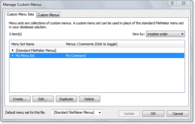
Figure 14.22. Manage your menu sets.
Click Create to create your menu set. The dialog shown in Figure 14.23 will open. Name your menu set. Notice that My Menu will not yet exist: That is what you will create in this step.
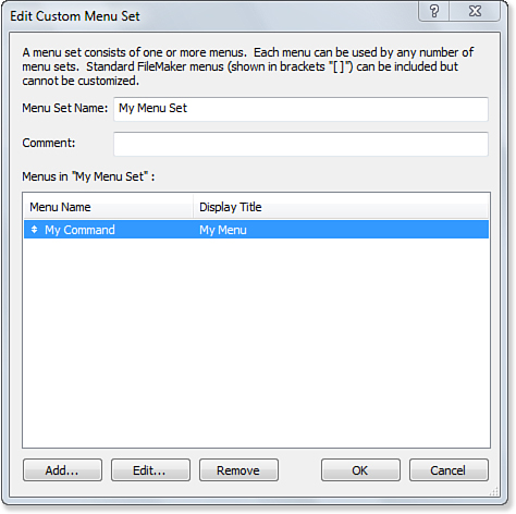
Figure 14.23. Name your menu set.
Click Add in the lower left to open the Select Menu dialog shown in Figure 14.24.

Figure 14.24. Select a menu to use.
Scroll down to the bottom. You will see the various FileMaker menus, but at the bottom you will be able to add your own. Figure 14.22 shows what it looks like when you have done your work.
Click the + button at the lower left to open the Create Custom Menu dialog shown in Figure 14.25.
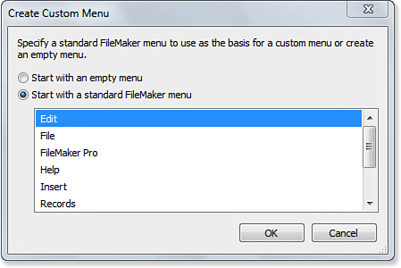
Figure 14.25. Create a custom menu.
Use the radio buttons at the top either to start with a standard FileMaker menu or to create a new empty menu. An empty menu is the choice to make for now.
The Edit Custom Menu dialog opens, as shown in Figure 14.26.
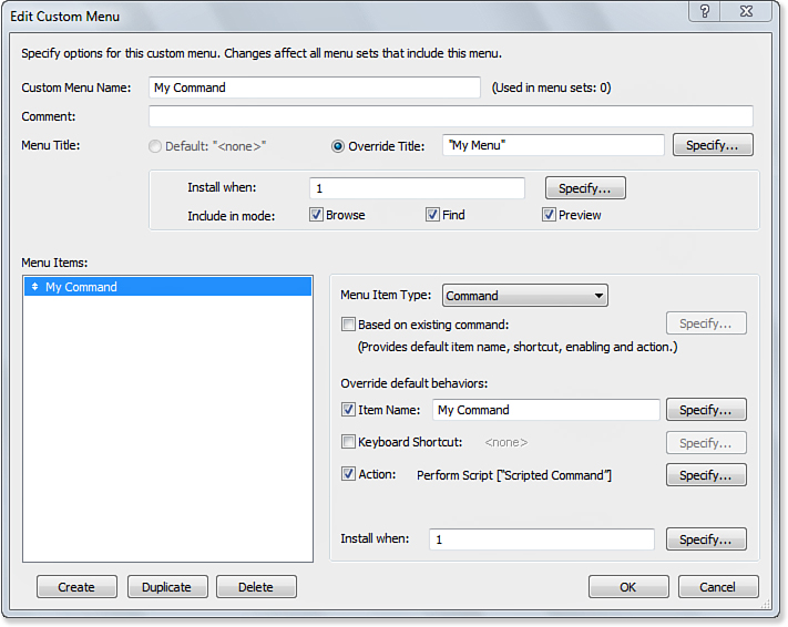
Figure 14.26. Edit your custom menu.
Provide a name for your new menu (this is the name you’ll use in the Manage Custom Menus dialog. Don’t confuse it with the menu title you specify on the third line down: That is what the user sees.
The Install When field is a calculation you set up to determine when this menu is to be installed. By default, it is set to 1 (true), but you can specify a calculation. Perhaps the most common calculation uses the Get ( SystemPlatform ) function so that you install different menus on the different FileMaker platforms.
Next, check boxes let you determine which modes the menu should be installed in. When you click Create, a new menu item is created and selected, as you see at the lower left in the figure.
Your choices for Menu Item Type are
• Command
• Submenu
• Separator
In the basic case, you want a command. If you click Based On Existing Command, you can then select an existing FileMaker command and modify it by changing its name, its keyboard shortcut, or its action (or all three).
In this example, you build a totally new command, so you must specify its name and any keyboard shortcut you want to use. As you saw in Figure 14.26, in this example a script has been written. Click Specify for Action (or just click the check box) and you’ll see a standard dialog for you to choose a script.
Finally, you have another Install When calculation: This controls the installation of the menu item.
The last part of installing the custom menu is attaching it to a layout or to a file. Use the Layouts, Layout Setup command in Layout mode to select the menu set for a layout, as shown in Figure 14.27.
Note that this is the dialog you have always used before to select a script, and you can pass a parameter into the script.
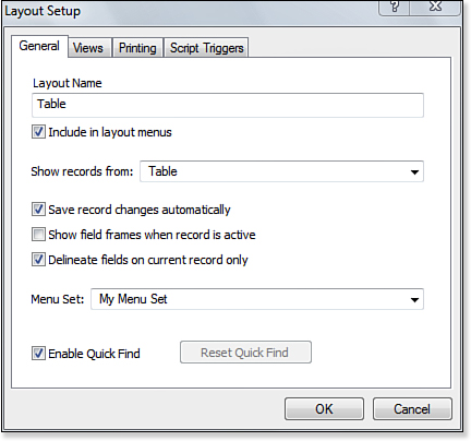
Figure 14.27. Use Layout Setup to attach a menu set to a layout.
To set up a custom menu set for a file, use the drop-down menu at the bottom of the Manage Custom Menus dialog, shown previously in Figure 14.22.
In addition, these techniques are also available to you:
• Load a menu set on demand by using a script.
• Load custom menu sets on demand, or tie menu sets to particular layouts, particular modes, or a particular operating system.
• Choose from among the available custom menus in the Tools, Custom Menus menu choices. This last option assumes that you’re working with FileMaker Pro Advanced.
• Assign a custom menu set as the default menu set for an entire file.
• Assign a specific custom menu set to a layout.
• Load a menu set on demand by using a script.
• Load custom menu sets on demand, or tie menu sets to particular layouts, particular modes, or a particular operating system.
• Choose from among the available custom menus in the Tools, Custom Menus menu choices. This last option assumes that you’re working with FileMaker Pro.
Providing Accessibility
FileMaker provides tools for the solution developer to improve access to solutions. This section covers the three aspects of providing improved accessibility for screen readers:
• Use the FileMaker Pro Accessibility Inspector to set up attributes for screen readers (developer)
• Turn on accessibility features in FileMaker and/or the operating system (end user)
• Use accessibility features (end user)
Set Up Accessibility Attributes in Layout Mode
In Layout mode, choose View, Accessibility to open the Accessibility Inspector as you see in Figure 14.28. As with all inspectors, the Accessibility Inspector reflects the values for the selected object. If no object in the layout is selected, the fields in the inspector are blank.
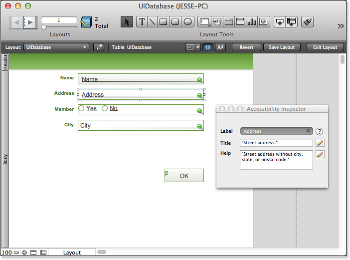
Figure 14.28. Use the Accessibility Inspector.
You can enter any of the three values in the Accessibility Inspector:
• Name—By default, this is the unqualified name of the field in the database that appears in the selected object. (Unqualified means that a field such as Customers::Address is shown as Address.)
• Title—This is the title that you want to be read by the screen reader. In this case, it might be Customer Address. This field can be entered as a calculation, which means you can incorporate data into it, such as a calculation like “Address for <name of customer field>”. If <name of customer field> contains “Anatol,” the spoken text would be “Address for Anatol.”
• Help—This is help text that will be spoken. It, too, can be a calculation field that incorporates data.
In the title and help fields, use punctuation in the text strings. The screen reader responds appropriately to commas and periods, so the resulting speech is easier to understand. Use Name, Title, and Help to provide different perspectives on the content: Do not simply repeat “Name” or “Address” in each label.
Turn On Accessibility Features
On OS X, use  , System Preferences to turn on accessibility:
• In Universal Access, use the Seeing tab to turn on VoiceOver, as seen at the left in Figure 14.29.

Figure 14.29. Turn on accessibility in OS X.
• In Keyboard, use the Keyboard Shortcuts tab to select All Controls. This enables you to add accessibility to controls and fields. This is shown at the right of Figure 14.29.
Accessibility features can also be provided by third-party products, such as JAWS for Windows.
This step needs to be done only once for your computer unless you want to change the settings.
Use Accessibility Features
As people use the solution with the accessibility features turned on, the appropriate text will be displayed and read, as shown in Figure 14.30.
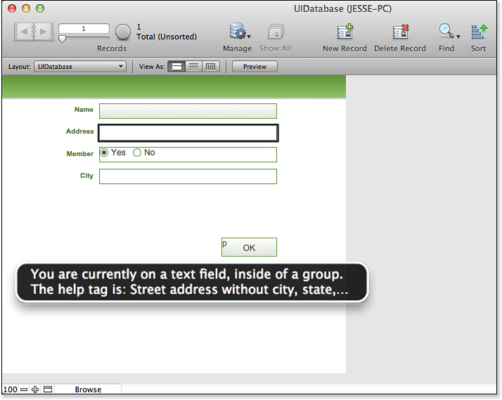
Figure 14.30. Use accessibility.
FileMaker Extra: User Interface Heuristics
We opened this chapter by saying we wouldn’t preach to you about what makes a good interface and what doesn’t. Well, we’re breaking our word here. Although we won’t argue about pop-up windows versus single-pane applications, or whether buttons should be 3D beveled or just text on the screen, here are a few guidelines we recommend to all our clients, students, and developers alike:
• Use real-world terminology—You should strive to speak your customers’ language. Use terms they’ll find familiar. In some cases, you might need to retrain them, but whenever possible, leverage the body of knowledge already in place in an organization to make your system more intuitive.
• Impart meaning with more than just labels—Text is only one of many things your users will see on a layout. They’ll also see colors, shapes, headlines, subheads, footers, and so on. Use all the objects in your toolbox to impart meaning: Consider, for example, changing the background color of find layouts or perhaps making navigation buttons look different from functional buttons. Keep this in mind though: Don’t rely too heavily on color. A great many people have varying degrees of colorblindness.
• Give users the freedom to click around without fear—Users should be able to cancel out of any destructive function (delete, for example) so that they can explore your application and learn by doing.
• Be consistent—We can’t stress this point enough. Whatever the colors, shapes, sizes, styles, and so on that you prefer, make sure your layouts follow the set of rules you establish. Name fields and buttons consistently, place them in the same positions, and give your users a visual grammar for your system that they can learn.
• Manage errors—Errors happen. Handle them behind the scenes whenever possible, but when they’re unavoidable, make sure you present the users with a graceful error routine that informs them, proffers a course of action, and then returns them to what they were doing.
• Focus your screens—Less is more. Whitespace is your friend. Leave the important bits on your layouts and dialogs and remove the objects that can be pushed elsewhere. If you offer focus to users, you will help them understand what to do on a given layout.
• Remember your power users—Contrary to all the earlier advice, don’t forget your power users. On desktop and laptop layouts, offer keyboard shortcuts through “Are you sure?” dialogs, give them simple Table view access to your data, and don’t bother them with assistants.