
4. Working with Layouts
What’s a Layout?
In the preceding chapter, we discussed how to define fields for holding the data you want to store in your database. In this chapter, we discuss the tools at your disposal for creating user interfaces to manage that data.
You use layouts to create user interfaces in FileMaker Pro. A layout is a collection of graphical objects that a user interacts with to view and modify data. These objects include fields, buttons, static text blocks, graphic elements (such as lines or rectangles), images, and even a Web Viewer object that can dynamically display a web page. FileMaker Pro contains a rich set of tools for manipulating these objects, allowing you to create attractive and functional interfaces for your users easily.
 Note
NoteBeginning with FileMaker Pro 12, themes are part of the developer’s toolkit. They consist of coordinated settings for graphical elements so that your default background, buttons, and other interface elements all work together. Themes are discussed in Chapter 14, “Advanced Interface Techniques.”
You can create many kinds of layouts in FileMaker. Form layouts are useful for data entry; often form layouts are shown as forms using the View as Form command from the View menu with a single record’s form shown at a time. List layouts are often used for reports and can contain summary parts; such layouts are often viewed in Preview mode, from which they are printed. List layouts are also created to be viewed as a list so that many records can be viewed at a time. Such list layouts generally have navigation tools to allow you to switch with a single mouse click to a Form view with more details for an individual record, and Form views often contain a button to let you switch to a multirecord list view. In addition, Table layouts display multiple records in a spreadsheet-like view.
Some layouts might be designed for system administrators to clean up data quickly with a minimum of interface elements and a maximum of data. Such layouts might also allow access to fields otherwise not shown on a layout or that do not allow entry on standard layouts. Still others can serve as user navigation tools and contain no data at all.
One of the aspects that makes FileMaker different from database products such as MySQL, SQLite, and databases such as Oracle, DB2, and SQL Server is that the layouts themselves are stored in the database file, along with data, scripts, access privileges, and other elements of application logic. Every FileMaker Pro file must have at least one layout; there is no practical limit to the number of layouts a file can contain. It’s neither unheard of nor undesirable to have anywhere from a dozen to a hundred or more layouts in a file.
Layouts are created and managed in Layout mode. Almost all the material in this chapter deals with tools and functions that require you to be in Layout mode to access them, but for simplicity and brevity, we do not specifically mention that fact in conjunction with every tool and tip. When you are in Layout mode, you can manipulate the objects in the layout. In addition, you can show the Inspector—a floating window that lets you view and change settings for the currently selected layout element. The layout itself in Layout mode and the Inspector together are sometimes referred to as the design surface.
 The introduction of triggers in FileMaker Pro 10 dramatically increased the options available to you as an interface designer. For more information, see Chapter 17, “Working with FileMaker Triggers.”
There are two ways to enter and exit Layout mode:
• Choose View, Layout Mode, or simply press (Command-L) [Ctrl+L]. To leave Layout mode, use the similar commands to choose another mode.
• At the right of the Status toolbar, click the Edit Layout button. That button turns to Exit Layout when you are in Layout mode; clicking it returns you to where you were.
Layouts provide the interface tools with which people interact to use your FileMaker solution, but the user interface is more than fields, buttons, and graphical elements. The user interface includes scripts that run in response to user actions as well as the triggers that cause other scripts to run in response to events that might or might not be caused by user actions. The user interface also includes validations and messages that you specify when you create and manage fields in your database. Together, all these make up the user interface. However, layouts are the most basic part of that interface. This chapter provides an introduction to the design and creation of FileMaker Pro layouts.
When you create a database and its fields, FileMaker Pro creates a default layout for you; each field is added to the layout as you create it, along with a label providing the field’s name. If you update the fields in the database while a layout based on the table you are updating is open, the fields you create will be added to that layout. If you are updating the database while the current layout is based on another table, no fields are added. Similarly, if you remove fields from tables, they are removed from all layouts on which they appear.
This is a companion to Small Task Management, which you will build in Chapter 6, “Working with Multiple Tables,” and Chapter 7, “Working with Relationships.”
Because FileMaker Pro is creating a default layout for you and managing it as you add and delete fields, you can use that default layout without any customization or design features. For example, consider creating a new database called Tiny Task Management.
Tiny Task Management is shown in Figure 4.1. It has three fields:
• DueDate is a date field.
• Name is the task name.
• zzID is a unique number that is auto-entered using a field option.
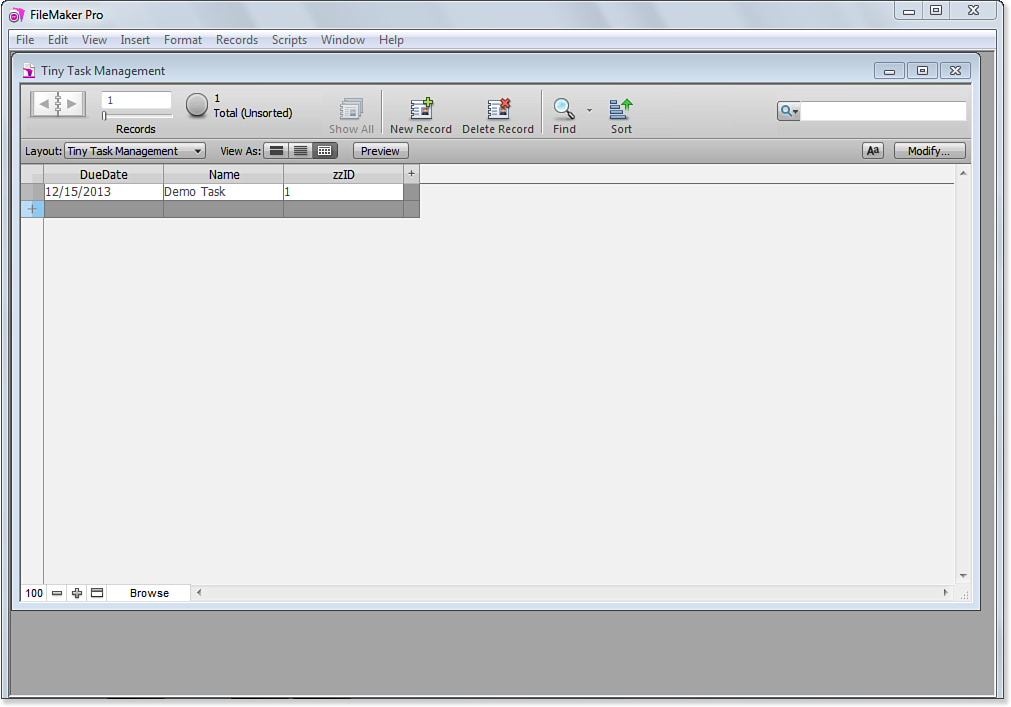
Figure 4.1. FileMaker Pro creates a default layout as you build your database.
In Figure 4.1, a single record has been created in the database, and values have been entered for those fields. Figure 4.1 shows the new layout in Table view.
In Figure 4.2, you see the same default layout with data entered as it appears in Form view.
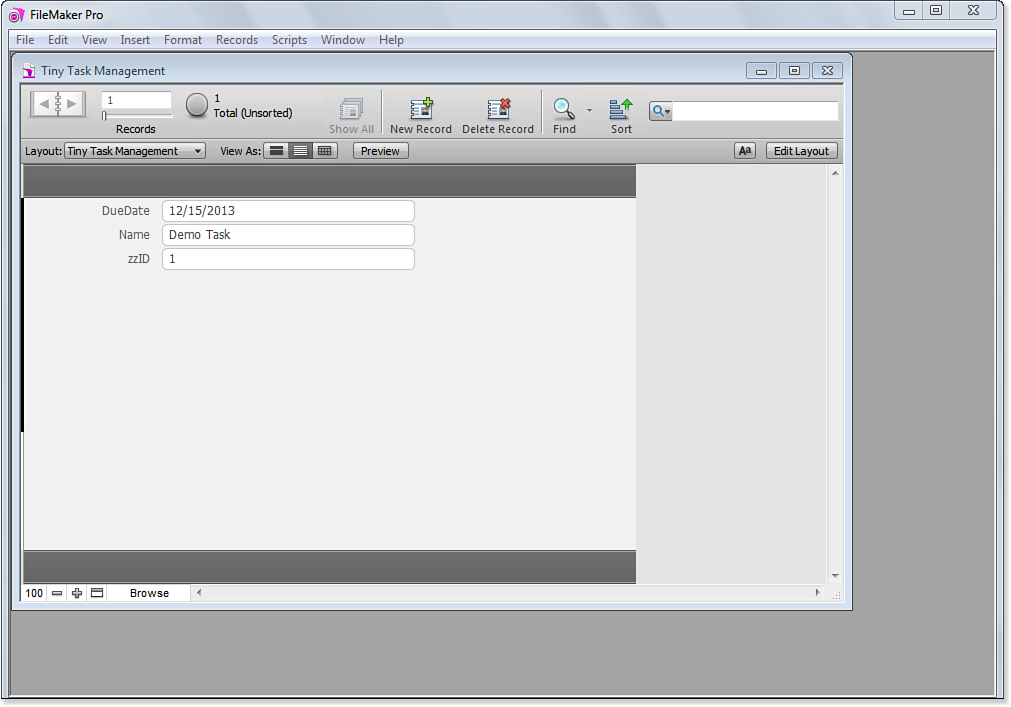
Figure 4.2. The default layout can be shown in Form view.
In Figure 4.3, you see a second record added to the database and the layout is shown in List view. (Because List view shows multiple records at the same time, you don’t get the full effect until you add a second record.)
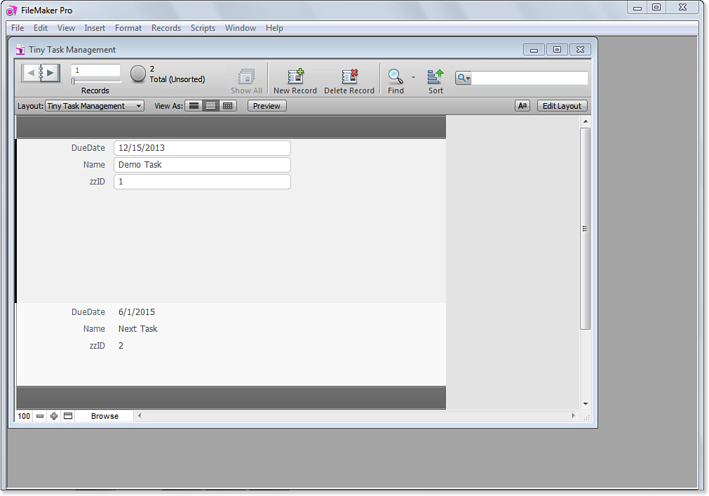
Figure 4.3. With a second record added, you can view the layout in List view.
The default layouts that FileMaker Pro builds for you are functional without any further work on your part, so you can get started doing whatever it is you want to do with your database. However, by building your own layouts, you can make your solution much more attractive and easy to use. In addition, without a great deal of trouble, you can make your solution usable on desktops, iPhones, and iPads as well as with Instant Web Publishing. Figure 4.4 shows the Contacts Starter Solution, which comes with an attractive and very usable interface. This chapter shows you the basics of moving from the layout shown in Figures 4.1, 4.2, and 4.3 to your own version of the layout shown in Figure 4.4.
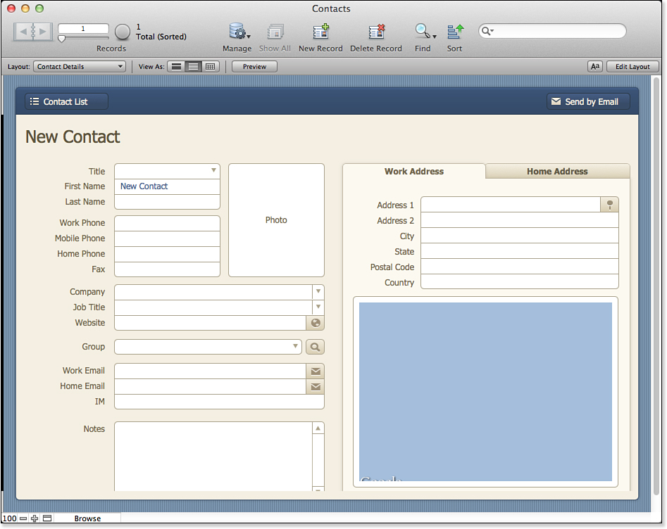
Figure 4.4. The Contacts Starter Solution has an attractive layout.
One of the major tools for improving the look of your layouts is themes. You can change the look of the interface consistently just by selecting one theme or another. You can customize the themes, but if you start by leaving them “as is,” you can switch easily from one theme to another. If you then want to customize a theme, you can add specific refinements.
You can learn more about themes in Chapter 14, “Advanced Interface Techniques.”
Using Multiple Layouts Automatically
As noted previously, layouts are just one part of the user interface: Scripts and triggers are other important components, along with options for your database field. This section provides a quick overview of how those tools can work together to help implement your user interface.
This is only an overview. Details of scripts are provided in Chapter 9, “Getting Started with Scripting,” and Chapter 16, “Advanced Scripting Techniques.” Triggers are discussed in Chapter 17, “Working with FileMaker Triggers.” Field options were discussed in Chapter 3, “Defining and Working with Fields and Tables.” Finally, Chapter 14 continues the discussion in this chapter in more detail.
The Contacts Starter Solution comes with three sets of layouts, as you can see in Figure 4.5.
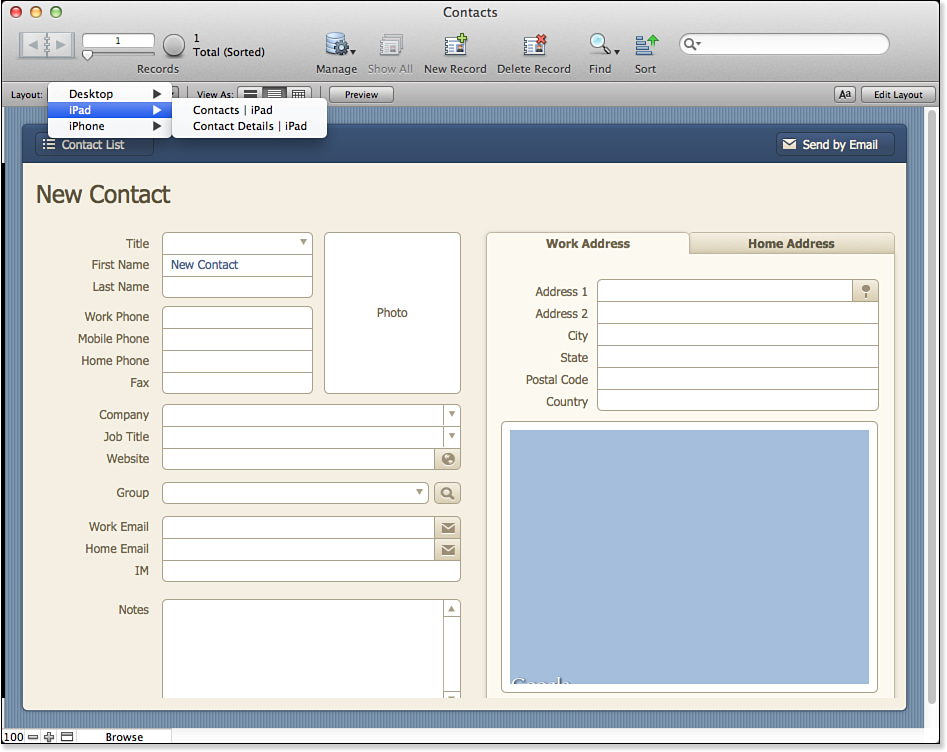
Figure 4.5. Contacts has multiple layouts.
There are layouts designed to be seen in Form view as well as layouts designed to show multiple records in List view; each pair of layouts is implemented for the desktop, iPhone, and iPad, making a grand total of six layouts. The user might not actually ever see the multitude of layouts because Contacts—like most Starter Solutions, including those that you create—automatically manages them.
Here is how you set up automatic layout management. Don’t worry that the details of layouts, triggers, and scripting haven’t been discussed yet: This process is used in almost the same form over and over again.
1. The first step is to design and create your layouts (which is the purpose of this chapter).
2. Next, create a script that tests to see on which device your solution is running. This script is used almost without change for many solutions, as you see in Figure 4.6. The only changes you normally make involve the highlighted lines: You identify the layouts you want to go to for each device.
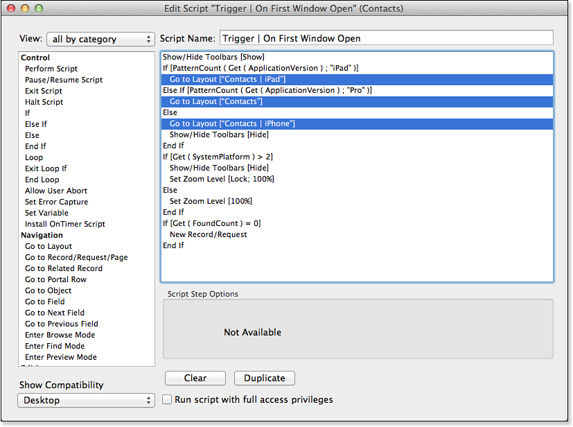
Figure 4.6. Create the startup script.
3. Select File, File Options to open the dialog shown in Figure 4.7. In the Open tab, you may specify an automatic login (Admin is the default for many databases including the Starter Solutions). Then, automatically switch to the opening layout.
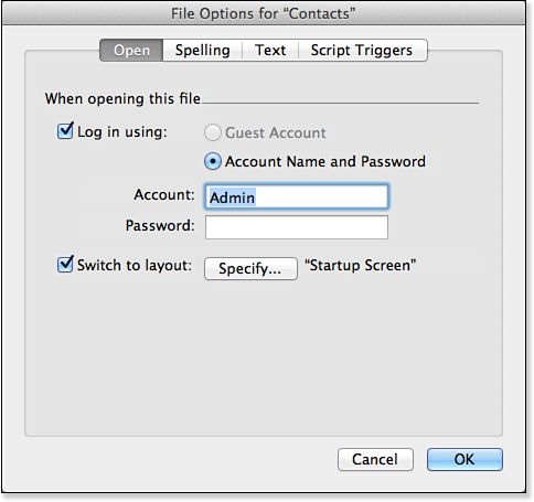
Figure 4.7. Set the opening layout.
4. In the same dialog, select the Script Triggers tab, as shown in Figure 4.8. Set the OnFirstWindowOpen trigger to your startup script.
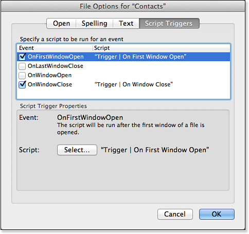
Figure 4.8. Run the startup script.
Having selected the right layout, you have made everything ready for people to use the solution. The buttons on each layout let users move from the Detail layout to the List layout, and vice versa. For the iPad Detail layout, the button moves to the iPad List layout; the same process occurs for iPhone and desktop. Once you have set the initial layout, you are home free (that is, provided you implement the layouts!).
If you have a sharp eye, you might notice that the Startup Screen layout shown in Figure 4.7 was not shown in the pop-up menu of layouts shown in Figure 4.5. You can control whether layouts appear in that menu.
Creating and Managing Layouts
Creating and managing layouts are among the most important tasks required of a FileMaker developer. They are also among the most intuitive. Nonetheless, you need to know numerous subtle facts and details. We encourage you to have a test file open as you go through the following sections so that you can try things firsthand.
 Tip
TipBeginning in FileMaker Pro 12, you can select a theme for your layout. As you build it—either by hand or by using an assistant—the theme attributes are used for fields and other graphical elements. Often, that is sufficient to produce very attractive and usable layouts. If you want to further customize your layouts, consider copying them and customizing the copy so that you can easily revert to the basic theme.
Creating a New Layout
You can create new layouts anytime you want while in Layout mode simply by choosing Layouts, New Layout/Report, or by pressing (Command-N) [Ctrl+N]. You are taken to a setup assistant that can help you configure a layout according to one of a handful of types of common layout designs. Figure 4.9 shows the first screen of the New Layout/Report assistant, where you specify a name for the layout and choose a layout type. You also specify a layout’s context here; the next section covers that topic.
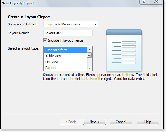
Figure 4.9. This is the first screen of the assistant for creating new layouts.
You can create the following seven types of layouts. As you make your selection on the first screen, schematic diagrams of the various layouts appear at the right of the dialog.
• Standard Form—Useful for data-entry layouts, Standard Form generates a basic form view layout with a set of fields you specify. You can select a theme for the layout as well; themes specify the default background color and text styles that will be applied to the layout.
• List View Report—As its name implies, this type is used for creating basic reports. It has the data organized in columns, with the name of each field at the top of the appropriate column (you can change these if you want). Each row of the layout is a single record’s data. Optionally you can constrain the layout to the width of a page. You also can select which fields/columns appear in the layout. If you don’t already have the necessary summary fields in your database, you can create them right from within the assistant.
• Report—This layout presents data in rows and columns, but it adds the capability to group and summarize the data for the entire report as well as for subsummaries within it. For example, you can group data based on an individual’s postal code in a subsummary, by state or province as a larger subsummary containing multiple postal codes, and then with a grand total across all the data. If you have declared summary fields in the table, not only will the data be grouped, but the relevant summary fields can be calculated at each subsummary level and for the grand total.
• Table View—Table View gives you a spreadsheet-like view of your data. When you select Table View as your layout type, you can select the fields you want to appear on your new layout. They are displayed in Table view according to your selected theme. Table view is quite useful for behind-the-scenes data manipulation, but it might not be suitable as an end-user interface.
• Labels—This type of layout is used for printing sheets of labels in standard or custom sizes. The Layout assistant prompts you to specify the type of label you will be using; Avery 5160/5260 are the labels used most commonly. If you don’t see your label type listed, you can specify custom measurements.
For some tips that come in handy for working with label layouts, see “Multicolumn Layouts,” p. 126.
• Vertical Labels—This layout is used for Asian and full-width characters that will be rotated so that the labels can be used vertically.
• Envelope—You are prompted to select fields you want to use for the address portion of the envelope. The default layout is sized for standard business envelopes. You might have to do some testing and tweaking of the layout to get things just right for your envelopes and printer.
• Blank Layout—Choosing Blank Layout gives you just that: a completely blank layout that you can manipulate any way you want, free of assistants.
We do not discuss all the screens of the New Layout/Report assistant here; they’re quite intuitive, even for new developers. Besides, if you are new to FileMaker, nothing beats spending an hour just playing around with the assistant to see firsthand what the various configuration options do for you. You won’t cause harm to any existing layouts by doing so, nor can you hurt the database even if you mess up the creation of a new layout.
No tool is available for importing layouts from one file to another. If you ever need to do this, the best method is to set up a new, blank layout with layout parts sized the same as the source layout. Then copy all the objects from the source file and paste them into the new file. Fields, buttons, and portals must be re-specified to point to their correct referents, but at least all your formatting will be retained.
After you create a layout, you can modify it and turn it into whatever you need it to be. Much of the remainder of this chapter is devoted to the tools at your disposal to do just that.
Within a file, you can duplicate layouts by choosing Layouts, Duplicate Layout. Often, this is a preferred method for creating new layouts, even if they end up looking significantly different from the original. All part sizes, graphic elements, and formatting options are retained, so modifying as necessary with these as a starting point is usually much faster than creating new layouts from scratch.
Create a template layout for yourself that has examples of all the necessary bits and pieces specified (portals, fields, field labels), along with color squares and grid lines. Then you can simply duplicate your template when you need to create a new layout, and you’ll be well on your way to a finished product. In a large project, you might create several template layouts: one for form views, another for layout views, and so forth. If you base your templates on themes (beginning in FileMaker Pro 12), you will dramatically streamline your design process.
Layout Context
Every layout is linked to a table occurrence from the Relationships Graph. You specify this on the first screen of the Layout assistant in the Show Fields From area; a similar area exists in the Layout Setup dialog, described later. Many layouts can be linked to a particular table occurrence, but each layout must be tied to one, and only one, table occurrence.
For more information on table occurrences, see “Adding a Table Occurrence to the Relationships Graph,” p. 195.
The reason layouts need to be associated with table occurrences is that, in a multitable file, FileMaker needs some way to know which records to display in a given layout. In the old days, when FileMaker allowed only one table per file, it was always clear that layouts in file X should display records from table X. Now, layouts in file X can be configured to display records from table A, B, or C. The context of a layout is determined by the table occurrence to which it is tied. Context, in turn, determines the table from which the layout will show records, and establishes the reference point for other types of operations, such as displaying data from related tables and evaluating calculations that reference related tables.
You might wonder why layouts need to be associated with table occurrences and not source tables themselves. If you were only concerned with displaying records from the source table, you wouldn’t have to worry about table occurrences. But layouts must also be able to contain records from related tables (that is, portals), and relationships are built between table occurrences, not between source tables. Having a layout linked to a table occurrence makes it unambiguous which context FileMaker should use to access related records.
The concept of layouts being tied to table occurrences can be a bit confusing. See “Determining Which Records Will Be Displayed on a Layout” in the “Troubleshooting” section at the end of this chapter.
Consider this situation in terms of perspective. To view any data within your solution, your user needs a starting point, or perspective, and an endpoint. For example, you might be looking from Company Detail through a portal to Employees related to that company record. The associated table occurrence tied to a given layout serves as a user’s starting point, and any related data is viewed from that table occurrence’s perspective on the Relationships Graph.
If you’re unfamiliar with relational data modeling or how to display related data in FileMaker, see Chapter 5, “Relational Database Design,” and Chapter 6, “Working with Multiple Tables.”
When you define a new layout, the first prompt of the New Layout/Report assistant lets you specify where to show records from. The options in the pick list are all the table occurrences from the current file’s Relationships Graph. If you want to use a table from another file, just add that table to the Relationships Graph (you may have to also add an external data source for the file if you have not done so already).
Working with relationships is the subject of the first three chapters of Part II, “Developing Solutions with FileMaker.” However, looking at a preview of the general issue is worthwhile because it illustrates the key role that layouts play. Figure 4.10 shows a FileMaker Relationships Graph for an ordering and quoting system. (Don’t worry about the details; they will be explained in Part II.)
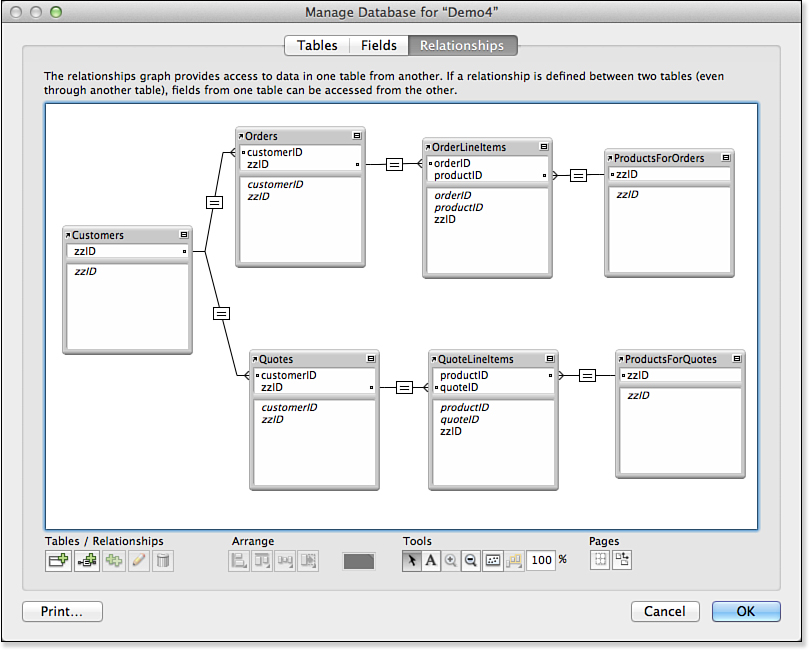
Figure 4.10. Create an ordering and quoting system.
Customers can be related to quotes or orders. Each quote or order can have multiple line items, and each line item is related to a given product. As will be explained in Part II, FileMaker requires that there be a unique path between any two related table occurrences in the Relationships Graph. Thus, the Products table appears as two different table occurrences: ProductsForOrders and ProductsForQuotes. It is the same table, but there must be two separate occurrences because otherwise there would be two paths between Customers and Products, and that is not allowed.
You can solve this problem in another way, as shown in Figure 4.11. Here, the duplicated table occurrences are for the orders and quotes. Note that there is no direct link from customers to any product table occurrence. For this structure to work, it must be tied to layouts. One layout can display customers; in a portal within that layout or in another layout, it can display orders and quotes for that customer. But when you want to look inside an order or quote, a button or some other interface element takes you to a layout that is based on either the Orders or Quotes table occurrence that is related to its own line items and thence to a single Products table occurrence. Many people would agree that this structure—although it contains nine table occurrences rather than seven—is simpler than the one shown in Figure 4.10. The layouts supporting both structures are going to be similar; they just are based on different table occurrences. The moral of this story is that layouts help you structure your database; they are not just for the interface.
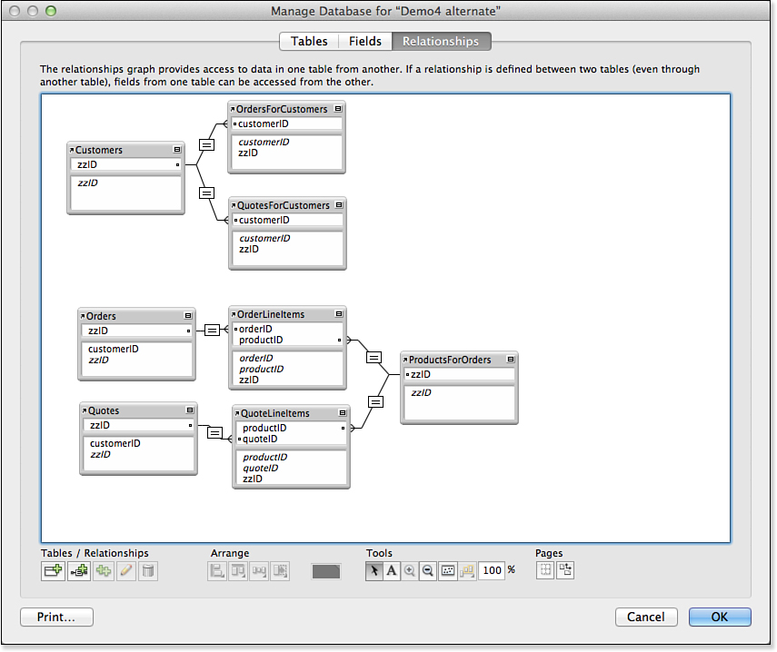
Figure 4.11. Create an alternative structure.
For the implications of context for scripting, see “Script Context and Internal Navigation,” p. 268.
Layout Setup
The Layout Setup dialog, accessed from the Layouts menu, allows you to edit many of the fundamental characteristics of a layout, such as the name of the layout, its context, and how it can be viewed (see Figure 4.12).
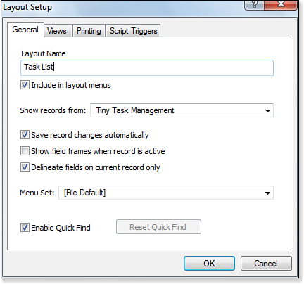
Figure 4.12. The Layout Setup dialog allows you to change the name of a layout and its context, for example.
In the Layout Setup dialog, you name the layout and select the table (actually the table occurrence from the Relationships Graph) that is the base table for the layout. Data from other tables can appear in the layout, but there is always one, and only one, base table for each layout.
Check boxes also let you save record changes automatically if you want to. These changes are the changes to the layout itself (not to its data). If you are doing a lot of layout modification, you can choose to have your changes automatically saved without a prompt. When major development is over, you might want to turn this option back on so that the relatively rare updates to layouts are reviewed more carefully.
The Show Field Frames When Record Is Active check box influences the layout’s behavior in Browse mode. It is a good idea to select the same setting for this check box for all layouts in a given solution so that users know what to expect.
Naming your layout as well as the objects within it is just as important as naming fields and tables. The “Layout Naming Conventions” section, later in this chapter, provides guidance in these areas. The “Hiding and Reordering Layouts” section, also later in this chapter, gives you some tips on how to handle the Include in Layout Menus check box.
You can provide custom menu sets for each layout. To do so, see Chapter 14, “Advanced Interface Techniques.”
View Options
Every layout you develop could potentially be viewed in three ways: as a form, as a list, or as a table. A user with access to standard menu commands can use the View menu in Browse mode to switch among them. When you navigate to a layout, you will see it in whatever state it was last saved, so bear in mind that switching from layout to layout might change the view setting as well.
The differences among the three view types are quite straightforward:
In developing a custom solution, you can provide scripted buttons to switch from layout view to layout view. If you do so, you can use the scripts to enforce certain standards, such as always viewing a certain layout with a certain view (at least to start). By using a combination of hiding the Status Toolbar and a custom menu set, you can even hide the standard FileMaker Pro commands that allow users to switch from view to view without using the controlled scripts that will limit the experience and flexibility but provide more consistency. This capability is particularly useful when your users are not adept at using FileMaker Pro.
• View as Form—This view type always shows one record at a time. Any header and footer parts are not fixed on the layout; if the layout has a long body, a user might have to scroll to see the footer. If the body part is short, the last part on the layout expands to fill the empty space in the window. If you are using scripts to navigate among layouts, you can adjust the window automatically to fit the form so that there is no empty space. For some long forms, such as legal contracts, you might have to split the form into two separate layouts.
• View as List—With View as List, the height of the layout body part and the height of the window determine the number of records displayed. If more records are present in the found set than can be displayed onscreen, the vertical scroll bar enables users to see additional records. Any header and footer parts are fixed onscreen at all times, even when a user scrolls to see additional records. Subsummary parts are never visible in Browse mode with View as List. If fields are placed in the header or footer parts, they take their values from the currently active record. Any modification to a field in the header or footer part likewise affects the currently active record.
• View as Table—In Table view, all the fields placed in the layout’s body are presented in a spreadsheet-like grid. The fields’ top-to-bottom position on the layout determines their initial order. That is, the first column is the topmost field on the layout. No nonfield elements (for example, buttons, text, or graphics) from the body of the layout are rendered in Table view. Field formatting (for example, color, font, and font size) is honored, however. The column headers conform to the format of the first field. Other properties of the Table view can be specified under the Views tab of the Layout Setup dialog. As you can see in Figure 4.13, you can specify whether header and footer parts should be visible and whether columns can be sorted, reordered, and resized. You can also specify row heights here.
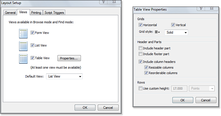
Figure 4.13. You can alter the look and functionality of the Table view by using the Table View Properties dialog.
Using the Views tab of the Layout Setup dialog, you can disable user access to certain view types. Although usually not necessary, this can be a good precaution to take to keep adventurous users on the right track. Accessing an inappropriate view type is likely not going to cause much harm, but it certainly can confuse users.
Multicolumn Layouts
When printing labels and certain types of reports, you might want to present your data in multiple columns. You can specify the number of columns to display on the Printing tab of the Layout Setup dialog; this is shown in Figure 4.14.
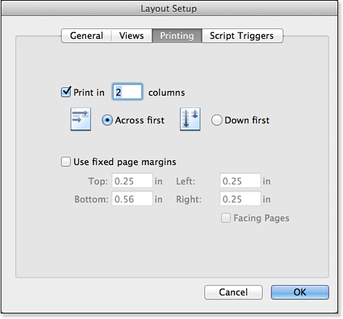
Figure 4.14. You can customize the print settings for a particular layout on the Printing tab of the Layout Setup dialog.
In Layout mode, dashed vertical lines represent the boundaries between columns. FileMaker grays out columns other than the first; the idea is that you need to place any objects you want displayed in the first column, and these objects replicate to the other columns as necessary. Figure 4.15 shows an example of a three-column layout: Labels layout from Contacts. (These happen to be Avery 5160 labels: the New Layout/Report label section provides dozens of standard labels from Avery as well as DYMO.) Notice that the header and footer part are not divided into columns. This means that if you want headers to appear above the second and third columns, you have to add them explicitly.
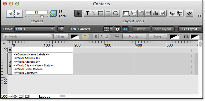
Figure 4.15. This example shows a layout for the three-column label layout from the Contacts Starter Solution.
You can use subsummary parts and leading and trailing grand summaries on multicolumn layouts, but they behave slightly differently depending on whether you choose to display data using the Across First or Down First option. If you choose the Down First option, any summary parts are also columnar. On the other hand, if you choose the Across First option, summary parts span the full width of the layout, just as the header and footer parts do.
It’s not possible to have columns of differing widths; every column is the same width as the first one. You can manually adjust the column width by clicking the dashed divider between the first and second columns and dragging left or right as appropriate.
Subsummary parts are covered in depth in “Working with Parts,” p. 130.
The effects of a multicolumn layout can be viewed only in Preview mode. In Browse mode, the user sees only a single column of data.
Hiding and Reordering Layouts
In Browse mode, layouts can be designated to be either accessible or inaccessible via the layout pull-down menu in the Status Area. If a layout is accessible, users can see it and navigate to it at will, assuming that the Status Area is visible and/or accessible. If the layout is inaccessible, users can navigate to it only by running a script that takes them there. In Layout mode, all layouts are accessible.
Typically, layouts are set to be inaccessible when you need to prevent users from manually navigating to a layout. For instance, you might have report layouts or find screens that require certain preparation before they become useful. There might be unanticipated and/or undesired results if a user is able to bypass the scripts you created and navigate directly to a layout.
The option to have a layout be accessible or not is the Include in Layout Menus check box on the first screen of the New Layout/Report assistant; it can also be set through the Layout Setup dialog. The Manage Layouts dialog, shown in Figure 4.16, also has a check box on each line that can be toggled to change a layout from visible to hidden, and vice versa. Using this method is the quickest way to hide or show a number of layouts at once. Open the Manage Layouts dialog from File, Manage, Layouts, or as shown in Figure 4.17.
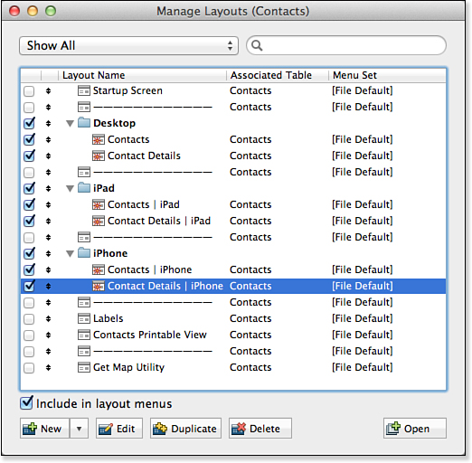
Figure 4.16. Use the Manage Layouts dialog to set the accessibility and order of layouts.
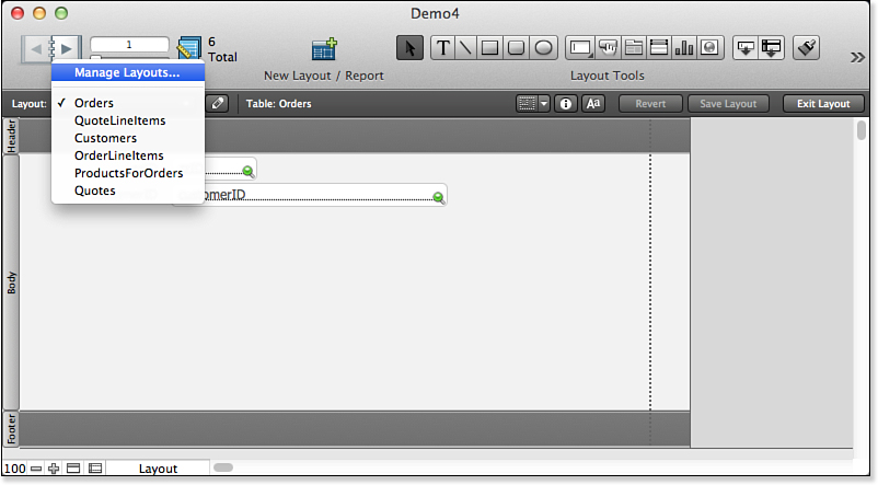
Figure 4.17. Open Manage Layouts from the Layouts pop-up menu in the Status toolbar in Layout mode.
The Manage Layouts dialog also enables you to change the order in which layouts appear in the Layout pop-up list. You can use the double-arrowed selection tool to move a layout up or down in the order. On OS X, you can accomplish the same thing by selecting a line and pressing (Command) [Ctrl] and the up or down arrow.
Layout Naming Conventions
You have a great deal of flexibility in how you name layouts. Layout names do not have to be unique and can be up to 100 characters long. They can include numbers, symbols, spaces, and pretty much anything else you want to use. Although flexibility is a good thing, we suggest that you follow a few guidelines:
• If a layout has the potential for access via ODBC or Custom Web Publishing, you should avoid symbols, punctuation, and spaces in its name.
• Only the first characters of a layout name are visible in the layout selection pop-up menu in the Status toolbar. The full name is visible when a user clicks the pop-up, but it can be helpful to use short, unique names for easy identification.
• Try to use names that are somewhat descriptive of the purpose of the layout. Names such as List and Layout #3 might not convey much meaning to users, or future developers, for that matter.
• In a multitable file, consider having the base table name as part of the layout name. For instance, Customer:Data Entry and Data Entry (Customer) might be good names if you need to differentiate among multiple data entry layouts. Note that this may conflict with the first guideline about not having symbols, punctuation, or spaces in the layout name.
• You can use a z or zz prefix for internally used layouts. You can omit them from the Layout menu or place them at the bottom (using the Set Layout Order command from the Layouts menu in Layout mode). You can also use a distinctive theme in the Layout assistant. Any or all of these will make it clear when you are working in a layout that users will not normally see.
• Finally, if you use a single hyphen (-) as a layout name, this appears in the Layout pop-up list as a divider. Users can’t select divider layouts, which merely serve to help organize what might otherwise be an unwieldy list. Typically, such layouts would be left completely blank, but this isn’t a requirement.
As you see in Figure 4.16, you can construct a sophisticated naming guideline—many of the Starter Solutions use this type of naming convention so that the base table as well as the device are included in the name. In practice, the issues involved in naming layouts might work themselves out quite easily. If you are building a solution with multiple layouts, you might very well build navigation tools into the layouts (commonly at the top of a layout). This means that when you go to a layout using a script, you automatically adjust the window, or in the case of a layout designed for printing, you automatically go into Preview mode. In that case, you can name layouts from the developer’s perspective and hide them from users in the Layouts menu.
The single-hyphen naming trick works in other areas of FileMaker as well, such as within value lists.
Working with Parts
Parts make up layouts. Depending on your objectives, your layout might contain header and footer parts, a body part, one or more subsummary parts, and maybe even a leading or trailing grand summary. Every layout must contain at least one part. Briefly, the purpose and some characteristics of each type of part are as listed here:
• Title Header—Title headers are used when you need a header on the first page that differs from the header on subsequent pages of a multipage report. In Form view, a user can view a title header while in Browse mode, but not in List or Table view.
• Header—Objects in the header part appear at the top of each page of a multipage report, except the first page when a title header is present. A header part remains fixed onscreen in List and Table views, even when a user scrolls to see additional records. Data in fields placed in a header part can be edited; fields in a header part always display data from the currently active record.
• Leading Grand Summary—Typically used on report layouts, a leading grand summary appears between the header and any subsummary or body parts. Summary fields placed in this part aggregate across the entire found set.
For more information about using summary fields and summary parts to create reports, see “Using Summarized Reports,” p. 295.
• Body—The body part is used to display data from a single record. A data-entry layout often consists of nothing other than a body part. Almost every layout you create will have a body part.
• Subsummary—Subsummary parts are used primarily for displaying subtotals on reports. For a subsummary to display properly, the found set must be sorted by the same field as that on which the subsummary is based. Subsummaries can be placed either above or below the body part, depending on whether you want the subtotals displayed before or after the data they summarize.
• Trailing Grand Summary—Similar to a leading grand summary, a trailing grand summary is typically found on report layouts and is used to display aggregate summaries. When printed, the trailing grand summary report appears directly following the body part and any trailing subsummaries.
• Footer—Objects in the footer appear on every page of a multipage printout, except on the first page when a title footer is present. In List view, the footer remains fixed on the layout when a user scrolls through records.
• Title Footer—A title footer part is used when you want to display a different footer on the first page of a multipage printout.
You can save time creating complex layouts by beginning with a layout that might never see the light of day. Create a layout with a body part and as many subsummaries as you might ever need. Then duplicate the layout and remove parts that you don’t need. For example, you can delete the body part from a duplicate and—voilà—you have a summary layout. Likewise, you can delete some of or all the subsummaries to produce a detail report. To finish up, you can even delete the original layout.
Adding and Ordering Parts
There are two ways to add parts to a layout. The first is by clicking and dragging the Part button in the Status toolbar to the point where you want the new part to appear. FileMaker prompts you to select a part type when you release the mouse. Although this method is convenient, we discourage using it to add new parts. New parts, except when added to the bottom of the layout, always come at the expense of existing parts. That is, if you have a 50-pixel header followed by a 200-pixel body, and you attempt to add a subsummary between these parts, the body part shrinks by the size of the subsummary part. Moreover, fields that were in the body part might now be part of the subsummary part.
The other option for adding new parts, which we prefer in almost every circumstance, is to use the Part Setup dialog (shown in Figure 4.18), which can be found under the Layouts menu. When you add parts with this tool, it’s not at the expense of any existing part; the total height of the layout increases.
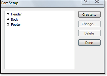
Figure 4.18. You can add, edit, delete, and reorder the parts on a layout from the Part Setup dialog.
The Part Setup dialog can also be used to reorder, edit, and delete parts. The only types of parts that can be reordered are the body and subsummary parts. To reorder them, click the arrow in front of the part name and drag it to the desired position. Other part types appear with a lock in front of them, indicating that they are fixed in a certain order by definition.
You can delete a part from a layout either by selecting it from the Part Setup dialog and clicking Delete or by clicking the part label while in Layout mode and pressing the Backspace or Delete key on your keyboard. Either way, when you delete a part, you also delete any objects contained in that part.
Formatting a Part
You can configure a few attributes of parts directly from Layout mode itself. First, you can set a background color and/or fill pattern for a part by clicking the part label and then selecting a color and/or fill pattern. (Control-clicking) [right-clicking] the part label similarly pulls up a contextual menu with access to these attributes.
You can achieve much the same effect simply by drawing a large rectangle on the layout, sending it to the back, and locking it. Setting a background color for the part is preferred because the color extends to the right and downward if the user expands the window beyond the boundaries of your rectangle.
You can also change a part’s size. To do this, simply click the dividing line between two parts and drag either up or down. When making a part smaller, you can remove whitespace from the part, but you are prevented from dragging through any objects in the part. Any expansion of a part increases the overall size of the part.
For users with monitors set to higher resolutions than your database was designed for, consider adding a footer with a background color different from the body part so that users can visually see where the layout ends and size their windows appropriately. Alternatively, use buttons and scripts for layout navigation so that you can automatically adjust the window to the layout.
Holding down (Option) [Alt] as you resize a part changes the rules slightly. First, any expansion or contraction comes at the benefit or expense of the neighboring part; the overall height of the layout remains the same (except, of course, when enlarging the last part on the layout). Also, you can “run over” objects this way; an object that was in one part might end up belonging to another part after you resize things. An object that ends up straddling two (or more) parts belongs to the part that contains its upper-left corner.
The Object Info palette can also be used to see and set a part’s length. This is the best way to set part lengths precisely, especially when you’re trying to duplicate complex layouts from one file to another. Click the part label to display that part’s data in the Size palette.
For more information about the Object Info palette, see “Positioning Objects on a Layout,” p. 145.
Part Definition
Beyond the size and background color of a part, some part attributes can be set only in the Part Definition dialog, shown in Figure 4.19. You can get to this dialog either by using the Part Setup dialog (by clicking Create or Change) or by double-clicking the part label itself.
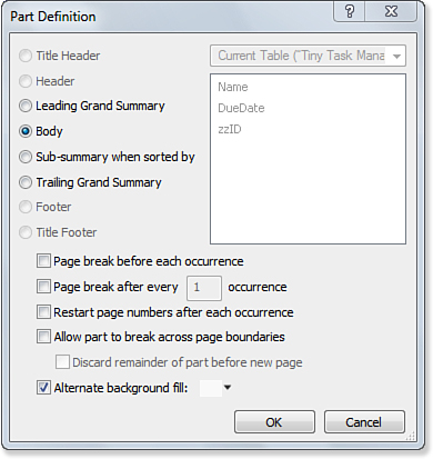
Figure 4.19. The Part Definition dialog specifies a part’s type and attributes.
The radio buttons on the left side of this dialog indicate the type of part. You can change the type of a part simply by selecting a different radio button. If a type is grayed out, it means you already have a part of that type. The only part type for which you can have multiples is subsummary.
The fields on the right side of the dialog apply only to subsummary parts. When you make a subsummary part, you must specify which field will act as the break field for the summary. The break field doesn’t actually have to appear in that part, but the found set must be sorted by the break field for the subsummary part to appear on a report.
For more information on break fields and subsummary reports, see “Using Summarized Reports,” p. 295.
At the bottom of the dialog are some options for configuring page breaks and page numbers. In subsummary reports, you’ll often want each new subsection to start on a new page. To do this, you edit the part definition of the subsummary part to include the Page Break Before Each Occurrence option. As you would expect, a page break precedes only each occurrence after the first one.
If there is a script to display the layout, as is the case if you have used the assistant, that script contains a Sort step. When you add or change a subsummary part, make it a habit to immediately go to the script and change the sort so that it reflects the new or changed sorting order.
You can also opt to use the Alternate Background Fill feature. This option is available only on body parts. Any color and/or fill that you specify is used as the background for every other record. It alternates with any background color specified for the part itself. A slight shading of alternate rows on a report often makes it easier to read.
Working with the Layout Status Toolbar
You have seen how the Status toolbar works and can be customized in Browse and Find modes; now you will see how it can be used in Layout mode. As noted previously, the Status toolbar has a slightly different appearance in Windows and OS X. Furthermore, the methods of customizing it differ across the two platforms. Nevertheless, its buttons and other interface objects behave the same way on the two platforms.
The Status toolbar can be customized in many ways. This section describes the components of the Status toolbar; they may or may not be in the Status toolbar you are looking at, and even if they are, they may be in different places. Figure 4.20 shows the Status toolbar with a minimal configuration.
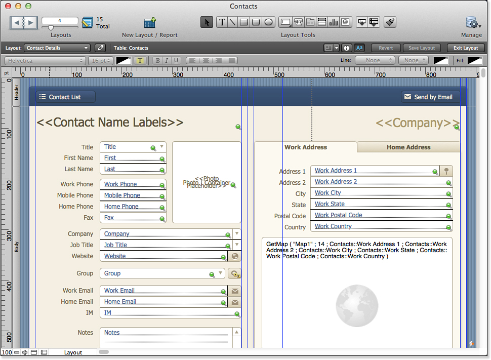
Figure 4.20. The Status toolbar varies in its appearance.
Using the Layout Bar
Below the main area of the Status toolbar is an uncustomizable Layout bar. From left to right, here are the tools available:
• The Layout pop-up menu lets you select a layout by name. The first item in the pop-up menu is Manage Layouts. It opens the Manage Layouts dialog shown previously in Figure 4.16.
• The pencil icon opens the Layout Setup dialog shown previously in Figure 4.12.
• Next, you see the base table occurrence for the layout. (Set it in the General Pane of Layout Setup.)
• Three buttons show or hide palettes and the formatting bar. Further details about these palettes and the formatting bar are provided later in this chapter. The first shows or hides the device dimension stencils, the next shows or hides the Inspector, and the third one shows or hides the formatting bar.
• The last three buttons let you save the layout. The first lets you revert to the last saved version. The second lets you explicitly save your layout changes. The last one lets you exit Layout mode.
Using the Customizable Status Toolbar Tool Groups
On OS X, the View, Customize Status Toolbar command opens the sheet shown in Figure 4.21. You can drag items into or out of the toolbar; you can also rearrange them. In Windows, the same command opens the text-based dialog shown in Chapter 2, “Using FileMaker Pro.” Also in Windows, you can use the small arrow at the right of the Status toolbar to open a hierarchical set of menus in which you can select what tools are used in the Status toolbar. This menu hierarchy is shown in Figure 4.22.
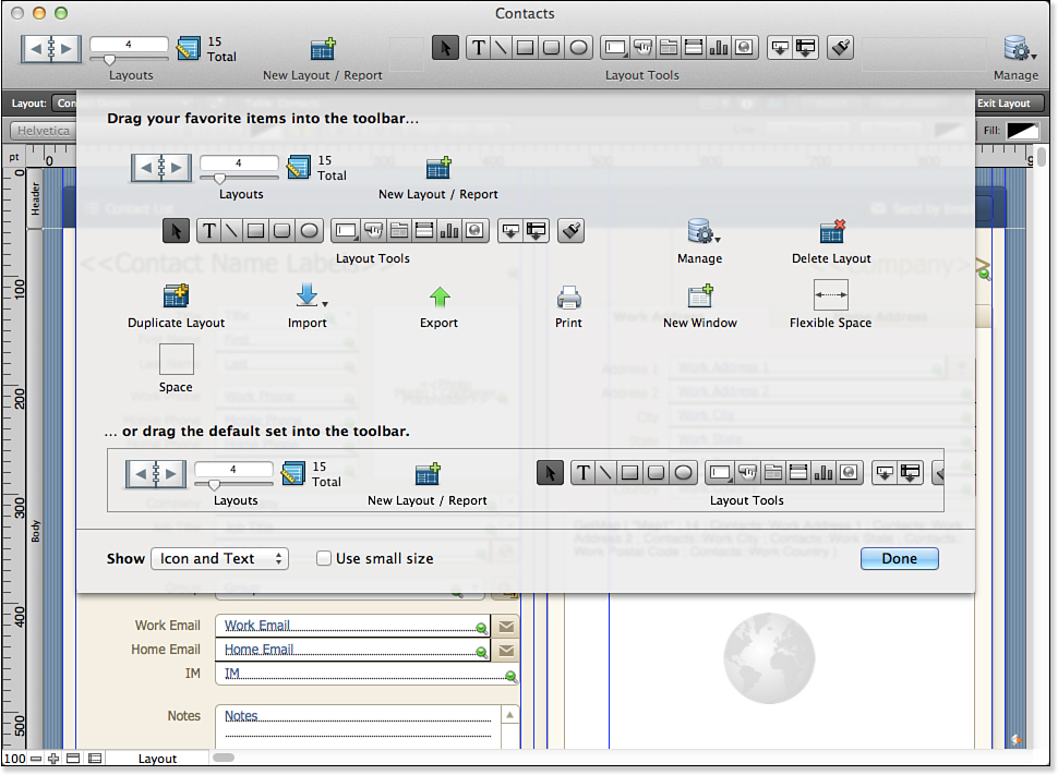
Figure 4.21. Customize the Status toolbar on OS X.
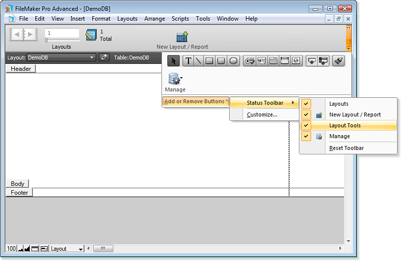
Figure 4.22. Customize the Status toolbar in Windows.
The tools described here are actually groups of tools: You cannot split them apart. They move into and out of the Status toolbar as a group. Many of the tools correspond to menu commands.
Because all the tools are shown in the Customize Status Toolbar sheet shown on OS X in Figure 4.21, earlier in this chapter, you might want to refer to that figure throughout this section.
For more information on how to customize the Status toolbar, see Chapter 2, “Using FileMaker Pro.”
Layouts Group
The Layouts tools are shown installed in the Status toolbar at the top left of Figure 4.20. At the left, the book icon lets you move to the next and previous layouts (provided that there is a next or previous). The slider lets you quickly drag through your layouts, and the text field above the slider shows the current layout number; you also can type in a number to go to that layout. Finally, you will see a layout-editing icon that displays the number of layouts in the file.
Layout Tools Group
The Layout tools collection consists of five groups of tools. Their use is described in the following section.
• The pointer lets you select an item in the layout. Holding down the Shift key lets you select multiple items. You can then drag the items around the layout and resize or reshape them by using the handles at their corners and sides.
• Next come five tools that let you draw a text box, a line, a rectangle, a rounded rectangle, or an oval. Holding down the Shift key while you draw constrains the object vertically and horizontally; holding down the Option key makes it regular (that is, a rectangle becomes a square, and an oval becomes a circle).
• The next six tools let you draw specific FileMaker objects. From left to right, they let you draw fields or controls, buttons, tab controls, portals, charts, and Web Viewers. Select a tool and draw the object on the layout. After you have finished drawing, a setup dialog opens for you to specify further details. These setup dialogs are described in the sections related to using fields, buttons, tab controls, portals, and Web Viewers.
For more information on adding fields to a layout, see “Working with Fields,” p. 149.
• The next pair of tools lets you add a field or part to a layout. Drag a tool onto the layout and select its field or its part. Note that these tools are dragged into the layout; the previous five let you draw on the layout.
• Finally, the Format Painter tool lets you copy formatting attributes from one object to another.
Using the Status Toolbar Items
Many of the Status toolbar’s customizable items correspond to individual commands or to a group of commands:
• New Layout/Report (Layouts, New Layout/Report).
• Delete Layout (Layouts, Delete Layout).
• Duplicate Layout (Layouts, Duplicate Layout).
• Import (File, Import command and its subcommands).
• Export (File, Export command and its subcommands)
• New Window (Windows, New Window).
• Manage. This is the File, Manage set of submenus: Database, Accounts & Privileges, Value Lists, Layouts, Scripts, External Data Sources, Custom Functions (FileMaker Pro Advanced), and Custom Menus (FileMaker Pro Advanced).
Using the Inspector
Beginning with FileMaker Pro 11, the Inspector was added to Layout mode. You find inspectors in a number of modern programs like FileMaker. In the initial versions of graphical user interfaces, there was a routine process for users: Select something, and then choose a menu command to act on it. Over time, the menu commands multiplied, and inspectors were devised to manage the multitude of commands for selected objects. The Inspector is shown in Figure 4.23.
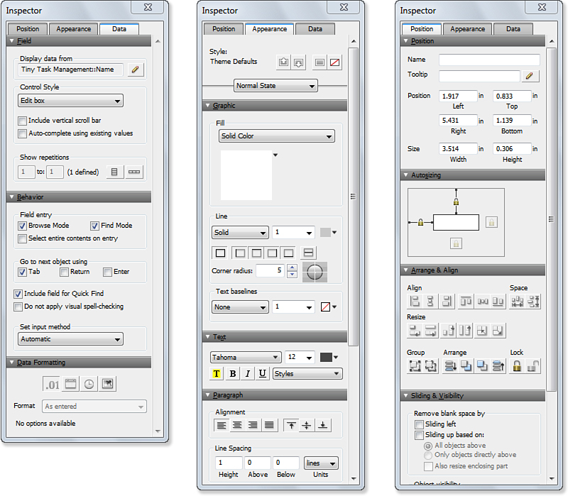
Figure 4.23. The Inspector lets you work with layout objects.
The three tabs on the Inspector let you work with the data for a selected object, its position, and its appearance. You open the Inspector with View, Inspector, (Command-I) [Ctrl+I], or by using the Inspector button on the Layout bar. Remember that the data displayed in the Inspector varies depending on what is currently selected.
You can open up to three inspectors at the same time. If your screen is large enough, that means that you can see all three of the tabs at the same time.
Inspecting Data Settings
The data settings are composed of three sections: Field, Behavior, and Data Formatting. All of these are related to the data itself rather than its appearance or position on the layout. It is important to note that you can have more than one field showing the same data element from the database. By judiciously combining the various attributes of fields in the Inspector, you can display the same data in various formats (different numbers of decimals on numeric fields, for example), and in various types of controls (radio buttons as well as edit boxes, for example).
Using Field Settings
At the top of the Inspector, you can specify data settings for a selected field. These settings include the field name and the style of the control that is used to display or edit it. Depending on which type of control you select, some additional settings may be displayed. For example, if you select a radio button or check box, you can specify a value list that is used to support it.
For standard fields where a user will be manually entering and editing data, the Edit Box format is appropriate. The option to include a vertical scroll bar is normally used only when a user is able and/or expected to type multiple lines of text.
As you choose the control style of a field, bear in mind that on mobile devices tappable inputs (radio buttons, checkboxes, drop-down lists, and drop-down calendars) are particularly useful.
The options to format a field as a Drop-Down List, Pop-Up Menu, Checkbox Set, or Radio Button Set require you to specify a value list that provides the content for the selection values.
You can apply a Drop-Down Calendar to a field to help with entering dates, and you can toggle either a drop-down indicator icon or a calendar picker icon for the fields you’re working with. The two icons—drop-down indicator and calendar icon—appear only if a field has its right border turned on.
The lower left of the field settings is relevant only for fields defined to allow multiple repetitions. You can hard-code the starting and ending repetitions and specify whether a vertical or horizontal orientation should be used.
Controlling Field Behavior
The behavior settings contain controls for setting when a field is enterable and how a user can exit it.
In this section, you can control whether a user is able to enter a particular field while in Browse or Find mode. Typically, a user should be able to enter a field in both Browse and Find mode. Sometimes, though, you’ll want a field to be enterable in only one of these modes. For instance, you might have a field that you don’t want users to manually edit but that they might have to use as part of a query. On the other hand, there might be unindexed fields on your layout that, for performance reasons, you don’t want users to search on.
You can also use a check box to determine whether a field is used in Quick Find. As described in Chapter 2, “Using FileMaker Pro,” Quick Find lets users search from Browse mode. The search term is entered at the right of the Status toolbar, and FileMaker Pro searches all Quick Find fields for the value.
You can also specify visual spell-checking for each individual field in this section. You set the filewide spell-checking option in the File Options dialog in the File menu; this setting overrides that value on a field-by-field basis.
The other setting in this section is the Go to Next Object Using option. By default, in FileMaker Pro, pressing the Tab key lets users move to the next field on the layout. Developers can also specify the option to allow the Return and/or Enter key to perform this function. This is desirable in some cases to allow rapid data entry and to prevent data-entry mistakes. For instance, by setting a text field to use the Return key to go to the next field, you prevent users from accidentally adding stray returns at the ends of fields. Obviously, if a user needs to be able to enter carriage returns in a text field—say in a Comments field—you wouldn’t set the Return key to go to the next field.
Note that you can also choose the input method that FileMaker uses for this field in Japanese.
 Caution
Normally, the Enter key serves to commit a record and exit all fields. If you change all your field behavior to have a press of the Enter key move focus to the next field, be aware that users must explicitly click the background of a layout or perform some script or navigation routine to commit record changes.
Managing Data Formatting
At the bottom of the Inspector, you can set the formatting for numbers, dates, times, and images. Note that for container fields beginning in FileMaker 12, you can set optimization. Images such as PNG, JPEG, and BMP, are simply downloaded. If you choose the interactive radio button (PDF, MP3, and the like), you can allow interaction and set an option the start playback automatically.
Inspecting Appearance Settings
These are the standard settings you expect for text and graphics: fonts, alignments, colors, and the like. You can also set styles for objects.
Styles are discussed in Chapter 14.
Inspecting Position Settings
These settings let you size and position an object as well as arrange and align several selected objects. Autosizing settings let you anchor the edge of an object to its container so that as the container changes size or shape, the object does so, too. This is particularly important if you are developing layouts that will be used on iOS devices that can be rotated.
Naming Objects on a Layout
You can name objects on a layout. Object names must be unique on a given layout. They most often work in conjunction with the new Go To Object script step. When you go to a layout, you can immediately select the specific field, portal, tab, or any other layout object that you want to select. You can even determine this dynamically in a script that goes to a given layout—yet another reason for using scripts for layout navigation. The combination of object names and the Go To Object script step makes FileMaker Pro a much more powerful interface development system.
The name of an object as specified on the position tab is used for scripting. In the case of text that is formatted as a button using Format, Button Setup, that text is totally separate from the name. You might even want to establish a naming convention for names that makes it clear what they are. For example, a button that appears on the layout as Print might have a name of btnPrint or PrintBtn.
Using Tooltips
A tooltip is a small snippet of text that appears when a user hovers the mouse pointer over a layout object (a data field, field label, button, or any other item that can be placed on a layout in Layout mode). The tooltip can provide information about the item beneath it, or it can provide additional information about data in the database, among many possible uses.
Remember that there is no such thing as hovering on an iOS device. This means that tooltips never appear on iPads and iPhones.
You can supply a simple text string as the tooltip. Note, though, that you can also use the edit button (the pencil next to the tooltip field), which enables you to define a calculation that is used to generate the tooltip text. The capability to have tooltip text derived from a calculation can lead to some elegant applications. Here are a few examples:
• In a list or portal view of data, in which some data might be too wide for its column, add a tooltip to display the entire data value of the field.
• Create contextual help. If you have Next Record and Previous Records links on a layout, create tooltips that will warn the user if there is no next or previous record (that is, they’re at the beginning or the end of the found set).
• Create “smart” Next and Previous buttons that use the GetNthRecord() function to display some information about the next or previous record in the set.
For more information on FileMaker’s GetNthRecord() function, see “GetNthRecord,” p. 438.
Tooltips are a standard feature of modern user interfaces. Because they are a relatively new addition to FileMaker Pro, you might want to add them whenever you work on an older solution.
Automatically Resizing Objects on a Layout
The autosizing section of the Position tab lets you resize and relocate an object. For a selected object, you can choose to bind it to the edge of the window or its container (such as a portal) by clicking the appropriate box by the anchor in the direction you want to bind it. You can check from zero to four boxes.
As the layout window is resized, any bound edge of an object moves to keep its same distance from the edge to which it is bound. Thus, you can create a text field that expands horizontally with the window, but whose vertical height is fixed (that is, unbound).
Objects that contain data or that are backgrounds are prime candidates for auto-resizing. Objects such as buttons are not normally expected to change size as a window resizes, but you may choose to anchor them to a constant location relative to the window.
The default behavior is what has happened until now: Objects are placed in a layout, and, as the window is resized, they remain where they are relative to the top and left. Thus, if you widen or lengthen a window, you might have unused space at the right or bottom. Now that you can see what the bindings are, you will see that this is implemented by default with the top and left sides of objects bound to the window.
If you bind an object to the right and bottom, it will stay at the bottom right of the window as you change its size. If you bind an object to the right and left, it will stretch as the window is resized horizontally; likewise, an object bound to the top and bottom will stretch vertically. If you have a large object such as a Web Viewer, you may choose to bind it to all four edges. It will resize as the window is resized in any direction and will retain its distance from each of the new edges.
In Preview mode (and, thus, in printing), there is no vertical resizing. Horizontal resizing occurs if the page size is wider than the layout. Furthermore, remember that autosizing happens on the desktop when a user resizes the window. On mobile devices where there are no resizable windows, autosizing happens automatically as the layout is shown on different-sized screens and in different orientations.
Arranging Objects
The Arrange & Align section of the position inspector lets you manage objects.
• Grouping Objects—Objects can be grouped together to form a new object. You do so by selecting the desired objects and choosing Arrange, Group or pressing (Command-R) [Ctrl+R]. The resulting object behaves just like any other object. It has a single set of selection handles, and you can move and resize it as described in the previous sections. Any formatting applied to the grouped object is applied to each of the elements of the group, as if you had simply selected all the elements individually. Grouped objects can be further grouped with other objects to form new objects.
To ungroup an object, select the object and then choose Arrange, Ungroup or press (Command-Shift-R) [Ctrl+Shift+R]. If an object was formatted as a button, ungrouping it deletes the button definition.
• Locking Objects—To prevent an object from being moved, resized, reformatted, or deleted, you can lock it by selecting it and choosing Arrange, Lock or pressing (Command-Option-L) [Ctrl+Alt+L]. When you select a locked object, its handles appear grayed out rather than black.
When you select a combination of locked and unlocked objects and attempt to move or resize them as a set, only the unlocked objects are affected. If you attempt to change the formatting of the selected set, you see an error that the formatting can’t be applied to some objects in the set because they are locked.
Locking objects is useful when you have objects stacked on top of or overlapping one another. It’s as if the locked objects become a backdrop against which you do your work. Whether you leave the objects permanently or temporarily locked, it becomes much easier to select and work with certain objects when the objects behind them are locked. To unlock an object, choose Arrange, Unlock, or press (Command-Option-Shift-L) [Ctrl+Alt+Shift+L].
• Layering Objects—FileMaker maintains a stacking order for objects on a layout. When you add a new object to a layout, it becomes the frontmost item in the stacking order. The stacking order becomes important when objects overlap one another. If two objects overlap, object A appears in front of object B if it is forward in the stacking order. In addition, if object B is completely behind object A, it is impossible to select object B simply by clicking it. When you click a spot on a layout where multiple objects overlap, you select the frontmost of the objects.
There is no way to review the stacking order of the objects on a layout visually. But you can manipulate the stacking order by using the Bring to Front, Bring Forward, Send to Back, and Send Backward functions, all of which can be found under the Arrange menu.
The stacking order also determines the tab order of layouts published to the Web with Instant Web Publishing. For more on IWP, see “Layout Design,” p. 591.
The stacking order also determines the order in which objects draw on the screen. With a local file or on a fast network, the drawing is probably imperceptible, but on slow networks, you will sometimes see the objects draw one by one, from back to front.
• Rotating and Selecting Objects by Type—You can rotate object by using commands in the shortcut menu or the Arrange menu of the toolbar.
Aligning Objects
Aligning objects on a layout relative to one another often is desirable, and FileMaker Pro has some built-in tools to make this easy to do. For instance, a layout might have ten fields that you want to be aligned along their left edges. You can use the Align, Distribute, and Resize To menu options, under the Arrange menu, to manipulate objects relative to each other.
You can specify a Top to Bottom alignment, or a Left to Right alignment, or both. You can also distribute objects or resize to the largest or smallest dimensions of the selected objects.
When you align a set of objects relative to one another, one of the objects usually serves as the reference point. For instance, when you left-align a set of objects, the leftmost object is the reference point. The other objects move left while the leftmost object remains in place. Similar results are obtained for aligning to the right, top, and bottom. The exception to this is when one or more of the selected objects is locked. If this is the case, and you want to, say, left-align a set of objects, the leftmost locked object becomes the reference point.
The rules for centering are slightly different. When you are centering left to right, the objects align on the midpoint between the leftmost and rightmost selection points. For top-to-bottom centering, they align on the midpoint between the topmost and bottommost selection points.
The option to distribute space is useful when you want to be sure that objects in a set are equidistant from one another. The two outermost objects, whether left-to-right or top-to-bottom, act as anchors for the distribution: The selected objects in between them are spaced apart evenly.
Even the sloppiest of developers can benefit from this simple process: Select a group of irregularly placed and irregularly sized fields. Then choose Arrange, Align, Left Edges, followed by Arrange, Distribute, Vertically. Last, select Resize To, Largest Width and Height. Voilà—your layout objects are now nicely sized and positioned.
Working with Objects on a Layout
Many tools and techniques exist for configuring and manipulating layout objects. Some apply only to specific types of objects, whereas others are more general in nature. The better you know how to work with the tools for crafting layouts, the better your user interface will be, although there are, of course, no guarantees.
Adding Objects to a Layout
Normally, after you finish creating an object, FileMaker reselects the pointer tool automatically. At times, however, you’ll want to create multiple objects of the same type at once. In those cases, it’s useful to lock in the selection of a particular tool. You can do this by double-clicking the tool in the Status toolbar. There’s also a preference named Always Lock Layout Tools that is located on the Layout tab of the application preferences screen, although we advise against enabling it.
The Insert menu provides another means for adding objects to a layout. At the top of this menu, you’ll find selections for adding all the object types found in the Status toolbar.
To insert a picture or another graphic element developed externally, you can use the Insert, Graphic menu command. Alternatively, you can simply cut and paste objects from many other applications directly into your FileMaker layouts.
The Format Painter Tool
You can copy the formatting attributes from one object to other objects on your layout by using the Format Painter tool. The Format Painter can be found under the Format menu and in the Status toolbar.
To use the Format Painter, you select an object that has the formatting attributes you want to propagate and then turn on the Format Painter, using either of the two methods just mentioned. A small paintbrush appears next to your mouse pointer, indicating that the Format Painter tool is active. Then select the object or set of objects to which you want to apply the formats. You can lock in the Format Painter tool by double-clicking its icon on the Status toolbar. This enables you to click several objects and apply formats as you go.
Duplicating Layout Objects
Any object on a layout can be duplicated in one of two ways. When you duplicate an object or a set of objects, the new objects have all the same attributes of the source objects. It is, therefore, often faster and more efficient to create a new object by duplicating an existing one and modifying it rather than by adding a new one using the layout tools.
The first way is simply to select some set of objects and choose Edit, Duplicate or press (Command-D) [Ctrl+D]. The entire set of objects is duplicated, with the new objects appearing 9 points to the right of and 9 points below the original set. The new objects are selected (as opposed to the original set), so you can easily move them to wherever you want.
A useful technique exists for creating multiple copies of an object spaced out at consistent intervals. Begin by selecting a set of objects, which we’ll call set A, and duplicate it as described, creating set B. Without deselecting any of the objects in set B, move them to some desired place on a layout. Choose Edit, Duplicate again; the new copy, set C, instead of having the “6 pixels to the right, 6 pixels down” relationship to its source, is spaced an equal distance from set B as B is from A. Continued selection of Edit, Duplicate results in additional new sets, each positioned a consistent distance from its source. This technique is useful for creating columnar lists and grids of equally spaced lines.
The second way to duplicate layout objects is to (Option-drag) [Ctrl+drag] them. Simply select a set of objects, and then start to drag them as if you intended to move them to a new location on the layout. As you move the objects, however, hold down the (Option) [Ctrl] key. Continue to hold down this key until after you release the mouse click; the objects are not moved, but a copy of them is placed at the new location.
Positioning Objects on a Layout
Much of layout design is simply moving things around until they look just right. This is also one of the most intuitive things for new developers to learn. So much so, in fact, that many never learn some of the fine points of working with objects on a layout. We attempt to remedy that problem here.
Selecting Objects on a Layout
Most object formatting and positioning on a layout begins with the selection of a set of objects to work with. You can go about selecting objects in several ways; knowing these methods can greatly increase your efficiency at designing layouts. Here are your options:
• Click an object—You can select any object simply by clicking it. When you do so, small squares, called handles, appear at the four corners of the object, indicating that the object is indeed selected. Another set of handles appears in the middle of the top and bottom sides.
• Shift+click—When you have one or more objects selected, you can Shift+click an additional object to add it to the selected set. Similarly, Shift+clicking an already-selected object removes it from the selected set.
• Selection box—If you click the background of the layout (that is, any place there’s not an object) and drag a rectangle across the screen, any objects that were contained within your selection box are selected when you release the mouse. This is typically the easiest and quickest way to select multiple objects.
• Select all objects—To select all the objects on a layout, choose Edit, Select All, or use the (Command-A) [Ctrl+A]) keyboard shortcut.
• Select all instances of a type of object—It’s also possible to select all instances of a particular type of object, such as all the text objects, or all the fields, or all the rectangles. There are several ways to do this. You can select an object and then press (Command-Option-A) [Ctrl+Alt+A] to accomplish the same thing. Finally, if you have a tool other than the Button or Portal tool selected from the layout tools, you can select all the objects of that type by choosing Edit, Select All.
Moving Objects
After you select a set of objects, you can move those objects around on the layout—provided that they are not locked—in a few ways. First, you can click the interior of any object in the selected set and drag the set to a new location. You can also use the arrow keys on your keyboard to move a selected set of objects point by point.
Resizing Objects
When you select an object, four handles appear at the corners of the object and another four appear at the midpoints of all four sides of the object. All objects, even circular ones, have a rectangular footprint defined by the four handles at the corners. Gray handles indicate that the object is locked; it can’t be moved or resized in this state.
For more information on this topic, see the bulleted entry, “Locking Objects,” p. 142.
You can resize an object by clicking one of the handles and dragging in the desired direction. If you have selected multiple objects, resizing any one of them causes all the objects to resize by a similar amount. This capability is useful in cases where you want to select, for instance, five fields and make them all slightly longer or shorter. Resizing them as a set ensures that they all change by the same relative amount.
To use the Resize To alignment tools, access the Arrange menu in Layout mode. These tools allow developers to make a group of objects consistent by resizing all objects in the group to the largest or smallest width or height of the objects selected.
The Object Grid
You have the option, when working with layouts, of enabling or disabling an object grid. You can change the status of the object grid by toggling the Object Grids command found at the bottom of the Arrange menu. You can also toggle the status of the object grid by pressing (Option-Command-Y) [Alt+Ctrl+Y]. In addition, the grid options are available at the bottom of the Position tab of the Inspector in the Grid section.
When object grids are enabled, all movement and resizing of objects takes place against a virtual grid.
The object grids are defined relative to each object; that is, there’s no static grid to which everything snaps. If object A and object B are 2 points apart, with object grids enabled, you could move each object one “chunk” in any direction and they’d still be 2 points apart, each having moved 6 points from its original location.
Whether you choose to have object grids enabled as you design layouts is purely a personal preference. Some developers love object grids; others loathe them. The benefit of using the object grids is that they make it easy to keep things arranged and sized nicely. It’s much easier to notice visually when an object is 6 points off-line rather than 1 point. Plus, if you ever need to move things in finer increments, you can simply use the arrow keys to nudge the objects into line. In addition, you can temporarily suspend the object grids by holding down the (Command) [Alt] key as you move or resize an object. On the con side, for developers accustomed to positioning things exactly to the point, the object grid can get in the way and prove simply cumbersome to work around.
The grid spacing can be set in the Grid section at the bottom of the Position tab of the Inspector. It might start out as 6 points, but you can modify it.
The object grid’s status is a file-level setting. That is, as you work on different layouts within a file, the grid status carries through to them all. But if you have multiple files in a solution, you could conceivably have the object grid enabled in some files and not in others.
For more positioning tools, see “Using Guides” and “Using Dynamic Guides,” p. 392 and 393.
Working with the Tab Control Object
The tab control does one thing: It extends the amount of screen real estate you can provide users by allowing them to flip from one pane to another while remaining on the same layout and same record. For an example, refer to Figure 4.4: at the right is a tab control with two tabs—one for home address and the other for work address. This is a frequent type of use for a tab control because both tabs are presenting variations on the same data element.
Adding a Tab Control Object to a Layout
To add a tab control object to a layout, click the Tab Control button in the Status toolbar and draw a rectangular area on your layout. You are presented with the Tab Control Setup dialog, as shown in Figure 4.24.
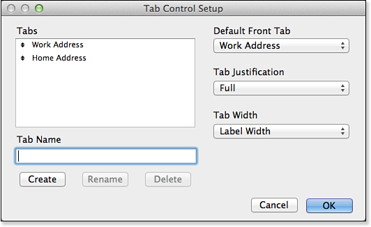
Figure 4.24. The Tab Control Setup dialog enables you to create however many panes you require.
In the Tab Control Setup dialog, you can add as many tab panes as necessary and then choose alignment and tab styles. Although the options aren’t exhaustive, the simplicity of working with the tab control object will no doubt quickly win you over.
The width of the tabs on the tab control can be set in the Tab Control Setup dialog. Your choices are as follows:
• Label Width
• Label Width + Margin of (to provide a small space on each side)
• Width of Widest Label
• Minimum of
• Fixed Width of
If you select a tab in the tab control, you can use the Position tab of the Inspector to name it. Then, when using a script to go to a layout with a tab control on it, you can go to a specific tab—even changing the tab depending on circumstances. After you close the dialog, you remain in Layout mode and can add layout objects—including additional tab control objects—to the tab pane currently selected.
The tab control is operational in Layout mode. If you click a tab once, you flip to the pane it represents. If you want to return to editing in the Tab Control Setup dialog, double-click the tab control object. If you want to edit the tab pane’s properties (color, line weight, and line color), click the tab a second time. You will see an active rectangle appear.
When you select the tab control object, notice that its rectangular area includes its tab space. The negative space next to your tabs when they’re not set to Full justification is still considered part of the selected pane. One handy technique we’ve learned is to place a button or text or even field objects in that space: They appear and disappear just as all objects for a pane do.
Working with Fields
The primary purpose of a layout is to allow users to interact with data. By interact, we mean everything from viewing, editing, and formatting to finding and sorting. Although a field is at some level just another type of layout object and can be manipulated using the same tools as other layout objects, a number of tools are designed specifically for working with fields. They provide you with a great deal of freedom and flexibility for creating the interfaces that work best for your users and your solution. We don’t cover every option of every tool here, but rather try to give you a sense of what the tools are and some of the situations in which to use them.
Adding Fields to Layouts
There are several ways you can add fields to a layout: by using the Field tool in the Status toolbar to draw it, by using the Add Field button in the Status toolbar, and by duplicating an existing field. The first of these—which is generally also the first method that people learn—involves clicking and dragging the Field button in the Status Area out to the section of the layout where you want to place the field. The current theme format attributes govern the attributes of a field added this way.
There is another way to add fields to a layout. If Add Newly Defined Fields to Current Layout is set in the Layout tab of Preferences, the Manage Database dialog will add fields automatically using the default settings if the current layout’s base table is the table to which you have added the fields.
As with other layout objects, when you duplicate an existing field, the new field has all the attributes of the previously existing field (including its width). Remember, to duplicate any layout object, you can select it and either choose Edit, Duplicate or press (Command-D) [Ctrl+D], or select it and then (Option-drag) [Ctrl-drag] to a new location. In either case, if you have selected a single field, when you duplicate it, you see the Specify Field dialog and can select the new field. On the other hand, if you select multiple objects, when you duplicate them, you get just the duplicated objects. Keep in mind that you duplicate all the attributes of a field—including any button behaviors you attached to it, tooltips you assigned, and so on.
There are some issues to be aware of when copying and pasting fields from a layout in one file to a layout in another file. See “Copying and Pasting Fields Between Files” in the “Troubleshooting” section at the end of this chapter.
Each field object on a layout is defined to display data from a particular field. Unless you selected Sample Data in the View, Show menu, you see the field’s name on the object when you’re in Layout mode. If you see :: at the beginning of the field name, that’s an indication that the object is linked to a related field. The Specify Field dialog lets you view and change the database field used in the field object on a layout. In Layout mode, double-click the field to open that dialog. You can also view and change the database field for a field object on a layout using the Field section of the Data tab in the Inspector.
If a field has been defined as a button, double-clicking it takes you to the Button Definition dialog, not the Specify Field dialog. Similarly, if multiple fields are grouped together, right-clicking gives you only the control elements of the dialog. This is one of the reasons many people prefer to use the Inspector: Its behavior is more predictable in some ambiguous situations.
Setting the Tab Order
When moving from field to field on a layout with the Tab key—or Return or Enter, as described in the preceding section—the order in which the fields are activated is known as the tab order. The default tab order is the order in which the fields appear on the layout from top to bottom. Rearranging fields changes the tab order.
Tab order is stored with the layout, so there’s no opportunity to customize the tab order for different users. The Set Tab Order dialog is shown in Figure 4.25. After you edit the tab order manually, rearranging fields doesn’t change the tab order. New fields are added to the end of the tab order automatically, regardless of position.
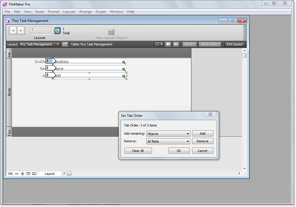
Figure 4.25. You can change the tab order of a layout to make data entry flow in a logical progression for end users.
If you click the Add Field button in the Status toolbar, you are simply asked to select the field to use. You must later use the Inspector to modify its attributes.
Anyone with the ability to modify a layout can change its tab order; this is done by selecting Layouts, Set Tab Order. You can click both fields (the arrows to the left of objects) and objects themselves (the arrows to the right of objects) to manually edit the tab order for a given layout. You can remove items by pressing the Delete or Backspace key.
The dialog operates on like objects. If you want to add all fields to the tab order or remove all objects, choose from the two menu options in the dialog and click the button for the appropriate command.
Note that it is entirely possible to attach a button behavior to a field and for that field to appear twice in the tab order. One instance tabs into the field for editing, and another selects the field to perform the button action.
The Set Tab Order dialog allows developers to add and remove both fields and objects (including tab control object tabs) from the tab order of a given layout.
To further enable users to work from keyboard commands, and review adding keyboard shortcuts via Custom Menus, see “Working with Custom Menus,” p. 396.
Merge Fields
If you’ve ever done a mail merge, the concept of merge fields should be familiar to you. Merge fields give you a way of incorporating field data within text blocks on a layout. This feature is useful for creating form letters, labels, and reports.
Merge fields display field data, but they don’t behave like or have all the properties of normal fields. A user can’t click into a merge field to do data entry, for instance.
To add a merge field to a layout, choose Insert, Merge Field, or press (Command-Option-M) [Ctrl+Alt+M]. You are prompted to specify a field. After you make your selection, the field name shows up on your layout surrounded by angle brackets. Note that you can add a merge field alone to a layout or you can incorporate it, and potentially others, into a block of text within a text object. A single merge field can contain several actual fields as well as constant text so that it might appear as follows:
Total: <<sTotalPopulation>>; Average Age: <<sAverageAge>>
Merge fields provide a good way of displaying uneditable data on a layout so that it wraps as you would expect it to in a word processing program. (On report layouts shown in Preview mode or that are printed, the field-sliding controls can do the same thing.) However, remember that a field can be searchable, whereas a merge field cannot. You might want to use a field where the behavior does not allow editing in Browse mode but does allow editing in Find mode so that a title is searchable.
The primary benefit of merge fields is that field data can be flexibly placed within a text block; text before and after the merge field is repositioned to close up any extra space. Thus, within a text block, you could have “Hi, <<First Name>>, how are you?” On one record, that would come out as “Hi, Joe, how are you?”, whereas on another it might be “Hi, Frederick, how are you?”
Text, number, date, and time formatting applied to a text block is applied to any appropriate merge field within the text block. It is not possible to have a single text block that contains multiple merge fields having different formats applied to them.
Troubleshooting
Copying and Pasting Fields Between Files
When I copy and paste fields from a layout in one file into another file, sometimes the fields retain their proper identity, sometimes they have no identity, and sometimes they have the wrong identity. Why is that?
When you copy fields from a layout in one file and paste them into another file, they might or might not retain their identity, as you’ve discovered. A field retains its identity when there exists a field in the destination file that has the same source table and field name as the source field. Additionally, the layouts must be based on identically named table occurrences. It’s not enough for the source tables to be named the same. If the table occurrences match, but no similarly named field is found in that table, the field displays <Field Missing> when it’s pasted into the destination file. If the table occurrence names don’t match, the field shows up without any identity in the destination file.
Given the ease with which you can copy and paste tables using FileMaker Pro Advanced, we recommend first creating a compatible schema in the destination file and then copying your layout objects.
Determining Which Records Will Be Displayed on a Layout
I created a table occurrence that’s supposed to display only invoices that are more than 60 days overdue. However, when I build a layout based on this table occurrence, I still see all the invoice records. What did I do wrong?
The problem here isn’t anything you’ve done or haven’t done, but rather your expectations. The table occurrence to which a layout is tied never determines which records from the source table are displayed on that layout. It merely determines the starting point on the Relationships Graph from which any action or object involving a relationship is evaluated. To view a set of related records, you must establish a perspective through which those records are viewed; in other words, you’ll need a portal.
If you have a layout that’s tied to an occurrence—any occurrence—of an Invoice source table, all the records from the Invoice table can be viewed from the context of that table occurrence. Think of it this way: A layout’s table occurrence doesn’t determine what records you can view from that layout; rather, it determines what records the records of that table can view. Therefore, in the case of your table occurrence, which is supposed to show only invoices that are more than 60 days overdue, you’d need to view those via a portal from a layout tied, say, to a Customer table.