The previous chapter was all about process colors, the four transparent inks that combine to make full-color images on paper. Process color printing is expensive, and most projects either can’t afford it or don’t really need it. But what if you want some color on the page? That’s when you use a spot color, just an ink or two applied to text or graphics that adds bright spots to your page.
Spot colors are one of the most misunderstood aspects of printing. Part of the problem is that many designers, print shops, and software companies use a variety of terms to describe spot colors: specialty, Pantone, custom, flat, solid, second color, and fifth or sixth colors are just some of the terms used to describe the technique.
Whatever you call them, spot colors can help you create many special effects in your printed projects, including duotones, and they can also help lower the printing costs.
The term spot color refers to any other single color besides the four process colors (cyan, magenta, yellow, or black) that is printed on paper. The print shop always has black ink on the press, so they typically only charge you for colors besides black because then they have to wash the press to put new colors on. (For more information on the number of colors used for printing, see Chapter 11.)
Some print jobs use both spot and process colors. A typical project might use process colors for most of the text and photos, and spot colors for special areas of the project, like where you want a metallic color or a richer red than the red that’s created with CMYK colors. But let’s look at the different uses for spot color.
If you want to put color into your project but can’t justify the expense of the four-color process, use a spot color. This book uses process colors to add color to the pages. That means my publisher has to pay for four-color printing.

But if my publisher had wanted to save money, they could have printed the book using black ink plus a spot color. That second color would add some variety without costing as much as a four-color printing.
One reason to use a spot color is to match a specific color. For example, it’s very common to match the colors used in company logos. The red used by Coca-Cola is a spot color. The American Express Card green is a spot color. The MasterCard orange-and-yellow logo are two spot colors.
Color matching is why spot colors are sometimes called specialty or custom colors, colors that are specifically mixed for a company or a project.
Another reason to use spot color is to create a special effect, such as silver or gold metal. You might use metallic ink or special metallic foils. There’s no way the ordinary process inks can create that metallic look, so whenever you see it, you know the press used a spot color.

You can also use fluorescent spot colors to make the images in a printed piece seem to glow or shine from the page. Fluorescent inks have special chemicals added. The yellow and orange colors on a box of Tide detergent are examples of fluorescent spot colors. Many magazines print their covers with fluorescent colors to call attention to the magazine on the newsstand. Book covers use fluorescent spot color to make the title of the book jump from the shelf. Whenever you see printing that seems to glow, you know the project was printed using a spot color.

Many times fluorescent and metallic colors are used in jobs printed with process colors. This means the job is printed with more than four colors. When spot colors are added to a project that already uses process colors, the spot colors are said to be the fifth or sixth colors.
Another reason to use spot colors is to hold avoid registration issues when dealing with very small text. For instance, let’s say you want a lot of body text in a color such as green. If the green comes from two process colors (cyan and yellow), small text could look a little fuzzy if the plates don’t match exactly. (See Chapter 15 for an example of what that looks like.) Instead of two process colors, using a single spot color green plate avoids the problem of getting the colors to register exactly.
You can find a lot of this technique in textbooks, especially for teacher editions, which have lots of colored text in the margins.
Spot color doesn’t have to be an actual color—the “spot” can be a special printing effect. For instance, a varnish is a printed coat of shellac or plastic. It might cover the entire surface of the page or just a specific area. You’ve probably seen spot varnish, where an area on a page looks very shiny compared to the rest of the page or cover. That varnish is specified by a spot color.

Embossing is a technique where text or an image is pressed into the printed page to create a raised surface. This is also specified as a spot color, even though embossing doesn’t add any actual ink to the page.
It’s actually very easy to define a spot color. Instead of choosing the process color setting in your color editor, you just set the color type as spot color.
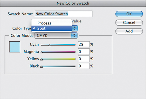
The easiest way to define a spot color is to simply choose the Spot designation.
Once you define the spot color, an indicator appears next to the color name that shows it is not a process color.
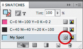
The circle inside the square next to the color name indicates that the color is defined as a spot color.
When you create a spot color, like process colors, it too will have a screen angle. Fortunately you don’t have to worry about setting the screen angles for spot colors unless you are going to mix them in a duotone (covered on page 146). If you do create a duotone that mixes black and a spot color, you may need to talk to your print shop for the best way to set the screen angle.
Spot colors can be difficult to print on the office inkjet printer. With only four cartridges in the printer, it is difficult—if not impossible—to replicate a corporate spot color. This can be a problem when you want to show a proof of the project to a client.
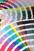
Each of the spot color companies has created books that show how their spot colors look in print. In addition, spot color companies provide software for desktop publishing applications that allows you to pick from their libraries of colors within the program. These spot colors correspond to the colors that are printed in the spot color guides. Instead of relying on the color from the inkjet printer, you can show the client the actual spot color swatch in the color guide.
Don’t create a color on the screen and expect that color to appear on the printed page. It just won’t happen. You can calibrate your screen (set the colors to an industry standard) with software, and that will help coordinate the colors you see on your screen with other calibrated monitors. But it still does not ensure that the ink on the paper is exactly what you see on the screen.
But don’t worry if the color on your screen doesn’t match the printed book! It doesn’t matter what it looks like on your screen—what matters is that it will print that color.
Once you start working with spot colors, you’ll discover there are many special effects you can create using just two inks to arrive at at different looks. Some of these effects are very simple to achieve; others need specialized software. The following are just some effects you can create with spot colors.
Once you have defined a spot color, you can then make a tint of it. This simply means that instead of using the color at 100 percent, you use it at a certain percentage of its value, such as 10 percent. The press prints tiny dots of ink; these tiny dots mix with the white background of the paper to give the appearance of a lighter color.
It’s very easy to tint a spot color to make it lighter. But how do you make a spot color darker? How can you add black to the spot color? Mixing a spot color and black is a special technique called Mixed Inks in InDesign and Multi-Inks in QuarkXPress. With Mixed Inks you can create a wider range of colors on your page than with just the spot color and its tints.
Ordinarily in a layout, if one item is on top of another, the portion of the bottom item does not print where it’s hidden beneath the top one. The top is said to knockout the bottom. But if the top overprints, the bottom object prints even where it is beneath the top one. This means the ink from the top item combines with the ink for the bottom item, which causes the colors of two objects to mix together.
Overprinting allows you to combine spot colors together. For instance, you need to set a varnish color to overprint the images below. This allows the images to be seen under the varnish plate. If you don’t set the varnish to overprint, it will delete the image underneath.
Overprinting is used with both spot as well as process colors. For an example of overprinting, see Chapter 19.
You can also use spot colors to change the look of photographs. The easiest way to do this is to change the black of a photograph to a spot color, as shown below. This is sometimes called colorizing the photo.
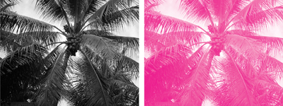
An example of tinting a grayscale image. Here the black color of the left image has been changed to the magenta plate. It’s a very simple way to colorize a photo.
To colorize a photo in a page layout application, you need to import a grayscale image. Once you have put the image on the page layout page, you can colorize it—just select the image and choose a color from the color palette. This changes all the black pixels in the image to a different color.
Sometimes it helps to understand the different effects you can create with spot colors if you know when spot colors have been used. Look at different printed materials and try to find the spot colors. It’s easy to pick them out when they’re fluorescent or metallic colors, but they’re a little harder to identify if four different colors have been used.
One quick way to tell if a color is spot or process is to look for the dot pattern that is created by the four-color process. If you see a dot pattern in a color, it is most likely a process ink. If a color such as a light orange or green is solid (no dots), then it is most likely a spot color.

A simulation of what spot colors look like under a magnifying glass. A solid area of color or a single color of dots (left and middle examples) indicates the color is a spot color. A pattern of dots of any of the process colors (shown on the right as magenta and yellow) indicate a process color.
Even though a grayscale photograph can display up to 256 levels of gray on a monitor, a printing press can only reproduce about 50 levels of gray. In two-color printing, you can print a grayscale photograph as a duotone, a special process that allows you to mix two different colors together in a photo, each color capable of 50 levels, which can significantly increase the depth of the image.
You can also make tritones using three colors and quadtones using four colors.
Today, the most sophisticated way to make a true duotone is to use the patented technology in Adobe Photoshop. You choose the two inks you want to use in the duotone, typically black and a spot color. You adjust the “curves” of each of the colors, which changes the amount of ink that prints. This essentially creates the two versions of the halftone screen that are necessary to print a duotone.
Adjusting the curves for a duotone is not a foolproof process. Some spot colors, such as light yellows, require different settings than, say, dark browns. Different images also require different settings than others; for instance, a human face would use different curves than a shiny metal teapot. If you are in doubt as to how to adjust the curves, talk to the commercial print shop. They will be able to advise you on the best settings for your image.

The fake duotone on the left was created by taking a grayscale photo and adding a cyan background behind the black plate. It looks dull and flat compared to the true duotone, created in Photoshop, on the right.
You can also use the duotone controls to add one of the process colors to a grayscale image. The duotone above is an example of adding the process color cyan to a black and white image.
If you don’t want to (or can’t) use Photoshop to create a true duotone with different images for each color, you can still create a fake duotone by placing a grayscale image over a tint of a color. However, these fake duotones are not as interesting as creating a proper duotone in Photoshop.
Don’t worry about finishing these projects quickly. These projects are suggested as a way to look at printed materials with a spot color eye.
Examine the envelopes that you get from direct mail companies. Look for those printed with black and another color. When you see only two colors on the envelope, most likely it is a spot color.
Go visit a magazine stand and look for magazines that have bright orange or another neon color on the cover. That neon color is usually a spot color. (Don’t stand there reading the magazine if you’re not going to buy it!)
Go to a bookstore and look at some of the covers for the gothic novels or science fiction paperbacks. See if you can find examples of varnish, metallic inks, or embossing on the covers.
Go to the laundry detergent aisle of your supermarket. Look at the boxes of detergents. See all those glowing colors? (You may need your sunglasses.) Those are fluorescent spot colors.
Find some take-out menus from a local pizza place or Chinese restaurant. Count the number of colors. Is the menu printed with two or four colors? If it is only two colors, most likely the restaurant saved money by printing black plus a spot color. (The Chinese restaurant in my neighborhood uses black plus a spot color for its menus as well as the covers for the chopsticks.