There’s more than just colors and resolutions to consider when working with computer graphics. One important issue is working with fonts. You need to understand how the fonts are installed, what files you need, and how the fonts can be styled and modified.
You also need to understand what happens to strokes, or the outlines around objects, when you reduce or enlarge those objects. You could be in for some nasty surprises if you don’t.
Finally, you need to be aware of the technique that converts fonts into artwork. You need to understand when this is a good idea and when it is not.
One of the most important things about fonts you need to understand is the three basic font formats, Type 1, TrueType, and OpenType.
Type 1 fonts (also called PostScript fonts) are one of the oldest font formats that is still used today. Type 1 fonts come in two separate files:
The file for the screen font is used by the computer to display the font.
The file for the printer font contains the information that is sent into the printing machine to print the font outlines.

As you can guess from their alternate name, these fonts use PostScript information to draw the font in the printing machine. Many years ago there were some issues with trying to print Type 1 fonts to machines that did not understand the PostScript language. But that’s way in the past and nothing you have to worry about.
The most common problem with Type 1 fonts is when the screen font gets separated from the printer font. Without both of those files in the same folder, the font isn’t going to work correctly.

TrueType fonts were created to combat some of the problems with Type 1 (PostScript) fonts. The major advantage of working with TrueType fonts is that you have only one file to keep track of. This one file contains both the screen font and the printer font.
In addition, there are no issues trying to print TrueType fonts to non-PostScript printers.
All the fonts that are pre-installed on Macintosh machines running OS X are a variation of TrueType fonts called dfonts.
The newest font format is OpenType. All the fonts that are pre-installed on Windows machines are OpenType fonts.
Like TrueType fonts, OpenType fonts consist of a single file, which makes it easier to keep track of your fonts.
But even better, OpenType fonts can work on either the Windows or Macintosh platform. This avoids a common problem that occurs when files are passed from one platform to another. Without an OpenType font, a file that uses the Helvetica Type 1 font on my Macintosh machine could reflow if I send it to someone who has the Helvetica Type 1 on a Windows machine.
This is because even though the fonts have the same name, they have slightly different settings that could cause the text to move from one line to another.
OpenType fonts come in two different “flavors.” The actual font information inside the file can be either PostScript or TrueType. It really doesn’t matter much which flavor of OpenType you use. The OpenType fonts that come with Windows machines are OpenType with TrueType information.
Finally, OpenType fonts can contain many more characters than either TrueType or Type 1 fonts. This means that you can create proper fractions or small capitals quickly and easily.
If you are going to buy fonts to set up your computer, I strongly suggest you invest in OpenType fonts, and not Type 1 or TrueType. (In fact, Adobe only sells OpenType fonts these days.)
The term “styling fonts” refers to using the automatic italic or bold commands in your software to change a font to its italic or bold versions.
The style controls in QuarkXPress (left) and Microsoft Word (right) that allow you to apply bold and italic styles to fonts.
For instance, you click the letter I in the style controls to convert a font such as Chapparal Pro to Chapparal Pro Italic. You click the letter B in the style controls to convert it to Chapparal Pro Bold. This is different from the controls in my favorite program, InDesign, which requires me to choose the actual style name to apply the italic or bold style of a font. So what’s the difference?
Let’s consider what happens when you click the style control for italic to a font. With a font such as Chapparal Pro, the software (QuarkXPress or Word) changes the font to its italic version. There is no problem to this.
But what happens when you click the style control for italic to a font such as Comic Sans MS, which has a bold version but no italic? In QuarkXPress and Microsoft Word, the typeface gets slanted to the right. This is not an actual italic typeface, however. It is a fake italic! Most professional designers know enough not to use such a fake font. It looks bad. The same thing happens with fonts that don’t have a proper bold style. The font just gets thicker in a clumsy way.
Learn which fonts have italic or bold versions. Learn which keystrokes will apply a real bold versus a fake one. Print your document to a PostScript printer or create a PDF to see if the styling is applied correctly.
There’s another type of electronic styling that you should be aware of, applying the small caps style to text. Small caps is a very elegant look where the uppercase letters are large capitals and the lowercase letters are smaller capitals. Programs such as QuarkXPress and InDesign allow you to apply the electronic style for small caps to text.
Here’s where it gets tricky: If the font is the “Pro” version of an OpenType font, the small caps style will substitute the proper small caps version of the characters. If the font isn’t an OpenType Pro font, the small caps style converts all the text to capitals and then reduces the size of the lowercase characters. This makes the lowercase capitals look wrong next to the uppercase capitals.

Be careful when applying color to text—especially text smaller than 8 or 9 points. If the color is a single plate, such as cyan, magenta, or yellow, there is no problem. That one plate will look fine. But if the color is a combination of two or more plates, such as a green that is created from cyan, yellow, and black, those three plates may not register correctly when printed. The result is fuzzy letters that can be difficult to read.
This is an exaggeration of why it may be difficult to read colored text at small sizes. Notice how if the color plates don’t match up exactly, the text is not clean.
This is one of those situations where you may end up knowing more than the so-called experts at a print shop. I’ve seen many designers who have been told by their print service providers to select all the text in their document and convert it to outlines.
When you convert text to outlines, you no longer have actual text. The text is changed into paths or outlines as if they had been drawn using a vector illustration program.
There are several important reasons why you should not do this. First, you lose the ability to edit the text later on. Next, certain effects such as underlines are lost when you convert the text. And finally, you may not realize it, but the text becomes slightly thicker when it is converted to outlines.
The reason for this thick look is the lack of hinting. PostScript fonts include hinting specifications that tell the letters how to display within the pixels or dots per inch of the monitor or the printer. When you convert the font from text to paths, you lose the hinting and the font may look thicker on the screen.
The smaller the type, the bigger the problem with thickness; the higher the resolution, the less the problem of thickness. So small type in paths on a laser printer will look worse than the same type on an imagesetter. Type larger than about 9- or 10-point will usually look just fine in paths on any good laser printer and any imagesetter.
So why do so many print shops instruct their customers to convert all the text in their document to outlines? The most common answer is that they are lazy—they don’t know how to handle complicated documents and figure that converting the text will cause the file to print more easily. The other answer is more nefarious—they are trying to avoid purchasing the proper fonts to print files.
So what should you do if your print shop tells you to convert all your text to outlines? If you can, find another print shop. You’re better off with a shop that doesn’t ask for such a bad workflow. Or, if you can’t change the print shop, create a PDF of the document. This will avoid any missing font problems. (For more information on creating PDF files, see Chapter 17.)
There are legitimate reasons why you should convert text into outlines. Most company logos have their text converted to paths so there are no problems with missing fonts. This is especially true for the registered trademark sign (®) that is positioned next to a company logo. The company doesn’t want their logo to be listed as having a missing font. So they convert the text into paths.
Another legitimate reason for converting text to paths is to create a special effect. This allows you to manipulate the text as artwork rather than text—you can put pictures inside the letters, distort them, or color them in special ways.
One of the most common problems users create in page layout or vector illustration programs happens when rules (lines) have been set to a hairline weight. PostScript code defines a hairline as “the width of one device pixel in the output device.” This is “geek speak” that means the size of the hairline changes depending on the type of printer you output to.
Hairlines that are visible on the print from a laser printer practically disappear on the output from a high-resolution printer.
Another part of the problem is that not all programs use the same definition of a hairline rule. This means the hairline rules created in a vector illustration program may not match the hairline rules created in a page layout program.
Rather than set a rule width to hairline, it is much better to set it to an absolute measurement: Instead of “hairline,” choose “.25 point.” Although there may still be some difference in the thickness between a laser printer and a high-resolution output, the .25-point rule won’t disappear on the imagesetter output.
As discussed in Chapter 7, one of the advantages of working with vector programs is that the artwork is resolution independent. You can change the size of the art without worrying about pixels clumping together or enlarging. There are no pixels. However, when you make the artwork smaller, you also make the width of the lines (called the stroke weight) smaller. For instance, you might import a graphic from a vector program into a page layout program and then reduce the graphic to fit on the page.
When you import illustrations from programs into page layouts, don’t scale them down so far that the stroke weight becomes smaller than .25 point. Those lines may not be visible on the final print, or they may not be printable.
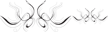
The illustration on the left contains both .25 and .125 pt stroke weights. When scaled down on the right, those strokes become almost impossible to see.
If the stroke weight is too small, you need to go back to the original illustration and increase the width of the lines so they can still be seen when reduced. If your artwork is a company logo, you may actually need two versions of your file: a large version of the logo with thin strokes, and a small version with thicker strokes.
Here are a few projects which should help you understand working with fonts. Like all the projects in this book, you don’t have to finish all of them at once. Rather, they are projects you should continually do as you work.
Look at the icons for the fonts on your computer. Are some of the icons different from the others? Some of your fonts may be TrueType and others may be OpenType.
Set some text in the regular version of a font. Then set the same text in the italic version of the font. Are the slanted characters in the italic version the same as the regular version? Or does the italic version have letters that are drawn differently?
Set some text in a paragraph. Duplicate the paragraph and then convert the text to outlines. Did the spacing between the characters change? How do you feel about that?