
The menu, highlighted in the following screenshot, allows you to choose the Mark type:
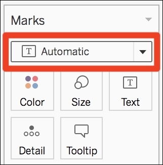
By default, the Mark type is set to Automatic. This means that Tableau chooses the best visualization based on the fields (that is, which data types you use and where).
Of course, you can change the Mark type and use any type you want. For example, if you put Order Date in Columns and Profit in Rows, Tableau displays a Line chart because it's the best way to visualize an evolution. However, by using the Marks shelf, you can select the one you prefer (for example, a bar chart, an area chart, or whatever you think is best).
Let's explore what you can build with the different Mark type. For almost every type, there is an example that you can reproduce with Sample - Superstore.
Note
You can also download the Mark Types ZIP file from my website (https://tableau2019.ladataviz.com) in Chapter 6, Design Insightful Visualizations section, or click on this direct link: http://ladataviz.com/wp-content/uploads/2019/05/Mark-Types.zip. When you unzip the file, you'll find a Tableau Package Workbook with an example of each Mark type.
Let's start with our Mark type tour with bar charts:
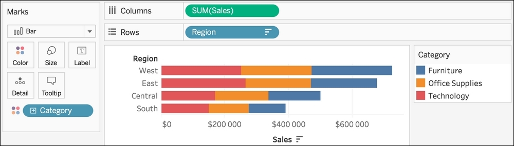
- Bar (
 ): This is probably the most common and useful Mark type. It's perfect for comparing values between multiple categories. When you don't know how to visualize your data, start with a bar chart! Here's an example of a visualization using a bar chart:
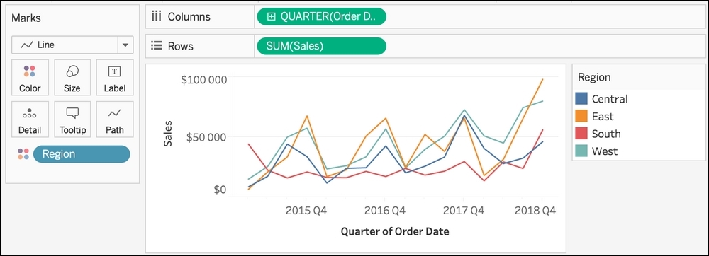
- Line (
 ): This is useful for seeing trends and evolution. When you have multiple lines, you can easily compare the values at each time point. However, it's harder to see the global trend than with a bar. Here's an example of a visualization using a line chart:
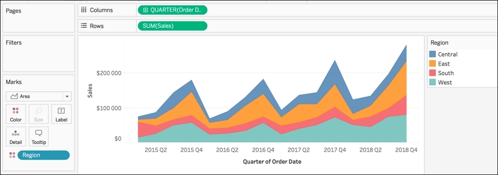
- Area (
 ): This is useful for seeing the global trend and the proportions at each time point. Here's an example visualization using an area chart:
- Square (
 ): You can create two types of charts with a square—a heatmap and a treemap. A heatmap is a table, but better. When you build a table, you have to read every value to compare them. A heatmap gives the same level of granularity, but with the ability to quickly spot the top and bottom values. Here's an example of a heatmap:
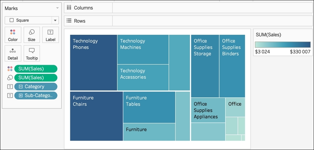
A treemap is a hierarchical representation, with nested rectangles, that gives you a quick idea of the number of values and the proportion of each of them. Here's an example of a treemap:
): You can create two types of charts with a square—a heatmap and a treemap. A heatmap is a table, but better. When you build a table, you have to read every value to compare them. A heatmap gives the same level of granularity, but with the ability to quickly spot the top and bottom values. Here's an example of a heatmap:
A treemap is a hierarchical representation, with nested rectangles, that gives you a quick idea of the number of values and the proportion of each of them. Here's an example of a treemap: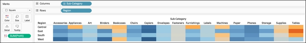
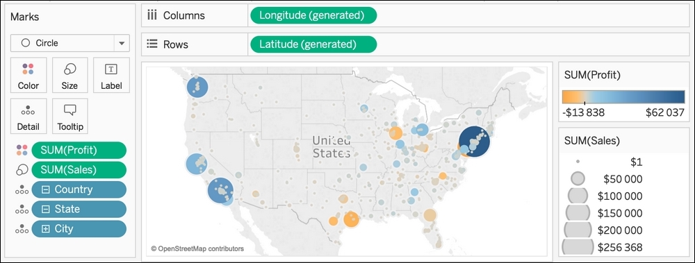
- Circle (
 ): The big advantage of this Mark type is that you can easily use two properties, Color and Size, on top of the position of the circle. In the following example, you can easily spot the biggest city, the sales, and the profit at a glance:
- Shape (
 ): When you use the shape Mark, the Shape property (the boxes beneath the Mark type menu) becomes available. To use a Shape, drag and drop a Dimension in the Shape property and each value gets a different shape. Here is an example of a visualization using Shape:
Wait, there's more! Shapes are among the best features to customize your visualization and create something unique. You can add any custom shapes you want in Tableau. You'll learn how to do that in the next section.
): When you use the shape Mark, the Shape property (the boxes beneath the Mark type menu) becomes available. To use a Shape, drag and drop a Dimension in the Shape property and each value gets a different shape. Here is an example of a visualization using Shape:
Wait, there's more! Shapes are among the best features to customize your visualization and create something unique. You can add any custom shapes you want in Tableau. You'll learn how to do that in the next section.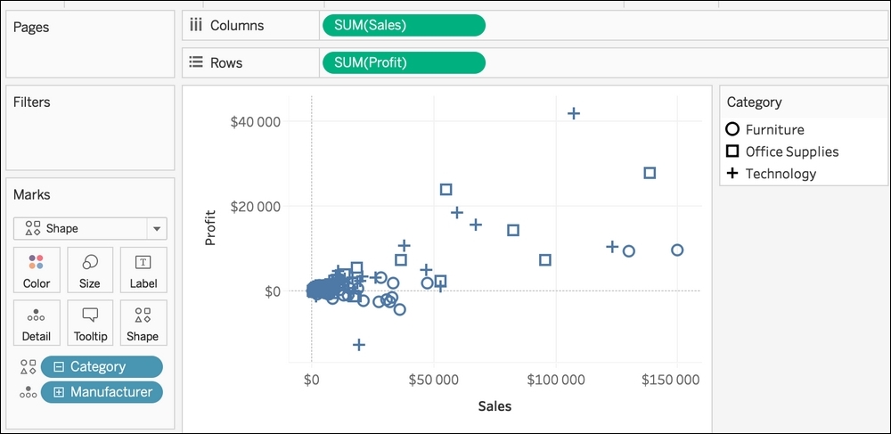
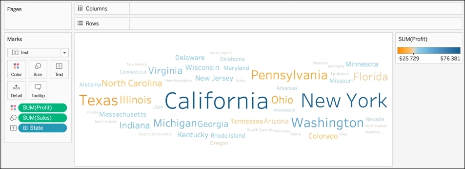
- Text (
 ): This is used to build tables but also word clouds. Tables will always be there. You can build the best visualization ever, but there will still be someone asking for a simple table because they need to see the values. You can't do anything about this, so you may as well learn how to create a table:
A word cloud isn't the best visualization to do an analysis. However, it can be used to see the big picture. As with circle, you can use a Measure in Size and another one in Color. Here's an example of a word cloud:
): This is used to build tables but also word clouds. Tables will always be there. You can build the best visualization ever, but there will still be someone asking for a simple table because they need to see the values. You can't do anything about this, so you may as well learn how to create a table:
A word cloud isn't the best visualization to do an analysis. However, it can be used to see the big picture. As with circle, you can use a Measure in Size and another one in Color. Here's an example of a word cloud: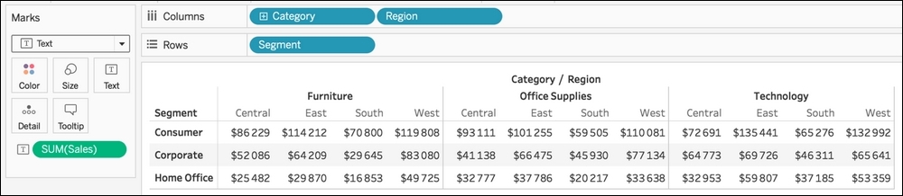
- Map (
 ): To use the map Mark type, you need at least one Dimension with a geographical role in the Marks shelf, the Longitude (generated) field in Columns, and the Latitude (generated) field in Rows. When you display a map, there are options to search, zoom, and select values in the menu in the top-left corner of the map. Here's an example of a map in Tableau:
Maps are customizable. When you click on the Map top menu, you'll find options to change the background, use a custom geocoding, manually edit the locations, add the legend. However, the two most important options are:
): To use the map Mark type, you need at least one Dimension with a geographical role in the Marks shelf, the Longitude (generated) field in Columns, and the Latitude (generated) field in Rows. When you display a map, there are options to search, zoom, and select values in the menu in the top-left corner of the map. Here's an example of a map in Tableau:
Maps are customizable. When you click on the Map top menu, you'll find options to change the background, use a custom geocoding, manually edit the locations, add the legend. However, the two most important options are: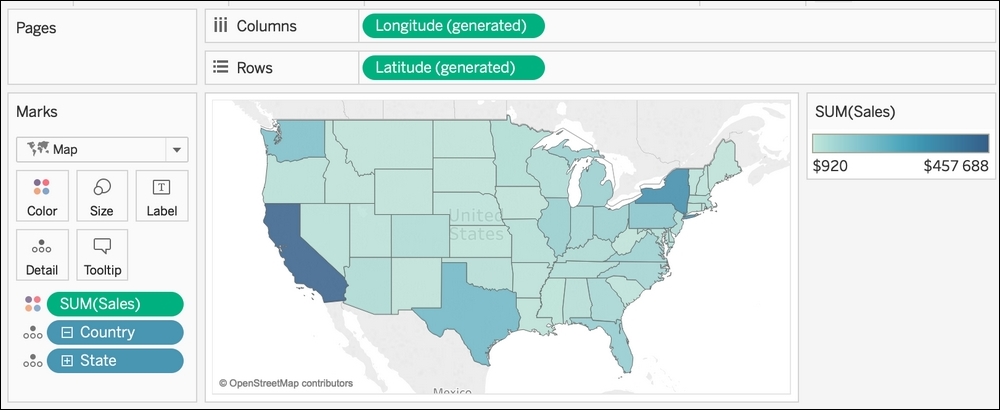
- Map layers: Opens a new pane on the left where you can change the Style of the map, the Washout, and add or remove multiple Layers such as Coastline, Cities, Country Borders, Building footprints, and so on.
- Map options: Opens a new menu on the map where you can customize the options to search and zoom, but also change the units and remove the toolbar.
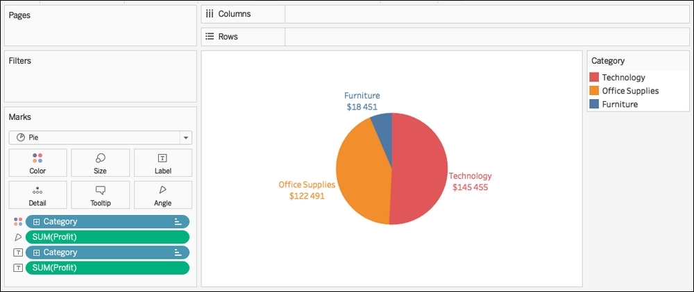
- Pie (
 ): When you select Pie in the Mark type selector, a new property becomes available: angle. To create a pie chart, put a Dimension in Color and a Measure in the Angle property. A pie chart works in one specific situation when you want to compare the proportion between two values. With more than two values, a bar chart is always more efficient. Here's an example of a visualization, representing the unranked sales by category with a pie chart and a bar chart:
If you still want to create a pie chart, at least don't forget to sort the values as in the following example:
): When you select Pie in the Mark type selector, a new property becomes available: angle. To create a pie chart, put a Dimension in Color and a Measure in the Angle property. A pie chart works in one specific situation when you want to compare the proportion between two values. With more than two values, a bar chart is always more efficient. Here's an example of a visualization, representing the unranked sales by category with a pie chart and a bar chart:
If you still want to create a pie chart, at least don't forget to sort the values as in the following example: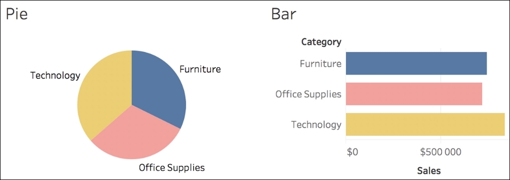
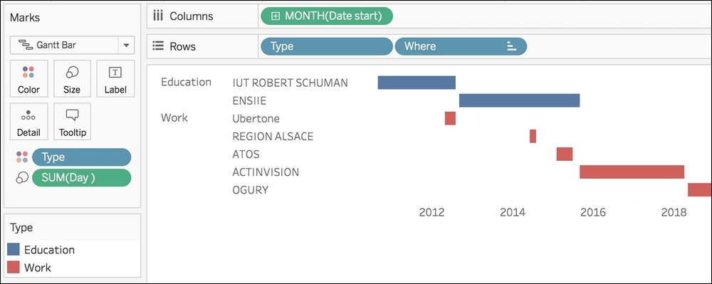
- Gantt Bar (
 ): This is generally used to create a Gantt chart, and this visualization is helpful when you manage projects over time or if you want to create a timeline. A Gantt Bar uses a Continuous field (generally a date) in Rows or Columns to set the initial position and another Continuous field in Size. Here is an example of using a Gantt Bar for a resume:
- Polygon (
 ): This Mark type exists when you want to represent something supposedly impossible to do in Tableau. When you select Polygon, a new property is available: Path. To create a polygon, you'll need a Dimension representing the unique identifier of each polygon, and a number in Path to connect the points and draw the polygons and coordinates in Rows and Columns. Once you have that, you can create, for example, the following polygon:
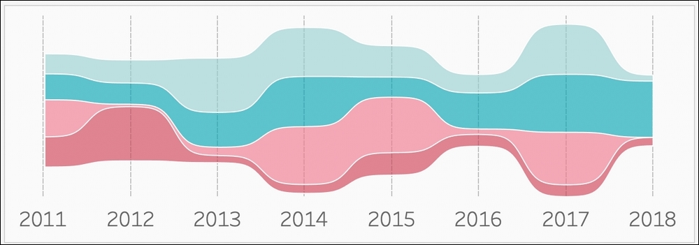
Note
The preceding example is a Stream Graph created by Ludovic Tavernier. You can learn how to build a Stream Graph with this tutorial: https://greatified.com/2018/09/17/how-to-build-a-stream-graph-in-tableau-software/
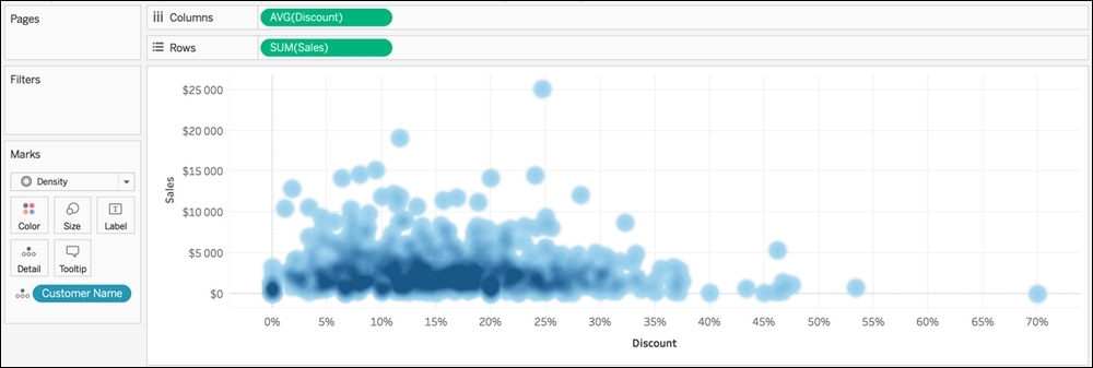
- Density (
 ): The newest Mark type was introduced in Tableau 2018.3, and it allows you to show the density of your Marks. The superposition of multiple Marks determines the color intensity. It's a very simple Mark type; you can use it in various cases as long as you have many Marks overlapping. In the following example, you can see where the concentration of customers is by sales and quantity:
Now that you know how and when to use the different Mark type, it's time to learn how to use another critical part of the Marks shelf, that is, the Mark properties.