
A Dashboard is a composition of multiple Worksheets, and objects such as Container, Text, Image, and Actions to create interactivity. The goal of a Dashboard is to provide insights on a regular basis. The look and feel don’t change, just the data. In this chapter, you’ll learn how to create a Dashboard, you’ll understand the different objects available, and will be able to choose between the different Actions. A Story is a composition of Worksheets and Dashboards. You’ll learn how to create and use a Story to do a presentation, or to tell an amazing story you found in your data.
In this chapter, we'll cover the following topics:
- Dashboard basics
- Dashboard objects
- Dashboard actions
- Creating a Story
Let's start with the Dashboard basics.
If a Worksheet is one idea, a Dashboard is a way to combine multiple such ideas. With a Dashboard, you can create interaction between the Worksheets, and add pictures, web pages, and other objects to create a unique page that will answer all your questions.
To add a new Dashboard, you can either click on the icon at the bottom-right,
, click on New Dashboard from the Dashboard top menu, or use the New Dashboard button in the toolbar.
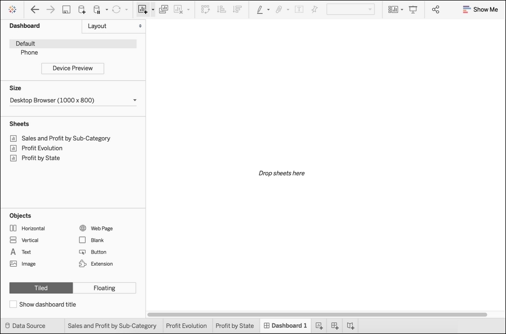
The Dashboard workplace is composed of a central blank part where you can drop Worksheets and objects. On the left pane, you can find two tabs, Dashboard and Layout:
Let's start by seeing how to build a Dashboard; then, we'll focus on the two different tabs.
To create a Dashboard, you have to drag Worksheets or objects to the central blank area (you can also double-click on a Worksheet, but as always, you let Tableau build it for you).
A Worksheet that you add in a Dashboard is the Worksheet itself; this means that if you modify the Worksheet, you'll see the change in both the Dashboard and the Worksheet.
You cannot modify any of the Worksheet shelves from the Dashboard. However, you can still use all the toolbar buttons (to sort, add labels, swap, create groups, and so on) and use a right-click to change the format, or all the other options we've seen in the previous chapter.
When you click on a Worksheet in a Dashboard, its outline will turn gray, and you'll see four (or five) icons:
 : The first removes the Worksheet from the Dashboard.
 : The second takes you to the Worksheet to modify it.
 : The third is a shortcut to put a filter action on the Worksheet (detailed in a later section).
 : The fourth icon is optional, and it can be used to fix the width or height of the Worksheet if it's inside a horizontal or vertical Container.
 : The last one, the small arrow, opens the options for the selection Worksheet. Many of those options can be found elsewhere among the Worksheets or Dashboard options. The most useful options are probably legends, Filters, and parameters, which allow you to quickly add the Legends, Filters, or Parameters that exist on the Worksheet to the Dashboard.
Speaking of options, let's discover what you can do with the pane on the left.
On the left of the Dashboard workplace, you can find two panes, Dashboard and Layout. Simply click on Dashboard or Layout to open the different panes.
On the top, you'll find the different device layouts available for your Dashboard. You'll learn more about that in a later section of this chapter.
The second—and more important than you think—useful option is Size. Here, you can set the size of your Dashboard to Fixed (with a list of standard sizes, and also the option to set the height and width manually), Automatic (the Dashboard will resize to fit the screen), or Range, with a minimum and maximum range.
Tip
Automatic may seem to be the best option, but it is often the worst. The ratio between height and width is critical in data visualization, and with automatic sizing, you have no control. A bad ratio can lead your Dashboard to look very bad, even unusable. My advice is to go with Fixed size when you want absolute power over the looks of your visualization, or choose Range to allow resizing for when the Dashboard will be displayed on many different screen sizes.
On the Dashboard pane, the part you'll use the most is sheets. Here, you'll find all the different Worksheets in your workbook, as long as they are not hidden (you understand, now, why giving a meaningful name to each of them is crucial).
Beneath the list of Worksheets, you can find the different objects that you can add to your Dashboard, and the option to choose between Tiled and Floating. All these essential functionalities will be seen in detail in this chapter.
To finish, at the very bottom, you can use the checkbox to choose whether to show the Dashboard title. Let's continue on to the Layout pane.
The Layout pane is handy when you select a Worksheet or Container in the Dashboard. You can show or hide its title, make it float or not, change its position and size (only for floating items), add a border, modify the background, and add outer and inner padding. Don't be afraid to try those different options, especially the padding, to add some space to your Dashboard.
At the bottom, you'll find the Item hierarchy:
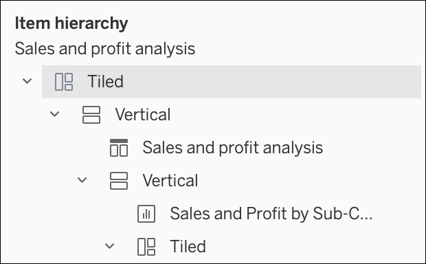
Here, you can unfold all your Dashboard items to find, edit or remove them. Among the different elements, you’ll see the added Worksheets, but also the different Dashboard objects. Since Tableau Desktop 2019.1, you can rename the different Containers.
Now, let’s explore the difference between Tiled and Floating.
When you drag and drop a Worksheet or an object on your Dashboard, you can either use Tiled or Floating layouts. Some users don't like Tiled; others consider Floating dangerous. Let's see the pros and cons.
Tiled is the default way to add elements on a Dashboard. At the beginning, it seems perfect: the grey part where you're dragging an element helps you to see where it'll go; the different items are distributed evenly; and it stays in place when you resize the Dashboard. But rapidly, you'll notice the limits of that technique.
Many cons make it hard to create a great Dashboard with Tiled Layouts:
- You have low control over the size and position of the elements.
- Achieving a pixel-perfect Dashboard is a big fight (maybe a little less now that the grid exists).
- You cannot add a border or a background that outlines multiple items.
- You cannot move multiple items at the same time.
What about the Floating Layout, then?
The Floating Layout often became the default layout for people who had terrible experiences with Tiled. With this layout, you can drag and drop any element wherever you want. With the Layout pane, you can define the exact position and size of every item. Among the options (with the small descending arrow), you can also specify the Floating order to move the element to the back or the front.
The Floating Layout seems to be far better than Tiled, but it's more time-consuming to define the position and size of everything on the Dashboard. Also, the main problem is the time you have to spend if you need to make changes in your Dashboard. Let's say that you want to add a new Worksheet above all the existing ones—you'll need to reset the position and size of all the existing elements on your Dashboard, one by one. That's also the case when you resize the Dashboard.
In short, Tiled is probably better for quick business dashboards that can easily evolve, and Floating is better for pixel-perfect one pagers. Fortunately, there is a third solution, using Containers, that we'll see in the next section about objects. But first, let's talk about device layouts.
You can create different device layouts on your Dashboard. Then, depending on the device used to open the Workbook (on Tableau Public, Server, or Mobile), the right layout is automatically chosen.
Since Tableau 2019.1, every Dashboard starts with two layouts: the default layout that you use to build your Dashboard, and an automatic Phone layout generated by Tableau.
To visualize or add new device layouts, click on the Device Preview button on the Dashboard pane to open the layout toolbar:

On this toolbar, you can select the type of device, the model, and the orientation of the layout. When you're done, click on the last button to add the layout and start personalizing it. You can add two additional layouts: Desktop and Tablet.
On the Dashboard pane on the left, you can click on the different layouts to switch from one to the other and configure them. You can specify the fitting and the height of the layout. You can also see the different items that exists in the Default layout and choose to keep or remove them (they are only removed from the selected layout and not from the other layouts). It's also possible to add other objects, such as text, that will be visible only for the selected layout.
Since Tableau Desktop 2019.1, you have two options for the Phone layout: either use the automatic layout generated by Tableau, or edit it manually.
Let's finish this introduction with the different Dashboard options.
In the top menu, between Worksheet and Story, you can find the different Dashboard options.
Among those options, the most important one surely is Actions.... There is a focus on Actions in a later section. Format is also handy as you can configure the Dashboard color background, titles, and text objects.
The Grid is a great feature if, like me, you like when everything is properly aligned. You can decide whether to show the Grid, and how to configure its size.
All the other options are either straightforward to understand and use (such as Export Image...) or just duplicates of options in different places (such as Device Layouts, Show Title, and Auto Update).
That's it for the basics, but you still have many things to learn about Dashboards! A major part of building a Dashboard is adding objects.