
Appendix. Extra Practice Salad Catch—Art
Your parents tell you that you need to have a salad for lunch, so you head out to your backyard garden with your bratty younger brother to collect the vegetables. Your brother has decided to make a mess of everything. He starts yanking up carrots and tossing them over his shoulder. You have to catch them using the salad bowl in figure 1 before they hit the ground. Unfortunately, the more you catch, the faster he pulls.
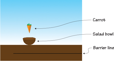
Figure 1. A game of Salad Catch involves making a simple outdoor backdrop for the garden, a salad bowl, a carrot, and a line to serve as a barrier.
In Salad Catch, a reflex-testing game in the tradition of Activision’s Kaboom!, the carrots come fast and furious, speeding up as the game continues. Move the salad bowl left and right using the arrow keys on the keyboard in order to catch the falling carrots. Miss three carrots and not only will you not have vegetables in your salad, the game is also over. Salad Catch tests how quickly your fingers can move.
Once again, as you make the sprites for the game, you’ll learn some key art concepts. In this section, you will learn
- How to make a two-dimensional drawing look three-dimensional with shading
- How to use light to show a curved surface
- How to digitally blend colors
- How to trick the eye into seeing solid objects as hollow
You’ll start off by making a simple background.
Prepping the background and learning about light
When I think of salads, I think of summer, which is why I’ve set the game on a sunny day. A patch of dirt and a blue sky complete the garden. You’ll be able to recreate the different shades of blue that occur in the actual sky by using the gradient (fading) feature in the Color Toolbar.
Making the garden background
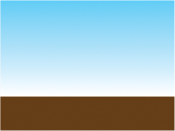
Make the background by dividing the Stage into uneven sections of brown and blue, with the bottom section smaller than the top, as in figure 2.
Figure 2. A smaller section of brown and a larger section of blue create a garden-themed background.
To make a new backdrop
- Navigate to the Sprite Zone and click the white box marked Stage on the left side of the screen.
- Move to the Block Menu and click the second tab labeled Backdrops.
- Choose the darkest brown paint sample square.
- Click the Line tool and draw a brown line across the canvas, holding down the Shift key on the keyboard as you drag the mouse in order to make a straight line. Don’t release the Shift key until you have released the mouse button.
- Switch to the Paint Bucket tool and click anywhere in the bottom quarter of the screen to fill the space with brown paint.
- Return to the Color Toolbar at the bottom of the screen and choose a shade of blue, either from the paint sample squares or the rainbow box.
- Look toward the boxes on the left side of the Color Toolbar where you’ll see the four fill options, shown in figure 3.
Figure 3. You’ll find four gradient (or fading) options on the left side of the Color Toolbar.
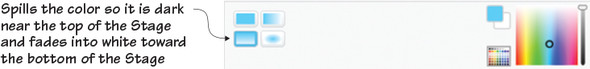
- Choose the bottom left gradient option, which concentrates the blue paint at the top of the screen and fades downward into white.
- Click anywhere above the brown section of your backdrop in the Art Editor and watch the blue fill the top portion of the Stage.
Like the purple background in Breakfast Wars, this simple background provides contrast for the orange carrot. Blue and orange are complementary colors, which means that the orange carrot is going to visually pop against the blue sky. Using the gradient option in the Paint Bucket tool mirrors what happens with the sky outside—the blue is darker at the top of the Stage and fades into white as it reaches that brown ground. Using this fun effect introduces an artist’s most important tool: light.
Moving the light source
Unless you’re sitting in complete darkness right now (and if you are, turn on a light!), there are light sources in the room. Artificial light sources include lamps, overhead lights, and flashlights. Natural light is any light coming in from the outside through a window. All forms of light reflect off the objects in the room, illuminating them so you can see them.
Go grab a bowl and a flashlight. Hold the flashlight slightly above and to the right of the bowl and shine it on the surface. What do you notice? The part of the bowl getting hit with the light is brighter than the surfaces farther away from the light. Now move the flashlight so it’s shining down on the left side of the bowl. The lightest part of the bowl moves! It’s now the right, inner part of the bowl, and the outside of the bowl is falling into shadow. Just in case you don’t have a bowl and flashlight, look at figure 4 to see the light shining from different angles on the bowl.
Figure 4. By moving around the flashlight, you can create bright spots and shadows on the bowl.

This phenomenon is even easier to see in the bottom two pictures, where the flashlight is held underneath the bowl. In the left bottom picture, the flashlight is shining on the bottom right side of the bowl. You can see the area closest to the flashlight is so light that the bowl looks more white than tan. But the tan gets progressively darker the farther you move from the light source until the ceramic is in shadow on the left side of the bowl. The opposite is true for the picture on the right because the flashlight is shining on the bottom left side of the bowl.
Light reflecting off a surface not only allows you to see the object, it shows that the object has depth. Drawings are two-dimensional, but you can trick the eye into seeing even pixelated art as three-dimensional by adding shading. Shading means making some areas of your drawing darker and some lighter in order to make it look as if light is reflecting off the object’s surface. You’ll sometimes hear the dark areas referred to as shadowed areas, and light areas referred to as highlights.
Learn It: Value
Remember, back in chapter 4, when I told you about tint, shade, and tone? I’m now going to throw another artistic word at you: value. Value is a fundamental aspect of art, and it refers to the darker and lighter versions of the same color. Value is how you add shading. Let’s say that you want to draw a red ball. Although most of the pixels in your drawing will be the same red hue, you’ll also go a few steps lighter (tint) to create highlights as well as a few steps darker (shade) to create shadows.
What about inside the bowl? Internal spaces are usually darker than external spaces, because unless the light is shining from above the object, it can’t pass through solid walls. That flashlight beam shining on the bottom of the bowl can’t magically pass through the ceramic surface and illuminate the space inside. Look back at figure 4 and you’ll see that the inside of the bowl is lighter in the top two pictures where the flashlight is shining down from above versus the bottom two pictures where the flashlight is underneath the bowl.
Making the internal space darker tricks the eye into seeing the object as three-dimensional, and you’re going to do exactly that when you make the salad bowl sprite.
Prepping the main sprites
In figure 4, you saw a photo of a real salad bowl, and that will be the inspiration for the salad bowl sprite that you’ll use to catch the falling carrots in Salad Catch. You also need to make a single carrot that you’ll clone when you begin coding the game. In both cases, you’re going to use shading to make the object look three-dimensional. You can remove the default cat on the Stage by clicking the scissors in the Grey Toolbar and clicking the cat.
Making the salad bowl
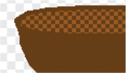
In figure 5, you can see the inside of the bowl is empty and contains lighter and darker pixels, as if it’s catching the light from above.
Figure 5. The finished wooden salad bowl keeps things simple by only adding pixelated shading inside the bowl to show depth.

To make a new sprite, go to the Sprite Zone and click the paintbrush icon next to New Sprite. Zoom in to 800% using the magnifying glass in the bottom right corner of the Art Editor.
To make the bowl
- Choose the darkest brown paint sample square in the Color Toolbar.
- Click the Circle tool and draw a circle. It should be about 17 grey-and-white canvas squares across.
- Switch to the Line tool and draw a straight line across the circle, as in figure 6.
Figure 6. You’ll use the line across the circle as a guide for making the salad bowl three dimensional.

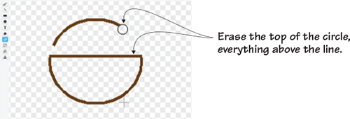
- Click the Eraser tool and remove the top half of the circle, as in figure 7.
Figure 7. Make a half moon shape by starting with a circle and erasing the top half.
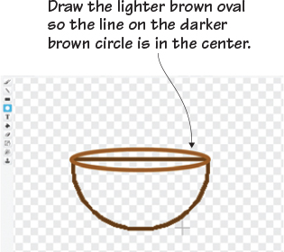
- Return to the Circle tool and choose the slightly lighter brown option in the paint sample squares. Draw a thin oval at the
top of the half circle, as in figure 8. This will create the opening for your salad bowl.
Figure 8. Create easy curves by layering circles and then erasing unnecessary lines rather than trying to freehand draw the top of the bowl.
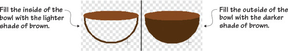
- Click the Paint Bucket tool and make sure the tool is set to the full color option and not the gradient option. Fill in the
thin oval with the light brown paint by clicking anywhere inside the oval. Also click the darker brown line running through
the top of the bowl to change it to the lighter brown. Return to the darker shade of brown and click anywhere in the bottom
portion of the bowl to fill the outside of the bowl with the dark brown paint. Your bowl should currently be two shades of
brown, as in figure 9.
Figure 9. The inside of the bowl should be lighter than the outside of the bowl.
You could technically leave the bowl like this because it is already creating an illusion of depth, but digital shading will make the difference between the inside and the outside of the bowl more subtle. If you were painting, you’d blend the two shades of brown with a brush. If you were using charcoals, you’d blend the two shades with your finger. But you’re drawing on a screen, which means you have to blend with pixels. Digitally blending two shades together is called dithering. You’ll see this section repeated again in chapter 8, so consider this a sneak peek.
Learn It: Dithering
The word dithering means wavering between two options. For example, if a person is trying to decide between chocolate and vanilla ice cream, they’re dithering about the ice cream flavor. In pixel art, dithering is wavering between color options. By mixing up two or more shades of the same color, the eye is tricked into seeing simple shading on the sprite. Dithering is done by creating a pattern between the two colors. You started using this idea in chapter 4 when you created the yolk for the pixelated egg, and you can see another example of blending tones in Shading A in figure 10. But you can also blend pixel by pixel by using a checkerboard pattern (Shading B). Breaking apart the pattern (Shading C) by leaving spaces between pixels creates another layering of texture, and diffusing the pixels by leaving even bigger gaps (Shading D) can create subtle changes.
Figure 10. Pixelated shading uses a technique called dithering that creates a pattern out of two or more related colors.

Let’s learn how to dither in steps beginning with practicing that checkerboard pattern on the inside section of the bowl. You’ll keep the same pattern across the bowl’s opening as shown in Step Four in figure 11, where you can see the bowl come together. Don’t worry about any stray squares that go over the edge of the bowl. You’ll clean them up after you fill the bowl’s opening.
Figure 11. Keep the same pattern across the whole opening of the bowl.
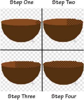
- Using the darker shade of brown, make a single square on the far right side of the lighter brown oval marking the inside of the bowl.
- Moving diagonally, make another brown square touching the top left corner and the bottom left corner of the first square.
- Place another square on the diagonal between the second and third square. If you need to see an example of a checkerboard pattern to see where the squares touch, look at Shading B in figure 10.
- Continue this checkerboard pattern across the whole light brown oval marking the inside of the bowl.
- Zoom in to 1600% and use the Line tool, individual pixels, or another well-placed circle to add a dark brown edge to the top
of the bowl, as in figure 12.
Figure 12. The completed bowl is outlined in dark brown at the end to hide any uneven pixels that were drawn during dithering.
You now have a salad bowl sprite that you’ll use to catch the falling carrots. Don’t forget to go to the Sprite Zone and rename this sprite Salad Bowl by clicking the blue i in the top left corner of the sprite.
Making the carrot
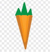
You’ll blend two shades of orange together, as in figure 13, to create visual depth.
Figure 13. The carrot sprite will use dithering, too, blending two shades of orange together in the center to show that an imaginary light source is shining from the left side of the carrot.

Like the bowl, the carrot is an irregular shape. You’ll see, once you start drawing, that the carrot is made up of a bunch of triangles turned in different directions. Go to the Sprite Zone and click the paintbrush icon next to New Sprite.
To make the carrot
- Go to the paint sample squares and select the bright orange paint.
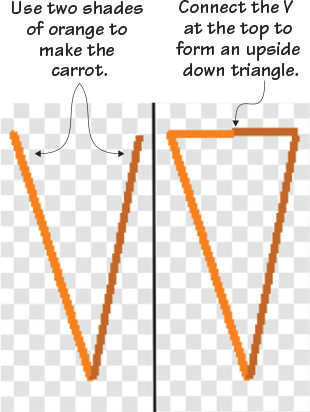
- Choose the Line tool and make a diagonal line, similar to the left side of a letter V.
- Switch to the dark orange and finish the V by making another diagonal line.
- Draw a short line midway across the top of the V in the dark orange, as in figure 14. Then return to the light orange to complete the line so you have an upside down, two-toned triangle.
Figure 14. Step one is to make the two-toned V. Step two is to close that V, changing it into a triangle, with another two-toned line across the top.
- Still using the light orange paint, draw a line down the center of the triangle to divide it in half. Fill the left side with light orange using the Paint Bucket tool. Switch back to the dark orange and fill the right side also using the Paint Bucket tool.
- Click the Paintbrush tool and draw dark orange pixels, each one pixel apart, down the center of the carrot, placing each dark
orange pixel on the light orange side, as in Step One on figure 15.
Figure 15. Placing evenly spaced dark orange pixels on the light orange side (and the same in reverse) creates a checkerboard pattern that digitally blends the two orange tones when seen from afar or during the game when the carrots are quickly dropping from the top of the Stage.
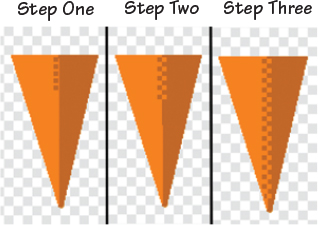
- Continue drawing dark orange pixels (leaving a one-pixel space between each tiny square) all the way to the bottom of the carrot.
- Switch to the light orange paint and do the same thing on the dark orange side of the carrot, placing light orange pixels directly to the right of each dark orange pixel drawn in steps 6 and 7. The new light orange pixels should touch the recently drawn dark orange pixels, as in Step Two of figure 15.
- Continue this all the way to the bottom of the carrot, as in Step Three, creating a zipper effect or checkerboard pattern where the two colors meet in the middle of the carrot.
- Choose a medium shade of green from the paint sample squares to make the top of the carrot.
- Click the Line tool. Starting in the top left corner of the carrot, draw three upside-down triangles of varying height, as
in figure 16.
Figure 16. The bottom of the carrot is a simple triangle, and the top is three unevenly drawn triangles. With four triangles, you’ve drawn a carrot.

- Fill in the triangles with the green paint using the Paint Bucket tool.
Travel back to the Sprite Zone and rename this sprite Carrot by clicking the blue i in the corner of the sprite thumbnail. Giving a name to the sprite will help you once you begin coding in the next section.
Prepping the odds and ends
Remember, sometimes you need to make a few boring but important sprites that will be used in the next section when coding the game. In this case, you’re once again making a line.
Making the bottom barrier
This line will serve as a barrier at the bottom of the Stage so the game knows when the carrot sprite has hit the ground instead of the salad bowl. Go to the Sprite Zone, click the paintbrush to make a new sprite, and get ready to draw a black line:
- Zoom out so you can see the whole canvas in the Art Editor, which is at 100%.
- Choose the Line tool and black paint from the paint sample squares.
- Navigate to the bottom of the Art Editor canvas.
- Draw a line that starts at the bottom left corner of the canvas and ends at the bottom right corner. Hold down the Shift key
on the keyboard as you drag your mouse to make the line completely straight, as in figure 17.
Figure 17. A simple black line drawn across the bottom of the Art Editor canvas will be used as a barrier when you program the game.
Go to the Sprite Zone and rename this sprite Barrier Line to make it easier when you use it in your code in the next section.
Preparing to code
You’re almost ready to start using these sprites to program your game. But before you jump into coding, look at all the things you learned in this section that you’ll use to make the rest of the sprites in this book.
Play with the game
Dithering, as I mentioned, blends two or more colors together using a pattern. In fact, step away from the computer or squint for a moment—do you see a third shade between the two on the screen? When I squint at the carrot, I see the light orange and the dark orange as well as a medium line of orange in between.
Challenge
Can you set up your carrot using three shades of orange and dither the spaces in between each shade using the same method you used on the original carrot? You could place darker sections on both sides of the carrot and move lighter towards the center of the carrot, as in figure 18. Hint: you may want to draw your carrot large in the Art Editor and then minimize it afterward using the Shrink tool from the Grey Toolbar.
Figure 18. The more shades of the same color you use, the more realistic your drawing will look on the screen.
What did you learn?
How does thinking about light sources help you with coding or other aspects of STEAM? First and foremost, being an artist means knowing about how light waves move. You need to think about whether light would pass through or reflect off an object in order to realistically draw the shape on the screen. By knowing the direction of the light source, you can add shading to your sprite, which will make it look more three-dimensional on the screen. Moreover, blending is an artistic version of an engineering concept: you want to pay attention to where two unrelated colors (or objects) come together and make sure they are working in harmony rather than against one another.
Pause for a moment and think about everything you learned in this section:
- How to gradually blend two colors together using dithering
- How to set a fictional light source in a game and “shine” it on the sprites in the game by adding shading
- How to use gradient color to make a complementary backdrop for the carrot that also reflects a realistic sky
You now have three sprites ready to be coded. Move to the next section to start making a reflex-testing game in the spirit of Kaboom! (but a lot more delicious).