
Chapter 3. Basic Text
When I started in advertising, back in the late seventies, setting type was a complicated process. First, the writer typed out the text on paper. The art director or typographer then marked up the copy with a red pencil to indicate the typeface, point size, leading, and so on.
Then, the copy was sent to a typesetting house where a typesetter retyped the text into a special typesetting machine. The text was printed onto special photographic paper and sent back the next morning. The copywriter then had to proof the text to make sure that there were no errors.
She might also have to cut some lines of text to fit the layout. Depending on how much text had to be cut, the art director would use a razor blade to delete the text, or the copy would be sent back to the typesetter.
That’s why I am amazed every time I use a program such as InDesign to set text. I don’t type the copy onto a piece of paper; I type to fit right onto my actual layout. I don’t have to send the copy out overnight; it’s right there on my computer screen. And I know that the only mistakes are the ones I make myself!
Creating Text Frames
InDesign holds text in objects called frames. Before you can start typing text, you need to create a text frame. The easiest way to do this is with the Type tool.
Tip
You can resize or reshape text frames like you can other objects. (See Chapter 4, “Working with Objects,” for more details on creating and working with objects.)
To create a text frame with the Type tool:
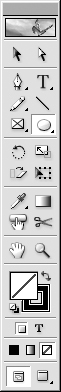
- Click the Type tool in the Tools panel
 .
.
 Choose the Type tool in the Tools panel to work with text.
 - Move the cursor to the page. The cursor changes to the Type tool cursor
 .
.
 The cursor set to create a text frame.
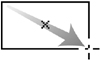
 - Drag diagonally to create the frame
 .
.
 Drag diagonally with the Type tool to create a text frame.
 - Release the mouse button. The text frame appears with an insertion point that indicates you can type in the frame.
The Type tool will always create rectangular frames. However, you can use the frame tools to create other geometric shapes such as ellipses and polygons to hold text.
- Click the Ellipse tool in the Tools panel
 .
.
 The Ellipse tool in the Tools panel.
 - Drag diagonally to create the ellipse
 .
.
 Drag diagonally to create an ellipse.
 - Release the mouse button when the ellipse is the correct size.
- Click the Type tool inside the frame to convert it to a text frame.
The Polygon tool also lets you draw stars as well as ordinary polygons.
- Double-click the Polygon tool in the Tools panel
 . This opens the Polygon Settings dialog box
  .
.
 The Polygon tool in the Tools panel.
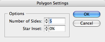 Use the Polygon Settings dialog box to change the shape and the number of sides of a polygon.
 - Enter a number in the field for the number of sides.
- Leave the Star Inset amount as 0%. If you increase the star inset, you create a star. (See the next exercise.)
- Drag across the page to create the polygon
 .
.
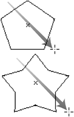 Drag diagonally to create polygons or stars.
 - Release the mouse button when the polygon or star is the correct size.
- Click the Type tool inside the frame to convert it to a text frame.
- Double-click the Polygon tool in the Tools panel to open the Polygon Settings dialog box .
- Enter a number in the Number of Sides field for the number of outer points.
- Enter a value for the Star Inset amount. The greater the amount, the sharper the points will be.
- Drag to create the star .
Tip
Press the up or down arrow keys as you drag to increase or decrease the number of points of the star.
- Release the mouse button when the star is the correct size.
- Click the Type tool inside the frame to convert it to a text frame.
You can also create rectangular frames using the Rectangle tool.
- Click the Rectangle tool in the Tools panel
 .
.
 The Rectangle tool in the Tools panel.
 - Drag diagonally to create the rectangle
 .
.
 Drag diagonally to create a rectangle.
 - Release the mouse button when the rectangle is the correct size.
- Click the Type tool inside the frame to convert it to a text frame.
The Elliptical and Rectangular frame tools let you numerically specify the frame size.
To set the size of a frame numerically:
- Choose the Ellipse or Rectangle tool from the Tools panel.
- Position the cursor where you want to create the frame.
- Click. A dialog box appears
 .
.
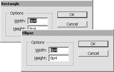 The Ellipse and Rectangle dialog boxes let you specify the width and height of a frame.
 - Set the Width and Height of the frame.
- Click OK. The frame appears with its upper-left point where you first clicked.
Frames created with the Ellipse, Polygon, and Rectangle tools must be converted before they can be used as text frames.
- Select the frame you want to convert.
- Choose the Type tool and click inside the frame.
or
Choose Object > Content > Text. An insertion point appears indicating that you can begin typing.
Typing Text
The two most important parts of working with text are typing the text and then selecting it to make changes.
- Click with the Type tool in a frame.
- Begin typing.
- Press Return to begin a new paragraph.
or
Press Shift-Return to begin a new line without starting a new paragraph. InDesign calls this a Forced Line Break. Others call it a soft return.
To add text into a passage you have already typed, you move the insertion point to where you want to place the new material. The point blinks to help you find it ![]() .
.

![]() The blinking insertion point indicates where text will be added.
The blinking insertion point indicates where text will be added.
- Position the Type tool cursor where you want the insertion point.
- Click to set the insertion point.
To move the point using the keyboard:
- Use the arrow keys to move the insertion point left or right one character at a time or up and down one line at a time.
- Use the Cmd/Ctrl key with the arrow keys to move the insertion point one word or one paragraph at a time.
Selecting Text
The simplest way to select text is to use the mouse.
To select text using the mouse:
• Press and drag across the text. The highlight indicates which text is being selected.
Like other programs, InDesign has special techniques to select words, lines, and paragraphs with the mouse.
To select a single word:
• Double-click within a word to select it ![]() .
.
![]() Double-click to select a single word, which is then highlighted.
Double-click to select a single word, which is then highlighted.
Tip
Although only the word is selected, if you hit the Delete key, the word and the space after it will be deleted.
To select a single line:
• Triple-click within the line ![]() .
.
![]() A triple-click selects a single line in a paragraph.
A triple-click selects a single line in a paragraph.
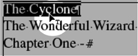
To select a paragraph:
• If Triple Click to Select a Line is turned off, triple-click within the paragraph ![]() .
.

![]() An example of how a triple-click or quadruple-click can select a paragraph.
An example of how a triple-click or quadruple-click can select a paragraph.
or
If Triple Click to Select a Line is turned on, quadruple-click in the paragraph.
To select all the text in a frame or story:
• If Triple Click to Select a Line is turned off, quadruple-click within any paragraph.
or
If Triple Click to Select a Line is turned on, quintuple-click in any paragraph.
If you spend a lot of time typing and modifying text, you should learn the following techniques for selecting text.
To select text using keyboard shortcuts:
- Use the following keyboard commands to select text using the keyboard:
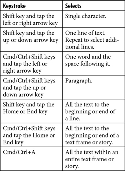
- Repeat any of the above commands to select additional text.
Tip
You can quickly edit text by double-clicking a text frame with either selection tool. This switches to the Type tool and places an insertion point where you double-clicked.
Moving and Deleting Text
You can copy or move text from one place and then paste it into another. Text that is copied or cut is stored on the computer clipboard. (See the sidebar on this page for an explanation of how the clipboard works.)
- Select the text or text frame
 .
.
 Select text in order to copy or cut it from one position to another.
 - Choose Edit > Copy or Cut.
- Position the insertion point where you want to put the copied or cut text
 .
.
 Click to put the insertion point where you want to insert the copied or cut text.
 - Choose Edit > Paste. The text is inserted into the new position
 .
.
 The Paste command inserts the copied or cut text at the insertion point.
or
Choose Edit > Paste Without Formatting to paste the text so that its formatting (point size, typeface, style, etc.) matches the text it is being pasted into.
Tip
The Paste Without Formatting command is very helpful if you want the text from one place to be pasted into a paragraph that has different formatting.
You can also use the mouse to drag text from one place to another.
Tip
Use the Preferences to set the options for drag-and-drop text to be active in the Story Editor and/or the Layout View.
To drag text from one place to another:
- Select the text so that it is highlighted within the frame.
- Position the cursor inside the highlighted text. The cursor changes to a curved arrow with the letter T next to it
 .
.
 Press on the highlighted text to display the Drag-and-Drop Text cursor.
 - Press with the mouse and drag to the new position. An insertion point appears at the new location
 .
.
 Drag to display the destination insertion point for drag-and-drop text.
 - Release the mouse to move the text to the new position
 .
.
 Release the mouse button to drop the text into its new position.
Tip
Hold the Opt/Alt key as you drag text to create a copy of the original text in the new location.
The Duplicate command copies and pastes in one step. It also leaves the contents of the clipboard untouched.
- Select the text or text frame.
- Choose Edit > Duplicate. The copied text is duplicated as follows:
• A text frame is created slightly offset from the original object.
• Text inside a frame is pasted immediately following the original text.
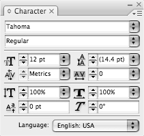
Using the Character Panel
Character formatting refers to attributes that can be applied to a single character or glyph in a paragraph without applying that formatting to the entire paragraph. The Character panel controls character attributes.
Tip
As you work with text frames, the Control panel changes to display many of the text controls found in the Character panel. This makes it possible to style text using just the Control panel.
To work with the Character panel:
- If the Character panel is not visible, choose Window > Type & Tables > Character or Type > Character. This opens the Character panel
 .
.
 The Character panel lets you change the character attributes.
or
Click the Character panel tab to move it to the front of a set of nested panels.
- Click the panel tab to reveal all the panel options.
or
Choose Show Options from the Character panel menu
 .
.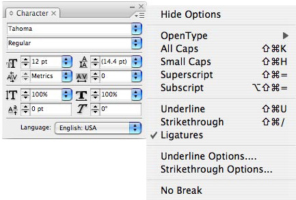 The Character panel menu contains additional controls for formatting text.
Setting the Typeface and Point Size
The design of type is called the typeface. The typeface you are reading now is called Minion Pro. The typeface of the subhead below is called Myriad Pro Bold Condensed.
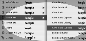
- Choose Type > Font and then choose the typeface from the font menu. The font menu can be set to preview the typefaces.
or
In the Character panel, choose a typeface from the font menu
 .
. The font menu in the Character panel lets you choose the typeface for text. The style menu next to each font name displays the style choices.
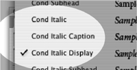
 - If necessary, choose the styling for the font from the style menu next to the name of the font.
or
Use the style list in the Character panel to choose the styling
 .
. The style menu in the Character panel lets you choose the proper style choices for a typeface.
Tip
The style list changes depending on the typeface and the fonts you have installed. If you do not have the bold version of a font, for example, it will not be listed.
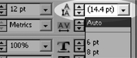
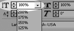
The size of type is measured using a system called points. There are 72 points per inch. The point size of this text is 10.25.
To change the point size:
• Choose Type > Size and then choose a point size from the list.
or
Use the point size field controls to enter a custom point size ![]() .
.
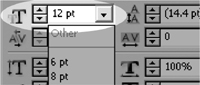
![]() The point size field in the Character panel lets you choose common point sizes or enter a specific size in the field.
The point size field in the Character panel lets you choose common point sizes or enter a specific size in the field.
Styling Text
InDesign also lets you apply electronic styling such as All Caps, Small Caps, Subscript, and Superscript.
To apply electronic styles:
• Choose one of the styles listed in the Character panel menu ![]() . The text changes to the style chosen
. The text changes to the style chosen ![]() .
.
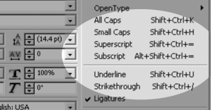
![]() The electronic style options in the Character panel menu.
The electronic style options in the Character panel menu.
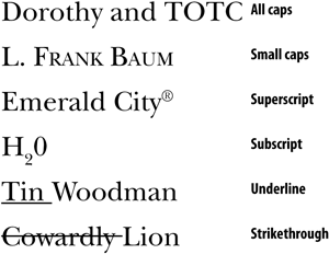
![]() Examples of the electronic styles applied to text.
Examples of the electronic styles applied to text.
• All Caps converts lowercase letters to all capital letters.
• Small Caps converts lowercase letters to reduced capitals.
• Superscript reduces and raises the text above the baseline.
• Subscript reduces and lowers the text below the baseline.
• Underline draws a line under the text.
• Strikethrough draws a line through the text.
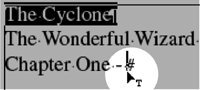
• Ligatures automatically substitutes the combined letterforms for characters such as fi and fl ![]() .
.

![]() Applying the Ligatures command to the top text replaces specific pairs of letters with combination letterforms such as those on the bottom.
Applying the Ligatures command to the top text replaces specific pairs of letters with combination letterforms such as those on the bottom.
As mentioned on the previous page, you can change the appearance of the Underline and Strikethrough effects.
To customize Underline and Strikethrough Options:
- Select the text.
- Choose Underline Options or Strike-through Options from the Character panel menu. The Underline Options or Strikethrough Options dialog box appears
 .
.
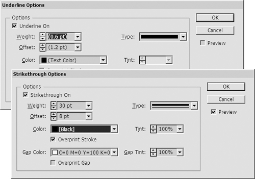 The Underline Options and Strikethrough Options dialog boxes let you customize the appearance of the Underline and Strikethrough effects.
 - Click Underline On or Strikethrough On to turn on the effect.
- Use the Weight controls to set the thickness of the line.
- Use the Offset controls to move the line as follows:
• Positive underline numbers move the line below the baseline.
• Positive strikethrough numbers move the line above the baseline.
- Choose one of the rules from the Type list.
- Choose a color and tint from the Color and Tint lists.
- If your line type has a gap, such as in a dashed line, use the Gap Color and Gap Tint lists to color the gap.
- If desired, check the Overprint Stroke and Overprint Gap options (See Chapter 5, “Working in Color,” for more information on overprinting colors).
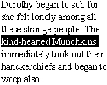
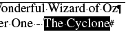
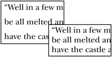
One of the most exciting uses for the custom underlines and strikethrough effects is to use them as highlights for individual lines or words of text. This is something designers have wanted to do for years.
All you have to do is set the weight of the line to slightly thicker than the text point size. And use the offset to position the line around the text. You can then apply these custom underlines as highlights for text. You can also combine the underline and strikethrough lines above and below the text ![]() .
.

![]() An example of how custom underlines and strikethrough settings can be used for highlights and other special effects.
An example of how custom underlines and strikethrough settings can be used for highlights and other special effects.
Setting Line and Character Spacing
Leading is the space between lines of type within a paragraph ![]() . (It is pronounced ledding, because it refers to the lead metal formerly used to set type.) Leading is specified as an absolute point size or as auto leading. The leading of this paragraph is 12 points.
. (It is pronounced ledding, because it refers to the lead metal formerly used to set type.) Leading is specified as an absolute point size or as auto leading. The leading of this paragraph is 12 points.
![]() The 24-point leading (top) has more line space than the 16-point leading (bottom).
The 24-point leading (top) has more line space than the 16-point leading (bottom).
- Select the paragraph of text.
- Use the leading controls in the Character panel to enter an amount of leading
 .
.
 The leading controls in the Character panel let you change the amount of space between lines.
or
Set the leading to Auto to have the leading automatically change to an amount based on the point size.
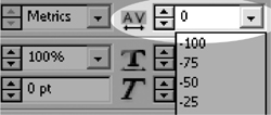
Kerning is the space between two letters. It is applied so letters fit snugly together ![]() .
.

![]() A comparison of the different kerning settings: 0 (top), Metrics (middle), Optical (bottom).
A comparison of the different kerning settings: 0 (top), Metrics (middle), Optical (bottom).
- Select the text you want to kern, or place an insertion point between the letters.
- To use the kerning pairs in the typeface, choose Metrics from the kerning list
 .
.
 The kerning controls in the Character panel change the space between characters.
or
Choose Optical to adjust the kerning using a visual representation of the text.
- To apply a specific kerning amount, use the kerning controls or pop-up menu to apply a numerical amount.
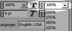
Tracking is similar to kerning; however, unlike kerning, which applies to letter pairs, tracking is applied to a range of letters ![]() . Tracking is very useful, because as you increase the space between the letters, you don’t lose the relative spacing that is applied by kerning.
. Tracking is very useful, because as you increase the space between the letters, you don’t lose the relative spacing that is applied by kerning.
![]()
![]() Tracking of 100 increases the space along all the letters.
Tracking of 100 increases the space along all the letters.
- Select the text you want to track.
- Use the tracking controls in the Character panel to set the amount of tracking
 .
.
 The tracking controls in the Character panel change the space across a sequence of letters.
Baseline shift moves text up or down from the baseline, or the imaginary line that the letters sit on. Baseline shift is often applied to shift bullets or parentheses so they sit better next to text. It can also be used for special effects in display or headline text ![]() .
.
![]()
![]() A negative baseline shift lowers the capital letters from the rest of the characters.
A negative baseline shift lowers the capital letters from the rest of the characters.
- Select the text that you want to reposition.
- Use the baseline shift controls in the Character panel to move the text away from the baseline
 .
.
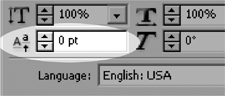 The baseline shift controls in the Character panel move text above or below the line.
Applying Text Distortions
InDesign also lets you apply horizontal or vertical scaling to text. This distorts the text to increase its height or width ![]() . This changes the type from the original design of the characters. Typographic purists (such as this author) disdain distorting text.
. This changes the type from the original design of the characters. Typographic purists (such as this author) disdain distorting text.
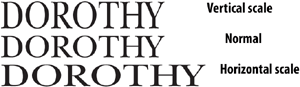
![]() The effects of applying either vertical scaling or horizontal scaling to text.
The effects of applying either vertical scaling or horizontal scaling to text.
- Select the text that you want to distort.
- Use the horizontal scale field controls in the Character panel to change the width of the text
 .
.
 Use the horizontal scale controls in the Character panel to distort the width of text.
- Select the text that you want to distort.
- Use the vertical scale field controls in the Character panel
 .
.
 The vertical scale controls in the Character panel let you distort text height.
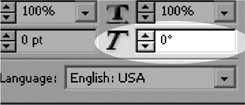
Skewing allows you to slant or tilt text ![]() . This is also called false italic because it resembles the slant of italic text.
. This is also called false italic because it resembles the slant of italic text.
![]()
![]() You can apply negative and positive skew to text to create a special effect.
You can apply negative and positive skew to text to create a special effect.
- Select the text that you want to skew.
- Enter an angle in the skew field in the Character panel to specify how much the text should be slanted
 .
.
 The skew controls in the Character panel let you create fake oblique and slanted text.
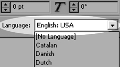
Setting the Language
You can also set the language. This ensures that foreign words as well as your native language are spell-checked and hyphenated using the proper dictionary. (Sorry, but changing the language doesn’t translate the text.)
Tip
If you have [No Language] selected, InDesign can’t substitute typographer’s quotes (“curly” quotes) for the ordinary typewriter quotes (“dumb” quotes).
- Select the text that you want to set the language for.
- Choose the language from the pop-up menu in the Character panel
 .
.
 The Language menu lets you set the language used for spelling checks as well as for typographer’s quotes.
Applying Paragraph Formatting
Paragraph formatting refers to the attributes that are applied to the paragraph as a whole. For instance, you cannot have half of the paragraph centered and the other half on the left size of the page. The alignment must be applied to the whole paragraph. InDesign paragraph formatting is applied using the Paragraph panel.
Tip
As you work with text frames, the Control panel changes to display many of the text controls found in the Paragraph panel. This makes it possible to style text using just the Control panel.
To work with the Paragraph panel:
- If the Paragraph panel is not visible, choose Window > Type & Tables > Paragraph or Type > Paragraph. This opens the Paragraph panel
 .
.
 The Paragraph panel controls attributes that are applied to the whole paragraph.
or
Click the Paragraph panel tab to move it to the front of a set of tabbed panels.
- To display all the paragraph formatting controls, choose Show Options from the Paragraph panel pop-up menu.
Tip
The Paragraph panel menu also contains additional controls for formatting text
 .
.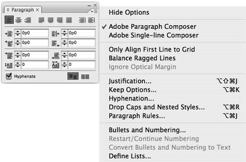 The Paragraph panel menu contains additional controls for paragraph attributes.
• To apply attributes to a single paragraph, click to place an insertion point within the paragraph.
• To apply attributes to more than one paragraph, select a portion of the first and last paragraphs and the paragraphs in between.
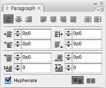
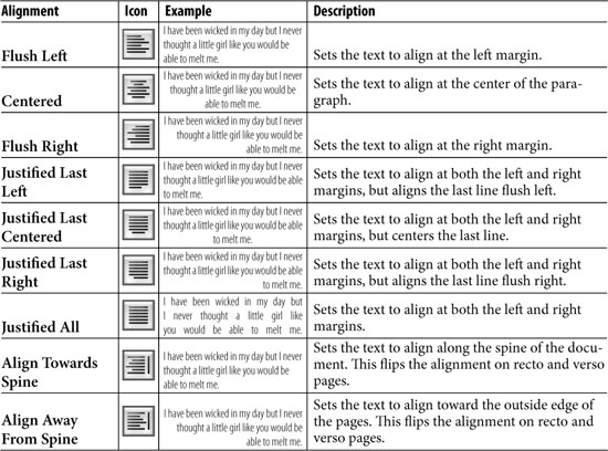
Setting Alignment and Indents
In addition to the common paragraph alignment controls found in page layout or word processing programs, InDesign offers some special controls for setting alignment.
- Select the paragraphs.
- Click one of the Alignment buttons
 to set the alignment as follows:
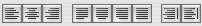 The Alignment buttons on the Paragraph panel control how the type is aligned to the frame edges.
Tip
Look closely and you’ll see that the lines in the alignment buttons resemble how the alignment changes the position of the text.
You might want to indent a paragraph so that it stands out or indent the first line of a paragraph to make the text easier to read. These looks are created by the margin indents.
- Select the paragraphs.
- Use the margin indent controls
 to move the text as follows
  :
:
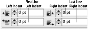 The margin indent fields control the space around a paragraph and the first and last lines.
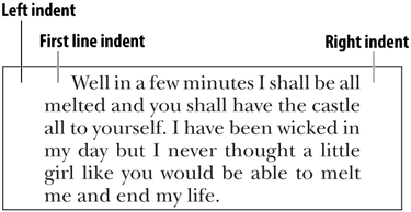 The effect of applying margin indents to text inside a text frame.
• Left Indent moves the left side of the paragraph away from the left side of the text frame.
• First Line Left Indent moves the first line of the paragraph away from the left edge of the rest of the paragraph.
• Right Indent moves the right side of the paragraph away from the right side of the text frame.
• Last Line Right Indent moves the last line of the paragraph away from the right side of the text frame.
Another look you can create is to hang elements on the first line outside the rest of the paragraph ![]() .
.

![]() The margin indent settings for a hanging bullet. Notice that the First Line indent has a negative value.
The margin indent settings for a hanging bullet. Notice that the First Line indent has a negative value.
Tip
You can use these steps to create bulleted and numbered paragraphs. Or you can create those automatically (as covered in Chapter 14).
To create a hanging bullet or numbered list:
- Select the paragraphs.
- Set the Left indent to the amount that the body of the paragraph should be indent.
- Set the First Line indent to a negative amount.
- Insert a tab character to separate the bullet or number from the rest of the line.
Inserting a Manual Indent
The Indent to Here character allows you to set an indent command that is tied to the position of the character.
Tip
The Indent to Here character makes it easy to set a hanging indent for a drop cap or bulleted list.
To use the Indent to Here character:
- Click inside a text frame where you would like the indent to occur.
- Type Cmd/Ctrl- (backslash).
or
Choose Type > Insert Special Character > Other > Indent to Here. This inserts a character that creates an indent at that point
 .
. The Indent to Here character is indicated by the small dagger symbol. It automatically creates a hanging indent for the drop cap.
To remove the Indent to Here character:
- Place the insertion point to the right of the Indent to Here character.
- Press the Delete/Backspace key.
Setting Paragraph Effects
The paragraph effects are available when Show Options is chosen in the Paragraph panel menu. One of the paragraph effects is to add space above and below a paragraph ![]() . For instance, the space between this paragraph and the one following is controlled by adding space below.
. For instance, the space between this paragraph and the one following is controlled by adding space below.
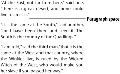
![]() An example of adding space between paragraphs.
An example of adding space between paragraphs.
To add space between paragraphs:
- Select the paragraphs that you want to add space above or below.
- Use the Space Before field controls to add space before the paragraphs
 .
.
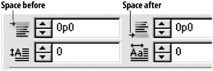 Use the Paragraph Space controls to add space before or after a paragraph.
 - Use the Space After field controls to add space after the paragraphs .
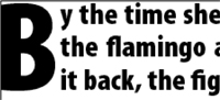
Drop caps increase the size of the first character or characters and positions them so that they drop down into the rest of the paragraph ![]() . The opening page for each chapter of this book contains a paragraph that has a drop cap applied.
. The opening page for each chapter of this book contains a paragraph that has a drop cap applied.
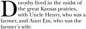
![]() An example of a drop cap set for one character and three lines.
An example of a drop cap set for one character and three lines.
- Select the paragraph you want to set with a drop cap.
- Use the Drop Cap Number of Lines field to set the number of lines that the letter should occupy
 .
.
 Use the Drop Cap controls to change the appearance of a paragraph drop cap.
 - Use the Drop Cap Number of Characters field to set how many characters of the text should have the drop cap applied .
The Control panel contains only the basic options for drop caps. There are additional controls for refining the appearance of drop cap characters.
To set the additional drop cap attributes:
- Choose Drop Caps and Nested Styles from the Control panel menu or the Paragraph panel menu. This opens the Drop Caps and Nested Styles dialog box
 .
.
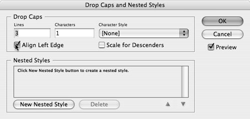 The Drop Caps and Nested Styles dialog box allows you to refine the settings for drop caps.
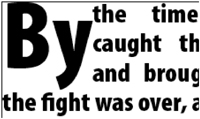
 - Check the Align Left Edge option to force the drop cap character to align flush to the left side of the paragraph
 .
.
 An example of how Align Left Edge forces the drop cap character to align to the left margin edge.
 - Check the Scale for Descenders option to reduce the size of the drop cap letters to keep character descenders from touching lines of text
 .
.
 An example of how Scale for Descenders changes the size of the drop cap so that descenders don’t touch the other lines of text.
 - Use the Character Style menu to apply a different typeface or other character attribute to the drop cap. (See Chapter 15, “Text and Object Styles,” for information on how to create a character style.)
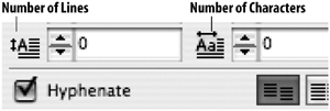
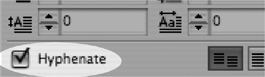
You can also control whether the text within a paragraph is hyphenated or not.
- Select the paragraphs you want to set the hyphenation for.
- To turn on hyphenation, click the Hyphenate checkbox in the Paragraph panel
 . Depending on what words are hyphenated, the text may reflow. (See Chapter 16, “Typography Controls,” for information on controlling the number of hyphens in a paragraph.)
 Use the Hyphenate checkbox to hyphenate words at the ends of lines.
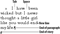
Working with Hidden Characters
Every time you tap the Spacebar, Tab key, Return key, or Enter key, you create a non-printing character in the text. These hidden characters (sometimes called invisibles) can be turned on to let you see where the spaces, tab characters, and paragraph returns fall in the text.
To show or hide hidden characters:
• Choose Type > Show Hidden Characters. This displays the characters in the same color as the highlight for the layer ![]() .
.
![]() An assortment of the hidden characters displayed within text.
An assortment of the hidden characters displayed within text.
or
Choose Type > Hide Hidden Characters to hide the hidden characters.
Tip
You can change the color of the hidden characters by changing the color of the Layer in the Layers panel.
Hidden Characters
The following is a chart of the various hidden characters.

Using the Glyphs Panel
Quick—what’s the keystroke for a trademark symbol? The Euro symbol or Japanese Yen symbol? If you can’t remember the keystrokes for all the characters you use, then you need to open the Glyphs panel. The Glyphs panel lets you easily see all the characters in a typeface. You can also use the panel to display the alternate letterforms in OpenType fonts.
- Place the insertion point where you would like the character to be inserted.
- Choose Type > Glyphs. This opens the Glyphs panel
 .
.
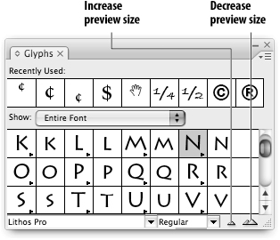 Use the Glyphs panel to insert characters from fonts.
 - Choose the typeface and style of the character you want to insert.
- Scroll through the Preview area to find the character you want to insert.
- Double-click the character you want to insert.
- Repeat step 5 to insert any additional characters.
To access alternative characters:
- Place your insertion point where you want to insert the alternative characters.
- Press the small triangle next to the glyph in the Glyphs panel
 . This opens the alternative letterforms for that character.
 Press the triangle under the glyph to display the alternatives for the glyph.
 - Choose the alternative character. This inserts the character into the text.
As you hunt through the Glyphs panel, you may find there are too many glyphs to look through. You can access the recently used glyphs or you can create your own custom glyph sets.
To access the recently used glyphs:
- Make sure Show Options is chosen in the Glyphs panel menu.
- Double-click one of the glyphs in the Recently Used area. This adds the glyph to your document.
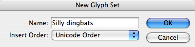
- Choose New Glyph Set from the Glyphs panel menu.
- Name the set in the New Glyph Set dialog box
 .
.
 The New Glyph Set dialog box lets you name the new glyph set.
 - Choose where you want new additions to the set to appear.
- Click OK to add the set.
Once you have created a glyph set, you can add your favorite characters from any font into the glyph set.
To add characters to a glyph set:
- Use the Glyphs panel to select the character you want to add to an existing glyph set.
- Choose Add to Glyph Set > [Set Name] from the Glyphs panel menu. The character appears in the glyph set.
- Choose what order you want the glyphs to appear in the set from the Insert Order list
 .
.
 The Insert Order list lets you control how glyphs are added to a set.
 - Click OK to create the glyph set.
To insert characters in a glyph set:
- Choose the glyph set from the Glyph Set menu in the Glyphs panel.
- Double-click to insert the glyph.
Once you have created a glyph set, you can edit the items in the set.
To edit the characters in a glyph set:
- Choose Edit Glyph Set > [Set Name] from the Glyphs panel menu. The Edit Glyph Set dialog box appears
 .
.
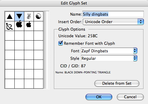 The Edit Glyph Set dialog box lets you delete or modify the glyphs in a custom glyph set.
 - Select the glyph item that you want to edit.
- Use the Insert Order list to change where new glyphs are added.
- Choose Remember Font with Glyph to set the glyph to a specific font. This means the glyph does not change to match the font in the text it’s inserted into.
or
Deselect Remember Font with Glyph to use the Unicode value of the current font. This option lets you match a character such as the Euro symbol to the text it is inserted into.
- If you have selected Remember Font with Glyph, you can change the typeface and style in the Edit Glyph dialog box.
- Click the Delete from Set button to delete a glyph from a set.
- Click OK to apply the changes to the set.
Working with Text Flow
As mentioned earlier in this chapter, if text is too long to fit in its text frame, you can link the text into another frame.
- Click the overset text symbol. The cursor changes to the load text cursor
 .
.
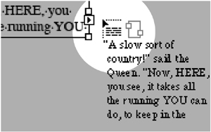 The load text cursor indicates that you can continue the overset text in another frame.
 - Move the cursor over to the frame you want to flow the text into. The cursor changes to the link text cursor
 .
.
 The link text cursor indicates you can click to fill the next frame with text.
 - Click in the text frame. The link indicators show that the text in the frame flows to or from another frame
 .
.
 The link indicators show that the text flows into and out of the text frame.
To change the link between frames:
- Click the link indicator in the frame where you want to break the link. The cursor turns into a link text cursor.
- Click in a new text frame to flow the text into a new frame.
or
Click inside the text frame to keep all the text within that frame. (The overset text symbol appears.)
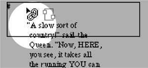
InDesign also displays text threads, which show you the links between text frames.
To show the links between frames:
- Select the text frame that you want to see the links for.
- Choose View > Show Text Threads. This displays lines that show which frames are linked together
 .
.
 The text threads show the links between frames.
Setting Text Frame General Controls
Once you create a text frame, you can still control the flow of text within the frame. This is similar to creating a mini-layout within the text frame.
- Select the text frame.
- Choose Object > Text Frame Options. This opens the Text Frame Options dialog box
 .
.
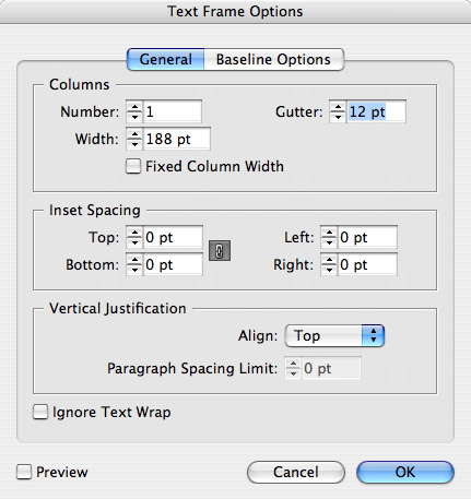 The Text Frame Options dialog box controls the flow of text within a frame.
 - Click the General tab.
- Make whatever changes you want to the settings.
You can create columns within a text frame.
To create text frame columns:
• Set the following options in the Columns area ![]() :
:
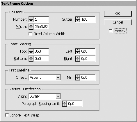
![]() The Columns settings for the Text Frame Options dialog box.
The Columns settings for the Text Frame Options dialog box.
• Number sets the number of columns.
• Width sets the column width.
• Gutter controls the space between the columns.
InDesign also has a powerful feature that helps you maintain a fixed column width when working with a text frame. This is very helpful for magazine and newspaper layouts where all text is in the same column width.
- Click Fixed Column Width in the Text Frame Options dialog box.
- Drag to resize the frame width. The width automatically jumps to whatever size can accommodate an additional column
 .
.
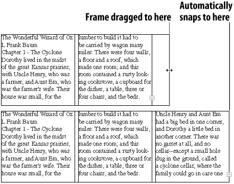 Applying Fixed Column Width ensures that the columns in a text frame are always the same size.
You can also add space between the text and the frame. This is called the inset spacing.
- Select the text frame and open the Text Frame Options dialog box.
- Enter the values in the Inset Spacing fields to control the amount of space between the top, bottom, left, and right edges of the frame
 .
.
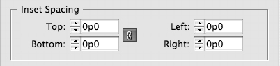 The Inset Spacing settings for the Text Frame Options dialog box.
 - Click OK to apply the changes to the column
 .
.
 A text frame with inset spacing has space between the text frame and the text.
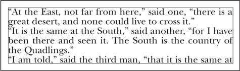
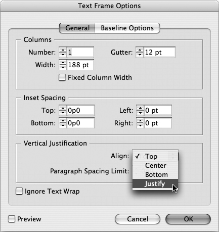
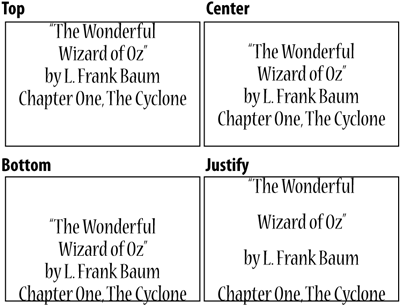
The vertical justification of a text frame controls where the text is positioned from the top to the bottom of the frame.
To set the vertical justification:
- Select the text frame and open the Text Frame Options dialog box.
- Choose one of the four options in the Vertical Justification Align pop-up list
 :
:
 The Vertical Justification Align menu lets you choose where text is positioned vertically.
• Top positions the text so that the first line sits at the top of the frame
 .
. The four vertical alignment settings change the position of text within a frame.
• Center positions the text so it is centered between the top and bottom of the frame
.• Bottom positions the text so that the last line sits at the bottom of the frame
.• Justify positions the text so that it fills the entire frame from top to bottom
.
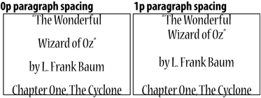
When you set the vertical alignment to Justify, you can set how the space between paragraphs is applied.
To set the paragraph spacing limit:
- Set the Vertical Justification Align list to Justify.
- Set an amount in the Paragraph Spacing Limit field
 . The higher the number, the more space between paragraphs and the less likely the leading between the lines will be affected by justifying the text vertically.
 The Paragraph Spacing Limit for justified vertical alignment controls how much space will exist between paragraphs before the leading is increased.
Using the Control Panel for Text
As mentioned previously, the Control panel changes its settings depending on the type of object selected. For example, when a text object is selected, the Control panel displays a combination of the Character and Paragraph panel controls.
To use the Control panel for character settings:
- Use the Type tool to create an insertion point within a text frame. The Control panel displays the text options.
- Click the Character icon to display the character attributes in the first position in the Control panel
 . The paragraph attributes follow.
 Click the Character icon to move the character attributes to the first position in the Control panel.
To use the Control panel for paragraph settings:
- Use the Type tool to create an insertion point within a text frame. The Control panel displays the text options.
- Click the Paragraph icon to display the paragraph attributes in the first position in the Control panel
 . The character attributes follow.
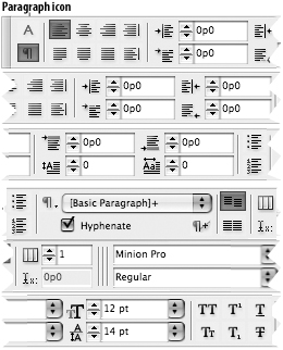 Click the Paragraph icon to move the paragraph attributes to the first position in the Control panel.
Using Special Text Characters
Text does not consist of just alphanumeric characters. There are special alphanumeric characters and spaces that are used as part of professional typography. InDesign lets you insert those characters into your documents.
- Place the insertion point where you want to insert the special character.
- Choose Type > Insert Special Character.
or
Control-click (Mac) or right-mouse click (Win) and choose Insert Special Character from the contextual menu.
- Choose a character from the submenu.
You can insert white space characters, which are fixed spaces such as em and en spaces. You can also insert a nonbreaking space that forces two words to stay together.
To insert special space characters:
- Place the insertion point where you want to insert the special character.
Choose Type > Insert White Space.
or
Control-click (Mac) or right-mouse click (Win) and choose Insert White Space from the contextual menu.
- Choose a white space character listing from the submenu.