
When Peter Sellers acted in Stanley Kubrick’s Dr. Strangelove or: How I Learned to Stop Worrying and Love the Bomb, he played not one character, but three. Although there was only one Peter Sellers, costume, makeup, and acting brought Dr. Strangelove, President Merkin Muffley, and Group Captain Lionel Mandrake to life.
Flash assets known as symbols bring your Flash files to life much in the same way that actors contribute to films. Symbols are efficient Flash asset types that you can use again and again without materially contributing to file size, just as one actor can play multiple characters without increasing the size of a film’s cast.
Furthermore, when a new instance, or unique occurrence, of a symbol is created, that instance can be transformed without leaving any lasting effect on the symbol. For example, you can add three instances of a symbol to the stage. The first can be rotated, the second can be scaled, and the third can be faded to 50% opacity. Despite all of these transformations, the symbol from which the instances were derived remains unchanged. Taken from another perspective, editing or replacing the symbol will immediately update all instances derived from it.
Likening this to film, one actor can play multiple characters, and costume and makeup do not permanently transform the actors into the characters they play. If an actor is replaced, all characters played by that actor reflect the change.
Reusability, global editing, and file efficiency, combined with the special features discussed in this chapter, make symbols the cornerstones of Flash assets.
There are three types of Flash symbols: button, movie clip, and graphic. A button, as the name implies, is typically used when mouse interaction from the viewer is required. Buttons usually require ActionScript to be fully functional and are commonly used, for example, as interactive user interface elements. Movie clips are typically used for animation because each movie clip has its own timeline just like the main FLA. ActionScript can also control movie clips, making them popular assets for programming-driven tasks. Graphics, on the other hand, are essentially movie clips that cannot be manipulated by ActionScript. Instead, graphic symbols can be controlled in a few simple ways without ActionScript, making them useful to nonprogrammers.
Button symbols have two distinct functions in Flash. First, a button can be controlled by ActionScript and is typically used as an input device of sorts. When a user clicks on a button, a script can be triggered to perform an action. Second, a button can automatically provide two kinds of feedback to the user when the mouse interacts with the button: a hand cursor is automatically displayed when rolling the mouse over the button, and optional Up, Over, and Down states can be shown during mouse interaction.
An Up state is the default button state, visible anytime the mouse cursor is not hovering over the button. An Over state is displayed when the mouse cursor is over the button but while the mouse is not clicked. Finally, a Down state is visible only when the mouse is clicked while over the button.
Note
Over and Down states are not required for buttons to work. It is not unusual for a button to only have an Up state if a project design does not require multistate buttons. This is because a designer can rely on the display of the hand cursor when the user rolls over the button with the mouse.
Creating and editing buttons are the easiest ways to understand how they work. Although the ActionScript required to use a button won’t be discussed until a little bit later, understanding the parts of a button, and seeing the visual feedback provided, will be a great first step. The following simple test file will give you some experience with your first button. It won’t be used in the final project, so feel free to experiment.
Create a new file using the File→New menu command. Because this file will not be used in your project, you do not need to use the book template.
Enable Object Drawing mode for simplicity and practice (consult Chapter 2, if necessary).
Using the Rectangle tool, draw on the Stage a rectangle at the desired size of your button. Look at the Properties panel and see that you have created a Drawing Object (or Shape if you chose to use Merge Drawing mode).
Note
It’s a good idea to follow the example using a Rectangle first, before experimenting with your own button art.
Test your Flash movie using the Control→Test Movie menu command. Your file will compile and display the SWF. Roll your mouse over the rectangle, and you will see no change in the cursor. Close the SWF and return to the FLA.
If needed, select the rectangle again (click or drag over it with the Selection tool) and choose the Modify→Convert to Symbol menu command (F8).
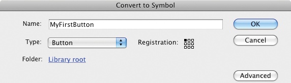
A Convert to Symbol dialog will appear (Figure 3-1). This dialog has basic and advanced options. Only the basic options are required for this exercise, so regardless of which is displayed, you only need to pay attention to the first section of the dialog.
Name this symbol
MyFirstButtonand chooseButtonfrom the Type menu.The Registration option lets you choose where the registration point will be placed when creating the symbol. This is the point that is used for things like positioning an object on the Stage. Click the upper-left corner in the nine-box grid to place the registration point in the upper-left corner of the button.
The Folder option determines where this symbol will be placed in your Library. For now, leave the default, Library root. This will place your newly created symbol in the root, or top, directory of the Library. In other words, it will not appear inside a specific folder in your Library. You’ll learn more about using the Library later in this chapter.
When you’ve completed these steps, click OK. This will create the button symbol, close the dialog, and return your focus to the Stage. Save your file as my_first_button.fla. You can compare your work to the sample file, my_first_button_01.fla.
Your rectangle may not appear to have changed much, but if you look at the Properties panel, you will see that the object has changed from a Drawing Object (or Shape) to a Button, as shown in Figure 3-2. The icon and menu indicate that the symbol is a button.
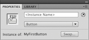
The text at the bottom left of Figure 3-2 shows that the selected object (the button you clicked on the Stage) is an instance of the MyFirstButton symbol you created. If you look in your Library (Window→Library) you will see that the button symbol has been added to the Library. You can drag a few copies from the Library (dragging from either the button name in the list or the preview icon) to create additional instances of the symbol.
When you start adding ActionScript to your files, you will be able to distinguish one symbol instance from another by giving them instance names, as shown near the top of Figure 3-2. This isn’t necessary until you begin programming, so for now you can leave the instance unnamed.
Finally, in the lower-right corner of the panel detail, you can see an icon named Swap. When an instance is selected on the Stage, you can click this icon to switch the symbol that the instance is derived from. This is handy when you want to swap one button for another because all attributes of the instance (such as transformations like x- and y-position, scale, rotation, alpha, and so on), will remain even after the symbol is swapped.
If you test your movie again (Control→Test Movie) and roll your mouse over your newly created button instance, the cursor will now change to the appearance of a hand with a pointing finger. This cursor feedback is automatic when using a button symbol.
You’ve seen one visual aspect of button use (the cursor change), but you still need to examine the various button states to better understand how a button works. To do this, you must edit your symbol.
Warning
Editing a symbol is very different from transforming a symbol instance. Applying a transformation, such as rotation, to an instance is an isolated occurrence that affects only that instance. Such a transformation affects neither the symbol nor other instances derived from it. Editing the symbol, however, alters the symbol and every instance spawned from the symbol.
Double-clicking the button instance will allow you to edit the button symbol. If you look at the Edit Bar, near the left corner above the Stage, you will see that a breadcrumb trail has been started, showing that you are now inside the MyFirstButton symbol. The trail also shows that your button symbol is in Scene 1, or your main Timeline.
To leave the symbol-editing mode and return to your main Timeline, you can either double-click the Stage or use the Edit Bar (Figure 3-3). In the latter case, you can either click the Scene 1 button or click the left arrow to traverse back to the stage one object at a time. In this case, the two options yield the same results, but it’s possible to have a symbol inside a symbol inside a symbol, and so on. Such a nested arrangement would cause the Edit Bar to include more objects through which you could navigate.
In the Timeline, you will notice that your symbol has a unique set of frames, specific to buttons (Figure 3-4). They are labeled and represent the Up, Over, and Down button states, as well as a fourth state, called the Hit state. The Hit state is invisible at runtime and defines the areas of the button that will react to the mouse. Any nontransparent object will trigger button detection and mouse feedback. Semitransparent pixels are not supported. They will be seen as nontransparent and, therefore, as part of the button.
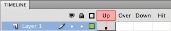
Because the art in the Hit state defines the areas of the button that react to the mouse, it is possible to create hot areas that are larger (or smaller) than the button. For example, if a button must appear to be very small, and is hard to click with the mouse as a result, you can add area to the Hit state. This added area will not be visible, but will increase the area(s) with which the mouse can interact. Similarly, you could adjust the Hit state of a button that looked like a target by removing all but the bull’s-eye from the target. This would prevent the outer rings of the target from being treated like a button, limiting mouse interaction solely to the bull’s-eye. Finally, if no Hit state is used, Flash automatically uses the Up state to define the hot area(s) of the button.
To see a visual change in your button resulting from state changes (in addition to cursor changes), it is necessary to create one or more of the labeled Timeline frames and populate them with altered artwork. Follow these steps to give it a try:
Click in the frame labeled Over so the frame appears selected. Use the Insert→Timeline→Keyframe menu command (F6) to add a keyframe. This feature creates a new keyframe and duplicates the contents of the previous frame. Because you’ve created a keyframe rather than adding another frame to the existing frame span, you can transform the contents of each keyframe independently.
Create another keyframe by selecting the Down frame and inserting another keyframe. Leave the Hit frame empty for now.
Use your mouse to move the Timeline playhead back and forth over these three frames by clicking and dragging the red playhead over the words Up, Over, and Down (you won’t be able to move the playhead over the Hit frame because there is no content in that frame). You will see the same artwork used in all three states.
Move the playhead to the Over frame and select the button artwork on the Stage. Change the fill color of the Drawing Object.
Alter the Down state in a similar fashion and again scrub through the frames. You should now see a unique color for all three states.
Test your movie again. This time you will see art changes and cursor feedback when interacting with the button using the mouse. You can compare your work to the sample file, my_first_button_02.fla.
Note
Dragging the playhead through frames to interactively play segments of the timeline is called scrubbing.
Once you’ve successfully tested your button, it’s time to experiment with the Hit state. It’s useful to see how adding to, or removing from, this frame affects Flash’s recognition of the button. To start, add another keyframe to the Hit frame (F6), which will duplicate the Down state. When testing your movie, no change in behavior will occur because the prior example automatically used the Up state to define the button hot area(s).
Warning
Remember that the Hit state is invisible at runtime. If the button’s Up, Over, and Down states occupy the same area, it doesn’t matter which state you duplicate in the Hit frame. On the other hand, if the size or location of any state changes, it is sometimes advantageous to use the union of these states in the Hit frame. Related examples can be found on the companion website.
Now edit the content in the Hit frame to remove the right half of the button. If you test your movie now, you’ll see that only the left half of the button will respond to the mouse. By removing content from the Hit frame, you’ve reduced the area of the visible button with which the mouse can interact. Finally, go back into the Hit frame and double the size of the button. When testing your movie, you’ll find that the mouse will appear to respond to the button even before you touch it. This is because all nontransparent pixels in the Hit frame will cause such a reaction—even when the art ends up being larger or smaller than the visible Up state.
Just for fun, add your first ActionScript to this test file. You’ll learn more about what this script does in later chapters, but trying this now will get your feet wet and give you some experience with the ActionScript-related interface elements.
If you haven’t already, double-click the Stage or click the Scene 1 button in the Edit Bar to return to the main Timeline.
Select the button instance on the Stage and, at the top of the Properties panel, give the button an instance name of
myButton(not only does spelling count in ActionScript, case-sensitivity counts, too, so be sure you type the instance name correctly). The button can now be referenced by this instance name when using ActionScript.Using the mouse, click on the current frame (indicated by the red playhead line) in the Timeline. If you’ve followed these steps without any added experimentation, your file will have only one frame in it: frame 1 of layer 1. You will be adding your script to this frame, so you still cannot select the button for the next step.
Open the Actions Panel (Window→Actions). If you see the message “Current selection cannot have actions applied to it,” look over step 3 again. If the Actions panel is empty and ready for typing, add the following script:
myButton.addEventListener(MouseEvent.CLICK, onClick);
function onClick(evt:MouseEvent):void {
        myButton.rotation += 10;
}
Test your movie and click the button. With each click, the button should rotate around the registration point you chose in an earlier exercise (the upper-left corner was recommended).
Although it will not be used in the project, you may wish to save your work for later review. You can compare your work to the sample file, my_first_button_03.fla.
Movie clips are much simpler than buttons in that they are essentially self-contained timelines. That is, a movie clip contains a timeline just like the FLA documents you’ve been working with to date, but they are not additional external files. This means that you can create an animation inside a movie clip, and then separately animate the movie clip as a whole.
For example, certain types of character animation are simplified significantly by using what might be described as animations within animations. To animate a character walking across the stage, it is much more efficient to animate the task in two phases. First, animate the character walking in place inside a movie clip. This is often called a walk cycle because it is a full cycle of movement needed to give the appearance of walking. This might require 5 or 10 frames. Second, move the movie clip as a single element rather than copying and pasting the entire walk cycle over and over, updating the location of each frame every time.
To create a simple movie clip, follow these steps:
Create a new file using the File→New menu command. Because this file will not be used in your project, you do not need to use the book template.
As you did with the button exercise, create a symbol. Use the Rectangle tool to create a rectangle on the stage, then convert it to a symbol (Modify→Convert to Symbol or F8).
Choose Movie Clip as its type. Name the symbol
MyFirstMovieClipand click OK.Double-click the instance of the movie clip to edit it, and look at the Timeline. Instead of frames marked with Up, Over, Down, and Hit, the Timeline looks just like the main Timeline you’ve been using all along.
Again, as you did with the button exercise, create keyframes in frames 2 through 5 and change the color of the Drawing Object in each frame. Rather than using the color changes for button states, you are simply creating a five-frame animation of a rectangle changing colors.
Before you leave the Movie Clip Editing mode, scrub through the frames using the Timeline. The effect will be similar to scrubbing through the button frames, but this is a very important concept. Remember that you are inside the movie clip, editing its Timeline.
Double-click the Stage to return to the main Timeline. You should see that the main Timeline still has only one frame and that it’s not possible to scrub through the animation any longer.
Save your file as my_first_movie_clip.fla, test your movie (Control→Test Movie), and watch your animation play.
Notice that your five-frame movie clip animates even though the main Timeline in which it resides only has one frame. You do not need more than one frame to play a movie clip, regardless of its length. However, short of manually previewing playback while editing your movie clip (as in this exercise), you must test your movie (Control→Test Movie) to see the animation play. You cannot otherwise preview movie clips in authoring mode.
Finally, notice that your animation loops forever. Movie clips are designed to loop by default and you must use ActionScript to alter this behavior. If you had any trouble with this stage of the exercise, compare your file with my_first_movie_clip_01.fla in the source code from the companion website. Then complete the exercise by adding some ActionScript:
Close your SWF to return to the FLA and, if not already in symbol-editing mode, double-click your movie clip to edit it (you can always tell where you are by looking at the breadcrumb trail in your Edit Bar).
Click the last frame in your animation and open the Actions panel. (Windows→Actions). If you are warned that you cannot apply actions to the selected object, be sure the last frame of the animation in the Timeline is selected—not the art (on the Stage) in that frame. Type the following script:
stop();
Test your movie, and notice that the animation now plays through once and stops. The ActionScript you added told Flash Player to stop the movie clip animation on the frame in which you typed the relevant command (the final frame).
Save your work and compare it to the sample file, my_first_movie_clip_02.fla.
The most important thing to remember about movie clips is that you can control them with ActionScript. You used ActionScript inside a movie clip in the previous exercise, and you will control movie clips from the main Timeline in the upcoming Project Progress section of this chapter.
Another unique attribute of movie clips is that they are the only symbol type to which you can apply certain animation techniques and special effects. These points will be discussed in later chapters, but, for now, commit to memory the fact that movie clips are the best animation tools when ActionScript control is required.
Graphic symbols are nearly identical to movie clips, but with three very significant differences:
For example, in the previous movie clip exercise, an instance of a five-frame movie clip played through all its frames while sitting in a main Timeline that contained only one frame. If that movie clip were a graphic, only the first frame of the instance would display. By contrast, if the main Timeline spanned five frames, the graphic symbol instance would have enough frames to play through its entire animation.
Graphic symbols were invented to serve as an animation asset that did not require ActionScript skills to use. As such, the Properties panel offers three playback options, found in the Looping section of the panel (Figure 3-5):
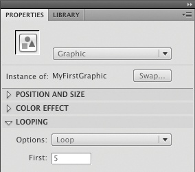
- Loop
Plays all the frames in the graphic symbol for as many frames as the instance of the symbol occupies.
- Play Once
Plays the animation from the first frame you specify in the accompanying text field, labeled First, to the end of the animation and then stops.
- Single Frame
Displays a single frame, specified in the accompanying text field, labeled First.
Note
The number of frames in which the graphic symbol resides significantly affects the Loop and Play Once options. If you plan to use these options, test your work thoroughly. See the companion website for additional examples.
Creating a graphic symbol does not differ substantially from creating a movie clip. The only difference is specifying that the symbol is a Graphic instead of a Movie Clip during creation. So, to demonstrate the use of a graphic symbol, you’ll learn how to convert a symbol from one type to another.
Open or continue with the file you created previously when building your first movie clip. Save the file with a new name, my_first_graphic.fla.
In the lower-left corner of the Library panel, click the Properties button, which looks like a lowercase i in a circle. The Symbol Properties dialog will open and will look almost identical to the dialog you saw when creating the movie clip. In this dialog, simply use the Type menu to change this symbol from Movie Clip to
Graphic.Drag a new copy of the symbol to the Stage somewhere near the copy that was already there.
Using the Selection tool, click on the new copy and look in the Properties panel. The symbol is now a graphic. Click on the previous copy and again look in the Properties panel. Despite changing its symbol type in the Library, the original instance is still a movie clip. This is because you can change the way an instance behaves just like you can change a symbol. You’ll change the original instance to a graphic in a short while, but take a look at the differences and similarities between the two symbol types first.
Select the new instance of the graphic symbol again and make sure the Looping Options menu says Loop. Theoretically, this graphic should behave just like the movie clip, looping when it reaches the end of the Timeline.
Test your movie (Control→Test Movie) and see what happens. The movie clip plays all the frames and loops, but the graphic does not. This demonstrates the aforementioned need for as many frames in the host Timeline (the one in which the graphic is placed) as the graphic itself contains. Close the SWF and return to your FLA.
Because your movie clip had five frames, the graphic converted from that movie clip has five frames. In the Timeline, select frame 5 and use Insert→Timeline→Frame (F5) to add four new frames.
Test your movie again; the graphic now animates just like the movie clip.
Finally, use the Selection tool to select the graphic and, in the Properties panel, switch the Looping Options to
Single Frameand enterframe 3in the text field.Test your movie and notice that the graphic displays frame 3 only. A nice bonus is that this display change is also updated in authoring mode, meaning you don’t have to test your movie to see the result as you did in the movie clip example.
There are two distinct approaches to creating and editing symbols, and the primary difference between the two is context. One way to create a new symbol is to start fresh with an empty canvas on which to draw. Alternately, you can convert an asset already on the Stage to a symbol. This is the more oft-used technique because you can take full advantage of surrounding art elements to inform your editing.
When creating a movie clip or button, it is usually most helpful to convert an existing asset into the new symbol type while you are working with the artwork. This allows you to work with the new symbol immediately, in the same location and context as the original art.
To demonstrate this approach, draw three separate rectangles on the Stage, then convert one to a symbol. It doesn’t matter whether you create a movie clip, button, or graphic. The point is, after creating the symbol, you will see the Stage again and the shape you converted is now a symbol. This typically means that the location and appearance of the art remains intact after making the symbol, and you can immediately begin working with your creation.
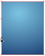
You can also edit a symbol with the benefit of this graphical context. Double-click the symbol you just created and look at the surrounding rectangles. You can still see them, albeit slightly faded in appearance (Figure 3-6). This faded look tells you that you’re in editing mode, but you can still see all the other stage-bound elements in the movie to assist your editing efforts. This approach to editing is called Edit in Place and can also be initiated using the Edit→Edit in Place menu command.

When surrounding context is not necessary, you can create a new symbol using Insert→New Symbol. This creates the button, movie clip, or graphic, but changes the interface to display only the empty new symbol in Editing mode. In other words, you can’t see any other artwork while editing the symbol. Furthermore, when you’re finished editing, the newly created symbol is not in the Timeline and you must drag it from the Library to the Stage.
This approach is used less often than converting an existing asset to a symbol, but allows you to edit a symbol without any surrounding distractions. After selecting a symbol, you can use the Edit→Edit Selected menu command to enter Editing mode. However, you will not be able to see anything other than the contents of your symbol.
Note
You can also edit symbols without visual distraction by selecting the symbol from the Edit Symbols menu in the Edit Bar above the Stage, or by double-clicking the symbol in the Library panel.
Transforming symbol instances does not permanently alter a symbol. Chapter 2 discusses several ways to transform symbol instances using features such as the Free Transform tool, Transform panel, and Properties panel.
Reuse is one of the main benefits of symbols. In addition to using multiple instances of a symbol within a single document without contributing noticeably to file size, you can also reuse symbols by copying them from one FLA to another.
Within a FLA, adding instances of a symbol to your project is as easy as dragging the symbol from the Library to the Stage:
Create a new file using File→New. Save the file temporarily as rectangle.fla. Saving this file is just for convenience. It will not be used in the project.
Use the Rectangle tool to draw a rectangle anywhere on the Stage and then convert it to a movie clip called
rect.Drag the rect symbol to the stage more than once. Use the Free Transform tool to transform one of the symbol instances. Note that no other instance is affected, nor is the symbol in the Library changed.
Save this file and leave it open to continue with the next exercise.
Between FLA files, you can use exactly the same process of adding symbol instances to the Stage:
Create another new file using File→New. You will not need to save this file, nor will it be used in the project.
Using the Oval tool, draw an oval anywhere on the Stage and then convert it to a movie clip called
oval. Delete the instance of this symbol from the stage so only the symbol remains in the library.In the Library panel, use the menu near the top to switch from the library of the current file (displayed as some variant of untitled.fla if you haven’t saved it) to the library of rectangle.fla (don’t switch documents, just switch libraries). After switching libraries, you will see the rectangle symbol from the other document, and you can drag it from the Library panel to the Stage of the new document.
Leave this file open and continue with the exercise.
It is also possible to swap one symbol for another that is already in use:
If the Library from rectangle.fla is still visible, select the Library of the new untitled document again. In the new document, you should now see the rectangle movie clip somewhere on the Stage, and both the oval and rectangle movie clips in the Library.
Using the Selection tool, select the rectangle and use the Modify→Symbol→Swap Symbol menu command. A dialog displays a listing of all existing symbols in the current FLA. Pick the oval movie clip and click OK to close the dialog. On the Stage, the rectangle is replaced by the oval. All properties of the symbol instance, such as the x and y location, scale, rotation, and so on, are preserved.
Note
The Swap Symbol feature is also accessible from the Properties panel when a symbol instance is selected. A button called Swap appears near the top of the panel, which will function the same way as the Swap Symbol menu item.
The more you use symbols, the more you will appreciate the power of reuse. The next section of this chapter discusses the Deco tool, which takes great advantage of reusing symbols to create art with a little assist from your friend, math.
Chapter 2 briefly discussed the application of symbols while using the Spray Brush tool. When spraying a swash of stars, the Spray Brush reused the same symbol again and again, not only reducing file size, but also making it possible for you to edit all instances of the stars just by editing the original symbol.
Another tool new to Flash CS4 Professional that makes similar use of symbols is the Deco tool. The Deco tool automatically applies instances of a symbol, or default shape, to the stage, but uses three distinct effects.
The Deco tool is the last in the drawing section of the Tools panel, and looks like a pencil drawing a series of dots. Activate this tool and experiment along with the text.
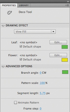
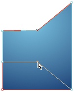
The first Deco tool drawing effect is Vine Fill. Similar to the way the Paint Bucket fills an area with color, Vine Fill fills a contiguous area in your drawing with a vine drawn by a computer algorithm. For example, Figure 3-7 shows a rectangle, originally filled with black and a large yellow flower, to which the Vine Fill effect has been applied. The origin point of the vine is the location clicked by the user, indicated by the star. Simply by clicking at that location with the Deco tool, the vine grew, branching and sprouting leaves and flowers. When it reached an obstacle, such as the edge of the shape or the large flower, the vine detected the collision and stopped growing in that direction.

Figure 3-8 shows the Properties panel with the Deco tool selected, illustrating the properties for the Vine Fill effect. You can choose to use the default leaf and flower shapes, using any color, or substitute your own symbols. You can also set the angle of the sprouting branches, the length of each branch segment, and the overall pattern scale (creating bigger or smaller leaves and flowers). You can even animate the process at runtime by enabling the Animate Pattern option; to determine how much of the vine is drawn each frame, specify the Frame step value. Increasing the step size will draw more of the vine in each frame, requiring fewer frames to complete the animation.
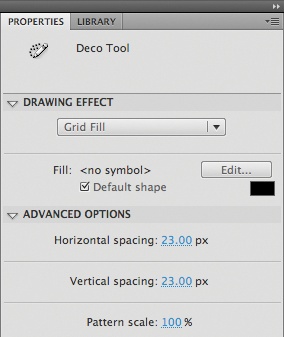
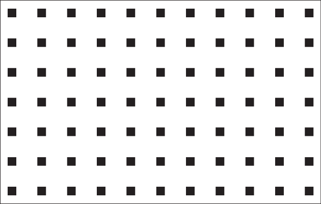
The Grid Fill drawing effect fills an area in your drawing with a grid. The properties of the Grid Fill effect can be seen in Figure 3-9. Again, you can use a default shape (a small square) of any color or substitute your own symbol. You can also dictate the horizontal and vertical spacing between grid elements and the scale of the overall pattern. Figure 3-10 shows the result of the Grid Fill effect using the default shape.
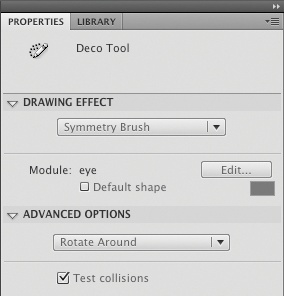
The last Deco tool drawing effect is the Symmetry Brush, which places shapes or symbols on the Stage in symmetrical patterns. As shown in Figure 3-11, the effect’s only basic option is to use a default shape (again, a small square) of any color, or substitute your own symbol. The Symmetry Brush, however, has four possible advanced options—Reflect Across Line, Reflect Across Point, Rotate Around, and Grid Translation—all of which control how the shape or symbol is placed on the stage. In all four cases, the symmetrical patterns can check for collisions between symbols to prevent overlapping, or place the symbols without concern for one another.
With every mouse click, Reflect Across Line positions two instances of your symbol reflected anywhere across a single line. For example, if you position your Deco tool in the center of the Stage, orienting the line of reflection vertically (the default behavior), every click on the right half of the Stage will be reflected on the left half of the Stage. You can also click and drag (before releasing the mouse) to see a live preview of the position of your objects. Control points allow you to rotate the line around which elements are reflected (effectively rotating the entire collection of shapes or symbols around the control point), or move the collection of shapes or symbols as a single object.
Reflect Across Point again creates two objects with every click, but reflects the desired shape or symbol across a center point. This is similar to Reflect Across Line, but is not limited to a single axis of reflection. That is, if you click and then drag to preview position, you can rotate the objects’ positions in a complete circle, reflecting around the center point. A single control point allows you to move the collection of shapes or symbols as a whole.
Rotate Around, shown in Figure 3-12, adds multiple instances of your shape or symbol along the circumference of a circle around your chosen center point. The distance from the center point determines how close to one another the shapes or symbols will be placed.
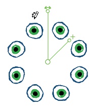
Three control points are provided to help you adjust the placement of the shapes or symbols. A center control point allows you to move the collection of objects as a whole. The control point with an accompanying plus (+) symbol adjusts the angle between objects along the unseen circular path you are describing. Dragging the control point at the end of this smaller axis (shown at an angle in Figure 3-12) closer to the other axis tightens this distance. Dragging it further away from the other axis increases this distance. Finally, dragging the control point at the end of the longer axis (shown as vertical in Figure 3-12) rotates the entire collection of shapes or symbols.
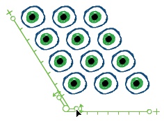
Grid Translation adds a grid of symbols, much like the Grid Fill Deco tool option. With Grid Translation, however, the grid is treated as an adjustable object and can be translated in several ways:
- Grid size
You can reduce or enlarge the size of the grid (number of shapes or symbols added) along columns, rows, or both, by dragging the control handles at the end of each long axis, as shown in Figure 3-13.
- Grid gaps
You can reduce or enlarge the gaps between columns, rows, or both, by dragging the handles of the shorter axes. Figure 3-13 shows the cursor manipulating the control point that affects column gaps. If you drag the cursor to the right, additional space is added between columns.
- Angle between grid elements
You can reduce or enlarge the angle used to place grid elements relative to one another, causing the grid to appear more acute (between 0 and 90 degrees) or more obtuse (between 90 and 180 degrees).
To do this, drag the handle near the corner control point, which is on the inside of the axes. Figure 3-13 shows the cursor manipulating this control point. Instead of dragging this point left and right to affect the column gap value, you can drag it around the corner point to change the angle of object placement. If you drag the cursor that appears in Figure 3-13 clockwise around the corner point, the angle between the grid elements will open up even further than depicted. If you drag the point counter-clockwise around the corner point, the grid will begin to square off and eventually become more and more acute.
- Rotation of grid as a whole
You can rotate the entire grid around its corner control point. This is akin to rotating a shape or symbol, but this feature allows you to preview the results while still editing the grid. To do this, drag the control point near the corner that is on the outside of the axes in a clockwise or counter-clockwise direction. In Figure 3-13, this point is outside the leftmost axis, approximately at the bottom of the lowest eye.

In this chapter you will focus your project work on symbols and gain additional experience with the Timeline, creating a sound control widget that you will eventually add to the portfolio’s main interface. In addition, you’ll use the Deco tool to create the first interactive element of the project using ActionScript.
Don’t worry about your scripting abilities yet. The Deco tool exercise will be just for fun. Typing in a provided script will give you a little more experience with the Actions panel, and you’ll learn how the code works in Chapter 6, where ActionScript is discussed in greater detail. Chapter 13 will give you the necessary information to program the sound controller so, for now, you’ll only need to build the required parts.
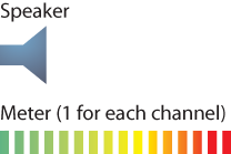
The portfolio project will include a sound controller that viewers can use to turn soundtrack music on and off. In addition, the controller will visualize the music during playback by manipulating volume meters for the left and right stereo channels.
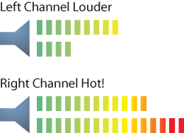
These meters are often comprised of bars, oriented vertically or horizontally, that grow in length with the volume of the sound. Advanced meters of this type also display colors that indicate the relative “temperature” of a sound. Sound playing at a volume that is under a specific level—usually about two-thirds or three-quarters of maximum volume—typically contain less distortion and are less likely to cause hearing problems. These levels are represented by “cool” colors such as greens and blues. Volumes above this threshold run the risk of degrading the quality of the sound and damaging your ears or sound equipment. These levels are represented by “hot” colors like oranges and reds.
Figure 3-14 shows two states of the horizontal sound controller that you will be creating. The top image shows a point at which the left channel (top bar) is louder than the right channel (bottom bar), but both channels are at acceptable volumes. The bottom image shows that the right channel is louder than the left channel and that both are above the desired volume threshold. In particular, the right channel is “hot,” or at maximum volume and distortion.
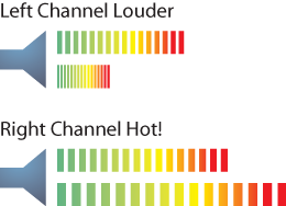
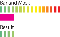
Building a basic volume meter with a solid-color bar requires only that you set the width of the bar to the volume of the sound. However, if you used this simple approach with gradient colors, as described previously, all colors would be visible during the scaling. This would not expose the hot colors only at high volumes, as desired. Figure 3-15 shows the result of scaling the color bars. Note that the individual bar segments squash horizontally and all colors remain visible at all times.
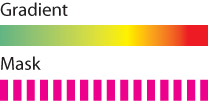
The way around this problem is to use layer masks. A layer mask is a special kind of layer in the Timeline that serves as a window through which you can see underlying masked layers. Any nontransparent pixel in a layer mask will act like a hole cut out of a piece of paper. In other words, when adding to a layer mask, you are drawing the hole.
You will use masks twice in the sound controller. First, you’ll create a static mask that will divide a continuous gradient into vertical bars. Second, you’ll create a dynamic mask that will be controlled by ActionScript. By using ActionScript to control the width of the color bar’s mask, not the bar itself, you can expose varying degrees of color in sync with the audio volume, rather than distorting the entire color bar.
Before you begin drawing assets for the sound controller, it helps to have an inventory of the required parts. Ultimately, the entire controller will be a movie clip symbol, which will act like a button that the user can click on to turn the sound on and off. At the top level, the controller will consist of the two main parts shown in Figure 3-16: a speaker shape and (two instances of) a movie clip for the volume meter. The speaker requires no further explanation, but the meter consists of additional parts.
Before the meter can reveal a subset of color segments, you must create a bar that is divided into the stripes shown in Figure 3-16. Two parts are required: an underlying gradient with a range of cool to hot colors, and a mask of the stripes through which the colors will be visible. Shown in Figure 3-17, both are static parts and are combined to create the color bar that will be dynamically revealed during sound playback.
Once you have masked the gradient so that only individual segments of the color can be seen, you will add a mask to the entire meter. Unlike the mask in the previous step, this is a movie clip and will be dynamically controlled by ActionScript at runtime. Figure 3-18 shows the two meter parts.

At runtime, the horizontal scale of the bar mask will be synchronized to the volume of the sound. At full volume, the bar will be at full width, showing all the colors in the meter. When the volume is at 0, or when the sound is not playing, the width of the bar will be 0, showing none of the meter colors. Figure 3-19 shows one possible result of the meter when the sound is at approximately 25% of maximum volume. The horizontal scale of the mask is set to approximately .25 and the mask, therefore, reveals only cool colors.
The first step in putting the sound controller together is to create the speaker icon:
Create a new file using the File→New menu command. You don’t need to use the template because the sound controller will be relocated in the final file. Instead, create a new file and leave the document properties at their default settings. You should have a white Stage that is 550×400 pixels.
Use the Rectangle tool with Object Drawing mode off, and draw a rectangle anywhere on the Stage. Using the Properties panel, set its width and height to
20and25, respectively, and position it at point (210,185).Use the Properties panel to give the rectangle a thin stroke, or no stroke at all, and a blue fill to contrast the eventual background. Try to use a gradient to practice with the Color panel.
Use the Pen tool menu to select the Add Anchor Point tool. (Zoom in for easier editing.) Click twice along the left edge of the rectangle, dividing the edge into thirds, as shown in Figure 3-20. The sample file uses distances approximately 8 and 17 pixels down from the top, dividing the edge into 8-, 9-, and 8-pixel segments. You can check your work by opening the Info panel and hovering over the points with your mouse. The y-values along the left edge should be approximately 185, 193, 202, and 210.
Switch to the Subselection tool. Select the upper-left corner of the rectangle and drag it down to about 10 pixels directly opposite the top point that you added to the left edge. Use the Info panel as in the previous step to confirm that the new point is at approximately (220, 193). Drag the lower-left corner up and over to a similar location opposite the second point you added to the left edge, as shown in Figure 3-21. The new location of this point should be at approximately (220, 202).
Your speaker icon is now complete, and because the icon itself won’t be interactive it can remain a shape. To avoid damaging the icon with other shapes, select it and group it using the Modify→Group menu command. Finally, save your work as sound_control.fla.
Now it’s time to create the meter:
Using the Rectangle tool, draw a horizontal bar anywhere on the Stage and use the Properties panel to set its width and height to
100and10, respectively, and position it at point (235,185).Use the Selection tool to drag over the new bar to select it and open the Colors panel. Use the Stroke chip in the upper-left corner of the panel to select no stroke. You should see a red line through the chip.
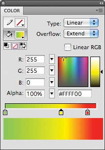
Select the Fill chip in the Colors panel and switch the Type menu to
Linearto create a linear gradient. Create a three-color gradient moving from green to yellow to red, approximating what you see in Figure 3-22. See the “Color Panel” section in Chapter 2 if you need any review on creating gradients.If you’ve been following along, your horizontal bar is now filled with the gradient shown in Figure 3-22 because the bar was selected while you were using the Color panel. If the bar fill is not the desired gradient, switch to the Swatches panel and click in the bottom bar to add your new gradient to the panel. Choose the new gradient with the Fill color in the Tools panel and then use the Paint Bucket tool to fill the bar with the gradient. If the shape still has a stroke, use the Selection tool to double-click the stroke and delete it.
Use the Selection tool to select the bar and use the Modify→Convert to Symbol menu command. In the resulting dialog, choose
Movie Clipand an upper-left corner registration point. Name the symbolbarand click OK. Save your work and compare your file with the source file sound_control_01.fla. If preferred, continue with the provided file.
You will now add a layer mask to create the color segments of the meter:
Double-click the new movie clip to edit its contents.
Rename the only layer in the movie clip to
color.Add a new layer and name it
mask. Double-click the layer icon of the mask layer to access the Layer Properties dialog. Change the layer type toMask.Double-click the layer icon for the color layer and change its type to
Masked. Lock this layer to prevent future changes.In the mask layer, use the Rectangle tool to draw a rectangle anywhere on the Stage. Use the Properties panel to set the rectangle’s width to
4and height to10and position it at point (0,0). (You are editing the contents of a movie clip with a registration point of (0, 0), so the stage coordinates you used to draw the original gradient bar no longer apply.)Create 15 copies of this shape, so that you end up with 16 shapes evenly spaced horizontally between 0 and 96 pixels, all with a y coordinate of 0. The Align panel can help with this task and features both alignment and spacing options. Position the last copy you made at point (
0,96), select all the shapes, and use the Align top edge and Space evenly horizontally options.Lock the mask layer to see your finished color bar. Save your work and compare your results with the source file, sound_control_02.fla. If preferred, continue with the provided file.
Now that your color bar is finished, you need to assemble the meter in a single movie clip and create a mask that will expose the appropriate colors based on sound volume:
Using the Selection tool, select the instance of the bar movie clip on the Stage and convert it to a movie clip following the same process used earlier in the exercise. Select the upper-left corner for the registration point and name the new clip
meter.Double-click to edit the new movie clip and rename its only layer to
bar. Lock this layer to prevent any unwanted changes.As you did previously, create a new layer of type
Mask(naming itmaskagain) and change the bar layer to a type ofMasked.In the mask layer, draw a rectangle anywhere on the Stage. Set its width to
100and height to10and position it at point (0,0).Use the Selection tool to select the entire rectangle and convert it to a movie clip. Again, select the upper-left corner as its registration point and name it
maskBar. Later on, you’ll need to control this movie clip with ActionScript, so you need to give it an instance name. While the maskBar movie clip instance is still selected, give it a name ofbarMaskat the top of the Properties panel.Lock the mask layer to see your finished meter. If you sized your mask correctly, you should see the entire color bar. Save your work and compare your results with the source file, sound_control_03.fla. If preferred, continue with the provided file.
Before tying all the parts together, you must now duplicate the first meter you created and give both meters instance names so they can be controlled with ActionScript. Two meters are required because you will be visualizing stereo sound.
Using the Selection tool, select the instance of the meter movie clip on the Stage and copy it. Paste the copy onto the Stage and use the Properties panel to position the copy below the first meter at point (
235,200).Select the first meter and use the Properties panel to give it an instance name of
lPeak. Select the second meter and name itrPeak. These names are derived from the left and right peak volume values that will later be used to visualize the volume of the sound.Now wrap everything up into one controller. Using the Selection tool, drag over everything to select the speaker icon and both meters. Use Modify→Convert to Symbol to convert everything into a movie clip. Select an upper-left corner registration point and name the symbol
soundController.You are almost finished. Create a folder in your Library called
soundControllerAssetsand place the bar, maskBar, and meter movie clips in it. This will keep things nice and tidy when you transfer your controller to your master file later on.Save your work and compare your results to the source file, sound_control_final.fla. In Chapter 13, you’ll write the code necessary to put the controller into action.
This exercise is strictly to increase your enthusiasm and get you creating interactive elements right away. You won’t spend any time learning ActionScript prematurely. Instead, you’ll revisit this code in Chapter 6 and learn everything you need to see it through. For now, it’s just time to plug and play. After using the Deco tool to create a symbol in a new file, you’ll paste a provided script into the Timeline and the symbol will animate.
Open the file you created in Chapter 1 for your home page. Double-click anywhere on the HomePage movie clip’s Stage to edit its contents.
Create a new layer at the top of the timeline called
decoand place all visual assets from this exercise in that layer.Using the Oval tool, draw an oval anywhere on the Stage. Using the Properties panel, use a
blackfill and no stroke, and make the oval6pixels wide and12pixels tall.Use the Selection tool to select the oval and convert the shape to a symbol (Modify→Convert to Symbol). Choose the
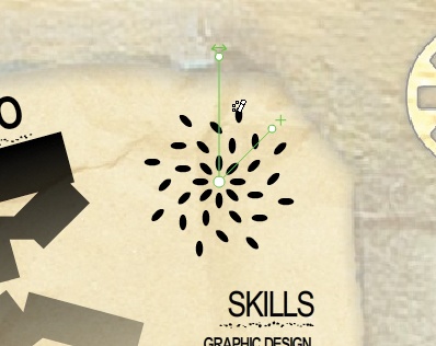
Movie Cliptype, name itoval, and use a center registration point. Click OK to create the symbol, then delete the instance from the Stage. You will use the movie clip in the Deco tool instead of manually placing instances on the Stage.Select the Deco tool and drag the center point of the tool’s interface to the center of the vacant area in your Home screen. This area is constrained to the top and right by the frame implied in the guide layer, to the left by the rectangle cascade, and to the bottom by the list of skills. Figure 3-23 shows a detail of the screen and the work in progress, and shows approximately where to position the tool interface. This need not be exact, but remember that the frame shown in the guide layer will cover anything that appears outside the framed area.
As described previously in the Using the Deco Tool section of this chapter, use the Properties panel to choose the tool’s Symmetry Brush drawing effect. For the Module setting, select the oval movie clip you created and, for the Advanced Options, choose Rotate Around and Test Collisions.
Click and drag on the Stage to position a series of ovals along a circular path around the Deco tool’s center point. Start close to the center and repeat the click and drag process four times to end up with four rings of ovals, as shown in Figure 3-23. The number of ovals added is not important, but this will approximate the example provided in the sample file.
When you are done, switch to the Selection tool. The Deco tool will deselect, so click on the group of ovals to select them. Convert this group to a movie clip, naming it
decoOvalsand choosing a center registration point. Click OK to create the symbol.Using the Selection tool, click again on the ovals to select your new movie clip. In the Properties panel, give the movie clip an instance name of
ovals. You are now done with the Deco tool and can add ActionScript to animate the ovals.Add a layer to the top of the timeline, and name it
actions. Select the frame in the actions layer and open the Actions panel (Window→Actions). Add the following script to the Actions panel:1 ovals.addEventListener(Event.ENTER_FRAME, onEnter); 2 function onEnter(evt:Event):void { 3 var numOvals:int = ovals.numChildren; 4 for (var i:int = 0; i < numOvals; i++) { 5 ovals.getChildAt(i).rotation += 10; 6 } 7 ovals.rotation = mouseX; 8 }Test your movie (Control→Test Movie). You should only see the Home screen assets (not the guide layer), and each of the ovals should be spinning. Also, if you move your mouse left and right across the stage, the entire set of ovals will rotate with your mouse. You’ll learn more about this script in Chapter 6 when ActionScript is introduced.
When you are finished, lock both the deco and actions layers and save your file. Check your work against the sample file, home_page_final.fla. If your script isn’t working the way you expect it to, feel free to use this sample file moving forward.
In the next chapter, you’ll import assets and make use of powerful import features from native Photoshop and Illustrator files. You’ll create the main user interface shell and a background for your content pages, and begin work on the Lab page of your portfolio. Finally, you’ll bring in your first completed content: the home page and sound control!