
Twitter is a speedy medium. Information (along with rumors and nonsense) travels at breakneck speeds across the social network/world. It has now become a norm for an event or news to break first on Twitter and then on any other source of information. It is commonly observed that TV news channels usually play catchup with Twitter during any news breaks. Such a quick spread of information has its own pros and cons, but a discussion of these are out of the scope of this book.
It would be safe to say that if there's anything trending in the connected world, it will be on Twitter first. From brand promotions, sports events, government decisions, election results to news about terror attacks, natural disasters and the notorious fake celebrity death news, Twitter has it all.
Twitter uses search terms, what are called hashtags in Twitter-verse. Any word which begins with a # is termed as a hashtag and instantly becomes searchable on the platform. This not only helps users search for relevant topics, it also allows different users talking about the same event to tag their tweets for better reach. Hashtags which attract a lot of tweets are usually termed as trends. Trends are determined by Twitter's algorithm for the same which may look at various aspects to decide what a trend is.
Note
Twitter has a lot of users generating a lot of content every second. Its algorithms make use of this immense data to come up with worldwide, localized, as well as personalized trends. More details on this are available at: https://support.twitter.com/articles/101125
Trends can be used for various different scenarios which can help us understand the dynamics of our society and world in general. Twitter data has been a source of curiosity for researchers across the world. Now let us also dive into this ocean of data to extract some insights of our own.
As mentioned earlier, Twitter helps share and spread information in superfast mode. This makes it a very good tool for spreading information about natural disasters, such as, for example, earthquakes. Earthquakes as we all know are devastating and happen without much of a warning. Every year there are many earthquakes across the planet. Let's see if Twitter can help us track them down.
The first and foremost step is to load the required packages for analysis. We will make use of packages such as tm, ggplot2, worldcloud, lubridate and so on apart from the twitteR package. Packages such as tm provide us with tools for text mining (such as stemming, stop word removal and so on) while ggplot and wordcloud help us in visualizing the data. You are encouraged to find and learn more about these packages as we go on.
The following snippet loads the required packages and connects to Twitter using our app credentials:
library(tm)
library(ggmap)
library(ggplot2)
library(twitteR)
library(stringr)
library(wordcloud)
library(lubridate)
library(data.table)


CONSUMER_SECRET = "XXXXXXXXXXXXXXXXXXXXX"
CONSUMER_KEY = "XXXXXXXXXXXXXXXXXXX"

# connect to twitter app
setup_twitter_oauth(consumer_key = CONSUMER_KEY,
          consumer_secret = CONSUMER_SECRET)
Once connected, our next step is to extract relevant tweets using a search term. Since we are trying to track down earthquakes, the search term #earthquake seems good enough. The following snippet makes use of the function searchTwitter() from the twitteR package itself to help us extract relevant tweets. Remember, Twitter has a rate limit on its APIs, and so we'll limit our search to just 1000 tweets:
# extract tweets based on a search term
searchTerm <- "#earthquake"
trendingTweets = searchTwitter(searchTerm,n=1000)
As an additional step, readers may choose to combine data extracted using different search terms for more comprehensive analysis of this trend.
The next step is to clean the extracted set of tweets and transform them into a data structure which would be easier for analysis. We begin by first converting the extracted set of tweets to a DataFrame (see Chapter 1, Getting Started with R and Social Media Analytics for more details on DataFrames) and then transforming the tweet text and dates to relevant formats. We make use of the package lubridate which makes playing with date fields a breeze. The following snippet illustrates the preceding discussion:
# perform a quick cleanup/transformation
trendingTweets.df = twListToDF(trendingTweets)

trendingTweets.df$text <- sapply(trendingTweets.df$text,
                function(x) iconv(x,to='UTF-8'))
trendingTweets.df$created <- ymd_hms(trendingTweets.df$created)
Once converted to a DataFrame along with a couple of transformations, the trendingTweets dataset takes shape of a tabular format with multiple attributes listed as columns and each row depicting one tweet. The following is a sample DataFrame:

Trending tweets as a Dataframe
Now that we have the data in the desired format, let us visualize and understand different aspects of this dataset.
With this dataset, we ask a few questions and see what insights can be drawn from the same. The questions with respect to earthquakes could be:
- When was the earthquake reported?
- Where were some of the most recent earthquakes?
- What devices/services were used to report earthquake related tweets?
- Which agencies/accounts are to be trusted?
These are a few straightforward questions which we will try to find answers for. These questions can be used as a starting point of any analysis post which we can proceed to complex questions about correlating events and so on. This is by no means an exhaustive list of questions and is being used for illustrative purposes.
To answer the question regarding when an earthquake was reported, let us first plot tweet counts by time and see if we can find something interesting about it.
The following snippet makes use of ggplot2 to plot a histogram of tweet counts with time on x-axis. The bars are color coded, with blue pointing towards low counts and green towards high:
# plot on tweets by time
ggplot(data = trendingTweets.df, aes(x = created)) +
  geom_histogram(aes(fill = ..count..)) +
  theme(legend.position = "none") +
  xlab("Time") + ylab("Number of tweets") +
  scale_fill_gradient(low = "midnightblue", high = "aquamarine4")
The output plot shows high activity around 3:00 am UTC which slowly tapers off towards 9:00 am. If one tries to narrow down to the time period between 2:00 am and 4:00 am, we can easily identify that maximum tremors were reported from New Zealand (we'll leave this activity for users to explore further):
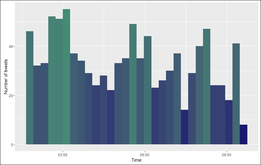
Tweets by time
Let us now try and identify which countries/places have reported most earthquake related tweets. To answer this question we first need to associate each tweet with a corresponding country. Upon inspecting the dataset, we found that there are two attributes which could be helpful, that is, $latitude and $longitude. These attributes should help us narrow it down to exact locations. However, before we use these attributes, we need to ascertain how many tweets have these attributes populated (not all attributes are available for all tweets; see the API documentation).
A quick check using the following snippet reveals that out of 1,000 tweets extracted, about 90% do not have these attributes populated. #OutOfLuck it seems!
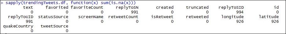
Tweet attributes and their missing counts
Data science is an art, and with art comes creativity. Since the location related attributes did not turn out to be helpful, let us try something else. We analyzed the tweets themselves and found that most of the tweets contain the location of the earthquake in the text itself. For example:
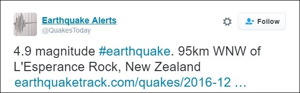
Sample earthquake tweet
To utilize this information from tweet text itself, we write a simple utility function called mapCountry() and apply the same on our dataset using sapply() on the $text attribute of the dataset. We assign the extracted countries from each of the tweets to a new attribute of the dataset called as $quakeCountry. The following snippet assigns values to $quakeCountry:
# identify earthquake affected countries
trendingTweets.df$quakeCountry <- sapply(trendingTweets.df$text,
                          mapCountry)
Our simple utility maps a few countries known to have earthquakes fairly commonly and maps the rest of them as rest_of_the_world. We can tweak this function to include more countries or follow an even more sophisticated approach to identify countries using advanced text analytics concepts, but for now let us see what results we have from this mapping itself.
The following snippet again makes use of ggplot2 to plot tweet counts by country:
# plot tweets by counts
ggplot(subset(trendingTweets.df,quakeCountry != 'rest_of_the_world'), aes(quakeCountry)) +
  geom_bar(fill = "aquamarine4") +
  theme(legend.position="none", axis.title.x = element_blank()) +
  ylab("Number of tweets") +
  ggtitle("Tweets by Country")
The output of the preceding snippet is as follows:

Tweet counts by country
The preceding plot clearly shows that New Zealand had that maximum number of tweets related to earthquakes, followed by Japan and United States. This falls in line with the devastating earthquake which New Zealand faced in November 2016, and there have been a series of tremors ever since. Japan, on the other hand, is a regular on the list of earthquake affected countries.
Note that we have removed the tweets marked as rest_of_the_world from this plot for better understanding. We can analyze left out population for improving our utility function along with some more interesting analysis like identifying the most unlikely countries to be affected by earthquakes.
Data analysis and visualization go hand in hand. It is commonly seen that with better visualizations, our understanding of data improves. This can in turn lead to uncovering more insights from the data.
To take a better view of the earthquake and tweet relationship, let us plot the same on a world map. In the following snippet, we make use of ggplot2 and ggmap for plotting the world map and identifying the latitude and longitude of each country respectively. The geocode utility from ggmap makes use of Google's location APIs from its data science toolkit. The snippet first geocodes the countries and then plots it on the world map as follows:
# geocode tweets->map to earthquake locations
quakeAffectedCountries <- subset(trendingTweets.df,
                quakeCountry != 'rest_of_the_world')
                $quakeCountry
unqiueCountries <- unique(sort(quakeAffectedCountries))
geoCodedCountries <- geocode(unqiueCountries)
country.x <- geoCodedCountries$lon
country.y <- geoCodedCountries$lat

mp <- NULL

# create a layer of borders
mapWorld <- borders("world", colour="gray50", fill="gray50")
mp <- ggplot() +   mapWorld

#Now Layer the cities on top
mp <- mp+ geom_point(aes(x=country.x, y=country.y) ,color="orange", size=sqrt(table(sort(quakeAffectedCountries))))
A world map with earthquake-related tweets plotted over it looks like (the size of each point corresponds to the number of tweets, that is. the larger the point, the greater the number of tweets):

Tweets on a world map
We just saw that, with a few lines of code, we could mark out earthquake affected places on the planet. If we look carefully, the preceding plot roughly marks out the ring of fire, that is, the most vulnerable countries along the Pacific Ocean which are most likely to be affected by earthquakes.
As we know, Twitter as a social network is quite different from others like Facebook or Tumblr because it does not enforce the concept of a user being human. A Twitter handle could belong to an organization or a website. With the proliferation of Internet and Internet-enabled services, it has become very easy for organizations to spread information/awareness. There are multiple services on the Internet which link various systems (both online and offline) to send automated alerts/tweets. Similarly, there are multiple earthquake alert generating services, apart from a few like IFTTT and https://dlvrit.com/, which enable users to setup personal alerts which can tweet on their behalf.
In such a landscape, it would be interesting to find an answer to the question: Which sources are generating the tweets in my dataset? The answer to this question could be in the form of humans versus non-humans/services or by devices. Let us view a combined picture and see which devices and services contribute the most to earthquake related tweets.
We do this by creating another simple utility which makes use of the field $statusSource. As we discovered earlier, this field contains data for all tweets we have, thus allowing us to use this field. We parse the text in this field to identify the device and/or the service which has generated the tweet.
The following snippet generates a histogram of source versus tweet count:
# plot tweets by source system (android, iphone, web, etc)
trendingTweets.df$tweetSource = sapply(trendingTweets.df$statusSource, function(sourceSystem)enodeSource(sourceSystem))
ggplot(trendingTweets.df[trendingTweets.df$tweetSource != 'others',],aes(tweetSource)) +
                geom_bar(fill = "aquamarine4") +
                theme(legend.position="none", axis.title.x = element_blank(),axis.text.x = element_text(angle = 45, hjust = 1)) +
                ylab("Number of tweets") +
                ggtitle("Tweets by Source")
The output histogram is as follows:

Tweet Counts by services
As expected, there are many services, such as did_you_feel_it, earthquake_mobile, and so on, which generate tweets automatically based on information from different sources. Yet the highest count comes from humans, as shown by the bar denoting Android!
The final question we need to answer before we conclude this use case is that of the Twitter handles behind these tweets. With the Internet in everybody's hands (thanks to smart phones), it is very important to identify the source of information. Twitter is known to be used for spreading both correct and false information. To remove noise from the actual information, let us try and identify the handles which generate these earthquake related tweets. This analysis will not only help us narrow down our dataset but also enable us to verify if the information related to earthquakes is valid or not. A similar analysis can be used in other scenarios with a bit of tweaking.
We will make use of tools from stringr and tm packages to accomplish this task. We will also use the wordcloud package to finally visualize our findings. We encourage readers to dive a little deeper into the tm package (we will be using more of it in the coming sections as well as chapters).
The following snippet helps us extract Twitter handles and prepare a tm corpus object. This object is then used by the wordcloud function to plot one:
quakeAccounts <- str_extract_all(trendingTweets.df$text, "@\w+")
namesCorpus <- Corpus(VectorSource(quakeAccounts))

set.seed(42)
wordcloud(words = namesCorpus,
          scale=c(3,0.5),
          max.words=100,
          random.order=FALSE,
          rot.per=0.10,
          use.r.layout=TRUE,
          colors=pal)
Twitter user's wordcloud
The wordcloud shows that maximum tweets are coming from @quakestoday followed by @wikisismos. Upon inspection of these handles on https://twitter.com/, we found these to be reliable sources of information with @quakestoday sourcing its data from US Geological Survey (USGS) itself. #connectedWorld!
As we saw, it is simple to utilize Twitter and its APIs to find answers to some really interesting issues which affect us as humans. By following a proper analytics workflow along with a few questions to start with, we can go a long way.