
We mentioned before that any collaborative software development is typically done in repositories on GitHub. A repository is typically a store for code, data, and other assets which can be accessed in a distributive manner by various collaborators across the world. In this section, we will analyze and visualize various parameters with regard to repository activity for one of the most popular open sourced operating systems, Linux. The GitHub repository for Linux can be accessed at https://github.com/torvalds/linux in case you want to view its components. With over 600,000 commits, it is one of the most popular open source repositories on GitHub. We will start by loading the necessary packages we will be using in this and in future sections and our GitHub access tokens. I have already placed them in the load_packages.R file available with the code files for this chapter. You can load it up using the following command:
source('load_packages.R')
Now we have the necessary packages loaded along with the access tokens and we can start accessing and analyzing the required repository activity data.
Commits are basically a mechanism to add new code and make changes to existing code files and assets in a repository. Here, we will analyze the weekly commit frequency for the linux repository. We will start by retrieving the weekly frequency data using the following snippet:
# get weekly commit data
base_url <- 'https://api.github.com/repos/torvalds/linux/stats/commit_activity?'
repo_url <- paste0(base_url, api_id_param,arg_sep,api_pwd_param)
response <- fromJSON(repo_url)
The week field returned in the preceding response will be in epoch, so we will convert it into a more readable and understandable date-time format using the following code.
# convert epoch to timestamp
response$week_conv <- as.POSIXct(response$week, origin="1970-01-01")
We are now ready to visualize the weekly commit frequency and we can do this by using the following code:
# visualize weekly commit frequency
ggplot(response, aes(week_conv, total)) +
  geom_line(aes(color=total), size=1.5) +
  labs(x="Time", y="Total commits",
       title="Weekly GitHub commit frequency",
       subtitle="Commit history for the linux repository") +
  theme_ipsum_rc()
This gives us the following line chart showing the weekly commit frequency in the linux repository:

Weekly GitHub commit frequency for the Linux repository
We can clearly observe a steady flow of commits over a period of time which peaked sometime during September, 2016 and then declined from late November until the end of December, 2016, most probably due to people enjoying their winter vacation and holidays. The commit frequency seems to have picked up again since January, 2017 with a decline again after February-March, 2017.
Let's look at the distribution of commit frequencies for the linux repository based on the different days of a week. A week consists of five weekdays and two weekends. We will see the distribution of commit activity frequencies per day by using box plots. The idea is to see which days have the maximum or minimum commits and if there is any stark comparison between different days of the week. To achieve this, we would need to curate our data to assign the day of the week to each row in our dataset. To do this, we can use the following code:
# curate daily commit history
make_breaks <- function(strt, hour, minute, interval="day", length.out=31) {
strt <- as.POSIXlt(strt)
strt <- ISOdatetime(strt$year+1900L, strt$mon+1L,
strt$mday, hour=hour, min=minute, sec=0, tz="UTC")
seq.POSIXt(strt, strt+(1+length.out)*60*60*24, by=interval)
}
daily_commits <- unlist(response$days)
days <- rep(c('Sun', 'Mon', 'Tue', 'Wed', 'Thu', 'Fri', 'Sat'), 52)
time_stamp <- make_breaks(min(response$week_conv), hour=5, minute=30, interval="day", length.out=362)
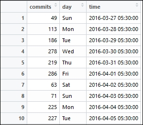
df <- data.frame(commits=daily_commits, day=days, time=time_stamp)This gives us a DataFrame of daily commits where each row consists of the number of commits, the timestamp, and the day of the week corresponding to that timestamp. We can view our curated dataset using the following command:
# view the daily commit history dataset
View(df)
This gives us a peek at the DataFrame which you can see in the following snapshot:
Let's now visualize this data to view the commit frequency distribution per day of the week using the following code:
# visualize commit frequency distribution vs. day of week
ggplot(df, aes(x=day, y=commits, color=day)) +
  geom_boxplot(position='dodge') +
  scale_fill_ipsum() +
  labs(x="Day", y="Total commits",
    title="GitHub commit frequency distribution vs. Day of Week",
    subtitle="Commit history for the linux repository") +
  theme_ipsum_rc(grid="Y")
This gives us the following graph depicting the distributions per day of the week for the linux repository:

GitHub commit frequency distribution versus day of the week for the Linux repository
The distribution graph provides us with some interesting insights. We can clearly observe that the number of commits based on the median measure is highest on Wednesday, signifying more people tend to commit around mid-week and the least amount of commits usually happens around the weekends (Saturday and Sunday).
We visualized how the commit frequency distribution looks like per day of the week. Let's now look at the daily commit frequency for the linux repository. We can reuse the curated DataFrame from the previous section and visualize the commit frequency using the following code snippet:
# visualize daily commit frequency
ggplot(df, aes(x=time, y=commits, color=day)) +
  geom_line(aes(color=day)) +
  geom_point(aes(shape=day)) +
  scale_fill_ipsum() +
  labs(x="Time", y="Total commits",
       title="Daily GitHub commit frequency",
       subtitle="Commit history for the linux repository") +
  theme_ipsum_rc(grid="Y")
This gives us the following plot showing the daily commit frequency over time per day of the week:
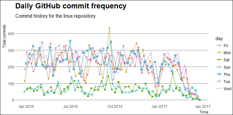
Daily GitHub commit frequency for the linux repository
The graph is basically the weekly commit frequency now broken up into daily commit frequency over time and as expected, we see a lesser number of commits over time in the weekends.
An open source repository usually has multiple collaborators where one of them is the creator of the repository and often he/she is the owner and maintainer of the repository. Other collaborators are contributors to the repository and based on certain processes, conventions, and policies, commits are merged into the repository to add or change code. We will now do a comparative analysis of the weekly commit frequency comparing the number of commits for the owner of the repository versus all other contributors in the repository. To start with, we will retrieve the commit history for the contributors and owner of the linux repository using the following snippet:
# get the commit participation history
base_url <- 'https://api.github.com/repos/torvalds/linux/stats/participation?'
repo_url <- paste0(base_url,api_id_param,arg_sep,api_pwd_param)
response <- fromJSON(repo_url)
response <- as.data.frame(response)
Next, we will be extracting the contributors commit frequency from the total frequency. We will also curate the dataset into a more easy-to-use format in visualizations by using the following snippet:
# get contributor frequency & curate dataset
response$contributors <- response$all - response$owner
response$week <- 1:52
response <- response[,c('week', 'contributors', 'owner')]
# format the dataset
df <- melt(response, id='week')
We are now ready to visualize the comparative weekly commit frequency for the Linux repository and the following code will help us achieve this:
# visualize weekly commit frequency comparison
ggplot(data=df, aes(x=week, y=value, color=variable)) +
  geom_line(aes(color=variable)) +
  geom_point(aes(shape=variable)) +
  scale_fill_ipsum() +
  labs(x="Week", y="Total commits",
       title="Weekly GitHub commit frequency comparison",
       subtitle="Commit history for the linux repository") +
  theme_ipsum_rc(grid="Y")
This gives us the following graph with the comparative weekly commit frequency:

Weekly GitHub commit frequency comparison for the Linux repository
We can clearly see that over the past year, the frequency of commits made by contributors is really high as compared to that of the owner. A question might arise as to why this is the case. Well, as you might know, the Linux repository is owned by Linus Torvalds, the creator and father of the Linux operating system and also the person who created Git! Linus himself had stated in 2012 that after the initial days of intense programming and development of Linux, these days he mostly contributes by merging code written by other contributors with little programming involvement. Torvalds still has written approximately 2% of the total Linux kernel and considering the vast number of contributors, that is still one of the largest percentages of overall contribution to the Linux kernel. I hope you found this little bit of history interesting!
Commits to any repository usually consist of additions and deletions where lines of code are usually added or deleted in various files present in the repository. In this section, we will retrieve and analyze weekly code modification history for the linux repository. The following code snippet enables us the get the code modification historical frequency data from GitHub:
# get the code frequency dataset
base_url <- 'https://api.github.com/repos/torvalds/linux/stats/code_frequency?'
code_freq_url <- paste0(base_url,api_id_param,arg_sep,api_pwd_param)
response <- fromJSON(code_freq_url)
df <- as.data.frame(response)
We will now format this DataFrame into an easy to visualize object and also convert the number of deletions into absolute values with the following code snippet:
# format the dataset
colnames(df) <- c('time', 'additions', 'deletions')
df$deletions <- abs(df$deletions)
df$time <- as.Date(as.POSIXct(df$time, origin="1970-01-01"))
df <- melt(df, id='time')
We are now ready to visualize the total code modifications made to the linux repository over a period of time. The following snippet helps us achieve this:
# visualize the code frequency timeline
ggplot(df, aes(x=time, y=value, color=variable)) +
  geom_line(aes(color = variable)) +
  geom_point(aes(shape = variable)) +
  scale_x_date(date_breaks="12 month", date_labels='%Y') +
  scale_y_log10(breaks = c(10, 100, 1000, 10000,
                           100000, 1000000)) +
  labs(x="Time", y="Total code modifications (log scaled)",
    title="Weekly Github code frequency timeline",
    subtitle="Code frequency history for the linux repository") +
  theme_ipsum_rc(grid="XY")
This gives us the following plot showing the code modification frequency over time:
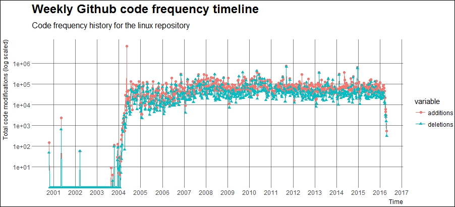
Weekly GitHub code frequency timeline for the linux repository
The plotted graph portrays an interesting picture. The obvious fact is that the total additions to the code are usually more than the total deletions. But we can see that the code additions and deletions start around 2000-01 when GNOME and KNOPPIX, two major Linux distributions, were released. We also notice a steep increase in the code modification frequency around 2004-05, which is around the time Ubuntu, one of the most popular Linux distributions, came into existence! A part of the Linux timeline is depicted in the following figure:

A section of the Linux timeline
You can find more information about the entire history and timeline of the Linux operating system at http://www.linux-netbook.com/linux/timeline/, which contains further detailed information including an interactive version of the preceding snapshot.
This brings us to the end of the repository analytics section, where we saw various statistics and ways of analyzing and visualizing repository activity.
A repository is usually known as a trending repository if it's popular among the software or technical community. There are various ways to look at trending repositories on GitHub. Usually the total stargazer and fork counts are ways of measuring the popularity of repositories. In fact, you can check trending repositories on GitHub from the website itself by going to https://github.com/trending, where GitHub depicts the repositories which are trending in open source.
In this section, we will retrieve trending repositories based on the following conditions:
- We will use the search API
- We will retrieve trending repositories which were created over the last 3 years: 2014-2016
- The definition of trending repositories in our case will be only those repositories which have at least 500 stars or more
You can always change these conditions and experiment with conditions of your own. This is just an example to depict a way to retrieve trending repositories over time. The code used in this section is available in the file named github_trending_repo_retrieval.R, which you can refer to for more details. We will start by creating a function which will take a timeline of dates (a vector of dates) and the authentication tokens and retrieve the trending repositories for us. We also use a progress bar to show the retrieval progress since it takes some time to retrieve all the trending repositories over a span of 3 years:
source('load_packages.R')

get.trending.repositories <- function(timeline.dates, auth.id, auth.pwd){
  # set parameters
  base_url <- 'https://api.github.com/search/repositories?'
  api_id_param <- paste0('client_id=', auth.id)
  api_pwd_param <- paste0('client_secret=', auth.pwd)
  per_page <- 100
  top.repos.df <- data.frame()
  pb <- txtProgressBar(min = 0, max = length(timeline.dates), style = 3)
  # for each pair of dates in the list get all trending repos
  for (i in seq(1,length(timeline.dates), by=2)){
    start_date <- timeline.dates[i]
    end_date <- timeline.dates[i+1]
    query <- paste0('q=created:%22', start_date, '%20..%20',
                    end_date, '%22%20stars:%3E=500')
    url <- paste0(base_url, query, arg_sep, api_id_param,arg_sep,api_pwd_param)
    response <- fromJSON(url)
    total_repos <- min(response$total_count, 1000)
    count <- ceiling(total_repos / per_page)
    # convert data into data frame
    for (p in 1:count){
      page_number <- paste0('page=', p)
      per_page_count <- paste0('per_page=', per_page)
      page_url <- paste0(url, arg_sep, page_number, arg_sep, per_page_count)
      response <- fromJSON(page_url)
      items <- response$items
      items <- items[, c('id', 'name', 'full_name', 'size',
         'fork', 'stargazers_count', 'watchers', 'forks',
         'open_issues', 'language', 'has_issues', 'has_downloads',
         'has_wiki', 'has_pages', 'created_at', 'updated_at',
         'pushed_at', 'url', 'description')]
      top.repos.df <- rbind(top.repos.df, items)
    }
    setTxtProgressBar(pb, i+1)
  }
  return (top.repos.df)
}
You can clearly see that we do not store all the parameters for each repository but only a handful which will be used for us in our future analyzes as depicted in the items DataFrame in the preceding snippet. The top.repos.df DataFrame keeps getting updated with trending repositories and contains all the trending repositories based on the timeline we give as input.
The following snippet will now help us retrieve trending repositories from 2014 to 2016 based on the rules which we talked about earlier:
# set timeline
dates <- c('2014-01-01', '2014-03-31',
           '2014-04-01', '2014-06-30',
           '2014-07-01', '2014-09-30',
           '2014-10-01', '2014-12-31',
           '2015-01-01', '2015-03-31',
           '2015-04-01', '2015-06-30',
           '2015-07-01', '2015-09-30',
           '2015-10-01', '2015-12-31',
           '2016-01-01', '2016-03-31',
           '2016-04-01', '2016-06-30',
           '2016-07-01', '2016-09-30',
           '2016-10-01', '2016-12-31')
> trending_repos <- get.trending.repositories(timeline.dates=dates,
+                         auth.id=auth.id,
+                         auth.pwd=auth.pwd)
  |=======================================================| 100%
We can now check if the retrieval worked using the following snippets:
# check total trending repos retrieved
> nrow(trending_repos)
[1] 9912

# take a peek at the data
> View(trending_repos)
This allows us to take a peek at our newly created dataset, which is depicted in the following snapshot:

The preceding DataFrame just shows a fraction of all the columns which we had retrieved and you can check out other rows or columns by scrolling in the desired direction in the generated output. Now, we will store this dataset so we can load it up directly when we want to analyze it in the future instead of spending time again to retrieve all the necessary data points:
# save the dataset
save(trending_repos, file='trending_repos.RData')
This brings us to the end of this section on looking at a methodology to retrieve trending repositories from GitHub. In the next few sections, we will look at various ways to analyze this data. We will be focusing on analyzing trends in the following three major areas:
- Repository trends
- Language trends
- User trends