
Continuing our analysis of Facebook pages, let us now focus our analysis on brand page engagements. Each page on Facebook belonging to a commercial entity is basically a prestigious brand and keeping proper engagement with its followers on Facebook is very important. In this section, we will pick up three prestigious top tier football clubs from the Premier League and analyze their brand page engagements, trending posts and influential users using various analyzes and visualizations by retrieving data from their Facebook pages. We will also be using a multiplot(…) function for depicting multiple ggplot2 plots together. The code is present in the multiple_plots.R code file which you can load along with the other dependencies as shown here:
library(Rfacebook)
library(ggplot2)
library(scales)
library(dplyr)
library(magrittr)
source('multiple_plots.R')
The code used for analysis in this section is available under the file named fb_page_data_analysis.R in the code files for this chapter, in case you want to open it and follow along. Now, let's look at how we can retrieve page data from Facebook.
You can use the Rfacebook package to get data from any Facebook page using the getPage(…) function. The following snippet gets data for three popular football clubs from the English Premier League. Besides being popular, there is also serious rivalry and competition between them, which is one of the reasons for choosing them. I have retrieved posts starting from 1st January, 2014 till 17th January, 2017. Some of the posts from a couple of the pages in the 2015-16 time period were not retrieved because of a Facebook post privacy issue rather than a library issue. However, we will analyze whatever data we were able to retrieve for the time period:
# get facebook token
token = 'XXXXXXXXX'

# get page stats
man_united <- getPage(page='manchesterunited', n=100000,
                      token=token,since='2014/01/01',
                      until='2017/01/17')
man_city <- getPage(page='mancity', n=100000,
                      token=token,since='2014/01/01',
                      until='2017/01/17')
arsenal <- getPage(page='Arsenal', n=100000,
                    token=token,since='2014/01/01',
                    until='2017/01/17')

# save data for later use
save(man_united, file='man_united.RData')
save(man_city, file='man_city.RData')
save(arsenal, file='arsenal.RData')
I have saved the page posts in the previously mentioned files for your ease and they are included with the code files for this chapter. You can use the following snippet to load the data directly into R:
# load data for analysis
load('man_united.RData')
load('man_city.RData')
load('arsenal.RData')Now that we have the data loaded in R, we will curate the data by following some steps to filter specific columns in the data, and we'll also format the post creating a timestamp and adding new fields as needed. The steps are shown in the following snippet:
# combine data frames
colnames <- c('from_name', 'created_time', 'type',
              'likes_count', 'comments_count', 'shares_count',
              'id', 'message', 'link')
page_data <- rbind(man_united[colnames], man_city[colnames], arsenal[colnames])
names(page_data)[1] <- "Page"
# format post creation time
page_data$created_time <- as.POSIXct(page_data$created_time,
format = "%Y-%m-%dT%H:%M:%S+0000",
tz = "GMT")
# add new time based columns
page_data$month <- format(page_data$created_time, "%Y-%m")
page_data$year <- format(page_data$created_time, "%Y")
You can now view the total number of combined posts from all three Facebook pages using the following command:
# total records
> nrow(page_data)
[1] 12537
Let's deep dive into analyzing this data in the next sections!
We can visualize the total number of posts made by each of the football clubs' Facebook pages by using the following code snippet and by leveraging ggplot2:
# post counts per page
post_page_counts <- aggregate(page_data$Page, by=list(page_data$Page), length)
colnames(post_page_counts) <- c('Page', 'Count')
ggplot(post_page_counts, aes(x=Page, y=Count, fill=Page)) +
  geom_bar(position = "dodge", stat="identity") +
  geom_text(aes(label=Count),  vjust=-0.3, position=position_dodge(.9), size=4) +
  scale_fill_brewer(palette="Set1")  +
  theme_bw()
This gives us the following plot depicting post counts per football club:
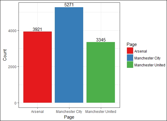
Post counts per page
Manchester City is the page with the highest number of posts compared to the other two. Surprisingly Manchester United has fewer posts, even though it has more fans and people talking about it on Facebook. There could be two reasons for this, either Manchester United posts less frequently than the other two pages, or we were unable to retrieve some of the posts for this page due to the post privacy issue mentioned earlier.
We can visualize the post counts per page by post types or categories. To do this, we use the following code snippet:
# post counts by post type per page
post_type_counts <- aggregate(page_data$type, by=list(page_data$Page, page_data$type), length)
colnames(post_type_counts) <- c('Page', 'Type', 'Count')
ggplot(post_type_counts, aes(x=Page, y=Count, fill=Type)) +
  geom_bar(position = "dodge", stat="identity") +
  geom_text(aes(label=Type),  vjust=-0.5, position=position_dodge(.9), size=3) +
  scale_fill_brewer(palette="Set1")  +
  theme_bw()
This gives us the following plot showing posts grouped by post type for each brand page:

Post counts by post type per page
We can see that photos and videos are the media which are used the most by each page, to engage with their fans.
Let's visualize some user engagement with the brand pages now. To start with, we can compute the mean likes per post in each page by post type and then visualize it. Basically, the higher average likes per post means more fans are engaging actively with the page. Grouping them by post type would enable us to get insights as to which types of media are getting the most likes from the football club fans. The following snippet helps us achieve this:
# average likes per page by post type
likes_by_post_type <- aggregate(page_data$likes_count,
                                by=list(page_data$Page, page_data$type), mean)
colnames(likes_by_post_type) <- c('Page', 'Type', 'AvgLikes')
ggplot(likes_by_post_type, aes(x=Page, y=AvgLikes, fill=Type)) +
  geom_bar(position = "dodge", stat="identity") +
  geom_text(aes(label=Type),  vjust=-0.5, position=position_dodge(.9), size=3) +
  scale_fill_brewer(palette="Set1")  +
  theme_bw()
This gives us the following plot showing mean user likes grouped by post type per page:
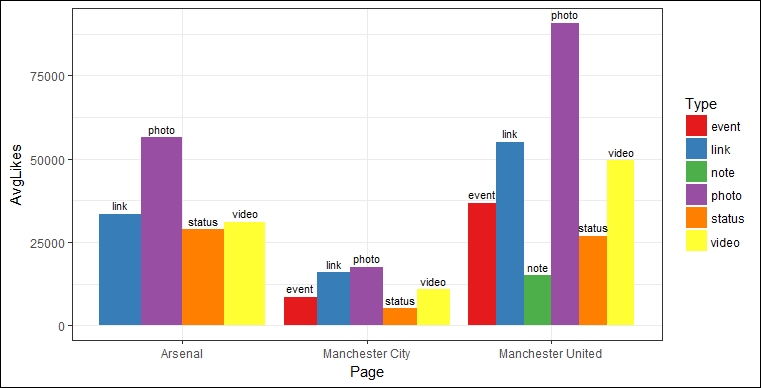
Average user likes by post type per page
Interesting, right? We can now see how Manchester United's strong fan base has an impact here. It has a massive count with regards to mean likes for each post type compared to the other football clubs. This clearly indicates that more club fans and page followers lead to more user engagement with the club's page posts based on post likes. Besides this, we also see that photos are the most liked media. Glory Glory Manchester United indeed!
Let's now visualize user engagement with the brand pages based on mean shares grouped by post type and compare it across all the football club brand pages. The following snippet helps us achieve this:
# average shares per page by post type
shares_by_post_type <- aggregate(page_data$shares_count,
                                by=list(page_data$Page, page_data$type), mean)
colnames(shares_by_post_type) <- c('Page', 'Type', 'AvgShares')
ggplot(shares_by_post_type, aes(x=Page, y=AvgShares, fill=Type)) +
  geom_bar(position = "dodge", stat="identity") +
  geom_text(aes(label=Type),  vjust=-0.5, position=position_dodge(.9), size=3) +
  scale_fill_brewer(palette="Set1")  +
  theme_bw()
This gives us the following visualization showing average post share counts per page grouped by post type:
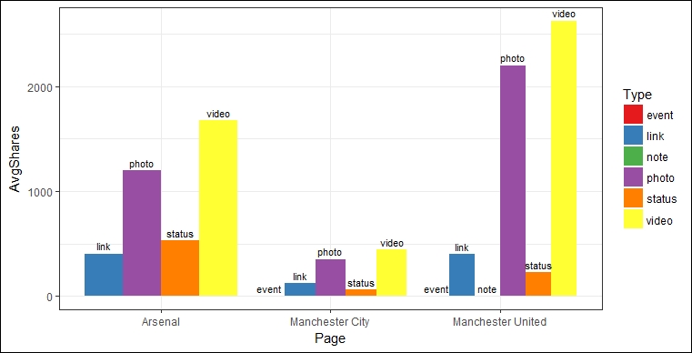
Average user shares by post type per page
No surprises here for Manchester United's landslide victory over the other two clubs in terms of user engagement based on post shares. However, do you notice an interesting pattern here across all three clubs compared to the previous plot? Videos are clearly shared more than photos. This provides an interesting aspect of user behavior. It's highly likely that fans want their friends and other fans to see short videos posted by the clubs about their training sessions, match highlights, and daily news related to the club, and hence the high counts in video shares.
Let's now visualize each brand page's engagement over time, based on their posts. We can do this by aggregating post counts per page over time and then visualizing it with the help of the following snippet:
# page engagement over time
page_posts_df <- aggregate(page_data[['type']], by=list(page_data$month, page_data$Page), length)
colnames(page_posts_df) <- c('Month', 'Page', 'Count')
page_posts_df$Month <- as.Date(paste0(page_posts_df$Month, "-15"))
ggplot(page_posts_df, aes(x=Month, y=Count, group=Page)) +
  geom_point(aes(shape=Page)) +
  geom_line(aes(color=Page)) +
  theme_bw() + scale_x_date(date_breaks="3 month", date_labels='%m-%Y') +
  ggtitle("Page Engagement over time")
This gives us the following plot depicting the total posts per page over a period:
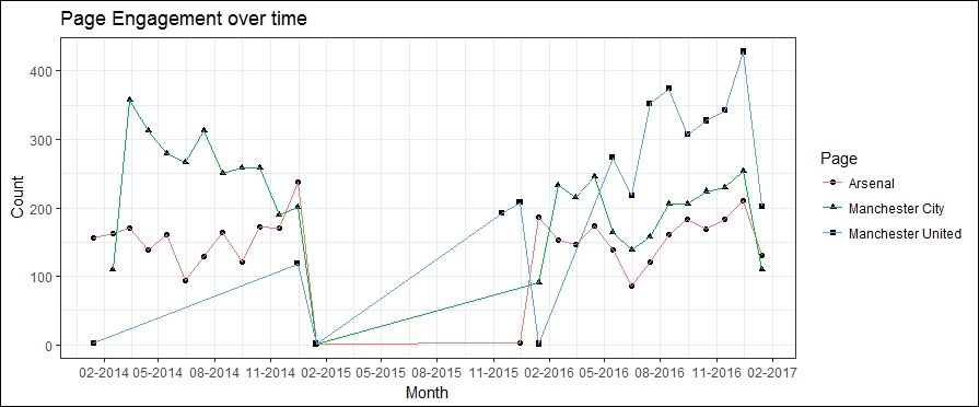
Page engagements over time with their users
The drop in posts in 2015 could be due to the page privacy issue mentioned earlier regarding inaccessible posts. Ignoring that, we can see that Manchester City and Arsenal have a higher post count in 2014, but that Manchester United slowly picks up the pace and beats them from May 2016 onwards.
Let's now visualize user engagement with each brand page over time based on likes, shares, and comments on various page posts. The steps are shown in the following snippet:
## user engagement with page over time
# create metric aggregation function
aggregate.metric <- function(metric, data) {
  m <- aggregate(data[[paste0(metric, "_count")]], list(month = data$month),
                 mean)
  m$month <- as.Date(paste0(m$month, "-15"))
  m$metric <- metric
  return(m)
}

# get aggregated stats per page
mu_df <- subset(page_data, Page=="Manchester United")
mu_stats_df.list <- lapply(c("likes", "comments", "shares"), aggregate.metric, data=mu_df)
mu_stats_df <- do.call(rbind, mu_stats_df.list)
mu_stats_df <- mu_stats_df[order(mu_stats_df$month), ]

afc_df <- subset(page_data, Page=="Arsenal")
afc_stats_df.list <- lapply(c("likes", "comments", "shares"), aggregate.metric, data=afc_df)
afc_stats_df <- do.call(rbind, afc_stats_df.list)
afc_stats_df <- afc_stats_df[order(afc_stats_df$month), ]

mc_df <- subset(page_data, Page=="Manchester City")
mc_stats_df.list <- lapply(c("likes", "comments", "shares"), aggregate.metric, data=mc_df)
mc_stats_df <- do.call(rbind, mc_stats_df.list)
mc_stats_df <- mc_stats_df[order(mc_stats_df$month), ]

# build visualizations on aggregated stats per page
p1 <- ggplot(mu_stats_df, aes(x=month, y=x, group=metric)) +
  geom_point(aes(shape = metric)) +
  geom_line(aes(color = metric)) +
  theme_bw() + scale_x_date(date_breaks="3 month", date_labels='%m-%Y') +
  scale_y_log10("Avg stats/post", breaks = c(10, 100, 1000, 10000, 50000)) +
  ggtitle("Manchester United")

p2 <- ggplot(afc_stats_df, aes(x=month, y=x, group=metric)) +
  geom_point(aes(shape = metric)) +
  geom_line(aes(color = metric)) +
  theme_bw() + scale_x_date(date_breaks="3 month", date_labels='%m-%Y') +
  scale_y_log10("Avg stats/post", breaks = c(10, 100, 1000, 10000, 50000)) +
  ggtitle("Arsenal")

p3 <- ggplot(mc_stats_df, aes(x=month, y=x, group=metric)) +
  geom_point(aes(shape = metric)) +
  geom_line(aes(color = metric)) +
  theme_bw() + scale_x_date(date_breaks="3 month", date_labels='%m-%Y') +
  scale_y_log10("Avg stats/post", breaks = c(10, 100, 1000, 10000, 50000)) +
  ggtitle("Manchester City")

# view the plots together
multiplot(p1, p2, p3)
This gives us a nice multi-plot comparing three visualizations for user engagement across time for each of the three brand pages:

User engagements with pages over time
We can see that Manchester United and Arsenal have a higher user engagement over time compared to Manchester City.
Let's now see if we can get the top stories per year for each page based on user likes, in order to find out which were the most trending or viral posts annually. The following snippet helps us achieve this:
# trending posts by likes per page
trending_posts_likes <- page_data %>%
                        group_by(Page, year) %>%
                        filter(likes_count == max(likes_count))
trending_posts_likes <- as.data.frame(trending_posts_likes)
View(trending_posts_likes[,c('Page', 'year', 'month', 'type',
'likes_count', 'comments_count',
'shares_count','message', 'link')])
This gives us the following table showing the most trending posts per page based on likes:
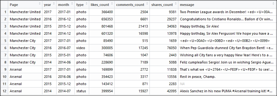
Top trending page posts by year and user like counts
You can see that Manchester United's beloved manager and legend Sir Alex Ferguson gets the highest likes on his birthday posts. Manchester City gets the highest likes on the birthday post for its star striker, Sergio Aguero. Their new coach, Pep Guardiola, also receives quite a lot of attention. Arsenal's cover photo was most liked in 2015, and their star player, Alexis Sanchez, is popular with their fans based on the likes he gained when he joined the club.
Let's now see if the top trending stories per year for each page based on user shares are any different compared to those based on likes. The following snippet gives us the top annual trending posts per page based on user shares:
# trending posts by shares per page
trending_posts_shares <- page_data %>%
                         group_by(Page, year) %>%
                         filter(shares_count == max(shares_count))
trending_posts_shares <- as.data.frame(trending_posts_shares)
View(trending_posts_shares[,c('Page', 'year', 'month', 'type',
'likes_count', 'comments_count',
'shares_count','message', 'link')])
The following table depicts the top trending annual posts per page based on shares:

Top trending page posts by year and user share counts
Do you notice any difference in the posts this time compared to the trending posts based on likes? Interestingly New Year greeting posts get a lot of shares across all three clubs. So do United and City coaches. Do you notice any other interesting patterns? Everton 4 – 0 City was a surprise result in 2017 for Manchester City and it is one of the most shared posts!
Let's take a couple of trending posts and try to see who the most influential users from their post comments are. We can do this by simply taking the total number of likes on their comment by other users. We will extract comments for one United and one Arsenal post using the following snippet:
# extract post comment data
mu_top_post_2015 <- getPost(post='7724542745_10153390997792746',
token=token, n=5000, comments=TRUE)
afc_top_post_2014 <- getPost(post='20669912712_10152350372162713',
token=token, n=5000, comments=TRUE)

# save the data for future analysis
save(mu_top_post_2015, file='mu_top_post_2015.RData')
save(afc_top_post_2014, file='afc_top_post_2014.RData')
The data is saved and available for analyzes along with the code files of this chapter, so you can choose to skip the preceding steps and directly load the data to start analyzing it using the following snippet:
# load top post comments
load('mu_top_post_2015.RData')
load('afc_top_post_2014.RData')

# get top influential users for United post
> mu_top_post_2015$post[, c('from_name', 'message')]
          from_name                   message
1 Manchester United Happy birthday, Sir Alex!
mu_post_comments <- mu_top_post_2015$comments
View(mu_post_comments[order(mu_post_comments$likes_count,
                       decreasing=TRUE),][1:10,
c('from_name', 'likes_count', 'message')])
This gives us the following table depicting top influential users based on total likes on their comments:

Top influential users based on comment like counts for Manchester United's trending post
Let's now look at the top influential users for the Arsenal post using the following snippet:
# get top influential users for Arsenal post
> afc_top_post_2014$post[, c('from_name', 'message')]
  from_name                                                                message
Arsenal Alexis Sanchez in his new PUMA #Arsenal training kit!

#SanchezSigns

afc_post_comments <- afc_top_post_2014$comments
View(afc_post_comments[order(afc_post_comments$likes_count,
                             decreasing=TRUE),][1:10,
c('from_name', 'likes_count', 'message')])
This gives us the following table showing the top influential users based on likes received on their comments:

Top influential users based on comment like counts for Arsenal's trending post
All the comments are about praising Alexis Sanchez on signing for the Gunners (Arsenal). This is just scratching the surface of what can be done with this data. Try and see if you can come up with more interesting patterns and insights.