
In the previous section, we analyzed a small personal social network and got a good grasp of the basic concepts of social networks. In this section, we will analyze a much larger social network of Facebook brand pages which are directly or indirectly associated with English football. We will be associating ourselves with the English Premier League (EPL) which is the top tier of football competition in the English football league system.
The following figure depicts the official logo of the English Premier League for the season of 2016-17:

The English Premier League brand logo
We shall be extracting a huge network of Facebook pages related to the EPL and then analyzing it in detail to understand social networks better. Without further ado, let's get started! You can refer to the file fb_pages_network_analysis.R for code snippets used in the examples depicted in this section, Getting the data.
I have used the Netvizz application to extract the page network from Facebook. The root page is Premier League available at https://www.facebook.com/premierleague/ . It has a node identifier of 220832481274508. You can go to the Netvizz Page Like Network Module and extract the data as shown in the following snapshot:

Netvizz's Page Like Network extraction interface
Once you extract the page like network data, it is available as a .gdf graph file, which I've reformatted and cleaned up a little bit, including changing the node identifier numbers because R has problems dealing with large number identifiers. Finally I opened this file using Gephi, a popular Graph visualization platform available at https://gephi.org/ and saved it as a .gml file named pl.gml. This is available along with the code files of this chapter. We will be using this file for our analysis in this section.
To start our analysis, we will first load the necessary dependencies and our Facebook pages social network using the following snippet:
# load dependencies
library(Rfacebook)
library(gridExtra)
library(igraph)
library(ggplot2)

# read in the graph
pl_graph <- read.graph(file="pl.gml", format="gml")
We will look at some basic descriptive statistics pertaining to our social network in this section starting with the total nodes and edges in our network:
# inspect the page graph object
> summary(pl_graph)
IGRAPH D--- 582 2810 --
+ attr: id (v/n), label (v/c), graphics (v/c), fan_count (v/c),    | category (v/c), username(v/c), users_can_post (v/c),
| link (v/c), post_activity (v/c), talking_about_count (v/c),
| Yala (v/c), id (e/n), value (e/n)
We can see that our social network in this case has a massive 582 node pages and 2810 edge connections. Quite a step-up from the last graph! The following snippet creates a DataFrame of some basic statistics of the Facebook pages from some metadata which was extracted when getting the page network data:
pl_df <- data.frame(id=V(pl_graph)$id,
                    name=V(pl_graph)$label,
                    category=V(pl_graph)$category,
                    fans=as.numeric(V(pl_graph)$fan_count),
       talking_about=as.numeric(V(pl_graph)$talking_about_count),
       post_activity=as.numeric(V(pl_graph)$post_activity),
                    stringsAsFactors=FALSE)
> View(pl_df)
The following table depicts a part of the DataFrame we built for the different pages in the network:

Let's now look at various statistics of the network:
# aggregate pages based on their category
if (dev.cur()!=1){dev.off()}
grid.table(as.data.frame(sort(table(pl_df$category),
           decreasing=TRUE)[1:10]), rows=NULL,
           cols=c('Category', 'Count'))

# top pages based on their fan count (likes)
if (dev.cur()!=1){dev.off()}
grid.table(pl_df[order(pl_df$fans, decreasing=TRUE),
                 c('name', 'category', 'fans')][1:10,],
           rows=NULL)

# top pages based on total people talking about them
if (dev.cur()!=1){dev.off()}
grid.table(pl_df[order(pl_df$talking_about, decreasing=TRUE),
                 c('name', 'category', 'talking_about')][1:10,],
           rows=NULL)

# top pages based on page posting activity
if (dev.cur()!=1){dev.off()}
grid.table(pl_df[order(pl_df$post_activity, decreasing=TRUE),
                 c('name', 'category', 'post_activity')][1:10,],
           rows=NULL)
This gives us the following four tables showing top page categories, pages based on fans (likes), talking about and posting activity respectively:

Do you notice any correlation between page fans and fanspeople talking about the pages? The following snippet helps us visualize this:
# check correlation between fans and talking about for pages
clean_pl_df <- pl_df[complete.cases(pl_df),]
rsq <- format(cor(clean_pl_df$fans, clean_pl_df$talking_about) ^2,
              digits=3)
corr_plot <- ggplot(pl_df, aes(x=fans, y=talking_about))+ theme_bw() +
  geom_jitter(alpha=1/2) +
  scale_x_log10() +
  scale_y_log10() +
  labs(x="Fans", y="Talking About") +
  annotate("text", label=paste("R-sq =", rsq), x=+Inf, y=1,
           hjust=1)
corr_plot
This gives us the following scatter plot where R-square is the square of the correlation coefficient:

Visualizing correlation between page fans and people talking about the page
The plot shows a strong correlation between page fans and people talking about the page depicted by the data points on the plot as well as the R-square value.
We will now visualize the network in a similar way to what we did for our friend network. However, in this case, we are dealing with over 580 page nodes and visualizing them all on a small plot area would mess up the plot and not convey much useful information. Therefore, we will apply a degree filter to the plot and plot only important nodes having a degree of at least 30:
# plot page network using degree filter
degrees <- degree(pl_graph, mode="total")
degrees_df <- data.frame(ID=V(pl_graph)$id,
                          Name=V(pl_graph)$label,
                          Degree=as.vector(degrees))
ids_to_remove <- degrees_df[degrees_df$Degree < 30, c('ID')]
ids_to_remove <- ids_to_remove / 10

# get filtered graph
filtered_pl_graph <- delete.vertices(pl_graph, ids_to_remove)

# plot the graph
tkplot(filtered_pl_graph,
       vertex.size = 10,
       vertex.color="orange",
       vertex.frame.color= "white",
       vertex.label.color = "black",
       vertex.label.family = "sans",
       edge.width=0.2,
       edge.arrow.size=0,
       edge.color="grey",
       edge.curved=TRUE,
       layout = layout.fruchterman.reingold)
This gives us the following page network connected by mutual likes as depicted in the following figure:
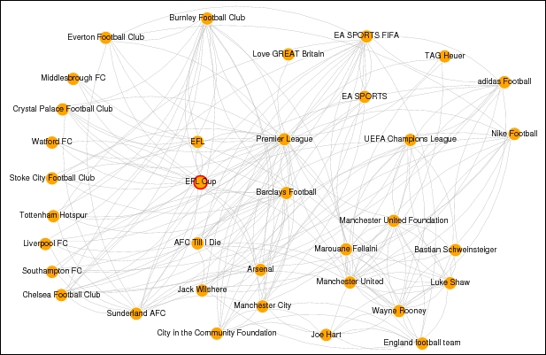
Visualizing the Premier League football social network
You can see the Premier League page at the center of the network and connected by various other competitions like the Champions League, Europa League and different football clubs as well as players and sponsors. Use this plot as a reference whenever we are analyzing the network in detail in the subsequent sections, especially with regard to influential pages, communities and so on.
In this section, we will try to analyze the network as a whole and extract useful insights with regard to the network. These include various properties and attributes like diameter, density, coreness and so on. The basic idea here is to get an in-depth idea about the structure of our network and its various elements.
The diameter of a network is basically the length of the longest geodesic or path between two nodes in the network based on the number of edges between them. In our case, we are dealing with a directed graph, so remember that when trying to find out the diameter using the following snippet:
# diameter (length of longest path) of the network
> diameter(pl_graph, directed=TRUE)
[1] 7

# get the longest path of the network
> get_diameter(pl_graph, directed=TRUE)$label
[1] "Sports Arena Hull" "Hull Tigers" "Teenage Cancer Trust"
[4] "Celtic FC" "Dafabet UK" "Premier League" "Carling"
[8] "Alice Gold"
We can see that the diameter of our network is 7 and the longest path is also depicted in the preceding network.
Considering we have each page as a node or vertex in our social network graph, we can compute distances between nodes as well as find out what the average distance is between two nodes in the network. The following snippets help us achieve this:
# mean distance between two nodes in the network
> mean_distance(pl_graph, directed=TRUE)
[1] 3.696029

# distance between various important pages(nodes)
node_dists <- distances(pl_graph, weights=NA)
labels <- c("Premier League", pl_df[c(21, 22, 23, 24, 25), 'name'])
filtered_dists <- node_dists[c(1,21,22,23,24,25), c(1,21,22,23,24,25)]
colnames(filtered_dists) <- labels
rownames(filtered_dists) <- labels
if (dev.cur()!=1){dev.off()}
grid.table(filtered_dists)
In the preceding code snippet we basically try to find out the distance between some important nodes in the network (top football clubs) from the root page Premier League and we get the following table showing the required page distances:
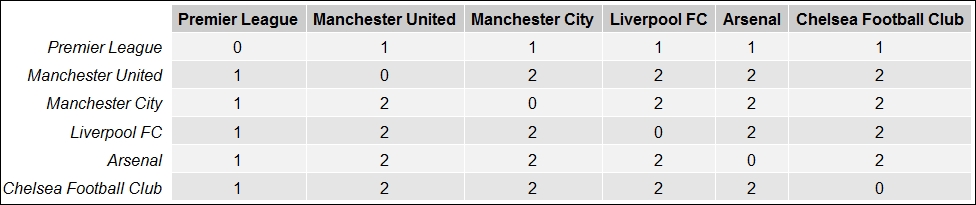
Distances between several Facebook pages related to Premier League football
The density of the graph is the ratio of the number of actual edges in the graph to the total number of possible edges in the graph. Mathematically, it can be denoted as:

Here ND(G) denotes the network density of the graph G(V,E) with vertices V and edges E such that |E| denotes the total number of edges in the graph and |V| denotes the total number of vertices or nodes in the network. The following snippet shows us how to get the density of the network and also verifies it with the preceding mathematical equation:
# edge density of the graph
> edge_density(pl_graph)
[1] 0.008310118

# Verify edge density of the graph
> 2801 / (582*581)
[1] 0.008283502
We get the density of our network, and it's pretty close to our manual computation using the formula depicted previously.
The transitivity of the network is also defined as the clustering coefficient and gives a measure of the probability that the adjacent nodes of a network are connected. For instance, if page A is connected to B and B to C, what is the probability of A being connected to C. The following snippet computes the transitivity of our network:
# transitivity - clustering coefficient
> transitivity(pl_graph)
[1] 0.163949
The coreness is a useful measure to understand which pages are present at the heart or core of the network and which pages are at the edge or periphery of the network. This can be computed using K-core decomposition which has two major principles:
- The k-core of a graph is the maximal subgraph in which each node has at least a degree of k
- The coreness measure of any page is k if it belongs to a k-core subgraph but not a (k+1)-core subgraph
The following snippet helps us compute the coreness of our network:
# compute coreness
page_names <- V(pl_graph)$label
page_coreness <- coreness(pl_graph)
page_coreness_df = data.frame(Page=page_names,
                              PageCoreness=page_coreness)

# max coreness
> max(page_coreness_df$PageCoreness)
[1] 11
To view important pages at the core of the network and unimportant pages at the periphery of the network, use the following snippet:
# view the core of the network
View(head(page_coreness_df[
  page_coreness_df$PageCoreness == max(page_coreness_df$PageCoreness),], 20))

# View the periphery of the network
View(head(page_coreness_df[
  page_coreness_df$PageCoreness == min(page_coreness_df$PageCoreness),], 20))
This gives us the following two tables showing the core and periphery pages in the network:

Facebook pages which are at the core and periphery of the Premier League network
You can see from these tables that all the football clubs in the Premier League have the highest coreness along with the Premier League page itself, which is expected; in addition, various pages have some relationship with the Premier League, like same country, sponsors, regions, cities, and popular people. These pages are part of the peripheral pages since they have the fewest connections when compared to other more influential nodes in this football social network.
Just like we analyzed various node properties in the previous social network, we will do the same here using various measures of centrality including several new ones to find out influential and important pages. Let's get started!
The degree of a node is defined as the number of edges adjacent to the node, which is the sum of the indegree and outdegree, as we've discussed earlier. Therefore, the greater the degree of a page node, the greater influence it will have on the network and vice-versa. So, important and influential pages will be the first to hear or spread information quickly compared to other pages. The following snippet computes the degree of pages in our network. We will show the output together after computing betweenness and closeness:
# compute degree
degree_plg <- degree(pl_graph, mode="total")
degree_plg_df <- data.frame(Name=V(pl_graph)$label,
                            Degree=as.vector(degree_plg))
degree_plg_df <- degree_plg_df[order(degree_plg_df$Degree, decreasing=TRUE),]
Now we will compute the closeness of various pages in the network.
The term closeness is defined as how long it might take for information to arrive at various page nodes in the network. Theoretically, it can be defined as the distance (shortest) from the node under analysis to all other nodes in the network. So, the larger the distance sum, the less central is the node. However ,we compute the normalized closeness score by taking the reciprocal of this distance and multiplying it by the total number of nodes –1 in the network. Mathematically this can be denoted as:

Here, Cl(x) denotes closeness for the node x; sdist(i,x) is the shortest distance between nodes i and x; and |V| is the total number of nodes in the network. The higher the score in this case, the more central and influential is the page node. The following snippet computes closeness of the pages in our network:
# compute closeness
closeness_plg <- closeness(pl_graph, mode="all", normalized=TRUE)
closeness_plg_df <- data.frame(Name=V(pl_graph)$label,
                               Closeness=as.vector(closeness_plg))
closeness_plg_df <- closeness_plg_df[order(closeness_plg_df$Closeness,
                                           decreasing=TRUE),]
Next, we will compute betweenness of the pages in the network and then we will finally compare the scores and correlate them.
The term betweenness is basically defined as the number of geodesic or shortest paths passing through a page node thus indicating the number of times a node needs to go through a given node to reach any other node in the network using the shortest path. Mathematically, this can be denoted by:

Here, Bw(x) indicates betweenness for the node x, such that nsdist(i,j)_x denotes the total number of shortest path connecting i and j that pass through x; and nsdist(i,j) denotes the total number of shortest path connecting i and j in the whole network. The following snippet helps us compute betweenness for the page nodes in the network:
# Betweenness
betweenness_plg <- betweenness(pl_graph)
betweenness_plg_df <- data.frame(Name=V(pl_graph)$label,
Betweenness=as.vector(betweenness_plg))
betweenness_plg_df <- betweenness_plg_df[order(betweenness_plg_df$Betweenness,
                                               decreasing=TRUE),]
Now we can view the top ten influential pages based on degree, betweenness and closeness using the following snippet:
# view top pages based on above measures
View(head(degree_plg_df, 10))
View(head(closeness_plg_df, 10))
View(head(betweenness_plg_df, 10))
The following three tables are consolidated into a single figure where we can look across the top influential pages on the basis of degree, betweenness and closeness respectively:
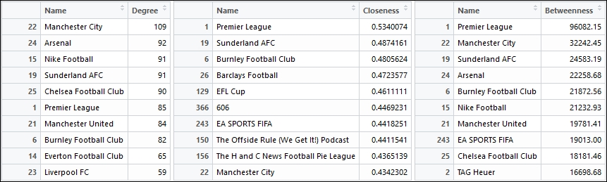
Top influential pages with the highest degree, closeness and between
Do you see any common pages in all the three tables in the previous figure? Do you think there might be some correlation between these measures? Think about these questions for a while and try to see if you can find some answers.
While analyzing our previous social network, we did mention an exercise for you about thinking of ways in which we could visualize and measure the correlation among our various measures of centrality. In this section, we will try to visualize and compute the correlation between the centrality measures that we computed for our network in the previous section.
plg_df <- data.frame(degree_plg, closeness_plg, betweenness_plg)

# degree vs closeness
rsq <- format(cor(degree_plg, closeness_plg) ^2, digits=3)
corr_plot <- ggplot(plg_df, aes(x=degree_plg, y=closeness_plg))+ theme_bw() +
  geom_jitter(alpha=1/2) +
  scale_y_log10() +
  labs(x="Degree", y="Closeness") +
  annotate("text", label=paste("R-sq =", rsq), x=+Inf, y=1, hjust=1)
corr_plot
This gives us the following figure with the R-square value, which is the squared value of the correlation coefficient between degree and closeness for our network:
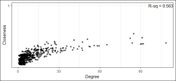
Visualizing correlation between degree and closeness
From the preceding figure, we can see that there is a strong correlation between degree and closeness and the correlation coefficient is the square root of the R-square value which gives us 0.75 indicating a strong correlation. Let's now look at the correlation between degree and betweenness:
# degree vs betweenness
rsq <- format(cor(degree_plg, betweenness_plg) ^2, digits=3)
corr_plot <- ggplot(plg_df, aes(x=degree_plg, y=betweenness_plg))+ theme_bw() +
  geom_jitter(alpha=1/2) +
  scale_y_log10() +
  labs(x="Degree", y="Betweenness") +
  annotate("text", label=paste("R-sq =", rsq), x=+Inf, y=1, hjust=1)
corr_plot
This gives us the following plot of degree versus betweenness and depicts the R-squared value:

Visualizing correlation between degree and betweenness
The preceding figure shows us that there is a strong correlation between degree and betweenness, and that the correlation coefficient has a value of 0.72 approximately.
The eigenvector centrality scores usually correspond to the values of the first eigenvector of the graph adjacency matrix in the network. These scores are computed by a reciprocal process, such that the centrality of each page node is directly proportional to the sum of the centralities of those nodes to which it is connected. So, pages with high eigenvector centralities are connected to many other page nodes, which, in turn, are connected to many others, and the process goes on. In simple terms, eigenvector centrality can be defined as is a measure of being well-connected to the other well-connected nodes. The following snippet computes the eigenvector centrality for pages in our network:
# Eigenvector Centrality
evcentrality_plg <- eigen_centrality(pl_graph)$vector
evcentrality_plg_df <- data.frame(Name=V(pl_graph)$label,
                               EVcentrality=as.vector(evcentrality_plg))
evcentrality_plg_df <- evcentrality_plg_df[order(evcentrality_plg_df$EVcentrality,
                                           decreasing=TRUE),]
View(head(evcentrality_plg_df, 10))
This gives us the following table showing top ten influential pages on the basis of eigenvector centrality:

Top influential pages with highest eigenvector centrality
Interestingly, if you look at this table, all these pages have a high value of the degree measure. Do you think there is a strong correlation between eigenvector centrality and degree? Try finding out!
The PageRank measure gives an approximate probability value of a message arriving on a particular page node. This is computed using the Google PageRank algorithm invented by Google founders, Sergey Brin and Lawrence Page. Mathematically this is defined as:

In the preceding formula,  are the various page nodes in the network, N is the total number of pages in the network, d is the damping factor usually set to 0.85,
  is the set of pages having links to
 ![]() and
and ![]() is the total number of outgoing links on page
is the total number of outgoing links on page ![]() . For more details, you can refer to the original paper on PageRank at http://infolab.stanford.edu/~backrub/google.html. The following snippet computes the
. For more details, you can refer to the original paper on PageRank at http://infolab.stanford.edu/~backrub/google.html. The following snippet computes the PageRank score for various page nodes in our network:
# Pagerank
pagerank_plg <- page_rank(pl_graph)$vector
pagerank_plg_df <- data.frame(Name=V(pl_graph)$label,
                                  PageRank=as.vector(pagerank_plg))
pagerank_plg_df <- pagerank_plg_df[order(pagerank_plg_df$PageRank,
                                                 decreasing=TRUE),]
View(head(pagerank_plg_df, 10))
The following table depicts the top ten important pages on the basis of their PageRank score:

Top influential pages with highest PageRank score
It looks like Adidas and Nike are quite influential pages in this case along with some top level football clubs in the Premier League!
The Hyperlink-Induced Topic Search (HITS) authority score developed by Jon Kleinberg is another algorithm which is used to rank web pages like PageRank. The authority scores of the page nodes can be computed as the principal eigenvector of t(M) X M, where M is the adjacency matrix of the network. The following snippet computes the authority score of the pages in the network using the HITS algorithm:
# Kleinberg's HITS Score
hits_plg <- authority_score(pl_graph)$vector
hits_plg_df <- data.frame(Name=V(pl_graph)$label,
                          AuthScore=as.vector(hits_plg))
hits_plg_df <- hits_plg_df[order(hits_plg_df$AuthScore,
decreasing=TRUE),]
View(head(hits_plg_df, 10))
The following table depicts the top ten influential pages based on the HITS authority score.

Top influential pages with highest HITS authority score
This time, it looks like the top ten are all English football clubs or teams, apart from our root page. Quite interesting!
We can also find out the neighboring pages from a root page by leveraging igraph's neighbor(…) function. The following snippet depicts the same for our root page Premier League and one of the football clubs, Southampton FC, more popularly known as Saints FC:
# finding neighbours of page vertices
> pl_neighbours <- neighbors(pl_graph, v=which(V(pl_graph)$label=="Premier League"))
> pl_neighbours
+ 26/582 vertices:
 [1]  2  3  4  5  6  7  8  9 10 11 12 13 14 15 16 17 18 19 20 21 22 23 24 25 26 27

> pl_neighbours$label
 [1] "TAG Heuer" "Carling""Hull Tigers""Middlesbrough FC"
 [5] "Burnley Football Club" "Watford FC" "AFC Bournemouth"              "Leicester City Football Club"
 [9] "Crystal Palace Football Club" "West Ham United"              "Southampton FC" "Love GREAT Britain"
[13] "Everton Football Club" "Nike Football" "West Bromwich Albion" "Tottenham Hotspur"
[17] "Swansea City Football Club" "Sunderland AFC"               "Stoke City Football Club" "Manchester United"
[21] "Manchester City" "Liverpool FC" "Arsenal"                      "Chelsea Football Club"
[25] "Barclays Football" "EA SPORTS"

> pl_neighbours <- neighbors(pl_graph, v=which(V(pl_graph)$label=="Southampton FC"))
> pl_neighbours
+ 19/582 vertices:
 [1]  26 126 185 186 187 188 189 190 191 192 193 194 195 196 197 198 199 200 201

> pl_neighbours$label
 [1] "Barclays Football" "The Emirates FA Cup" "Jérémy Pied"
 [4] "Virgin Media" "Under Armour (GB, IE)" "Radhi Jaïdi"
 [7] "Oriol Romeu Vidal" "NIX Communications Group" "José Fonte"
[10] "OctaFX" "Florin Gardos" "Harrison Reed"
[13] "Ryan Bertrand" "Garmin" "James Ward-Prowse"
[16] "Benali's Big Race" "Southampton Solent University - Official" "Sparsholt Football Academy"
[19] "Saints Foundation"
If you look more closely at the neighbouring pages in each case you will see that they make a lot of sense. In the first case, they are all football clubs or sponsors related to the Premier League. In the second case, they are all players, sponsors, or other entities related to Saints FC.
Just as in our previous social network, we will try to extract and analyze specific clusters or communities in our page network graph, such that each community is more strongly connected compared to the rest of the network.
As we've mentioned before, a clique is basically a subset of the nodes in the graph such that they are connected, and a maximum clique in a graph has the maximum number of connected nodes. Let us look closely at the maximum cliques in our football pages social network:
# get the size of the max clique
> clique_num(pl_graph)
[1] 10
# get count of max cliques of size 10
> count_max_cliques(pl_graph, min=10, max=10)
[1] 2
# get the max cliques and their constituent pages
clique_list <- cliques(pl_graph, min=10, max=10)
for (clique in clique_list){
print(clique$label)
cat('
')
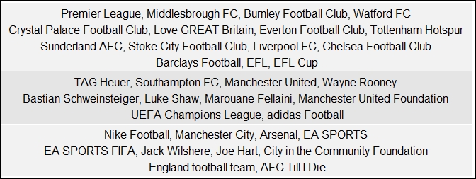
}This gives us two cliques having ten pages each as shown in the following figure:

Can you detect any relationship between pages in the cliques, Manchester United fans? Well they are all players, sponsors, or entities closely linked with the Manchester United football club! That's definitely a justification of why this is a clique.
We will now try to find communities or clusters of pages that are more connected by using the fast greedy clustering algorithm from the igraph package. Before we do that, we need to curate our network and keep only the important pages to reduce the size of our network, otherwise visualizing it would be really difficult on smaller plots. We use the following snippet for the same to remove nodes of lower degrees:
# filtering graph to get important nodes based on degree
degrees <- degree(pl_graph, mode="total")
degrees_df <- data.frame(ID=V(pl_graph)$id,
                         Name=V(pl_graph)$label,
                         Degree=as.vector(degree_plg))
ids_to_remove <- degrees_df[degrees_df$Degree < 30, c('ID')]
ids_to_remove <- ids_to_remove / 10

filtered_pl_graph <- delete.vertices(pl_graph, ids_to_remove)
fplg_undirected <- as.undirected(filtered_pl_graph)
We now apply the fast greedy clustering algorithm which tries to maximize the cluster modularity score which we had discussed earlier when we analyzed communities in our personal friend network:
# fast greedy clustering
fgc <- cluster_fast_greedy(fplg_undirected)
layout <- layout_with_fr(fplg_undirected,
                         niter=500, start.temp=5.744)
communities <- data.frame(layout)
names(communities) <- c("x", "y")
communities$cluster <- factor(fgc$membership)
communities$name <- V(fplg_undirected)$label

# get total pages in each cluster
> table(communities$cluster)
 1  2  3
15 10 10

# get page names in each cluster
community_groups <- unlist(lapply(groups(fgc),
                             function(item){
                              pages <- communities$name[item]
                              i <- 1; lim <- 4; s <- ""
                              while(i <= length(pages)){
                                start = i
                                end = min((i+lim-1),
                                          length(pages))
                                s <- paste(s,
                      paste(pages[start:end], collapse=", "))
                                s <- paste(s, "
")
                                i=i+lim
                              }
                              return(substr(s, 1, (nchar(s)-2)))

                            })
)
if (dev.cur()!=1){dev.off()}
grid.table(community_groups)
This gives us the following table depicting each community and its constituent pages:
We can now get the modularity score of the network using the following code:
# get modularity score
> modularity(fgc)
[1] 0.2917283
To visualize the clusters in the network, we can use the following snippet:
# visualize clusters in the network
comm_plot <- ggplot(communities, aes(x=x, y=y, color=cluster,
label=name))
comm_plot <- comm_plot + geom_label(aes(fill = cluster),
                                     colour="white")
comm_plot
This gives us the following plot showing the different pages based in their cluster color:

Visualizing communities of football pages related to the Premier League
We can now visualize the whole network along with its various communities using the following code:
plot(fgc, fplg_undirected,
     vertex.size=15,
     vertex.label.cex=0.8,
     vertex.label=fgc$names,
     edge.arrow.size=0,
     edge.curved=TRUE,
     vertex.label.color="black",
     layout=layout.fruchterman.reingold)
This gives us the following plot depicting the complete network with all the pages, their connections, and the communities we computed earlier:

Visualizing important pages in the Premier League football social network including communities
Do you notice any specific reason for these communities being formed? Try the edge betweenness clustering algorithm using the cluster_edge_betweenness(…) function from the igraph package. You can refer to the code files for the solution if needed. Do you notice any difference in the communities being formed? Why do you think it exhibits such behavior?