
If we wanted to, we could continue to add single-value elements to the top row, but the last thing we want to do is overwhelm and confuse our users, or worse, bore them. We instead want to draw them into the dashboard to have them take more interest in the data that we are presenting to them. Instead of creating a dashboard that is perfectly symmetrical, we may want to customize the layout of the dashboard further. This is where we can start to utilize JavaScript to further enhance our layout. As we will see in later chapters, we normally use JavaScript when we start to work with HTML dashboards, but in this instance we can still use JavaScript in Simple XML code.
In the following example, we will add some extra code into our Splunk App in the form of JavaScript code to manipulate the layout, but don't worry! We will be keeping the code simple, so let's get started:
- Access your development environment and change to the base of the Cell Biology Splunk App:
cd $SPLUNK_HOME/etc/apps/cell_biology/ - As we discussed in earlier chapters, Splunk has the ability to use CSS and JavaScript files located in the static directory in the
appserverdirectory. We created our new Splunk App from the barebones template, so we will need to create this directory:mkdir appserver/static - Change to the static directory you have just created, create the JavaScript file called
cell_layout.js, and start by adding the first line of code:1 require(['jquery', 'splunkjs/mvc/simplexml/ready!'], function($) { - This tells our code to load the jQuery and SplunkJS libraries to use as part of our code.
- The next two lines of code will create variables of the first row and then the panels within the row:
2 var firstRow = $('.dashboard-row').first(); 3 var panelCells = $(firstRow).children('.dashboard- cell'); - Now we will set the
panelCellsvariable to be be equal to 70% of the screen for the first panel and 30% for the second panel, as listed here:4 $(panelCells[0]).css('width', '70%'); 5 $(panelCells[1]).css('width', '30%'); - We save the file, but our Simple XML does not yet know that we have made this change, and we need to open our Simple XML code again to add this new static file to our code.
- We open the
cell_counts.xmlfile that we have been working on and change the first line to the following code:1 <dashboard script="cell_layout.js">
- Unfortunately, changes such as this cannot be activated by simply refreshing the cache as we have been doing in the previous examples. For a change such as this to take effect, we need to restart Splunk. So restart your development environment and you should be presented with a dashboard looking similar to the following screenshot:
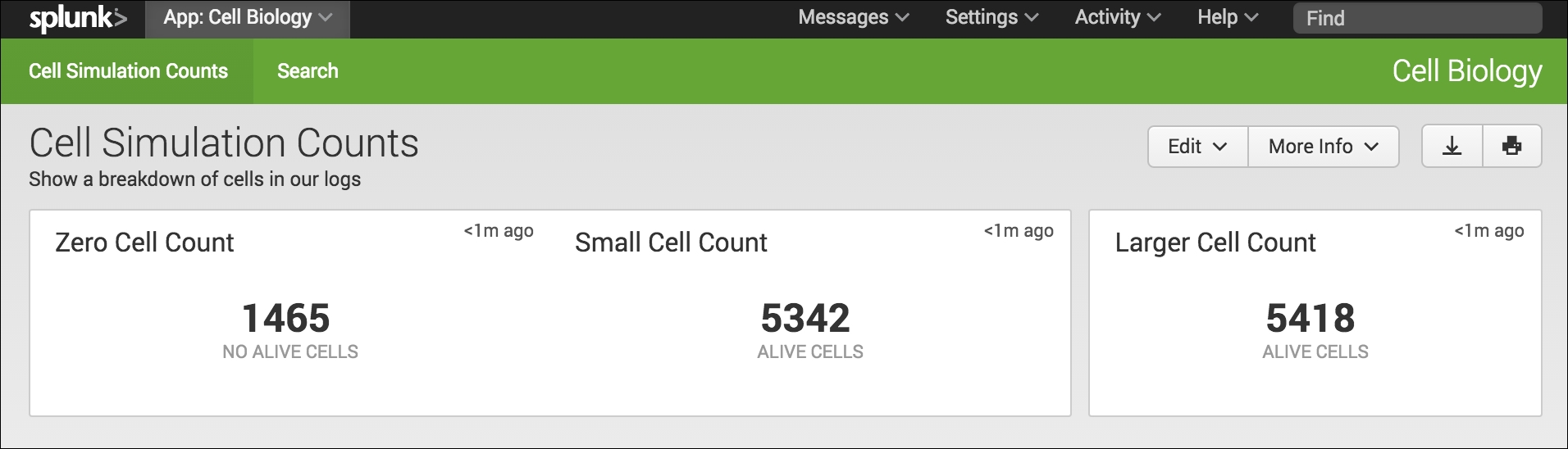
I know this is not a dramatic change to our interface design, but if you are anything like me, you will see yourself naturally being drawn from the left of the dashboard to the right and focusing on the Larger Cell Count single-value element.