
We have been using the Splunk Web Framework to set up our menus for quite a few chapters now. Splunkmenus are limited in the way we can control the look and feel of how the menu works and there is not much in the way of individualization or customization. If you have worked with CSS before, you would be familiar with setting up menus across the top or side of your HTML documents. We are going to quickly add some CSS to the header of our raw dashboard to set up a menu on the side of our screen. Let's start working through the code and we will step through the CSS and changes you need to make to get this working, as we have in the previous chapters:
- We should still be in our development environment and working in our html directory, but if not, move into the html directory of our Stock Market Splunk App:
cd $SPLUNK_HOME/etc/apps/stock_market/default/data/ui/html/ - Open up the
raw_stock_market_historical_overview_html.htmlfile in your text or code editor, so we can add CSS to our dashboard code. Back in Chapter 6, Moving from Simple XML to HTML, when we looked through the code of our converted HTML dashboard, we discussed the header of our HTML code, and within the first 10 lines of the code, we have our CSS styles sheets being referenced within these lines. We are going to add in our own style definitions just below these lines of code.Tip
As we mentioned in our previous chapter, mixing CSS from different sources can cause our page to have issues with specificity and in turn not allow our dashboard to display the way we want. We are mixing style definition types in our page as an example of how to get started and this should be planned carefully at an earlier stage of development.
- Move down to line 12 and we will kick off our style definitions for our menu with the style element. We will set the margin of the body of the dashboard to zero:
12 <style> 13 body { 14 margin: 0; 15 } - Our menu is basically going to be an unordered list and a set of list elements, but by specifying the way they act, we can have it look like a nice menu on the side of our screen. So we don't mess up an other CSS that might already be set up and we could be using within our header or chart elements, we will set up our styles with a class name of side:
17 ul.side { 18 list-style-type: none; 19 margin: 0; 20 padding: 0; 21 width: 25%; 22 position: fixed; 23 overflow: auto; 24 background-color: #e6f2ff; 25 } - The code that we just added is nothing too complex. We are simply defining margins, width, padding, and position, among other things. All of these will be used by the elements when we work with them in the body section of our dashboard code.
- We can now specify the definitions of the list elements and how they work within our dashboard:
26 li.side a { 27 display: block; 28 color: #000; 29 padding: 8px 0 8px 16px; 30 color: red; 31 } - The preceding definitions specify how the menu items will act when there are no specific actions occurring.
- The next part of the style rule defines how the list item menus will act when we hover over the items, and how they will act when they are active:
34 li.side a.active { 35 background-color: #4CAF50; 36 color: white; 37 } 38 39 li.side a:hover:not(.active) { 40 /* This will not be compatible with IE8 or earlier 41 background-color: #555; 42 color: white; 43 } 44 </style> - Don't forget line 43, where we close off the style element on our header code.
- Now move down to the body section of our dashboard code and we can use the new element classes that we have just defined. Within the body of the dashboard code, move just past the div container we have specified to use the Splunk header code and add the following unordered list:
55 <ul class="side"> 56 <li class="side"><a href="overview">Overview</a></li> 57 <li class="side"><a href="stock_market_historical_overview_html">Splunk Historical Overview</a></li> 58 <li class="side"><a class="active" href="newraw_stock_market_historical_overview_html"> Yahoo Historical Overview</a></li> 59 <li class="side"><a href="search">Search</a></li> 60 </ul> - As you can see, we are using the specific class that we created, called side, for both the unordered list (
ul) and list (li) elements. For each of the list elements, we have simply referenced each of the dashboards that we have created within our Splunk App so far. You will note that the overview and search Simple XML dashboards are simply referenced with the basic filename with no extensions. However, we do need to specify the entire file name for thehtmldashboards, and in this instance we have provided names that are a little more descriptive of the information they are displaying. - To make sure that our menu and our graph is properly separated, we will enclose our visualization and heading in a div element. Move down to where we specified the original heading and graph elements and replace them with the following lines of code:
62 <div style="margin-left:25%;padding:1px 16px;height:1000px;"> 63 <h2 style="color:blue;margin-left:30px;">Yahoo Stock Values</h2> 64 <p id="element1" /> 65 </div> - Save your code and reload your Splunk cache. You should now have a menu added to the left side of your dashboard:
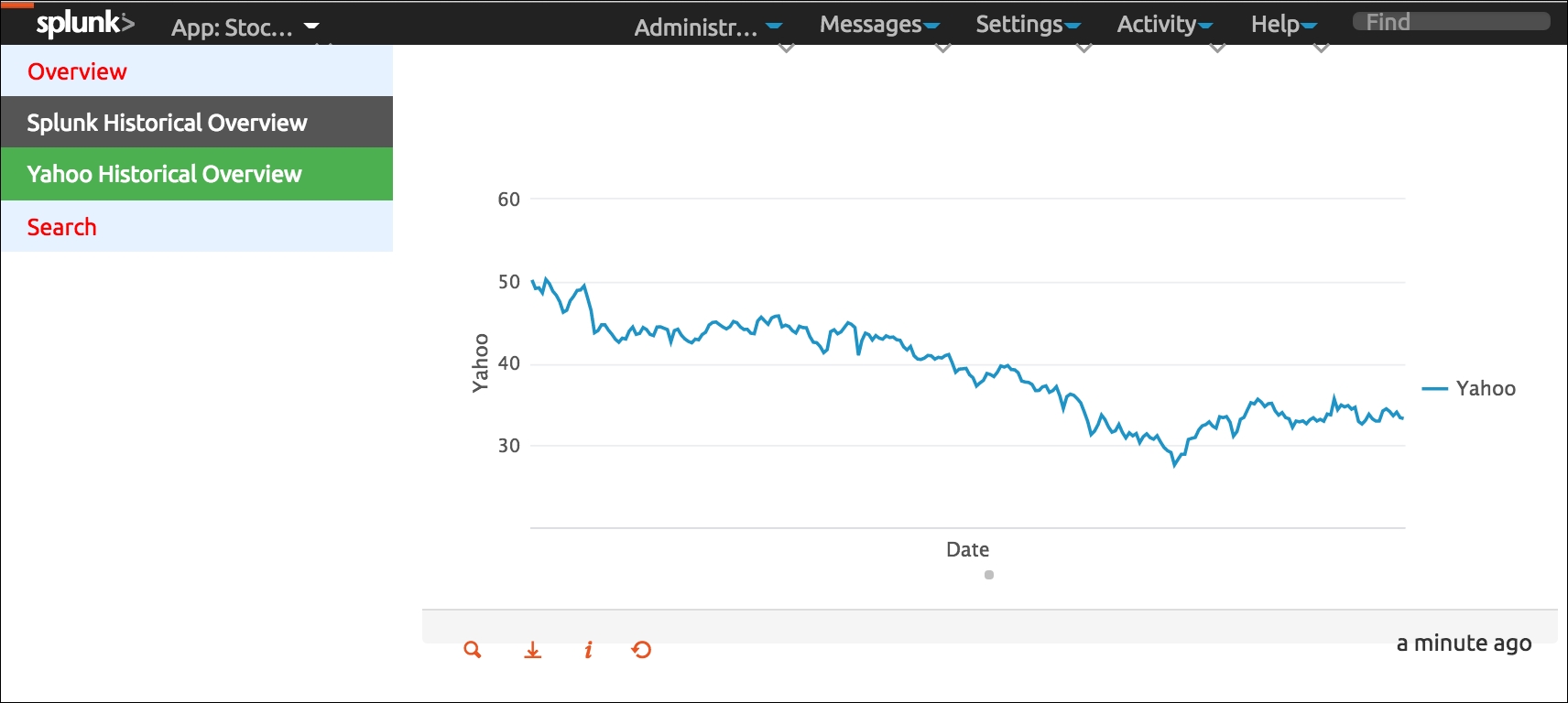
Hopefully, your dashboard looks the same as the preceding image, where we have a nicely styled menu sitting on the side of our page which links directly to the other pages in our Stock Market Splunk App. The current dashboard that is available will be highlighted in green, and when our mouse pointer hovers over one of the other menu items, as in the preceding image, it will be highlighted in dark grey. We have also made the names of our Splunk and Yahoo! stock market data dashboards a little more descriptive.