Business intelligence (also referred to as BI) is all about connecting business decision making to facts about the business and its environment. BI lets you take a deep dive into data in order to make better business decisions.
Microsoft Power BI is Microsoft's BI tool that helps you model, visualize, and share insights. Power BI enables you to analyze information in a more meaningful and intuitive way.
Power BI is a tool for everyone. Decision-makers can use Power BI dashboards for making business decisions, while developers can use Power BI application programming interfaces (APIs) to push data into datasets and build data models.
You can build Power BI reports using Power BI Desktop. Power BI Desktop (https://m365book.page.link/powerbi-desk) is a free application that you can install right on your own computer.
While Power BI Desktop is a downloadable tool to build reports, the Power BI service is a cloud-based service that letsyou share reports over the web with your colleagues. The Power BI service provides limited editing features but lets you collaborate with your colleagues and teams.
If your organization is already using Microsoft 365, then you might already have an Enterprise plan that includes Power BI Pro. Power BI Pro is an individual user license that allows access to all content and capabilities in the Power BI service. Power BI Pro also allows you to collaborate and use workspaces to share with other people, create apps, sign up for subscriptions, and so on.
If your organization has over 500 users using Power BI, you will need to move to a higher plan, which is the Power BI Premium plan. Power BI Premium allows organizations to be able to better administer and manage the resources that are being used with Power BI.
This chapter provides you a basic understanding of Power BI. There are several advanced concepts and topics that were not possible to be covered in a single chapter. This chapter should serve as a good starting point for end users or anyone who is new to Power BI.
In this chapter, we will learn about the following topics:
- Retrieving data
- Transforming data
- Modeling data
- Visualizing data
- Sharing a report/dashboard/dataset
Technical requirements
Power BI Desktop is supported only on the Windows platform at the moment, on Windows 10, Windows 7, Windows 8, Windows 8.1, Windows Server 2008 R2, Windows Server 2012, and Windows. It is available for both 32-bit (x86) and 64-bit (x64) platforms.
You can either download the standalone installer from the website or you can install it from the Windows Store as a Windows app.
Power BI reports can also be viewed on the mobile app (covered later, in Chapter 19, Microsoft 365 on Mobile), which is available from the Windows, Android, and Apple stores.
Please refer to the Power BI Desktop guide athttps://m365book.page.link/bi-desktop for more info.
The examples used in this chapter have been demonstrated using Power BI Desktop.
Retrieving data
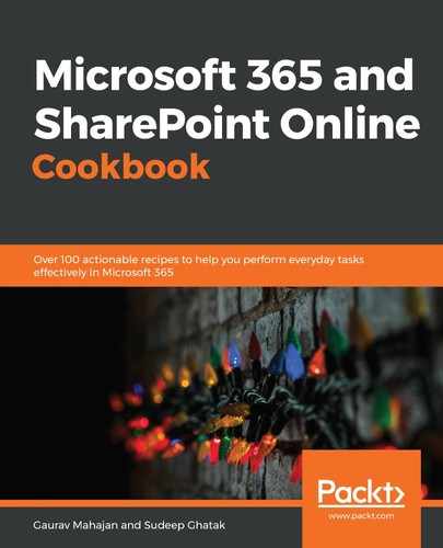
Retrieving is the process of fetching data from a location. Power BI has connectors to various data sources, ranging from text and comma-separated values (CSV) files to databases, as well as web pages. Some common Power BI connectors are shown in the following screenshot:
In this section, I will demonstrate how you can retrieve data from a CSV file.
Getting ready
Download the Products_bikes.csv file fromChapter 15 folder in the GitHub repository of this book here https://m365book.page.link/github
You don't need any special permission to retrieve data from files such as text, CSV, or Excel files.
How to do it...
- Open the Power BI Desktop tool.
- Click on Get Data and select the Text/CSV option:

- Press Connect.
- Browse to the location of the CSV file and open the Products_bikes.csv file.
- Click Load.
- Power BI Desktop will show a preview of the data. Click on Load, and the data gets loaded into the tool.

How it works...
After the data is imported, Power BI Desktop lets you analyze the data in three ways:
- By using one of the visualizations on the imported data:

- By looking at the raw data in tabular form:

- By looking at the structure of the table and its relationship to other tables:
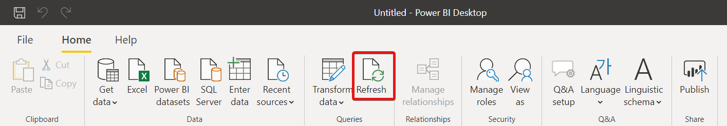
If you import the data once, Power BI Desktop stores the data source details internally. So, if the data in the source file changes, you can just use the Refresh option to import the modified data:
See also
- The Transforming data recipe
- TheModeling data recipe
- TheVisualizing data recipe
- TheSharing a report/dashboard/dataset recipe
Transforming data
Data transformation refers to the process of converting data from one format to another. This could require simple or complex data manipulation, based on the nature of the data.
In most cases, the data that you retrieve from a data source is not in a format where it can be used as-is, and you might have to take some additional steps to clean it.
Examples of basic transformations include the following:
- Changing data types
- Filtering (rows and/or fields)
- Creating conditional columns
- Splitting columns
- Renaming/reformatting
Some examples are as follows:
- Getting rid of trailing spaces at the end of a text field
- Reconciling multiple formats saved in a date field (such as Jan-19, Jan 2019, 01-19, and so on)
- Concatenating Title, First Name, Last Name, and so on to get the person's name
Hence, the first step after retrieving data from a data store is to clean the data and convert it into a reusable format. In the following example, we will perform three data transformation activities on an Excel spreadsheet, shown in the following screenshot:

- Get rid of the . in the Title field (where applicable).
- Combine the name fields (First Name, Last Name) into one field.
- Change the dates to conform with a consistent date format.
Getting ready
For this exercise, download the file DOB.csvfromChapter 15 folder in the GitHub repository of this book here https://m365book.page.link/github
You don't need any special permission to perform data transformation on the data that has already been imported.
You should have access to the data if you are querying a secure data store.
How to do it...
- Connect to a data store and load the data, as demonstrated here:

- Once the dataset is loaded, click on Transform data:

- You are now able to apply transformations to the imported data:
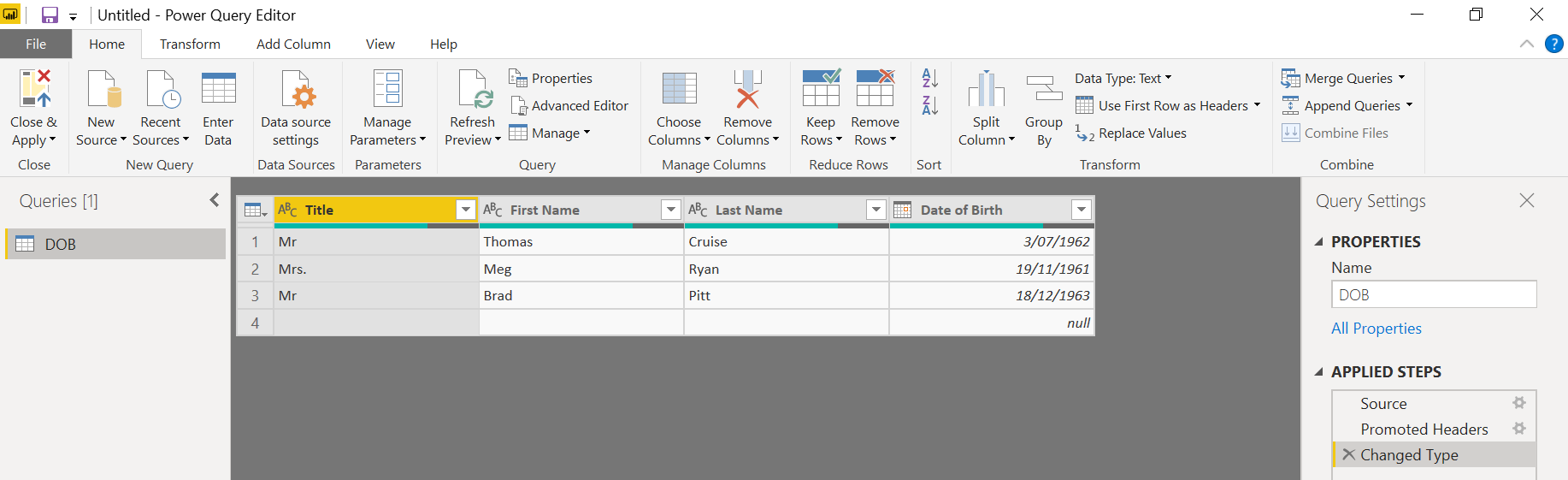
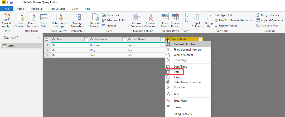
- Next, we need to remove the dot (after Mrs) to make the Title consistent with other records:

- The replace operation requires you to specify the text that needs to be changed, along with the replacement string. Replace the . with an empty string.
- Instead of having three name fields, we'll merge them all into one. To do this, select the three columns and click Merge Columns:

- Use Space as the separator between the three columns while merging:

- A new column should now appear in the table:
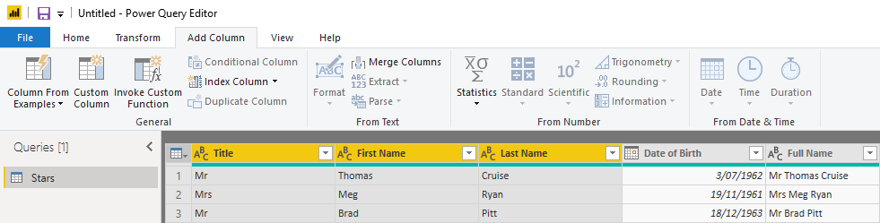
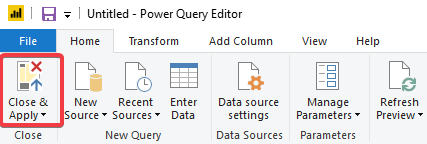
- Finally, click on Close Apply to close the transformation window and apply the transformations to the dataset:
How it works...
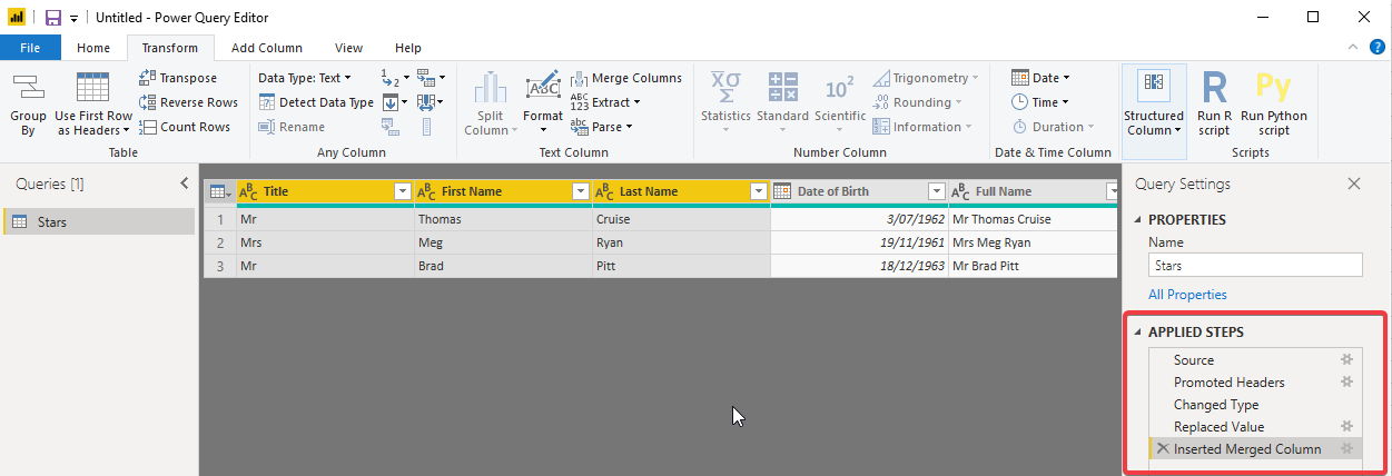
Power BI Desktop gets busy as soon as you import data. You saw that in the preceding example. Three operations were applied to your dataset when it was loaded. They were as follows:
- The first row got promoted to row header.
- The data type of the Date Of Birth column was changed to Date.
- The date format of all dates was set to dd/mm/yyyy.
The way Power BI Desktop achieved this by applying a series of steps called transformations. The transformation steps can be seen on the lower right section of Power BI Desktop:
As you witnessed in this example, the first three transformation operations were applied automatically for you. You can change the data type by clicking on the data type selector in the header and assign a particular data type:
The beauty of transformation is that it eliminates the need to perform repetitive operations on data every time you connect to the data store. Power BI Desktop records all your transformation steps and then applies the steps sequentially every time you query the data store. In other words, you spend time building the transformation steps just once. From there on, Power BI Desktop manages the data cleansing operations for you.
You can see a preview of the data at each step, and you can insert/remove/rearrange steps. When you clickApply in Power Query Editor, all the data goes through all the steps and then gets loaded to Power BI:

See also
- The Retrieving data recipe
- TheModeling data recipe
- TheVisualizing data recipe
- TheSharing a report/dashboard/database recipe
Modeling data
Modeling is a process of combining multiple data sources and setting relationships between the datasets.
To understand modeling, you need to first grasp some key database terms.
Primary key: The primary key of a relational table uniquely identifies each record in the table (refer to Customers.csv). A table can have only one primary key. Since a primary key is unique, it cannot be repeated in the same table. Take this, for example:

In the preceding example, by specifying the customer ID, I can uniquely identify a person. There can be two customers with the same name, but they will each have a unique customer ID.
Foreign key: A database foreign key is a field in a relational table that matches the primary key column of another table (refer to Product_Sales.csv). See this, for example:

The Customer ID column (used in the earlier example) becomes a foreign key when used in the sales table. The same person can buy two products, and hence the customer ID can appear multiple times in the sales table. Every foreign key value must always correspond to a primary key in another table.
Fact table: A fact table stores quantitative information and is used for analysis and reporting. In our case, sales info is a fact table.
Dimension table: A dimension table is a collection of reference information about a business. In the preceding example, the customer info table will be a dimension table because it provides additional information about the customer. Similarly, we can have a product info dimension table (refer to Products.csv) with more information about the product being sold:

A fact table usually has information in the form of numeric data. Additionally, this data can be modified quite easily, and that can be done by clubbing together and adding any number of rows. These tables typically have more rows and fewer columns because they store transactions.
Dimension tables, on the other hand, tend to be shorter (because you can only have a given number of customers or products) but have many columns because they store metadata about the entity being stored, such as customer name, age, DOB, phone, address, email, and so on.
Let's say that you want to create a sales report. To build a meaningful sales report, you will need to pull information from other supporting tables. For example, a "Sales Info" table will contain transactional information such as the date of sale, and the number of products sold. A "Products Info" table will store information such as the product category, product price, product color, discount, and so on. A "Customer Info" table will contain information such as customer name, city, and so on.
Power BI lets you combine information from the three tables, thus enabling you to view the report in multiple dimensions such as Sales by Region, Sales by Product Category, Sales by Year, and so on. To do this, you need to define relationships between these tables. This is done using foreign key relationships, as explained previously. Modeling is the process of setting up this relationship.
Power BI modeling lets you do more than build relationships. It also lets you do the following:
- Perform custom calculations on existing tables.
- Define new metrics.
- Perform custom calculations for new metrics.
In the following example, we will create relationships between the product sales data tables
Getting ready
Download the following .csv files from Chapter 15 folder in the GitHub repository of this book here https://m365book.page.link/github
- Customers.csv.
- Locations.csv.
- Product_Sales.csv.
- Products.csv.
You don't need any special permission to perform data modeling once the data is imported.
How to do it...
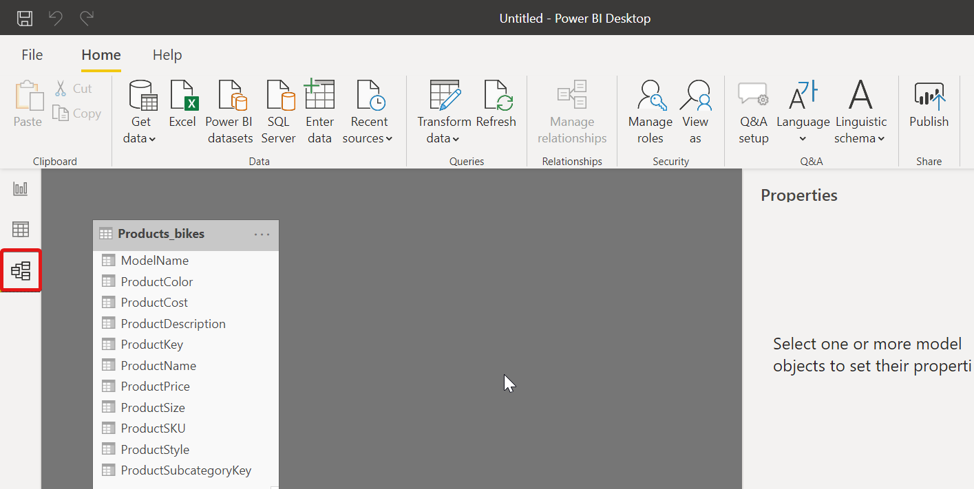
- After the transformations are applied, click on the
 icon on the left-hand side of the screen. You will see all the data sources you have connected to:

- In some cases, Power BI Desktop will automatically determine the relationships based on the column names. If it doesn't, connect the columns manually by dragging the column from one table to another:

- Once the columns are connected, your model is ready:

How it works...
The question you might ask is this: why do we need a model at all?
A model signifies the relationship between the tables. This enables you to analyze the data by customer, location, or product, or a combination of these. We will see this in action in our next recipe.
For a more detailed view of your data relationships, you could try selecting theManage Relationships option on theHometab.
A pop-up screen, which lists all the relationships in a single view, appears. From here, you can selectAutodetectto find relationships in new or updated data. SelectEditin theManage Relationshipsdialog to manually edit your relationships.
To better understand the concept of relationships, you need to understand two key terms:
- Cardinality
- Cross-filtering
Cardinality refers to the relationship between two tables based on the number of unique values in the column. It could be any of the following relationships:
- One to many: If the column is a primary key in one table and a foreign key in another table—for example, products and sales relationships
- One to one: If the column has a one-to-one mapping of data in both tables—for example, a person and driver license table relationship where there will be a unique record of a person against every driver's license number
- Many to Many: When there is a possibility of multiple values in both columns—for example, a student and class relationship, where each student can take multiple classes, and each class can have multiple students enrolled
Cross-filteringis the ability to set a filter context on a table based on values in a related table. The cross-filter relationship can be one of the following:
- Both: Where data in one table can be filtered based on the data in another—for example, Sales and Store. A product could be sold in multiple stores; at the same time, a store could have multiple products.
- Single: This is a relationship where the filter direction is unidirectional—for example, a Product table versus a Sales table. A sale item will only correspond to a single product, but a product could be sold several times.
Power BI Desktop resolves the cardinality and cross-filtering based on the column values in the two tables. It lets you change the cardinality and cross-filtering if you wish to.
To create/modify a relationship, go to Home | Manage relationships, as shown here:
There's more...
Before we jump into the visualizations, we have got to learn some additional concepts—namely, calculated columns and measures.
Calculated columns
Sometimes, you need to create additional columns or measures within your model to create data for your visualizations. You can create these columns using Data Analysis Expressions (DAX) formulas. For instance, if you have been provided the dimensions of a car in feet and inches, you could create a DAX formula to change them to their metric system equivalents (refer to car_sales.csv). DAX formulas look similar to the formulas used in Excel, such as the one shown here:

You might also need to create a calculated column to build a relationship between tables when no unique fields exist.
To create uniqueness in data, you can, for example, create a calculated column named "Phone Number" by combining the values from the "Area Code" and "Local Number" columns from your dataset.
Measures
Measures are usually the numeric fields within a dataset that can be aggregated or used in other ways (such as average, minimum, and maximum) to derive meaning from your data—for example, total sales by state; average sales by year. Measures are calculated at the time of the query and hence are not stored in the database. However, they use processing power to execute a query at the time of the request. Because measures are not stored in memory, they are generally faster but require more processing power. Hence, calculated columns and measures should be used judiciously.
You can create a measure in Power BI Desktop, as shown in the following screenshot. I am getting a forecast for the next year, based on the average cars sold this year:

Unlike calculated columns, they don't appear in the model next to other columns, but you can drag them to your visualization window in the Report tab, as shown in the following screenshot:

Notice that the measures are context-aware. What that means is that if you drag the Sales(2020) field alone, it shows the average sales across all models, but when you place it along with the Model field, it represents the breakup by each model:

See also
- The Retrieving data recipe
- TheTransforming data recipe
- TheQuerying data using natural language recipe
- TheVisualizing data recipe
- TheSharing a report/dashboard/dataset recipe
Visualizing data
The end goal of any data-crunching exercise is to draw insights from your data. Power BI visualizations provide you with hundreds of visuals (some within Power BI Desktop; others from the marketplace). A Power BI report might consist of a single visual on the entire page, or it might have pages full of visuals.
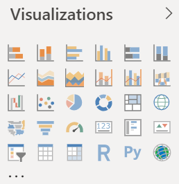
There are many different visual types available directly from the Power BI Visualizations pane:
And, for even more choices, visit the MARKETPLACE:

Getting ready
A user can interact with the visual either as a designer or as a consumer.
A designer can add/edit or change visuals using Power BI Desktop. A consumer, on the other hand, can only look at the reports or dashboards shared with them. The consumer can interact with the visuals using filters and via natural language; they cannot make any major changes to the visualization.
Download the file car_sales.csvfrom Chapter 15 folder in the GitHub repository of this book here https://github.com/PacktPublishing/Microsoft-365-and-SharePoint-Online-Cookbook/tree/master/Chapter%2015.
How to do it...
- After you've completed the modeling of the dataset, click on the
 icon on your left-hand side of the screen to enter the report view.
 - From the right-hand Visualizations pane, pick a visual. We will use a line chart for the demo.
- Pick the fields you want to display on the report.
- Based on the field type, Power BI Desktop will place them under Axis or Values. You could also drag the fields as appropriate:

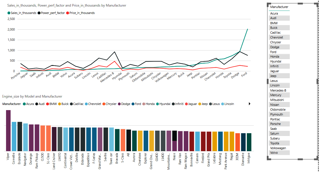
- As soon as the fields are selected, the report appears on the canvas. You can sort by graph on any of the selected fields to derive insights:
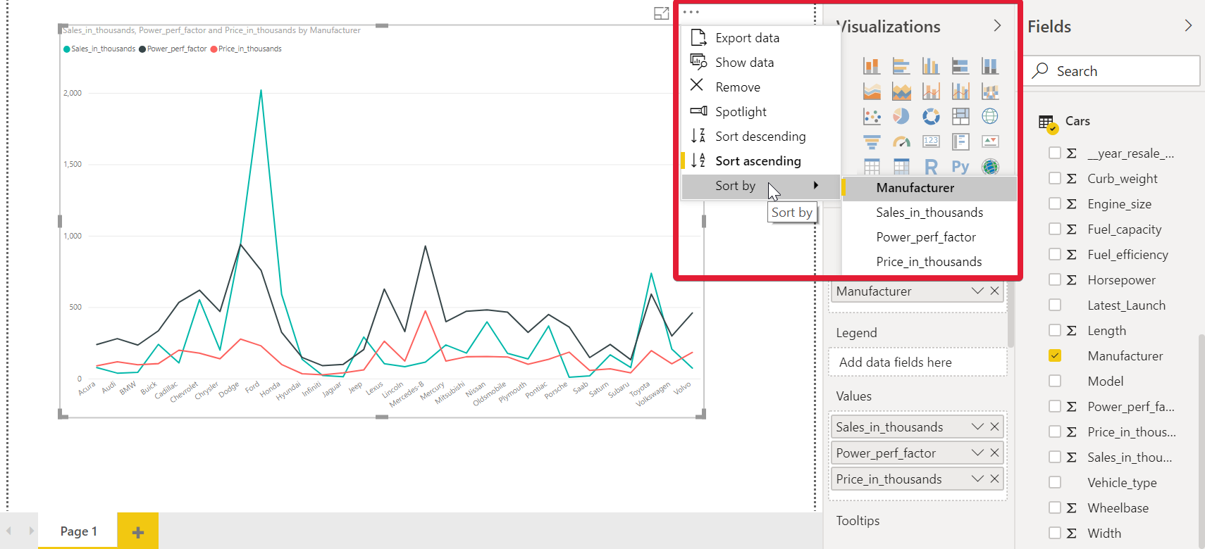
- You can bring a visual into focus by clicking on the Focus mode option. This option displays the report in a full-page view. This is helpful when you have multiple reports on your page:

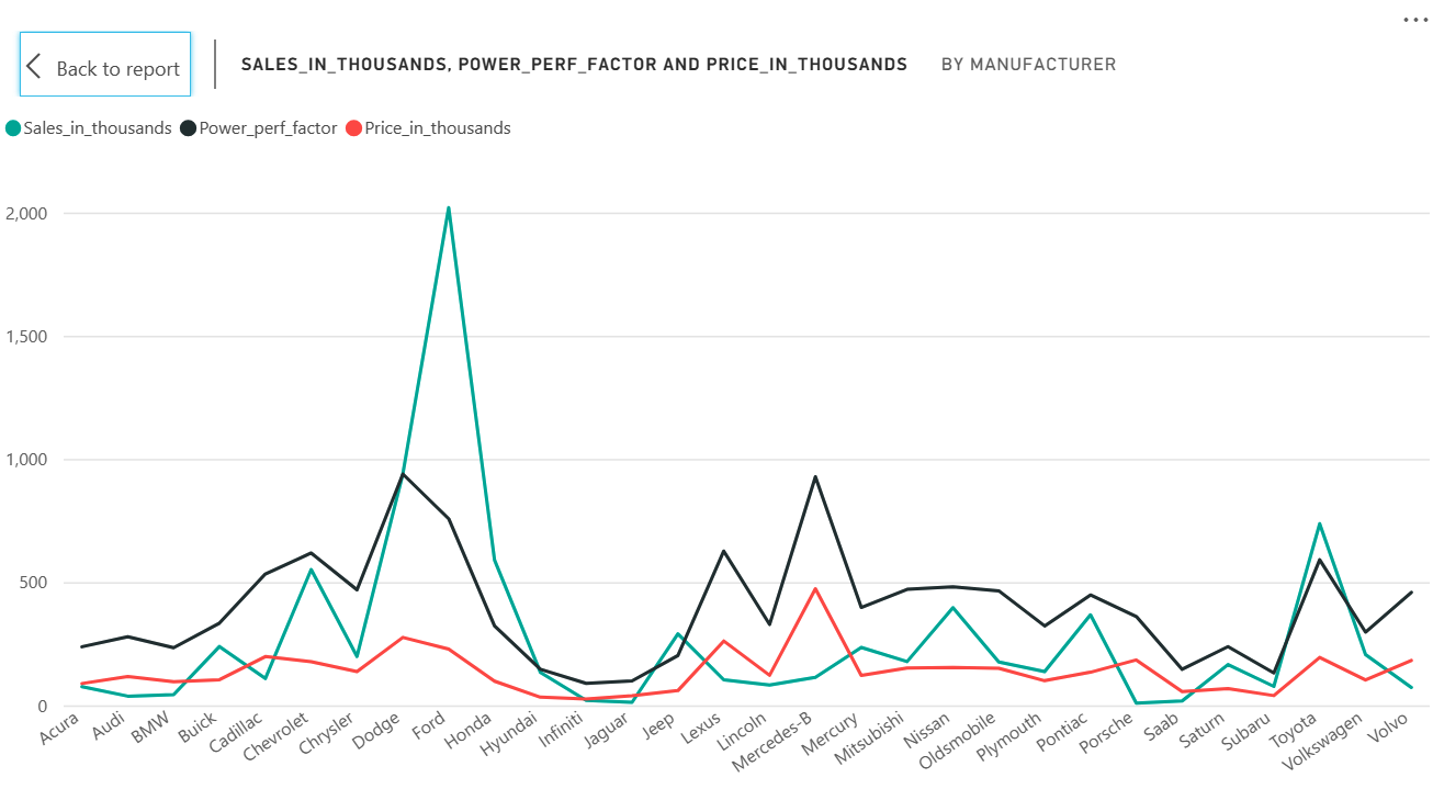
- To go back to your report, use the Back to report option:
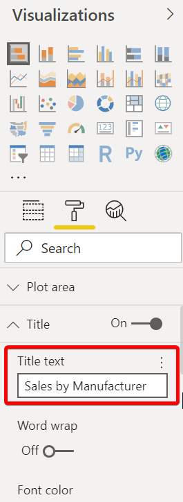
- Power BI Desktop generates a random report title based on the fields you have selected. You can change the Title by updating the Title text option:
- You now have built your first report using Power BI Desktop.
How it works...
Visuals in Power BI Desktop can be changed by simply selecting the report and choosing another visual from the visualizations gallery. There are several visuals that are provided within the Power BI Desktop. You can read more about each individual visual on Microsoft's Power BI documentation page, at https://m365book.page.link/bi-visuals.
A visualization has three property tabs:
- Fields: This tab lets you choose the fields for your visualization.
- Format: This tab lets you choose the data colors and labels for your dataset.
- Analytics: This tab lets you add additional lines to compare your data points against, such as a constant or an average line across your report.
Filters let you reduce the dataset you want to analyze. Say you want to focus on a specific year or a specific brand of car. Filters remove noise from the visual so that you can focus on the subject of interest. Filters are of three types:
- Visual-level filters: These affect only the selected visual but have more options, such as Top N filtering and filtering by measure value.
- Report-level filter: This applies the filter on a specific visual without affecting the rest of the page.
- Page-level filter: This applies the filter on all the related visuals within the page. The following screenshot shows a page-level filter on the Manufacturer field:
There's more...
Power BI has a powerful Q A feature that can be used to build charts just by using natural language.
You can use this feature by dragging the Ask A Question button from the ribbon, as shown in the following screenshot:

As soon as you drag this menu item on the canvas, Power BI suggests some probable questions based on the data. As you start typing, it even autoselects a visual based on the data:

You can change the fields (highlighted with a yellow underline) to view the data in other ways (say, by model), as shown here:

You get the same experience when you use the Q A feature on the Power BI web experience.
See also
- The Retrieving data recipe
- The Transforming data recipe
- The Modeling data recipe
- The Querying data using natural language recipe
- The Sharing a report/dashboard/dataset recipe
Sharing a report/dashboard/dataset
Microsoft 365 is a collaboration platform. The ability of users to build and share reports is a key factor. The Power BI service lets you share the charts and dashboards with your colleagues in several ways.
The Dashboard feature is only available in the Power BI service. Itis a non-interactive collection of visuals pinned from one or more existing reports. If you click on a report pinned into the dashboard, the Power BI service takes you to the individual report, which provides a richer and more interactive experience.
Getting ready
In order to share a report, you need to first publish it to your Microsoft 365 tenant. While Power BI Desktop is free, you need a Power BI license to share your report with your colleagues. If you have a Power BI Pro license, you should be able to publish your report to Microsoft 365:
You can publish the report to your Microsoft 365 workspace or to a workspace you have access to. After you publish the report, you can access it athttps://app.powerbi.comand log in with your Microsoft 365 credentials:
From the workspace, you can share the report with your colleagues. You need a Power BI Pro license to share your content, and those you share it with also require a Pro license, unless your organization has a Premium subscription. Read more about Premium subscriptions at: https://m365book.page.link/bi-premium.
How to do it...
You can share a report in two ways:
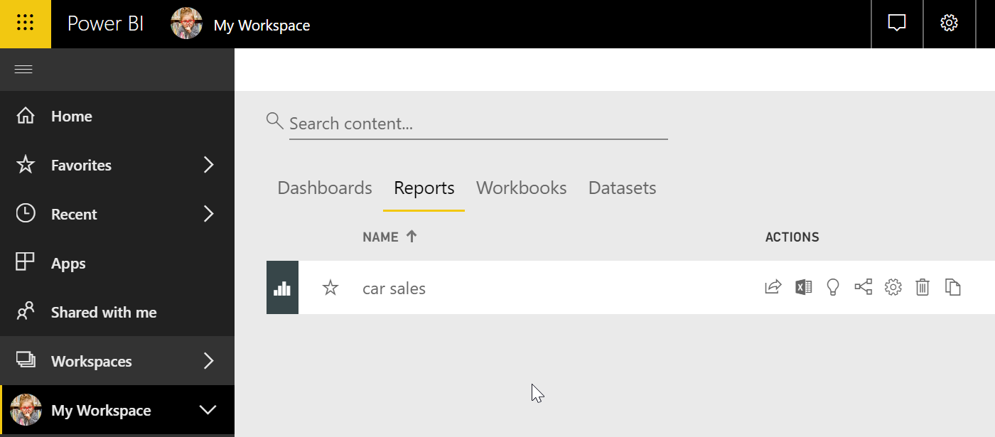
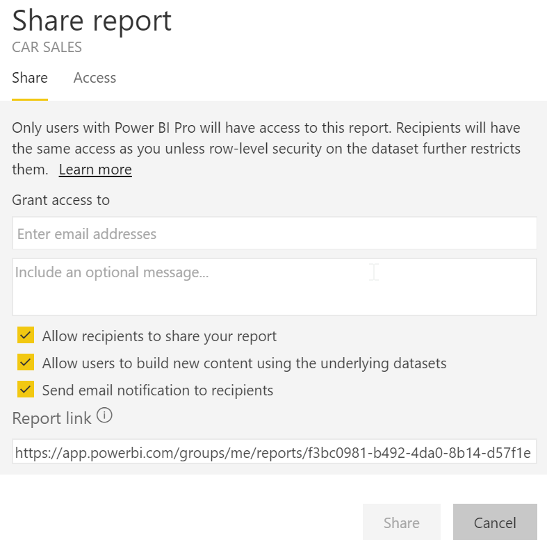
- In a list of Dashboards or Reports, or in an open dashboard or report, select Share:

- You can then specify the colleagues you want to share the report with. You could provide full email addresses for individuals, distribution groups, or security groups. Check the options as applicable:
How it works...
There are several ways in which you can share a Power BI report. In order to choose the right platform, you first need to understand the following terminology:
- Share your workspace: Workspaces provide a common area for your co-workers. You can specify roles to decide who can manage the entire workspace, or edit its content, and distribute its content. Power BI provides a default My Workspace area for every user, for them to store their own dashboards and reports. So, while you can, in theory, save the reports in your My Workspace area and share it with your co-workers, this workspace is not actually meant for collaboration. It is more like your personal space.
You should set up separate workspaces to work with your co-workers:
- Share your dataset: The dataset refers to the data that drives your visualization. We saw earlier how the data needs to go through transformation and modeling before it can be used within the report. You would obviously not want everyone to go through the same ordeal if they want to base their reports on the same data. So, while this option allows you to save time by sharing the cleansed data, on top of that it also ensures that everyone is building their report based on a single version of the truth.
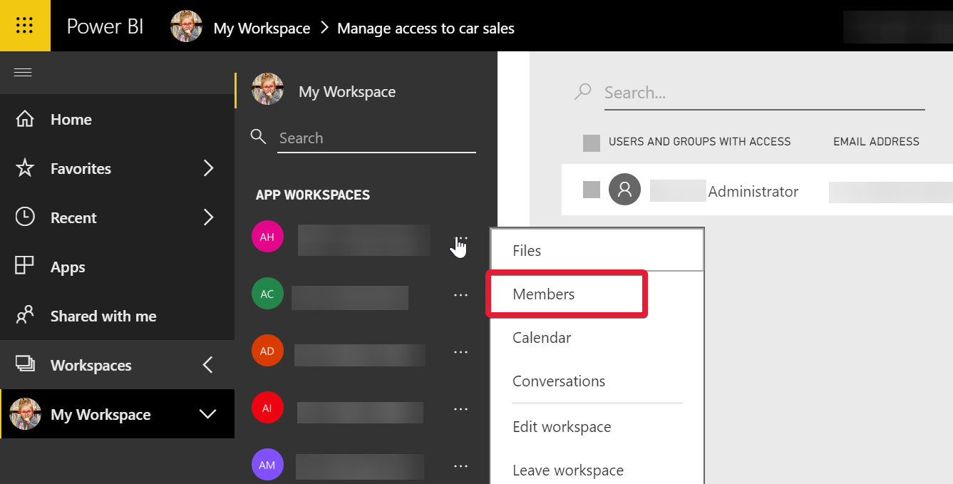
You can share a dataset by clicking Manage permissions, as shown in the following screenshot:

Then, choose the people you would like to share with. You do not need to share reports with people who have access to the workspace already. They will be able to view the reports immediately in the workspace:

Share your report or dashboard: When you share a dashboard or report, recipients can view it and interact with it, but can't edit it:

See also
- The Retrieving data recipe
- The Transforming data recipe
- The Modeling data recipe
- The Querying data using natural language recipe
- The Visualizing data recipe