In Chapters 6 and 7 you learned to adjust the tonality and color of your photos using a variety of the Photoshop Elements (PSE) Editor's adjustment tools. All the techniques you used with those tools — with the exception of the Hue/Saturation command — used adjustment methods that affected the entire image. Sometimes, though, it's necessary to change the tone or color of an isolated portion of a photo without affecting the rest of the photo. Fortunately, the PSE Editor provides a wide variety of methods for making these localized changes. This chapter surveys a number of tools and techniques and explores the more important ones in depth.
The terms burning and dodging were first used in the chemical darkroom. In this scenario, a negative is loaded into an enlarger and projected onto a piece of light-sensitive photographic paper. The more light that strikes the paper, the darker the tones in the final print will be.
If a printer wishes to make a particular area darker, he makes a second exposure while holding his hand in front of the enlarger lens, blocking most of the light from hitting the paper. He then shapes his hand so that some light is directed to the desired area. This additional exposure is called burning, or burning-in.
If the printer wishes to lighten an area, he holds something in the enlarger's light beam during the initial exposure, preventing light from striking certain areas of the photo paper for a portion of the exposure. Typically, this is a circular piece of cardboard taped onto the end of a piece of wire. The areas of the print that are not exposed to as much light come out lighter. This is called dodging.
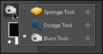
The Burn and Dodge tools, shown in Figure 9.1, are near the bottom of the Toolbox, stacked with the Sponge tool. (If you can't see them on the single-column Toolbar, you need to convert the Toolbar to the two-column layout by clicking the double-headed arrow on the Toolbox header.) Notice that the icons hint at the origins of these tools.
Note
The Sponge tool uses a brush-based tool to add or remove saturation to specific areas.
When burning and dodging in a film darkroom, the process can be hit and miss. Fortunately, when using the Editor's Burn and Dodge tools, you have a great deal of control.
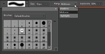
When either of these tools is selected, the Options bar displays the information shown in Figure 9.2. (Notice that I have both the Brush Picker pop-up panel and Range drop-down menu showing in this figure.)
Brushes presets. When you click on the brush shape at the left of the Options bar, the Brush Picker pop-up panel opens. This panel gives you access to a number of brush size/hardness presets. Some of them are normal brush tips, while some of the brushes lower on the list have unusual shapes. Click a preset to switch the brush to that preset's settings.
Size. After picking a brush preset, you can modify its size using the Size drop-down menu. You can also press the [key to quickly make your brush smaller and the] key to make it larger.
Range. You use the Range drop-down menu to choose to darken or lighten Shadows, Midtones, or Highlights.
Tip
Use Shift+[ to soften the edge of a brush, and Shift+] to increase the hardness in 25 percent increments. The hardness of a brush refers to how crisp the edge of its application is. A high hardness value creates a crisper edge, while a low hardness value creates a softer, more feathered edge transition. This is a mega-tip because there is no control on the Options bar to change the hardness value of this tool.
Exposure. You use the Exposure drop-down menu options to change the strength of the effect. Higher values increase the strength.
Now that you know something about these tools, its time to put them to the test in the following exercise.
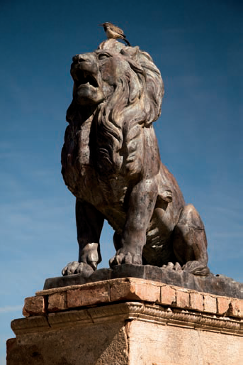
Open the Lion.tif file from the downloadable practice files on the Web site (
www.wiley.com/go/pse8aftertheshoot). Zoom the photo to 25 percent or 50 percent magnification so that you can see the details.This photo, shown in Figure 9.3, was shot on a sunny day in Tucson. Because of the lighting, the tonal range is a bit too much. Parts of the statue are in direct sun and other parts are in deep shadows. Use the Burn and Dodge tools to balance these tones.
Before you begin working with the tools, duplicate the layer by choosing Layer

By duplicating the layer, you are limiting all activity to the duplicate. If you don't like the burning and dodging, your can eliminate the layer and begin again with a new duplicate. The second reason is that after you finish burning and dodging, you can turn off the visibility of the duplicate layer to check your work against the unmanipulated Background layer.
Tip
The Editor does the best job of displaying photos at zoom ratios of 25 percent (25, 50,100). If you use the Zoom tool to zoom, it has presets for these percentages.
Choose the Burn tool (O) from the Toolbox. Click the Soft Round 300 pixel brush preset from the Brush Picker pop-up panel. Now that you have a soft edge brush, change the size to 500 px (pixels) using the Size slider. Select Highlights from the Range drop-down menu and set the exposure value to 30 percent.
Carefully paint the lighter, right side of the pedestal with short stokes by clicking and dragging. Be careful to not let your painting spill over onto the darker front of the pedestal. Try to cover the bottom section with one pass of the brush, and the upper section with a second pass. Also try to avoid overlapping your strokes; otherwise, the overlapped sections will be darker.
Change the size of the brush to 200 px and paint some of the lighter areas of the lion's head and shoulder. Notice that the Burn tool is mostly affecting the highlights, without making the shadows go too dark.
Change the tool to the Dodge tool (O) and choose the Soft Round 300 pixel brush. Select Shadows from the Range drop-down menu and set the Exposure value to 10 percent. Paint the darker areas of the lion's face and chest to lighten them a bit.
Continue working on the statue, switching back and forth between the Burn and Dodge tools as needed.
Click the Arrange menu at the left of the screen and choose Fit On Screen from the drop-down menu so that you can see the entire image. If you overdo the adjustment on an area, use the Undo History panel to retrace your steps and try again instead of compensating with the other tool; otherwise the whole effect may look overworked.
Go back to the Burn tool and choose a brush size of 500 px. Choose Midtones from the Range drop-down menu and 10 percent from the Exposure drop-down menu. Then carefully paint the upper corners of the image to darken the blue sky. Then lightly paint both of the lower corners as well. Darkening the corners of a photo is a traditional darkroom treatment that's designed to give the image a finished look.
Click the eyeball icon next to the duplicate layer so that you can see the unchanged Background layer. By hiding and revealing the duplicate, you can do a quick before and after check.
These days, photographers have much more control over the outcome of burning and dodging than in years past. The biggest downside is that the Burn and Dodge tools are destructive. In this exercise, you limited the damage by duplicating the layer, which, by the way, doubled the document size.
As you just learned, the Burn and Dodge tools use a brush to apply adjustments to the image.
Another way of working with specific image content is to select it so that it's isolated from other image elements. Then you can run a command, such as Levels or Adjust Color Curves, to selectively modify areas of the image.
When it comes to localized corrections, selections are the usual starting place. That's because selection tools have been a part of Elements since its earliest days. In more recent years, a number of smart selection tools have been added to the lineup.
The point of all selections is to isolate part of a photo for adjustment while protecting other areas from change.
Tip
If you hold down the Shift key while drawing your selection, the Rectangular Marquee tool draws a perfect square.
The easiest way to get a basic understanding of how selections work is to do the following exercise:
Choose File
Choose the Rectangular Marquee tool (M), which is the fifth tool from the top on the single-column Toolbox. If you see the Elliptical Marquee tool instead (which is used for drawing circular selections), click and hold it to reveal the Rectangular Marquee tool that's stacked with it.
Click and drag across the white background to draw a rectangular selection. For this exercise, the size of the selection isn't important. Just be sure that it covers about 50 percent of the area. You'll know you have an active selection when you see the marching ants, the animated dashed line around the selection.
Tip
If you don't like the selection, and you want to redraw it, choose Select
Now select the Brush tool (B), which is way down the single-column Toolbox, seventeenth from the top. Click on the Options bar, below the Menu bar, and change the size of the brush to somewhere around 100 px.
Click on the Color Swatches at the bottom of the Toolbox. If you can't see them, you'll need to change your Toolbox to the two-column display by clicking the double-headed arrow on its header. The upper swatch is used to set the foreground color and the lower one is used to set the background color. Click the Foreground swatch to open the color picker. Choose a bright color and click OK.
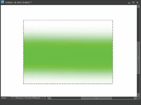
Click and drag across the entire image with the Brush tool to apply the color you chose. Notice that the color is only applied inside of the selected area, as shown in Figure 9.4. That's because the outer, unselected area is protected from any changes. To see the final effect, deselect the selection.
Press Ctrl/

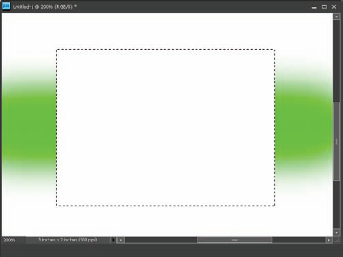
Use the Brush tool to draw another stroke across the entire image frame. Notice that this time, because the selection has been inverted, the central area is protected and the area outside of it, which is now selected, is the only part of the image that's affected, as shown in Figure 9.5.
Remember that any time a selection is active, only the selected area is affected by most changes to the image. For example, if you want to change the color of something, you can select it and then use the Hue/Saturation command to modify the selected area. Another thing that's worth remembering is that you can almost always invert a selection.
Another set of selection tools that has been in PSE for quite a while is the Lasso tools set, shown in Figure 9.6. The name Lasso reminds you that when you draw a selection with these tools, you must be certain to go all the way around the section to be selected to complete the loop, connecting the finishing point to the starting point.
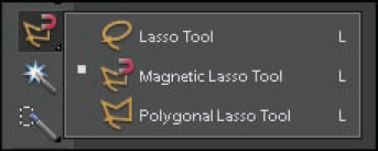
Each of these Lasso tools is suited to a different type of selection scenario. Here's how they're used:
Lasso tool. You use the Lasso tool (often called the Freehand Lasso tool) to draw a selection in any shape you desire. When using it, you are only constrained by your ability to draw, which can be somewhat limited when working with a mouse. To use this tool, click and hold, then drag around the subject. Release the mouse button when you complete the shape.
Magnetic Lasso tool. This selection tool is one of the earliest smart selection tools. It's designed to follow edges around image detail to help you draw a complex selection. It looks for contrast and sticks to edges in between differing areas. Use the Options bar to adjust how this tool works.
Polygonal Lasso tool. This version of the Lasso tool is used for creating selections with straight edges — for example, selecting a square building. To use it, click at one corner of a shape, release the mouse button, click another corner and release, and so on, until you've completely outlined the shape.
Tip
Sometimes it's easy to forget that you have something selected, especially when the selected area is small. If you run into a situation where things don't seem to be working correctly, you may have something selected. Choose Select
Take a moment to explore these tools before moving to the next section. Keep in mind, though, that you may not be using these tools often after you learn about some of the Editor's other selection tools.
In addition to the Marquee and Lasso tools, the PSE Editor features a third set of smart selection tools: the Magic Wand, the Quick Selection tool, and the Selection Brush tool. These tools enable you to create complex selections quickly and easily. Here's how they work:
Magic Wand tool. The Magic Wand tool (W), seventh from the top in the single-column Toolbox, has one of the coolest names of any tool in the PSE Editor. It gets this name because it creates selections almost by magic. When you click a color, it finds other similar colors within the image and selects them. To select only similar tones that are touching one another — for example, selecting a man's blue shirt without selecting the blue sky — choose Contiguous from the Options bar.
Quick Selection tool. The Quick Selection tool (A), eighth from the top in the single-column Toolbox, creates selections based on color and texture similarities combined. This makes it a bit smarter than the Magic Wand, which only uses color for a selection basis. The Quick Selection tool is different than the other selection tools discussed so far because it uses a brush to create a selection. Use the settings on the Option bar to choose the size and hardness of the brush before painting.
To use the Quick Selection tool, click and drag across similar image content. You don't even need to be precise, because this tool intuitively analyzes the image. It has an Auto-Enhance option on the Options bar that enables you to fine-tune the edge of the selection as it's created.
Selection Brush tool. The Selection Brush tool (A) is stacked with the Quick Selection tool. This tool also uses a brush, but in a more literal sense. It doesn't make selections based on color or texture. It simply selects whatever you paint. Because of that, it isn't technically a smart selection tool. Instead, it's used to augment the Quick Selection tool when it selects just a bit too much, or not quite enough. You can also use the Mask mode on the Selection Brush Options bar to exclude an area from a selection.
As I'm sure you can imagine, there are countless ways in which you can use these selection tools. With that in mind, I walk you through a simple exercise in this section to help you better understand how combining selections with minor adjustments helps improve an image.
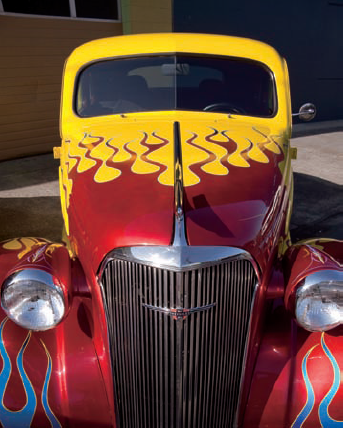
Figure 9.7 shows a photo of a hot rod that I photographed at a local car show. The photo is colorful and has nice geometric shapes in the background. They provide a nice counterpoint to the organic shapes of the car and its paint job. However, some of the detail and color in the background is distracting because it competes for visual attention. With a couple of quick changes, you can make this background more subdued.
Open the Hot_Rod.tif file from the downloadable practice files on the Web site (
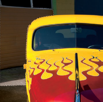
www.wiley.com/go/pse8aftertheshoot). Make a duplicate layer (LayerClick the Quick Selection tool and select a small, soft brush of about 30 px. Choose Auto-Enhance from the Options bar to let the tool automatically smooth the edge of the selection. Click and drag on the tan garage door on the left side of the image. Notice how quickly the tool automatically seeks out similar tones and textures, as shown in Figure 9.8.
Work your way around the outside of the car until all of the background is selected. Try simple clicking, and then clicking and dragging to compare how the tool functions with different types of clicks.
If a small part of the car (such as the rearview mirror) gets selected, switch to the Selection Brush tool. Then click the Subtract from Selection button, the tool icon with a minus sign (−) beside it, on the left side of the Options bar. Begin painting the areas you want to remove. If you take too much out and need to add some back in, click the Add to Selection button. It's the tool icon with a plus sign beside it, next to the Subtract from Selection button.
After the selection is in order, choose Filter
Tip
An old trick for fixing a photo that's not quite in focus is to blur everything around the main subject, making the subject appear sharper by comparison.
While the selection is still active, choose Layer
Lower the Saturation value to somewhere around −40. This slightly desaturates the color of the background, making the bright colors of the car seem brighter. (You can also try setting the Saturation slider to −100 to make the background completely black and white.)
Hide the visibility of the duplicate layer and the Hue/Saturation adjustment layer to compare the finished project to the untouched Background layer. To hide the layers' visibility, click the eyeball icon next to each layer.
Tip
Remember that you can invert the selection (Select
Notice that in the previous exercise you made all the edits non-destructively. If this file is saved as a PSD or TIFF, then all of its layers remain intact, enabling you to modify or delete them later. If you happen to be working quickly and don't expect to revisit the photo for further editing, it's okay to do all the adjustments to the original Background layer.
Now that you have a basic understanding of what selections are and how they're used, it's time to learn about the Editor's most powerful selection toolsets — the Smart Brushes.
The newest selection tools in PSE are the Smart Brush and the Detail Smart Brush tools. These two tools, which are stacked together, enable you to intuitively make a number of localized image adjustments that would be much more complicated with the Editor's standard selection tools.
All of their adjustments are automatically applied on a separate layer — much like the adjustment layers discussed in Chapter 6. This means that all Smart Brush adjustments are non-destructive to the underlying image layer.
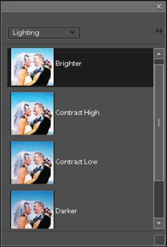
When you select one of these tools, the Style Picker pop-up panel shown in Figure 9.9 opens. This panel contains adjustment presets for effects that can be painted onto the photo.
Use the panel's Style menu at the upper left to choose the group of presets that are displayed on the main panel. For example, you can burn or dodge non-destructively by choosing Lighting from the menu, and then painting with the Brighter or Darker presets.
Tip
You can drag the Smart Brush pop-up panel out of the Options bar and position it elsewhere on the screen.
As with all other tools, when you select one of the Smart Brush tools (F), the Options bar displays its relevant settings. Something that's interesting about these companion tools is that though their options are almost the same, each has a different Brush Picker pop-up panel.
The Detail Smart Brush tool has the same picker as the Burn and Dodge tools (shown in Figure 9.1).
However, the Smart Brush tool has the more extensive Brush Picker pop-up panel that's shown in Figure 9.10.
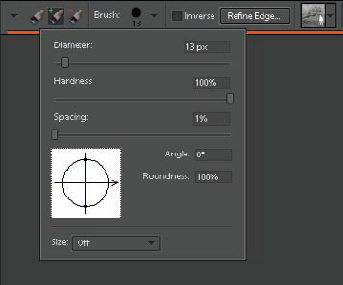
The Brush Picker menu enables you to adjust a number of brush features:
Diameter. Diameter controls the size of the brush, much like the Size option with the Burn and Dodge tools.
Hardness. Hardness controls the hardness/softness of the brush's edge: 100 percent yields a brush with a hard edge and 0 percent yields a brush with a very soft edge.
Spacing. Spacing controls the distance between brush marks in a stroke. Higher values add more space between the marks, causing a dotted-line effect.
Angle. You can use Angle to change the offset between the vertical and horizontal axis of the brush.
Roundness. Lower Roundness values create a linear brush shape instead of a circular one.
I typically leave most of these settings at their defaults. That means I change only the Diameter and Hardness values when working with a brush-based tool. This is especially true when using this tool because it's so smart that it's not necessary to micromanage brush settings.
The best way to understand the Smart Brush tools is to take them for a test drive.
Open the Blue_Car.tif file from the downloadable practice files on the Web site (
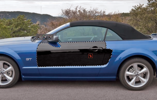
www.wiley.com/go/pse8aftertheshoot). I wish I could tell you that this blue Mustang is my car, but it's merely a car I was lusting after in the parking lot on a recent hiking trip. Though I like the blue color, I've always wanted a black Mustang convertible. I'll show you how to make this one black.Select the Smart Brush tool from the Toolbox, eighteenth from the top in the single-column Toolbox. Then choose Black and White from the Style menu and choose Yellow Filter from the Black and White presets. This effect is the same as using a yellow filter over the lens when shooting black and white, causing yellow colors to be lighter in tone and blue colors to be darker. Click the X at the top right of the panel to hide it.
Tip
To prevent this panel from opening every time you choose one of these two tools, deselect Show On Tool Select from its panel menu.
Set the Brush Picker pop-up menu to the following settings: Diameter = 15 px, Hardness = 100 percent, Spacing = 1 percent. Click and drag across the car's door. Notice that as you do, the brush selects similar areas and changes them to black. The combined area is surrounded by marching ants, indicating that the area is selected.
Your photo should now look similar to Figure 9.11. There are a couple of things to notice about this figure. First, a red tag, called a pin, has been placed on the selected area where I first clicked.
The second thing to notice is the set of three paintbrush icons, near the rearview mirror in Figure 9.11.
These same Brush Selection buttons are on the Options bar. The brush with a plus sign (+) beside it is used to add to the current selection. The brush with a minus sign (−) beside it is used to remove a selected area from the current selection. The first brush, the one without a symbol beside it, is used to begin a new selection.
Pick up where you left off in the exercise in the last step. Continue painting the car until most of it is selected. Click carefully whenever you get near an outside edge of the car, especially along the bottom. If too much is selected, back up by choosing Edit
Switch to the Detail Smart Brush tool. This tool works more like a true brush tool. It applies the adjustment only to areas you paint, rather than selecting areas of similar tone and contrast like the Smart Brush tool does. Notice that the marching ants have disappeared, which is another clue that this brush doesn't use a selection.
Zoom in to 100 percent and begin painting any of the hard-to-select details. Change the size of the brush as needed.
If you find any areas that were inadvertently selected by the Smart Brush tool, click the Subtract from Selection with the Detail Smart Brush tool and remove those details. For example, on my project, both the front (orange) and rear (red) reflectors need to be deselected.
Leave the project open because you use it in the next exercise. If you need to save it, be sure to save it as a PSD or a TIFF with layers. That way when you open it again, the selection will still be active and you can pick up where you left off. This isn't the case with the selections you make with other selection tools. When you close the file, they're gone.
The car in your project should now be mostly black. If it's still a bit rough around the edges, try refining the edges of your selection.
If you zoom in on your project photo from the last exercise, you may notice that some of the edges aren't perfect. In Figure 9.12, you can see on my version where some of the blue is still showing around the edges of this wheel well and the reflector.
With a bit more work using the Smart Selection tools, you could eventually clean it up. Fortunately, there's a faster way to smooth these edges.
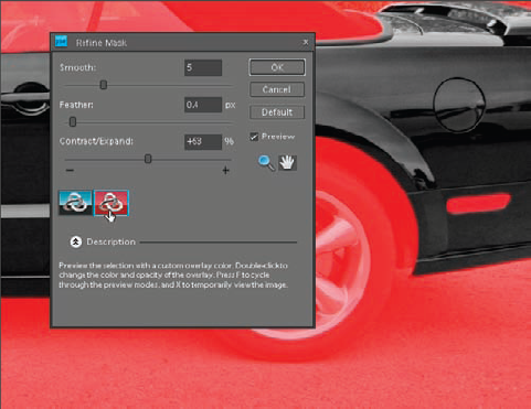
When many of the Editor's selection tools are active, the Refine Edge button appears on the Options bar. Clicking this button opens the Refine Selection dialog box. However, when you click it when using the Smart Brushes, it opens the Refine Mask dialog box.
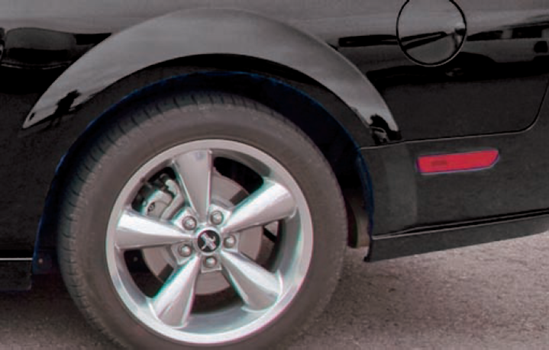
Figure 9.13 shows the Refine Mask dialog box. It has two buttons with interlocking circle icons on the lower left. When you click the first one, you see the familiar marching ants of a standard selection. When you click the second Custom Overlay Color button, an orange mask overlay covers all the unselected areas. If you press your F key, you can temporarily hide this overlay. Pressing F again restores it.
Because you used a hard edge brush to create your Yellow Filter selection, you have the option of softening the edges of the selection using Refine Mask panel. If you had begun with a soft-edged brush, you would not be able to make the edges any harder with the Refine Edge pop-up panel. You could only soften them even more.
Tip
You can change the color of the mask overlay by double-clicking the Custom Overlay button. This is useful when in situations where it's hard to see the red (for example, if you were changing the car to red instead of black).
The Refine Mask panel has three sliders:
Smooth. The Smooth slider is used to reduce jagged portions of the selection's edge.
Feather. The Feather slider is used to soften the transitional area along each side of a selection. In the exercise here, it allows the black inside the selection to soften as it blends with the surrounding unselected image details.
Contract/Expand. The Contract/Expand slider is used to make the selected area larger or smaller.
The Refine Mask panel is very useful for cleaning up the edges of selections and masks. I used the values shown in Figure 9.13 to smooth, soften, and expand the selection on my version of the Mustang shot. Note that the two reflectors on the side of the car were affected negatively by the expansion, so I had to make a quick adjustment to them with the Detail Smart Brush tool after running Refine Edge.
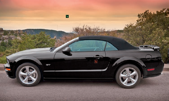
In the last exercise, you changed the blue Mustang to black because that's what I like. But what if you like a different color? No problem. Earlier I mentioned that the Smart Brush tools work non-destructively. That's because all the information contained in them is on a separate layer. Figure 9.14 shows what the Layers panel looks like after the previous project has been completed.
Notice that there's a new layer named Yellow Filter 1 that's been placed above the Background layer. This new layer is a type of adjustment layer, similar to the adjustment layers you learned about in Chapter 6. It has a mask icon on it, showing that only the white-masked portion of the Yellow Filter 1 layer is in effect. If you click the eyeball icon to hide the new layer, you see the original blue car. If you delete this layer, the image goes back to its original state.
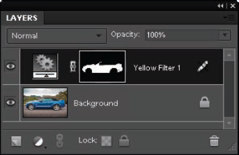
The small pencil icon with a line through it indicates that this type of layer isn't adjustable in the same way you can adjust a Levels or Hue/Saturation adjustment layer using the Adjustments panel. However, this icon is misleading because you can make some adjustments. For example, if you prefer a green car to the black one, follow these steps.
Return to the Blue_Car.tif file from the last project and pick up where you left off. Make sure that the Yellow Filter 1 layer is still the active layer.
Choose one of the Smart Brush tools and then click the Style Picker pop-up panel on the Options bar to open the pop-up panel (if it's not already open). Click the menu, choose Color to display the color presets, and choose Going Green from the presets list to change the color of the car to green. The default color is a bit strong, but it's just a starting place.
Warning
Some of these presets build upon one another. If you select one preset, and then select a second preset, you may get a different effect than if you had simply clicked the second preset without trying the first one.
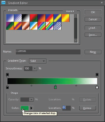
Choose Window
Click the gradient to open the Gradient Editor dialog box, shown in Figure 9.15. This editor is designed to enable you to modify the range of the gradient. The current color is indicated by the green slider at the center of the gradient. You can use it to pick any custom color you want.
Click and drag the middle slider to the right or left just a bit. When you do, a color swatch appears at the bottom left. Click this swatch to open the Select stop color dialog box and then pick any color you want to work with.
After changing the color, you may notice that some cleanup on the car's color is necessary. That's because the black color was much more forgiving around the tire areas so you may not have noticed that the edges of your selection weren't perfect.
If you don't feel like doing the cleanup, change the car to silver instead of a bright color. To do that, choose the Blue Filter from the Black and White presets on the Smart Brushes pop-up panel, or simply use the Undo History panel to go back to the black, which is what I did.
Because each Smart Brush adjustment is on its own layer, it's possible to use more than one type of adjustment on a photo. For example, now that the Mustang is the color you want, you might want to make the sky more dramatic. Follow these steps to add a second adjustment layer just for the sky.
Choose the Smart Brush tool and then choose the New Selection brush from the Options bar. It's the first button with a paintbrush icon on it at the left of the Options bar. Choose the Sunset preset, which is one of the Nature Styles in the Smart Brushes pop-up panel.
Paint the sky and the edges of the trees that are along the horizon so that any sky showing through them is added to the selection. Use the Detail Smart Brush tool to do any detail work that you cannot do accurately with the Smart Brush tool.
The effect is a bit strong, so go to the Layers panel and lower the opacity of the new adjustment layer by clicking and dragging the Opacity slider to the left. I stopped at 40 percent.
After adding the second modification, notice that there are now two pins marking selections in the photo, as shown in Figure 9.16. The red pin marks the first adjustment and the green pin marks the second adjustment. If there were a third one, it would be blue. Click a pin to make its layer active so that you can modify it.
In the last few exercises, you had a chance to learn about one of the Editor's more powerful tool sets. As you can see, when working with the Smart Brush tools, the possibilities are endless. However, there are some other adjustments you can do with them that you may want to explore:
Use some of the Nature style presets to give the sky a different look.
Use the Lighting style presets to change the brightness or contrast of specific areas.
Explore the Photographic style presets to add some creative effects.
Use the Portrait style presets on photos of people to improve facial details, such as lightening teeth or improving details in eyes.
Explore the Reverse-black and white preset from the Reverse Effects styles. This one converts the entire photo to black and white, enabling you to paint color back into special areas. You see this effect quite often in portraits of a bride holding her bouquet. The tones in the photo are black and white, except for the colorful bouquet.
In order to get the most from the tools in this chapter, you need to have a certain level of dexterity with a mouse. Let's face it: The mouse was not designed for making precise shapes. It's more about clicking and dragging.
Another problem with doing this kind of detailed work with a mouse is that there's a tendency to tighten up all your muscles in your arm, shoulder, and neck in an effort to control it. This often leads to discomfort after a long editing session. When I really got into digital photography, I experienced wrist and shoulder pain that took some of the fun out of working with my photos.
Tip
When you spend a lot of time in front of a computer, you have to be conscious of your working environment. I've met many digital photographers who pour a lot of money into their equipment, but never consider the health consequences of working in a non-ergonomic environment. To learn more about ergonomics, see the United States Department of Labor's Safety and Health Topics Web site at www.osha.gov/SLTC/ergonomics/.
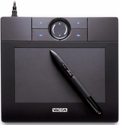
One way to address the problem of dexterity and of ergonomics is to work with a graphics tablet. A graphics tablet is an electronic tablet that has a special pen you use to draw on the tablet instead of drawing on a desktop with a mouse. The pen has right- and left-click buttons, just like a mouse. Working with the pen is much more natural, making it easier to draw complex shapes and reducing stress on your body. In fact, I even use my graphics tablet for other tasks that require a lot of clicking and dragging. I simply set it in my lap and go to town.
The industry-leading maker of graphics tablets is Wacom Technology. I've used Wacom tablets for many years and I know a lot of professional photographers and image editors who use them. Most of Wacom's tablet designs are intended for imaging professionals. However, it recently released a new consumer-oriented line of tablets named Bamboo. There are four versions of the Bamboo, with one specifically intended for scrapbookers. Figure 9.17 shows the standard Bamboo tablet, which retails for $79 at the time of this writing. To learn more about the Bamboo tablets, visit www.wacom.com/wacombamboo/. If you find it difficult to use some of the Editor's creative tools with a mouse, or if you're experiencing any wrist, shoulder, or neck pain when editing your photos, think about trying a graphics tablet. It takes a bit of getting used to, but after you get comfortable with a pen and tablet, you'll wonder how you managed without them.