
Most artists react very warmly to the word "color" and a bit more coolly to the word "management." One's reaction is normally a matter of temperament, and you may be able to empathize. Put the two words together, though, and you can clear a room in seconds. The term color management has been known to simultaneously frighten and bore the most steadfast of graphic artists, photographers, and computer users.
It's no exaggeration to say that color management is the least understood topic in all of computer imaging. Most people, if they think about it at all, expect to calibrate their monitors and achieve reliable if not perfect color. But in point of fact, there's no such thing as perfect color. So-called device-dependent color — synthetic color produced by a piece of hardware — is a moving target. The best that Photoshop or any other piece of software can do is to convert from one target to the next.
For what it's worth, most consumer monitors (and video boards, for that matter) are beyond calibration, in the strict sense of the word. You can try using a hardware calibrator (one of those devices where you plop a little suction cup onto your screen), but calibrators often have less to do with changing screen colors than identifying them. Even if your monitor permits prepress-quality calibration — as in the case of $3,000-plus devices sold by different vendors over the years, including Radius, Mitsubishi, and LaCie — it's not enough to simply correct the colors onscreen; you also have to tell Photoshop what you've done.
Therefore, color management is first and foremost about identifying your monitor. You have to explain your screen's weaknesses to Photoshop so it can make every attempt to accommodate them. In days gone by, Photoshop used the screen data to calculate CMYK conversions and that was it. These days, Photoshop embeds a profile that identifies the source of the image and uses this information to translate colors from one monitor to another. Photoshop also permits you to work in multiple profile-specific color spaces at the same time, which is great for artists who alternatively create images for print and for the Web. Photoshop also permits you to specify exactly what to do with images that lack profiles.
The Color Settings command is that interesting combination of wonderful and bewildering. It can just as easily mess up colors as fix them, but if you read this chapter, you and your colors should be able to ride the currents safely from one digital destination to the next. And best of all, color management in Photoshop is consistent with color management in recent versions of Illustrator and other Adobe applications, so you can learn one, and then the others make much more sense.
For Windows users, Photoshop CS3 devotes three features to color management; Mac users have only two. Formerly a standard component of Photoshop on both platforms (prior to version CS), the Adobe Gamma control panel, which characterizes your monitor, is now a Windows-only utility accessible in the Control Panel. Mac users can use the built-in Display Calibrator Assistant, available from the Color section of the Displays system preferences.
The second color management feature, common to both platforms, is the Color Settings command, found under the Edit menu for Windows users and under the Photoshop menu on the Mac. Choose the command or press Ctrl+Shift+K (
Now, we could just explain each of these color-management features — each on its own — and hope you can put it all together, but that might prevent you from seeing the bigger picture and understanding the concepts as a whole. Therefore, we begin our tour of color management by showing the various control panels, commands, and options in action. In this introductory scenario, an RGB image has been created on the Mac and opened on a Windows system. The Mac is equipped with a high-end monitor, and the PC is hooked up to relatively low-end monitor, so we're covering two extremes and allowing for the many users whose monitors fall somewhere in between.
Despite the change of platforms and the even more dramatic change in monitors, Photoshop maintains a high degree of consistency, so the image looks the same at both ends of the spectrum. The specifics of setting up your system obviously will vary, but this tour should give you an idea of how color management in Photoshop works.
If you own a monitor with calibration capabilities, start by calibrating it. You can use OS 10.X's built-in Display Calibrator Assistant. You can access this feature by clicking the Calibrate button in the Color panel of the Displays system preferences, as shown in Figure 17.1. The Display Calibrator Assistant utilizes ColorSync, which is Apple's system-wide color management system.
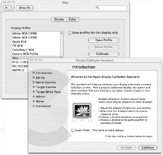
Figure 17.1. On the Mac, clicking the Calibrate button on the Color panel of the Displays system preferences launches the Display Calibrator Assistant.
If you feel particularly confident (and even if you don't), go ahead and select the Expert Mode option. That gives you access to a few more options, but you also may find that you can't access every option in the Display Calibrator Assistant (or for that matter of the Adobe Gamma control panel on the PC). Some monitors, particularly LCDs, don't allow for every adjustment. Again, your situation may vary from the one depicted and described here, but the overall concept is the same.
For the Windows/PC users, Photoshop ships with the Adobe Gamma control panel. Under Windows XP and Vista, the Control Panel is available immediately under the Start menu. After the Control Panel window appears, double-click the Adobe Gamma icon. (Make sure you're viewing all Control Panel options.)
If you don't see the Adobe Gamma icon in the Control Panel window, select the Appearance and Themes option, and then double-click the Adobe Gamma icon. (If the Control Panel displays a warning that your video card doesn't support systemwide color management, don't lose any sleep over it — many video cards don't.) Select the Step By Step (Wizard) option and click Next to walk through the setup process one step at a time. If you don't want to take it step by step, you can choose the Control Panel option and use the dialog box shown in Figure 17.2. If that dialog box scares you, click the Wizard button to go back to the step-by-step process.
If you do choose to use the Adobe Gamma Wizard, all you have to do is answer questions and click Next to advance from one screen to another. For example, after adjusting the contrast and brightness settings, Gamma asks you to specify the nature of your screen's red, green, and blue phosphors. If you own a Trinitron or Diamondtron monitor — which you'll know because you paid more for it — select the Trinitron settings. Or select Custom, and type values according to your monitor's documentation. If the documentation does not suggest settings, ignore this screen and click Next to move on. This isn't a big problem, so don't worry if you don't know or can't find all of your monitor's specs and suggested settings.
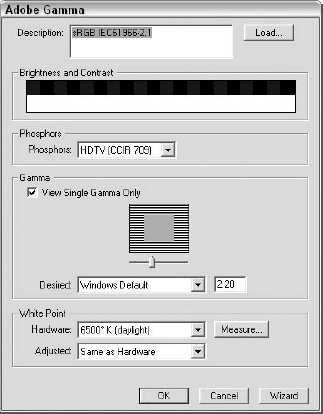
Figure 17.2. This Control Panel Adobe Gamma dialog box lets you set the Brightness and Contrast, Phosphors, Gamma, and White Point for your monitor.
As with the Native Gamma section of the Mac Display Calibrator Assistant, the next screen, pictured in Figure 17.3, is the most important. It asks you to balance the red, green, and blue display functions of your monitor. But to do so, you need to deselect the View Single Gamma Only option; this presents you with separate controls over each of the three monitor channels. Then use the sliders to make the inner squares match the outer borders. You are in essence calibrating the monitor according to your unique perceptions of it, making this particular brand of characterization a highly personal one.
The next screen asks you to set the white point, which defines the general colorcast of your screen from 5,000 degrees Kelvin for slightly red to 9,300 degrees for slightly blue. A medium value of 6,500 degrees is a happy "daylight" medium. To find the best setting for your monitor, click Measure. Then click the gray box that appears the most neutral — neither too warm nor too cool — until you get dumped back into the Gamma Wizard. Click Next.
After you click Finish, the Gamma utility asks you to name your new monitor profile and save it to disk. Name it whatever you want, but don't change the location because the profile has to stay in the default location to be made available to Photoshop and other applications.
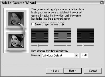
Figure 17.3. Deselect the View Single Gamma Only option to modify each of the three color channels independently.
Adobe Gamma generates a custom monitor profile and automatically alerts Photoshop to the change. Your screen may not look any different than it did before you opened Gamma, but you can rest assured that Photoshop is now officially aware of its capabilities and limitations.
Now that you've identified your monitor, it's time to select an RGB working environment, which is a color space other than the one identified for the monitor. This is the strangest step, but it's one of the most important as well. Fortunately, all it requires is a bit of imagination to understand fully.
On the Mac, switch to Photoshop and choose Photoshop
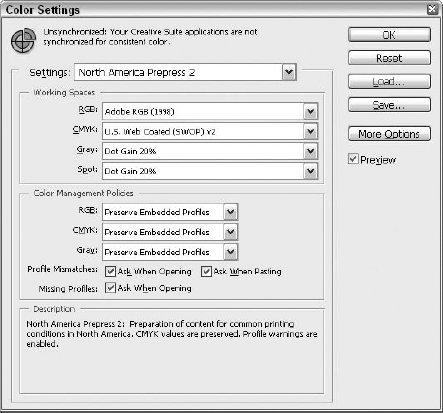
Each of these options has its relative advantages in certain settings, but most people gravitate toward two other options. If you create most of your images for the Web, select the Web Graphics Defaults option. This directs Photoshop's color functions so that they're most amenable to screen display. On the other hand, if most of your artwork finds its way into print, and if you live in the United States or a country that supports U.S. printing standards, select North America Prepress 2.
If you develop images for both print and Web use and aren't sure if you should commit to settings for one over the other, select North America Prepress 2, as shown in Figure 17.4. Why? Among its other attractions, the North America Prepress 2 option sets the working RGB color space to Adobe RGB (1998), arguably the best environment for viewing 24-bit images onscreen.
Adobe RGB includes a wide range of theoretical RGB colors, whether or not they can truly be displayed on a monitor. You may see some clipping, which is when two or more color spaces appear as one, onscreen, but Photoshop has greater latitude when interpolating and calculating colors.
After selecting North America Prepress 2, click OK. The source environment is fully prepared, and you can now save an image and send it on its way.
The final step on the Mac side in this scenario is to embed the Adobe RGB profile into a test image. (Embed simply means that Photoshop adds a little bit of code to the file stating where it was last edited.) For this, choose File
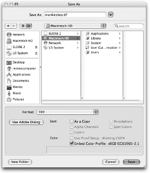
Figure 17.5. Select the Embed Color Profile option to append the Adobe RGB profile to the image saved on the Mac.
Warning
To save a profile with an image, you have to select a file format that supports profiles. This includes the native Photoshop (PSD) format, TIFF, JPEG, EPS, PSB, and PICT. The two DCS formats also save profiles, but because DCS supports only CMYK images, it converts the RGB image to CMYK and saves a CMYK profile. If you select another format — GIF, PNG, BMP, or the like — the Embed Color Profile option becomes dimmed.
Note
The Embed Color Profile option always embeds the device-independent profile defined in the Color Settings dialog box. This is very important: It does not embed the monitor profile. Photoshop handles the conversion from monitor space to RGB space internally without the help of either the Color Settings or Save As commands. This permits Photoshop to accommodate a world of different monitors from a single RGB working space.
After saving the test image with the embedded Adobe RGB profile, you can transfer the file from your Mac to your PC. You can do this by e-mailing the file to yourself (if you have two computers, one Mac and one PC), or by sending it to a network folder that you can access from the PC (if you're on a network). With either transfer method — or if you want to bring the file over on a flash drive or CD — no translation occurs; this is a simple file copy from one computer to another. Before you can open the image and display it properly on the PC, you have to set up the RGB colors. Start by characterizing the monitor using the Adobe Gamma Wizard, as discussed earlier in this chapter.
After you finish with Adobe Gamma, go into Photoshop and choose Edit
The truncated name for this working space is sRGB, short for standard RGB, the ubiquitous monitor space touted by Hewlett-Packard, Microsoft, and a host of others. Although much smaller and drabber than Adobe RGB, the sRGB space is perfect for Web graphics because it represents the colors projected by a run-of-the-mill PC monitor. It also happens to be Photoshop's default setting. Given that many users will never visit this dialog box, sRGB is fast becoming a cross-platform standard.
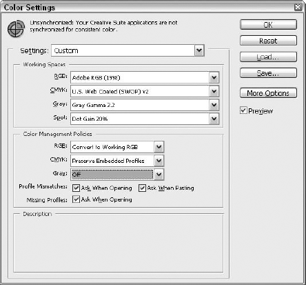
The Color Settings command determines not only how Photoshop projects images onscreen but also how it reads embedded profiles. The three Color Management Policies' pop-up menus control how Photoshop reacts when it tries to open an image whose embedded profiles don't match the active color settings. When Web Graphics Defaults is active, the RGB pop-up menu is set to Off, which tells Photoshop to resist managing colors when it opens an RGB image. Disabling color management entirely is probably not a good move, especially when it threatens to ruin your color-conversion scenario. Instead, set the option to Convert to Working RGB, as shown in Figure 17.6.
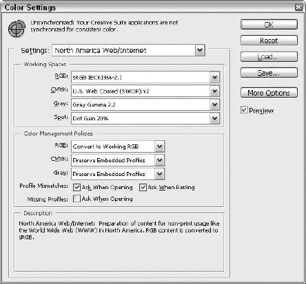
Figure 17.6. On the Windows side, select North America Web/Internet to set the working environment to sRGB. This forces Photoshop to make a conversion. The setting also may appear as Web Graphics Defaults.
Finally, Photoshop wants to know how it should behave when it encounters an image with a profile other than sRGB. Should it convert all colors in the image to the sRGB environment? Or should it ask permission before proceeding? If you want to be able to make this choice on a case-by-case basis, select the Ask When Opening option from the Profile Mismatches options, as shown in Figure 17.7.
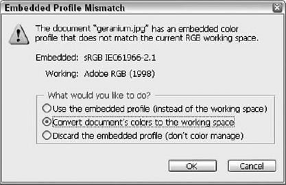
When you're ready to open the test image (assuming you're working along here; if not, you can refer to these pages when you're doing this "for real"), choose File
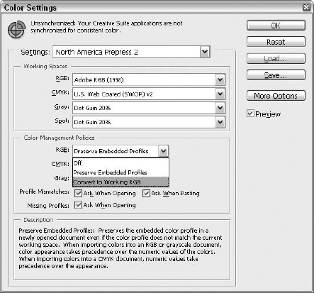
Figure 17.7. Set the first of the Color Management Policies to Convert to Working RGB to convert the image from the Adobe RGB working space to the sRGB space.
Use the embedded profile: Photoshop is perfectly capable of displaying multiple images at a time, each in a different color space. Select this option to tell Photoshop to use the Adobe RGB space instead of sRGB to display the image it's about to open. No colors are converted in the process.
Convert document's colors to the working space: This option converts the colors from the Adobe RGB space to sRGB. Because Convert to Working RGB was selected in the preceding section, this option is selected by default. Had the Ask When Opening option not been activated, Photoshop would have performed the conversion without asking you.
Discard the embedded profile: Select this option to ignore the embedded profile and to display the image in the sRGB space without any color manipulations. Thanks to the low saturation inherent in sRGB, the result would be a significantly grayer, gloomier image.
Select the Convert document's colors to the working space option, and click OK. Photoshop spends a few seconds converting all pixels in the image from Adobe RGB to the smaller sRGB and then displays the converted image onscreen. The result is an almost perfect match — much better than the sort of results you could achieve without profile-based color management.
Color Settings is the command that puts Photoshop's color conversion functions in play. It defines the color space parameters and at the same time makes the color conversions happen. This section explains the specific options as they're grouped in the Color Settings dialog box. You'll also find some suggestions for using particular settings, in case you're interested in a little advice.
This portion of the Color Settings dialog box comes last, but it's also the most important. It tells you what every one of the Color Settings options does. Just position the cursor over an option to see a detailed description. To see how an option in a pop-up menu works, select the option and then position your cursor over it. With help like this, what do you need us for?
No, seriously, what do you need us for? Before we take the rest of the chapter off — there's laundry to do, after all — we will tell you that if you save your own color settings, you can type a description that shows up in the Description section when you load your settings.
Because every color model except Lab varies according to the hardware — the screen or the printer — Photoshop has to tweak the color space to meet your specific needs. There's no such thing as a single, true CMYK color model, for example. Instead, there are lots of printer-specific CMYK color models. These color models inside color models are called working spaces. You define the default working spaces that Photoshop uses when opening unprofiled images, creating new ones, or converting mismatched images using the four Working Spaces pop-up menus:
RGB: The RGB environment defines what you see onscreen. Rather than limiting yourself to the circumscribed range of colors that your particular brand of monitor can display — known as the monitor's gamut — you can work in a larger, richer color environment, filled with theoretical color options that will serve your image well when projected on other monitors and output from commercial presses. Unless you work strictly on the Web and never create artwork for print, select the Adobe RGB (1998) option. If you're working with images destined for After Effects, Adobe recommends that you choose the Monitor RGB working space. Notice that your monitor space also appears in the pop-up menu; this shows that your monitor was correctly tagged with Adobe Gamma or the Display Calibrator Assistant.
Tip
If you're a Web artist and want to preview how an image will look on a different kind of monitor, choose View

CMYK: Use this option to specify the kind of printer you intend to use to print your final CMYK document. This option defines how Photoshop converts an image to the CMYK color space when you choose Image
Grayscale: This command defines how Photoshop displays a grayscale image (created using Image
Spot: From a printing perspective, a spot-color separation behaves like an extra grayscale print. Specify the dot gain value that correlates to your commercial printer. If you don't know that value, Dot Gain 20% is a safe bet.
If the Assign Profile command leaves pixels unchanged so that they appear to change onscreen, there must be a command that converts pixels so that they appear consistent onscreen. That command is Edit
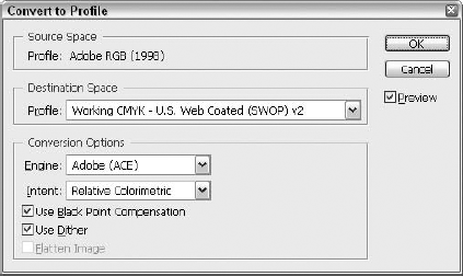
Figure 17.9. Convert to Profile is the complement to Assign Profile. Choose it to switch an open image to a different color space and convert the pixels. The result is an image that looks the same onscreen as it did before.
Assigning a Profile
An open profiled image remains in its working space regardless of how you change the settings in the Color Settings dialog box. Suppose that you open an image in sRGB and then change the working space to Adobe RGB. The open image remains unchanged onscreen, safe in its sRGB space. If you prefer the image to change to the new space, choose Edit
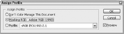
To permit the image to change on the fly according to the active working space, choose Edit
Tip
At first glance, the Destination Space pop-up menu may seem complicated, offering RGB, CMYK, and grayscale working spaces, and even allowing you to create your own. Surprisingly, this vast array of options may result in less work for you. The Destination Space option permits you to switch color modes. For example, if you open an RGB image, choose the Convert to Profile command, and select a CMYK space such as U.S. Web Coated (SWOP), Photoshop remaps the colors and converts the RGB channels to CMYK. Convert to Profile has an edge over Image
Highlighted in Figure 17.10, the next set of options controls how Photoshop reacts when opening an image that either lacks a profile or contains a profile that doesn't match the specified Working Spaces options previously listed. These are the options that are most likely to cause confusion because they're responsible for the error messages that Photoshop delivers when opening images. The trick is to keep the error messages to a minimum while keeping control to a maximum. Here are some suggestions for each option accompanied by what is hopefully enough explanation for you to make your own educated decisions:
RGB: The first three pop-up menus establish default policies that Photoshop suggests or implements according to the options that follow. For example, when opening an untagged RGB image, tag it with the working RGB profile, which in my case is Adobe RGB. Select Convert to Working RGB, and deselect the Missing Profiles option. This way, when no profile is evident, Photoshop assigns the Adobe RGB profile without any further fanfare. However, if the image contains a profile, you could go either way. An image tagged with an sRGB profile is probably a Web image, so you could go ahead and open it in the sRGB space without conversion. However, if you have an image tagged with the Apple RGB profile — intended to match a typical Apple Macintosh screen — you may want to convert it to Adobe RGB. Therefore, set Profile Mismatches to Ask When Opening. This way, Photoshop asks you what you want to do every time you open an image with a non-matching RGB profile. It will suggest that you convert the image to Adobe RGB, but permit you to override it if you prefer.
CMYK: Whereas RGB color is a function of your monitor and the RGB working space, accurate CMYK is all about matching colors to a specific output device. Therefore, if you're accepting CMYK images from clients and colleagues, you probably want to be very careful about making arbitrary conversions. By setting CMYK to Preserve Embedded Profiles, you tell Photoshop to open a tagged CMYK image in its own color space and override the default CMYK space specified in the Working Spaces option mentioned previously. Again, setting Profile Mismatches to Ask When Opening gives you the option to change your mind and convert the image to your working CMYK space if it seems appropriate. If the image has no profile, Photoshop leaves it untagged, giving you the option of testing multiple CMYK working spaces and assigning the one that fits best. This is case-by-case decision making at its best.
Gray: Making automatic color manipulations to color images is all very well and good, but clipping is bound to occur, and with millions of theoretical colors at your disposal, the clipping is unlikely to do any visible harm. Grayscale images are another story. Blessed with just 256 brightness values, they are significantly more fragile than color images, and few grayscale images are tagged properly, which makes Photoshop's automatic adjustments less than reliable. You, therefore, would be well served to correct grayscale images manually (as explained in Chapter 18) and keep Photoshop out of the process. Set the Gray option to Off.
Profile Mismatches: These two options tell Photoshop how to behave when opening an image whose profile does not match the working color space. If you select Ask When Opening, Photoshop asks your permission to perform the conversion suggested in the previous pop-up menus. This prompt also gives you the option of opening the image in its native color space or leaving the image untagged. Back in the Color Settings dialog box, select the Ask When Pasting option to tell Photoshop to warn you when you copy an image from one working space and paste it into another. As for the Ask When Pasting option, deselect that, too, and let Photoshop do its work unhindered.
Missing Profiles: When you open an image that lacks an embedded profile, Photoshop likes to ask you whether you want to manage the colors. I say deselect the Ask When Opening option — enough alert messages already! — and let Photoshop take its cues from the RGB, CMYK, and Gray pop-up menus. According to Figure 17.10, this means Photoshop tags most unprofiled RGB images with an Adobe RGB profile and leave unprofiled CMYK and grayscale images alone. An exception occurs when opening newer unprofiled images. If you save an image without a profile using version 5 or later, Photoshop inserts a tag that explicitly states, "I have no profile." In this case, the file opens untagged and Photoshop resists color managing the image until you tell it to do otherwise.
The Color Management Policies options are particularly dense, so no one will blame you if you find yourself reading and rereading the text trying to make sense of it. If you can't for the life of you make heads or tails of it, try this instead: Set your options to match the ones suggested in Figure 17.10. Then work in Photoshop for a few days or weeks and see how it feels. The good news about suggestions is that they're just that, and the settings they affect can be reset as needed. In the suggested positions, they won't hurt your images, even if you don't know what you're doing. With a little time and practice, you'll get a feel for how the settings work. Then come back, read the text again, and see if it makes more sense.
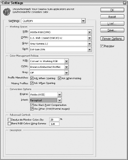
Up to this point, admiration for Photoshop's color management tools has outweighed frustration with its complexity. But the moment More Options is clicked patience evaporates. Suddenly, this really is too much. The next portion of the Color Settings dialog box that is covered is the stuff that appears when you click More Options. This button brings with it many frustrations, and it's tempting to just skip it. But that's not something a bible can do — skip entire sections of pivotal dialog boxes — so here you go.
Think of More Options as the key to the color management underworld. When you click it, you unleash two categories of demonic preference settings: Conversion Options and Advanced Controls. Shown in Figure 17.11, each set of options possesses its own special brand of loathsome and horrible power. Save yourself now, dear reader — run while you still can.
Wait — you're still here? Brave soul. Oh, well, as long as you're here, we may as well go over it. Here goes:
Engine: The first of the Advanced Mode options is Engine, and it does just what it sounds like it does. The force behind the color management process is the engine. If you don't like one engine, you can trade it for another. If you work in a Macintosh-centric environment, for example, you may want to select Apple ColorSync. You should probably stick with the Adobe Color Engine, or ACE. Not only is ACE a great engine, it ensures compatibility with Illustrator, InDesign, and other Adobe applications.
Intent: Whenever you remap colors, a little something gets lost in the translation. The trick is to lose as little as possible, and that's the point of Intent. In previous versions of Photoshop, the option was set by default to Relative Colorimetric, which converts every color in the source profile to its closest equivalent in the destination profile. Although such a direct transfer of colors may sound attractive, it can create rifts in the image. The closest equivalent for two similar colors in the source profile might be a single color in the destination, or they might be two very different colors. As a result, gradual transitions may become flat or choppy. Wisely, Adobe has now set Perceptual as the default, which sacrifices specific colors in favor of retaining the gradual transitions between colors, so important to the success of continuous-tone photographs.
Tip
Is Perceptual really better? Well, we think so, but don't take our word for it. Instead, position your cursor over the word Perceptual and read the Description text (refer to Figure 17.11), which tells you that Perceptual "requests a visually pleasing rendering, preserving the visual relationships between source colors." The truth is that most people at Adobe believe Perceptual to be the better choice. Who are we to disagree?
Use Black Point Compensation: Like any other colors, Photoshop wants to convert black and white to new values. Whites are compensated naturally by the Intent setting, which may in many cases map white to a different color in the name of smoother transitions. But if you let black map to a lighter color, you can end up with wimpy gray shadows. To keep your blacks their blackest, select this option.
Use Dither (8-bit/channel images): Just so we're all on the same page, a 24-bit image contains 8 bits per channel. So don't think we're talking about 8-bit GIF images here; this option uses dithering (random patterns of pixels) to smooth out what otherwise might be harsh color transitions. Ostensibly, it can result in higher file sizes when saving an image in the native PSD format or TIFF with LZW compression. But the effect is usually minimal. Leave this option selected.
Desaturate Monitor Colors By: The Adobe RGB space in particular has a habit of rendering such vivid colors that the brightest areas in the image flatten out onscreen. Because they may or may not have a direct outcome on the appearance of the final image, whether in print or on the Web, such flat areas can be a bit misleading. To better see details in bright areas of color, select the Desaturate Monitor Colors option. Note that this option affects only the screen view; the colors continue to print as vividly as ever. Use this option only for running previews in the Color Settings dialog box. Leaving this option selected for extended periods of time can be more deceiving than deselecting it.
Blend RGB Colors Using Gamma: When this option is deselected, as by default, Photoshop blends layers according to the gamma of the working color space. For example, the gamma of Adobe RGB is 2.2, the same as a typical PC screen and a few shades darker than a typical Macintosh screen. On occasion, however, this may result in incongruous highlights around the edges of layers. If you encounter this, try selecting this option. Photoshop recalculates all blends using a theoretically more desirable gamma value.
To prepare an image for reproduction on a commercial offset or Web press, you first need to specify how you want Photoshop to convert the image from the RGB to CMYK color space. This step also affects the conversion from CMYK to RGB, which in turn defines how CMYK images appear onscreen.
You specify the CMYK space by choosing Edit
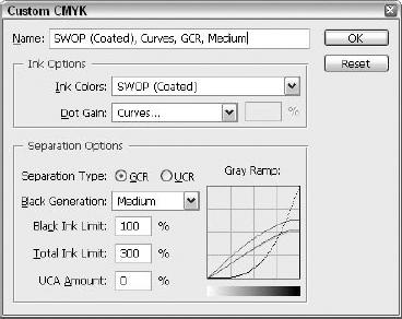
Figure 17.12. Use the options in the Custom CMYK dialog box to prepare an image for printing on a commercial offset or Web press.
The following list explains each and every option in the Custom CMYK dialog box. If you're not a print professional, some of these descriptions may seem a little abstruse. After reading this section, you may want to talk with your commercial printer and find out what options, if any, he or she recommends.
Name: Okay, so this one's not so abstruse after all. Type a name for your custom CMYK settings here.
Ink Colors: This pop-up menu offers access to a handful of common press inks and paper stocks. Select the option that most closely matches your printing environment. (Your commercial printer can easily help you with this one.) The default setting, SWOP (Coated), represents the most common press type and paper stock used in the United States for magazine and high-end display work. Regardless of which setting you choose, Photoshop automatically changes the Dot Gain value to the most suitable setting.
Dot Gain: Type a value from −10 to 40 percent to specify the amount by which you can expect halftone cells to shrink or expand during the printing process, a variable known as dot gain. When printing to uncoated stock, for example, you can expect halftone cells to bleed into the page and expand by about 25 to 30 percent. For newsprint, it varies from 30 to 40 percent. In any case, Photoshop automatically adjusts the brightness of CMYK colors to compensate, lightening the image for high values and darkening it for low values.
Separation Type: When the densities of cyan, magenta, and yellow inks reach a certain level, they mix to form a muddy brown. The GCR (gray component replacement) option avoids this unpleasant effect by overprinting these colors with black to the extent specified with the Black Generation option. If you select the UCR (under color removal) option, Photoshop removes cyan, magenta, and yellow inks where they overlap black ink. GCR is almost always the setting of choice except when printing on newsprint.
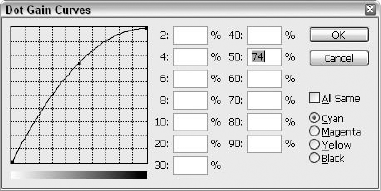
Curve Control
For more control, select Curves from the Dot Gain pop-up menu. As shown in the figure, this brings up the Dot Gain Curves dialog box, which permits you to specify how much the halftone dots expand on a separation-by-separation basis. If the All Same option is selected, deselect it. Then use the Cyan, Magenta, Yellow, and Black radio buttons in the lower-right corner of the dialog box to switch among the four separations and modify their output independently. To do this, locate the lone point in the center of the curved line in the graph on the left side of the dialog box. Drag this point up to add dot gain, which in turn darkens the display of CMYK colors onscreen; drag the point down to lighten the display. If you need more control, you can add points to the graph by clicking on the curved line. Points added to the left side of the curve affect the display of light colors; points added to the right side of the curve affect dark colors.
Black Generation: Available only when the GCR option is active, the Black Generation pop-up menu determines how dark the cyan, magenta, and yellow concentrations must be before Photoshop adds black ink. Select Light to use black ink sparingly; select Heavy to apply it liberally. The None option prints no black ink whatsoever, and the Maximum option prints black ink over everything. You may want to use the UCA Amount option to restore cyan, magenta, and yellow ink if you select the Heavy or Maximum option.
Black Ink Limit: Type the maximum amount of black ink that can be applied to the page. By default, this value is 100 percent, which is solid ink coverage. If you raise the UCA Amount value, you'll probably want to lower this value by a similar percentage to prevent the image from over darkening.
Total Ink Limit: This value represents the maximum amount of all four inks permitted on the page. For example, assuming you use the default Black Ink Limit and Total Ink Limit values of 100 and 300 percent, respectively, the darkest printable color contains 100 percent black ink. The sum total of cyan, magenta, and yellow inks, therefore, is the difference between these values: 200 percent. A typical saturated black — a mix of inks that results in an absolute pitch-black pigment — is 70 percent cyan, 63 percent magenta, 67 percent yellow, and 100 percent black. And 70 + 63 + 67 + 100 =, you guessed it, 300.
UCA Amount: The opposite of UCR, UCA stands for under color addition, which enables you to add cyan, magenta, and yellow inks to areas where the concentration of black ink is highest. For example, a value of 20 percent raises the amount of cyan, magenta, and yellow inks applied with black concentrations between 80 and 100 percent. This option is dimmed when the UCR option is selected.
Gray Ramp: The Gray Ramp graph on the right side of the Custom CMYK dialog box shows the effects of your changes. Four lines — one in each color — represent the four inks. Although you can't edit the colored lines in this graph by clicking and dragging them, you can observe the lines to gauge the results of your settings. If you have an urge to grab a curve and yank it, choose Custom from the Black Generation pop-up menu. The ensuing dialog box lets you edit the black curve directly while you preview its effect on the C, M, and Y curves in the background.
Tip
To see how your changes affect an open CMYK image in Photoshop, do this: Before choosing the Color Settings command, choose Edit
As we've seen, it can be a painstaking process of trial and error to arrive at the perfect color settings. Furthermore, the perfect settings for one job may be highly imperfect for another. Clearly, there's a pressing need for a way to save and load color settings; and just as clearly, Photoshop is the sort of obliging application to provide a way to do it.
You might logically surmise that the Load and Save buttons on the right side of the Color Settings box will come into play here — and you'd be correct. After you have your settings just the way you want them, click Save. You'll be prompted to save your settings in a Settings folder located deep within the bowels of your hard drive. (Should you ever need to find it again, here's the path: Under Windows, it's Program FilesCommon FilesAdobeColorSettings. On the Mac, it's located in your User folder at Library/Application Support/Adobe/Color/Settings.) Clicking Load takes you to the same folder, where you can choose the saved settings that you want to load.
And that's not all. Not only can you save and load individual CMYK Working Spaces settings, but with the dreaded Advanced Mode option activated, you can save Working Spaces files for RGB, Grayscale, and Spot color settings as well. You'll find the load and save commands under the individual pop-up menus for each space.
What if you work with multiple commercial prepress houses? Wouldn't it be nice to be able to select different custom working spaces from the CMYK pop-up menu without having to constantly open setup files using the Load CMYK option? Yes, it would, and here's how you do it.
STEPS: Creating a CMYK profile
In the Color Settings dialog box, choose Save CMYK from the CMYK pop-up menu, and give the file a name ending in the .icm extension to create an ICM file. Other than the extension, the name you give it here isn't really that important; the original name you assigned when you first created the settings with the Custom CMYK command is the name you'll see when you actually load the settings.
Save the ICM file to the Recommended folder. For Photoshop to see the CMYK profile, you have to save it to a specific folder. On the PC, the path for that folder is C:Program FilesCommon FilesAdobeColorProfilesRecommended. On the Mac, start with the Library folder at the root level of your hard drive, and then go to Application Support/Adobe/Color/Profiles/Recommended. When you finally arrive inside the Recommended folder, save the ICM file.
Quit Photoshop. Regardless of which version of Photoshop you're using, quit it by choosing File
Launch Photoshop. By starting (or restarting) Photoshop, you force the program to load the ICM profile.
Confirm that the profile has loaded. Press Ctrl+Shift+K (

Tip
Because the ICM file created in the preceding steps resides in the Recommended folder, it appears in the CMYK pop-up menu even when More Options has not been clicked. Any ICM files saved in the Profiles folder but outside the Recommended folder appear only when Advanced Mode is turned on.
As discussed in Chapters 3 and 20, Photoshop CS3's Bridge feature enables you to both organize your images and use them in creative ways that go beyond the Save for Web & Print commands in the main Photoshop workspace. You can use the Bridge to scan images or to capture images from a digital camera or video phone, as well as other sources.
So what's all this synchronizing business? It's simple, actually — unbelievably so, considering all the dialog boxes and steps and settings you have to deal with in Photoshop — choosing color settings, embedding them, dealing with those dreaded More Options. When you work with images in the Bridge, though, assuming you want to make sure you've got the same color settings in place as you do in the main Photoshop workspace, all you have to do is choose Edit
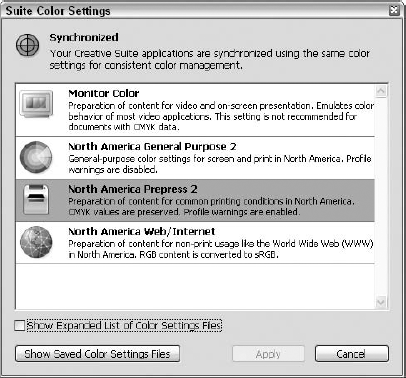
Figure 17.13. The Suite Color Settings dialog box offers 13 color management choices, including Color Management Off. Choose the one that matches your Photoshop settings so you're in synch with the Bridge.
So anyway, you want to synchronize your color settings. You may not have known that is what you want to do, but you do. Synchronization is something you want to maintain because, as the dialog box itself tells you, it provides "consistent color management." What's life without consistency? Interesting, you say? Well, yes. But in Photoshop, consistency is a good thing.
After the Suite Color Settings dialog box is open, you can scroll through the 13 options, reading the short blurb about each one, and then you can make a selection by clicking the setting you want to use, the one that matches your Photoshop color settings choice. If you click the Show Expanded List of Color Settings Files option and then click Apply, the list expands (what a surprise) to show 18 additional settings, the last of which is Web Graphics Defaults, so if you're a Web artist and have your Photoshop color settings set for the Web, you may want to expand the list and choose this one. The expanded list, showing the tail end of the 18 additional settings, appears in Figure 17.14.
Tip
The Show Saved Color Settings Files option takes you to Windows Explorer (it opens a new Windows Explorer window, even if you have such a window open already) and shows you the location of the settings files — a handy tool if you can't remember the exact path (C:Documents and SettingsDefaultApplication DataAdobeColorSettings).
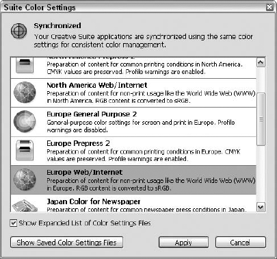
Figure 17.14. More, more, more: You have 18 more color settings to choose from, including North America Prepress 2 and North America Web/Internet.
After you click the setting you want to use, click Apply, and the dialog box closes. That's all there is to it. You can reset the selection as needed, matching your Photoshop settings for individual images or for groups of photos that need different handling — images bound for a Web Gallery rather than a printed Contact Sheet, for example. Luckily, all the hard work is done on the Photoshop side, and all you have to do in the Bridge is match the main color management method, and you're good to go.
In this chapter, you learned about controlling how Photoshop displays and uses color. This included everything from testing the way your image will appear on different monitors to embedding a color profile to making sure that your color settings in Photoshop follow your images to the Bridge and beyond.