Conceptually, printing is a pretty straightforward process. You choose the Print command, press Enter or Return, wait for something to come out of your printer, and then you admire yet another piece of forest that you've destroyed. Of course, printing can be an unbelievably complicated subject too, involving things like dot-gain compensation, hardware calibration, under-color removal, toxic processor chemicals, separation table generation, infinitesimal color parameters, and then factor in the publishing requirements for graphics bound for the Web and you're liable to spend a whole lot of your otherwise valuable time trying to figure out what the heck's going on — or pulling your hair out. At the very least, you're going to feel some anxiety at some point.
This chapter is intended to help you avoid that anxiety — or maybe lessen it — and to help you make sense of it all. By the time you finish this chapter, you should be able to figure your way out of any printing dilemma, or at least know how to avoid them by taking the proper preparatory steps before embarking on an important print job — be it one you're doing yourself on your own printer or one you're taking to a "professional" for specialized results.
Although the chapter is not intended to cover every possible facet of printing and publishing digitized images, it does take you through the process of preparing and printing the four major categories of output: composites, color separations, duotones, and Web graphics. By the end of the chapter, you'll be familiar with all of Photoshop's printing and publishing options for both paper and Web production. You'll also be prepared to communicate with professionals at your service bureau or at a commercial printer, if need be, and to learn from their input and expertise.
While not a glossary in the traditional sense, the following is a general list of the printing and publishing terms that you'll encounter as you work with commercial printers, your own printer, and your Web master or host. Ready? Here you go:
Service bureau: A service bureau is a shop often filled with young graphic artists, printer operators, and about a billion dollars worth of hardware. A small service bureau is usually outfitted with a few laser printers, photocopiers, and self-service computers. Big service bureaus offer scanners, imagesetters, film recorders, and other varieties of professional-quality input and output equipment.
Service bureaus once relied exclusively on the Macintosh. This has changed, but a substantial number of Mac-based service bureaus remain. Most service bureaus are equally ready to help Photoshop users on both Windows and Mac platforms, but many will take your Windows Photoshop file and run it through a Mac. There's nothing wrong with this — Photoshop is nearly identical on the two platforms — but cross-platform problems may crop up. If you're a PC user, try to be sure that your service bureau knows how to address cross-platform incompatibilities and has a general working knowledge of Windows. How can you be sure? Ask.
Commercial printer: Generally speaking, a commercial printer takes up where the service bureau leaves off. Commercial printers reproduce black-and-white and color pages using offset presses, Web presses, and a whole bunch of other age-old technology. The process is less expensive than photocopying when you're dealing with large quantities, say, more than 100 copies, and it delivers professional-quality reproductions.
Web host: This sounds like the Internet version of a game-show host, but in truth, your Web host is simply the company (or maybe it's just a person) who has a Web server, and who sells or rents you space on that server for your Web site. The impact this entity (the host) has on your Photoshop use relates to your creation of Web graphics. If you try, for example, to load an image that's not in a Web-friendly format onto you Web page, it may well be your host (or one of his or her customer service staff) who has to explain to you that the type of file you tried to use won't work on the Web. So knowing the file formats that the Web does like is a good thing to have under your informational belt. Between Chapter 3 and its "File Format Roundup" and this chapter's coverage of Web-related issues, you'll be ready to take on your Web host and know exactly what kind of images you can and cannot use online.
Output device: This is just another way to say printer. Output devices include printers, imagesetters, film recorders, and a whole bunch of other machines.
Laser printers: A laser printer works much like a photocopier, and comes in both black and white-only and color laser varieties. First, it applies an electric charge to a cylinder, called a drum, inside the printer. The charged areas, which correspond to the black portions of the image being printed, attract fine, petroleum-based dust particles called toner. The drum transfers the toner to the page, and a heating mechanism fixes the toner in place. Most laser printers have resolutions of at least 300 dots (or printer pixels) per inch. The newer printers offer higher resolutions, such as 600 and 1200 dots per inch (dpi), and as prices come down, color laser printing is now within more people's reach.
Color printers: Color printers fall into three categories. Generally speaking, inkjet and thermal-wax printers are at the low end, and dye-sublimation printers occupy the high end. Inkjet printers deliver colored dots from disposable ink cartridges. Thermal-wax printers, which aren't much in vogue these days, apply wax-based pigments to a page in multiple passes. Both kinds of printers mix cyan, magenta, yellow, and, depending on the specific printer, black dots to produce full-color output. Inkjet output quality can be quite good, but if you want truly photographic quality prints, you must migrate up the price ladder to dye-sublimation printers. Dye-sub inks permeate the surface of the paper, literally dying it different colors. Furthermore, the cyan, magenta, yellow, and black pigments mix in varying opacities from one dot to the next, resulting in a continuous-tone image that appears nearly as smooth on the page as it does onscreen.
Imagesetter: A typesetter equipped with a graphics page-description language (most often PostScript) is called an imagesetter. Unlike a laser printer, an imagesetter prints photosensitive paper or film by exposing the portions of the paper or film that correspond to the black areas of the image. The process is like exposing film with a camera, but an imagesetter knows only two colors: black and white. The exposed paper or film collects in a lightproof canister. In a separate step, the printer operator develops the film in a processor. Developed paper looks like a typical glossy black-and-white page. Developed film is black where the image is white and transparent where the image is black. Imagesetters typically offer resolutions between 1200 and 3600 dpi. But the real beauty of imageset pages is that blacks are absolutely black (or transparent), as opposed to the irregular gray you get with many laser-printed pages.
Film recorder: A film recorder transfers images to full-color 35mm and 4-×-5-inch slides, perfect for professional presentations. Slides also can be useful to provide images to publications and commercial printers. Many publications can scan from slides, and commercial printers can use slides to create color separations. So, if you're nervous that a color separation printed from Photoshop won't turn out well, ask your service bureau to output the image to a 35mm slide. Then have your commercial printer reproduce the image from the slide.
PostScript: The PostScript page-description language was the first product developed by Adobe — the same people who bring you Photoshop — and is now a staple of hundreds of brands of laser printers, imagesetters, and film recorders. A page-description language is a programming language for defining text and graphics on a page. PostScript specifies the locations of points, draws line segments between them, and fills in areas with solid blacks or halftone cells (dot patterns that simulate grays). Some newer printers instead use stochastic screens that simulate grays and colors using almost-random patterns.
Spooling: Printer spooling allows you to work on an image while another image prints. Rather than communicating directly with the output device, Photoshop describes the image to the system software. In Windows (XP and Vista), you set spooling options using the Control Panel. In Windows XP, you can select Printers and Faxes from the Start menu, or choose the same icon within the Control Panel window (choose Control Panel from the Start menu). In Windows Vista, you choose Control Panel from the Start menu, and then choose Hardware and Sound from the resulting Control Panel window. Then, choose Printers. Once you're looking at the Printers icons, right-click the icon for your specific printer, and choose Properties from the pop-up menu. In the printer's Properties dialog box, switch to the Details panel and click the Spool Settings button. When Photoshop finishes describing the image — a relatively quick process — you are free to resume working while the system software prints the image in the background. This isn't an issue anymore under Mac OS 10.X, which has spooling turned on at all times.
Calibration: Traditionally, calibrating a system means synchronizing the machinery. In the context of Photoshop, however, calibrating means to adjust or compensate for the color displays of the scanner, monitor, and printer so what you scan is what you see onscreen, which in turn is what you get from the printer. Colors match from one device to the next. Technically, this is impossible; a yellow image in a photograph won't look exactly like the onscreen yellow or the yellow printed from a set of color separations. But calibrating is designed to make the images look as much alike as possible, taking into account the fundamental differences in hardware technology. Expensive hardware calibration solutions seek to change the configuration of scanners, monitors, and printers. Less expensive software solutions, including those provided by Photoshop, manipulate the image to account for the differences between devices.
Brightness values and shades: As described in Chapter 4, there's a fundamental difference between the way your screen and printer create gray values and colors. Your monitor shows colors by lightening an otherwise black screen; the printed page shows colors by darkening an otherwise white piece of paper. Onscreen colors, therefore, are measured in terms of brightness values. High values equate to light colors; low values equate to dark colors. On the printed page, colors are measured in percentage values called shades or, if you prefer, tints. High-percentage values result in dark colors, and low-percentage values result in light colors.
Composite: A composite is a page that shows an image in its entirety. A black-and-white composite printed from a standard laser printer or imagesetter translates all colors in an image to gray values. A color composite printed from a color printer or film recorder shows the colors as they actually appear. Composites are useful any time you want to proof an image or print a final grayscale image from an imagesetter, an overhead projection from a color printer, or a full-color image from a film recorder.
Proofing: To proof an image is to see how it looks on paper before the final printing. Consumer proofing devices include laser printers and color inkjet printers, which provide quality and resolution sufficient only to vaguely predict the appearance of your final output. Professional-level proofing devices include the Rainbow dye-sublimation printer and Matchprint laser proofer, both developed by Imation; DuPont's toner-based Cromalin; and Creo's Iris, the latter of which uses a special variety of inkjet technology.
Bleeds: Simply put, a bleed is an area that can be printed outside the perimeter of a page. You use a bleed to reproduce an image all the way to the edge of a page, as in a slick magazine ad. For example, this book includes bleeds. Most of the pages — such as the page you're reading — are encircled by a uniform 2-pica margin of white space. This margin keeps the text and figures from spilling off into oblivion. A few pages, however — including the parts pages and the color plates — print all the way to the edges. In fact, the original artwork goes 2 picas beyond the edges of the paper. This ensures that if the paper shifts when printing — as it invariably does — you won't see any thin white edges around the artwork. This 2 picas of extra artwork is the bleed. In Photoshop, you create a bleed by clicking the Bleed button in the Print dialog box.
Color separations: To output color reproductions, commercial printers require color separations (or slides, which they can convert to color separations for a fee). A color-separated image comprises four printouts, one each for the cyan, magenta, yellow, and black primary printing colors. The commercial printer transfers each printout to a plate, which is used in the actual reproduction process.
Duotone: An 8-bit grayscale image in Photoshop can contain as many as 256 brightness values, from white on up to black. A 16-bit grayscale image can contain thousands of brightness levels. Most printers can convey significantly fewer shades. A laser printer, for example, provides anywhere from 26 to 65 shades. An imagesetter provides from 150 to 200 shades, depending on resolution and screen frequency. And this assumes perfect printing conditions. You can count on at least 30 percent of those shades getting lost in the reproduction process. A duotone helps to retain the depth and clarity of detail in a grayscale image by printing with two inks. The number of shades available to you suddenly jumps from 150 to a few thousand. Photoshop also lets you create tritones (three inks) and quadtones (four inks). Note that using more inks translates to higher printing costs.
Spot color: Most color images are printed as a combination of four process color inks — cyan, magenta, yellow, and black. But Photoshop also lets you add premixed inks called spot colors. As mentioned in Chapter 4, the most popular purveyor of spot colors in the United States is Pantone, which provides a library with hundreds of mixings. But many large corporations use custom spot colors for logos and other proprietary emblems. Most spot colors fall outside the CMYK gamut and thus increase the number of colors available to you. In addition to using spot colors in duotones, Photoshop lets you add a spot color channel to any image.
Note
But what about the Web? This chapter's title and introduction give the impression that Web publishing is covered, and it is. Look to the latter sections on the Save For Web & Devices dialog box (also covered in Chapter 3), and for tips on animating Web graphics in Chapter 18. Slicing images for use on the Web is covered later in this chapter. And the Bridge and its commands for creating Web-based output from one or more of your Photoshop creations is covered in nearly excruciating detail in Chapter 3 — and also later on in this chapter.
Now that you're armed with a bit of printing jargon, you're ready to learn how to put it all together. This section explores the labyrinth of options available for printing composite images. Later in this chapter, you'll learn about color separations and duotones.
Like any Windows or Macintosh application, Photoshop can print composite images to nearly any output device you can hook up to your computer. Assuming that your printer is turned on, properly attached, and in working order, printing a composite image from Photoshop is a five-step process, as outlined next. The sections that follow describe each of these steps in detail.
Perhaps not surprisingly, you start this process by choosing your printer. You can use the Printers control panel on your PC (in Windows XP, Printers and Faxes is in your Start menu, in Vista, go to Hardware and Sound, and then Printers via the Control Panel) or the Print & Fax System Preferences utility on the Mac to select the output device to which you want to print. If your computer is not part of a network, you probably rely on a single output device, in which case you can skip this issue and go right to the process of sending the print job to the printer to which you're directly connected.
Next, with the image you want to print open and in the active image window (it can be minimized, however), choose File
Within the preview area of the Print dialog box, you can position the image on the page, scale the print size of the image, and select a few other options, as discussed later in this chapter. Before you select those settings, however, you can click Page Setup to specify the page size and orientation of the image on the page — through a dialog box that varies based on your printer, as the interface offers tools for customizing your specific printer's settings with respect to this particular print job. After making your choices, click OK to apply them, and you're returned to the Print dialog box to continue setting up the print job.
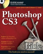
On the right side of the Print dialog box (refer to Figure 20.1), the list at the top gives you two choices: Output or Color Management. The rest of the contents of the right side of the Print dialog box hinge on which one you choose, and for many print jobs, you need to dabble in both sets of options. Dealing with Color Management first, this version of the right side of the Print dialog box offers options for whether you're printing a document or a proof, if you've got your printer set up to color-manage your output, selecting a printer profile, choosing your Rendering Intent (this is explained later), and setting up a proof (if that's what you're printing). Much of the time, you won't have to tinker much with these options. If you've already set up how Photoshop handles color issues, and if you have it set up to have your printer bow to Photoshop's desires on that score, you shouldn't have much else to deal with here.
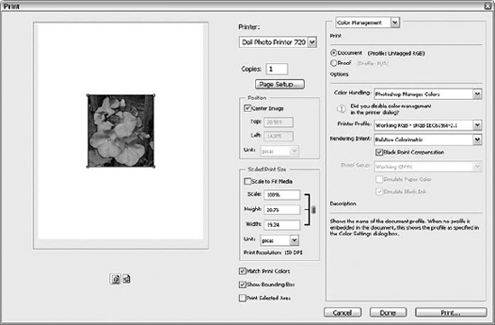
If you choose Output from that list at the top of the right side of the Print dialog box, your options change, as we said, and this different right side of the Print dialog box is shown in Figure 20.2. You get a list of check boxes, things you can choose to include in the print job, such as calibration and registration marks, crop marks, and labels. You also can click any of a series of five buttons at the bottom of the dialog box to affect how backgrounds, borders, screening, bleeds, and transfer are handled. You can turn on Interpolation, and choose whether to include vector data with the printout. Here's more about these options (and there's more information on them later in the chapter too):
Background: Click Background to pick a color for your printout's background. The Color Picker opens when you click the Background button, and you can use it just as you would at any other time. Of course, don't pick a color that's going to make the content of your image invisible, so keep your image content in mind.
Border: Click Border to determine how thick a border you want added around the print job. Pretty straightforward.
Bleed: Click Bleed to determine the width of the bleed (extra ink or toner applied around the edge of an image or sections thereof to make sure the content goes fully to the edges of the print area). You can express this in millimeters (mm, the default), inches, or points.
Screen: The Screen button opens a dialog box through which you can change the size, angle, and shape of the halftone screen dots. This step is purely optional and useful mostly for creating special effects.
Transfer: Click Transfer to map brightness values in an image to different shades when printed. This step also is optional, though frequently useful.
When you're ready to send your print job to your printer, click Print. This opens the printer-based Print dialog box, which varies depending on your operating system (Windows or Mac), your printer, and any accessories you have on your printer. After you've tweaked all relevant print settings, click Print to send the image to the printer.
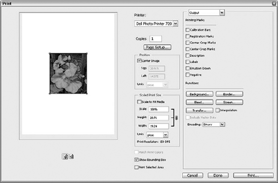
Figure 20.2. Switch to Output mode in the Print dialog box to control what's included in your print job.
Tip
Just want to send one copy of your image to the printer, no questions asked? Choose File
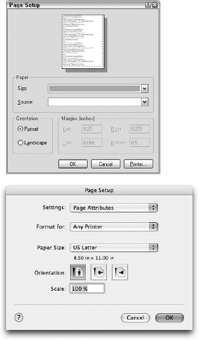
The Page Setup dialog box varies depending on what kind of printer you use and based on how you open it. If you click the Page Set up button in the Print dialog box, you get a printer-specific dialog box that allows you to communicate directly with your printer, using an interface designed by your printer manufacturer. Figure 20.3, for example, shows the Page Setup dialog box for a Dell 720 printer. If you choose File
Even though the Page Setup dialog box offers different options for different printers, you should always have access to the following (or their equivalents):
Paper size: Select the size of the paper loaded into your printer's paper tray. The paper size you select determines the imageable area of a page — that is, the amount of the page that Photoshop can use to print the current image. For example, the Letter option calls for a page that measures 8.5×11 inches, but only about 7.5×10 inches are imageable.
Source (Windows only): Virtually all printers include paper cartridges, but some permit you to manually feed pages or switch between cartridges. Use this option to decide where your paper is coming from.
Orientation: You can specify whether an image prints upright on a page (Portrait) or on its side (Landscape) by selecting the corresponding Orientation option. Use the Landscape setting when an image is wider than it is tall.
All the options described so far are constant regardless of what application you're using. However, the settings in the Print dialog box (refer to Figure 20.1) are unique to Photoshop. These settings enable you to position the image on the page and perform a few other handy printing adjustments:
Position: If you want the image to print in the middle of the page, leave the Center Image option selected. Otherwise, deselect the Center Image option and type values in the Top and Left option boxes to position the image with respect to the top-left corner of the page. You can select from five different measurement units for these options. If you're not overly concerned about placing the image exactly at a certain spot, deselect the Center Image option and then just click and drag the image in the preview on the left side of the dialog box. The Unit option is available only if Center Image is unchecked, and then you can pick how the position is measured — in picas, points, inches, centimeters, or millimeters. The preview updates to show you the current image position.
Scaled Print Size: If you want to adjust the image size for only the current print job, use these controls. They have no effect on the actual image file; they merely scale the image for printing. You can type a scale percentage; values greater than 100 percent enlarge the image, and values less than 100 percent reduce the image. Or type a specific size in the Height and Width option boxes. If you want Photoshop to adjust the image automatically to fit the page size, select the Scale to Fit Media option. You also can set the Unit (again, same as with the Position version of this field, picas, points, inches, centimeters, or millimeters) and verify (but not change) the current print resolution as would have been set through the Image Size dialog box.
Show Bounding Box: This option, when selected, displays handles at the corners of the preview image. For faster scaling, you can drag the handles until the image is the approximate print size you want.
Match Print Colors: This option, off by default, allows you to do a soft-proof of the colors in your image, within the preview area.
Print Selected Area: If you've made a selection in your image prior to opening the Print dialog box, this option is available and simply allows you to print only what's within the selection.
Tip
Photoshop prints only visible layers and channels, so you can print select layers or channels in an image by hiding all the other layers or channels. (To hide and display layers and channels, click the eyeball icon next to the layer or channel name in the Layers or Channels palette, respectively.) To print a single layer or channel, Alt-click (Win) or Option-click (Mac) the eyeball.
To display the special print options shown in Figure 20.2, choose Output from the drop-down list at the top of the Print dialog box, as stated earlier. The five most important Output buttons work as follows:
Background: To assign a color to the area around the printed image, click this button and select a color from the Color Picker dialog box, described in Chapter 4. This button and the one that follows (Border) are designed specifically to accommodate slides printed from a film recorder. If you select either of these options, Photoshop updates the preview to show them.
Border: To print a border around the current image, click this button and type the thickness of the border in the Width option box. The border automatically appears in black.
Bleed: This button lets you print outside the imageable area of the page when outputting to an imagesetter. (Imagesetters print to huge rolls of paper or film, so you can print far outside the confines of standard page sizes. Most other printers use regular old sheets of paper; any bleed — were the printer to acknowledge it — would print off the edge of the page.) Click Bleed and type the thickness of the bleed in the Width option box. Two picas (24 points) is generally a good bet. (Bleeds are defined in the section "Understanding Printing Terminology" at the beginning of this chapter.)
Screen: Click this button to enter a dialog box that enables you to change the size, angle, and shape of the printed halftone cells, as described in the upcoming section "Changing the halftone screen."
Transfer: The dialog box that appears when you click this button enables you to redistribute shades in the printed image, as explained in an upcoming section.
Most of the Output options — all except Negative, Emulsion Down, Interpolation, and Include Vector Data — append special labels and printer marks to the printed version of the image. Except for Interpolation and Include Vector Data, Photoshop shows the result of selecting the option in the image preview.
Interpolation: If you own an output device equipped with PostScript Level 2 or later, you can instruct Photoshop to anti-alias the printed appearance of a low-resolution image by selecting this option (the check box with the five buttons, just above "Include Vector Data"). The output device resamples the image up to 200 percent and then reduces the image to its original size using bicubic interpolation (as described in Chapter 2), thereby creating a less-jagged image. This option has no effect on older-model PostScript devices.
Calibration Bars: A calibration bar is a 10-step grayscale gradation beginning at 10 percent black and ending at 100 percent black. The function of the calibration bar is to ensure that all shades are distinct and on target. If not, the output device isn't properly calibrated, which just means that the printer's colors are out of whack and need realignment. When you print color separations, the Calibration Bars option instructs Photoshop to print a gradient tint bar and a progressive color bar, also useful to printing professionals.
Registration Marks: Select this option to print eight cross hairs and two star targets near the four corners of the image. Registration marks are imperative when you print color separations; they provide the only reliable means to ensure exact registration of the cyan, magenta, yellow, and black printing plates. When printing a composite image, however, you can ignore this option.
Corner Crop Marks: Select this option to print eight hairline crop marks — two in each of the image's four corners — that indicate how to trim the image in case you anticipate engaging in a little traditional paste-up work.
Center Crop Marks: Select this option to print four pairs of hairlines that mark the center of the image. Each pair forms a cross. Two pairs are located on the sides of the image, the third pair is above it, and the fourth pair is below the image.
Description: To print a description below the image, select this option. Then press Enter or Return to exit the dialog box, choose File

Labels: When you select this option, Photoshop prints the name of the image and the name of the printed color channel in 9-point Helvetica. If you process many images, you'll find this option extremely useful for associating printouts with documents on disk.
Emulsion Down: The emulsion is the side of a piece of film on which an image is printed. When the Emulsion Down option is deselected, film prints from an imagesetter emulsion side up. When the option is selected, Photoshop flips the image so the emulsion side is down. Like the Negative option, discussed next, this option is useful only when you print film from an imagesetter, and this option should be set in accordance with the preferences of your commercial printer.
Negative: When you select this option, Photoshop prints all blacks as white and all whites as black. In-between colors switch accordingly. For example, 20 percent black becomes 80 percent black. Imagesetter operators use this option to print composites and color separations to film negatives.
Include Vector Data: If your image contains any vector objects or type for which outline data is available (not outline or protected fonts), select this option to send the actual vector data to a PostScript printer. If your image has no vector objects, the option is dimmed. Your vector objects then can be scaled to any size without degrading the quality. Including the vector data increases the image file size, which can slow printing and cause other printing problems. But if you deselect the option, everything in the image is sent to the printer as raster data. This reduces the file size, but you no longer can scale the vector objects or type with impunity. They're subject to the same quality loss that occurs when you enlarge any pixel-based image.
Encoding: Select an option from this pop-up menu to control the encoding method used to send the image file to the printer. In normal printing situations, leave the option set to the default, Binary. If your network doesn't support binary encoding (highly unlikely) or your printer is attached through the local parallel printer port instead of the network, select the ASCII option to transfer PostScript data in the text-only format. The printing process takes much longer to complete, but at least it's possible. If your printer supports PostScript Level 2 or later, you also can choose to use JPEG compression to reduce the amount of data sent to the printer. (This option is applicable only to PostScript printers.)
If you choose Color Management from the list at the top of the Print dialog box (refer to Figure 20.1), you can adjust settings that enable you to convert the image color space for printing only. You may want to do this to print a proof of the image on a printer other than the printer you'll use for final output. To convert the color space of the actual image file, you need to use the techniques discussed in Chapter 17.
First, you can select from two Print options: Document and Proof. These options tell Photoshop whether you want to print the image according to the color profile officially assigned to the image file or according to the Proof Setup profile (the so-called "soft proofing" profile). Document uses the actual color profile; Proof uses the profile currently selected in the View
The Printer Profile options (available only if Color Handling is set to give Photoshop control), determine whether Photoshop converts the image to a different profile during the printing process. To convert to a different profile, select the profile from the drop-down menu. You then can specify the rendering method by selecting it from the Rendering Intent pop-up menu.
Tip
As you're working in the Print dialog box later, perhaps without this trusty book by your side, note that there's a big "Description" section at the bottom of the right side of the dialog box. This area displays an explanation of each area of the dialog box, changing as you mouse over different options, menus, lists, and so forth.
You can convert to any color space offered by Photoshop, Kodak's ICC CMS (Win), or Apple's ColorSync (Mac). Ideally, you want to select the specific profile for your brand of printer. If you can't find such a profile, you'll probably want to stick with the RGB color space (specified in the Color Settings dialog box). Another option is to choose Working CMYK, which prints the image just as if you had converted it to the CMYK color space. Unfortunately, most consumer-grade printers are designed to accommodate RGB images and fare pretty badly when printing artwork converted to CMYK.
Note
Again, if you're unfamiliar with any of these terms or just don't know which options are best for your printing situation, review Chapter 17, where color management is discussed in detail.
Before discussing the Screen option, available when you select Output from the pop-up menu in the Print with Preview dialog box, you should learn a bit more about how printing works. To keep costs down, commercial printers use as few inks as possible to create the appearance of a wide variety of colors. Suppose you want to print an image of a pink flamingo wearing a red bow tie. Your commercial printer could print the flamingo in one pass using pink ink, let that color dry, and then load the red ink and print the bow tie. But why go to all this trouble? After all, pink is only a lighter shade of red. Why not imitate the pink by lightening the red ink?
Unfortunately, with the exception of dye-sublimation printers, high-end inkjets, and film recorders, output devices can't print lighter shades of colors. They recognize only solid ink and the absence of ink. So how do you print the lighter shade of red necessary to represent pink?
The answer is halftoning. The output device organizes printer pixels into spots called halftone cells. Because the cells are so small, your eyes cannot quite focus on them. Instead, the cells appear to blend with the white background of the page to create a lighter shade of an ink.
The cells grow and shrink to emulate different shades of color. Large cells result in dark shades; small cells result in light shades. Cell size is measured in printer pixels. The maximum size of any cell is a function of the number of cells in an inch, called the screen frequency.
For example, suppose the default frequency of your printer is 60 halftone cells per linear inch and the resolution is 300 printer pixels per linear inch. Each halftone cell must, therefore, measure 5 pixels wide by 5 pixels tall (300 ÷ 60 = 5), for a total of 25 (52) pixels per cell. When all pixels in a cell are turned off, the cell appears white; when all pixels are turned on, you get solid ink. By turning on different numbers of pixels — from 0 to 25 — the printer can create a total of 26 shades.
Photoshop enables you to change the size, angle, and shape of the individual halftone cells used to represent an image on the printed page. To do so, click Screen in the Print with Preview dialog box (after clicking More Options and choosing Output from the pop-up menu). The Halftone Screen dialog box shown in Figure 20.5 appears.
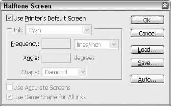
Figure 20.5. Use the Halftone Screen dialog box to edit the size, angle, and shape of the halftone cells for any one ink.
In the dialog box, you can manipulate the following options:
Use Printer's Default Screen: Select this option to accept the default size, angle, and shape settings built into your printer's ROM. All other options in the Halftone Screen dialog box automatically become dimmed to show that they are no longer in force.
Ink: If the current image is in color, you can select the specific ink you want to adjust from the Ink pop-up menu. When you work with a grayscale image, no pop-up menu is available.
Frequency: Type a new value in this option box to change the number of halftone cells that print per linear inch. A higher value translates to a larger quantity of smaller cells; a smaller value creates fewer, larger cells. Frequency is traditionally measured in lpi, or lines per inch (as in lines of halftone cells), but you can change the measurement to lines per centimeter by selecting Lines/cm from the pop-up menu to the right of the option box.
Tip
Higher screen frequencies result in smoother looking printouts. Raising the Frequency value, however, also decreases the number of shades an output device can print because it decreases the size of each halftone cell and, likewise, decreases the number of printer pixels per cell. Fewer printer pixels mean fewer shades. You can calculate the precise number of printable shades using the following formula:
Number of shades = (printer resolution ÷ frequency)2 + 1
Angle: To change the orientation of the lines of halftone cells, type a new value in the Angle option box. In the name of accuracy, Photoshop accepts any value between negative and positive 180 degrees.
Warning
When printing color composites to inkjet and thermal-wax printers, and when printing color separations, Photoshop calculates the optimum Frequency and Angle values required to print seamless colors. In such a case, you should change these values only if you know exactly what you're doing. Otherwise, your printout may exhibit weird patterning effects. When printing grayscale images, though, you can edit these values to your heart's content.
Shape: By default, most PostScript printers rely on roundish halftone cells. You can change the appearance of all cells for an ink by selecting one of six alternate shapes from the Shape pop-up menu. If you know how to write PostScript code, you can select the Custom option to display a text-entry dialog box and code away.
Use Accurate Screens: If your output device is equipped with PostScript Level 2 or later, select this option to subscribe to the updated screen angles for full-color output. Otherwise, don't worry about this option.
Use Same Shape for All Inks: Select this option if you want to apply a single set of size, angle, and shape options to the halftone cells for all inks used to represent the current image. Unless you want to create some sort of special effect, leave this option deselected. The option is unavailable when you are printing a grayscale image.
Auto: Click this button to display the Auto Screens dialog box, which automates the halftone editing process. Type the resolution of your output device in the Printer option box. Then type the screen frequency you want to use in the Screen option box. After you press Enter or Return to confirm your change, Photoshop automatically calculates the optimum screen frequencies for all inks. This technique is most useful when you print full-color images; because Photoshop does the work for you, you can't make a mess of things.
Load and Save: You can load and save settings to disk in case you want to reapply the options to other images. These buttons are useful if you find a magic combination of halftone settings that results in a really spectacular printout.
Tip
You can change the default size, angle, and shape settings that Photoshop applies to all future images by Alt-clicking (Win) or Option-clicking (Mac) Save. When you press Alt (Win) or Option (Mac), the Save button changes to read ->Default. To restore the default screen settings at any time, Alt-click (Win) or Option-click (Mac) Load (<-Default).
Note
The Halftone Screens dialog box settings don't apply to printing images only directly from Photoshop. You can export these settings along with the image for placement in QuarkXPress or some other application by saving the image in the Photoshop EPS format. Make sure you select the Include Halftone Screen option in the EPS Format dialog box, as discussed in Chapter 3. This also applies to transfer function settings, explained in the following section.
Warning
If you decide to include the halftone screen information with your EPS file, be sure the settings are compatible with your intended output device. You don't want to specify a low Frequency value such as 60 lpi when printing to a state-of-the-art 3600-dpi imagesetter, for example. If you have any questions, be sure to call your service bureau or commercial printer before saving the image.
A transfer function enables you to change the way onscreen brightness values translate — or map — to printed shades. By default, brightness values print to their nearest shade percentages. A 30 percent gray pixel onscreen (which equates to a brightness value of roughly 180) prints as a 30 percent gray value.
Problems arise, however, when your output device prints lighter or darker than it should. Depending on your printer, you might compensate for this overdarkening effect by clicking Transfer in the Print with Preview dialog box after clicking More Options and choosing Output from the pop-up menu. The resulting Transfer Functions dialog box, shown in Figure 20.6, can be a big help in fixing printer problems.
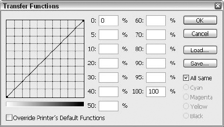
Figure 20.6. The Transfer Functions curve enables you to map onscreen brightness values to specific shades on paper.
The options in the Transfer Functions dialog box work as follows:
Transfer graph: The transfer graph is where you map onscreen brightness values to their printed equivalents. The horizontal axis of the graph represents onscreen brightness values; the vertical axis represents printed shades. The transfer curve charts the relationship between onscreen and printed colors. The lower-left corner is the origin of the graph — the point at which both the onscreen brightness value and the printed shade are white. Move to the right in the graph for darker onscreen values; move up for darker printed shades. Click in the graph to add points to the line. Click and drag up on a point to darken the output; drag down to lighten the output.
Note
For a more comprehensive explanation of how to graph colors on a curve, read about the incredibly powerful Curves command in Chapter 18.
Percentage option boxes: The option boxes are labeled according to the onscreen brightness values. To lighten or darken the printed brightness values, type higher or lower percentage values in the option boxes. There is a direct correlation between changes made to the transfer graph and the option boxes. For example, if you type a value in the 50 percent option box, a new point appears along the middle line of the graph.
Override Printer's Default Functions: As an effect of printer calibration, some printers have custom transfer functions built into their read-only memory (ROM). If you have problems making your settings take effect, select this option to instruct Photoshop to apply the transfer function you specify, regardless of the output device's built-in transfer function.
Load and Save: Use these buttons to load settings to disk and save settings to disk, respectively. Alt-click (Win) or Option-click (Mac) the buttons to retrieve and save default settings.
Ink controls: When you print a full-color image, five options appear in the lower-right corner of the Transfer Functions dialog box. These options enable you to apply different transfer functions to different inks. Select the All Same option to apply a single transfer function to all inks. To apply a different function to each ink, deselect the option, and then select one of the radio buttons and edit the points in the transfer graph as desired.
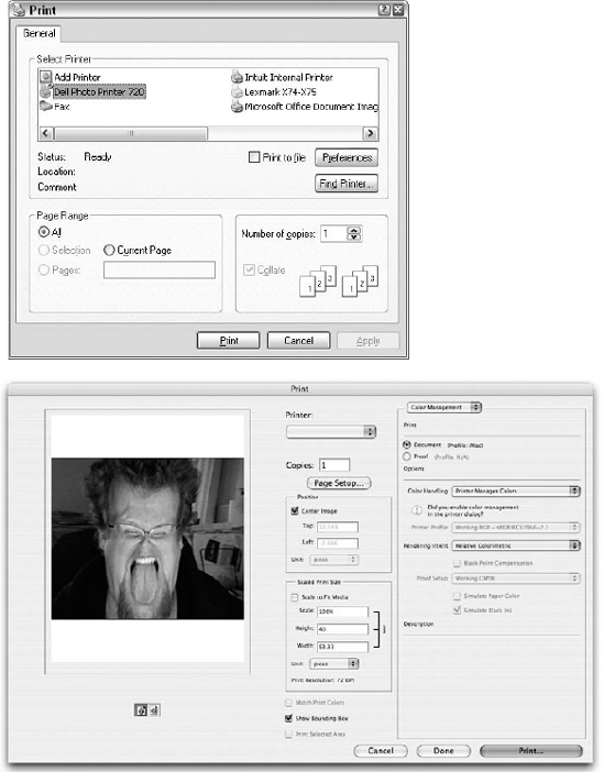
When you finish slogging your way through the Page Setup and Print dialog boxes, you can initiate the printing process by clicking Print in the Print dialog box. A secondary Print dialog box appears, this time operating system-based, shown in its Mac and Windows XP forms in Figure 20.7.
Several options in this dialog box also appear in the Page Setup dialog box, both discussed earlier in this chapter. The few remaining options you need to understand work as follows:
Copies: Type the number of copies you want to print in this option box. You can print up to 999 copies of a single image if you want to. Will you want to? Probably not.
Print Range (Pages on the Mac): No such thing as a multipage document exists in Photoshop, so you can ignore these options for the most part. If you selected an image area with the rectangular marquee tool, you can print just the selected area by choosing the Selection radio button (Win) or the Print Selected Area check box (Mac), if available. Alternatively, you can select the Print Selected Area option in the Print with Preview dialog box. You may want to use this option to divide an image into pieces when it's too large to fit on a single page.
PDF: This option lets you save a PostScript-language version of the file on disk rather than printing it directly to your printer. Under Windows, deselect the Print to File option to print the image to an output device as usual. Select Print to File to write a PostScript-language version of the image to disk. To save a PostScript file to disk on the Mac, choose Save PDF as Postscript from the pop-up menu that appears when you click the PDF button in the lower left of the dialog box.
Tip
Because Photoshop offers its own EPS option in the Save dialog box, you'll probably want to ignore this option. In fact, the only reason to select Print to File is to capture printer's marks, as shown back in Figure 20.4. If you do, a second dialog box appears, asking where you want to save the PostScript file. You can navigate just as in the Open and Save dialog boxes. For the best results, select the Binary radio button.
Note
Mac OS 10.x offers a handy Preview button at the bottom of the Print dialog box; click it to generate a PDF file of the image and display it in Adobe Reader (if you have Reader installed). To save the image to Adobe PDF without opening it in Adobe Reader, click Save As PDF.
Press Enter or Return in the Print dialog box to start the printing process on its merry way. To cancel a print in progress, click Cancel. If you neglect to cancel before Photoshop spools the print job, don't worry because you can still cancel. On the PC, choose Settings
In addition to the options in the Page Setup and Print dialog boxes, you may be able to control certain print attributes specific to the selected printer. To explore these options in the Print dialog box, click Properties on the PC or choose the appropriate command from the middle pop-up menu on the Mac.
Unless you're a printing professional, you'll rarely have to print color separations directly from Photoshop. You'll more likely import the image to QuarkXPress, PageMaker, InDesign, or a similar application before printing separations. It's even more likely that you'll take the image or page-layout file to a commercial printer and have a qualified technician take care of it.
So why discuss this process? Two reasons. First, it's always a good idea to at least peripherally understand all phases of the computer imaging process, even if you have no intention of becoming directly involved. This way, if something goes wrong on the printer's end, you can decipher the crux of the problem and either propose a solution or strike a compromise that still works in your favor.
Second, before you import your image to another program or submit it to a commercial printer, you'll want to convert the RGB image to the CMYK color space. (You don't absolutely have to do this — with Photoshop's improved color-matching functions, you can exchange RGB images with greater confidence — but it's always a good idea to prepare your images down to the last detail, and CMYK is invariably the final destination for printed imagery.)
Accurately converting to CMYK is the trickiest part of printing color separations; the other steps require barely any effort at all, but for simplicity's sake, we're enumerating them here so you can follow them anytime you need to and to help make the whole process clearer.
STEPS: Printing color separations
Calibrate your monitor, and specify the desired RGB environment. Use the techniques discussed in the sections in Chapter 18 that pertain to the Gamma control panel, the Macintosh Display Calibrator Assistant, and selecting the ideal working space.
Identify the final output device. If you're lucky, your commercial printer may provide a CMYK table that you can load. Otherwise, you have to grapple with some weird settings. The good news is that you need to complete this step only once each time you switch hardware. If you always use the same commercial printer, you can set it up and forget about it.
Convert the image to the CMYK color space. Choose Image
Adjust the individual color channels. Switching color modes can dramatically affect the colors in an image. To compensate for color and focus loss, you can edit the individual color channels as described in the section on color channel effects in Chapter 4.
Trap your image, if necessary. If your image features many high-contrast elements and you're concerned that your printer may not do the best job of registering the cyan, magenta, yellow, and black color plates, you can apply Image
Choose your printer. Select the printer you want to use, as described earlier in this chapter.
Turn on a few essential printer marks. Choose File
Adjust the halftone and transfer functions as needed. Click Screen and Transfer in the Print with Preview dialog box to modify the halftone screen dots and map brightness values for each of the CMYK color channels, as described earlier in this chapter. This step is entirely optional.
Send the job to the printer. In the Print with Preview dialog box, make sure the Show More Options check box is selected and choose Color Management from the pop-up menu. Then choose Separations from the Profile pop-up menu in the Print Space section of the dialog box. This tells Photoshop to print each color channel to a separate piece of paper or film. Finally, click Print to open the Print dialog box and initiate the print job.
Note
You also can create color separations by importing an image to a page-layout or drawing program. Instead of choosing your printer in Step 6, save the image in the DCS format, as described in Chapter 3.
Steps 1 through 4 were covered at length in Chapters 4 and 17. Steps 6 through 9 are repeats of concepts explained in previous sections of this chapter. This leaves Step 5, trapping, which is explained in the following section.
If color separations misalign slightly during the reproduction process (a problem called misregistration), the final image can exhibit slight gaps between colors. Suppose an image features a 100 percent cyan shape against a 100 percent magenta background. If the cyan and magenta plates don't line up exactly, you're left with a shape that has a white halo partially around it. Not good.
A trap is an extra bit of color that fills in the gap. For example, if you choose Image
Continuous-tone images, such as photographs and natural-media painting, don't need trapping because no harsh color transitions occur. In fact, trapping actually harms such images by thickening up the borders and edges, smudging detail, and generally dulling the focus.
One of the primary reasons to use the Trap command, therefore, is to trap rasterized drawings from Illustrator or FreeHand. Some state-of-the-art prepress systems trap documents by first rasterizing them to pixels and then modifying the pixels. Together, Photoshop and Illustrator (or FreeHand) constitute a more rudimentary but, nonetheless, functional trapping system. When you open an illustration in Photoshop, the program converts it into an image according to your size and resolution specifications, as described in Chapter 3. After the illustration is rasterized, you can apply Image
Warning
If you plan on having a service bureau trap your files for you, do not apply Photoshop's Trap command. You don't want to see what happens when someone traps an image that's already been trapped. If you're paying the extra bucks for professional trapping, leave it to the pros.
It's been a few pages since the printing terminology section of this chapter, so here's a quick recap: A duotone is a grayscale image printed with two inks. This technique expands the depth of the image by allowing additional shades for highlights, shadows, and midtones. If you've seen a glossy magazine ad for perfume, designer clothing, a car, or just about any other overpriced commodity, you've seen a duotone. Words like rich, luxurious, and palpable come to mind. Photoshop also enables you to add a third ink to create a tritone and a fourth ink to create a quadtone, so you can create those glossy, rich, luxurious photos.
To convert a grayscale image to a duotone, tritone, or quadtone, choose Image
Specify the color of each ink that you want to use by clicking the color swatch associated with the desired ink option. You can define colors with the Color Picker or with the Custom Colors dialog box. You can switch back and forth between the two by clicking the Custom button or the Picker button, depending on which dialog box you currently are using.
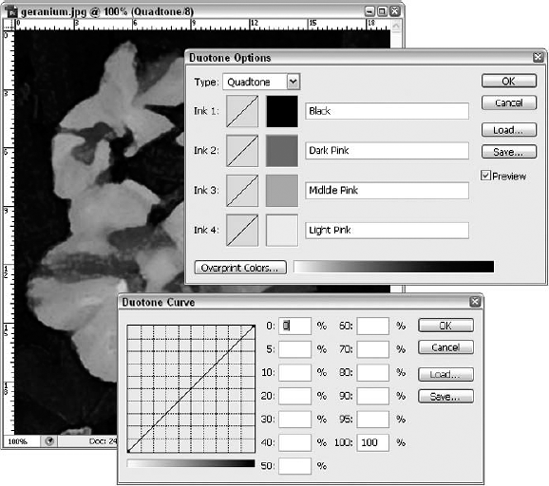
Figure 20.8. The Duotone Options dialog box enables you to apply multiple inks to a grayscale image. If you click the Ink 1, Ink 2, Ink 3, or Ink 4 curve, the Duotone Curve dialog box opens (bottom image).
Photoshop takes the guesswork out of creating a duotone by previewing your settings in the image window when the Preview option is selected. Keep in mind that the preview may not exactly match your output when using certain Pantone inks. (This is a common problem when previewing Pantone inks in any program, but it's always a good idea to keep in mind, particularly because Photoshop mixes inks to create its duotone effects.) The next time you create a duotone, Photoshop displays the same colors you defined in your last visit to the Duotone Options dialog box.
When creating duotones, tritones, and quadtones, prioritize your inks in order — from darkest at the top to lightest at the bottom — when you specify them in the Duotone Options dialog box. Because Photoshop prints inks in the order in which they appear in the dialog box, the inks will print from darkest to lightest. This ensures rich highlights and shadows and a uniform color range.
After selecting a color, you can use either of two methods to specify how the differently colored inks blend. The first and more dependable way is to click the curve box associated with the desired ink option. Photoshop then displays the Duotone Curve dialog box (refer to Figure 20.8), which works just like the Transfer Functions dialog box described in the section "Specifying a transfer function." This method permits you to emphasize specific inks in different portions of the image according to brightness values.
The second method for controlling the blending of colors is to click Overprint Colors. An Overprint Colors dialog box appears showing how each pair of colors will mix when printed. Other color swatches show how three and four colors mix, if applicable. To change the color swatch, click it to display the Color Picker dialog box.
The problem with this second method is that it complicates the editing process. Photoshop doesn't actually change the ink colors or curve settings in keeping with your new specifications; it just applies the new overprint colors without any logical basis. And you lose all changes made with the Overprint Colors dialog box when you adjust any of the ink colors or any of the curves.
To return and change the colors or curves, choose Image
Note
You also can use the new Black and White dialog box, opened by choosing Image
If you want a commercial printer to reproduce a duotone, tritone, or quadtone, you must print the image to color separations, just like a CMYK image. Because you already specified which inks to use and how much of each ink to apply, however, you needn't mess around with all those commands in the Color Settings dialog box. Just follow these simple steps:
STEPS: Reproducing a duotone (or tritone or quadtone)
Choose the printer you want to use. Select a printer as described previously in this chapter.
Set the page size, orientation, and printer marks options. In the Page Setup dialog box (Ctrl+Shift+P or

Adjust the halftone screens, if desired. If you're feeling inventive, click Screen to change the size, angle, and shape of the halftone screen dots for the individual color plates, as described in the section "Changing the halftone screen."
Specify output to color separations. Still in the Print with Preview dialog box, choose Color Management from the pop-up menu. Then choose the Separations option from the Profile pop-up menu in the Print Space section of the dialog box to print each ink to a separate sheet of paper or film.
To prepare a duotone to be imported to QuarkXPress, Illustrator, or some other application, save the image in the EPS format, as described in Chapter 3. As listed in Table 4.1 of Chapter 4, EPS is the only file format other than the native Photoshop format that supports duotones, tritones, and quadtones.
If you'll be printing your duotone using CMYK colors and you can't quite get the effect you want in the Duotone Options dialog box, you can convert the duotone to the CMYK mode by choosing Image
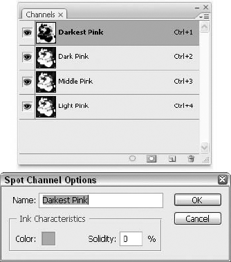
If your duotone includes Pantone or other spot colors, converting to CMYK is not an option. But you can still access and edit the individual color channels. To separate the duotone inks into channels, choose Image
To save a duotone converted to the multichannel mode, you have just two options: native Photoshop (as always) and DCS 2.0. For complete information on the latter, see Chapter 3.
Audio and video content may be cooler, and text-based content, databases, and hyperlinks are the main stock and trade of the Internet, but bitmapped graphics rule the Web. They make the Web intelligible and invite us to come back for more. From the moment the <img> tag was added, enabling embedded graphics in HTML documents, those graphics have brought the masses to the Web. Because Photoshop is the world's number one image editor, it's no surprise that Photoshop has become as inextricably linked to the Web as Internet Explorer, Firefox, Mozilla, Macromedia Flash, Apple QuickTime, and a hundred other programs.
The Web provides a highly satisfying outlet for creative expression. How else can you get your work in front of hundreds of thousands of viewers without running up the world's largest postage debt or television advertising fee? But as is the case with just about everything in life, success on the Web depends not just upon your artistic prowess, but also upon your understanding of the right and wrong ways to prepare your images.
If you have any experience with the Web, you know that small images are speedy images. Physically small images are flexible, because they can coexist with text and other elements on a page displayed on a low-resolution screen. Meanwhile, disk size affects speed. A 20K image that fills your screen takes less time to download and display than a 50K file no larger than a sticky note. It's the act of getting the data through the network lines, routers, cables, and modems that takes the time. Even in a time when more and more Web visitors have broadband connections to the Web — cable modems, DSL, and so on — small, speedy files are still your goal if you're designing graphics for the Web.
So, in a nutshell, optimizing an image for use on the Web is a process of reducing that image to its smallest possible file size (to facilitate quick downloading), while maintaining the highest level of clarity and fidelity.
At the time of this writing, Web browsers support three graphic file types: Graphics Interchange Format (GIF), Joint Photographic Experts Group (JPEG) format, and Portable Network Graphics format (PNG). The trick is to know which format to use for the type of image you've created. What follows is a rundown of the strengths and weaknesses of these three Web file formats.
When talking about image formats, we have to talk about bits. A bits is the smallest unit of data that computers work with, and the number of bits that a format can devote to each pixel determines the maximum number of colors the format can display. Now it's time for some new terms:
Bit depth: This is the total number of bits a file format is capable of devoting to each pixel. This stat determines the total number of colors that a format can display in a single image, which is our next term.
Color depth: This is the total number of colors that a format can display in a single image. For example, GIF files can display a total of 256 colors in a single image, therefore GIF files have a color depth of 256. Pretty simple so far, yes?
A format's color depth is calculated this way: We begin by taking the number of states a bit has — which is two (one state being on, the other being off) — and raise that number to the power indicated by the format's bit depth.
GIF is an 8-bit format, meaning it can devote 8 bits of data to each pixel. So, using our handy little equation, this makes its color depth 28 — or 2x2x2x2x2x2x2x2 — which totals 256. This is the first of GIF's strengths: A low color depth helps ensure a low file size.
GIF's next major strength is how it compresses file data. GIF uses a compression method called LZW, after its creators Lempel, Ziv, and Welch. If you've been creating TIFF files for ages, then you've already seen this option in the TIFF Options dialog box. When turning an image into a GIF file, this compression method exploits inefficiencies in the file's data structure, effectively removing unused space within the file. Consequently, no additional information is removed from the image. In techno-babble, LZW compression is called a "lossless" compression method because no image data is lost in the process.
If GIF supports only a maximum of 256 colors in an image, then it follows that you wouldn't try to optimize an image with thousands of colors into this format. GIF is best suited for images with a limited number of total colors, preferable with a high degree of contrast where the edges at which two colors meet are sharply defined. Figure 20.10 shows a prime candidate for GIF optimization.
Granted, Figure 20.10 is produced as a grayscale image here, but regardless, it has only a handful of colors. Furthermore, those colors aren't jumbled together along a continuous tone gradient. The image is divided into distinct regions of solid color. GIF loves these — unlike its cousin JPEG, which you'll examine in a just a second and which has a nasty habit of introducing pixilated noise (called artifacts) into regions of solid color.
Another of GIF's strengths is its support for transparency. Sadly, GIF doesn't support multiple levels of transparency. GIF supports binary transparency, meaning a pixel is either transparent or it's not, unlike the Portable Network Graphics format, discussed momentarily. GIF also is capable of animation (the bane of the early Web), and we'll grudgingly look at this feature later in the chapter.

Figure 20.10. LZW compression favors images with large zones of solid colors, straight, clean lines, and text. This logo for an online bakery Web site (www.wendyjos.com) is a perfect example.
GIF's major strengths — a limited number of total colors per image, a lossless compression method, and a liking for regions of solid color — also are the format's major weaknesses. After all, what do you do if your image has millions of colors that fade from one to the next all over the place? For example, how do you deal with the average color photograph? We thought you'd never ask.
Members of the Joint Photographic Experts Group represent a wide variety of companies and academic institutions throughout the world who meet to discuss and create the standards for still-image compression. The standards they developed for continuous-tone images — images with an unlimited range of color or shades of gray — were used by C-Cube Microsystems to create the JPEG File Interchange Format.
JPEG has a bit depth of 24, giving it a color depth of 224 or 16,777,215 colors. Its method of compression reduces file size by removing "unessential" data from the image. What is this unessential data? The JPEG format takes advantage of certain limitations inherent in the human eye. You see (no pun intended), our eyes perceive minute changes in brightness better than they perceive equally minute changes in color. JPEG's compression method favors changes in brightness, discarding colors the eye won't necessarily miss, while still reproducing up to 16,777,215 million colors. When viewing the image on a 72 dpi monitor, we humans perceive an image we consider highly detailed.
Because JPEG compression removes data, it is referred to as a "lossy" compression method. The degree of compression is adjustable, allowing you to choose how much data is lost. The more you compress the file, the smaller its size. The less you compress it, the better the image quality.
The type of images best optimized in the JPEG format can be deduced from the name: photographs and photo-realistic images — in other words, images with millions of colors or shades of gray, heavy degrees of gradation, where large zones of single colors are few. Figure 20.11 shows a good candidate for the JPEG format (top), with the results of trying to optimize Figure 20.10 as a JPEG (bottom).
The PNG format has an interesting history. When Unisys, the owner of the patent on LZW compression, began demanding royalty payments eight years after the format's introduction, some confusion erupted and there were those who thought the royalties would be levied against anyone who so much as used a GIF image in a Web site. This confusion turned out to be a boon for graphics artists when the Internet Engineering Task Force produced its answer to GIF: PNG, a format that used a lossless compression method AND came in 8-bit and 24-bit flavors, effectively combining the best aspects of both GIF and JPEG.
Used in its 8-bit version, PNG and GIF are fairly even in their abilities to produce quality images with low file sizes. PNG tends to produce slightly larger files, but only by a kilobyte or two, and is fine for optimizing the same sort of images GIF should be used for.
The 24-bit version of PNG does not, however, compare with JPEG. Because the compression method is lossless (removing no additional data from the image), files optimized in this format tend to be double in size than when optimized in the JPEG format. Of course, you'll find that as a trade-off for this larger file size, PNG images are often cleaner-looking than JPEG files, with no artifacts and no deterioration over the course of subsequent edits and re-saves of the image files.
As mentioned earlier, PNG supports transparency. It offers binary transparency equivalent to GIF's. It also has a more impressive version, called alpha transparency, which gives the format something Photoshop users can wrap their brains around — a mask channel. In total, PNG supports 256 levels of transparency from fully opaque to completely transparent, with 254 stops in between. Most current browsers support PNG's transparency, but to be safe, test your Web graphics locally, using at least two different browsers, before publishing them to the Web.
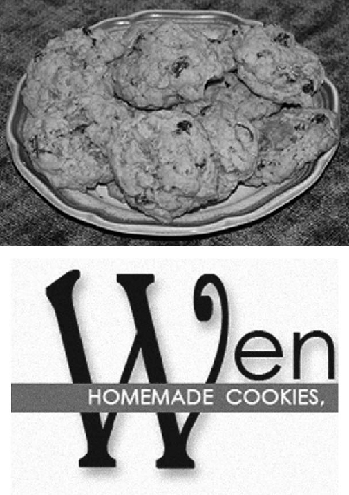
Figure 20.11. While best for photos, avoid using JPEG to optimize images with large zones of a solid color, type, and any edges that you'd like to keep clean, especially against a drastically different color. JPEG compression introduces distortions (called artifacts) when attempting to render them (bottom).
In the mid 1990s, Adobe received a fair number of complaints regarding Photoshop's relatively paltry collection of Web-savvy features. Adobe explained to Web designers that they were missing the point: Photoshop was for print graphics, and a separate program Adobe had acquired, ImageReady, was for the Web. But most Web designers ignored this advice and continued to grouse, so Adobe eventually caved, and started to do the right thing, bringing ImageReady into the fold, distributing it with Photoshop. The two programs, ImageReady and Photoshop, continued to be sold as a package deal until CS3, in which ImageReady is finally gone, its capabilities rolled completely into Photoshop. We saw the final throes of ImageReady's independence in CS2, but even with the release of that last version, we all heard it was ImageReady's swansong, and to look for CS3 to be all-inclusive, which it is — at least with regard to the Web tools that used to live in ImageReady.
Part of Photoshop since CS, the Save for Web dialog box is now the Save For Web & Devices dialog box in CS3, and it appears in Figure 20.12. Why "& Devices"? Because graphic artists also are designing images for use on handheld devices — phones, i-whatevers, and PDAs. Through the dialog box, you preview your optimized image, selecting the format, compression, and color options. To display the Save For Web & Devices dialog box, choose File
In the Save For Web & Devices dialog box, you compare your original image with the optimized results, deciding which optimization settings prove best for your image. The annotation area beneath the original image displays the file name and file size. Beneath the optimized image, the current optimization settings, file size, and estimated download time are shown.
The download time is based on the dialog box's currently selected Internet access speed. To change the selected Internet access speed, click the small arrow to the right of the optimized image to display the Preview pop-up menu, shown in Figure 20.13, and select the access speed of your choice.
The Save For Web & Devices dialog box also allows you to view the differences in gamma correction between platforms. Gamma measures the intensity to voltage response of a signal sent to a computer system's monitor. The Windows and Macintosh platforms, for example, use significantly different gamma correction methods. Macintosh systems have partial gamma correction integrated into their hardware. Windows systems have no such gamma correction, though some graphics card manufacturers do provide this functionality. Because Macintosh has gamma correction, images created on Windows PCs look washed out on Macintosh systems. Conversely, images created on Macintosh systems look darker to Windows users.
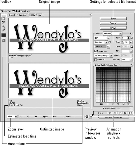
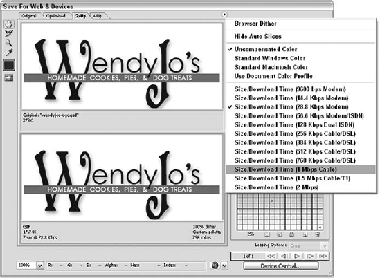
Figure 20.13. The Preview pop-up menu allows you to choose among multiple modem, ISDN, cable, or DSL speeds.
To preview differences in gamma correction, access the Preview pop-up menu by clicking the small arrow to the right of the optimized image, and choose one of the following display options:
Uncompensated Color: This default option displays the image with no color adjustment.
Standard Windows Color: This option displays the image with the color adjusted to simulate the gamma of a standard Windows monitor.
Standard Macintosh Color: This option displays the image with color adjusted to simulate the gamma of a standard Macintosh monitor.
Use Document Color Profile: This option displays the image with its current color profile if it has one.
These options only adjust the color display in the Save For Web & Devices dialog box alone. The original and optimized images are not physically modified in any way. Windows users should view their images in Standard Macintosh Color, and Mac users in Standard Windows color to see the differences. If the change is too great, the typical remedy is for Macintosh users to slightly lighten their images and for Windows users to slightly darken their images.
Device Central
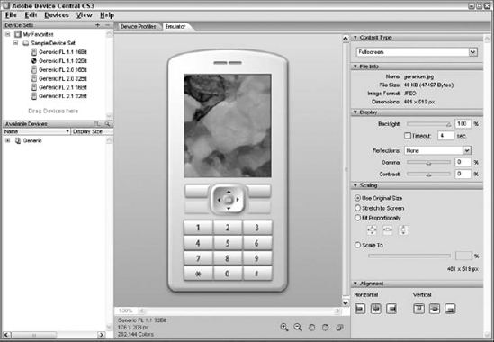
What's that Device Central button in the Save for Web & Devices dialog box all about? You can test your graphics to see how they'll look on a handheld device, making sure they look as you'd expected (or hoped). You can choose the type of device and adjust the backlighting, gamma, and contrast of the display; scale and stretch the display for the screen in question; and adjust the horizontal and vertical alignment. As you drag the sliders in each of the five main areas on the right side of the dialog box, you can see the changes reflected in the Preview in the center of the dialog box. The devices to which your computer is or has been attached (in terms of there being some setup information for the device installed on your computer) will restrict the list of Available Devices, although a good assortment of generic display presets are stored for your use. To see specs for the devices to which you're are or have been attached (along with the generic device presets), click on a device in the list on the left, and then click the Device Profiles tab to see pictures of the model/s for that device and lists of features and capabilities. The figure shows the Device Central window with the Emulator tab displayed.
GIF and PNG are both indexed color formats. When images are optimized into either format, Photoshop indexes the colors used, storing them in a color lookup table (CLUT). Limiting the color palette in this way helps to reduce file size while preserving image quality.
To reiterate, GIF and PNG-8 are best suited to images with a limited range of colors to begin with (under 256), where zones of color are crisply defined. Optimization settings are adjusted in the Settings area of the Save For Web & Devices dialog box, shown in detail in Figure 20.14.
The Optimization preset menu provides seven GIF and one PNG-8 preset:
GIF 128 Dithered
GIF 128 No Dither
GIF 32 Dithered
GIF 32 No Dither
GIF 64 Dithered
GIF 64 No Dither
GIF Web Palette
PNG-8 128 Dithered
The numbers 128, 64, and 32 represent total number of colors Photoshop maintains in the image. The Web Palette preset pushes each color in the image to its closest corresponding value in the Web-safe color palette — the palette of 216 colors identical to all browsers, operating systems, and monitors when running in 8-bit, 256-color mode.
In the color indexing process common to GIF and PNG, choosing Dithered or No Dither indicates whether some colors lost by optimization are simulated by alternating pixels in a checkerboard-like pattern using colors left within the CLUT.
Custom optimization settings are adjusted using the remaining menus, pop-ups, and sliders in the Settings area.
To specify your chosen file format, select GIF or PNG-8 from the File Format menu. Next choose a method for establishing the CLUT of the image by making a selection from the Color Reduction Algorithm menu.
In Photoshop, CLUTs fall into three categories: Dynamic options, Fixed options, and Custom options.
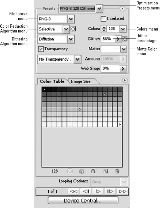
Figure 20.14. The options in the Settings area change based on the file format you choose. GIF and PNG-8 have identical Settings options.
Using Photoshop's dynamic options, CLUTs are based on colors present in the image and the number of colors chosen from the Colors menu.
These are the Color Reduction Algorithm menu's dynamic options:
Perceptual: The perpetual palette creates a customized CLUT using colors in the image to which human eyes are more sensitive.
Selective: The selective palette — similar to the perceptual palette in its inclination toward colors favored by human visual response — creates a table that is more sensitive to areas of single flat colors. This algorithm prevents such colors from being merged with other colors in the image and preserves any existing Web-safe colors. This palette tends to be the best for Web graphics.
Adaptive: The adaptive palette creates a CLUT by sampling the predominant colors within the image. For example, if the image you're optimizing has a preponderance of yellows and greens, choosing the adaptive palette creates a CLUT slanted to those two colors.
Instead of using colors present in the image as the basis from which the CLUT is derived, Photoshop's fixed options use predefined palettes from which to build the CLUT.
These are the fixed options:
Web: The Web palette consists of 216 colors common to Windows, Macintosh, Netscape Navigator, and Internet Explorer out of the 256 colors available in 8-bit mode. Choosing this option pushes the image's existing colors to their closest Web palette equivalent.
Mac OS: Choosing this palette pushes existing colors to their closest equivalents in the default 256 system colors of the Macintosh operating system's 8-bit color mode.
Windows: Choosing this palette pushes existing colors to their closest equivalents in the default 256 system colors of the Windows operating system's in 8-bit color mode.
When you select Custom from the Color Reduction Algorithm menu, this maintains your current color table as a fixed palette that doesn't update with changes to the image.
After the Color reduction algorithm is selected, choose the maximum number of colors you want the image to contain using the Colors pop-up menu. The maximum number of colors available is 256, because you're creating an indexed color file when optimizing as GIF or PNG-8. The fewest colors possible are two.
If you chose either Web or Custom for the Color Reduction Algorithm, you can choose Auto in the Colors menu, which tells Photoshop to decide the optimal number of colors in the color table based on the frequency of colors in the image.
Dithering creates the illusion of different colors and shades by varying a pattern of pixels using colors within the image's existing palette. For example, Figure 20.15 shows how a simple checkerboard pattern of black and white pixels can appear gray.
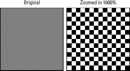
Figure 20.15. The image appears gray, but on closer examination we see it is actually made up of alternating black and white pixels.
Dithering can happen in one of two ways: through Photoshop's optimization process (application dither), or through the Web browser if the user has his or her system set to 8-bit color mode (browser dither). The likelihood, however, that contemporary computer users have their system set to 8-bit color mode when the typical graphics card is capable of 24-bit or 32-bit color is slim. Application dither, then, is your primary concern.
The reason to apply dither is to prevent colors from banding, a situation in which the chosen color reduction method has eliminated any continuous tone, leaving nothing but solid bands of color, as shown in Figure 20.16.
To dither an image in the Save For Web & Devices dialog box, simply make a selection from the Dithering Algorithm menu. These are your options:
Diffusion: The Diffusion algorithm, instead of using an obvious checkerboard-like pattern, diffuses the pattern of dithered pixels. This algorithm works in conjunction with the Dither percentage slider. The higher the dither percentage, the more latent colors you simulate, increasing the overall file size.
Pattern: The Pattern algorithm dithers pixels in a clear, linear pattern.
Noise: The Noise algorithm creates a randomized pattern of dithered pixels.
Figure 20.17 shows a close-up of the differences between Diffuse, Pattern, and Noise.
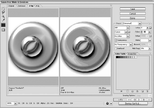
Unlike native Photoshop files, whose layers can have varying degrees of opacity, in a GIF or PNG-8 file a pixel is either opaque or transparent. This presents a dilemma when Photoshop needs to optimize a drop-shadow or anti-aliased edge. Here Photoshop translates any pixels of partial transparency into a fully opaque pixel, calculating the appropriate color based on that of the original semi-opaque color and the color you choose for the matte.
To preserve transparent regions when optimizing images in GIF or PNG-8 formats, simply select the Transparency option. Any completely transparent pixels remain so, while semi-transparent pixels are blended with your chosen matte color (typically, the intended Web page's background color) to simulate a gradual transition.
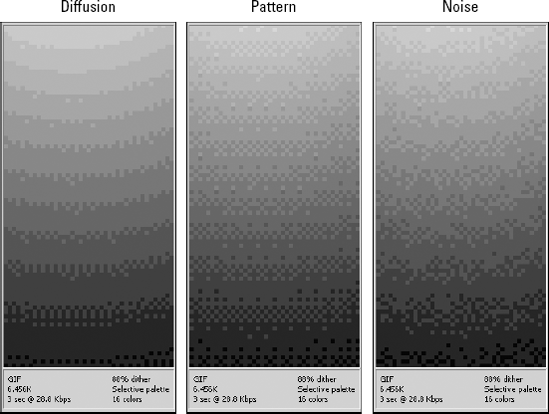
Figure 20.17. Where Diffuse creates a more random dither, Pattern creates a noticeable checkerboard-like effect. Noise generates a randomized pattern.
The matte color is selected using the Matte Color menu. The Matte Color menu provides the following options:
None: This option disables matte color. Pixels of less than 50 percent transparency are made entirely opaque, while pixels of more than 50 percent transparency are made completely transparent.
Eyedropper Color: This option uses the color last selected with the Save For Web & Devices dialog box's eyedropper, shown beneath the Eyedropper tool on the left side of the dialog box. Clicking this color swatch also invokes the Photoshop Color Picker from which to make a selection.
Black: This option sets the matte color to black.
White: This option sets the matte color to white.
Other: This option invokes the Photoshop Color Picker from which to make a selection.
The Photoshop Color Picker also can be invoked by clicking the Matte Color menu's text field directly.
To interlace an image, select the Interlace option in the Settings area. When an optimized image is interlaced, browsers start by displaying it at a lower resolution and bring it up to full resolution over seven progressive scans. The purpose of this is to get something to the site visitor's screen ASAP so there are no blank areas on the screen while the visitor waits for the entire page to download.
In the days of 14.4 and 28.8 Kbps modems, interlacing graphics was a common practice. While it resulted in insignificant increases in file size, at least the visitor wasn't staring at text with a bunch of square holes punched in it waiting for something to appear. With contemporary Internet connection speeds being light years faster than this, interlacing images isn't really necessary, and doing so can even hurt performance because imposing seven scans may take longer than simply allowing the image to download unencumbered.
JPEG and PNG-24 are meant for optimizing continuous-tone images. This is facilitated by their 24-bit color depth, supporting 16,777,215 colors. The JPEG format uses a lossy compression method that removes color data, while PNG-24 (like PNG-8 and GIF) uses lossless compression that results in significantly larger file sizes than JPEG, but often with greater color fidelity.
Figure 20.18 shows the Save For Web & Devices dialog box's Settings area options for JPEG and PNG.
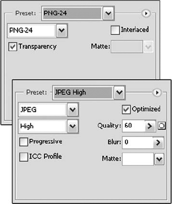
Photoshop offers three presets for JPEG and one for PNG-24:
JPEG Low
JPEG Medium
JPEG High
PNG-24
In Photoshop, JPEG compression is represented by a scale of 0 to 100. The three presets of Low, Medium, and High represent compressions of 10, 30, and 60, respectively. The higher the number, the greater the degree of compression — which decreases the overall image quality. Your mission is to achieve a balance between image quality and file size.
The JPEG Quality Level menu offers one setting not provided by the presets — Maximum — which equals a compression value of 80. The Quality slider manually adjusts the compression value to any point on the 0–100 scale.
The Optimized option available for JPEG optimization should always be selected. It improves color optimization and produces smaller files.
Note
If you opt to save as JPEG without going through the Save for Web & Devices dialog box, once you've chosen JPEG as the file format in the Save As dialog box and click Save, the JPEG Options dialog box offers a Quality setting that ranges from 1 to 12, 12 being Maximum (commensurate with the same quality through the Save for Web & Devices dialog box) and includes a slider that allows you to choose between a small and large resulting file size. On the right side of the dialog box, a size estimate appears, based on the selected Quality setting.
Unlike GIF and PNG-8, JPEG lacks transparency support, so a matte color must be used to fill such zones created in the original image. The JPEG Matte menu is identical to those used by GIF and PNG-8, described earlier in the chapter.
PNG-24 supports up to 256 levels of transparency by selecting the Transparency option, and consequently doesn't need a Matte option. Most current browsers, such as Mozilla Firefox, do support this option. As always, test your Web graphics locally, using at least two browsers, before you publish your images to the Web.
Like GIF and PNG-8, PNG-24 provides an interlacing option, and the same rules apply. JPEG provides similar functionality with a feature referred to as Progressive JPEG.
Where interlacing GIF and PNG files increases their overall file size, using the progressive option results in smaller JPEG files. But again, forcing the image into a series of progressive scans can actually make the download take longer.
Beneath the Save For Web & Devices dialog box's Settings area sits the Image Size area, shown in Figure 20.19, which allows you to adjust an image's dimensions without going back to the Photoshop workspace.
Tip
Don't use the resizing features of the Save For Web & Devices dialog box for radically altering an image's dimensions. Knocking an image 5 pixels one way or the other (provided that such a number doesn't account for 50 percent of an image's initial width or height) is fine. But, if you're starting with a high-resolution image that's over 300 dpi, with dimension values in the thousands of pixels, do your reducing out in the main Photoshop interface where you have the rest of the program's tools at your disposal to maintain sharpness and clarity.
The image's original dimensions are shown in the Original Size area, with the New Size area beneath, where you can type new values. Adjust the image's dimensions proportionally by selecting the Constrain Proportions option, which also activates the Percent field.
Some Web designers who come from a graphic arts background like to rough out their pages in Photoshop, which allows them to assemble all the buttons, special text, and other elements the way that they want them to appear on the final Web page. Then they can cut the elements apart and save them out to later assemble in HTML.
Consider the image in Figure 20.20. This image contains a text layer whose position in the finished Web page actually will be occupied by physical page text typed into the HTML code. The simplest way to combine text blocks and graphics on a Web page is to create an HTML table. And Photoshop's slicing feature can divvy up your image and generate the required HTML table code for you all in a one sitting.
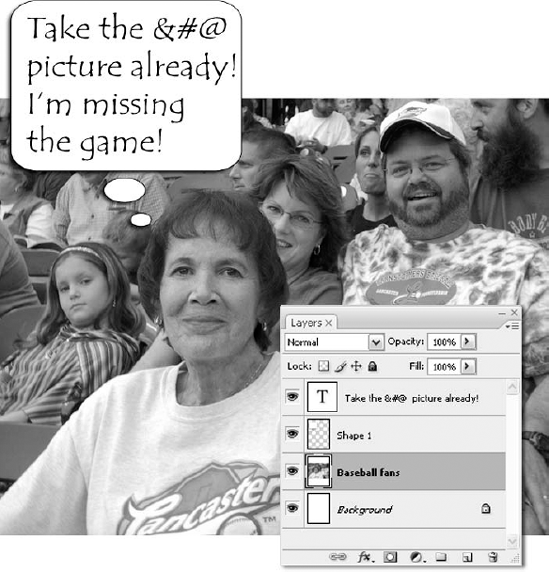
Figure 20.20. Here's a mock-up of an image destined for Web use. The Layers palette, obviously, is not part of the Web-bound image, but you get the idea.
Illustrated in Figure 20.21, slices are rectangular containers that permit you to add structure to a Web page design. The slices in the figure act like children's blocks, each of which contains just enough of the graphic to fit together into a seamless whole. The blocks marked in blue (appearing in dark gray here) are the user slices, the ones that the designer drew. They indicate the boundaries of the text. The remaining blocks are auto slices, which Photoshop creates automatically to fill in the gaps. In the figure, a total of six auto slices are needed to keep all slices exactly rectangular.
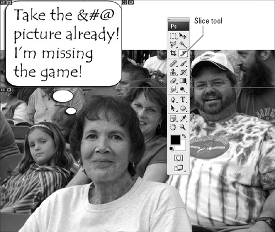
Figure 20.21. Use the Slice tool (right) to subdivide a Web page design into rectangular blocks. Photoshop later assembles the blocks into an HTML table, which adds structure to the otherwise free-flowing arrangement of elements on a Web page.
Photoshop provides two Slice tools, one for drawing slices and one for editing them. Press K to select the Slice tool (highlighted in Figure 20.21), which lets you draw slices. That tool shares a flyout with the Slice Select tool, which you use to move and scale slices.
Draw a rectangle around the portion of the image that you want to slice into an independent image; Shift-drag to constrain the shape of the slice to a square. For each slice that you create, a number appears in the upper-left corner of the slice, also as shown in Figure 20.20. Here are a few other things you should know:
As you draw your user slices, Photoshop automatically fills in the auto slices, which it differentiates using dotted outlines. The program also numbers the slices from left to right and then top to bottom. User slice numbers appear in blue; auto slice numbers appear in gray.
Simple tables are reliable tables. This means you want to draw as few slices as absolutely possible. In Figure 20.21, just one slice has been drawn around the text block. Avoid overlapping slices and avoid having two slices that almost, but don't quite, touch, because both result in Photoshop having to draw extra auto slices.
Tip
If you need help aligning your slices, choose View
Tip
You also can align slices on the fly. While drawing a slice, press and hold the spacebar to move the slice as you drag. Release the spacebar to put the slice down and return to sizing it.
To create a slice that surrounds everything on a particular layer, select the layer in the Layers palette and then choose Layer
Tip
Use this technique when saving slices that contain layer effects, such as drop shadows. This way, you can edit the effect without having to worry about redrawing the slice manually if the new effect takes up more space.
Photoshop also can make slices from guides. First, drag one or more guidelines from the horizontal and vertical rulers (View
To hide and show the slice boundaries, press Ctrl+H (
After you get your slices just so, choose View
Need to change a slice boundary? Grab the Slice Select tool (Shift+K), and click a slice to select it. You also can Shift-click and drag in the image window to select multiple slices. Then edit the slice or slices as described in the following list.
Tip
To temporarily access the Slice Select tool while the Slice tool is active, press and hold Ctrl (
A selected user slice displays corner handles. Click and drag a handle to change the size and shape of the slice. You also can drag inside a selected slice to change its location. Press Backspace (or Delete) to delete it.
To duplicate a slice, press Alt (or Option) and drag the slice.
When the Slice Select tool is active, you can promote an auto slice to a user slice. Click the auto slice, and then click the Promote to User Slice button in the Options bar. Then adjust the boundaries of the slice as desired. If the Slice tool is active, right-click an auto slice (Control-click on the Mac) and choose Promote to User Slice.
Tip
To change a user slice to an auto slice, simply select and delete the user slice. Photoshop has to fill the vacated space, and does so with an auto slice.
Double-click a selected slice with the Slice Select tool to display the Slice Options dialog box, shown in Figure 20.22, which lets you assign a name to the slice image file, add a link, and set other slice attributes described in the following list. You also can access a version of this dialog box with slightly different options (as you'll see) by double-clicking a slice inside the Save For Web window.
Slice Type: You can fill a slice with either an image or text. To keep the slice an image, leave this option unchanged. If you would prefer to fill the slice with text, select No Image.
To convey your text to the HTML document, select the text using the Type tool and copy it to the Clipboard by pressing Ctrl+C (
Name: Photoshop automatically names the slices after the saved image name followed by an underscore and number. If you want to override the automatic naming convention, type your preferred slice name here. (Note that this option and the four that follow apply only when you select Image as the Slice Type.)
URL: To turn the slice into a button, type the appropriate pathname to the page to which you want to link.
Target: If you need to target your link — for example, if your site is frames-based — type the appropriate frame name or reserved HTML target value (_blank, _parent, etc.) in this option box.
Message Text: Type a message to appear in the status bar at the bottom of the browser window when a visitor hovers the cursor over the slice. For those familiar with JavaScript, Photoshop handles this using an onMouseOver="window.status" event handler.
Alt Tag: To provide a text alternate for a button, type the text into this option box.
Dimensions: To specify the exact placement and size of a slice boundary, type the pixel coordinates into the X and Y options and the dimensions into the W and H options. This can be useful when trying to delete auto slices by getting the user slices into exact alignment.
Slice Background Type: If your image contains transparent areas, you can fill them with a color selected from this pop-up menu. The Matte option uses the matte color specified in the Save For Web optimization settings. Choose Other to select a color from the Color Picker. Note that you can't preview this background color in Photoshop; you must use a browser.
Tip
You can likewise insert HTML tags into the text-entry area, but if you do, things get a bit trickier. In Figure 20.22, an <a href> tag has been added (colorized for emphasis) around the word game. This should turn the word into a hyperlink, but instead, the Web page merely ends up displaying the tags as text. The solution is to visit the Save For Web & Devices dialog box, double-click the slice, and select an option not otherwise found in Photoshop — Text is HTML. Highlighted in Figure 20.24, this option correctly interprets HTML tags and once selected, remains selected as long as you work on the image.
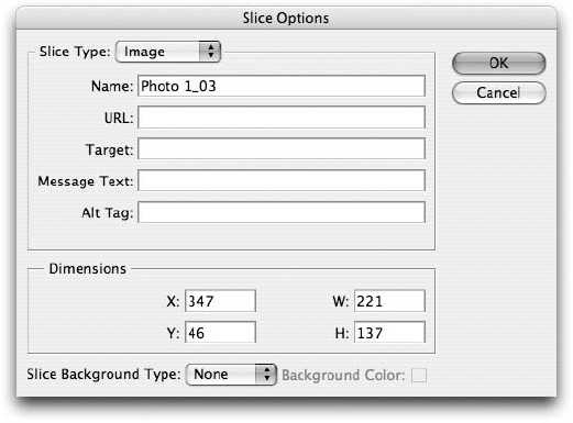
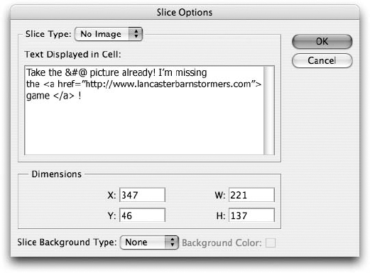
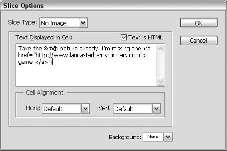
After you create and edit your slices to absolute perfection, you'll want to perform both of the following kinds of saves:
Save the image itself. To save your original image with all slice information, layers, and other doodads intact, choose File
Save the HTML table and slice files. To output the image in Web-ready form, choose File
So far in this chapter, you've looked at the various printing options that Photoshop provides. Next, the many automated methods of publishing images for presentation in print or for use on the Web are up for discussion.
If you're going to print and publish from within Photoshop, the commands reside in the File
The Bridge offers an Image Processor command. This opens the dialog box shown in Figure 20.25. Through this dialog box, you can send images from the Bridge to Photoshop for "processing." This is meant to be used for images coming from your digital camera primarily; "processing" means saving in a particular format (you pick this through the File Type section of the dialog box), and running actions and inserting copyright information. You can save the files in up to three formats: JPEG, PSD, and TIFF. If you're not sure of what other settings to use, select the Open first image to apply settings option, and the Camera Raw dialog box opens for the first image in the batch. You can use the dialog box to set things up for the first and all subsequent images in the batch.
Photoshop offers a Create Droplet command. This opens a dialog box through which you can create an executable file (.exe extension, for Windows users, no extension appears for Mac droplets) for automating the use of Photoshop actions. You can create droplets, store them as icons (say, on your Desktop), and then click and drag images (or folders thereof for batch processing) onto the icons, and the specified actions are performed on the image(s). You also can swap droplets between Mac and Windows, if you so desire; a Windows droplet much be dropped onto the Photoshop icon on the Mac desktop, at which point Photoshop accommodates the platform changes and automatically runs it, stopping, as needed to prompt you for any required settings, commands, or file names.
Photoshop has a Conditional Mode Change command. Choose File
The Fit Image command is available. This offers the dialog box shown in Figure 20.27. This can be a handy procedure to run an image through before printing, as it constrains the image to a particular width and height, measured in pixels. If your image is bound for the Web — and you haven't fired up the Save For Web & Devices dialog box yet — you can resize it with this dialog box first, and then go about the optimization process described earlier in this chapter and also in Chapter 3.

Figure 20.26. Need to change all your open images to a different mode in one fell swoop? Choose Conditional Mode Change from the File
Automate submenu.
Figure 20.27. Need an image to be this wide by this tall? Choose Fit Image from the File
Automate submenu and enter your desired dimensions there.So you can print and publish your images, singly or in groups, from either the Bridge or from right within Photoshop. For the next several sections of this chapter, you'll learn how to combine multiple images into printable and Web-displayable creations for business, personal, and artistic use.
Choose File
Figure 20.29 shows a contact sheet. You can add your own content later — additional captions, shapes, drawings, even layers from other images — and jazz the sheet up as desired. Right out of the box, however, it's a pretty cool way to print out a bunch of photos to be reviewed for use elsewhere or just to share them all on one page.
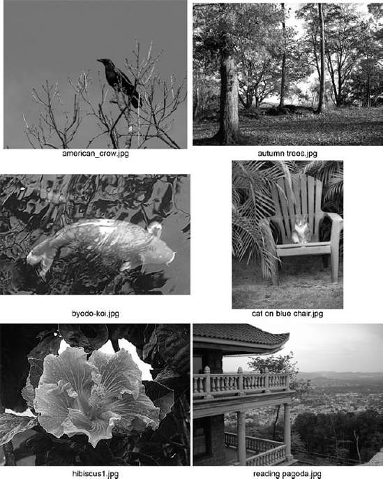
In addition to Contact Sheet II, Photoshop offers two other commands under the File
The Label section of the Picture Package dialog box, shown in Figure 20.30, lets you add text to your image. The options are pretty self-explanatory, but it's worth pointing out that the Custom Text option box keeps you from having to quit the Picture Package command to jump over to File
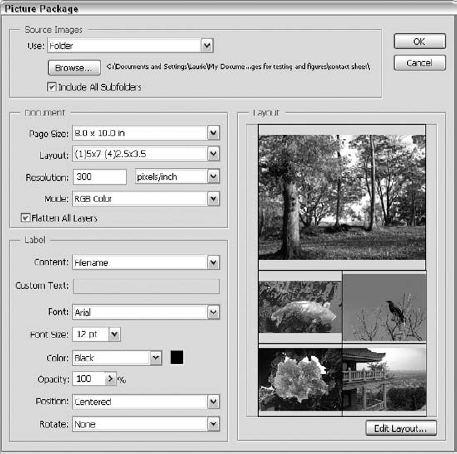
Figure 20.30. Save a tree: Print a Picture Package. By tiling several images on a single sheet of paper — how about photo paper? — you can share one image in several sizes or multiple images in a variety of layouts.
You can create and edit custom layouts for the Picture Package command. Click Edit Layout (refer to Figure 20.30) to display the Picture Package Edit Layout dialog box, shown in Figure 20.31. From the Layout section of this dialog box, you can create a template that sets a custom Name, Page Size, Width, and Height for the picture package. But the real power of the Edit Layout command is the ability to completely rearrange or even create from scratch a template that sets the actual positions and sizes of the images in your picture package.
By default, the Picture Package Edit Layout dialog box opens with the most recently selected layout template displayed. The dialog box also displays just one of your images, even if you clicked the individual tiles in the main dialog box and selected alternate images. Pay this no mind; just arrange the images without respect to what's in them, and your package in the end reflects the images you chose in the main Picture Package dialog box.
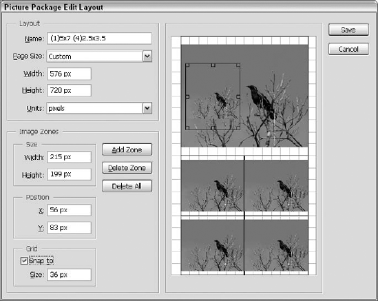
Figure 20.31. Photoshop gives you total control over the scale and position of the images in a picture package.
To alter the layout, just click one of the instances of the image, or "image zones" as Photoshop calls them, and drag it around the window. As soon as an image zone is selected, you gain access to handles that let you scale it. You also can manually type the Size and Position values for each individual zone in the Width, Height, X, and Y option boxes. The buttons in the Image Zone section of the dialog box let you add and remove zones at will. You can even place image zones on top of each other. Finally, the Grid section is where you specify whether the image zones snap to a grid and, if so, the size of the boxes within the grid. Click Save to save your new layout template as a text file or overwrite an existing template.
Again geared toward professional and aspiring photographers, the Web Photo Gallery command assembles a folder or selected group of images into a Web page, complete with HTML pages and JPEG images. In the Web Photo Gallery dialog box, shown in Figure 20.32, first select a page style from the Styles pop-up menu. The preview on the right side of the dialog box shows a sample page created using that style. You also can type an e-mail contact. You can make further design choices by selecting the various items in the Options pop-up menu. For each item, you get a different set of accompanying design options:
General: Choose between .htm and .html extensions. Additionally, you can choose to preserve the images' metadata when they're converted to JPEG files. You also can elect to use UTF 8 encoding, which enables older operating systems to view the generated Web pages.
Banner: Name your page and add the photographer's name, contact info, and the date. You also can select the font and type size for these items.
Large Images: Add a border around your images, resize images, add titles, and apply JPEG compression.
Thumbnails: Specify the thumbnail size and the number of columns and rows of thumbnails. You also can add borders around the thumbnails, add captions based either on the image file name or the description info typed in the File Info dialog box, and specify a font and type size.
Custom Colors: Set the colors for the page background, banner, text, and links.
Security: Create a text message that will be embedded into each image, making people much less likely to steal the images from your Web site for their own nefarious purposes. You can type custom text, use the File Info description or the name of the file, choose the placement of the text, and choose whether you want the text to be rotated at an angle on the image.
The Source Images options let you choose either a folder of images or a group of selected images in the File Browser for use in your Web Photo Gallery, allow you to determine whether to include folders nestled in a specified folder, and also choose where the resulting files should finally end up. Figure 20.32 shows a Web page created with the settings from Figure 20.33.
Web pages created using the Web Photo Gallery command aren't going to win any design awards, but the command is easy to navigate and it gets the job done. And if you know a little HTML, you can use the pages as a jumping-off point for a more sophisticated site.
The Web Photo Gallery includes styles that let a visitor or client submit feedback about your images directly from the Web page. Choose one of the three Styles that contain the word Feedback, and Photoshop includes a live tab in the finished Web Photo Gallery in which a visitor can type text or click a check box to mark the currently selected image as "approved." The Feedback styles can even program the generated Web page to e-mail visitor comments back to you by automatically opening the local mail program and generating a message instantly.
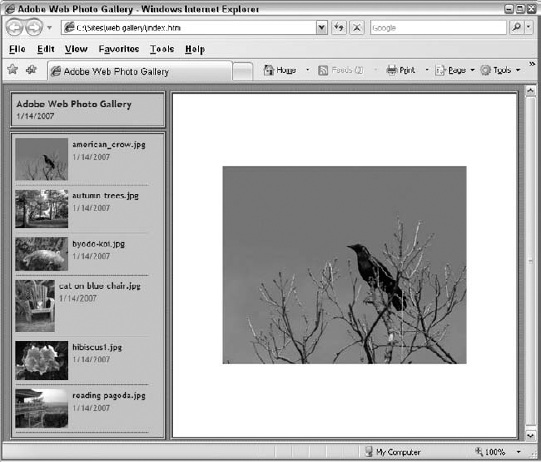
Figure 20.33. The visitor can click the thumbnails on the left to change the displayed large image on the right. It's a very basic page (using the Centered Frame 1 Info Only style here), but it's a clean design, and it's simple to navigate.
Tip
Photoshop also lets you define custom Web Photo Gallery page styles. Using an HTML editor, you can create a batch of HTML files that contain the instructions for formatting the various elements of the page. To get an idea of how to build a custom style, take a look at the HTML files provided for the Photoshop default styles, found in the PresetsWeb Photo Gallery folder. After creating your custom pages, store them together in a new styles folder in the Web Photo Gallery folder.
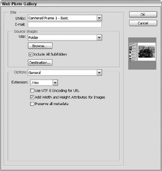
In addition to letting you create an HTML-based slideshow using the Web Photo Gallery command, Photoshop lets you create PDF-based slideshows using the new PDF Presentation command. As you're probably aware by now, PDF is Adobe's increasingly widespread and immensely robust format for delivering digital information onscreen. While originally designed as a sleek, efficient format for text layout and vector-based shapes, recent PDF versions have added support for sound and even video clips embedded directly in PDF files. This means PDF is also a great way to transmit and distribute multipage files containing high-quality images, and the new PDF Presentation command lets you do this without leaving Photoshop.
Choose File
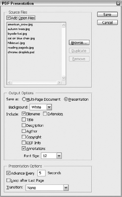
Figure 20.34. The PDF Presentation feature lets you create PDF slideshows and even set snazzy transitions between the images.
Below the Source Files section are the Output Options. Here, you can choose whether the PDF file will be a static, multi-page document or a slideshow, which Photoshop refers to as a Presentation. Choose Presentation and the Presentation Options at the bottom of the dialog box become available (refer to Figure 20.34) to you. Here you set the speed at which the slideshow advances, whether it loops continuously, and what type of transitions take viewers from one image to another while they watch it. You can experiment to see which transition you like best.
After you click Save, you can give the file a name (and choose a location and make some other choices) from the standard Save As dialog box, and then you're presented with the dialog box shown in Figure 20.35. Here you can customize the Adobe PDF settings for your file, selecting which version of Acrobat Reader to choose from the Compatibility list, make Security settings changes, and so on. It's the same dialog box you see when you save any Photoshop image in PDF format.
Figure 20.36 shows the PDF document window, and a panel of the images included, along with the main image that would appear in the individual slide during the show.
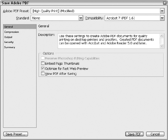
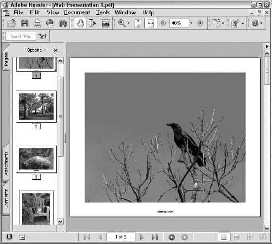
When the show runs, the screen displays the images, full-screen, with a black background. Press Esc to end the show, and if you didn't set automatic timings (through the Presentation Options portion of the dialog box), you can press Enter to move from slide to slide.
There are a number of reasons to create a PDF slideshow instead of a Web Photo Gallery for distributing your images. A PDF file is just that — one file — as opposed to the numerous files that make up a Web Photo Gallery. Thus, you can burn a PDF file onto a CD or e-mail it to friends, family members, or coworkers to view onscreen using Adobe Reader software, available for free from www.adobe.com. PDF files also allow you to use your own fonts within the presentation without worrying that the recipient of the file won't have the same ones, and PDF files scale well — you don't have to worry about what monitor resolution is set at the file's final destination.
HDR stands for High Dynamic Range. The Merge to HDR command allows you to take multiple images and capture a full range of color and detail by merging them into a single image. Of course, the multiple images should be of identical content. The only differences between them, as shown in Figure 20.37, are in terms of their color and light values.
You can start with the Merge to HDR dialog box open (choose File
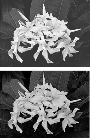
Figure 20.37. The same flowers with detail-robbing light and too little contrast (left) and deeper shadows (right) can be merged to create a single improved image.
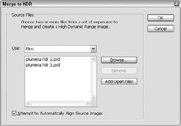
Figure 20.38. Click the Use list to choose between Files, Folder, or Open Files as the source for your images. You can click the Attempt to Automatically Align Source Images check box if your images are not exactly the same size and orientation.
Next, click OK to begin the merge. Your computer pauses and creates a temporary merged version, along with a Manually Set EV dialog box, shown in Figure 20.39, that you can use to manually adjust the settings for the individual images. After you've used the Image < and > buttons to move through all the images to be merged, the OK button becomes available.
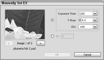
Figure 20.39. Make any manual adjustments before moving on to the final step, where your multiple images are merged into one HDR image.
Now you can click OK in the Manually Set EV dialog box, and the Merge to HDR dialog box opens, as shown in Figure 20.40. Last, drag the slider to adjust the Set White Point Preview, and when you like the Merged Result image, click OK. This creates the final merged image, which you can then convert to an 8-bit or 16-bit image, using the Image
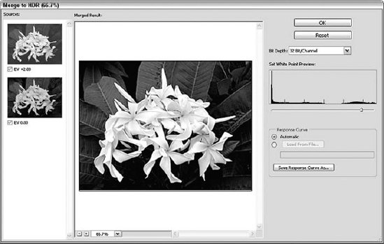
Until the release of Photoshop CS, the ability to create a panoramic composite from a group of images was something you could only do with Photoshop Elements. With the release of CS, Photomerge was added to Photoshop, and with each subsequent release — CS2 and now CS3 — there's been a little bit more added to the functionality and successful creation of panorama images in Photoshop's Photomerge feature. Of course, despite its beginnings in what's often called "Photoshop Lite" (Elements), there's nothing pared down about the Photomerge feature, and it's quite effective at taking a series of images and merging them into a single, wide, panoramic shot. Of course, the only catch is that the images you plan to merge need to have been shot under specific circumstances — the same setting, the same size film, the same orientation of the camera. If you painstakingly stood there at the Grand Canyon, however, and took a series of shots of a very wide view and now you have each section of the view represented by two or more images, you're good to go with Photomerge.
To get started, choose File
You'll want to leave Advanced Blending on to take advantage of the improvements in this area added to CS3. With this feature turned on, the images are laced together more smoothly, allowing for a more natural-looking flow from image in the panorama to the next. After you click OK to perform your Photomerge, in the dialog box shown in Figure 20.42, a progress bar reminds you that it is blending the images "based on content."
After you've made your choice, either the merge is performed and gives you a file called "Untitled Panorama," or you see the dialog box shown in Figure 20.42, and this, as they say, is where the magic happens. Again, if you don't choose Interactive Layout, you just get the merged photos; you don't get the dialog box.
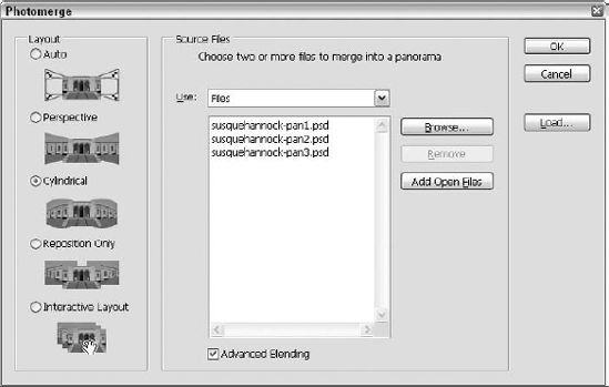
By default, Photomerge tries its best to make sense of the pixels in your images and match certain areas of one photo with similar areas of another. But it's something of a gamble; most of the time you'll see at least a few portions of your image that could use some fixing. You adjust the individual placement and rotation of the images in a panorama using the Select Image and Rotate Image tools available in the upper-left corner of the dialog box. The bottom two tools — the Zoom and Hand tools — work the same as they do everywhere else in the program. Between these two sets of tools is the Set Vanishing Point tool, which is covered in a moment.
Tip
If you adjust the settings without getting the results you want, try removing one of the images if the area it covers is already captured by the other images onscreen. To remove an image, simply select the arrow tool, click the image, and drag it to the Lightbox strip at the top of the screen, labeled in Figure 20.42. Giving the Photomerge command too much information about your scene can be a bad thing, and you may want to leave some of the images up in the Lightbox until you're ready to incorporate them. The Lightbox also is the all-purpose depository for any image that Photoshop cannot figure out how to fit within the panorama. If you'd like to reintroduce an image, simply click and drag it from the Lightbox and drop it back into the work area.
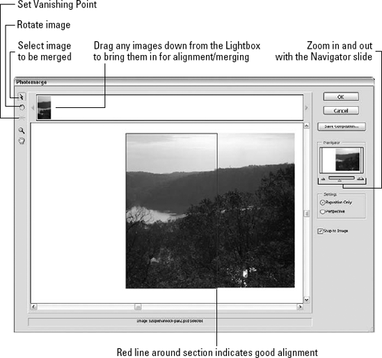
Figure 20.42. The very large Photomerge dialog box makes every attempt to create a panorama from a group of photographs, but you usually need to manually adjust the images to get the best results.
By default, Photomerge assembles the images into a flat, jagged puzzle that rotates the images to fit each other but does not distort them in any way. If you'd like Photomerge to try bending and distorting the photos in an attempt to make them fit better, select the Perspective option (refer to Figure 20.42). When the Perspective option is selected, the command contorts the images and presents a more accurate, nearly 3D view of your scene. You can select the Set Vanishing Point tool and alter the perspective by clicking the different images in the composition. If you just want a straight panorama, leave the Reposition Only option selected.
The two options in the Composition Settings section of the Photomerge dialog box let you correct certain problems inherent in the Photomerge process. For example, the Perspective setting does a great job of distorting the images to ensure that they all fit together in the composition, but it also often results in a sort of "bowtie" shape for your final composition. The Cylindrical Mapping option, available only when the Perspective option is selected, corrects this by bending the more extreme corners of the composition back toward the center. Even more useful is the Advanced Blending option, which attempts to smooth over the common color and luminance shifts between images that can be dead giveaways of a computer-generated panorama. Both Composition Settings options make for pretty intense renders, so you may want to click the Preview button to see a lower-resolution preview while working in the dialog box.
If you've carefully arranged the images in your panorama and would like to return sometime later and continue adjusting the settings, click Save Composition to save a version of your Photomerge settings for these particular images that you can open and edit at any time. To do so, choose File
As mentioned earlier, the way in which the original images were photographed is perhaps the most important factor in determining the results of a panorama created with Photomerge. The most crucial thing to keep in mind when shooting photos that you plan to merge is that the greater the consistency in focal length, camera angle, exposure, and position, the easier it is for Photoshop to merge the resulting images. Adobe recommends an image-to-image overlap of 15 to 40 percent and that you avoid using any sort of lens that distorts your images (such as a "fish-eye"). Finally, the use of a tripod or another stabilizing surface can mean the difference between an expert merge and an expressionist fiasco.
Not to be confused with the Batch Rename command (found on the Bridge, in the File menu), the Batch command in Photoshop's Automate submenu allows you to run any action on a group of files, including renaming the resulting files and storing a log of any errors encountered. This makes it possible to do cool, timesaving things like creating thumbnails (record an action that reduces the images to a specified size and resolution first) and naming them so that the original file name plus a serial number (serially applied) is added to the names. Just about anything that you repeatedly do to a series of files can be done with the Batch command, augmented by the ability to ignore steps in your actions that might clash with the batch aspect of the procedure, such as Open and Save As commands that you don't want causing a pause and the display of a dialog box that's not needed when you're applying the action to a bunch of files.
You may want to have these things prepared before you embark on the Batch command:
Have the action ready, recorded, running properly, and know which set it's in.
Have all the files you want to handle as a batch either open within Photoshop already or stored in a single folder so that you can select them easily.
Know your action so you know if Open and Save As commands need to be skipped.
Know what you want to call the resulting files, if you do want to change the Destination for the files (renaming is not necessary, if what you're doing to the batch of files doesn't require that a new file be created for each file that's affected).
After you have all those ducks in a row, choose File
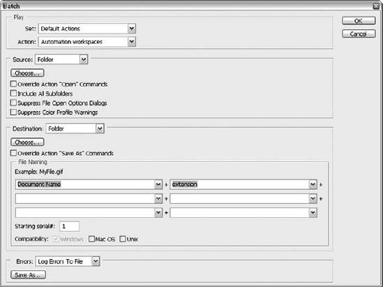
Figure 20.43. The Batch Processing dialog box lets you pick an action, choose the files to apply it to, and rename batches of files, all in one fell swoop.
The dialog box has three main sections: Play, where you choose the action to run on the files; Source, where you choose the files that will be subjected to the action; and Destination, where you decide where new files created through the action will be stored. A small subsection entitled File Naming is where you set up the naming convention for the resulting files.
Tip
If things go awry, a file that logs the errors might come in handy. Choose Log to File from the Errors drop-down list, and click Save As to choose the name of the log file to create.
As you work through the dialog box, the Choose buttons allow you to pick the Source folder and Destination folders, respectively; the check boxes in the Source section allow you to turn action steps like Open off when the batch command is run, and to include subfolders or not. The other spot where you can tell Batch to skip an action step is in the Destination section. Mote the Override Action "Save As" Commands check box; turn this on if your action has such a command within it.
Warning
Whenever possible, you should make your Batch process create new files from the effects of whichever action you're applying. Why? Because if it goes wrong, you can just delete the deformed results of your efforts, and start over, tweaking the action and/or your Batch dialog box settings accordingly. If the only thing to go wrong is something in the naming process, use Batch Rename (again, from the Bridge) to fix things up name-wise.
In this chapter, you discovered terms to help you communicate with your commercial printer and learned how to print grayscale and color composites. You also learned about setting up and previewing your print job in Photoshop and how to assign transfer functions to distribute brightness values. Through a discussion of the color-separation process, you should now understand how to apply color trapping and know about adding spot-color highlights to a CMYK image. You also learned about publishing to paper and the Web, with Photoshop and via the new Bridge, and how to create Web graphics. Finally, you learned about processing files in batches, applying actions (discussed in Chapter 3) to whole folders of files for uniform naming and other mass-production activities.