Blend modes permit you to mix the color of a pixel with that of every pixel in a straight line beneath it. A single blend mode can pack as much power as a mask, a filter, and a retouching tool combined. And, unlike some of those combined options, blend modes don't physically alter an image's pixels — they're temporary. As long as one image remains layered in front of another, you can replace one calculation with another as easily as you change a letter of text in a word processor.
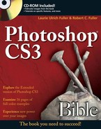
To appreciate the most rudimentary power of blend modes, consider Figure 14.1. Here you see several clones of our bony old pal. Each one has been mixed with the background using a random sampling of blend modes from Photoshop's Layers palette. The skeleton image itself never changes; each repeated layer contains the same collection of pixels. In all, there are six layers: five skeletons and the background, each skeleton layer subject to the blend mode labeled in the figure.
Now, don't worry — you'll delve into the specifics of every one of these blend modes later in this chapter. However, before you get ahead of yourself, a few basics are in order.
In this chapter, you investigate three fundamental ways to mix pixels:
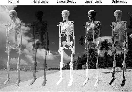
The Layers palette: You can combine the active layer with underlying pixels using the Opacity and Fill values, along with the blend mode pop-up menu, all members of the Layers palette, as seen in Figure 14.2. Opacity and Fill options are examined in detail in the next section. Blend modes are covered in the section after that.
Blending options: Right-click a thumbnail in the Layers palette (Control-click on the Mac) and choose Blending Options to display the Blending Options panel of the extensive Layer Style dialog box. Along with the Blend Mode, Opacity, and Fill Opacity options, you get an assortment of advanced blending options, including the Knockout pop-up menu and Blend If sliders. The Knockout options let you use one layer to cut a floating hole into one or more layers below it. Using the Blend If sliders, you can drop colors out of the active layer and force colors to show through from layers below. For more information about these and other options, read the section "Advanced Blending Options."
Channel operations: The so-called channel operations permit you to combine two open images of identical size, or one image with itself. Photoshop offers two commands for this purpose: Image

Blend modes are not Photoshop's most straightforward feature. There may even come a time when you utter the words, "Blend modes are stupid." They demand a generous supply of experimentation, and even then they'll try to fool you. The key is to combine a basic understanding of how blend modes and other compositing features work with your natural willingness to experiment, grow, and bond with pixels. Sometime when you don't have a deadline looming, take a multilayered composition you have lying around and hit it with a few calculations. Even if the result is a disaster that you wouldn't share with your best friend, let alone a client, you can consider it time well spent.
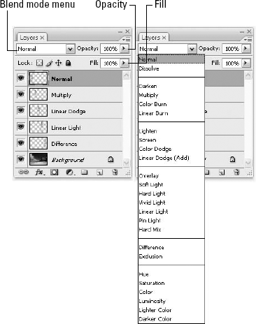
The Opacity value permits you to mix the active layer with the layers beneath it in prescribed portions. By way of example, consider Figure 14.3. The left side of the image shows a grouping of the skeletons at full opacity. In the example on the right, the Opacity setting was reduced, thereby transforming the group of skeletons into mere ghosts of their former selves.
The option directly below Opacity in the Layers palette is the field for controlling Fill opacity. Where Opacity controls the translucency of everything associated with a layer, Fill adjusts the opacity of the filled areas of a layer independently of any layer effects you add to it. Take a gander at Figure 14.4, where a drop shadow and outer bevel have been added to each of the skeleton layers. (You can add a layer effect to a layer by choosing an option from the cursive f icon at the bottom of the Layers palette, as discussed in Chapter 13.) Opacity affects pixels and layer effects alike; Fill affects pixels and leaves effects unchanged.
Fill also is more flexible than Opacity. While you can take Opacity and Fill all the way down to 0%, when you reduce Opacity to zero, the content disappears. When you reduce Fill to zero, the content disappears, but you leave the effects intact. Figure 14.5 shows the results of lowering the Fill value to 20 percent and then 0 percent.
Figure 14.3. Skeletons at 100% Opacity (left) and faded by 50% (right) directly beneath the Opacity field
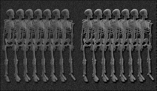
Figure 14.4. By adding a layer effect or two, the difference between Opacity and Fill becomes obvious: 50% Opacity makes layer and effects translucent (left); 50% Fill alters the layer independently of its effects (right).
Figure 14.5. Using the Fill value, you can subordinate a layer to its effect (20% Fill left) or fade the layer away entirely (0% Fill right).
Tip
When a selection or navigation tool is active, you can change the Opacity setting for a layer from the keyboard. Press a single number key to change the Opacity in 10 percent increments. That's 1 for 10 percent, 2 for 20 percent, up to 0 for 100 percent, in order along the top of your keyboard. If you have the urge to be more precise, press two keys in a row quickly to specify an exact two-digit Opacity value.
Hankering to change the Fill just as easily? Then press Shift. Shift+1 changes the Fill value to 10 percent; Shift+0 makes it 100 percent. Shift plus two numbers enters a two-digit value.
You also can change the setting by clicking and dragging the Opacity or Fill slider in the Layers palette (labeled back in Figure 14.2). Click the arrowhead to the right of the option to display the slider, and then drag the triangle to change the value. Or press the up and down arrows to nudge the triangle along; press Shift with the arrow key to nudge the value in 10 percent increments. Want yet another way? Point to the word Opacity or Fill on the palette, and when your mouse turns to a pointing figure with a two-headed arrow, you can "scrub" to the left to reduce the value for that field, or to the right to increase it. However you choose to change the setting, you can press Enter or Return to confirm the slider setting (or simply click onto another part of the workspace), or press Escape to restore the previous setting.
Note
Incidentally, both the Opacity and Fill options are dimmed when working on the background layer or in a single-layer image. There's nothing underneath, so there's nothing to mix. Naturally, this goes double when editing a black-and-white image, an indexed image, a single channel, or a mask, because none of these circumstances supports layers.
Photoshop offers a total of 25 blend modes, starting with Normal and ending with Luminosity. If you've been reading the chapters sequentially, you'll notice this isn't the first time blend modes have been touched upon. In fact, given that the blend modes mimic the brush modes described in Chapter 5 both in name and in function, we're covering some familiar territory. But you'll soon find that there's a big difference between laying down a color or pattern with a brush and merging the myriad colors that inhabit a single layer. This difference is the stuff of the following pages.
To demonstrate the effects of Photoshop's blend modes, we'll be compositing the series of images shown in Figure 14.6, in more or less the order shown. The background layer (being a true background layer) can have no blend mode applied to it. Also note that the flower includes a drop shadow layer effect, fading off to the right.
Tip
You can apply every one of the blend modes to a layer from the keyboard by pressing Shift+Alt (Shift+Option on the Mac) plus a letter, provided that the active tool doesn't offer its own brush mode options. (If the tool supports brush modes — as in the case of the Brush tool, Pencil, Clone Stamp, Healing Brush, and others — the shortcuts set the mode for the tool and not the layer.)
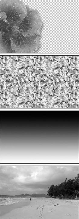
Figure 14.6. The default order of the images is the order pictured here: the hibiscus blossom on top, followed by the Confetti pattern (one of the predefined patterns included with Photoshop), then the gradient, and then at the bottom, a lovely view along Waiamanalo Beach. Sometimes we'll push the pattern and gradient layers around, if it better suits the discussion.
Here are Photoshop's 25 blend modes, in order of appearance:
Normal (N): In combination with Opacity and Fill settings of 100 percent, this option displays every pixel in the active layer normally, regardless of the colors in the underlying layers. When you use opacity values (whether Opacity or Fill) of less than 100 percent, the color of each pixel in the active layer is averaged with the composite pixel in the layers behind it. Figure 14.7 shows examples applied to the flower layer on its own.
Composite pixel refers to the pixel color that results from all the mixing that's going on beneath the active layer. For example, your document may contain hordes of layers with all sorts of blend modes in effect, but as long as you're working on, say, Layer 23, Photoshop treats the image formed by Layers 1 through 22 as if it were one flattened image filled with a bunch of static composite pixels.
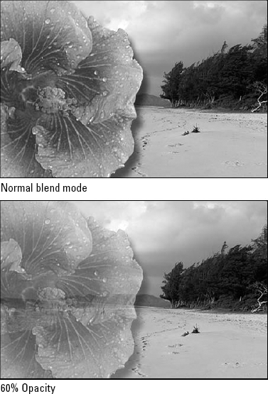
Figure 14.7. The Hibiscus layer set to the Normal mode when combined with Opacity values of 100 percent (top) and 60 percent (bottom)
When it comes to groups of layers (read about how to create them in Chapter 13), groups have no blending properties of their own. When you apply a blending mode to a group, you change the order of the image elements, with the layers within the group combined first, resulting in the composite group being treated like a single image and then blended with the rest of the image, based on the blending mode applied. So — if you use a blend mode other than Pass Through for a group, any adjustment layers or layer blending modes inside the group will not apply to layers outside the group.
Dissolve (I): This option affects feathered or softened edges. If the active layer is entirely opaque with hard edges, Dissolve has no effect. But when the edges of the layer fade into view, as seen in Figure 14.8, Dissolve randomizes, or dithers, the pixels. If you look closely, you'll see that Dissolve does not dither pixels in the drop shadow; as discussed in Chapter 13, layer effects are governed by their own, independent blend modes. Things change, however, when you drop the Opacity value below 100 percent, in which case Dissolve dithers all pixels, as demonstrated in the second example in the figure.
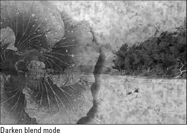
Darken (K): The first of the four darkening modes, Darken applies colors in the active layer only if they are darker than the corresponding pixels below. Keep in mind that Photoshop compares the brightness levels of pixels in a full-color image on a channel-by-channel basis. So although the blue component of a pixel in the active layer may be darker than the blue component of the underlying composite pixel, the red and green components may be lighter. In this case, Photoshop would assign the blue component but not the red or green, thereby subtracting blue and shifting the pixel toward yellow. Darken is most useful for covering up light portions of an image while letting dark areas show through.
To illustrate Darken and the other darkening modes, a light background was established by setting the pattern layer on top of the background and lowering its Opacity to 25 percent. Then the gradient layer was placed on top of that and set to the Screen mode, which left the white portion of the gradient visible and dropped out the black portion. The hibiscus (flower) layer was then added and set to the Darken mode, as shown at the bottom of the figure. The result, shown in Figure 14.9, is a flower that appears smooth in both the midtones and the shadows and patterned in the light areas, with relatively sharp transitions between the two.
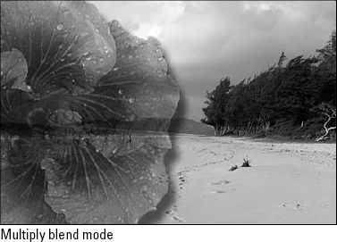
Multiply (M): Multiply is one of the rare blend modes that emulate a real-world scenario. Imagine that the active layer and the underlying composite are both photos on transparent slides. The Multiply mode produces the same effect as holding these slides up to the light, one slide in front of the other. Because the light has to travel through two slides, the outcome invariably combines the darkest elements from both images. So unlike Darken, Multiply universally darkens, resulting in smooth transitions that are ideal for preserving contours and shadows, as shown in Figure 14.10.

Figure 14.8. Here the Dissolve mode has been applied to the hibiscus layer at an Opacity setting of 100 percent (top) and 60 percent (bottom). Instead of creating translucent pixels, Dissolve turns pixels on and off to simulate transparency.
Tip
If the Multiply mode produces too dark an effect, reduce the Opacity or Fill value. If it isn't dark enough, clone the layer by pressing Ctrl+J (

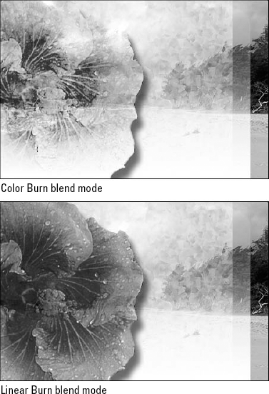
Color Burn (B) and Linear Burn (A): Where the Multiply mode darkens your images, the two Burn modes can literally char them. They both use colors in the active layer to reduce brightness values, resulting in radical color transformations. As demonstrated in Figure 14.11, Color Burn results in crisp, often colorful, toasted edges; Linear Burn creates a smoother, less vibrant effect. Both modes have an uncanny ability to draw colors from background layers.
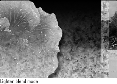
Lighten (G): The next four options use the active layer to lighten those below it. If you select Lighten, for example, Photoshop applies colors in the active layer only if they are lighter than the corresponding pixels in the underlying image. As with Darken, Photoshop compares the brightness levels of all channels in a full-color image.
To set the stage for the lightening figures, the background layers were modified, restoring the pattern layer to Normal and switching the gradient layer to Multiply. As a result, Photoshop dropped out the whites in the gradient and kept the blacks. The Lighten blend mode was then assigned to the face. The drop shadow also was modified — which would have otherwise remained black — by changing its color to white and its blend mode to Screen. The result, shown in Figure 14.12, is a drop glow, as described in Chapter 13.
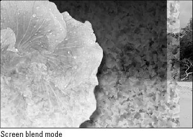
Screen (S): From a creative standpoint, Screen is the opposite of Multiply. Rather than creating a darker image, as you do with Multiply, you create a lighter image, as demonstrated in Figure 14.13.
You can use the Screen blend mode to emulate film that has been exposed multiple times. However, you should apply Screen only when working with images that are sufficiently dark so that you avoid over-lightening. Screen is equally useful for creating glows, retaining just the light colors in a gradient, and creating light noise effects such as snow and stars.
Color Dodge (D) and Linear Dodge (W): When you apply one of the two Dodge modes, each color in the layer becomes a brightness-value multiplier. Light colors such as white produce the greatest effect, and black drops away. As a result, the Dodge modes are Photoshop's most dramatic whitening agents. Imagine mounting your image on a gel and projecting it from a spotlight. Of the two, Color Dodge produces the sharper, rougher effect; Linear Dodge smoothes out the transitions, as shown in Figure 14.14. Because they send so much of an image to white, the Dodge modes are most useful for simulating hot spots and other intensely bright effects.
Overlay (O), Soft Light (F), and Hard Light (H): Photoshop's six Light modes darken the darkest colors and lighten the lightest colors, thereby allowing the midtones to intermix, so that foreground and background remain independently identifiable. Of the six, the first three — Overlay, Soft Light, and Hard Light — are the oldest and arguably the most useful, so the discussion begins with them.
Each of these three modes alternatively multiplies the blacks and screens the whites, but to different degrees. For example, where Overlay favors the background layers, Hard Light emphasizes the active layer. In fact, the two are direct opposites: Layer A set to Overlay in front of Layer B produces the same effect as Layer B set to Hard Light in front of Layer A. Meanwhile, Soft Light is a modified version of Hard Light that results in a more subtle effect than either Hard Light or Overlay.
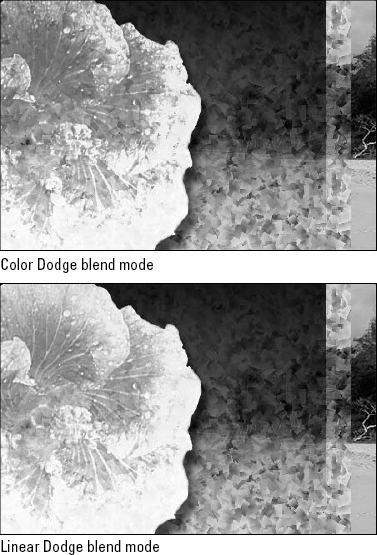
Figure 14.14. Color Dodge (top) and Linear Dodge (bottom) are never subtle. Both modes simultaneously bleach the image and draw out some of the dark outlines from the Confetti pattern.
When experimenting with these modes, always start with Overlay. If Overlay produces too strong an effect, reduce the Opacity or Fill value to favor the composite pixels.
Alternatively, you can switch from Overlay to Soft Light, as was done in the bottom example of Figure 14.15. On first glance, the examples in the figure — one showing Overlay at 50 percent and the other Soft Light at full opacity — look almost identical. But on closer inspection, you notice that where the balance of lights and darks is roughly equivalent, their distribution is quite different. The Overlay example favors the details in the flower; the Soft Light example favors the edges of the Confetti pattern.
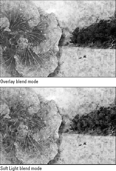
Figure 14.15. With the pattern layer in front of the flower, the Overlay mode (top) was applied, and its Opacity setting changed to 50%. Next we set the pattern layer to Soft Light mode with an Opacity of 100%.
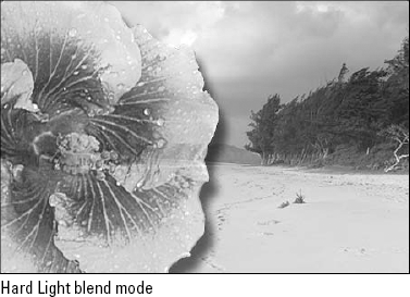
If the Overlay mode at 100 percent seems too subtle, consider switching to the Hard Light mode, shown in Figure 14.16, which provides the best marriage of emphasis on the flower and balance with the background.
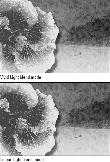
Vivid Light (V) and Linear Light (J): Where Overlay and family combine Multiply and Screen, the next two Light modes combine Dodge and Burn. Vivid Light combines Color Dodge and Color Burn, where Linear Light combines Linear Dodge and Linear Burn. Figure 14.17 shows examples.
The pattern layer is still in front, at 50 percent Opacity and set to Soft Light. The gradient layer is set to 50 percent Opacity and set to Normal. Sandwiched between them is the flower, set to Vivid Light (top) and Linear Light (bottom).
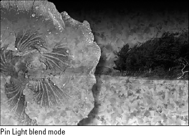
Pin Light (Z): Pin Light is as simple as it gets. This mode keeps the darkest blacks and the lightest whites, and then makes everything else invisible, which makes it a natural for modifying edge filters.
In Figure 14.18, we've gone back to the original stacking order and created a "Multiply on Pin Light" sandwich. The flower is set to Pin Light, as is the gradient layer. Both of these layers are set to 100 percent Opacity. Stuck in the middle is the pattern layer, set to 50 percent Opacity.
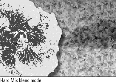
Hard Mix (L): The Hard Mix blend mode combines the pixels in your layers using the Vivid Light blend mode and then performs a color threshold operation on them. The results that Hard Mix produces don't fit a standard definition of "pretty," as shown in Figure 14.19. Hard Mix mixes two layers and pushes the colors to their absolute extreme. All in all, Hard Mixed pixels come in only eight colors: black, white, red, green, blue, cyan, magenta, and yellow. The end result is quite similar to the Posterize command (Image
Believe it or not, a color threshold created with the Hard Mix blend mode has its uses, rare as they may be. For a closer look at some effects you might be able to pull from thresholds, check out Chapter 17.
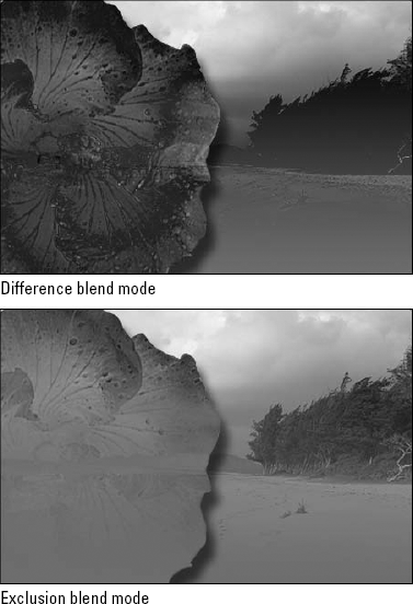
Difference (E) and Exclusion (X): Difference inverts lower layers according to the brightness values in the active layer. White inverts the composite pixels absolutely, black inverts them not at all, and the other brightness values invert them to some degree in between. In the first example of Figure 14.20, the Difference mode was applied to the flower layer, which is set against the gradient layer, also set to Difference.
Exclusion works just like Difference except for one small difference. Illustrated in the second example in Figure 14.20, Exclusion sends midtones to gray — much as Pin Light sends midtones to transparent — creating a lower-contrast, often smoother effect.
Hue (U): Hue and the remaining four blend modes make use of the HSL color model to mix colors between the active layer and the underlying composite. When you select Hue, Photoshop retains the hue values from the active layer and mixes them with the saturation and luminosity values from the underlying image.
Saturation (T): When you select this option, Photoshop retains the saturation values from the active layer and mixes them with the hue and luminosity values from the underlying image. Saturation produces such subtle effects that you'll typically want to apply it in combination with other blend modes. For example, after applying a random blend mode to a layer, you might duplicate the layer and then apply the Saturation mode to either boost or downplay the colors, much like printing a gloss or matte coating over an image.
Color (C): This option combines hue and saturation. Photoshop retains both the hue and saturation values from the active layer and mixes them with the luminosity values from the underlying layers. Because the saturation ingredient of the Color mode produces such a slight effect, Color frequently produces a very similar effect to Hue.
Luminosity (Y): The Luminosity blend mode retains the lightness values from the active layer and mixes them with the hue and saturation values from the composite pixels below. So just as the Color mode uses the layer to colorize its background, the Luminosity mode uses the background to colorize the layer.
Lighter Color: Not to be confused with the aforementioned Lighten blend mode, which is applied to one channel at a time, the new Lighter Color mode applies to all channels at once. If you're blending two ore more colors with Lighter Color, guess which one is visible? That's right, the lighter one.
Darker Color: Much like its pale partner, the new Darker Color mode applies to all of the channels at one time. This, like Lighter Color and Lighten, can be confused with Darken, which applies to only one channel at a time. If you're blending two or more colors with Darker Color, the darker color is visible (big surprise, huh?).
Blend modes are amazing. They permit you to try out so many permutations that you can lose yourself for hours. Predicting the outcome of these permutations might require a brain on par with Einstein's, but let's leave prediction to Nostradamus. Experimenting with Photoshop's different blend mode settings requires no intelligence at all, just the willingness to begin the experimentation in the first place — and that's where this book comes in.
An excellent technique to incorporate into your scientific method is sandwiching. This refers to the process of placing a heavily filtered version of an image between two originals. This technique is based on the principal that more than half the blend modes — including Normal, Dissolve, Color Dodge and Burn, the seven Light modes, and the four HSL modes — change depending on which of two images is on top.
For example, Figure 14.21 shows two layers, A and B, and the result of blending them with the Overlay mode. When the moon is on top, as in the third example, the Overlay mode favors the man; but when the man is on top, Overlay favors the moon.
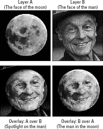
Figure 14.21. After establishing two layers, moon and man, the moon was placed on top and Overlay applied to get the third image. Then the order of the layers was switched, and Overlay was applied to the man to get the last image.
Overlay just happens to be balanced by its opposite, the Hard Light blend mode, which favors the layer to which it's applied. So you could have achieved the exact effect shown in the last example in Figure 14.21 by placing the man under the moon and setting the moon to Hard Light.
Therefore, you see that the order in which you stack your layers is as important as the blend mode you select. Even modes that have no stacking opposites — Color Dodge, Linear Light, and others — produce different effects depending on which layer is on top.
Note
Like Overlay, Color Dodge favors the composite pixels below the active layer. This holds true for Color Burn as well. Meanwhile, Linear Light, Pin Light, and all the other modes with Light in their name favor the active layer. Modes that do not change based on layering order — Multiply, Screen, Difference, and the like — favor neither front nor rear layer.
When you sandwich a filtered image between two originals you can lessen the effect of the filter and achieve different effects than those discussed in Chapter 11. Layers and blend modes give you the flexibility to experiment as much as you want and for as long as you please.
Returning to our hibiscus again in Figure 14.22, it was copied to a new layer and then Filter
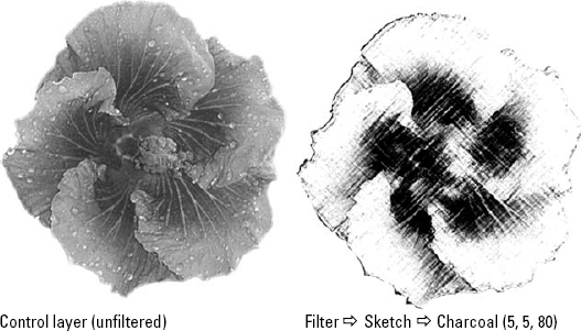
Figure 14.22. The ingredients for our blend mode sandwich include the original image layer (left) and a cloned version on an independent layer subject to the Charcoal filter (right).
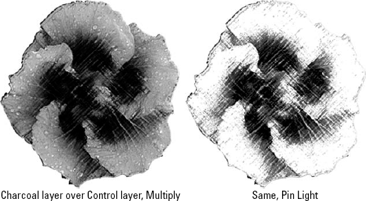
Like most filters under the Sketch submenu, Charcoal absolutely destroys the detail in the image, replacing all brightness values with the foreground and background colors — in this case, black and white. Fortunately, because Charcoal was applied to a clone of the image, a blend mode to restore some of the detail can be used. Figure 14.23 shows two of the many possibilities that exist — one using the Multiply mode, which kept the blacks in the Charcoal effect and threw away the whites, and the other using Pin Light, which allowed colors from the original image to show through the gray areas of the Charcoal rendering.
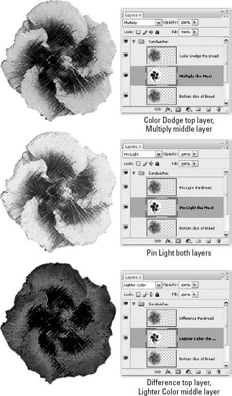
So that's an open-faced sandwich. Let's get three layers involved. Let's sandwich the filtered layer between two of the unfiltered layers by cloning the background layer and moving it to the top of the stack. Now you can really increase your opportunity for blend mode variations. Check out Figure 14.24 to get an idea of what's on the menu.
Check out the middle example in Figure 14.24 and you'll see a purist's sandwich, Pin Light on the cheese and Pin Light on the bread. In Photoshop, that's one of the best, most reliable sandwich combinations you can create. If blend modes were condiments, Pin Light would be mustard — it works for everything.
Tip
When it comes to things that "work for everything," you just can't forget the Difference mode. By applying Difference to both the filtered layer and the cloned original on top, you do a double-invert, first inverting the filter into the original image and then reinverting the original into the composite. The result is a subtler and utterly unique combination.
To display the Advanced Blending options, you have three options: First, you can double-click the layer thumbnail. Second, if you want to modify the Advanced Blending options for a specialty layer — such as type or an adjustment layer — right-click the layer name or thumbnail (Control-click on the Mac) and choose the Blending Options command. You also can right-click in the image window with one of the selection tools and access Blending Options that way. Third, you can press Alt (Option), and double-click the layer name. So you decide.
In any case, you'll see the vast and stately Layer Style dialog box. This one multi-paneled window holds controls for adding layer effects, changing the opacity and blend mode of a layer, and achieving some special blending tricks, which are discussed here. By default, you should see the Blending Options panel, pictured in Figure 14.25. If you're working in some other area of the dialog box, click the Blending Options item at the top of the list on the left side of the dialog box.
You already know how the two General Blending options — Blend Mode and Opacity — work. The same goes for the Fill Opacity slider (though as you'll see, it takes on broader meaning in this dialog box). These are the same options found in the Layers palette and discussed in the first half of this chapter. The next few sections explain the Advanced Blending options, spotlighted in Figure 14.25. Like so many aspects of blend modes, these options can be perplexing at first. But after you get the hang of them, they enable you to gain a degree of control over your layers unrivaled by any other image editor.
Note
Many of the Advanced Blending options affect the performance of layer effects, such as drop shadows, glows, bevels, and so on. These effects fall into the broader category of layer styles, which are discussed at length in Chapter 13.
It should be said at the outset that the Fill Opacity value behaves exactly like the Fill option in the Layers palette. Type a value in one option and it appears in the other as well. They are as one. The same goes for the Blend Mode setting in the dialog box and the selected mode in the Layers palette. However, you're about to discover a few ways to modify the performance of the Fill Opacity and Blend Mode options that are possible only from the Advanced Blending options.
As you may recall, the Opacity value controls the translucency of all aspects of a layer, including pixels and layer effects alike. This is a fact of life, regardless of any other settings that may be in place. Meanwhile, the Blend Mode and Fill Opacity settings modify the interaction of pixels independently of most or all layer effects. This caveat "most or all" is where things get interesting.
You see, Photoshop divides layer effects into two groups that you can control independently of each other. Interior effects fall inside the boundaries of the filled areas of a layer and consist of the Inner Shadow, Inner Glow, Satin, and three Overlay effects. Exterior effects fall either outside or both inside and outside the boundaries of a layer. These consist of the Drop Shadow, Outer Glow, Bevel, Emboss, and Stroke effects.
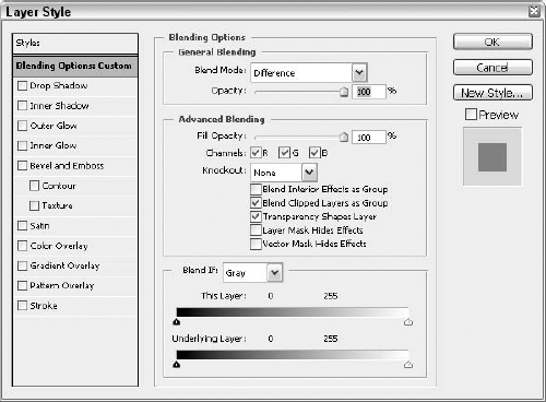
Figure 14.25. Using the Advanced Blending options, you can turn a layer into a floating hole, make specific color ranges invisible, and more.
Using blend modes and Fill Opacity, Photoshop permits you the option of modifying interior effects independently from exterior effects. The catalyst at the heart of this behavior is the Blend Interior Effects as Group option. When deselected, as by default, blend modes and Fill Opacity affect the pixels on a layer only. But if you select this option, Photoshop applies the blend mode and Fill Opacity to the interior layer effects as well; only the exterior effects remain unchanged.
Figures 14.26 and 14.27 show examples. In Figure 14.26, you see a layer to which a red Inner Glow as been assigned as well as two exterior effects — Drop Shadow and Stroke. When the Fill Opacity is lowered to 60 percent, the pixels that make up the yacht within the circle drop away, but the layer effects remain unchanged. However, if you also select the Blend Interior Effects as Group option, Photoshop reduces the opacity of the Inner Glow effects as well.
Note, however, that neither Fill Opacity nor blend mode affects the exterior layer effects — even when those exterior effects actually fall inside the boundaries of the layer. The Stroke effect, for example, is set to trace the inside of the layer. In fact, the only effect that truly exists outside the layer is the drop shadow. However, as far as Photoshop is concerned, an exterior effect is an exterior effect, regardless of where it happens to fall.
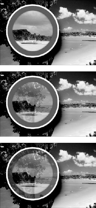
Figure 14.26. Here you see the results of taking a layer subject (the yacht) to an interior effect and two exterior effects (top), reducing the Fill Opacity value to 60 percent (middle), and then selecting the Blend Interior Effects as Group option (bottom).
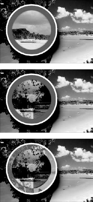
Figure 14.27. This figure shows the default image (top) and the effect of the Difference blend mode when applied to the yacht layer with the Blend Interior Effects as Group option deselected (middle) and selected (bottom).
Tip
Found just beneath the Blend Interior Effects as Group option, the Blend Clipped Layers as Group option controls whether the upper layers in a clipping mask blend along with the base layer or remain unchanged. By default, this option is selected, blending all layers in a clipping mask as a single unit. To adjust the blending of the base layer in a clipping mask by itself, simply deselect the option. Then only the Opacity slider affects the other layers in the group.
The Transparency Shapes Layers, Layer Mask Hides Effects, and Vector Mask Hides Effects options permit you to manage the boundaries of interior and exterior effects alike. Here's how:
Transparency Shapes Layer: Deselecting this option deactivates the transparency mask that is normally associated with a layer, permitting layer effects and clipped layers to spill outside the boundaries of a layer to fill the entire image window. If the layer includes a layer mask, effects and clipped layers fill the mask instead. So it serves two purposes: First, you can fill an image or clipping mask with a Color Overlay or other interior effect associated with a layer. And second, you can substitute a transparency mask with a layer or vector mask. You'll see both of these in the following pages.
Layer Mask Hides Effects: When selected, this option uses the layer mask to mask both the pixels in the layer and the layer effects. When deselected, as by default, the layer mask defines the boundary of the layer, and the effect traces around this boundary just as it traces around other transparent portions of the layer.
Vector Mask Hides Effects: Photoshop's shape tools allow you to draw vector-based shapes that you can fill with flat colors, gradients, patterns, or even layered images. When working inside a layer inside a shape, you can use the Vector Mask Hides Effects option to specify whether the shape defines the outline of the layer (selected) or clips layer effects just as it clips pixels (deselected). For complete information on defining a layer mask, see Chapter 13.
Typically, you use these options to change Photoshop's default behaviors because something has gone wrong and you want to correct it. Don't like how your layer effects look? Select or deselect one of these options and see whether it makes a difference. Of course, it helps to have a little experience with these options before you start randomly hitting switches, so let's work through an example.
Take a look at Figure 14.28. Here, the basic elements of the previous two figures are thrown in with a few items for a quaint little postcard effect. A head shot of a woman eating watermelon has been clipped to the circular layer of the yacht on the beach (which now becomes her backdrop), and a color Overlay layer effect was included, set to a blending mode of Saturation and an Opacity of 60 percent to punch up the colors of the clipped layers. The circular layer's blending options have both the Blend Interior Effects as Group and Blend Clipped Layers as Group options deselected.
Now let's say you want to add a layer mask to the circular layer. Nothing fancy, just a gradient from black at the bottom of the image to white near the middle, as shown in the second example in Figure 14.28. Naturally, this makes the layer transparent at the bottom and opaque toward the middle, but it has an unexpected consequence. Rather than fading into view, that red Inner Glow effect begins meshing at the point where the layer becomes fully opaque. At first glance, you might say, "Gee, I guess I can't combine this type of layer mask here." Not at all; simply consult your Advanced Blending options and make some adjustments.

Figure 14.28. Beginning with the woman masked inside the circle (top), a layer mask was added to the circle layer using the Gradient tool (middle). But instead of fading the effects, the mask shoved the Inner Glow so far upward the effects began to obscure the face (bottom).
In the first image in Figure 14.29, the problem was fixed by simply selecting the Layer Mask Hides Effects option. This way, rather than constraining the effects, the layer mask fades them out just like a good gradient mask is supposed to do.
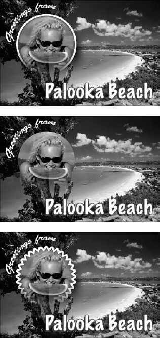
Figure 14.29. After fading out the Inner Glow and Stroke effects by selecting the Layer Mask Hides Effects option (top), the Transparency Shapes Layer option was deselected (middle). A vector mask was added, and the Vector Mask Hides Effects option was deselected (bottom).
The second example of Figure 14.29 shows what happens when the Transparency Shapes Layer option is deselected (it's selected by default). Suddenly, the layer effects are no longer constrained by the boundaries of the circular layer and grow to fill the entire layer mask. Edge-dependent effects, such as Inner Glow, Drop Shadow, and Stroke disappear.
Next, a vector mask was added to the circular layer. To do this, the Ctrl key (
That takes care of the most complex of the options. All that remain are the Channels options. Located directly below the Fill Opacity slider in the Layer Style dialog box, the Channels options let you hide the layer inside one or more color channels. For example, deselecting R makes the layer invisible in the Red channel, sending colors careening toward vivid red or turquoise (all red or no red, respectively), depending on the colors in the layers underneath.
Some opinion/advice here: You may find the Channels options useless. There are exceptions, of course — in a CMYK image, it can prove helpful to drop a layer inside, say, the Black channel — but for general RGB image editing, they just don't offer much. This is a shame, because if slightly retooled, they could. For example, it might be nice to be able to control the translucency of a layer on a channel-by-channel basis, but instead you have only on or off controls. Maybe in a future version of Photoshop....
Nestled in the middle of the Advanced Blending section of the Layer Style dialog box sits the Knockout pop-up menu, shown in Figure 14.30. Knockouts turn the contents of the active layer into a floating hole that can bore through one or more layers behind it. It's like a layer mask, except that you can use it to mask multiple layers and any associated layer effects simultaneously. You also can apply layer effects to the knockout, making them extremely flexible.
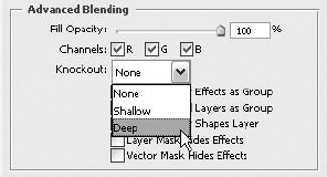
Figure 14.30. Selecting Shallow or Deep from the Knockout pop-up menu determines how deep a hole you're going to punch through the layers of your image.
To create a knockout, you specify how deep the hole goes using the Knockout pop-up menu. Then use the Fill Opacity or Blend Mode option to define the translucency of the hole. The Knockout pop-up menu provides the following three options:
None: This default setting turns the knockout function off. The layer is treated as a standard layer, not a hole.
Shallow: Choose this option to cut a hole through a group of layers and expose the layer immediately below the set. In a clipping mask where the Blend Clipped Layers as Group option is deselected, Shallow burrows down to the layer directly below the base layer of the group. When the Blend Clipped Layers as Group option is selected, the knockout layer burrows down to the base layer in the group. If the layer resides inside neither a set nor a clipping mask, the Shallow option typically cuts a hole down to the background layer.
Deep: The final setting bores as far down as the background layer, even if the knockout layer resides in a group. A notable exception occurs when working inside a clipping mask. If the Blend Clipped Layers as Group option is selected, Deep burrows down to the base of the clipping mask, just like Shallow.
Those are your Knockout options, but making one has less to do with what option you choose and more to do with your Fill Opacity settings, your layer order, and any groups you have in place.
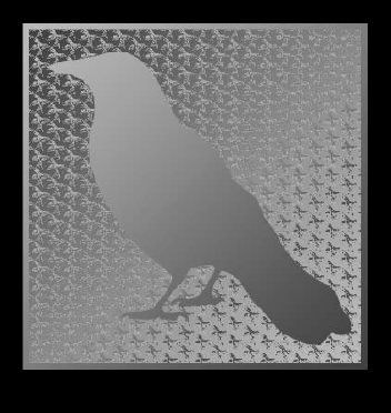
Figure 14.31 shows the basic ingredients used to create a knockout. In the example, there's a ratty scan of a crow from the local paper as the top — and eventual knockout — layer (the crow is surrounded by transparency, represented by Photoshop's checkerboard pattern), followed by an Ode-to-Escher pattern beneath that. These two layers are placed in a group. Next down in the layer stack is a gradient that reflects the colors in the pattern. All these layers ride above a black background layer.
With the crow and pattern placed in a layer group, you then can use the two knockout options to punch through to either the gradient layer (Knockout: Shallow) or through to the background layer (Knockout: Deep). Figure 14.32 shows the first option.
Not satisfied with the results, the crow's knockout option was pushed to Deep — knocking all the way through to the background layer — and included a gradient Stroke layer effect, reversing the colors used in the gradient layer. Last, the URL for the site for which this crow would serve as a logo was thrown in, as shown in Figure 14.33.
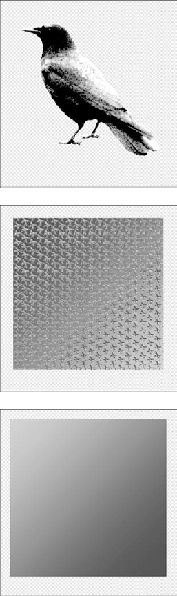
Figure 14.31. Using this collection of layers and layer groups, you can punch through to either the gradient layer or the black background layer — depending on the knockout option you use.

Found at the bottom of the Blending Options panel of the Layer Style dialog box, the Blend If sliders are among Photoshop's oldest and most powerful compositing features. Pictured in Figure 14.34, these sliders permit you to drop out pixels in the active layer and force through pixels from lower layers according to their brightness values. You can even use them in combination with the Knockout option. For example, if you set the Knockout to Deep, you force through pixels from the background layer instead of from the layer immediately below the active layer.
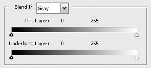
Figure 14.34. Use the This Layer sliders to drop pixels out of the active layer, and use the Underlying Layer sliders to force pixels through from lower layers.
Here's how the three Blend If options work:
Blend If: Select a color channel from the Blend If pop-up menu to apply the effects of the sliders according to the contents of a single color channel. If you choose Gray, as by default, Photoshop bases the changes on the grayscale composite. Each time you select a different Blend If option, the slider triangles change to the positions at which you last set them for that color channel. Regardless of how you set the sliders, Photoshop applies your changes evenly to all channels in the image; the selected channel is merely used for the calculation.
This Layer: This slider lets you exclude ranges of colors according to brightness values in the active layer. You exclude dark colors by clicking and dragging the black triangle to the right; you exclude light colors by clicking and dragging the white triangle to the left. In either case, the excluded colors disappear from view.
Underlying Layer: The second slider forces colors from the underlying layers to poke through the active layer. Any colors outside the range set by the black and white triangles are not covered and are therefore visible regardless of the colors in the active layer.
Preview: Don't forget to select the Preview option on the right side of the Layer Style dialog box so you can see the effects of your modifications in the image window every time you adjust a setting.
These options are far too complicated to fully explain in a bulleted list. You'll probably want to read the following sections, if only to make the authors feel better for having taken the time to write them.
The first Blend If slider, This Layer, hides pixels in the active layer according to their brightness values. You can abandon dark pixels by clicking and dragging the left slider triangle and abandon light pixels by clicking and dragging the right triangle. To demonstrate the Blend If options, we'll use the composite image first introduced in Figure 14.6.
In Figure 14.35, the top example has the blend mode for the hibiscus layer set to Multiply. Then the black slider triangle was dragged until the value immediately to the right of the words This Layer is set to 130. This hides all dark pixels whose brightness values are 130 or lower. In the bottom example we've set the blend mode to Pin Light, returned the black slider to 0, and pulled the white slider down to 175, thus tuning out any pixels with a brightness value higher than that.
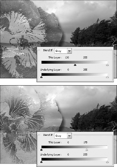
Figure 14.35. Examples of modifying the blend mode and This Layer settings in the Layer Style dialog box
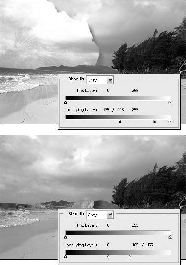
Let's move down a slider. You use that Underlying Layer slider to force pixels in the underlying layers to show through, again according to their brightness values. To force dark pixels in the underlying image to show through, drag the black slider triangle; to force light pixels to show through, drag the white slider triangle. Figure 14.36 gives you an idea of what happens when you repeat the same values and procedure using this slider.
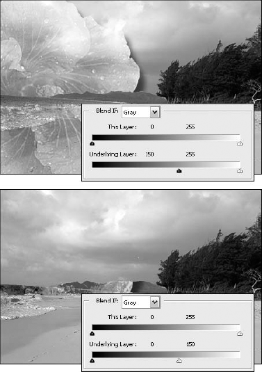
Figure 14.36. The top example has the blend mode set to Overlay, and the black slider has been cranked up to 150. The bottom example uses Vivid Light, with the white slider toned down to 150.
Bear in mind, like every other adjustment made in the Layer Style dialog box, changes made to the Blend If slider bars are temporary. These options hide pixels; they don't delete them. As long as the layer remains intact, you can revisit the Blend If sliders and restore hidden pixels or hide new ones.
The problem with hiding and forcing colors with the sliders is that you achieve some pretty harsh color transitions. But wait — there's a solution to this problem! If you take a close look at those sliders we've been mucking with, you'll notice they have a little line down the middle. This is Photoshop's tiny visual cue that they can be split in half. By doing so, you create a fuzziness range, not unlike the Fuzziness value in the Color Range dialog box. This feature allows you to soften the color transitions by dropping and forcing pixels gradually, leaving some pixels opaque and tapering others off into transparency.
To taper the opacity of pixels in either the active layer or the underlying image, press Alt (Option on the Mac) and drag one of the triangles in the appropriate slider. The triangle splits in half, and the corresponding value above the slider bar splits into two values separated by a slash.
The left triangle half represents the beginning of the fuzziness range — that is, the brightness values at which the pixels begin to fade into or out of view. The right half represents the end of the range, or the point at which the pixels are fully visible or invisible. Take a look at Figure 14.37.
Here's what we've done: We used the same blend modes as in Figure 14.35 (Multiply up top, and Pin Light on the bottom). In the upper example, we split the black This Layer slider and covered a range that sets that original 130 value in the middle. We've set the left half of the slider to 100 and the right half to 160. As a result, colors with a brightness value of 100 or darker turn transparent, fade into view from 101 to 159, and become opaque from 160 on up.
In the bottom example, both halves of the black triangle are restored to 0. Then we split the white slider. The left half is set to 150 and the right half to 200, just 25 points either side of 175. Those few pixels with brightness values from 0 to 150 are opaque, the pixels from 151 to 199 become gradually translucent, and pixels of 200 and brighter are transparent.
Now let's turn our attention to the Underlying Layer slider. This one works best when you're trying to force through very bright or dark details, like highlights or shadows. It also helps to work with a foreground layer that has lots of flat areas of color for the background to show through. Keeping this in mind, take a look at Figure 14.38.
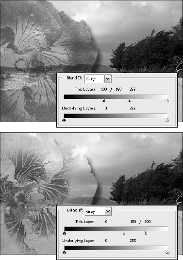
Figure 14.37. Alt-drag (Option-drag on the Mac) a slider triangle to split it in half. You then can specify a range over which brightness values will fade into transparency.
In the top image, we've used the Linear Dodge mode. We've split the black slider and set a fuzziness range from 135 to 215. This fades the dark regions of the surf and shoreline through the hibiscus layer where their brightness values fall between these two values. In the bottom example, we've change the bland mode to Linear Light, split the white slider, and set them to a zone of 105 to 155. As you can see, the hibiscus is now only visible in the surf and shoreline.
Image
Based on that encouraging and enthusiastic introduction to the Apply Image and Calculations commands, you'll no doubt be excited to learn what they do. The Apply Image and Calculations commands allow you to merge one or two identically sized images using 18 of the 23 blend modes discussed earlier plus two additional modes, Add and Subtract. In a nutshell, the commands duplicate the process of dragging and dropping one image onto another (or cloning an image onto a new layer) and then using the blend mode and the Opacity settings in the Layers palette to mix the two images together.
Although Apply Image and Calculations are more similar than different, each command fulfills a specific — if not entirely unique — function:
Apply Image: This command takes an open image and merges it with the foreground image (or takes the foreground image and composites it onto itself). You can apply the command to either the full-color image or one or more of the individual channels.
Calculations: The Calculations command works on individual channels only. It takes a channel from one image, mixes it with a channel from another (or the same) image, and puts the result inside an open image or in a new image window.
The primary advantage of these commands over other, more straightforward compositing methods is that they allow you to access and composite the contents of individual color channels without lots of selecting, copying and pasting, cloning, floating, and layering. You also get two extra blend modes, Add and Subtract, which may prove useful.
The Apply Image and Calculations commands provide previewing options, so you can see how an effect will look in the image window. But thanks to the sheer quantity of unfriendly options offered by the two commands, it's probably a good idea to use them only occasionally, if at all. The Calculations command can be a useful way to combine masks and layer transparencies to create precise selection outlines. Apply Image offers the unique capability to composite images in different color models. For example, you could mix a layer or channel from an RGB image with another image in the CMYK mode.
However, if your time is limited and you want to concentrate your efforts on learning Photoshop's most essential features, feel free to skip Apply Image and Calculations. No one will know if you skip right on to the next chapter.
Channel operations work by taking one or more channels from an image, called the source, and duplicating them to another image, called the target. When you use the Apply Image command, the foreground image is always the target, and you can select only one source image. Photoshop then takes the source and target, mixes them together, and puts the result in the target image. Therefore, the target image is the only image that the command actually changes. The source image remains unaffected.
When you choose Image
If this sounds a little complicated, think of it this way: The source image is the floating selection and the target is the underlying original. Meanwhile, the Blending options are the blend modes pop-up menu and the Opacity value in the Layers palette.
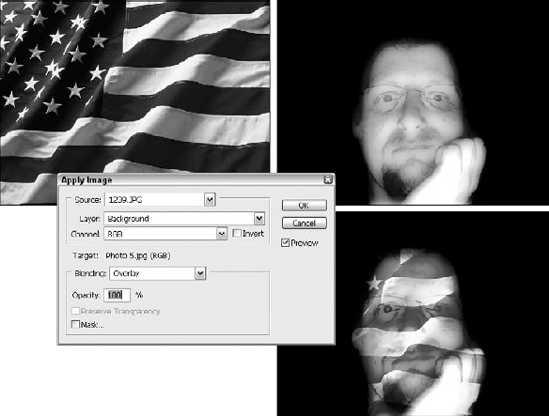
Figure 14.39. The Apply Image dialog box lets you mix one source image with a target image and make the result the new target.
Using the Apply Image command is a five-step process. You can always simply choose the command and hope for the best, but you'll get the most use out of it if you do the following:
STEPS: Applying the Apply Image command
Open the two images that you want to mix. If you want to mix the image with itself to create some effect, just open the one image.
Make sure that the two images are exactly the same size, down to the last pixel. Use the Crop tool and Image Size command as necessary. (You don't have to worry about this step when mixing an image with itself.)
Inside the target image, switch to the channel and layer that you want to edit. If you want to edit all channels, press Ctrl+tilde (
Tip
If you're thinking of editing a single channel, you should display all channels onscreen. For example, after pressing Ctrl+1 (
Select the portion of the target image that you want to edit. If you want to affect the entire image, don't select anything.
Choose Image
Apply Image.
Obviously, that last step is a little more difficult than the concise instructions let on. In fact, it takes an entire section to explain all the details you'll need to know, and that section begins now.
The following list explains how to use each and every option in the Apply Image dialog box:
Source: The Source pop-up menu contains the name of the foreground image as well as any other images that are both open and exactly the same size as the foreground image. If the image you want to merge is not available, you must not have been paying much attention to Step 2. Press Esc to cancel, resize and crop as needed, choose Image
Layer: This pop-up menu lists all layers in the selected source image. If the image doesn't have any layers, Background is your only option. Otherwise, select the layer that contains the prospective source image. Select Merged to mix all visible layers in the source image with the target image.
Channel: Select the channels that you want to mix from this pop-up menu. Both composite views and individual color and mask channels are included. Keep in mind that you'll be mixing these channels with the channels that you made available in the target image before choosing the command.
For example, if the target image is an RGB image shown in the full-color composite view, and you choose RGB from the Channel pop-up menu in the Apply Image dialog box, Photoshop mixes the Red, Green, and Blue channels in the source image with the corresponding Red, Green, and Blue channels in the target image. However, if you switched to the Red channel before choosing Apply Image and then selected the RGB option, the program mixes a composite grayscale version of the RGB source image with the Red channel in the target and leaves the other target channels unaffected.
Selection, Transparency, and Layer Mask: If a portion of the source image is selected, the Channel pop-up menu offers a Selection option, which lets you apply the selection outline as if it were a grayscale image, just like a selection viewed in the Quick Mask mode. If you selected a specific layer from the Layer pop-up menu, you'll find a Transparency option that represents the transparency mask. If the layer includes its own layer mask, a Layer Mask option also appears.
None of the three options is particularly useful when you work in the composite view of the target image; you'll usually want to apply the Selection, Transparency, or Layer Mask option only to a single channel, as described in the section "The Calculations command."
Invert: Select this option to invert the contents of the source image before compositing it with the target image.
Target: You can't change this item. It merely shows which image, which channels, and which layers are being affected by the command.
Blending: This pop-up menu offers access to 18 of the blend modes discussed in the section "Blend Modes" earlier in this chapter. The Dissolve, Hue, Saturation, Color, and Luminosity options are missing. Two additional options, Add and Subtract, are discussed in the section on the Add and Subtract options later in this chapter.
Opacity: By now, you're well aware of how this one works. If you're not, stop now and go back and reread the book
Preserve Transparency: When you're editing a layer in the target image — that is, you activated a specific layer before choosing Image
Mask: Select this option to mask off a portion of the source image. As stated previously, you can specify the exact portion of the target image you want to edit by selecting that portion before choosing the Apply Image command. You also can control which portion of the source image is composited on top of the target through the use of a mask. When you select the Mask option, three new pop-up menus and an Invert option appear at the bottom of the Apply Image dialog box. For complete information on these options, see the next section.
The Mask option in the Apply Image dialog box provides a method for you to import only a selected portion of the source image into the target image. Select the Mask option and choose the image that contains the mask from the pop-up menu on the immediate right. As with the Source pop-up menu, the Mask menu lists only those images that are open and happen to be the exact size as the target image. If necessary, select the layer on which the mask appears from the Layer pop-up menu. Then select the specific mask channel from the final pop-up menu. This doesn't have to be a mask channel; you can use any color channel as a mask.
After you select all the necessary options, the mask works as follows:
Where the mask is white, the source image shows through and mixes in with the target image, just as if it were a selected portion of the floating image.
Where the mask is black, the source image is absent. Gray values in the mask mix the source and target with progressive emphasis on the target as the grays darken.
If you prefer to swap the masked and unmasked areas of the source image, select the Invert option at the bottom of the dialog box. Now, where the mask is black, you see the source image; where the mask is white, you don't.
Tip
You can even use a selection outline or layer as a mask. If you select some portion of the source image before switching to the target image and choosing Image
The Add and Subtract blend modes found in the Apply Image dialog box (and also in the Calculations dialog box) add and subtract the brightness values of pixels in different channels. The Add option adds the brightness value of each pixel in the source image to that of its corresponding pixel in the target image. The Subtract option takes the brightness value of each pixel in the target image and subtracts the brightness value of its corresponding pixel in the source image. When you select either Add or Subtract, the Apply Image dialog box offers two additional option boxes, Scale and Offset. Photoshop divides the sum or difference of the Add or Subtract mode, respectively, by the Scale value (from 1.000 to 2.000) and then adds the Offset value (from negative to positive 255).
Perhaps an equation will help. Here's the equation for the Add blend mode:
Resulting brightness value = ((Target + Source) ÷ Scale) + Offset
And here's the equation for the Subtract mode:
Resulting brightness value = ((Target – Source) ÷ Scale) + Offset
Okay, so maybe that didn't help. Anyway, if equations only confuse you, just remember this: The Add option results in a destination image that is lighter than either source; the Subtract option results in a destination image that is darker than either source. If you want to darken the image further, raise the Scale value. To darken each pixel in the target image by a constant amount, which is useful when applying the Add option, use a negative Offset value. If you want to lighten each pixel, as when applying the Subtract option, use a positive Offset value.
The best way to demonstrate how the Add and Subtract commands work is to offer examples. To create the effects shown in Figures 14.40 and 14.41, use the hibiscus and the Waiamanalo background we started with way back in Figure 14.6. The only difference is, for purposes of the Apply Image command, both images have been separated out so they're now in independent images in their own windows.
After switching to the background image and choosing Image
For the sake of comparison, the final example shows what happens when introducing the background image into the face layer using the Add mode, with a Scale of 1.2 and an Offset of −60. Note that Add automatically respects the transparency mask of the hibiscus layer, regardless of whether you select the Preserve Transparency option.
To create the first example in Figure 14.41, the Subtract option was selected from the Blending pop-up menu, again accepting the default Scale and Offset values of 1 and 0, respectively. This time, the hibiscus turns extremely dark (were you surprised?) because the light values of the flower are subtracted from the light values in the background image, leaving no brightness value at all.
The result seems too dark, so it was lightened by raising the Scale and Offset values. To create the second image in the figure, the Offset value was raised to 100, thus adding 100 points of brightness value to each pixel. This second image is more likely to survive reproduction with all detail intact.
Subtracting the other direction — that is, applying the Subtract mode inside the face image — produces a radically different effect, as verified by the final example of Figure 14.41. Portions of the background are generally quite dark, so they have little effect when subtracted from the flower.
The Calculations command performs a different function than Apply Image, although its options are nearly identical. Rather than compositing a source image on top of the current target image, Image
Choosing Image
The Blending pop-up menu offers the same 20 blend modes — including Add and Subtract — found in the Apply Image dialog box. However, it's important to keep in mind how the Calculations dialog box organizes the source images when working with blend modes. The Source 1 image is equivalent to the source when using the Apply Image command (or the floating selection when compositing conventionally). The Source 2 image is equivalent to the target (or the underlying original). Therefore, choosing the Normal blend mode displays the Source 1 image. The Subtract command subtracts the Source 1 image from the Source 2 image.
Half of the blend modes perform identically regardless of which of the two images is Source 1 and which is Source 2. The other half — including Normal, Overlay, Soft Light, and Hard Light — produces different results based on the image you assign to each spot. Sound confusing? Don't worry. As long as you keep in mind that Source 1 is the floater, you'll be fine.
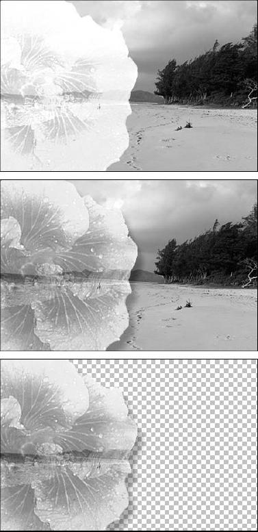
Figure 14.40. Here you see two applications of the Add blend mode from inside the background image (top and middle), each subjected to different Scale and Offset values. When adding an image into an independent layer, Add always preserves transparency (bottom).
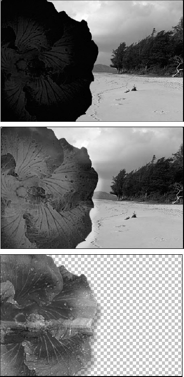
Figure 14.41. The Subtract command was used on the background image: The top image shows Scale and Offset values of 1 and 0, and the middle shows values of 1.2 and 100. When subtracting into the flower layer, Subtract not only respects the transparency mask but also delivers a very different result (bottom).
Tip
The only mode that can throw you off is Subtract, because you see Source 1 at the top of the dialog box and naturally assume that Photoshop subtracts Source 2, which is underneath it. Wouldn't you know it, though, this is exactly opposite to the way it really works? If you find yourself similarly confused and set up the equation backward, you can reverse it by selecting both Invert options. Source 2 minus Source 1 results in the same effect as an inverted Source 1 minus an inverted Source 2. After all, the equation (255 – Source 1) – (255 – Source 2), which represents an inverted Source 1 minus an inverted Source 2, simplifies down to Source 2 – Source 1. Are your eyes spinning like a cartoon character's yet?
As in the Apply Image dialog box, you can specify a mask using the Mask options in the Calculations dialog box. The difference here is that the mask applies to the first source image and protects the second one. So where the mask is white, the two sources mix together normally. Where the mask is black, you see only the second source image.
The Result option determines the target for the composited channels. If you select New Document from the Result pop-up menu, as in Figure 14.43, Photoshop creates a new single-channel image. Alternatively, you can stick the result of the composited channels in any channel inside any image that is the same size as the source images.
As described for the Apply Image command, the Channel pop-up menus may offer Selection, Transparency, and Layer Mask as options. Here, however, they serve a greater purpose. You can composite layer masks to form selection outlines, you can composite selection outlines to form masks, and you can make all sorts of other pragmatic combinations.
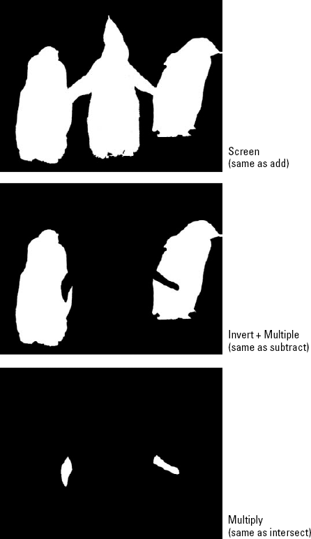
Figure 14.43 shows how the Calculations command sees selected areas. You see two selections, one for the penguin with his wings outstretched and one for penguins behind him that he directly overlaps. Whether you're working with masks, selection outlines, transparency masks, or layer masks, the Calculations command sees the area as a grayscale image. So in Figure 14.43, white represents selected or opaque areas, and black represents deselected or transparent areas.
Assuming that you've chosen Image
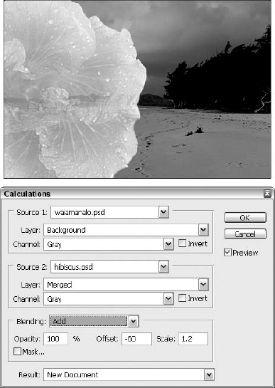
Figure 14.42. Use the Calculations command to mix two source channels and place them in a new or an existing target channel.
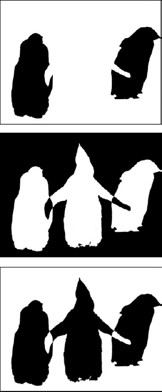
The Calculations command doesn't stop at the standard three — add, subtract, and intersect. Figure 14.45 shows three methods of combining selection outlines that are not possible using single keystroke operations. For example, if you invert the Source 1 mask and combine it with the Screen mode, it's like inverting the first selection and adding it to the second. The Difference mode adds the selections but subtracts the area where they overlap, an operation known as exclusion. And inverting Source 1 and then applying Difference retains the intersection, subtracts the areas that do not intersect, and selects the area outside the penguin — which is equivalent to excluding two selections and then inverting the result. You may not use these options every day, but they are extremely powerful if you can manage to wrap your brain around them.
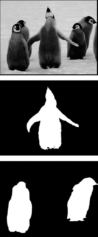
Figure 14.43. Here's our original photo, followed by two selections expressed as grayscale images (also known as masks). The joyous, skyward-looking penguin serves as the first source; the penguins behind him are the second source.
In this chapter, you learned to modify the Opacity and Fill values for image content, and you discovered how these settings affect both layer content and the blend modes applied to your layers. You also learned more about blend modes and how to use them to mix an active layer with those layers beneath it.
The use of filters and the sandwiching of heavily filtered images between unfiltered originals also were covered, along with the use of advanced blending options. You also discovered the need for and how to create knockouts, preserving transparency within an image. To further your ability to control visibility through your image layers, you learned to fade pixels according to brightness values using the Blend If sliders, and when and how to use the Add and Subtract blend modes.
In addition, you learned about mixing same-sized images with the Apply Image command and how to modify selection outlines and masks using the Calculations command.