Color mapping is a term that doesn't really explain itself. Both of the words make sense, but paired up, what to do they mean? Maybe color converting might be a better term, or perhaps color organization or assignment. Anyway, we're stuck with color mapping, at least in a technical sense, and the term simply refers to the process of shuffling colors around, taking them from where they are now to where you want or need them to be. For example, to map Color A to Color B simply means to take all the A-colored pixels and convert them to B-colored pixels. Photoshop provides several commands that enable you to map entire ranges of colors based on their hues, saturation levels, and most frequently, brightness values. They've even added a new one — Black and White — that we'll delve into later in the chapter.
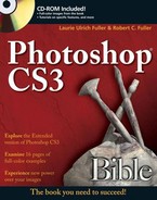
You may want to change colors in your photos and other artwork for lots of reasons. Perhaps you want to achieve some special effect or improve the clarity of an image or make some portion of the image stand out more so than it does under its current color scheme. In Figure 18.1, the image at the bottom is greatly improved by color mapping that was applied to the original version of the same image at the top: The colors stand out, edges are crisper and cleaner, and detail is much more evident. Of course, this is a black and white book (except for the Color Section), so the only things you can see here are the "crisper and cleaner" and the increase in detail. But believe it, the colors are the culprits, both in the original and the re-mapped version. The image in the middle shows the sort of "special" effects you also can achieve when tinkering with color settings.
While some mapping is done to create special — sometimes psychedelic — effects, most of the time the sort of correction or improvement shown in the bottom image in Figure 18.1 is the goal. You're making straightforward repairs, alternatively known as color adjustments and corrections. The reasons to need or want to make such adjustments or corrections are plentiful. Scans are never perfect, no matter how much money you spend on a scanning device or a service bureau. They can always benefit from tweaking and subtle adjustments, if not outright overhauls, in the color department. And, of course, digital cameras, and certainly lower-end traditional film cameras and their development methods can create images with colors that leave much to be desired.
Of course, Photoshop's color adjustment functions can't make something from nothing. In creating the illusion of more and better colors, most of the color adjustment operations that you perform actually take some small amount of color away from the image. Somewhere in your image, two pixels that were two different colors before you started the correction change to the same color. The image may look ten times better, but it will in fact be less colorful than when you started.
Remembering this principle is important because it demonstrates that color mapping is really a balancing act. The first several operations you perform may make an image look progressively better, but the tenth may send it into decline — the perfect example of less being more, or knowing when to quit. This knowledge, however, of when to quit or when correction has become corruption is a matter of experience and developing a good "eye" for when that line has been crossed. Of course there's no magic formula; the amount of color mapping you need to apply varies from image to image. But if you follow basic principles — use the commands in moderation, know when to stop, and save your image to disk before doing anything drastic — you should be happy with your results the majority of the time.
Note
Many of the commands discussed in the following sections also can be applied as adjustment layers. An adjustment layer is an extremely flexible tool, giving you all the advantages of the color correction commands without the drawback of having your original image permanently altered. Adjustment layers are discussed in full at the end of this chapter, but you should know they're "out there" from the beginning of any discussion of color mapping and image correction; this knowledge can help you put all the techniques covered between now and then in better perspective, evaluating the differences between techniques, weighing pros and cons, and so on. So there, now you know.
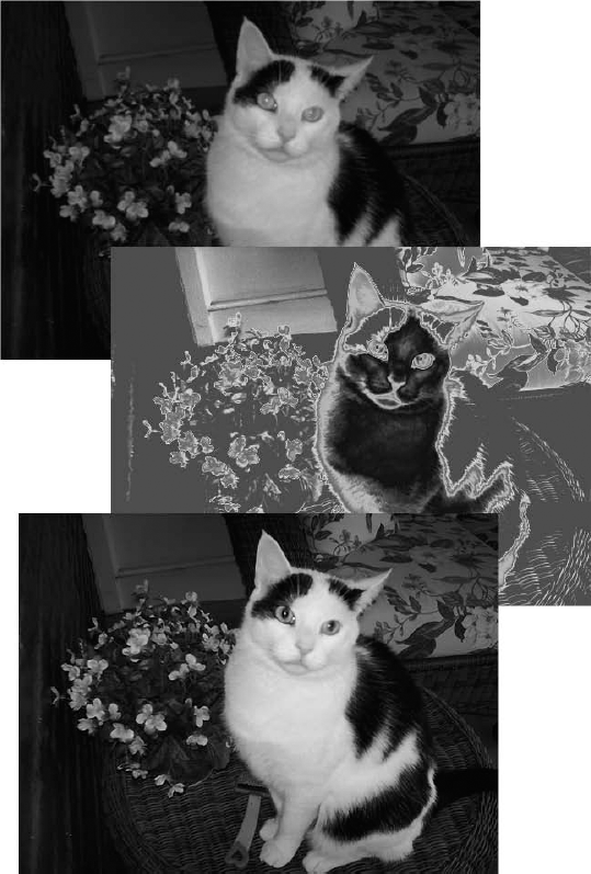
Figure 18.1. From bad to bizarre to better, color adjustments can serve many different purposes. The top image (original) is faded and blurry, and a gradient map makes it interesting — but not clearer or crisper, as it appears in the bottom image after some corrections were made to light and color levels.
Photoshop stores all its color mapping commands under the Image
Color mapping: Commands such as Invert and Threshold are quick-and-dirty color mappers, swapping, for example, the original colors for their color opposites (Invert). They don't correct images, but they can be useful for creating special effects and adjusting masks.
Easy color corrections: Brightness/Contrast and Color Balance are true color-correction commands, but you may feel that they sacrifice functionality for ease of use. By ease of use, we mean that the corrections are achieved through a few simple sliders, as shown in Figure 18.2. By sacrifice functionality, we also mean that the corrections are achieved through a few simple sliders. Too few. But you will end up using them from time to time, even if you think they're painfully simple and wish they offered more or more nuanced controls.
One thing that is improved in Brightness/Contrast in Photoshop CS3 is the addition of the Use Legacy checkbox. By turning this on, you can elect to clip extreme highlight and shadow detail. It's off by default, but when you turn it on, changes to brightness and contrast are made on a non-linear basis — mid-tones are effected to a greater extent than highlights or shadows — unlike the CS2 and previous versions of this tool, which affected highlights, midtones, and shadows to the same degree as you dragged the slider/s.
Expert color corrections: The third, more complicated variety of color-correction commands provides better control, but they take a fair amount of effort to learn. Levels, Curves, Hue/Saturation, and Shadows/Highlights are examples of color correcting at both its best and most complicated.
This chapter contains little information about the second category of commands for the simple reason that so little information is required. You issue a command from the Image
Now, it's important to state up front that some of the quick and automatic adjustment tools aren't going to wow you, even when you consider their incredible speed and ease of use. Some exceptions: Auto Color, which usually does a pretty good job of adjusting an image's midtones and removing color casts; Auto Levels and Auto Contrast, which are decent quick fixers; and Variations, which offers deceptively straightforward sophistication; this last one's not really that automatic compared with the others, in that you have several choices of color and lighting adjustments that you can make and you can confine the adjustments to specific ranges of color.
No matter how you end up feeling about the individual commands and the three types of adjustments that can be made, you're about to master them — so grab a really dysfunctional photo and let the color therapy begin.
The first category of commands, the color mapping tools, all occupy one of the lower sections in the Image
When you choose Image
Note
Now, you might have already thought, "Hey, this means I can scan a negative and convert it to a positive image with this command!" Well, not really, at least not that simply. By itself, the Invert command is not sufficient to convert a scanned color photographic negative to a positive. Negative film produces an orange cast that the Invert command does not address. After inverting, you can use the Variations command to remove the colorcast. Or avoid Invert altogether, and use the Levels command to invert the image. Both Variations and Levels are explained later in this chapter.
One really good thing about the Invert command is that it's just about the only color-mapping command that retains the rich diversity of color in an image. (The Hue/Saturation command also retains color diversity under specific conditions.) For example, if you apply the Invert command twice in a row, you arrive at your original image without any loss in quality. Cool, no?
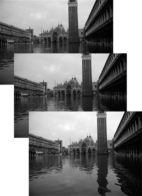
Figure 18.3. You can turn some or all of your image to its negative. Here the top half of the image has been inverted, showing you the before and after in one image.
Of course, bear in mind that when you're working on a full-color image, the Invert command simply inverts the contents of each color channel. This means the command produces very different results when applied to RGB, Lab, and especially CMYK images. Typically, the Invert command changes most pixels in a CMYK image to black. Except in rare instances — such as in night scenes — the black channel contains lots of light shades and few dark shades. So when you invert the channel, it becomes extremely dark.
Note
Just so you know, when we discuss applying color corrections in the CMYK mode, we assume that you're applying them after choosing Image
Tip
As mentioned in Chapter 13, inverting the contents of the mask channel is the same as applying Select
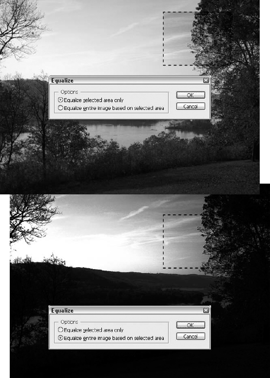
When you invoke the Equalize command, Photoshop searches for the lightest and darkest color values in a selection and then maps the lightest color in all the color channels to white, maps the darkest color in the channels to black, and distributes the remaining colors to other brightness levels in an effort to evenly distribute pixels over the entire brightness spectrum. This doesn't mean that any one pixel actually appears white or black after you apply Equalize, however. Instead, one pixel in at least one channel is white and another pixel in at least one channel is black. In an RGB image, for example, the red, green, or blue component of one pixel would be white, but the other two components of that same pixel might be black. The result is a higher contrast image with white and black pixels scattered throughout the color channels.
If no portion of the image is selected when you choose Image
Equalize Selected Area Only: Select this option to apply the Equalize command strictly within the confines of the selection. The lightest pixel in the selection becomes white, the darkest pixel becomes black, and the others remap to shades in between. Figure 18.4, at the top, shows an image that's been Equalized in only one selected area.
Equalize Entire Image Based on Selected Area: If you select the second radio button, which is the default setting, Photoshop applies the Equalize command to the entire image based on the lightest and darkest colors in the selection. All colors in the image that are lighter than the lightest color in the selection become white, and all colors darker than the darkest color in the selection become black. The bottom image in Figure 18.4 shows the same image with the Equalize command applied to the entire image based on the same selection.
What you may find with the Equalize command is that it can rely too heavily on the automation of its procedure to be of much use as a color-correction tool. You simply don't have enough control over the equalization process, or the equation it's using to distribute colors over the entire spectrum of light to dark. You can create some interesting special effects, though, and sometimes it can be a helpful command, depending on the photo in question, its problems, and your goals for it.
Tip
If you really want to automatically adjust the colors in an image from black to white regardless of the color mode and composition of the individual channels, choose Image

The Threshold command converts all colors to either black or white, based on their brightness values. When you choose Image
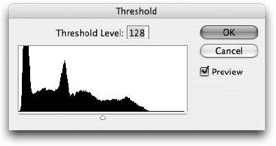
Figure 18.5. The histogram in the Threshold dialog box shows the distribution of brightness values in the selection. The weird mountain-range silhouette thing is what's known as a histogram.
The dialog box also includes a graph of all the colors in the image, even if only a portion of the image is selected. This graph is called a histogram. The width of the histogram represents all 256 possible brightness values, starting at black on the left and progressing to white on the right. The height of each vertical line in the graph demonstrates the number of pixels currently associated with that brightness value. Therefore, you can use the histogram to gauge the distribution of lights and darks in your image. You may have trouble imagining that looking at the histogram in a dialog box could ever translate to a useful tool for perceiving and adjusting color, but with enough experience, the histogram becomes an invaluable tool, permitting you to greatly improve the colors that you see onscreen. You may even get excited enough about histograms to spend some time using the Histogram palette, discussed later in this chapter.
Generally speaking, you achieve the best effects if you change an equal number of pixels to black as you change to white (and vice versa). So rather than moving the slider bar to 128, which is the medium brightness value, move it to the point at which the area of the vertical lines to the left of the slider triangle looks roughly equivalent to the area of the vertical lines to the right of the slider triangle. The example at the top in Figure 18.6 shows the result of applying the Threshold command with a Threshold Level value of 128 (right smack in the middle of the slider), while the image at the bottom shows a lower Threshold level of 70.
Tip
If you want to achieve a colorful Threshold effect, try applying the Threshold command independently to each color channel. In an RGB image, for example, press Ctrl+1 (
Where Threshold boils down an image into only two colors, Posterize can retain as many colors as you like. Of course, you can't control how colors are mapped, as you can when you use Threshold; the Posterize dialog box provides neither a histogram nor a slider bar. Instead, Posterize automatically divides the full range of 256 brightness values into a specified number of equal increments.
To use this command, choose Image
Like Threshold, the Posterize command is something you can play with in conjunction with filters to get some really interesting results. You can apply it before a filter or after it — or along with more than one filter. By reducing the number of levels and thus simplifying the color palette in the image, the Posterize command makes various filters perform differently than they would on a photo with millions of colors.
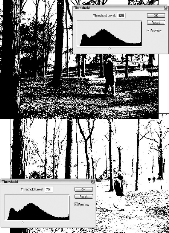
Figure 18.6. Use the histogram and your own eyes — trained on the preview — to determine when the Threshold command is delivering interesting or simply destructive results.
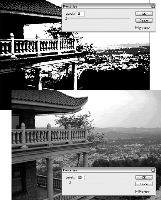
Figure 18.7. On the top, Posterize was applied at two levels. On the bottom, 16 levels were applied, which makes the image look almost "normal," like the original photo with millions of colors. Note that the sky is one of the giveaway areas: Bands of colors are visible there more than in the busier areas of the image.
Photoshop offers four quick, automatic correctors under the Image
The Desaturate command is quite useful for removing color from selected areas or from independent layers. You can use it to reduce or remove color from an entire image, but for that you'd probably be better off using the Image
You want to retain the option of applying RGB-only filters, such as Lens Flare and Lighting Effects. You'd lose these options if you convert to Grayscale.
You intend to downsize the colors using Image
Tip
You can use Edit
Note
Desaturate isn't the only way to remove colors from an image. You also can invert the colors and mix them with their original counterparts to achieve a slightly different effect. Just press Ctrl+I (
Image
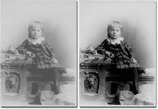
Figure 18.8. After the use of the Auto Levels command, you see more contrast, more discernable detail, more interest.
You may be thinking that Auto Levels is a whole lot like Equalize, and you'd be right — except that unlike the Equalize command, which considers all color channels as a whole, Auto Levels looks at each channel independently. This results in more dynamic, profound results, based on the color mode for the photo. Like Invert, Equalize, and other automatic color mapping commands, Auto Levels is designed for use in the RGB mode. If you use it in CMYK, you may not like the results.
If you find that Image
Not sure which one to use? If a low-contrast image suffers from a colorcast that you want to correct, try Auto Levels. If the image is washed out but the colors are okay, try Auto Contrast. If you're working on a grayscale image, the two commands work the same, so choose whichever is more convenient. Given that neither command is perfect, you may want to make additional Levels and Variations adjustments (these commands are covered in detail later in this chapter) — or try Auto Color, which is up next.
The Auto Color command is such a smart and useful tool that it serves as the exception to the rule that one must be somewhat reserved in praise for or use of any command that starts with the word "Auto." Auto Color is great at tweaking skin tones and making other subtle changes — something you'll notice right away, especially in photos where the Auto Levels and Auto Contrast commands don't seem to make much, if any, difference in the image.
Choose Image
Tip
Auto Color is different from Auto Levels in that rather than setting the darks to black and the lights to white, Auto Color neutralizes an image's highlights, midtones, and shadows, thereby restoring balance to other colors in the image. That's the plan, anyway. If you don't see the results that this command promises, you can always customize it using the Levels and Curves commands — a process discussed later in this chapter.
In this section, you're looking at the commands that change the distribution of colors in an image. You can move the hues across the color spectrum, change the saturation of colors, adjust highlights and shadows, and even tint an image. Four of these commands — Hue/Saturation, Selective Color, Photo Filter, and Match Color — are applicable only to color images. The other two — Replace Color and Variations — can be applied to grayscale images, too. You may find that they're better suited to color images, but it depends on the photo as to whether these commands are the most effective choice for a grayscale image. If you're more interested in editing grayscale photographs, you can check out the Levels, Curves, and new Shadow/Highlight commands, all of which are covered toward the end of the chapter. For those of you who want to correct colors, however, read on.
Tip
Remember how Ctrl+Alt+F (
The Hue/Saturation command provides two functions. First, it enables you to adjust colors in an image according to their hues and saturation levels. You can apply the changes to specific ranges of colors or modify all colors equally across the spectrum. And second, the command lets you colorize images by applying new hue and saturation values while retaining the core brightness information from the original image.
This command is perfect for colorizing grayscale images. You can give your images the Ted Turner treatment with just a little effort. Just scan and change the Hue value to 140 degrees.
When you choose Image
Hue: The Hue slider bar measures colors on the 360-degree color circle, as explained in the section of Chapter 4 that discusses the HSB model. You can adjust the Hue value from _180 to +180 degrees. As you do, Photoshop rotates the colors around the Hue wheel. Consider the example of flesh tones. A Hue value of +30 moves the flesh into the orange range; a value of +100 makes it green. Going in the other direction, a Hue of −30 makes the flesh red and −100 makes it purple.
Note
When the Colorize option is selected, Hue becomes an absolute value measured from 0 to 360 degrees. A Hue value of 0 is red, 30 is orange, and so on, as described in Chapter 4.
Saturation: The Saturation value changes the intensity of the colors. Normally, the Saturation value varies from −100 for gray to +100 for incredibly vivid hues. The only exception occurs when the Colorize option is selected, in which case saturation becomes an absolute value, measured from 0 for gray to 100 for maximum saturation.
Lightness: You can darken or lighten an image by varying the Lightness value from −100 to +100.
Warning
Because this value invariably changes all brightness levels in an image to an equal extent — whether or not Colorize is selected — it permanently dulls highlights and shadows. We advise that you avoid this option at virtually all costs and rely instead on the Levels or Curves commands to edit brightness and contrast.
Tip
Like many sliders and settings in the program, Photoshop now lets you "scrub" to adjust the values. Position your cursor over the name of one of the sliders (such as Hue) until you get a hand cursor with two arrows protruding from it. Drag left to decrease the value of the slider, drag right to increase it. Shift-drag to change the value in increments of 10.
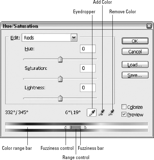
Edit: The Edit pop-up menu controls which colors in the active selection or layer are affected by the Hue/Saturation command. If you select the Master option, as by default, Hue/Saturation adjusts all colors equally. If you prefer to adjust some colors in the layer differently than others, choose one of the other Edit options or press the keyboard equivalent — Ctrl+1 (Win) or

Each Edit option isolates a predefined range of colors in the image. For example, the Reds option selects the range measured from 345 to 15 degrees on the Hue wheel. Naturally, if you were to modify just the red pixels and left all non-red pixels unchanged, you'd end up with some jagged transitions in your image. So Photoshop softens the edges with 30 degrees of fuzziness at either end of the red spectrum (the same kind of fuzziness as described in Chapter 9).
Tip
You can apply different Hue, Saturation, and Lightness settings for every one of the color ranges. For example, to change all reds in an image to green and all cyans to gray, choose the Reds option and change the Hue value to +50 and then choose Cyans and change the Saturation value to −100.
Color ramps: You can track changes made to colors in the Hue/Saturation dialog box in two ways. One way is to select the Preview option and keep an eye on the changes in the image window. The second way is to observe the color ramps at the bottom of the dialog box. The first ramp shows the 360-degree color spectrum; the second ramp shows what the color ramp looks like after your edits.
Color range controls: You also can use the color ramps to broaden or narrow the range of colors affected by Hue/Saturation. When you choose any option other than Master from the Edit pop-up menu, a collection of color range controls appears between the color ramps. The range bar identifies the selected colors and also permits you to edit them.
Figure 18.11 shows the color range controls up close and personal. Here's how they work:
Drag the central range bar to move the entire color range.
Drag one of the two lighter-colored fuzziness bars to broaden or narrow the color range without affecting the fuzziness.
Drag the range control to change the range while leaving the fuzziness points fixed in place. The result is that you expand the range and condense the fuzziness, or vice versa.
Drag the triangular fuzziness control to lengthen or contract the fuzziness independently of the color range.
Tip
By default, red is the central color in the color ramps, with blue at either side. This is great when the range is red or some other warm color. But if you're working with a blue range, the controls get split between the two ends. To move a different color to the central position, Ctrl-drag (Win) or
Eyedroppers: To lift a color range from the image window, click inside the image window with the Eyedropper cursor. The cursor automatically changes to an eyedropper when you move it outside the Hue/Saturation dialog box, and then when you click on a color, Photoshop centers the range on the exact color you click.
Tip
To expand the range to include more colors, Shift-click or drag in the image window. To remove colors from the range, Alt-click (Option-click on the Mac) or drag in the image. You also can use the alternative plus and minus Eyedropper tools, but Shift and Alt (Shift and Option on the Mac) work well, too.
Load/Save: You can load and save settings to disk in case you want to reapply the options to other images using the Load/Save options. These options are especially useful if you find a magic combination of color-correction settings that accounts for most of the color mistakes produced by your scanner.
Colorize: Select this option to apply a single hue and a single saturation level to the entire selection or layer, regardless of how it was previously colored. All brightness levels remain intact, although you can adjust them incrementally using the Lightness slider bar (a practice that should be avoided, as mentioned earlier).
Color ranges are not permitted when colorizing. The moment you select the Colorize option, Photoshop dims the Edit pop-up menu and sets it to Master.
Restore: Wait — there's no Restore button in this dialog box. Or is there? If you Alt-click (Windows) or Option-click (Mac) the Cancel button, it becomes a Restore button. While in Restore mode, you can restore the options in the Hue/Saturation, Levels, and Curves dialog boxes to their original settings by clicking Restore. You also can press Option+Escape on the Mac to achieve the same result.
To track the behavior of specific colors when using Hue/Saturation or any of Photoshop's other powerful color adjustment commands, display the Info palette (press F8) before choosing the Hue/Saturation command. Then move the cursor inside the image window. As shown in Figure 18.12, the Info palette tracks the individual RGB and CMYK values of the pixel beneath the cursor. The number before the slash is the value before the color adjustment; the number after the slash is the value after the adjustment. Note that the Info palette shows these before and after numbers only while the adjustment dialog box is open; if you're just sampling pixels with the Eyedropper, there is only one value shown in the palette — the color values for the pixel you're sampling at the time.
Note
Photoshop's Histogram palette also updates continuously as you work in the Hue/Saturation dialog box or with any of the other color adjustment commands. The Histogram palette is discussed a little later in this chapter.
Remember that you don't have to settle for just one color readout. Shift-click in the image window to add up to four fixed color samples, just like those created with the color sampler tool, described in Chapter 4. To move a color sample after you've set it in place, Shift-drag it.
In the case of the Hue/Saturation dialog box, you can set color sample points only when the Edit pop-up menu is set to Master. After you set the samples, select some other options from the pop-up menu to modify a specific range. As long as you select only the Master option and edit only the Hue value, Photoshop retains all colors in an image. In other words, after shifting the hues in an image +60 degrees, you can later choose Hue/Saturation and shift the hues −60 degrees to restore the original colors.
Note
Just as the Saturation option works like the Color control on a television, the Hue value serves the same purpose as the Tint control, and the Lightness value works like the Brightness control. Note that increasing the Saturation has the effect of heightening the contrast of the color channels, so display the Channels palette before opening the Hue/Saturation dialog box and display just one channel. Watch as you drag the Saturation slider, and then switch channels to see the impact on each one individually. You have to close the dialog box to switch channels though.
Tip
The Saturation option is especially useful for toning down images captured with low-end scanners and digital cameras, which have a tendency to exaggerate certain colors.
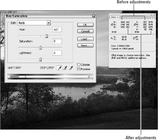
Figure 18.12. When you move the Eyedropper outside a color adjustment dialog box and into the image window, the Info palette lists the color values of the pixel beneath the cursor before and after the adjustment.
Another common use for the Saturation option is to prepare RGB images for process-color printing. As explained in Chapter 4, many colors in the RGB spectrum are considered out-of-gamut, meaning that they fall outside the smaller CMYK color space. Photoshop provides a means for recognizing such colors while remaining inside the RGB color space. Choose View
How do you eliminate these out-of-gamut colors? Consider these options:
Let Photoshop take care of the problem automatically when you convert the image by choosing Image
Another method is to scrub with the Sponge tool. Although it theoretically offers selective control — you just scrub at areas that need attention until the gray pixels created by the Gamut Warning command disappear — the process leaves too much to chance and can do more damage than simply choosing Image
The third and best solution involves the Saturation option in the Hue/Saturation dialog box.
If you're surprised to read the last item (and wondering why it's listed last if it's the best bet), don't be; read on for a procedure you can try to bring your colors back into the CMYK color space.
STEPS: Eliminating out-of-gamut colors
Create a duplicate of your image to serve as a CMYK preview. Choose Image
Return to your original image, and choose Select
To monitor your progress, choose View
Press Ctrl+U (
+U on the Mac) to display the Hue/Saturation dialog box.Lower the saturation of individual color ranges. Don't change any settings while Master is selected; it's not exacting enough. Instead, experiment with specifying your own color ranges and lowering the Saturation value. Every time you see one of the pixels change from gray to color, it means that another pixel has now left the "out of gamut" ranks and is officially within the CMYK color space.
When only a few hundred sporadic gray spots remain onscreen, click OK to return to the image window. Choose Image
Bear in mind that the differences between your duplicate image and the one you manually forced into gamut may be very subtle and you may not really notice any immediate improvement. When the image is printed, however, the difference is more obvious and produces a better-looking image with a more dynamic range of colors.
The one problem with the previous procedure is that the Color Range command selects only out-of-gamut pixels without even partially selecting their neighbors. As a result, you desaturate out-of-gamut colors while leaving similar colors fully saturated, an effect that may result in jagged and unnatural edges.
One solution is to insert a step between Steps 2 and 3 in which you do the following: Select the Magic Wand tool, and change the Tolerance value in the Options bar to 12, for example (feel free to tinker). Next, choose Select
This solution isn't perfect — ideally, the Color Range option box wouldn't dim the Fuzziness slider when you choose Out Of Gamut — but it does succeed in partially selecting a few neighboring pixels without sacrificing too many of the out-of-gamut pixels, and makes for a smoother result.
When you select the Colorize option in the Hue/Saturation dialog box, the options perform differently. Every pixel in the selection receives the same hue and the same level of saturation, and only the brightness values remain intact to ensure that the image remains recognizable. In most cases, you'll want to colorize only grayscale images or bad color scans. After all, colorizing ruins the original color composition of an image. For the best results, you'll want to set the Saturation values to somewhere in the neighborhood of 25 to 75.
Tip
To touch up the edges of a colorized selection, change the foreground color to match the Hue and Saturation values you used in the Hue/Saturation dialog box. You can do this by choosing the HSB Sliders command from the Color palette menu and typing the values in the H and S option boxes. Set the B (Brightness) value to 100 percent. Next, select the Brush tool and change the Brush mode to Color by pressing Shift+Alt+C (Shift+Option+C on the Mac).
The Replace Color command allows you to select an area of related colors and adjust the hue and saturation of that area. When you select Image
For further comfort or confusion (however the similarities with other tools strike you), this dialog box works the same as selecting a portion of an image using Select
So given that the Replace Color command's dialog box looks and acts like two other tools, why does it even exist? Because it allows you to change the selection outline and apply different colors without affecting the image. Just select the Preview option to see the results of your changes onscreen, and you can play with the settings and click OK only when you like what you see.
Note
If you're not clear on how to use all the options in the Replace Color dialog box, read the section in Chapter 9 on using the Color Range command. The content there tells you all about the Eyedropper tools and the Fuzziness option so you'll have a better idea of how they work.
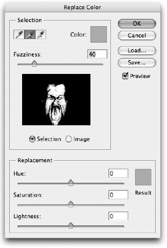
Figure 18.13. The Replace Color dialog box works like the Color Range dialog box described in Chapter 9, with the Hue/Saturation sliders thrown in.
The Selective Color command permits you to adjust the colors in CMYK images. Although you can use Selective Color also when working on RGB or Lab images, it makes more sense in the CMYK color space because it permits you to adjust the levels of cyan, magenta, yellow, and black inks.
Note
You may find that the Variations command provides better control and more intuitive options than the Selective Color command. Adobe created the Selective Color command to accommodate traditional press managers who prefer to have direct control over ink levels rather than monkeying around with hue, saturation, and other observational color controls. If Selective Color works for you, great. But don't get hung up on it if it never quite gels. You can accomplish all that Selective Color provides and more with the Variations command, described in the next section.
Choosing Image
If you examine the Selective Color dialog box closely, you'll notice that it is very much like the Hue/Saturation dialog box. You have access to predefined colors in the form of a pop-up menu instead of radio buttons, and you can adjust slider bars to alter the color. The two key differences are that the pop-up menu lets you adjust whites, medium grays (Neutrals), and blacks — options missing from Hue/Saturation — and that the slider bars are always measured in the CMYK color space.
Tip
As mentioned at the outset, the Selective Color command produces the most predictable results when you're working on a CMYK image. When you drag the Cyan slider to the right, for example, you're actually transferring brightness values to the cyan channel. However, you have to keep an eye out for a few anomalies, particularly when editing black. In the CMYK mode, areas of your image that appear black include not only black but also shades of cyan, magenta, and yellow, resulting in what printers call a rich black (or saturated black). Therefore, to change black to white, you have to set the Black slider to −100 percent and also set the Cyan, Magenta, and Yellow sliders to the same value.
Since the dawn of color film, photographers have used different filters and balanced film stocks to correct the color balance in their photos. Different types of light sources produce a variety of color temperatures: Natural daylight generally takes on a bluish cast, or a higher color temperature, whereas artificial light often produces more shades of reds and yellows, or a lower color temperature. When not shooting on film that has been prebalanced to account for these casts, photographers often place a color filter over the lens to compensate — adding blue to an indoor scene to counteract the yellows, for example. It's similar to how folks who work in video need to set the white balance on their cameras before they shoot.
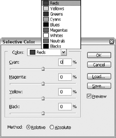
Figure 18.14. Select a predefined color from the Colors pop-up menu, and adjust the slider bars to change that color.
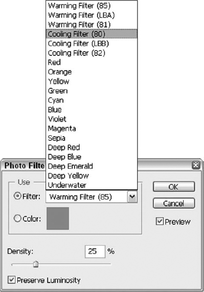
Although it has long let you correct the colorcast of an image through Variations (which is discussed next), Photoshop also offers a handy tool through the Photo Filter command. Choose Image
Filter: The Filter pop-up menu includes six specific filter options followed by a list of colors you can use to fix various colorcasts on your image. The first three options, Warming Filter (85), Warming Filter (LBA) and Warming Filter (81), simulate filters that a photographer would use when the color temperature is too cool, or bluish. Warming Filter (85) produces an orange colorcast, and Warming Filter (81) adds more of a tan tint to your image. Conversely, Cooling Filter (80), Cooling Filter (LBB) and Cooling Filter (82) add to your image a dark and rich cast of blue or a light cast of blue, respectively, to account for the yellows of artificial light. The rest of the options in the pop-up menu are different color presets that let you achieve photographic effects similar to those provided by some real-life filters.
Color: You also can specify any color and use it as though it were a filter. This is a great way to compensate for an unusual colorcast, such as a color light source in a scene that you'd like to neutralize. Click the color swatch to open the Color Picker, and select a color. Alternatively, after the Color Picker is open, you can click anywhere in your image to choose a particular color.
Density: The Density slider adjusts the amount of color correction that the Photo Filter command will apply. You also can manually type a value in the option box above the slider. Remember that you can always adjust the amount of correction after you click OK by choosing Edit
Preserve Luminosity: Select this option to ensure that the brightness values are not darkened by your color adjustments.
Tip
You also can apply the Photo Filter command as an adjustment layer, ensuring that none of the changes you make is permanent. You'll take a look at adjustment layers later in this chapter.
The Variations command is Photoshop's most essential color-correction function and its most un-Photoshop-ish in that it's amazingly simple and highly effective all at the same time. Typically, control comes with complexity, but not so here.
When it comes to control and effectiveness, you can adjust hues and luminosity levels based on the brightness values of the pixels, something Hue/Saturation cannot do. You also can see what you're doing by clicking little thumbnail previews, shown in Figure 18.16, which takes much of the guesswork out of the correction process. This is where the "alarmingly simple" description comes in.
On the other hand, the Variations dialog box takes over your screen and prevents you from previewing corrections in the image window — not a big deal, but if you're used to seeing a preview in the image window, this can be jarring. Another problem (equally slight, really) is that you can't see the area outside a selection, which can be disconcerting when making color adjustments to just part of your image. You won't know until you click OK if the adjustment you made to the selection works in context, but you can slide the dialog box aside to see the entire original image. Just click the title bar of the dialog box and drag it.
The Variations command is really great for correcting an image in its entirety, although it can be useful for adjusting selections (with the previously mentioned issues kept in mind). Whether you like it for the whole image or just part of it, here's how it works: To infuse color into the image, click one of the thumbnails in the central portion of the dialog box. The thumbnail labeled More Cyan, for example, shifts the colors toward cyan. The thumbnail even shows how the additional cyan will look when added to the image. You can also use the Lighter and/or Darker thumbnails to adjust the overall light levels in your image or a selected portion thereof.
Notice that each of the color thumbnails is positioned directly opposite its complementary color, with the Current Pick between them. More Cyan is across from More Red, More Blue is across from More Yellow, and so on. In fact, clicking a thumbnail shifts colors not only toward the named color but also away from the opposite color. For example, if you click More Cyan and then click its opposite, More Red, you arrive at the original image.
Note
Although this isn't exactly how the colors in the additive and subtractive worlds work — cyan is not the empirical opposite of red — the colors are theoretical opposites, and the Variations command makes the theory a practicality. After all, you haven't yet applied the color to the image, so the dialog box can calculate its adjustments in a pure and perfect world. Cyan and red ought to be opposites, so for the moment, they are.
To control the amount of color shifting that occurs when you click a thumbnail, move the slider in the upper-right corner of the dialog box. Fine produces minute changes; Coarse creates massive changes. Just to give you an idea of the difference between the two, you have to click a thumbnail about 40 times when the slider is set to Fine to equal one click when it's set to Coarse.
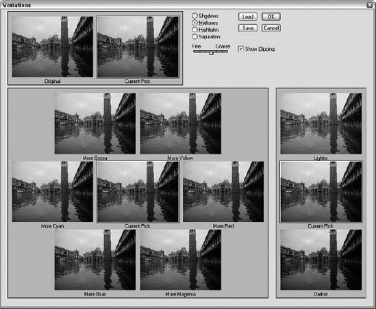
Figure 18.16. Click the "More" thumbnails to add more of one color or another to your image. Refer to the Current Pick to see your results before okaying them. Start over by clicking the Original thumbnail, and use the radio buttons to choose which aspect of the image to change. The slider adjusts sensitivity.
The radio buttons at the top control which colors in the image are affected. Select Shadows to change the darkest colors, Highlights to change the lightest colors, and Midtones to change everything in between.
Note
In fact, if you're familiar with the Levels dialog box, you may have noticed that the first three radio buttons have direct counterparts in the sliders in the Levels dialog box. For example, when you click the Lighter thumbnail while the Highlights option is selected in the Variations dialog box, you perform the same action as moving the white slider in the Levels dialog box to the left — that is, you make the lightest colors in the image even lighter.
Selecting the Saturation option lets you increase or decrease the saturation of colors in an image. Only one thumbnail appears on each side of the Current Pick image: one that decreases the saturation and another that increases it. The Variations command modifies saturation differently than Hue/Saturation. Hue/Saturation pushes the saturation of a color as far as it will go, but Variations attempts to modify the saturation without changing overall brightness values. As a result, an image saturated with Hue/Saturation looks lighter than one saturated with Variations.
As you click the options — particularly when modifying saturation — you may notice that unexpected colors spring up in the thumbnails. These brightly colored pixels are gamut warnings, highlighting colors that exceed the boundaries of the current color space. For example, if you're working in the RGB mode, these colors extend beyond the RGB gamut. Although the colors won't actually appear inverted as they do in the dialog box, don't exceed the color space because it results in areas of flat color, just as when you convert between the RGB and CMYK spaces. To view the thumbnails without the weirdly colored pixels, deselect the Show Clipping option.
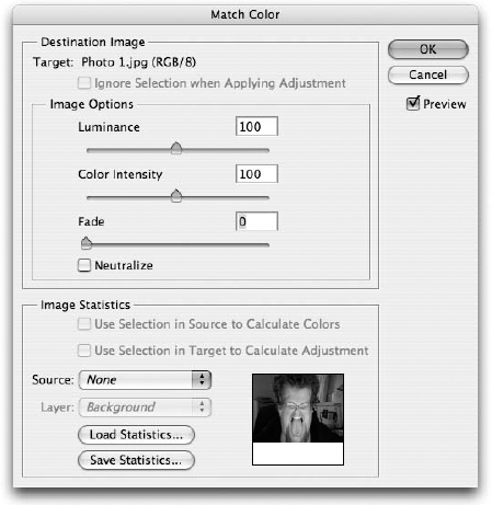
With Adobe's introduction of the Match Color command in Photoshop CS, the Photoshop user community wondered if Adobe had really added a true color-matching tool. Well, even with the release of Photoshop CS2 and now CS3, the answer was and is no, and the wait continues: The Match Color command has nothing to do with emulating the color of a match. It does, however, adjust the colorcast of one image to match that of another, which can still be pretty useful.
In case you were wondering how such a tool might be useful, imagine that you have a series of photos taken outdoors, on a day when the sun was coming in and out over the course of your shoot and the lighting was really different in several of the shots. Or you were taking photos of people indoors, and in the later afternoon, when the room got hotter, people started to look a bit flushed, or the sunlight coming into the room was starting to change and it no longer drowned out the fluorescent lighting from overhead in the room. Any of these scenarios would present you with the need to change a colorcast, making one photo's cast match another's. Brighten the cloudy photos, smooth out the ruddy cheeks, soften the pasty fluorescent glow.
You begin by opening both the image you want to adjust and the image whose color you want to match. If you want Match Color to base its analysis on a particular part of the image, such as skin tones, select the colors you want to isolate in both the source and destination images. Make sure the destination image is in the active image window and choose Image
The following list explains the options available to you in the Match Color dialog box:
Target: The Target is automatically set as whatever image was active when you chose the command, and you can't change this. If your destination image contains a selection, the Ignore Selection when Applying Adjustment option is available. If you don't select this option, the effect applies only to the selected area in your image, which may not be the desired result. If you've made a selection in your destination image and you don't want to confine the effect to that selection, select the option.
Image Options: The Image Options let you make adjustments to the lightness, saturation, and strength of the Match Color command. The Luminance slider defaults to a value of 100 and lets you increase or decrease the brightness of your destination image. Color Intensity works much like the Saturation slider in the Hue/Saturation command. The Fade slider saves you the step of applying Match Color and then choosing Edit
Tip
Select the Neutralize option to tell Photoshop to examine the destination image, without factoring in any values from the source image, and attempt to remove any colorcast that it finds. You may find that sometimes it works really well and sometimes it just dulls your image. If you don't get the results you want, try using the Photo Filter command or the Variations dialog box, discussed earlier in this chapter, to manually target and correct a colorcast.
Image Statistics: These options let you specify a source image and determine how it is interpreted. The source can be any other open image, or even a layer within the destination image itself. The latter is particularly useful if, for example, you're trying to composite a person from another photo on a separate layer into your destination image. If your source image contains a selection, select the Use Selection in Source to Calculate Colors option to only analyze the statistics, or characteristics, of the selected region. When this option is deselected, Match Color determines the statistics of the source by looking at all the pixels in the image. Similarly, selecting the Use Selection in Target to Calculate Adjustment option makes changes to the target image using colors found in only the selected area of that image. If you selected similarly colored areas in both your target and source images, leave both of these options selected.
Use the Source pop-up menu to choose the source image from among all open images. If you select None, you still have access to the Neutralize option and other Image Options settings. If you select a source with more than one layer, you can specify the layer from which you're culling statistics in the Layer pop-up menu. You also have the option of choosing a merged composite of all the layers in the source image.
Finally, the Match Color dialog box offers you the option of both saving and then loading the statistics it has calculated from a source image. This can be useful in a couple of ways. First, it means you don't need to have a source image open when applying the Match Color command. It also means that you can save the statistics of an image and use them to adjust an unlimited number of other images, on other machines, long after the original source image is out of the picture.
Note
The Match Color command works only with images in the RGB mode.
Now that you know several methods for adjusting hues and saturation levels with Photoshop, we want to discuss some of the possible challenges you may face in using them. The danger of rotating colors or increasing the saturation of an image is that you can bring out some unstable colors. Adjusting the hues can switch ratty pixels from colors that your eyes aren't very sensitive to — particularly blue — into colors your eyes see very well, such as reds and greens. Drab color also can hide poor detail, which becomes painfully obvious when you make the colors bright and vivid; all the problems in the image will come screaming out at you after you've heightened the colors.
Unstable colors may be the result of JPEG compression, as in the case of the digital photo. Or you may be able to blame bad scanning or poor lighting; the potential causes are abundant, and we've all been victims. No matter what's caused your color problems, you can correct the problem using the Median and Gaussian Blur commands, explained in the following procedure. Grab a particularly color-challenged digital photo and try the following:
STEPS: Boosting the saturation of digital photos
Select the entire image, and copy it to a new layer. You can speed this process along with the keyboard shortcuts Ctrl+A and Ctrl+J (
Press Ctrl+U (
Choose Filter
Choose Filter
Select Color from the blend mode pop-up menu in the Layers palette. Photoshop mixes the blurry color with the crisp detail underneath.
If your image is still a little soft, flatten the image and sharpen it until you like the results.
Note
Take a little refresher on those Blur, Sharpen, and Noise filters in Chapter 10.
You may find the Lighter and Darker options in the Variations dialog box to be more effective and controllable than the Lightness slider in the Hue/Saturation dialog box because you can specify whether to edit the darkest, lightest, or medium colors in an image. Focusing on these areas gives you the ability to target trouble spots, which is handy if not all of your pixels are in need of lighting adjustment. If your needs are even more specific, you may find that neither command is adequate for making very precise adjustments to the brightness and contrast of an image. If this is the case, Photoshop provides three expert-level commands for adjusting the brightness levels in both grayscale and color images:
Levels: This command is great for most color corrections. It lets you adjust the darkest values, lightest values, and midrange colors with a minimum of complexity and a maximum amount of control.
Curves: This command is great for creating special effects and correcting images beyond the help of the Levels command. Levels didn't really do it all? Using the Curves command, you can map every brightness value in every color channel to an entirely different brightness value. Hop from channel to channel, and let Curves work its magic until you're happy with the results.
Shadow/Highlight: This command is great for altering the brightness levels of certain sections of an image without harming other sections. It provides for a different approach than the Levels command and is particularly good at fixing backlighting problems in images.
Note
As with any application with a large number of fevered devotees, Photoshop's two brightness commands, Levels or Curves, have spurred some debates as to which is the more effective. Levels, it has been argued, provides a histogram, which is thought to be absolutely essential for gauging the proper setting for black and white points. Not to be outdone, Curves lets you map out a virtually infinite number of significant points on a graph. Of course, with Photoshop CS came the Histogram palette, and it remains a powerful weapon in Photoshop CS3. No longer confined to the Levels dialog box, the mighty histogram is right there under the Info and Navigator tabs in a shared palette. Every user and every user's photo will have special needs, and no one tool will serve or please them all — at least not all the time. Is there really a best here? Probably not.
As discussed earlier in the section on the Threshold command, a histogram is a graph depicting the intensity of different values in your image. While the histogram in the Threshold command displays only brightness values, the Histogram palette is capable of showing not only the brightness values but the combined color values and the individual color values in an image as well. Keep the palette onscreen, and you're never more than a quick look away from knowing the distribution of levels in your image at any given time.
Choose Window
The expanded view is where you can explore the real power of the Histogram palette. It contains the following options:
Channel: The Channel pop-up menu lets you determine the types of values displayed by the Histogram palette. By default, it's set to the color mode in which you're working. If you're editing an image in either the Grayscale or Indexed Color modes, this menu is unavailable.
From the Channel menu, you can choose to display the default combined tonal levels or any of the color channels individually. Choose Show Channels in Color from the palette menu to display the individual channels in the colors they represent. Any additional channels you have created also can be selected from the Channel pop-up menu. Choose Luminosity to display a histogram of only the brightness levels in your image. Finally, you can call up an overlapping composite graph of all the color channels by choosing Colors.
Uncached Refresh: Whenever you make an adjustment to an image that affects its brightness or color intensity levels, the histogram redraws itself to compensate. It saves time doing this by analyzing the already existing cache of the image and guessing how the change you've made will affect the graph. The Preferences setting that enables the Levels command to use the image cache is covered in Chapter 2.
Regardless of how you've set your preferences, the Histogram palette automatically regenerates based on the image cache unless you click Uncached Refresh (labeled in Figure 18.18), which tells the palette to redraw the graph based on the current image. Photoshop provides a number of other ways to refresh the histogram. You also can click the cached data warning icon (labeled in Figure 18.18) that appears in the top-right corner of the histogram whenever you're viewing a graph created from the cache. Additionally, you can accomplish the same thing by doubling-clicking the histogram itself. Finally, you can choose the Uncached Refresh option from the palette menu.
Source: In a multilayered image, you can tell the Histogram palette to display values for either the Entire Image or just the Selected Layer from the Source pop-up menu. If the image contains any adjustment layers, select one of them and choose Adjustment Composite from the Source pop-up menu to display a histogram of the adjustment layer and any visible layers below it.
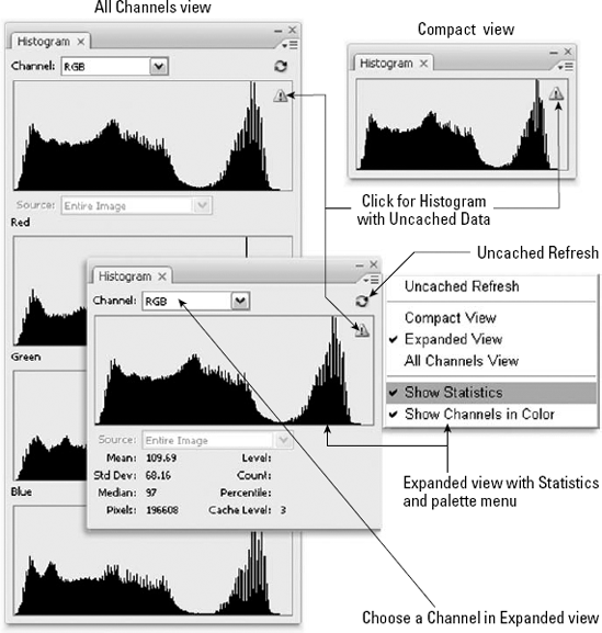
Below the Source menu in the expanded view, you'll find statistical information about the image or layer, which you can toggle on or off by choosing Show Statistics from the palette menu. The statistics give you some useful information about the intensity values in your image, plus you can find out about the intensity Level at the spot under your cursor. You also can view the Count, which tells you the total number of pixels in the image that match a particular intensity.
One of the great strengths of the Histogram palette is the fact that it updates on the fly even while you're working in one of the color adjustments dialog boxes (but only if you have selected the Preview option). Even better, the palette doesn't simply replace the original histogram with the new one; it keeps the original histogram visible behind the adjusted histogram in a grayed-out version.
Tip
When you select a portion of an image, the Histogram palette displays intensity levels and statistics for only the selected area.
Although many of the other palettes become frozen when you're working in a dialog box, you never lose access to the options in the Histogram palette — given that it is used in conjunction with so many of them. One exception? You can't access the Histogram palette options when the Filter Gallery window is open.
Oh, and don't panic if you go to the palette and see a circle with a line through it where the histogram should be: This is simply what's displayed when there is no image open in the Photoshop workspace.
When you choose Image
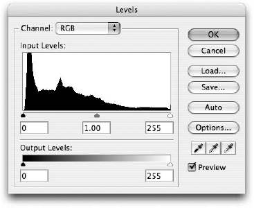
Figure 18.19. Use the Levels dialog box to map brightness values in the image (Input Levels) to new brightness values (Output Levels).
The options in the Levels dialog box work as follows:
Channel: Select the color channel that you want to edit from this pop-up menu. You can apply different Input Levels and Output Levels values to each color channel.
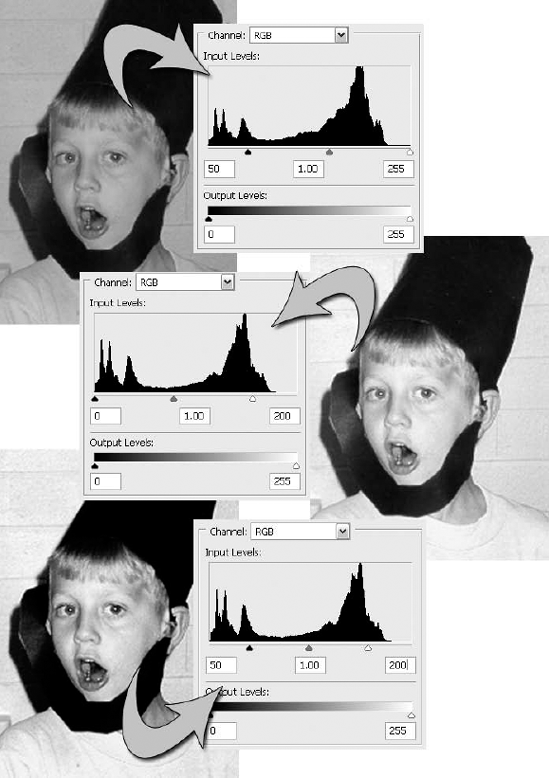
Input Levels: Use these options to modify the contrast of the image by darkening the darkest colors and lightening the lightest ones. The Input Levels option boxes correspond to the slider immediately below the histogram. You map pixels to black (or the darkest Output Levels value) by typing a number from 0 to 255 in the first option box or by dragging the black slider. For example, if you raise the value to 50, all colors with brightness values of 50 or less in the original image become black, darkening the image as shown in the first example of Figure 18.20.
You can map pixels at the opposite end of the brightness scale to white (or the lightest Output Levels value) by typing a number from 0 to 255 in the last option box or by dragging the white slider. If you lower the value to 200, all colors with brightness values of 200 or greater become white, lightening the image, as shown in the second example of Figure 18.20. In the last example of the figure, the first value was raised and the last value lowered, thereby increasing the amount of contrast in the image.
Tip
The Input Levels value is to select the numeric field and then press the up-arrow or down-arrow key. Each press of an arrow key raises or lowers the value by 1. Press Shift with an arrow key to change the value in increments of 10.
Tip
If you press and hold Alt (Option on the Mac) while dragging the black and white Input Levels sliders, you can watch where the first shadows appear and where the first highlight detail begins in your RGB image.
Gamma: The middle Input Levels option box and the corresponding gray triangle in the slider bar (shown in Figure 18.21) represent the midtone, or gamma value, which is the brightness level of the medium-gray value in the image. The gamma value can range from 0.10 to 9.99, with 1.00 being dead-on medium gray. Increase the gamma value or drag the gray slider to the left to lighten the medium grays (also called midtones). Lower the gamma value or drag the gray slider to the right to darken the medium grays.
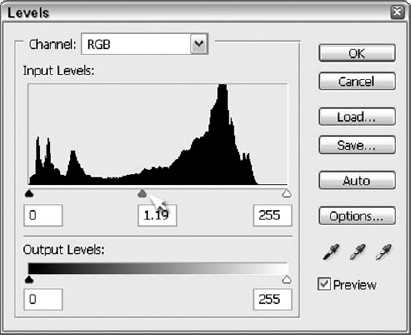
Figure 18.21. The middle slider under the Histogram controls midtones. Drag it to adjust the middle box, or type a new number in the middle of the three Input Levels boxes and see the slider move to indicate the new midtone level.
Tip
You also can edit the gamma value by pressing the up-arrow and down-arrow keys. Pressing an arrow key changes the value by 0.01; pressing Shift+arrow changes the value by 0.10.
Output Levels: Use these options to curtail the range of brightness levels in an image by lightening the darkest pixels and darkening the lightest pixels. You adjust the brightness of the darkest pixels — those that correspond to the black Input Levels slider — by typing a number from 0 to 255 in the first option box or by dragging the black slider. For example, if you raise the value to 100, no color can be darker than that brightness level (roughly 60 percent black), which lightens the image. You adjust the brightness of the lightest pixels — those that correspond to the white Input Levels slider — by typing a number from 0 to 255 in the second option box or by dragging the white slider. If you lower the value to 175, no color can be lighter than that brightness level (roughly 30 percent black), darkening the image. If you raise the first value and lower the second value, you dramatically decrease the amount of contrast in the image. Note that any change to the Output Levels values decreases the contrast of the image. Figure 18.22 shows two halves of the same image: The left half has darks made lighter, and the right half has lights made darker.
Tip
You can fully or partially invert an image using the Output Levels slider triangles. Just drag the black slider to the right and drag the white slider to the left past the black slider. The colors flip, whites mapping to dark colors and blacks mapping to light colors.
Load and Save: You can load settings to disk and save settings to disk using these buttons.
Auto: You might assume that the Auto button in the Levels dialog box performs the same function as the Auto Levels command, discussed earlier in this chapter. And if you were working in a version of the program before Photoshop 7, you'd be right. Photoshop 7, however, added the Options button into the mix. Since then, the effect of clicking Auto in the Levels dialog box (as well as in the Curves dialog box) has depended on the settings in the Auto Color Correction Options dialog box, described next.
Options: Clicking Options in the Levels (or Curves) dialog box brings up the Auto Color Correction Options dialog box, shown in Figure 18.23. The top section, Algorithms, determines the type of correction you want to apply. Instead of the long, somewhat confusing names, these three choices could be labeled Auto Contrast, Auto Levels, and Auto Color, because that's what the choices are equivalent to. In fact, you can rest your cursor over each name to see an informative tool tip telling you just this. Select the Snap Neutral Midtones option, and you'll apply Auto Color's automatic gamma correction as well. If you select the Save as Defaults option, your settings are remembered the next time you click Auto in the Levels and Curves dialog boxes.
The Target Colors & Clipping settings come into play not only when you click Auto in the Levels and Curves dialog boxes but also when you choose the Auto Levels and Auto Contrast commands in the Adjustments submenu. (This is assuming that Save as defaults check box is selected.) Here you can choose colors to assign to the target values for the highlights, midtones, and shadows in your image. You also have access to the Clip values for the highlights and shadows. Type higher values to increase the number of pixels mapped to black and white; decrease the values to lessen the effect. Figure 18.24 compares the effect of the default 0.50 percent values to higher values of 5.00 and 9.99 percent (the highest setting the field accepts). As you can see, raising the Clip value produces higher contrast effects.
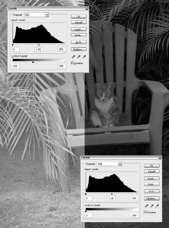
Figure 18.22. Lighten your darks and darken your lights, and you'll get something like these results of raising the first Output Levels value to 100 (left) and lowering the second value to 175.
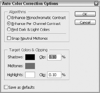
Figure 18.23. Customizing the settings in the Auto Color Correction Options dialog box lets you take the "auto" out of Photoshop's auto correction commands.
Note
The Clip settings have an effect only on Auto Levels and Contrast, not Auto Color. The reason is that Auto Color seeks to neutralize shadows and highlights, as opposed to clipping away the darkest and lightest colors.
Tip
You can combine the Auto Color Correction Options with the Auto Color command to create a truly useful tool. If you have a batch of photos you need to correct that share similar problems — maybe you've scanned an overexposed roll of film from a recent holiday — make adjustments to the first photo with the Target Colors & Clipping settings and make sure you select the Save as defaults option. Now when you open subsequent photos, you can simply choose Image
Eyedroppers: Select one of the Eyedropper tools in the Levels dialog box and click a pixel in the image window to automatically adjust the color of that pixel. If you click a pixel with the black Eyedropper tool (the first of the three), Photoshop maps the color of the pixel and all darker colors to black. If you click a pixel with the white Eyedropper tool (the last of the three), Photoshop maps it and all lighter colors to white. Use the gray Eyedropper tool (middle) to change the color you clicked to medium gray and adjust all other colors accordingly.
Tip
One way to use the Eyedropper tools is to color-correct scans without lots of messing around. Include a neutral swatch of gray with the photograph you want to scan. (For those who own a Pantone swatch book, Cool Gray 5 or 6 is your best bet.) After opening the scan in Photoshop, choose the Levels command, select the gray Eyedropper tool, and click the neutral gray swatch in the image window. This technique doesn't perform miracles, but it helps you distribute lights and darks in the image more evenly. You then can fine-tune the image using the Input Levels and Output Levels options.
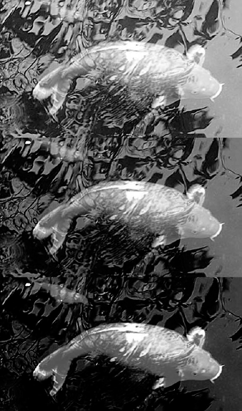
Figure 18.24. This figure shows the effect of the default Clip values in the Auto Color Correction Options dialog box (.50% on the left) and the effect after raising the values (5.00% in the middle and 9.99% on the right).
Tip
By default, the Eyedroppers map to white, gray, and black. But you can change that. Double-click any one of the three Eyedroppers to display the Color Picker dialog box. For example, suppose you double-click the white Eyedropper, set the color values to C:2, M:3, Y:5, K:0, and then click a pixel in the image window. Instead of making the pixel white, Photoshop changes the clicked color — and all colors lighter than it — to C:2, M:3, Y:5, K:0, which is great for avoiding hot highlights and ragged edges.
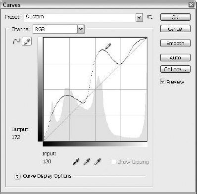
If you want to be able to map any brightness value in an image to absolutely any other brightness value, the Curves command is what you need. When you choose Image
Here's a quick sketch of how the Curves dialog box options work:
Channel: The concept of channels isn't new, certainly, and the use of channels within an adjustment dialog box is nothing new in the case of Curves either. You select the color channel that you want to edit from this pop-up menu, and then apply different mapping functions to different channels by drawing in the graph below the pop-up menu. Of course, as always, the options along the right side of the dialog box affect all colors in the selected portion of an image regardless of which Channel option is active.
Brightness graph: The brightness graph is where you map brightness values in the original image to new brightness values. The horizontal axis of the graph represents input levels; the vertical axis represents output levels. The brightness curve charts the relationship between input and output levels. The lower-left corner is the origin of the graph (the point at which both input and output values are 0). Move right in the graph for higher input values and up for higher output values. The brightness graph is the core of this dialog box, so upcoming sections explain it in more detail.
Tip
By default, a grid of horizontal and vertical dotted lines crisscrosses the brightness graph, subdividing it into quarters. For added precision, you can divide the graph into horizontal and vertical tenths by Alt-clicking (Win) or Option-clicking (Mac) in the graph to toggle between tenths and quarters.
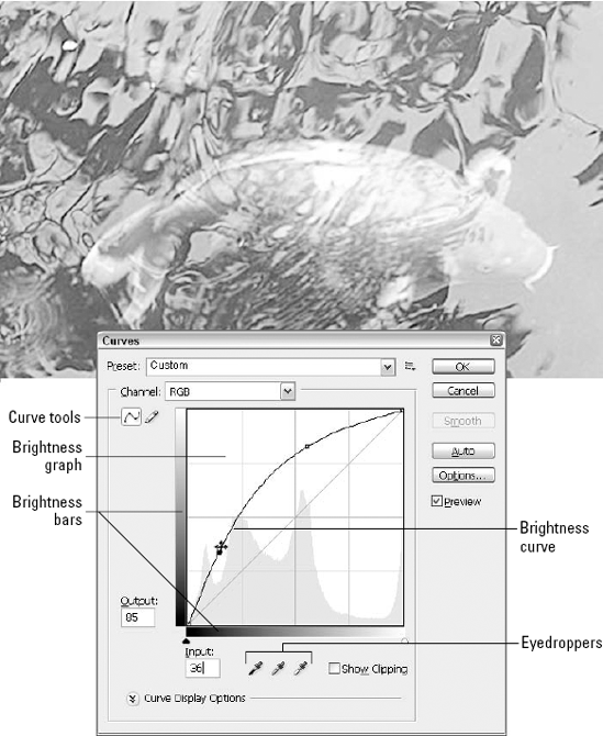
Brightness bar: The horizontal brightness bar shows the direction of light and dark values in the graph. When the dark end of the brightness bar appears on the left — as by default when editing an RGB image — colors are measured in terms of brightness values. The colors in the graph proceed from black on the left to white on the right, as demonstrated in the left example of Figure 18.26. Therefore, higher values produce lighter colors. This setting measures colors in the same direction as the Levels dialog box.
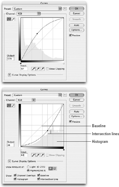
This dialog box has seen some changes in CS3. In previous versions of Photoshop, you clicked the brightness bar to toggle the view between brightness values and ink coverage. Adobe has extended the interface here, so this option is a little more obvious. The bottom portion of the dialog box now presents the Curve Display Options button. By clicking this, you gain access to radio buttons that toggle the view between Light and Pigment/Ink. You also have check boxes that allow you to show the channel overlays, histogram, baseline, and intersection lines. If you select Pigment/Ink, white and black switch places on the brightness bar, as shown in the second example of the figure, and the dialog box then measures the colors in terms of ink coverage, from 0 to 100 percent of the primary color. Higher values now produce darker colors. This is the default setting for grayscale and CMYK images.
Curve tools: Use the Curve tools to draw the curve in the brightness graph. The Point tool (labeled in Figure 18.27) is selected by default. Click in the graph with this tool to add a point to the curve. Drag a point to move it. To delete a point, Ctrl-click (Win) or
The Pencil tool lets you draw free-form curves simply by dragging in the graph, as illustrated in Figure 18.27. This pencil works much like Photoshop's standard Pencil tool, in that you can draw straight lines by clicking one location in the graph and Shift-clicking a different point.
Input and Output values: The Input and Output values monitor the location of your cursor in the graph according to brightness values or ink coverage, depending on the setting of the brightness bar. You can modify the Input and Output values when working with the Point tool. Just click the point on the graph that you want to adjust and then type new values. The Input number represents the brightness or ink value of the point before you entered the Curves dialog box; the Output number represents the new brightness or ink value.
When editing multiple graph points from the keyboard, you may want to activate the points from the keyboard. To advance from one point to the next, press Ctrl+Tab (Control+Tab on the Mac). To select the previous point, press Ctrl+Shift+Tab (Control+Shift+Tab on the Mac). To deselect all points, press Ctrl+D (
Tip
You also can change the Output value by using the up-arrow and down-arrow keys. Click the point you want to modify, and then press the up-arrow or down-arrow key to raise or lower, respectively, the Output value in increments of 1. Press Shift+up arrow or down arrow to change the Output value in increments of 10. Note that these techniques — and the ones that follow — work only when the Point tool is active because you can't change points with the Pencil tool.
Load and Save: Use these buttons to load and save curve settings to disk, respectively.
Smooth: Click Smooth to smooth out curves drawn with the Pencil tool. Doing so leads to smoother color transitions in the image window. This button is dimmed unless the Pencil tool is active.
Auto: This button is identical to the Auto button available in the Levels dialog box: It allows you to apply, automatically, the settings you can establish in the Options dialog box (opened by clicking Options, discussed in the next paragraph) when Auto is clicked. For more details on this concept, see the section "The Levels command" earlier in this chapter; the Levels dialog box has an Auto button too.
Options: Identical to the Options button in the Levels dialog box, this opens the Auto Color Correction dialog box, wherein you can set the Target Colors & Clipping settings discussed in the Levels command coverage earlier in this chapter. Whatever you set in this dialog box is applied by the aforementioned Auto button.
Eyedroppers: If you move the cursor out of the dialog box and into the image window, you get the standard eyedropper cursor. Click a pixel in the image to locate the brightness value of that pixel in the graph. A circle appears in the graph, and the Input and Output numbers list the value for as long as you hold down the mouse button, as shown in the first example in Figure 18.28.
The other eyedroppers work as they do in the Levels dialog box, mapping pixels to black, medium gray, or white (or other colors if you double-click the eyedropper icons, which opens the Color Picker). For example, the White Point Eyedropper tool changes to white whichever pixel you click.
Note
Bear in mind that Photoshop maps the value to each color channel independently. So when editing a full-color image in the Curves dialog box, you need to switch channels to see the results of clicking with the eyedropper. You can further adjust the brightness value of that pixel by dragging the corresponding point in the graph, as demonstrated in the last example of the figure.
Tip
Remember to keep an eye on the Histogram palette to view dynamic, constantly updating results while working in the Curves dialog box.
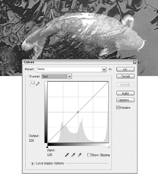
Figure 18.28. Use the standard eyedropper cursor (the first of the three buttons) to locate a color in the brightness graph. Click with one of the Eyedropper tools from the Curves dialog box to map the color of that pixel in the graph. You then can edit the location of the point in the graph by dragging it.
Tricks for Curves
The eyedropper tools aren't the only way to add points to a curve from the image window. Photoshop offers two more keyboard tricks that greatly simplify the process of pinpointing and adjusting colors in the Curves dialog box. Bear in mind, both techniques work only when the Point tool is active.
To add a color as a point along the Curves graph, Ctrl-click (
To add a color to all graphs, regardless of which channel is visible in the Curves dialog box, Ctrl+Shift-click (
The Gradient Map command permits you to apply a gradation as a Curves map. In other words, you can use a gradient map to adjust the brightness values of an image so that they match the values in a custom gradient. Just choose Image
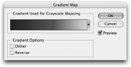
How does this work? Well, any gradient can be expressed as a Curves graph, progressing through a variety of brightness values in each of the three (RGB) or four (CMYK) color channels. When applied as a gradient map, the beginning of the gradient maps black and the end of the gradient maps white. If you apply the Violet, Orange preset, for example, the dark colors in the image map to violet and the light colors map to orange. Noise-type gradients (introduced in Chapter 6) produce especially interesting effects.
When drawing arbitrary curves, you may find the Pencil tool to be more flexible than the Point tool — although you will probably want to follow the Pencil tool with a click of the Smooth button so that any unwanted zigs, zags, or jags in the line can be ironed out in favor of smooth waves.
Sometimes it seems that the camera, be it digital or film, sees more than we do with our eyes. This is normally an observation made when a photo exposes some detail that no one noticed had the scene in question not been captured in a still photo, where every little object could be studied. In truth, the lens on any camera, but especially a digital camera, can't hold a candle to the human eye in terms of capturing light and color.
Modern cameras try their best to keep up with complicated and varied lighting situations, but unlike your eyes, which can probably adjust and absorb the next scene after just one blink, when it comes to a camera, you're often stuck having to choose between sacrificing the darker areas of an image or overexposing the lighter areas because the camera just can't keep up. For example, how many times have you photographed someone against the sky, only to find the sky perfectly exposed and your subject so dark you can barely make out his or her features?
Thanks to Photoshop's Shadow/Highlight command, the camera's limitations can be accommodated. It's a great tool for both the too-bright and the too-dark photo (or portions thereof), pulling detail out of the shadows and shielding your eyes from blinding highlights. You may find that that you're happier with its results on images with dark shadows, however, but you'll be glad to have it in your arsenal for a variety of lighting problems.
To use the command, choose Image
The Shadow/Highlight command examines the image and, according to your settings, deems certain spots to be "shadows" and others "highlights." From there, you adjust the sliders to tell Photoshop just how much brightening or darkening it should perform on those areas. It's a smart feature that's deceptively easy to master. The first two sections of the dialog box, Shadows and Highlights, contain identically named sliders. Naturally, the Shadows section controls the lightening of shadows in an image, and the Highlights section controls the darkening of brighter areas. Here's a list of the options available in both sections:
Amount: In the Shadows section, the Amount slider lets you specify the degree to which the shadows in an image will be lightened. In the Highlights section, the slider controls how much the highlights will be darkened. A value of 0 percent yields no change in the image; a value of 100 percent results in maximum lightening of the shadows (in the Shadows section) or darkening of the highlights (in the Highlights section). The default Shadows Amount setting of 50 percent is a safe place to start when lightening shadows in an image.
Tonal Width: This setting adjusts the range of the pixels that get modified by the command. In the Shadows section, higher values increase the range of shadow areas that gets lightened and lower values concentrate on only the darker regions of the image. In the Highlights section, higher values increase the range of light areas that gets darkened and lower values restrict the adjustment to only the lighter regions. The default Tonal Width value in both sections is 50 percent. If you find that the command is lightening too much of an image, lower the value in the Shadows section to correct it.
Radius: The Shadow/Highlight command determines which areas are shadows and which are highlights by examining each pixel compared to the pixels that surround it. This prevents every stray dark pixel from being classified as a shadow and subsequently lightened, for example. Adjust the Radius sliders to determine the size of each pixel's neighborhood or, in other words, the number of surrounding pixels that are taken into account when each pixel is categorized as shadow or highlight.
Radius is the setting you'll most likely need to adjust on an image-by-image basis. The default setting of 30 pixels is a good place to start, but keep in mind that by increasing the Radius value you apply a less exacting change to the image, and by decreasing the value you lose some of the contrast.
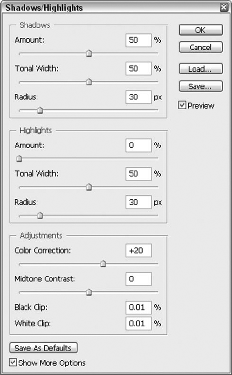
Below the Shadows and Highlights sections is a third area labeled Adjustments. It contains the following options:
Color Correction: Occasionally, the Shadow/Highlight command can make the colors in an image a little less vivid. The Color Correction slider lets you adjust the saturation of the color in the affected portion of the image. In grayscale images, this option is replaced with a general Brightness setting.
Tip
You can achieve an interesting effect by increasing the Amount value in the Shadows section and ramping down the Color Correction setting. The result is an image in which all pixels formerly in the shadowed areas become grayscale. In addition to producing an interesting effect, it also lets you glimpse exactly which pixels are being affected.
Midtone Contrast: This setting is fairly self-explanatory. It increases or decreases the contrast of the midtone pixels in the image. Generally speaking, higher values mean a darker image and lower values produce a lighter, more even result.
Black Clip and White Clip: These values let you adjust the maximum settings for how dark the adjusted shadow pixels will be and how light the adjusted highlight pixels will be. While the limit for both values is 50 percent, it is advisable to never even approach that high a value. On the contrary, keep these settings as low as you can to provide for smooth transitions and healthy contrast levels in your images.
The Shadow/Highlight dialog box lets you save your settings and then load them later using the Save and Load buttons on the right. If you want to designate your current settings as the default for the command, click Save As Defaults at the bottom of the dialog box. Finally, select the Show More Options check box to toggle between the default reduced view, which gives you access only to the two Amount sliders, and the expanded view, which presents you with all the options just discussed.
Tip
Okay, this has been mentioned before, but it's worth repeating: The Histogram palette is a great way to keep track of brightness and tonal changes to an image. It keeps up with you expertly while you're working in the Shadow/Highlight dialog box.
Figure 18.31 shows a photo of a stand of trees at Susquehannock State Park in autumn. The details of the branches and leaves are lost to the shadows, however, and need to be revealed so that the image looks more the way it did to the eye, live, in the park. In the second image, you can see the settings that worked for this image. Your results and settings will vary, depending on your image and its problems.
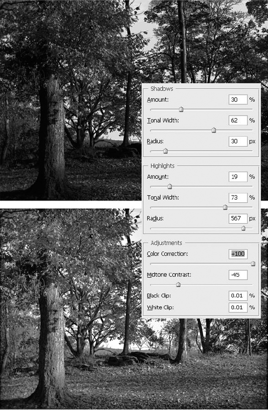
It may seem like the Shadow/Highlight command is all you need for a photo that's too dark or too light, with detail-smothering shadows and blinding, eye-piercing highlights. For some photos, that's true — Shadow/Highlight and its extensive set of tools are all you need. On the other hand, if all-over exposure is the problem and one shadowy or glaring area isn't what you're trying to fix, the Exposure command, which was introduced in Photoshop CS2, is your answer. As shown in Figure 18.32, the dialog box is very simple — three sliders and three eyedroppers for setting black, gray, and white points. There's also a Preview option, so you can see your adjustments take effect in the image window, as you make them.
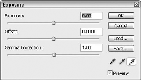
Figure 18.32. Adjust your photo's overall Exposure with three simple sliders. Used alone or with the help of other Adjustment submenu commands, the Exposure tools can fix underexposed or overexposed photos quickly.
Here are some details about your options in the Exposure dialog box:
Exposure: This slider does just what you'd expect: It increases or decreases exposure, depending on how far you drag it to the left or right. Drag to the right, and the image brightens; drag to the left and it darkens. Sometimes, this is the only slider you need to use, depending on the nature of the problems caused by the exposure of the original image. If the colors look fine after just a slight increase in the exposure (brightening an underexposed image, for example), you won't need to tinker with the other two sliders at all. On the other hand, if sliding the Exposure setting in either direction creates colorful havoc, the Offset and Gamma sliders (to be explained next) may need a tweak.
Offset: Set to 0.00 by default, increasing it both decreases contrast and brings all the pixels closer to gray. Decreasing the Offset increases contrast and brings all pixels closer to black.
Gamma: This setting adjusts the brightness of the midtone values. Set to a default of 1.00, an increase in Gamma brightens the colors, eventually shifting the entire image to white. Drag the other way, and the colors are darkened.
Eyedroppers: Click the Set Black Point button (the first of three eyedropper buttons), and then click the pixel in your image that's closest to black. The image exposure adjusts as soon as you click the pixel. The middle button, Set Gray Point, establishes a midpoint for your photo's pixel range, and the Set White Point button is used to establish the white or lightest pixel in the photo. In the photo in Figure 18.33, the black point could be any of the shadows on the trees or the shadowed ground, a midpoint or gray pixel could be on the tree's bark or the ground, where the sun has illuminated it slightly, and a white point would be in the sky, or where sunlight is illuminating a particular leaf. Figure 18.33 shows an original photo with exposure problems — the same one used to demonstrate Shadow/Highlight, to show that two different tools can be used to attack the same problem — and includes the "after" version and the Exposure dialog box so you can see the settings that fixed the photo.
New in Photoshop CS3, the Black and White dialog box is the first step in a more long-term goal for Adobe — to offer a complete tone-adjustment solution for black and white and duotone images. For a first step, it's not too shabby, as you've got 10 presets that meet lots of needs, and six sliders, one per RGB and CMY (well, no K) channel. As shown in Figure 18-34, you also have a Tint section, which if turned on, allows you to create duotones of any shade in the rainbow.
Now, it won't be terribly dramatic here in black and white (we can't show you a "before" in color and an "after" in black and white), but suffice to say that this dialog box replaces or betters several other tools that people traditionally use for going grayscale. It's better than switching to Grayscale mode, and it's better than Desaturate or the Sponge tool. (Yes, some people will scrub over an image with the Sponge tool set to Desaturate, to remove color — not because we told them to, but they just feel compelled to do so.)
To use this fantastic dialog box, after opening your image (and perhaps selecting a single layer or making a selection), choose Image
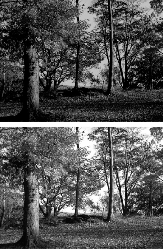
Figure 18.33. Here are the before (top) and after (bottom) images. The underexposure resulting in darks that hide details can be remedied by increasing the exposure and increasing Offset and Gamma just a tiny bit.
Figure 18.34. Quickly turn a color photo to black and white or a duotone, using any one of the presets and/or the channel sliders.
Interestingly, even if you've used the Channels filter prior to opening the dialog box — say displaying only the Red or Green channel and then opening the Black and White dialog box — the results of the dialog box's opening and application of default settings are unaltered. The changes that you can make through the dialog box, of course, are all channel-based, but don't waste your time tinkering with the Channels palette beforehand, unless you want to change something about the photo in general, using the Channels and another correction tool along with them before the image is converted to black and white.
Overall, the results of the dialog box are quite impressive, and the flatness one typically sees when color is simply drained out of an image is not seen here. A very convenient feature is the Tint option, which allows you to create duotones, using the Hue and Saturation sliders. They work like the sliders in the dialog box of the same name, but of course, you're only getting the addition of a single color as you drag the sliders, and you're starting with a black and white photo (or one that's become a black and white photo, actually).
Every one of the commands discussed in this chapter is applicable to a single layer at a time. If you want to correct the colors in multiple layers, you have to create a special kind of layer called an adjustment layer. Adjustment layers are layers that contain mathematical color correction information. The layer applies its corrections to all layers beneath it, without affecting any layers above.
You can create an adjustment layer in one of two ways:
Choose Layer
Click the button that looks like a black and white cookie (the New Fill or Adjustment Layer button) at the bottom of the Layers palette, also shown in Figure 18.36. The first three options — Solid Color, Gradient, and Pattern — are dynamic fill layers, as discussed in Chapter 15. Choose any one of the remaining options to make a new adjustment layer.
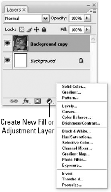
Figure 18.36. The Fill and Adjustment Layer menu offers three Fill options and 14 Adjustment Layer choices.
If you choose a command from the Layer
Regardless of the color adjustment you select, it appears as a new layer in the Layers palette, as shown in Figure 18.37. Photoshop marks adjustment layers with special icons that look like miniature versions of their respective dialog boxes. This way, you can readily tell them apart from image layers. You can double-click these icons to reopen the dialog box used to make the adjustment in the first place.
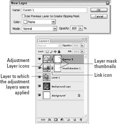
Figure 18.37. The New Layer dialog box appears if you start the Adjustment Layer process from the menu; name your layer, and choose its Color and Mode. The Layers palette is shown after two Adjustment Layers have been added; the name of the layer is determined by the choice made from the submenu of adjustments that can be made.
The whole concept of using Adjustment Layers to apply corrections to multiple layers may not seem so revolutionary, given that there are other ways to make your adjustments affect multiple layers. Before you write off everything said so far about Adjustment Layers as some sort of hype, though, consider these points:
They're forever editable. As long as the adjustment layer remains intact, stored in one of the four formats that support layers (native Photoshop PSD, TIFF, PDF, and PSB), you can edit the color correction over and over again without damaging the underlying pixels. Unlike standard color corrections that alter selected pixels directly, adjustment layers have no permanent effect on the pixels.
Warning
When editing the settings for an adjustment layer, be sure to double-click the first icon that precedes the layer name (labeled "Adjustment layer icon" in Figure 18.37). Double-clicking elsewhere displays the Layer Mask Display Options or the Layer Style dialog box, or it allows you to rename the layer.
They offer versatile layer masking. You also can adjust the affected area to your heart's content. Unless it's grouped with another layer, an adjustment layer covers the entire image like a tight-fitting blanket. An adjustment layer doesn't contain pixels, so painting inside the layer changes its layer mask. Paint with black to remove the correction from an area; use white to paint the correction back in.
Tip
In fact, if a selection is active when you create a new adjustment layer, Photoshop automatically creates a layer mask according to the selection outline.
You can reorder your corrections. As with any layers, you can shuffle adjustment layers up and down in the stacking order. For example, if you decide you don't want the correction to affect a specific layer, just drag the adjustment layer to a level in the Layers palette below the layer you want to exclude. If you're juggling multiple adjustment layers, you can shuffle the adjustment layers to change the order in which they're applied. This includes the standard reordering keyboard shortcuts, Ctrl+[ and Ctrl+] (
You can Fade corrections. As you know, you can use the Edit
You can correct using blend modes without ballooning file sizes. Some people prefer to correct overly light or dark images using blend modes. For example, such a person might take an image, copy it to a new layer, and apply the Multiply mode to darken the layer or Screen to lighten it. The problem with this approach is that it increases the size of the image in memory. Duplicating the image to a new layer requires Photoshop to double the size of the image in RAM. If you darken or lighten through an adjustment layer, no such size increase or memory hogging occurs.
Tip
Adjustment layers permit you to apply this same technique without adding pixels to RAM. Create a new adjustment layer with the Levels option selected, and after the Levels dialog box appears, press Enter or Return to ignore it. Next, select Multiply or Screen from the blend mode pop-up menu in the Layers palette. The adjustment layer serves as a surrogate duplicate of the layers below it, mimicking every merged pixel. It does all this without any significant file size increase.
You can change one adjustment to another. After applying one kind of adjustment layer, you can convert it to another kind of adjustment layer. For example, you could swap an existing Levels adjustment for a Curves adjustment. To do so, choose the desired color adjustment from the Layer
The images produced by modern digital cameras can be nothing short of breathtaking. Yet by the time a photo leaves a digital camera and enters an image-editing program like Photoshop, even a noncompressed TIFF can be many steps removed from what the CCD or CMOS (the camera's "eye") saw. That's because the camera itself takes that input from the sensor and performs a slew of processes meant to make the image more presentable. These can include white-balance adjustments, color and brightness correction, and sharpening and compression passes over an image. It's almost as if there was a tiny little person inside your camera, using a tiny little computer running a tiny little version of Photoshop, and that little guy is trying to make your photos look better.
Although many people would welcome the help of the tiny guy — after all, the picture generally looks brighter, more balanced, and sharper by the time it's opened — the real digital photo pro knows that almost any improvement comes at a cost. In truth, lots of the original information captured by the camera has been lost by the corrections. And who is that suspicious little guy inside the camera anyway? Why should we trust him to correct our images willy-nilly? He may know a few things about image editing, but there's certainly no way he could have a big helpful book like this one inside the camera for reference. For professional digital photographers and graphic designers, every last pixel counts, and there's no way those big-leaguers are going to trust the judgment of some little guy who lives in a camera over their own judgment. "Eliminate the little middle man!" is the professional's rallying cry.
Luckily, all hope is not lost. Some midrange and high-end digital cameras now offer the option of saving images as Camera Raw files, which skip all that post processing and save a perfect, pristine representation of the exact image as originally captured. It's very much akin to a digital negative. Between the releases of Photoshop 7 and Photoshop CS, Adobe quietly introduced a plug-in for the program that was capable of opening and making adjustments to certain Camera Raw files. The current phenomenally expanded version of the Camera Raw plug-in gives you access to better image detail and a wider range of colors than would be available otherwise. In many cases, raw format images offer more than 24 bits of information in a full-color file; some cameras provide up to 30 or 36 bits, meaning you have billions and billions of potential colors to work with. For professionals who need to get the absolute most out of their digital images, getting access to this raw data is nothing short of a godsend. Camera Raw lets you be the little guy in the camera, taking the raw pixels captured by the camera's sensor and manipulating them yourself before you open the image up in Photoshop proper.
It's important to know that Camera Raw files are proprietary, meaning that each and every manufacturer adheres to a different and unique format. At this time, Photoshop supports Camera Raw files created by several different cameras from Canon, Fujifilm, Leaf, Minolta, Nikon, and Olympus. Additionally, Adobe has pledged to continue expanding support to more manufacturers and models over the life of the product. Check www.adobe.com/products/photoshop/cameraraw.html to see if your camera has been added to the list.
Instead of the gigantic, unmanageable files you might expect them to be, Camera Raw files are very efficiently compressed, and Adobe's Camera Raw dialog box can make adjustments at an impressive speed. Instead of displaying the image, Photoshop first brings up the massive Camera Raw dialog box, as shown in Figure 18.38.
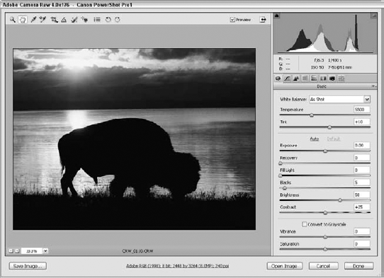
Figure 18.38. Think of the Camera Raw dialog box as your first stop along the road to correcting raw images with Photoshop. Here an image captured with Canon Powershot Pro1 digital camera is adjusted.
Tip
Before delving into the intricacies of Camera Raw settings, here's a little-known tip: Holding down the Shift key bypasses the Camera Raw dialog box altogether and immediately opens the image inside Photoshop. If you've used Camera Raw on the image before, the last settings you used are automatically applied as the image opens. If you've never opened the image before, Camera Raw's default settings for your camera are used instead.
At the bottom of the Camera Raw dialog box, you'll see a link that describes the file's current workflow options. Click the link to open the Workflow Options dialog box, shown in Figure 18.39.

You can set the target color space of the image (probably the same as the color settings you're currently using), the number of bits per channel desired, even the size and printing resolution of the image.
Space: Use this list to select your target color space profile. You'd typically set this to the same color space in Photoshop in which you're working (Adobe RGB). The source image usually has the native color space of the camera embedded in it, and if you want to use a color space that isn't on the list, choose ProPhoto RGB. You then can convert to the working space of your choice after you're finished in the Camera Raw dialog box and open the image in the Photoshop workspace.
Depth: Here you'd set the bits-per-channel that you want the image to open with — either 8-bit or 16-bit.
Size: By default, the image opens in the Camera Raw dialog box at whatever dimensions the camera took the shot at. If you want to resample the image to different dimensions, you'd use the values on this drop-down menu to specify an alternative.
Camera Raw uses slightly different interpolation methods than Image Size, but the results are very good. And if you're going to downsample anyway, it probably will save you some Camera Raw processing time if you go ahead and downsample now. If your camera uses nonsquare pixels, the default Size amount is automatically set to try to maintain the same approximate number of pixels when the image is converted to square pixels in Photoshop. To achieve this, one dimension (width or height) is upsampled and the other downsampled. Setting Size to the next highest choice causes the pixel count to be maintained along the high-resolution dimension of the image; the low-resolution dimension is upsampled to achieve square pixels (almost certainly a better choice for nonsquare pixel images).
Resolution: This is where you set the print resolution the image should use. You can easily change this later with the Image
As you can see in Figure 18.38, the Basic panel in the Camera Raw dialog box is composed of three sections: settings for adjusting white balance, settings for adjusting the tonal qualities, and a section for converting the image to grayscale. White balance is a process where something white (like a sheet of paper) is typically used to calibrate the camera; with many cameras, this information is recorded at the time an image is shot and saved as metadata in the Camera Raw file. When available, the Camera Raw dialog box uses this white balance information as the default when it opens an image; hence the As Shot setting in the White Balance pop-up menu. If Camera Raw can't read white balance info from your camera, it makes a decent guess. In this case, As Shot is the equivalent of the Auto setting. The pop-up menu also contains several other options that reflect various lighting conditions that may have been present when the image was first shot. The options contain different presets for the Temperature and Tint sliders below. The White Balance pop-up menu is a good place to start when adjusting white balance. It's quite possible you'll be happy with one of the preset options. If not, you can tweak the two sliders below the pop-up menu by hand:
Temperature: This setting lets you modify the color temperature of an image. Increase the Temperature value (which is measured in Kelvin) to bring out the more yellow colors in the image, as seen in the middle example in Figure 18.40. The right example shows a decrease in Temperature to cool the image into the realm of blue.
Tint: The Tint slider adjusts and compensates for different color tints that the image may contain. Drag the slider to the left to increase the amount of green in the image, and drag it to the right to remove green and add in magenta values.
Tip
You also can set the white balance manually by selecting the White Balance tool (it's the eyedropper located in the top-left corner of the dialog box) and clicking at a spot in the image that you'd like to assign as neutral, either white or gray. The White Balance settings in the Adjust panel snap into a position that adjusts the selected pixel to white and the other pixels in the image accordingly.

Below the White Balance settings are five sliders that let you make adjustments to the tonal qualities of an image. Generally, you should adjust these controls in the order they're presented:
Exposure: Quite simply, the Exposure setting adjusts the brightness of the image. But if you look a couple of sliders down, you see one labeled Brightness, so now you may quite rightly be wondering, "What gives?" The Exposure slider is based on the f-stop of a camera (a setting of +1.00 is the equivalent of opening the lens one stop wider), and adjusts in much larger increments than the Brightness setting. In fact, adjust this value more than a little, and you're bound to encounter some clipping, which occurs when pixels are pushed to pure white or black and lose all detail. It's best to adjust this setting until it begins to clip, ramp it back a smidge, and then do your finer brightness adjustments with the Brightness slider.
Shadows: Increase this value, and watch as more and more pixels get sucked into darkness and, eventually, pure black. It may appear as though the Shadows slider is just upping the contrast in the image, but it's really performing a function that's more in line with the black point slider in the Input Levels section of the Levels command, discussed in the preceding chapter.
Alt+drag (Option+drag on the Mac) the Exposure or Shadows slider triangles to see a dynamic depiction of any and all clipping pixels in the image. Different colors mean there is clipping only in one or two color channels. For Exposure, black means no clipping for highlights; contrariwise, white means no clipping for shadows. Figure 18.41 shows the clipping display for the Exposure slider.
Brightness: As mentioned previously, this setting makes gentle adjustments to the general brightness levels of the image.
Contrast: This setting increases (higher values) or decreases (lower values) the contrast in the midtone colors of the image.
Saturation: This is the basic saturation option that you've encountered a number of times before. Decrease the value to −100 to remove all colors from an image; increase the value to +100 to get colors so vibrant you may need to close your eyes.
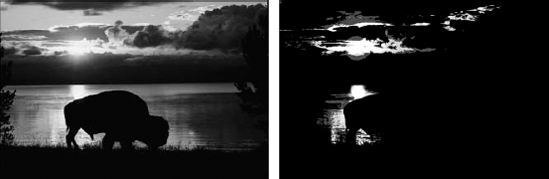
Figure 18.41. Holding down Alt (Option on the Mac) while using the Exposure slider (see this slider in Figure 18.38) brings up a graphic display of which pixels are being clipped to pure white (right). In this case, the brightest clouds are clipping.
Click the Detail tab to access options you can use to adjust the sharpness and smoothness of a Camera Raw image. The Detail panel contains the following three settings:
Sharpness: The Sharpness slider works in much the same way as the Unsharp Mask filter, which is discussed in Chapter 8. The biggest difference lies in the fact that the Camera Raw dialog box does not give you controls for Radius or Threshold. This is because Camera Raw calculates these factors for you using information based on the camera model and the ISO (or light sensitivity) for the image.
Luminance Smoothing: This slider adjusts the amount of blurring that the Camera Raw dialog box applies in an attempt to reduce grayscale noise in an image. Depending on the ISO and general quality of the camera, a little bit of noise — those random speckles that lower the quality of an image — is a common occurrence. Increase this setting to smooth out some of the noise, but don't go overboard: Too much smoothing, and you'll lose valuable detail in the image.
Note
The Camera Raw dialog box fully supports multiple undos through the usual keyboard shortcut, Ctrl+Alt+Z (
Color Noise Reduction: This slider performs the same function as Luminance Smoothing, except it works toward decreasing the amount of colored noise artifacts in the image.
A camera lens is an imperfect thing. As a result of lens imperfections, which are generally more prevalent in less expensive lenses, many times an image looks terrific in the center, but subtle problems start to creep in toward the edges and in the corners. Clicking the Lens Correction button in the Camera Raw dialog box gives you access to two additional panels full of settings. The first of these, Lens, compensates for the imperfections of a camera lens.
Chromatic Aberration Fix Red/Cyan Fringe: One of the problems that lenses can introduce into an image is color fringing, where sharp edges seem to have a fringe of pixels running along them. This happens when the color channels are slightly different sizes, creating a sort of misregistration like a bad printing job of the Sunday funnies. Commonly, this fringe runs red on the side of the edge toward the center of the image and cyan along the other side. The Chromatic Aberration Red/Cyan slider, shown in Figure 18.42, fixes this by slightly scaling the size of the red channel in relation to the green.
Chromatic Aberration Fix Blue/Yellow Fringe: Similar to the Chromatic Aberration Red/Cyan slider, this control can eliminate a blue/yellow fringing problem on high-contrast edges found along the sides and in the corners of images by slightly scaling the blue channel in relation to the green.
Tip
If your image has both kinds of fringing, hold down the Alt key (Option on the Mac) as you adjust one slider to temporarily turn off the effects of the other slider. And remember that these sliders do nothing to the center of an image. This type of chromatic aberration occurs only along the sides and in the corners of images.
Vignetting Amount: As shown in the top image in Figure 18.43, imperfections in lenses also can cause the edges and corners of an image to be darker than the center, creating a sort of vignette that frames the image. Drag the Vignetting Amount slider triangle to the right to lighten the edges of the image, which helps to eliminate the problem. And should you want this type of vignetting, drag the Vignetting Amount slider triangle to the left.
Vignetting Midpoint: This controls the vignetting transition from dark to light. Drag to the left to increase the range of the vignetting compensation; drag to the right to decrease it.
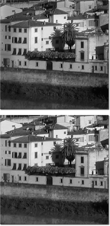
If you're using Camera Raw, it's safe to assume that Photoshop has a profile based on the model of your camera. But it's possible that your particular camera might not exactly match the one Adobe used when they created the profile for your model. If your camera has a repeatable, predictable problem that you always need to compensate for, you may want to use the controls available in the Calibrate tab of the Advanced Camera Raw settings. The first option, Shadow Tint, lets you fix a color cast lurking in the dark areas of the image. As with the Exposure and Shadows sliders in the Adjust tab, holding down the Alt key (Option on the Mac) gives you a look at any clipping that might occur as a result of your adjustments.
The remaining six sliders exist so you can give your Camera Raw settings a little extra tweak. Each color channel has both a hue and a saturation slider, enabling you to account for slight differences between your actual camera and the model of your camera that Adobe used to build its Camera Raw profile. There's no right or wrong way to use these sliders. The whole idea is to adjust things until they look right to you. If, after tweaking all the controls in the Adjust, Detail, and Lens tabs, those skin tones still don't look quite right, this is your chance to fix them.
If you feel you've thoroughly botched things with the Camera Raw dialog box, just hold down the Alt key (Option on the Mac) and, as with many Photoshop dialog boxes, the Cancel button changes to a Reset button. Click it, and the image is restored to its state when you first began this session of Camera Raw adjustments. You also may notice that the OK button changes to an Update button; clicking this updates the associated Camera Raw settings to reflect your changes and closes the Camera Raw window, but it doesn't open the image in Photoshop. And holding down the Shift key makes the OK button turn into a Skip button, in case you want to open an image with its default settings (disregarding any changes you may have already made).
After you are happy with your Camera Raw settings, click the OK button, and Photoshop proceeds to apply your adjustments and open the image. Note that you can't save the image back to the Camera Raw format. Just to thoroughly confuse things, there is a Photoshop Raw format available when you choose Save As, but that's a different format useful at times for saving images you plan to transfer between different computer systems. Photoshop is incapable of writing the raw format used by your digital camera. After you adjust the Camera Raw settings, Photoshop essentially opens a copy of your image, leaving the original file untouched.
Yet, here's an odd thing: The original file is untouched, but you probably will notice that the Bridge preview of your Camera Raw image has changed to reflect the adjustments you made. How can this be? Well, the changes you make with Camera Raw get saved in one of two places. By default, the changes are stored in the Camera Raw database, located on the Macintosh in the Preferences folder of the user, and under Windows in the user's Application Data folder. When the Bridge displays a RAW format image, it draws the preview both from the image and from the settings for that image in the database. The problem with this is that your Camera Raw settings will fail to travel with your images to another computer. Adobe's solution can be found in the Camera Raw Preferences dialog box, which you can access by selecting the Advanced radio button, clicking the right-pointing arrowhead next to the Settings pop-up menu, and choosing Preferences. Choosing Sidecar ".xmp" Files from the Save image settings in pop-up menu instructs Photoshop to store the Camera Raw settings for an image not in the default database, but rather in a small file located in the same folder as the image. The data file shares the same base name as the image. For example, the image "watermelon.orf" would have its settings stored in a file called "watermelon.xmp." Keep these sidecar files along with the main image files when you move images or burn CDs, and your Camera Raw settings will travel with you.
Note
These XMP files can be the same as those mentioned earlier in the chapter in the section "Using the File Info Command." In fact, when Camera Raw opens an image, it stores the settings in the XMP metadata. With File Info, you can export this metadata into an external XMP file and then load it back into Camera Raw.
Whether you decide to have your image's Camera Raw settings saved in the main Camera Raw database or in an individual XMP file, it's a darned good thing you can save them, isn't it? It would be a drag to have to try to recreate those Camera Raw settings from scratch if you should decide to open the image from the original raw file. But when you think about it, lots of the image problems you compensated for exist not just in that image, but in every image you take with that camera. Wouldn't it be great if you could save the settings from that image and apply them to other images? Apparently, Adobe figured you'd say, "Yes!," because Camera Raw lets you do just that.
When you open an image in the Camera Raw dialog box, by default the Settings pop-up menu is set to Camera Default, meaning that the default Camera Raw settings for your camera are being applied. Choosing Selected Image means that if you've ever opened that image with Camera Raw before, your last settings are automatically applied. Previous Conversion uses the settings from the last opened raw format image that came from the same camera. To save your current settings so that they can be used by other images, click the right-pointing arrowhead next to the Settings pop-up menu and choose Save Settings. You can name the settings anything you like, but make sure you save them inside the suggested Camera Raw folder (which is inside the Presets folder in the application folder on your hard drive, in case you're curious). From then on, the settings are available in the Settings pop-up menu. If for some reason you ignore the advice and choose to save the settings somewhere else, you'll need to use the Load Settings command (available in the same pop-up menu as the Save Settings command) to access them in the future.
When the Advanced mode is activated, it's also possible to save just a subset of settings. Maybe your camera consistently introduces chromatic aberration and vignetting to images, so you always want to apply those settings to images from that camera, but you'd rather tweak the other settings on an image-by-image basis. Click the right-pointing arrowhead next to the Settings pop-up menu, and choose Save Settings Subset. You'll be presented with a column of check boxes, enabling you to specify which settings you want included in the subset. The Subset pop-up menu contains a few preset options, designed to save you from having to click a bunch of check boxes. From there, click the Save button, and save your subset in the Camera Raw folder. If you want to delete settings you previously saved, choose them from the Settings pop-up menu, click the ever-popular right-pointing arrowhead, and choose Delete Current Settings.
It's also possible to override Camera Raw's default settings for your camera model by choosing Set Camera Default from the pop-up menu that appears when you click the right-pointing arrowhead. Thereafter, the Camera Default option in the Settings pop-up menu will load your current settings. To restore Camera Raw's default settings for your camera, choose Reset Camera Default.
Applying saved Camera Raw settings to a raw image before opening it in Photoshop is pretty straightforward. Start by double-clicking the raw image to open it in the Camera Raw dialog box. If you saved your settings in the Camera Raw folder as Photoshop suggested (see the preceding section), the settings appear at the bottom of the Settings pop-up menu. Just choose the settings, click OK, and go to work inside Photoshop.
But remember what happens to the OK button when you hold down the Alt key (Option on the Mac) inside the Camera Raw dialog box? It turns into an Update button, and clicking that button updates the Camera Raw settings for that image by changing the data saved in either the Camera Raw database or the image's XMP sidecar file. You then can see the change evident in the thumbnail and preview within the Bridge. (It's important to remember that Camera Raw never actually changes a single pixel of the raw format file. It can only change the data applied to that file which is saved in the database or the XMP file, and then open a copy of the image in Photoshop with that data applied. But you can't save back to your camera's raw format from Photoshop, so the original raw file — reflecting exactly what your camera's sensors saw — is always there on your hard drive.)
Because Photoshop is such a flexible tool, it should come as no surprise that you can actually update raw images with new Camera Raw settings without even opening the images. With one or more raw format images selected in the Bridge, either choose Edit
And in case that seems all too simple for a complicated feature like Camera Raw, you're exactly right. Clicking the Advanced radio button opens what is basically the Camera Raw dialog box without preview but with the Save Settings Subset dialog box. You can load saved settings, modify them, apply them, and save them as new settings or as just a subset of settings. Seriously, go nuts. Just click Update when you're finished, and the data for the selected image or images automatically updates to show the fruits of your labor.
And if that wasn't enough of an automated way to end this chapter on file management and automation, let me point out that Camera Raw works beautifully with actions and the Batch command. Just start recording an action, open a raw image, set the Settings pop-up menu to Selected Image so the action draws on each image's saved Camera Raw data, perform your action, and click the stop button in the Actions palette. You can then apply that action to a whole batch of raw images with the Batch command. And really, however cool it may be, don't just sit there watching the batch processing. Go away and read a book or something. Photoshop finds you distracting.
In this chapter, you learned about mapping colors with Invert, Equalize, Threshold, and Posterize, and tweaking colors with the Hue/Saturation dialog box. You learned how to raise and lower saturation levels, how to colorize grayscale images, and conversely, how to take a color photo and give it depth and detail as a black and white photo with the aptly-named Black and White dialog box.
You also learned about correcting colors with Replace Color, Selective Color, Variations, Photo Filter, and Match Color commands, and to use the Histogram palette. The process of boosting brightness and contrast levels, editing specific color values with Curves, and using the Shadow/Highlight command were also covered, along with techniques for fixing exposure problems and correcting multiple layers at once with adjustment layers. Finally, Photoshop's support for Camera Raw was covered, including techniques for correcting Camera Raw images.