All things considered, Photoshop's handling of type has come a long way. The journey has taken us from a Type tool that was about as forgiving and friendly as trying to write with a broken pencil while riding in an old truck on a bumpy road to the very efficient, useful, and powerful tool we have today. If you weren't there for those bumpy rides, consider yourself lucky.
The lack of layers before version 3 was the biggest problem; after you typed the text, it was part of your image, no editing, no taking it back or saying, "Hey, how does it look without the type?" There also was no spell-check, so if you weren't a spelling bee champion or the most accurate typist, it was very frustrating. To say the least.
With the release of version 5 came something new and welcome — editable bitmapped type. Suddenly, you could type your text and then go back and edit it. Imagine that! You could adjust the font, size, and color of the type, responding to the ubiquitous need for changes after first creating an image and adding type to it. You could adjust kerning and leading, giving you the ability to essentially typeset your images and not just rely on the defaults. Photoshop 5.5 expanded the type possibilities further, but with version 6, type finally evolved — into a graceful, intelligent part of the application. Here are some of the advances that users of Photoshop 5.5 and above can count on:
Scale text as large as you want, without any repercussions, just as you could with any vector object — because the text is vector text.
Create and edit text by typing directly on the image canvas — no more side trips to the Type tool dialog box required.
Create text inside a frame and then apply paragraph formatting to control hyphenation, justification, indents, alignment, and paragraph spacing. You can even create lists that use hanging punctuation and control word and character spacing in justified text, as you can in QuarkXPress, Adobe PageMaker, and InDesign.
Make per-character adjustments to color, width, height, spacing, and baseline shift.
Bend, twist, and otherwise distort text using a simple Warp Text dialog box instead of wrestling with the Wave filter or other distortion filters.
Convert characters to shapes that you can then edit, fill, and stroke just as you do objects you create with the shape tools (which are explored in Chapter 15). Alternatively, you can convert text to a work path.
Rasterize text so that you can apply any filters or tools applicable to ordinary image layers.
Photoshop 7 introduced a few useful type features, such as the type mask tools and the Check Spelling command, but you still couldn't put type on a drawn path, a feature by now standard to most illustration and layout programs. The closest Photoshop got was the Warp Text command, which is nice but fairly limited.
That limitation disappeared in Photoshop CS. Photoshop CS2 didn't really offer any major changes in the Type tool, but with Photoshop CS3, we see what may seem like a small change, but it's a huge one: We can now change the size of the font previews. If you've ever been nearly pressing your nose to the monitor, trying to see the font samples on the right side of the Font drop-down list (on the Type tool's Options bar and in the Character palette), you can certainly appreciate the excitement at being able to view those samples in Large and Extra Large.
Of course, even if you think the aforementioned improvement is so minor it's hardly worth mentioning, you have to admit that Photoshop continues to offer great features with regard to creating and editing type. In addition to supporting text on a path, Photoshop also can create and modify text around and even inside shape layers and paths. Finally, Photoshop's text features are fully in line with those found in page-layout, illustration, and even advanced word-processing programs. You should be able to make them a regular part of your text routine in no time.
Note
Woo hoo! You can stop squinting now. Choose Preferences
Note
This book doesn't cover the options for formatting Chinese, Korean, and Japanese text, which become available when you select the Show Asian Text Options check box on the General panel of the Preferences dialog box. Like the rest of Photoshop's type controls, these options should be familiar to you if you work regularly with type in these languages. But if you're not sure what each control does, check the Photoshop online help system for details.
Photoshop's Type tool produces vector type. But that's not all. You also can create a text-based selection outline or work path, convert each character to a separate vector object, or create a bitmap version of your text. Here's a rundown of your type choices:
To create regular text, select the Type tool (also known as the Horizontal Type tool, which is the default Type tool), click in the image window, and begin typing. Or, to create paragraph text, click and drag with the Type tool to create a text frame that's roughly the size you want the paragraph/s to take up in the image and then type your text in the frame. You then can choose from a smorgasbord of type-formatting options, apply layer effects, and more. There are a few things you can't do, at least while the type is still considered type, such as apply the commands in the Filter menu or use the standard selection tools. You can apply these features if you rasterize the type, but that's covered later on.
Tip
The process of selecting text can be somewhat enigmatic, but after you know how it's done, it's no big deal. You can use the Type tool to drag through and select existing text (note that the I-beam cursor changes from being in a small box to just being the I-beam when you get right next to existing type), and then just like you use your mouse to select text in a word processor, you can drag through the type, selecting as much or as little of it as you need. You also can use your mouse to select portions of the type on a given layer, without dragging — double-click to select a single word, triple-click to select a single line, quadruple-click to select an entire paragraph, or quintuple-click to select everything on the active Type layer. If "quintuple-click" sounds like you might end up short-circuiting your mouse, you can also select all the text on a given Type layer by double-clicking the T icon on the type layer. Easy as pie.
To produce a text-based selection outline, select the Horizontal or Vertical Type Mask tool from the Type tool flyout menu, shown in Figure 16.5 later in this chapter, and create your text. Photoshop covers your image with a translucent overlay, just like when you work in the Quick Mask mode, and your text appears transparent. You can apply all the same formatting options that are available when you work with ordinary text. When you commit the text (by clicking another tool or clicking the green checkmark at the far right end of the Type tool's Options bar), the overlay disappears and your selection outline appears.
Tip
You also can create type masks using the regular Type tool. Simply type and format your text as usual. Then Ctrl-click (

After creating text, choose Layer

Choose Layer
Finally, you can convert text to bitmapped type by choosing Layer
Warning
After you rasterize text or convert it to a shape or work path, you can't go back and run the spell-checker or change the text formatting as you can while working with vector text or type masks. So be sure that you're happy with the spelling, capitalization, and font before you convert it. And here's a tip embedded right here in this caution: You can save a copy of the vector text in a new layer so that you can get it back if needed.
When you save images in the PSD, PDF, TIFF, or PSB format, you must select the Layers option to retain the vector properties of your text — assuming you still have un-rasterized Type layers in your image. If you deselect this option or save in a format that doesn't support vectors, Photoshop rasterizes your text. Saving a backup copy of the image in the native Photoshop format is a good idea.
Before diving into the nuts and bolts of creating text, it would probably be useful and inspiring for you to see some examples of out-of-the-ordinary ways to use type in your images. By combining the powers of the Type tool with the program's effects, filters, paint, and edit tools, and layering features, and you can create an almost unlimited array of text effects; you can even produce text that stands alone as a powerful image in its own right. Here goes:
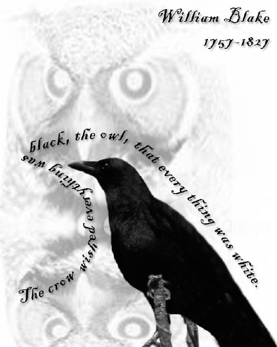
Create translucent type. Because Photoshop automatically creates type on a new layer, you can change the translucency of type simply by adjusting the Opacity value for the type layer in the Layers palette. Using this technique, you can merge type and images to create subtle overlay effects, as illustrated in Figure 16.1.
Use type as a selection. By creating a type mask, you can use type to select a portion of an image, and then move, copy, or transform it. To create Figure 16.2, for example, we used the text from Figure 16.1. Two selections were copied (including the background, grabbed with the text selection) and pasted into a new image window. Further enhancements came through new type, a photo on its own layer, and another independent text layer, overlapping the selection-based "type" from Figure 16.1.
Apply layer effects. Photoshop's layer effects are fully applicable to type. In Figure 16.3, a type object is again pasted into an image (the sky photo again), but a layer style was applied by right-clicking on the layer and choosing Blending Options from the pop-up menu. The Magic Wand tool was then used to select some of the clouds. That selection was copied and pasted it into a new layer, which was then subjected to the same pillow embossing applied to the type layer. A follow-up blurring with a Blur filter was the final touch.

Figure 16.1. Not only are some of the type layers translucent due to reduced opacity, the type layers were easily duplicated and resized to create a graphic statement that enhances the meaning of the type itself.

Figure 16.2. The word "CROWS" and a Web address were turned into selections in Figure 16.1 and then copied into this image, bringing their background with it. An additional type layer was created and placed on top of the selections and a new photo layer.
Edit type as part of the image. After rasterizing text (by choosing Layer

Figure 16.3. Text from Figure 16.1 has had a variety of layer styles applied to it. The less-opaque word "Crows" has an outer glow, and the black text layers have a soft chisel emboss.

So now that you've had a taste of just some of what's possible with Photoshop's Type tool and the things Photoshop will let you do to and with type, let's look at how to create a type layer in the first place.
First, of course, you want to select the Type tool by clicking its icon in the Toolbox or pressing T. Photoshop activates the Type tool, displays the I-beam cursor in the image window, and displays type controls in the Options bar. You can access additional formatting options by displaying the Character and Paragraph palettes shown in Figure 16.5.

Figure 16.5. Choose Window
Tip
You can toggle the Character and Paragraph palettes on and off with either the little palette button at the end of the Options bar, or the vertical strip of palette buttons on the left side of the dock: A opens the Character palette, and the paragraph symbol (looks like a backwards "P," also known as a "pilcrow") opens the Paragraph palette.
Before you begin typing, you can select the font, type size, and other formatting attributes from the Options bar and palettes. These are identified in Figure 16.5 and are quite easy to use. You'll also want to check the Color button on the Type Options bar and make sure it's set to the color you want to type in. That's not to say that you can't change it after you've typed the text (in fact, you probably will), but if you have a white background and are set to type in white and don't realize it, you'll sit there wondering why you can't see your type.
At this point, you're ready to begin typing, so just click or drag in the image window. If you click, Photoshop places the first character you type at the location of the blinking insertion marker, the same way it works in any word processing program. You can press Shift+Enter or Shift+Return to insert a line break, or just keep typing and the text string goes on as long as you do. Of course, you're likely to run off the edge of the image window, but the type is visible if you increase the Canvas size enough to accommodate it. You also can go back later and press Shift+Enter or Shift+Return at various points to force line breaks where you need them. Adobe calls this process of clicking on a single point and then typing point text.
Alternatively, you can create paragraph text by clicking and dragging with the Type tool to draw a frame — called a bounding box — to hold the text. Now your text flows within the frame, wrapping to the next line automatically when you reach the edge of the bounding box. If you create your text this way, you can apply standard paragraph-formatting attributes, such as justification, paragraph spacing, and so on. In other words, everything works pretty much like it does in every other program in which you create text in a frame. Pressing Enter or Return starts a new paragraph in the bounding box. Note that if you don't type like this — if you use the point text method to insert your text, not all of the Paragraph palette options will be applicable — you'll be able to adjust alignment, but not justification or margins, and hyphenation won't apply either.
As you're typing, if you make a mistake, press Backspace (Win) or Delete (Mac) to delete the character to the left of the insertion marker. To remove the character to the right of the insertion point, press Delete (Windows) or Del (Mac).
To alter the character formatting, select the characters you want to change by clicking and dragging over them or using the selection shortcuts listed in Table 16.1. Then choose the new formatting attributes from the Options bar, Character palette, or Paragraph palette. If you don't select any text, paragraph formatting affects all text in the bounding box (the bounding box appears only if you're working with paragraph text). If you're editing point text, any change you make to your formatting options while the cursor (insertion point) is still active within the text (but while no text is selected) will apply to new text that you type at the insertion point only. To make changes to existing text, the text must be selected. This enables you to change single characters or words to a new font, size, or color.
You also can choose the Check Spelling command to spell-check your text, as well as use the Find and Replace Text feature to search for words in large chunks of text.
After your text is typed, you can click the OK button (the check mark at the end of the Type Options bar) to commit the text. You also can simply click another tool, such as the Move tool, to let Photoshop know you've finished dealing with the type layer for now. If you want to keep the Type tool active, use the OK button. Oh — and don't worry — "committing the text" simply takes you out of text-editing mode. As long as you don't convert the text to a regular image layer, work path, or shape, you can edit it at any time.
Tip
If the Options bar is hidden or you just don't like reaching to click the button, you can commit text by selecting any other tool, clicking any palette but the Character or Paragraph palette, or pressing Ctrl+Enter (
Note
While you're in text-editing mode, most menu commands are unavailable. You must commit the text or cancel the current type operation to regain access to them. To abandon your type operation, click the Cancel button — the "no" symbol at the right end of the Options bar — or press Esc.
When you create the first bit of type in an image, Photoshop creates a new layer to hold the text — you'll see the layer created as soon as you began typing changes from "Layer 1" (or whatever generic layer number you're up to in the image at hand) to a layer named using the first 30 characters of the text you've typed.
After you commit the type, clicking or dragging with the Type tool has one of two outcomes. If Photoshop finds any text near the spot where you click or drag, it assumes that you want to edit that text and, therefore, selects the text layer and puts the Type tool into Edit mode. For paragraph text, the paragraph is selected as well. If no text is in the vicinity of the spot you click, the program decides that you must want to create a brand-new text layer and responds accordingly. You can force Photoshop to take this second route by Shift-clicking or Shift-dragging with the Type tool, which comes in handy if you want to create one block of text on top of another.
Tip
If you don't like the type layer being named for the text you've typed, you can double-click the name in the Layers palette and type something new.
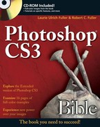
The Vertical Type tool is entirely dedicated to creating vertically oriented text. To get this tool, press T (or Shift+T) when the regular Type tool is active. In truth, the Vertical Type tool is nothing more than the standard Type tool lifted from the Japanese version of Photoshop. As shown in the first example of Figure 16.6, it creates vertical columns of type that read top to bottom, and right to left, as in Japan. If you want to make columns of type that read left to right, you have to create each column as an independent text block.
Tip
If you want to do what I do (and hey, who doesn't), type the text with the Horizontal Type tool, and then rotate it with the Edit
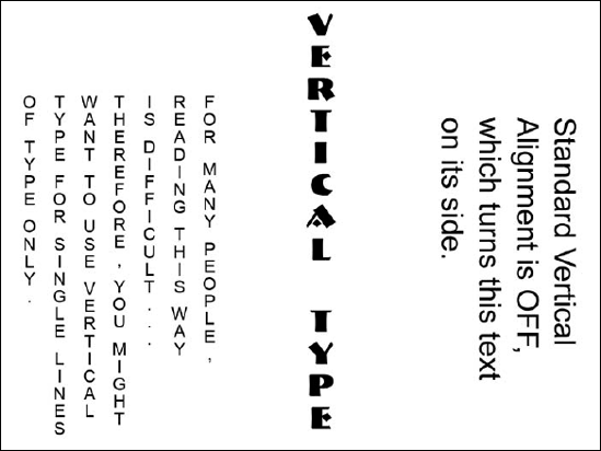
Figure 16.6. By default, vertical type reads right to left, as shown in the first example. If you deselect the Standard Vertical Roman Alignment option in the Character palette menu, your characters appear like those on the right.
After you click the image, you have access to the Standard Vertical Roman Alignment command in the Character palette menu. (If the palette isn't open, click the Display/Hide palettes button at the right end of the Options bar. It's labeled in Figure 16.5.) By default, the option is selected, which gives you upright characters such as those on the left side of Figure 16.6. Choose the command again to rotate the text 90 degrees clockwise and flip characters on their side, as shown in the right side of the figure. You also can deselect this feature before typing, which can be easier on the eyes if you're not from a country that typically reads right to left.
You also can choose Layer
If you click and drag the Type tool within your image window, Photoshop draws a bounding box to hold your text, as shown in Figure 16.7. If you want to create a bounding box that's a specific size, Alt-click (Win) or Option-click (Mac) with the Type tool instead of dragging. Photoshop displays the Paragraph Text Size dialog box, in which you can specify the width and height of the box. Press Enter or Return, and Photoshop creates the bounding box, placing the top-left corner of the box at the spot you clicked.
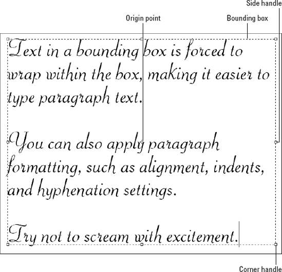
Figure 16.7. Click and drag the box handles to transform the frame alone or the frame and text together.
The bounding box looks just like the one that appears when you choose Edit
Click and drag a corner handle to resize the box. Shift-drag to retain the original proportions of the box. The text reflows to fit the new dimensions of the box.
Ctrl-drag (Win) or
To rotate both box and text, move the cursor outside the box and drag, just as you do when transforming selections, crop boundaries, and layers. Shift-drag to rotate in 15-degree increments. The rotation occurs respective to the origin point, which you can relocate by dragging, as usual.
Using the bounding-box approach to type, however, has more benefits than simply being able to use the transformation techniques just described. You also can apply all sorts of paragraph-formatting options to control how the text flows within the bounding box, as described in the section "Applying paragraph formatting."
Note
Keep in mind that you also can scale, skew, rotate, and otherwise transform the text layer after you commit the text to the layer. In addition, you can size and rotate text using the options in the Character palette.
Tip
If you ever decide that you'd like to work with your text as regular text instead of paragraph text, cancel text-editing mode by clicking the OK or Cancel button in the Options bar. Then select the text layer, and choose Layer
Before you can modify any type, you have to select it. You can select all text on a text layer by simply double-clicking the layer thumbnail in the Layers palette. (This automatically switches you to the Type tool as well.) You can select individual characters by clicking and dragging over them with the Type tool, as in any word-processing program. You also have access to a range of keyboard tricks listed in Table 16.1.
Table 16.1. Using the Mouse and Keyboard to Select Text
Keystrokes | |
|---|---|
Select character to left or right | Shift+left or right arrow |
Select entire word | Double-click the word |
Select entire line | Triple-click the line |
Select entire paragraph | Quadruple-click the paragraph |
Move left or right one word | Ctrl+left or right arrow ( |
Select word to left or right | Ctrl+Shift+left or right arrow ( |
Select to end of line | Shift+End |
Select to beginning of line | Shift+Home |
Select one line up or down | Shift+up or down arrow |
Select range of characters | Click at one point, Shift-click at another |
Select all text | Ctrl+A ( |
After selecting type, you can replace it by typing new text — no need to delete and then type the replacement text. You also can cut, copy, or paste text (perhaps a paragraph you already have in a document) by pressing the standard keyboard shortcuts (Ctrl/
Tip
Selected text appears highlighted onscreen, as is the convention. If the highlight gets in your way, press Ctrl+H (Win) or
The Options bar gives you easy access to the collection of formatting controls shown in Figure 16.8. The Character palette and its palette menu, also shown in the figure, offer some of these same controls plus a few additional options. If you use Adobe InDesign, the palette should look familiar to you — with a few exceptions, it's a virtual twin of the InDesign Character palette.
To open the palette and its partner, the Paragraph palette, click the Toggle the Character and Paragraph Palettes button in the Options bar. Alternatively, you can choose Window
Figure 16.8. Photoshop provides many character-formatting controls in the Options bar and the Character palette, including increased support for OpenType features.
Note
You can apply formatting on a per-character basis. For example, you can type one letter, change the font color, and then type the next letter in the new color. You can even change fonts from letter to letter, either as you type or by selecting existing text character by character.
The next several sections explain the character-formatting options. All apply to both paragraph and point text. You can specify formatting before you type or reformat existing type by selecting it first.
Tip
If you ever want to return the settings in the Character palette to the defaults, make sure that no type is selected. Then choose Reset Character from the bottom of the palette menu.
Select the font (typeface) and type style you want to use from the Font and Style lists. Photoshop offers a full list of designer-style options. For example, whereas Times is limited to Bold and Italic, the Helvetica family may yield such stylistic variations as Oblique, Light, Black, Condensed, Insert, and Ultra Compressed. The fonts that are available through Photoshop are dependent on the fonts that are installed on your computer. In general, if you have access to a font in your word processor, you'll find it in the Font list in Photoshop.
Tip
If you're working with multiple linked text layers, you can quickly change the font or type style on all linked layers in one fell swoop by pressing Shift while choosing an option from the Font or Style list.
The Character palette menu contains a whole lot of additional style options, which you can see in Figures 16.5 and 16.8. Click these options in the menu to toggle them on and off. A check mark next to the style name means that it's active; clicking it again turns it off.
Many of the style options in the palette menu also are available in the row of buttons near the bottom of the palette. They include the following (in order from left to right on the palette itself and top to bottom in the palette menu):
Faux Bold and Faux Italic enable you to apply bold and italic effects to the letters when the font designer doesn't include them as a type style. Use these options only if the Style pop-up menu doesn't offer bold and italic settings. You get better-looking type by applying the font designer's own bold and italic versions of the characters.
Choose All Caps and Small Caps to convert the case of the type. Small Caps works only on text that was typed using the Shift key to capitalize the first letter in words, Such As This Text Here. The Small Caps effect makes all the letters capital, but the ones typed with the Shift key are taller.
Tip
Pressing Ctrl+Shift+K (Win) or
Superscript and Subscript shrink the selected characters and move them above or below the text baseline, respectively, as you might want to do when typing mathematical equations or chemical formulas. If Superscript and Subscript don't position characters as you want them, use the Baseline option to control them, as explained in the section "Baseline."
Tip
You also can "cheat" and type the tiny character in its own type layer and then use the Move tool to place it right where you need it — just above or just below the text (on another layer) to which it relates.
Underline Left and Underline Right apply to vertical type only and enable you to add a line to the left or right of the selected characters, respectively. When you work with horizontal type, the option changes to Underline and does just what its name implies. Strikethrough draws a line that slices right through the middle of your letters.
Note
It's a bit confusing when working with vertical type to have two Underline options available in the menu — left and right — but only one Underline button on the palette itself. Activating the button turns on whichever type of underlining you used last; it's probably safer to ignore the Underline button when using vertical text and just use the palette menu.
Tip
Keep in mind that you can always produce these styles manually by using the Pencil or Brush tool — a choice that enables you to control the thickness, color, and opacity of the line and even play with blend modes. Just click to set a starting point, and then Shift-click to draw a straight line with these tools.
Although version 7 included support for a few OpenType font features, such as Old Style and Ligatures, Photoshop CS greatly expanded its OpenType support — and this support continues in CS3. Longtime favorites of designers and layout artists, OpenType fonts contain information for up to thousands of extra or alternate characters. The OpenType options are available only in the Character and Paragraph palettes' menu, and they appear dimmed unless an OpenType font is selected. Among the options added in recent releases of Photoshop is Ordinals, which lets you automatically create those little letter combinations that are often coupled with ordered numbers, such as 1st, 2nd, 3rd, and so on. Swash gives you those pretty, swooping letters that often extend below the baseline and out under the other letters in the word.
One of the more useful OpenType options is Ligatures. A ligature is a special character that produces a stylized version of a pair of characters, such as a and e, tying the two characters together with no space between, like so: æ. The rest of the OpenType options are specialized, and you're more likely to use them in a layout program such as Adobe InDesign. As with the Asian fonts, if you're going to be working with them, you probably already know what they do. If you're still curious, check the manual for a description of each option. The expanded OpenType support is an improvement that most Photoshop users won't need, but it gives you some great new options nonetheless.
You can measure type in Photoshop in points, pixels, or millimeters. To make your selection, press Ctrl+K and then Ctrl+6 (
Tip
You can type values in any of the acceptable units of measurement, and Photoshop automatically converts the value to the unit you select in the Preferences dialog box. For example, if you've set the units to pixels but want to type a point value when selecting a size, leave the units setting alone (don't reset the preference, in other words) and type the size plus "pt," and Photoshop changes the size and displays the pixel equivalent of the point size you typed in the Size field.
Note
See Chapter 2 for more information about measurement units in Photoshop and how to choose the measurement units that are right for you and your individual projects.
If the resolution of your image is 72 ppi, points and pixels are equal. There are 72 points in an inch, so 72 ppi means only 1 pixel per point. If the resolution is higher, however, a single point may include many pixels. Therefore, you want to select the point option when you want to scale text according to image resolution and select pixels when you want to map text to an exact number of pixels in an image. (If you prefer, you can use millimeters instead of points; 1 millimeter equals 0.039 inch, which means 25.64 mm equals 72 points — not easy to remember, perhaps, but if you're working with other metric measurements in a project, it's good to know.)
Whatever unit of measure you choose, type is measured from the top of its ascenders — letters such as b, d, and h that rise above the level of most lowercase characters — to the bottom of its descenders — letters such as g, p, and q that dip below the baseline. That's the way it's supposed to work, anyway. But throughout history, designers have played pretty loose and free with type size. To illustrate, Figure 16.9 shows four fonts, including a display font (Tekton) and a script font (Brush Script). Each line is set to a type size of 180 pixels, and then placed between two solid lines exactly 180 pixels apart. The dotted horizontal lines indicate the baselines. As you can see, the only font that comes close to measuring the full 180 pixels is Tekton. The Brush Script sample is relatively minuscule, and neither Times New Roman or Arial comes close to spanning the entire 180-pixel height of the space between the two lines. So if you're looking to fill a specific space, be prepared to experiment; if you have your heart set on a particular font, you may end up applying a much larger font size than you expected in order for the type to take up the desired space in your design.
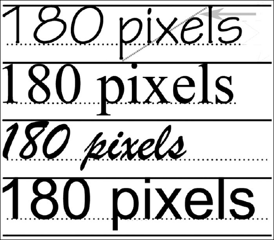
Figure 16.9. These four samples of 180-pixel type set inside 180-pixel boxes are, from top to bottom, Tekton, Times New Roman, Brush Script, and Arial. As you can see, type size is an art, not a science.
Tip
You can change the type size by selecting a size from the Size pop-up menu or double-clicking the Size value, typing a new size, and pressing Enter or Return. But the quickest option is to use the following keyboard shortcuts: To increase the type size in 2-point (or pixel) increments, press Ctrl+Shift+> (
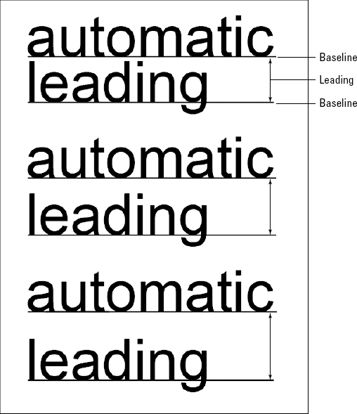
Also called line spacing, leading in Photoshop is the vertical distance between the baseline of one line of type and the baseline of the next line of type, as illustrated in Figure 16.10. Note that in manual typesetting, leading, which was named for the placement of strips of lead between lines of type on a printing press, is the distance between the top line's descenders (the tail on the y, for example) an the bottom line's ascenders (the vertical part of the lowercase b, for example). As stated, however, Photoshop simplifies it and separates the lines by their baselines, and you set leading using the Leading pop-up menu in the Character palette, labeled in Figure 16.8. Again, either select one of the menu options or double-click the current value, type a new value, and press Enter or Return. Leading is measured in the unit you select from the Type pop-up menu in the Preferences dialog box.
If you choose the Auto setting, Photoshop automatically applies a leading equal to 120 percent of the type size. The 120 percent value isn't set in stone, however. To change the value, open the Paragraph palette menu and choose Justification to display the Justification dialog box. Type the value you want to use in the Auto Leading option box, and press Enter or Return.
Leading Shortcuts
There are easier ways to adjust leading that allow you to tweak the settings in small increments and make your adjustments "by eye," tweaking until it looks the way you want it to. First, you can select the lines (or characters, in the case of kerning) that you want to adjust, and then click in the Leading field box in the Character palette. Now, use your up-arrow key to increase the leading or the down arrow to decrease it. Keep pressing the key/s until the desired spacing is achieved. Another technique: When adjusting the leading between a pair of lines, select the bottom of the two. Then press Alt+up arrow (Option+up arrow on the Mac) to decrease the leading in 2-point (pixel) increments and move the lines closer together. Press Alt+down arrow (Option+down arrow on the Mac) to increase the leading and spread the lines apart. To work in 10-point (pixel) increments, press Ctrl+Alt+up or down arrow (
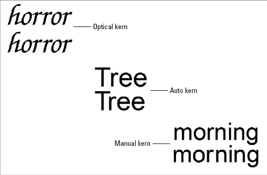
Technically, kern is the predetermined amount of space that surrounds each character of type and separates it from its immediate neighbors. (Some type-heads also call it side bearing.) Therefore, kerning became the verb based on that term — to adjust the kern around characters, thus changing the space between them. You establish kerning using the Kerning pop-up menu in the Character palette. Select 0 to use the amount of side bearing indicated by the specifications in the font file on your hard drive.
Some character combinations, however, don't look right when subjected to the default kern. The spacing that separates a T and an h doesn't look so good when you scrap the h and insert an r. Another pair that can look funky in certain fonts is an r and an n, which may look like an m. You may have your own pet pairs that look wrong to you in some or all fonts. You can select Metrics from the Kerning pop-up menu and ask Photoshop to look further into the font specifications and pull out a list of special-needs letter pairs. After it has done that, it applies a prescribed amount of spacing compensation.
Figure 16.11 shows a few ways to fix the awkward spacing that default kerning can create. The first word pair shows the before and after uses the Optical kern to create enough spacing between the r's. The second pair shows the before and after of using Metrics (auto kerning) on the T and the r. Finally, the third pair shows how to avoid having your r and n combination from looking like an m by using Manual kerning to create a slight separation.
Note
In most cases, you'll want to select Metrics or the Optical option (which was new in Photoshop CS), which relies on Photoshop's built-in artificial intelligence to examine the shapes of letters and determine the proper spacing. One advantage of Optical kerning is that it provides professional results with even the most nonprofessional custom fonts.
Still, there may be times when the prescribed kerning isn't really pleasing to the eye — even if it's only to your eye. To establish your own kerning, click between two badly spaced characters of type. Then select any value other than 0 from the Kerning pop-up menu. Or double-click the current kerning value, type a value (in whole numbers from −1000 to 1000), and press Enter or Return. Type a negative value to shift the letters closer together. Type a positive value to kern them farther apart. The last line in Figure 16.11 shows examples of tighter manual kerns.
Tip
To decrease the Kerning value (and thereby tighten the spacing) in increments of 20, press Alt+left arrow (Option+left arrow on the Mac). To increase the Kerning value by 20, press Alt+right arrow (Option+right arrow on the Mac). You also can modify the kerning in increments of 100 by pressing Ctrl+Alt+left or right arrow (
Incidentally, the Kerning and Tracking values (explained shortly) are measured in 1/1000 em, where an em (or em space) is the width of the letter m in the current font at the current size. This may sound weird, but it's actually very helpful. Working in ems ensures that your character spacing automatically updates to accommodate changes in font and type size.
If kerning is too annoying for you, try turning off Fractional Widths, found in the Character palette menu. (Click the option name to toggle the feature on and off.) When type gets very small, the spacing between letters may vary by fractions of a single pixel. Photoshop has to split the difference in favor of one pixel or the other, and 50 percent of the time the visual effect is wrong. It's better, in most cases, to turn the feature off and avoid the problem entirely.
However, turning off Fractional Widths isn't always a complete solution. A better choice when using small type for onscreen display — for example, in a graphic that will be used in a Web page — is to turn on the System Layout option in the Character palette menu. Doing so turns off anti-aliasing — in fact, choosing System Layout when you have an active text layer makes Photoshop automatically perform three tasks, the first of them setting anti-aliasing to None. This anti-aliasing method is the best option for small onscreen type and a particularly good choice when you need to match the type used in onscreen interface elements.
The Tracking value, which you set using the pop-up menu to the right of the Kerning pop-up, is almost identical to Kerning. It affects character spacing, as measured in em spaces. The Tracking value even reacts to the same keyboard shortcuts. The only differences are that you can apply Tracking to multiple characters at a time, and Photoshop permits you to apply a Tracking value on top of either automatic (as in Metrics or Optical) or manual kerning. Tracking is usually applied to body text, such as paragraphs, whereas kerning is typically used in single lines of text, such as headlines or character pairs.
Using the two scaling options, you can scale the width and height of letters individually. A value of 100 percent equals no change to the width and height. Type a value larger than 100 percent, and you make the characters larger. If you type a value lower than 100 percent, the characters shrink.
Photoshop applies horizontal and vertical scaling with respect to the baseline. If you're creating vertical type, the Vertical value affects the width of the column of letters and the Horizontal value changes the height of each character.
You also can distort text after you create it by applying the Edit
Note
See Chapter 13 for more information on the uses of Free Transform, most of which can be applied to type.
Tip
By converting text to shapes, you can reshape characters with even more flexibility, clicking and dragging points and line segments as you do when reshaping paths and objects created with the shape tools.
The Baseline value, which you set using the bottom-left option box in the Character palette (refer to Figure 16.8), raises or lowers selected text with respect to the baseline. In the lingo of the typesetting world, this is called baseline shift. Raising type above the baseline results in a superscript. Lowering type results in a subscript.
Typically, when type is raised or lowered relative to the baseline, the shifted type also is shrunken — and both superscript and subscript formatting, when applied through any word processor, automatically includes a size reduction in the process. The baseline shift value in the Character palette doesn't shrink the type for you, though, so if you're trying to create the look of scientific notation, a chemical formula, or a footnote, you'll want to reduce the font size on your own. You can do that with the Size value or by using the Superscript or Subscript style buttons at the foot of the Character palette instead of adjusting the baseline shift. By using these two buttons, you get both a shift and a size reduction — but no control over the amount of either. Examples of both superscript and subscript (with font size reductions also applied) appear in Figure 16.12.
The top example shows the 3 raised with the Superscript Style button on the Character palette. The asterisk was lowered with the Baseline Shift value, which also is in the Character palette. Its size was not changed. In the middle example, the 2s were reduced in size and then the baseline shift was adjusted to −30. Finally the bottom example creates a fraction by reducing the size of both numbers and adjusting their baseline shift. Then the size of the slash was increased so its top lines up with the top of the first number and its bottom lines up with the bottom of the second number.
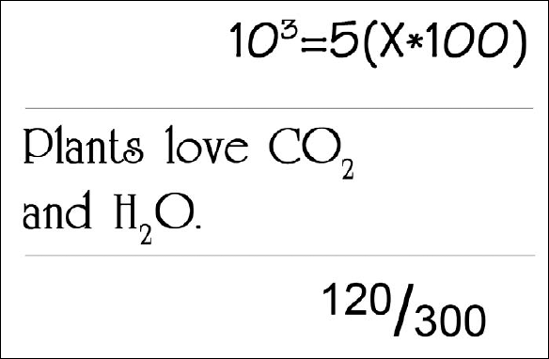
Figure 16.12. Here we have scientific notation and a chemical formula. The last example is a fraction, and both numbers are reduced in size as well as shifted relative to the baseline.
You also can raise type to create a built fraction, as shown in Figure 16.12. Select the number before the slash (the numerator), and type a positive value into the Baseline option box. Reduce the type size of the number (the denominator) after the slash, but leave the Baseline value set to 0.
Tip
Press Shift+Alt+up arrow (Shift+Option+up arrow on the Mac) to raise the Baseline value by 2 or Shift+Alt+down arrow (Shift+Option+down arrow on the Mac) to lower the value by 2. To change the value in increments of 10, add in the Ctrl key (
Click the Color swatch in the Options bar or in the Character palette to display the Color Picker dialog box. You can apply color on a per-character basis. The color you select affects the next character you type and any selected text. Your best results come from setting the color first and then typing, at least in cases where all the type in the type layer will be the same color. By default, when you activate the Type tool, the current Foreground color is used and appears on the Options bar, which may or may not be convenient at the time. If it's not convenient, then use the Color swatch to open the Color Picker and choose another color.
Tip
When applying color to selected text, you can't preview the new color accurately because the selection highlight interferes with the display. Press Ctrl+H (
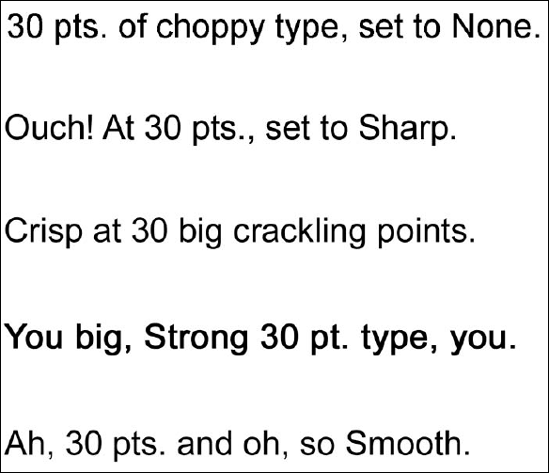
The Anti-alias pop-up menu, found both in the Character palette and in the Options bar, offers five choices: None, Sharp, Crisp, Strong, and Smooth. Although all of those things are nice (well, except "None"), type can be only one of them at a time, and whichever option you choose, the entire layer gets the effect. You can't apply anti-aliasing to individual characters on a layer, as you can other character formatting options.
In Figure 16.13, you can see several examples of various anti-aliasing settings. Choose None from the pop-up menu, as in the first line, to turn off anti-aliasing (softening, for those of you who've forgotten what anti-aliasing does) and give characters hard, choppy edges, which is good for very small type. Sharp, in the second line, applies a slight amount of anti-aliasing, creating sharp contrast. Crisp is similar to Sharp but a little bit softer, as in the third line. If anti-aliasing seems to rob the text of its weight, you can thicken it up a bit with the Strong setting as in the fourth line. If you notice jagged edges, try applying the Smooth setting as in the last line. Sharp, Crisp, Strong, and Smooth produce more dramatic effects at small type sizes.
Photoshop offers a comprehensive set of paragraph-formatting options, including ways to set your justification, alignment, hyphenation, line spacing, and indents. With the exception of the alignment, all these controls appear only in the Paragraph palette and affect text that you create inside a bounding box. (See the section "Creating and Manipulating Text in a Frame" for information about this method of adding text.) Point text, not typed into a bounding box, can be aligned, but the other paragraph formatting cannot be applied to it.
Figure 16.14 shows you the lay of the land in the Paragraph palette and also shows the palette menu, which offers additional paragraph formatting choices.
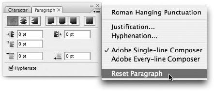
Figure 16.14. You can control the flow and position of text created in a bounding box by using the options in the Paragraph palette.
Note
If your bounding box contains more than one paragraph, you can apply formatting to individual paragraphs. Click with the Type tool inside a paragraph to alter the formatting of that paragraph only, or click and drag through the paragraph to select it, being careful not to select the blank lines above or below it. To format multiple paragraphs, you must click and drag over them. If you want to format all paragraphs in the bounding box, double-click the type layer thumbnail in the Layers palette, which selects every word, space, and blank line in the bounding box. You also can click the type and then press Ctrl+A (Win) or
Tip
When no text is selected, you can restore the palette's default paragraph settings by choosing Reset Paragraph from the Paragraph palette menu.
The alignment options, found both in the Paragraph palette and in the Type tool's Options bar, let you control how lines of type align with each other. This is close to what's occurring in a word processor when you use alignment tools there, but in the case of a word processor, you're also aligning relative to the page. As there is no page in Photoshop, the type is aligned to itself. If you're using the Horizontal Type tool, Photoshop lets you left-align, center, or right-align text. The lines on the alignment buttons indicate what each option does, and they change depending on whether you're formatting vertical or horizontal type. If you're using the Vertical Type tool, the lines run up and down, but align to the top (right alignment), bottom (left alignment), or vertical center (center alignment) of the button.
If you create paragraph text (in a bounding box), Photoshop aligns text with respect to the boundaries of the box. For example, if you draw a bounding box with the right alignment option selected, the text cursor appears at the right edge of the box and moves to the left as you type. For vertical type, the right-align and left-align options align text to the bottom and top of the bounding box, respectively. You must choose a different alignment option to relocate the cursor; you can't simply click at another spot in the bounding box.
When you create point text (that is, by simply clicking in the image window instead of drawing a bounding box), the alignment occurs with respect to the first spot you click and affects all lines on the current text layer.
Tip
You can change the alignment using standard keyboard tricks. Press Ctrl+Shift+L (
One additional alignment option controls the alignment of punctuation marks. You can choose to have punctuation marks fall outside the bounding box so that the first and last characters in all lines of type are letters or numbers. This setup can create a cleaner looking block of text and approximates the look of full justification in a word processor. Choose Roman Hanging Punctuation from the Paragraph palette menu to toggle the option on and off.
Speaking of justification, the justification options (second set of three buttons across the top of the Paragraph palette) adjust text so that it stretches from one edge of the bounding box to another. The different options, labeled in Figure 16.15, affect the way Photoshop deals with the last line in a paragraph.
Assuming that you're using the Horizontal Type tool, choose Justify left to align the line to the left edge of the box; Justify right to align to the right edge; and center to align the type exactly between the left and right edges. With Force justify, Photoshop adjusts the spacing of the last line of text so that it, too, fills the entire width of the bounding box. This option typically produces unsightly results, especially with very short lines, because you wind up with huge gaps between words. However, if you want to space a word evenly across an area of your image, you can use Force justify to your advantage. Click and drag the bounding box to match the size of the area you want to cover, type the word, and then choose the Force justify option. If you later change the size of the bounding box, the text shifts accordingly.
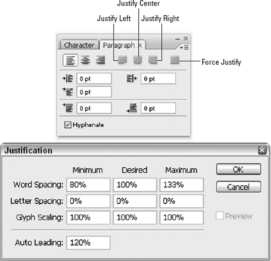
Figure 16.15. The Justification Options dialog box lets you control how Photoshop adjusts your paragraph text when you use the Justify tools in the Paragraph palette.
Tip
Photoshop lets you apply a couple of the justification options from the keyboard: Press Ctrl+Shift+J (
You can further control how Photoshop justifies text by using the spacing options in the Justification dialog box, also shown in Figure 16.15. To open the dialog box, choose Justification from the Paragraph palette menu. You can adjust the amount of space allowed between words and characters, and you can specify whether you want to alter the width (scaling) of glyphs — a fancy word meaning the individual characters in a font. Here's what you need to know:
The values reflect a percentage of default spacing. The default word spacing is 100 percent, which gives you a normal space character between words. You can increase word spacing to 1000 percent of the norm or reduce it to 0 percent.
The default letter spacing is 0 percent, which means no space between characters. The maximum letter spacing value is 500 percent; the minimum is −100 percent.
For glyphs, the default value is 100 percent, which leaves the characters at their original width. You can stretch the characters to 200 percent of their original width or squeeze them to 50 percent.
To establish your ideal settings for these options, use the Desired column and type the values there. Whenever possible, Photoshop uses these values — when it can't accommodate you, it refers to the Minimum and Maximum options to tell it how much it can alter the spacing or character width when justifying text. If you wind up with text that looks like sardines jammed into the bounding box, increase the Minimum values. Similarly, if the text looks spacey and becomes hard to read, decrease the Maximum values. You can type negative values to set a value lower than 0 percent.
Note
You can't type a Minimum value that's larger than the Desired value or a Maximum value that's smaller than the Desired value; nor can you type a Desired value that's larger than Maximum or smaller than Minimum.
Tip
If you want a specific character width used consistently throughout your text, use the Horizontal scale option in the Character palette rather than the Glyph spacing option. You can apply Horizontal scaling to regular text as well as paragraph text.
As for the Auto Leading option at the bottom of the Justification dialog box, it determines the amount of leading used when you select Auto from the Leading pop-up menu in the Character palette. As luck would have it, if you're seeking information on additional paragraph spacing controls, the next sections pertain to just that.
The five option boxes in the Paragraph palette control the amount of space between individual paragraphs in the same bounding box (like the space before and space after settings control paragraph spacing in a word processor) and between the text and the edges of the bounding box (like adjusting margins, if you think of the bounding box as though it's a tiny page). Photoshop's indent options work the same as their counterparts in just about any word processing or graphics program that supports the use of type, so there shouldn't be any surprises there either. Here are the details:
Type values in the top two option boxes to indent the entire paragraph from the left edge or right edge of the box.
To indent only the first line of the paragraph, type a value into the first-line indent option box, the second of three boxes on the right. Type a positive value to shove the first line to the right; Type a negative value to push it to the left, so that it extends beyond the left edge of the other lines in the paragraph, which creates a hanging indent.
Use the bottom option boxes to increase the space before a paragraph (left box) and after a paragraph (right box).
Note
In all cases, you must press Enter or Return to apply the change. To set the unit of measurement for these options, use the Type pop-up menu in the Units & Rulers panel of the Preferences dialog box; you can choose from pixels, points, and millimeters. As is the case with options in the Character palette, however, you can type the value using a unit of measurement other than that which is currently the preferred unit by typing the value followed by the desired unit's abbreviation ("in" for inches, for example, while pixels, points, or millimeters is the current unit). When you press Enter or Return, Photoshop converts the value to the unit you selected in the Preferences dialog box. (See Chapter 2 to find out more about setting preferences for units.)
In most cases, you probably won't be typing text that requires hyphenation in an image. If you need to type that much text, you're better off doing it in your page-layout program (such as PageMaker, InDesign, or QuarkXPress), and then importing the image into that layout.
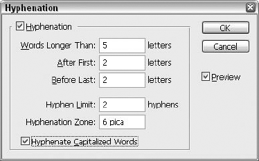
Even knowing that most images won't or shouldn't contain so much text that hyphenation is needed, Photoshop still offers the Hyphenate option in the Paragraph palette. When you select this option, the program automatically hyphenates your text using the limits set in the Hyphenation dialog box, shown in Figure 16.16. Choose Hyphenation from the Paragraph palette menu to display the dialog box and make any changes. If you move the dialog box so that you can see your text, the Preview option (on by default) can help you adjust the settings so that they meet the needs of your text and you won't have to close and reopen the dialog box in order to find the right settings.
This dialog box controls work as follows:
Type a value in the Words Longer Than option box to specify the number of characters required before Photoshop can hyphenate a word.
Use the After First and Before Last options to control the minimum number of characters before a hyphen and after a hyphen, respectively.
Type a number in the Hyphen Limit option box to tell Photoshop how many consecutive lines can contain hyphens.
Finally, specify how far from the edge of the bounding box Photoshop can place a hyphen by typing a value in the Hyphenation Zone box.
Deselect the Hyphenate Capitalized Words option if you want Photoshop to keep its mitts off words that start with an uppercase letter.
When you create paragraph text that includes several lines, you may not like the way Photoshop breaks text from line to line. Maybe you feel it's jumping the gun when it gets close to the right edge of the bounding box, or maybe you wish it were more conservative and didn't cram things so close to the sides of the box. Whatever your complaint is, you may be able to get some resolution by changing the equation that Photoshop uses to determine where lines break.
If you choose Adobe Every-line Composer from the Paragraph palette (available only if you have an active type layer with text in a bounding box), the program evaluates the lines of text in the active bounding box as a group and figures out the best place to break lines. In doing so, Photoshop takes into account the Hyphenation and Justification settings that are in place at the time. Typically, this option results in more evenly spaced text and fewer hyphens. That's a good thing most of the time: If bounding boxes are small and you use lots of long words, such as medical or legal terminology, your right edge (if your type is left-aligned) can end up with so many hyphens that it looks fringed.
Adobe Single-line Composer takes a line-by-line approach to your text, using a few basic rules to determine the best spot to break a line. The program first attempts to fit all words on the line by adjusting word spacing, opting for reduced spacing over expanded spacing where possible. If the spacing adjustments don't work for the given type, Photoshop hyphenates the last word on the line and breaks the line after the hyphen.
Remember, these options may not be an issue very often because most people don't create long blocks of text in Photoshop. If you want to control line breaks for a few lines of text, you can just create your text using the regular, point text method instead of putting the text in a bounding box. Then you can just press Enter or Return at the spot where you want the line to break, adding a hyphen to the end of the line if needed.
Found in the Edit menu, the Check Spelling command compares the words in your document with the words in Photoshop's built-in dictionary. If you've typed a word not found in the dictionary, Photoshop brings this to your attention by displaying the Check Spelling dialog box, shown in Figure 16.17.
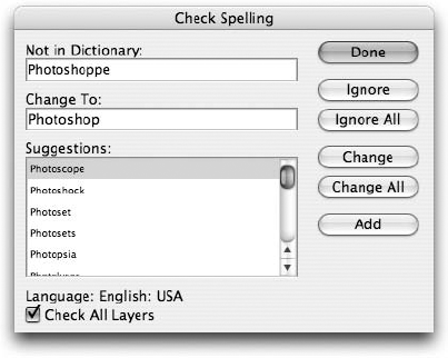
Figure 16.17. The Check Spelling dialog box offers helpful suggestions for replacing words it doesn't recognize. Here you can see that it doesn't recognize itself. Hmmmm....
The unrecognized word appears in the Not in Dictionary option box, and Photoshop offers you its favorite replacement word in the Change To option box. Other choices can be found in the Suggestions list. If you have made an error but none of Photoshop's suggested words is correct, you can type the correct word in the Change To option box. After you have the appropriate replacement word in the Change To option box, click Change. If you've made the same mistake throughout the rest of the text, click Change All. If the highlighted word is correct but simply isn't in Photoshop's vocabulary, you can click Ignore to tell it to ignore the word, or click Ignore All to tell it to ignore that and all other instances of the word. If you will be using the word often in the future, click Add to add the word to the dictionary — be sure it's spelled correctly, though, before doing so. After you finish making corrections, click Done to exit the dialog box.
If you're in text-editing mode — defined as when there's an insertion marker blinking away in your text — Photoshop performs the spell-check only on the currently active layer and only on the text that follows the placement of the insertion marker. In other words, if you want to check the entire text layer, make sure the insertion marker is at the beginning of the text block. Better yet, you can check spelling on all text layers at once. Just make sure that no active insertion marker appears in any text layer when you choose Edit
Note
You can specify the dictionary used by the Check Spelling command by choosing Window
In the unlikely event that you find yourself entering tons and tons of text into an image in Photoshop, you can choose Edit
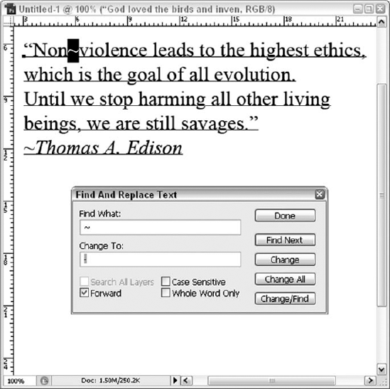
Figure 16.18. Find one or all instances of a particular word, phrase, or single character and insert more desirable content.
If you've ever used a similar command in a word-processing program, there are no big surprises here. Type the word, phrase, or symbol you're looking for in the Find What option box. If you want to replace that word with another, type the new word in the Change To option box. Click Find Next to locate the next instance of your word relative to the placement of the insertion marker; click Change to replace the word; click Change All to replace all instances of the word; and click Change/Find to replace the current instance and highlight the next. The remaining options are common in Find/Replace commands found in word processors. The one quirky thing about Photoshop's version of the command is that if you start your search in the middle of a text block, Photoshop doesn't wrap around when it reaches the end of the text and start looking at the beginning. That's the main use for the Forward option; leave it selected and Photoshop searches forward from the text insertion marker; deselect it and Photoshop looks backward.
Photoshop CS introduced the ability to place text on a path, and this long-overdue feature remains in CS3; who'd have had the nerve to remove such an essential feature? Even if you're not sure why this was considered long overdue or why tears would be shed if it were removed from Photoshop, this one little addition opens up a boatload of possibilities for the creation and placement of Photoshop text. Imagine not being able to draw text both around and inside paths you create with the shape tools. Imagine if all you had was the very limited Warp Text tool that gives you the ability to type text in an arc or along a wave. Yawn. In Photoshop CS3, not only can you place text along a path, you can even place two different pieces of text on the same side of the same path and keep them entirely independent of each other. Try that with the Warp Text option.
Perhaps the most impressive thing about Photoshop's new text-on-a-path capability is how easy it is to use. Instead of adding a new tool for creating path text or for creating the text path itself, Photoshop lets you use the regular Type tool to create path text, and you can drop text of any font, size, or formatting onto any path in your image.
To begin, you need to tell Photoshop which path it is you want the type to follow. The type doesn't exist at this time, but that comes later. To tell Photoshop where the path is, draw one by pressing P to select the Pen tool and click to set a few points to form an open path in your image. If you create a path with a few smooth curves using the Bézier handles discussed in Chapter 8, you'll provide a better line for the type. You can add text to any path you draw, but hard edges (corners, spikes, very sharp curves) cause harsh character jumps, and they're usually quite undesirable.
Now, you can add the type, by pressing T to select the Type tool and then position your cursor over the path you just drew. You'll notice that your cursor changes from the normal I-beam to one with a little diagonal line crossing through the bottom of it — a subtle change, but a change nonetheless. When you see it, click once to make the path active, and then type; it's that easy.
After the text is typed, you can work with it as you would any other type. You can format your text to any font, size, type style, and so on that you like. From here on, any formatting changes work just as they do when you're working with regular text, as shown in Figure 16.19. You can change the font, adjust the size of characters, increase the tracking to spread them out over the course of the path, and even alter the baseline for a specific character or word. Manual kerning comes in handy here, because Photoshop's Optical and Metrics options may not be able to accommodate the fine-tuning you require along certain paths and with certain words and fonts.
Note
When you create text on a path, the letters orient themselves according to the direction in which the path was originally drawn. For example, if you draw a path from left to right and then add text to it, the text appears as it normally does. But if you draw the path from right to left, no matter where on the path you click with the Type tool, the text appears upside-down and headed in the "wrong" direction — which you may find useful if you want the type to literally follow the underside of a path.
Tip
Very fancy fonts may not be legible when placed on an intricate path. You'll see the problem right away if you inadvertently create it by choosing an ornate font and placing it on a very curvy path, but it's a good idea to keep this in mind before you go to the trouble of selecting a font. If you see that your text is hard to read in the font you've chosen, try another one, using the Type Options bar or the Character palette.
Press A to select the Arrow tool. Position the cursor over a path with text on it until your pointer changes to an I-beam cursor with a black arrow protruding from one side. This protruding arrow tells you that you can now use the tool to slide the text along on the path. If you accidentally typed your text upside-down, drag the text all the way to the end of the path and continue dragging to pull the text back up to the correct side. You also can use the Arrow tool to move the path around your image. To do so, move the cursor away from the path until you again see the standard Arrow tool cursor. Then click and drag to reposition the text and path in unison.
Tip
The point at which you originally click on a path with the Type tool is designated as the start point of your text. By default, an endpoint is set at the far end of your line. You can click and drag this point with the Arrow tool back toward the start point to remove letters from the end of your text. Any letters that fall beyond your end point will get clipped and disappear.
By now, you're probably sitting on the edge of your chair, one hand clasped over your mouth, which fell open as you read about dragging your text along a path. Well, close your mouth and use that hand to keep turning pages — in the following section, you learn to add text inside a closed path, and you wouldn't want to miss that, would you? Quoth the raven, "No way, man!"
The process of adding text inside of, rather than along, a path is quite simple — and very much like the one we just discussed in the preceding section. Here, though, the examples involve using a shape-based path and not a path drawn with the Pen tool.
You want to start with the Paths button selected in the Shape tool's Options bar and then draw a shape. Press U (or Shift+U) to select the desired shape tool, and click the Paths button in the Options bar. Click and drag to draw a shape in the image. You can play it safe your first time out and draw a circle or a square, but you also can try something more interesting, such as the shape you see in Figure 16.20. When choosing a path, remember that sharp or tight corners can be difficult for the type to follow without losing legibility. If you're emotionally tied to a very complex shape, be prepared to use the Pen tool's variants to add and remove anchor points along the path, smoothing out any undesirable twists and turns. Don't remember how to do that? Go back to Chapter 8. No, really. We'll wait.
After your shape path is drawn, select the Type tool and position your cursor at the center of the shape. As you hover, the cursor should look like an I-beam with parentheses around it — again, a slight variation on the standard Type cursor, just to let you know something different is going on. Click once and begin to type your text. As you type, notice that the text appears inside the shape, like the text inside the arrowhead shape in Figure 16.20. The shape essentially functions as a bounding box for the text, thus molding the text to its shape. When you finish typing text, click the OK button in the Options bar or click another tool in the Toolbox.
Tip
To use the same path and have text to run along it, choose Window
Note
Just because you've fit type to a path doesn't mean that the shape of the path is set in stone. On the contrary, you can reshape a path freely with the Convert Point tool; any text fitted to the path bends and moves according to your edits.

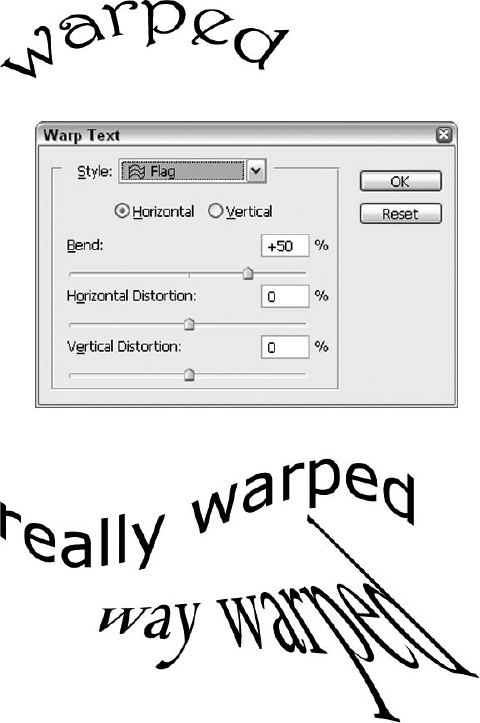
Prior to the addition of Photoshop's tools for fitting text to a path, the Warp Text feature was the only way to make editable text bend in a circle, an arc, or a wave. With the Warp Text tool, you also can control the nature of the warp, adjusting its horizontal and vertical distortion. You can choose from 15 different warp shapes and choose to curve type, distort it, or both.
Tip
You can warp paragraph text or regular text, but the warp affects all existing text on the layer, making it a little difficult to use on paragraph text and sometimes tricky to use on a long string of point text. If you want to reshape just a part of a line of text — for example, to make the last few letters in a word bend upward — put that bit of text on its own layer and position the two layers so that the text looks continuous.
Note
You can't warp type to which you've applied the faux bold style (applied through the Character palette), nor can you warp bitmap fonts or fonts for which the designer hasn't provided the paths, or outlines, that make up the font characters.
To warp text, select the text layer, click the text warp button in the Options bar, labeled in Figure 16.21, or choose Layer
After choosing a warp style from the Style pop-up menu, set the orientation of the warp by selecting the Horizontal or Vertical radio button. Then adjust the Bend, Horizontal Distortion, and Vertical Distortion sliders until you get an effect that fits your needs. You can preview your changes in the image window.
Note
You can warp text that you create on a path, but you basically lose all ability to perform any more path-related adjustments with the text.
Some tips for making effective use of the Warp tool:
When you select the Horizontal radio button, the warp occurs as the shape in the Style pop-up menu suggests. If you choose Vertical, the warp is applied as if you turned the shape on its side.
Use the Bend value to change the direction of the curve. A positive Bend value curves the text upward, and a negative value curves the text downward.
You can use the Horizontal and Vertical Distortion options to create perspective effects. Horizontal Distortion puts the origin point of the perspective to the left if you type a positive value and to the right if you type a negative value.
Vertical Distortion places the origin point above the text if you type a positive value and below the text if you type a negative value.
If you edit warped text, Photoshop reapplies the warp to the layer after you finish editing the text.
Tip
The effects of a warp can be enhanced by tweaking the tracking, kerning, and other character-spacing and scaling formatting. If you have trouble achieving the distortion or perspective effect you're after, try choosing Edit
As stated earlier in this chapter, you can convert each letter in a text layer to individual shapes by choosing Layer
After you make the conversion to a shape, each character works just like a shape that you create with the shape tools. Photoshop creates points and line segments as it sees fit for each letter, as shown in Figure 16.22. This enables you to fool with the shape of each letter by clicking and dragging points and segments, as you can see in Figure 16.22. You also can apply all the same effects to your new text shapes as you can to any shape.
Note
See Chapter 15 for a complete list of your options.
Warning
Before you convert text to shapes, make sure that you don't need to make further changes to character or paragraph formatting or do any editing. Photoshop sees your text purely as shapes after the conversion, so you can't edit the text using the Type tool anymore. For safety's sake, you should save the text to a new layer or image before choosing Convert to Shape; you can hide the backup layer and only use it if you find that your converted text needs editing.
Tip
Like regular shapes, type shapes appear jagged around the edges because of the tiny outline that Photoshop displays around the shape. To hide the outline and smooth the onscreen appearance of the text, press Ctrl+H (
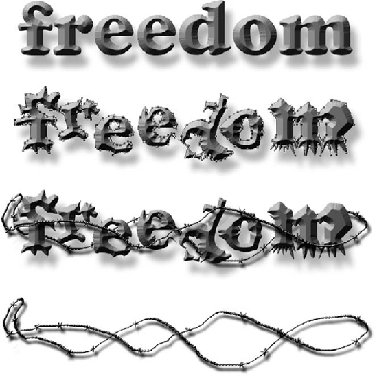
Figure 16.22. Sure, you can make editable text look cool, but can you reshape the individual letters? Not without converting them to shapes first. Here, text has been converted to shapes, the shapes have been pushed, pulled, and stretched like mad, and some interesting background elements have been added to pull the image together.
After a short retrospective on the use of text in Photoshop, this chapter showed you how to insert text, to edit existing text, and several ways to use text artistically — including the creation of vector type, text-based selection outlines, and rasterized text. You learned how to create paragraph text in a bounding box, and to build vertical text, as well as how to use the Character and Paragraph palettes to customize the appearance of your individual type characters and the flow of your text within its own layer.
To make sure text is not only beautiful but also correct, you learned to use the Check Spelling, and Find and Replace commands, and finally, to take your type to a whole new level, you learned to fit your text to a path and to warp your text using a variety of preset shapes.