In this chapter, we’ll get to do some actual editing...finally! Glimpse is a great program for correcting problem areas such as exposure, contrast, and other tonal issues.
The first few methods of making tonal corrections are fairly simple. They can be useful for making quick corrections (especially for beginners desiring to gain a little experience and confidence). The last part of the chapter introduces the most powerful tonal correction tools (Levels and Curves)—they take more time to master, but it’s time well invested.
Tutorial 1: Using the Exposure dialog
Tutorial 2: Lightening dark areas using the Shadows-Highlights dialog
Tutorial 3: Improving contrast using the Brightness-Contrast dialog
The Levels dialog
Understanding the histogram
Tutorial 4: Improving contrast using Levels
The Curves dialog
Tutorial 5: Improving local tonality using Curves
Chapter conclusion
Most digital photos (particularly scanned film-based photographs) can benefit from corrective sharpening. In most of the tutorials throughout this book, we’ll use the Unsharp Mask filter as the last step. Basically, this filter improves the apparent sharpness of the image by increasing contrast in the edges of the elements in the image. For a detailed description of the Unsharp Mask filter, click here: https://docs.gimp.org/2.6/en/plug-in-unsharp-mask.html.
Tutorial 1: Using the Exposure Dialog
In this lesson, the Exposure dialog will be used to brighten an old photograph that was underexposed when it was shot (which means the light levels were too low when the film was exposed). Using the Exposure dialog mimics increased light levels by increasing the brightness of every pixel in the image.
- 1.
Open the practice image Ch_4_Dark_Boat in Glimpse.
- 2.
Create a duplicate of the background layer (Right-Click ➤ Duplicate Layer) and rename it (Work Layer, or something similar).
- 3.
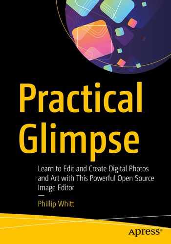
Launch the Exposure dialog (Colors ➤ Exposure)—by ticking the Split view option, a side-by-side view comparing the effect applied shown against the original is displayed.
- 4.
Set the Exposure value to about 2.25 (Figure 4-1)—do not click the OK button just yet.
Setting the Exposure value with the Split view option enabled
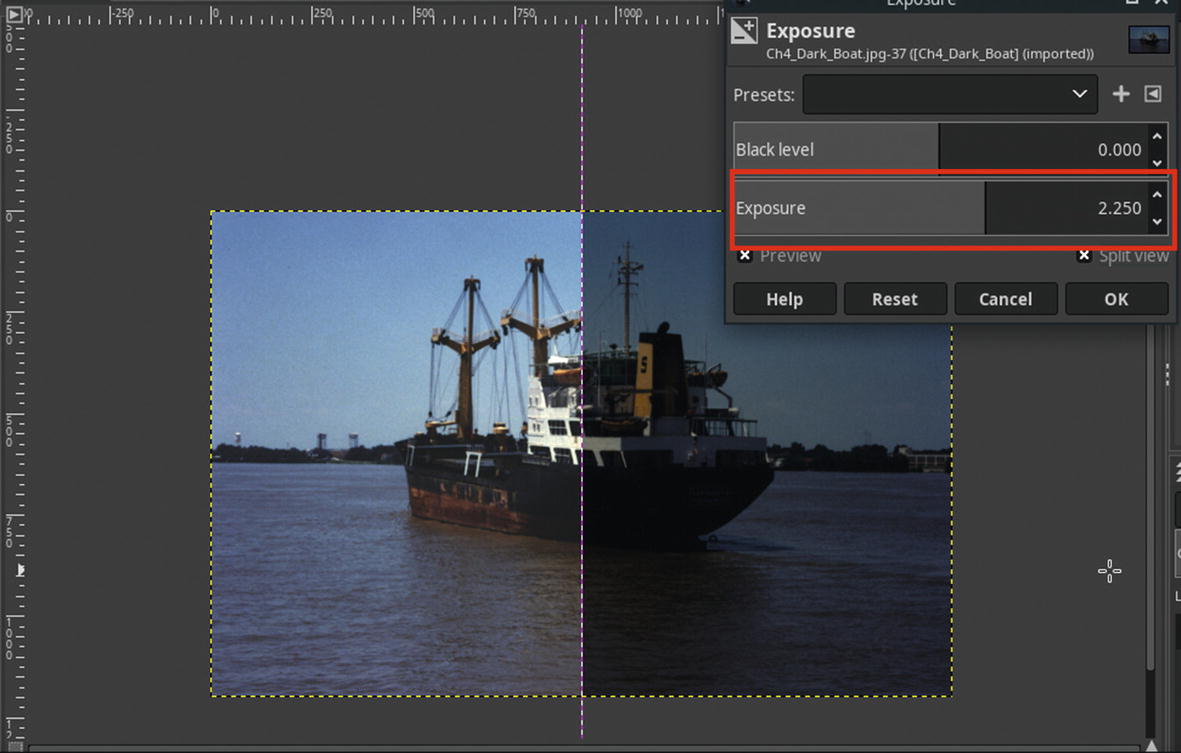
- 5.
This action caused the areas that are supposed to be dark to become muddy, so now we’ll offset this by adjusting the Black level. Set the Black level value to 0.002, then click OK (Figure 4-2).
Setting the Black level value darkens the shadow areas that became muddy
- 6.
The last thing to do is to slightly sharpen the image. Open the Unsharp Mask dialog (Filters ➤ Enhance ➤ Sharpen (Unsharp Mask)).
- 7.
Set the Radius to 1.00, leaving Amount and Threshold at their default settings (Figure 4-3), then click OK.

Setting the Radius in the Unsharp Mask dialog

The before and after comparison
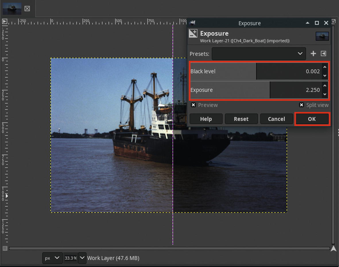
Overview of the Shadows-Highlights Dialog
The Shadows-Highlights dialog
- 1.
Presets—Allows the user to save the current value settings; this is useful when reapplying the same adjustments to multiple images, eliminating the need to manually adjust the settings each time.
- 2.
Shadows—Adjusts the exposure in the shadow (darkest) areas of the image.
- 3.
Shadows Color Adjustment—Adjusts the color saturation in the shadow (darkest) areas of the image.
- 4.
Highlights—Adjusts the exposure in the highlight (lightest) areas of the image.
- 5.
Highlights Color Adjustment—Adjusts the color saturation in the highlight (lightest) areas of the image.
- 6.
White Point Adjustment—Shifts the white point of the image.
- 7.
Radius—Spatial extent (essentially expands or narrows range of effect). Figure 4-6 shows an example of the shadows being lightened, and the radius expanding the range a bit further (note the shadows cast on the ground).

A comparison of the original image, the Shadow slider, and the Radius slider
- 8.
Compress—Compresses the effect while preserving midtones. Normally, the subject in the photograph is in the midtone range and has been adjusted for in the camera’s settings, so it’s usually desirable to preserve these.
- 9.
Split View—Provides a side-by-side view of the image with and without effect applied.
Tutorial 2: Lightening Dark Areas Using the Shadows-Highlights Dialog
In this lesson, the Shadows-Highlights dialog will be used to lighten a portion of a digital photograph that is underexposed while preserving the midtones and highlights.
- 1.
Open the practice image Ch4_Dark Foreground in Glimpse.
- 2.
Create a duplicate of the background layer (Right-Click ➤ Duplicate Layer) and rename it (Work Layer, or something similar).
- 3.
Launch the Shadows-Highlights dialog (Colors ➤ Shadows-Highlights)—by ticking the Split view option, a side-by-side view comparing the effect applied shown against the original is displayed.
- 4.
Set the Shadows slider to 60.00-65.00, the White point adjustment to 2.00, and the Radius slider to 10.00; click OK when done (Figure 4-7).

Set the Shadows slider to 60.00–65.00, the White point adjustment to 2.00, and the Radius slider to 10.00, then click OK
- 5.
The last thing to do is to slightly sharpen the image. Open the Unsharp Mask dialog (Filters ➤ Enhance ➤ Sharpen (Unsharp Mask)).
- 6.
Set the Radius to 1.00, leaving Amount and Threshold at their default settings (Figure 4-8), then click OK.
Note I zoomed in a great deal to show the subtle but noticeable difference that the Unsharp Mask filter made.

Setting the Radius in the Unsharp Mask dialog
The before and after comparison
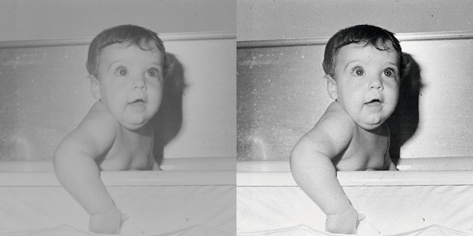
Tutorial 3: Improving Contrast Using the Brightness-Contrast Dialog
In this tutorial, we’ll call on the easy-to-use Brightness-Contrast dialog. It can be a useful dialog, but it’s a bit limited compared to other tonal adjustment dialogs (such as Levels or Curves).
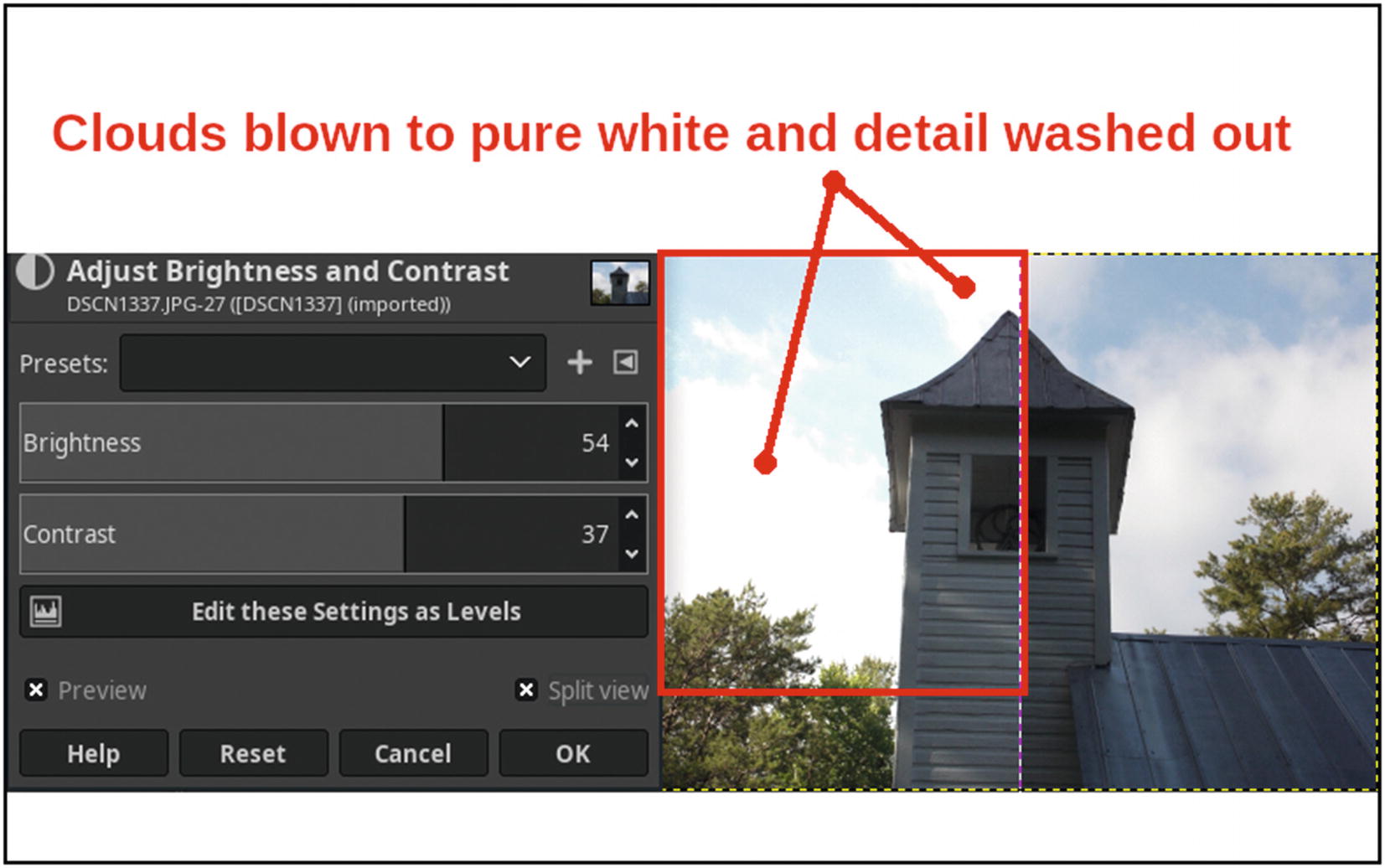
The Brightness-Contrast dialog can “overdo” the result, such as blowing out highlights
Now we’ll use the Brightness-Contrast dialog to improve an old photo that has dull contrast.
- 1.
Open the practice image Ch4_Baby_in_Bath in Glimpse.
- 2.
Create a duplicate of the background layer (Right-Click ➤ Duplicate Layer) and rename it (Work Layer, or something similar).
- 3.
Open the Brightness-Contrast dialog (Colors ➤ Brightness-Contrast).
- 4.
Set the Contrast slider to 53; click OK when done (Figure 4-11).
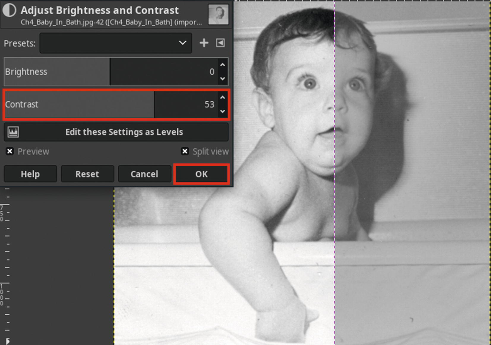
Set the Contrast slider to 53 to boost the contrast in this dull image
- 5.
Open the Unsharp Mask dialog (Filters ➤ Enhance ➤ Sharpen (Unsharp Mask)).
- 6.
Because this is an old image, we’ll sharpen it a bit more than the previous ones. Leave at the default settings (Radius 3.0, Amount 0.50, and Threshold 0.0), then click OK (Figure 4-12).

Leave the Unsharp Mask dialog at the default settings
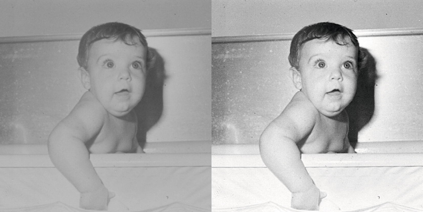
The before and after comparison
The Levels Dialog
The Levels dialog is an extremely useful feature. Levels can be used to make tonal corrections, such as making an image lighter, darker, or boosting the contrast with great precision.
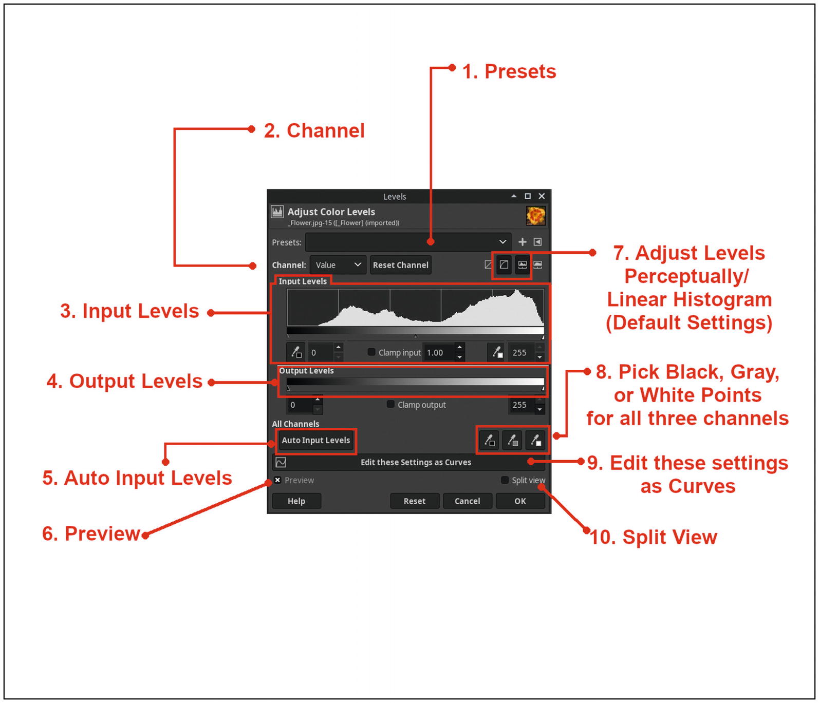
The Levels dialog
The Levels dialog’s functions are as follows:
- 1.
Presets—Allows the user to save the current value settings; this is useful when reapplying the same adjustments to multiple images, eliminating the need to manually adjust the settings each time.
- 2.
Channel—Adjusts the composite channel, or the red, green, and blue channels individually.
- 3.
Input Levels—The tonal information is essentially “remapped” by using the black, midtone, or white sliders. The numeric input boxes can also be used. The eye drop icons are used to pick black or white points for the selected channel (composite or the red, green, or blue channel).
- 4.
Output Levels—Allows the output level range to be limited or constrained; an example would be moving the white slider to the left set a lower maximum value for the highlights.
- 5.
Auto Input Levels—Automatically adjusts levels for all channels.
- 6.
Preview—When this box is checked, the effect is shown in real time as the adjustments are being made.
- 7.
Adjust Levels Perceptually/Linear Histogram—These are the default levels adjustment and histogram readout settings.
- 8.
Pick Black, Gray, or White Points for All Channels—Makes tonal adjustments in the composite channel.
- 9.
Edit These Settings As Curves—Instantly switches from Levels to the Curves dialog.
- 10.
Split View—A side-by-side view comparing the effect applied shown against the original is displayed.
Understanding the Histogram
The Levels dialog displays a histogram , which is a graphical representation of the pixel brightness values ranging from 0 (100% black) to 255 (100% white).

The tonal information of this image is mapped in the histogram
If you’ll notice, most of the data spans most of the length of the histogram with no large gaps.
There are gaps in the shadow and highlight portions of the histogram
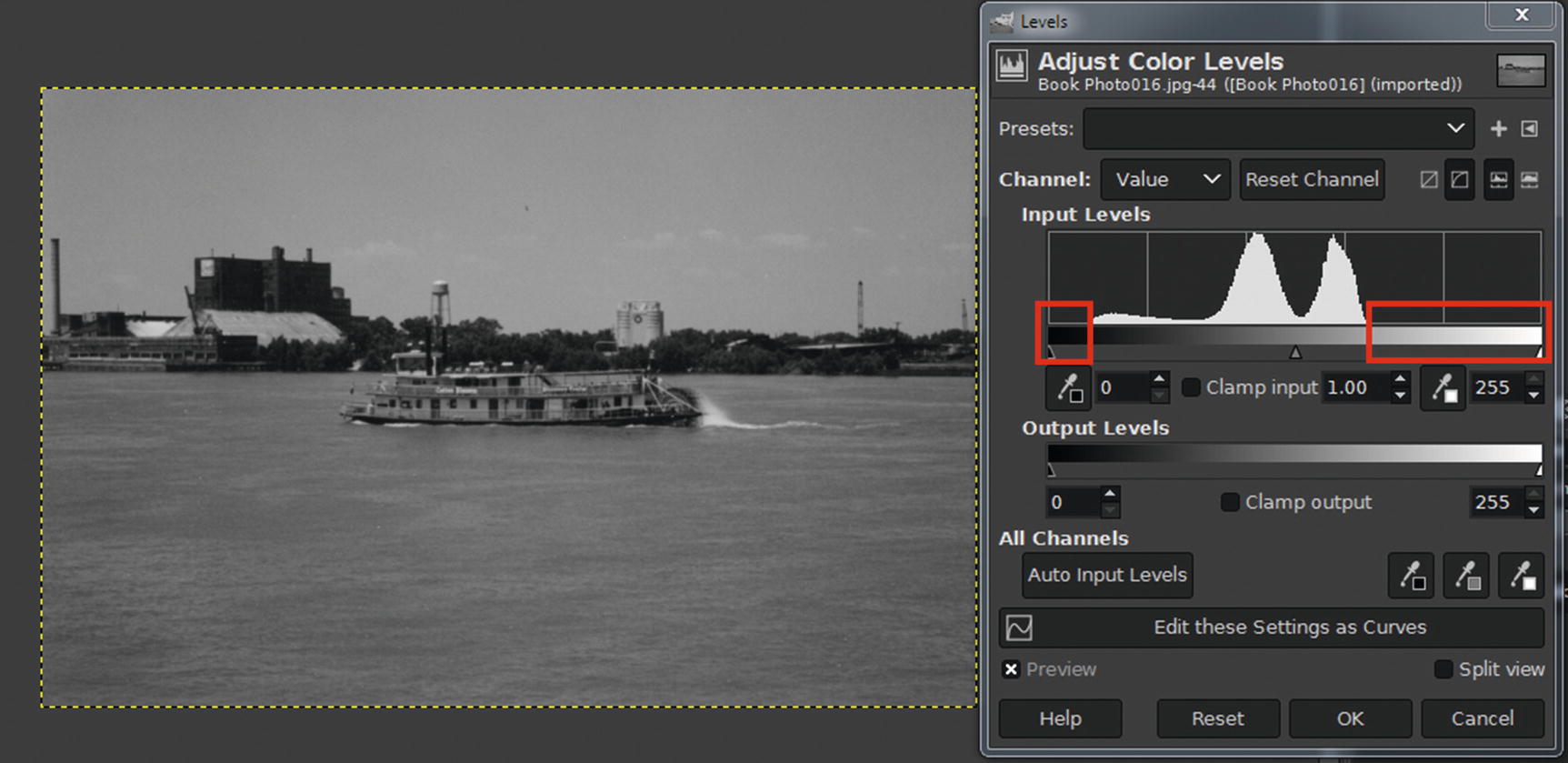
Tutorial 4: Improving Contrast Using Levels
- 1.
Open the practice image Ch4_Baby_in_Bath in Glimpse.
- 2.
Create a duplicate of the background layer (Right-Click ➤ Duplicate Layer) and rename it (Work Layer, or something similar).
- 3.
Open the Levels dialog (Colors ➤ Levels).
- 4.Now, we’ll make the following adjustments (Figure 4-17):
Move the black slider (input levels) to the right until the value is 76.
Move the white slider (input levels) to the left until the value is 195.
Click OK when done.

Move the black and white sliders as shown to bring out contrast
- 5.
As we did in the previous tutorial, we’ll sharpen the image a bit. Launch the Unsharp Mask filter dialog (Filters ➤ Enhance ➤ Sharpen (Unsharp Mask)).
- 6.
Leave at the default settings (Radius 3.0, Amount 0.50, and Threshold 0.0), then click OK.
The before and after comparison
The Curves Dialog
The Curves dialog is another useful feature—like levels, curves can be used to make tonal corrections and color corrections, but it offers greater precision.
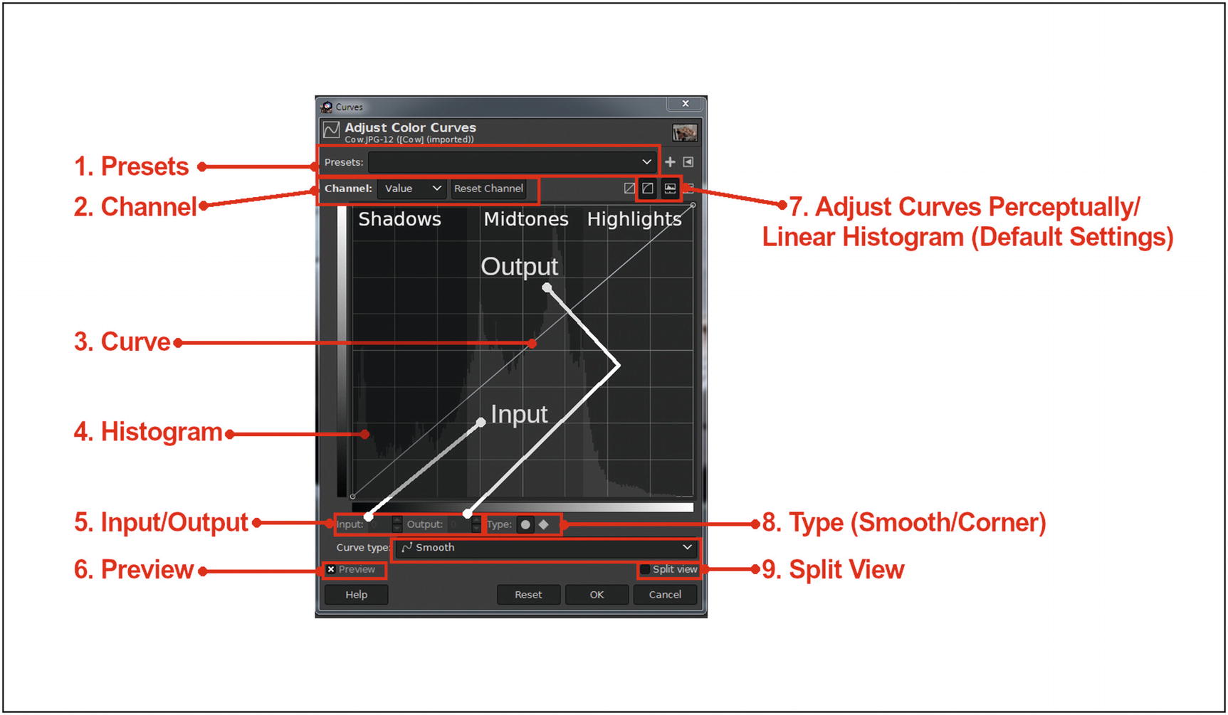
The Curves dialog
The Curves dialog’s functions are as follows:
- 1.
Presets—Allows the user to save the current value settings; this is useful when reapplying the same adjustments to multiple images, eliminating the need to manually adjust the settings each time.
- 2.
Channel—Adjusts the composite channel, or the red, green, and blue channels individually.
- 3.
Curve—This line can be curved to make adjustments in tone or color.
- 4.
Histogram—Graphical display of the pixel brightness.
- 5.
Input/Output—Displays the x/y position of the cursor on the grid as the curve is being adjusted.
- 6.
Preview—When this box is checked, the effect is shown in real time as the adjustments are being made.
- 7.
Adjust Curves Perceptually/Linear Histogram—Default settings; the other two settings are Adjust curves in linear light and Logarithmic histogram.
- 8.
Type—Configure as a curve or angled; the Curve type option offers smooth or freehand; an option of a curve with rounded arcs, or a pencil-like tool that allows the user to draw sharp angles on the curve (Figure 4-20).

The Smooth and Freehand curve types
- 9.
Split View—A side-by-side view comparing the effect applied shown against the original is displayed.
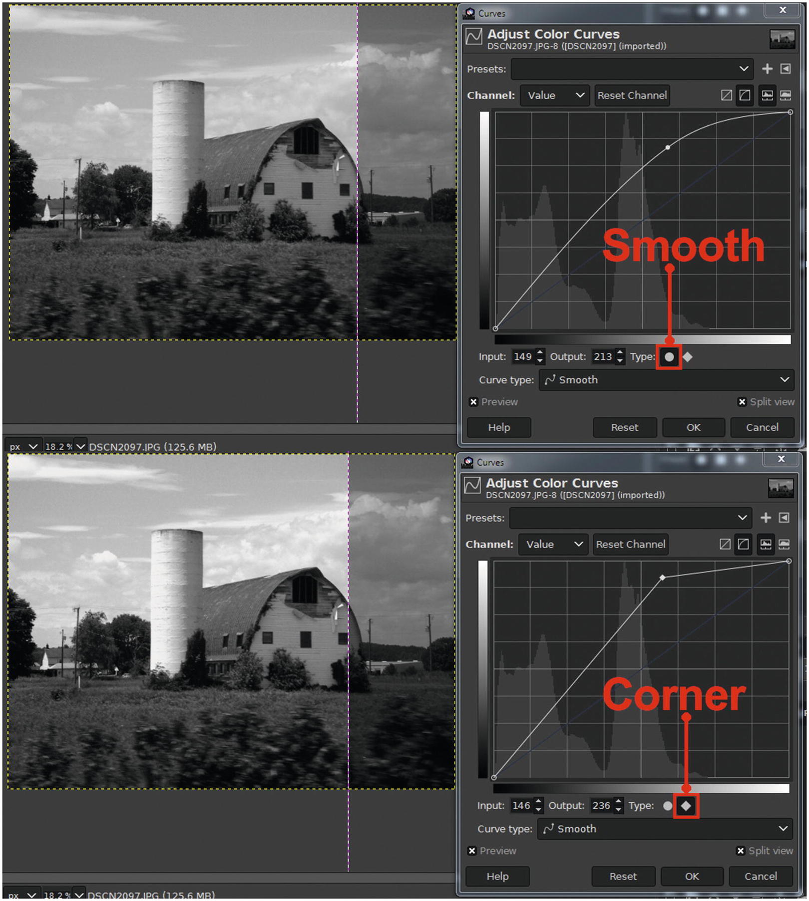
A comparison of the Smooth and Corner curve settings
An example of an “S” curve, which is used to improve contrast
Tutorial 5: Improving Local Tonality Using Curves
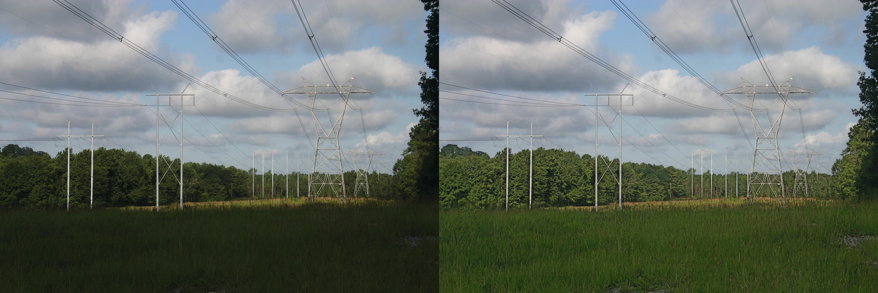
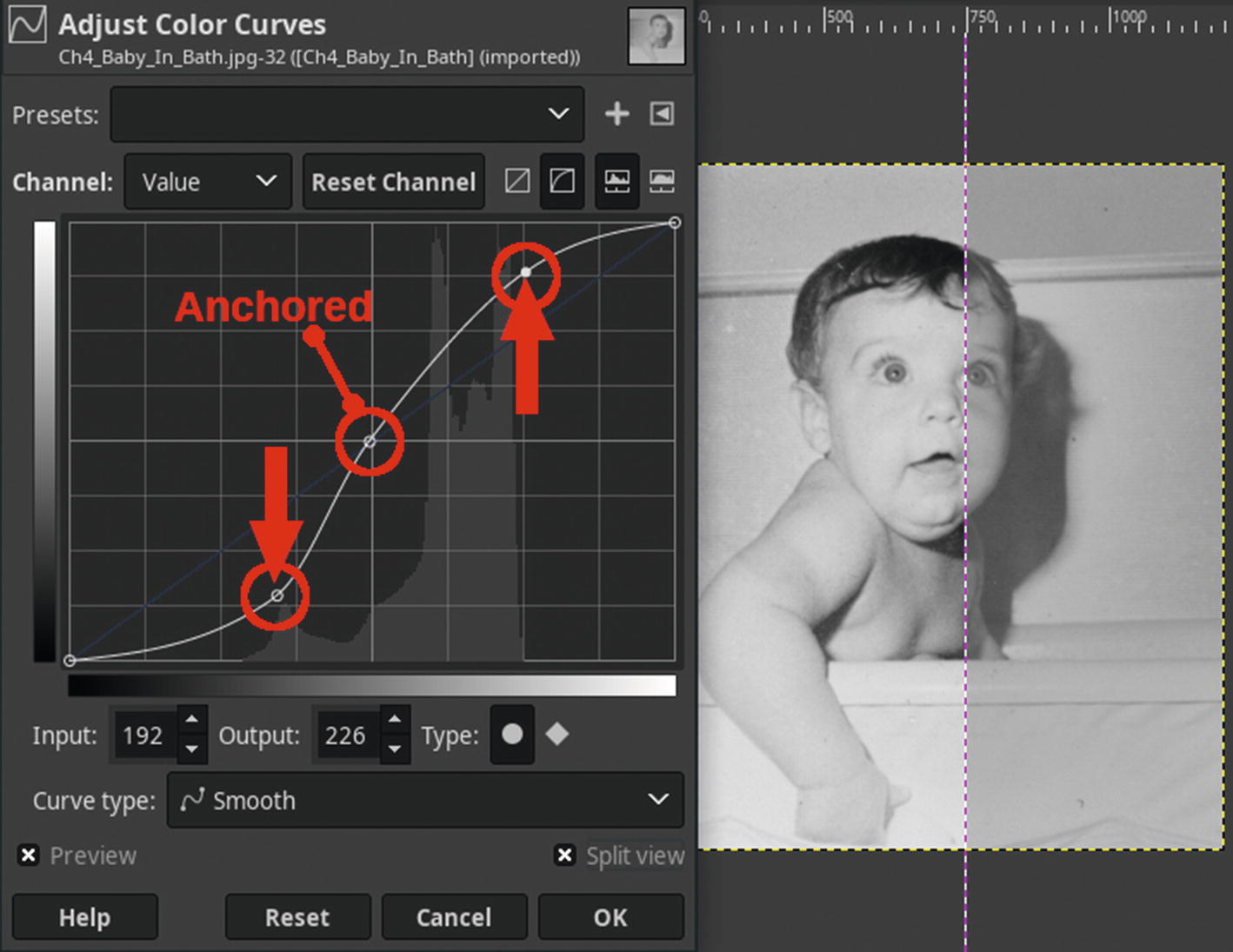
Now we’ll use the Curves dialog to reduce the harshness in the shadows of a slightly underexposed image. This adjustment localizes the darkest areas and lightens them slightly while leaving the midtones and highlights mostly unaffected.
- 1.
Open the practice image Ch4_Lighten_Shadows in Glimpse.
- 2.
Create a duplicate of the background layer (Right-Click ➤ Duplicate Layer) and rename it (Work Layer, or something similar).
- 3.
Open the Curves dialog (Colors ➤ Curves).
- 4.
We’ll make a slight bend in the curve to lighten the shadows. As shown in Figure 4-23, place an anchor point on the grid (input: 160/output: 160), and bend the curve slightly upward (input: 64/output 160).

Adjust the curve as shown to lighten the shadows
- 5.
Now, we’ll sharpen the image a bit. Launch the Unsharp Mask filter dialog (Filters ➤ Enhance ➤ Sharpen (Unsharp Mask)).
- 6.
Set the Radius to 1.00, leaving Amount and Threshold at their default settings (Figure 4-24), then click OK.
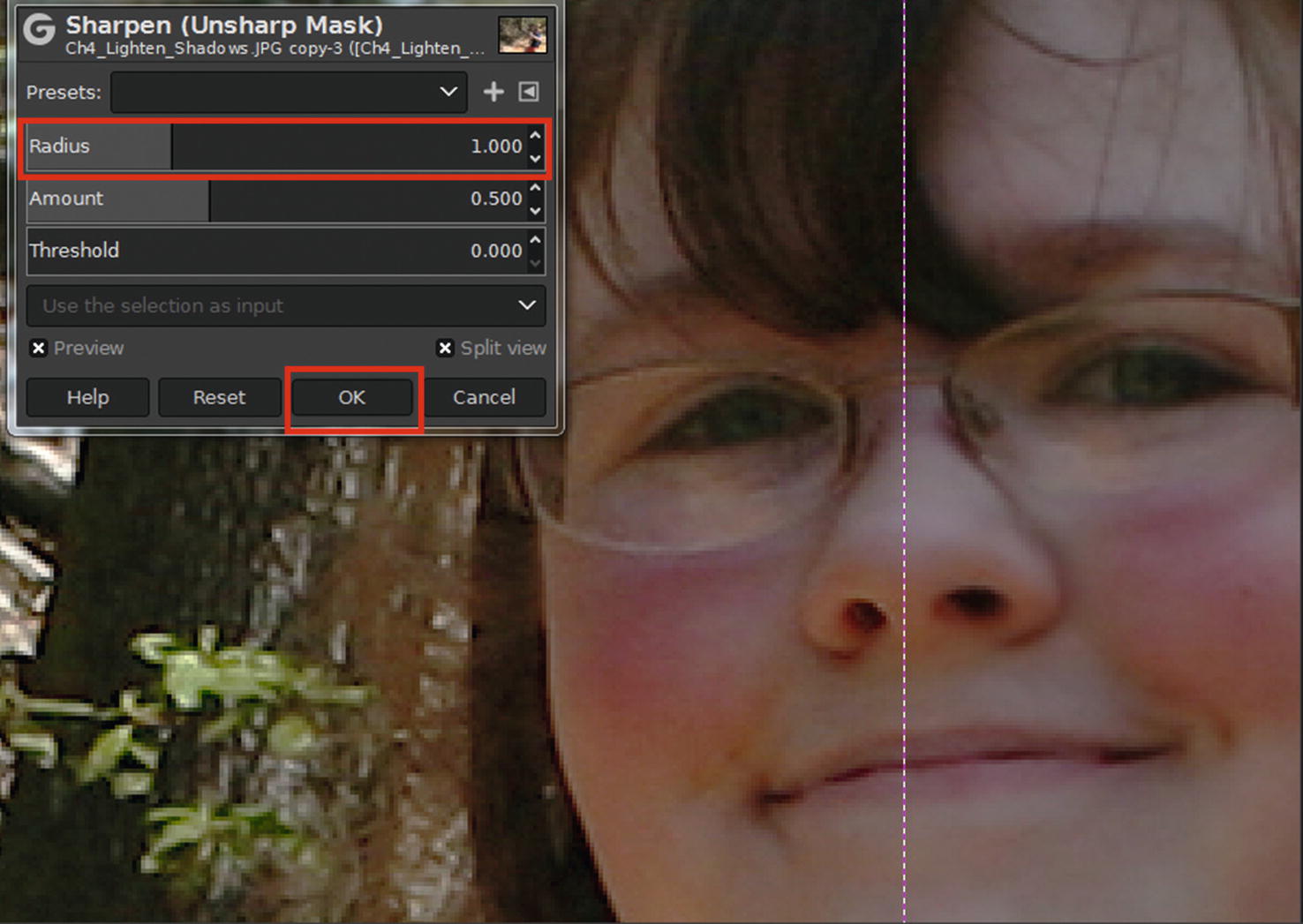
Setting the Radius in the Unsharp Mask dialog

The before and after comparison
Chapter Conclusion
This chapter provided several tutorials on correcting tonal problems (such as exposure and contrast).
Using the Exposure dialog
Lightening dark areas using the Shadows-Highlights dialog
Improving contrast using the Brightness-Contrast dialog
The Levels dialog
Understanding the histogram
Improving contrast using Levels
The Curves dialog
Improving local tonality using Curves
In the next chapter, we’ll look at working with color and making color corrections.