In this chapter, we’ll now learn about improving color images—both enhancing color and correcting color problems. We’ll also work with color by colorizing a grayscale (black-and-white image).
Tutorial 6: Correcting an unwanted color cast using Color Balance
The Color Temperature dialog
Tutorial 7: Correcting an image using Color Temperature
Tutorial 8: Restoring faded color using Levels
Tutorial 9: Restoring faded color using Auto White Balance
Tutorial 10: Turning a color image to sepia using Desaturate
Tutorial 11: Turning a color image to black and white using Mono Mixer
Tutorial 12: Colorizing a black-and-white photo
Chapter conclusion
Tutorial 6: Correcting a Color Shift Using Color Balance
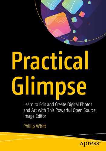
The color pairs used by the Color Balance dialog
In this case, we’ll correct an image with a blue color cast by offsetting it using yellow (blue’s opposite). We’ll make separate adjustments in the shadows and the midtones.
Not all color casts are necessarily undesirable. For example, taking a photograph in the evening before sunset may produce a golden or yellow color cast that lends an ideal mood for the image. Undesirable color casts are often a result of chemical changes in the photographic print over the years, or the camera’s settings (such as white balance) being improperly set.
- 1.
Open the practice image Ch5_Blue_Color_Cast in Glimpse.
- 2.
Create a duplicate of the background layer (Right-Click ➤ Duplicate Layer) and rename it (Work Layer, or something similar).
- 3.
Launch the Color Balance dialog (Colors ➤ Color Balance)—by ticking the Split view option, a side-by-side view comparing the effect applied shown against the original is displayed.
- 4.As shown in Figure 5-2, make the following adjustments:
Click the Shadows button.
Deselect the Preserve Luminosity option (the X in the box will not appear).
Move the Yellow-Blue slider to the left until the value is –40.00 (or double-click in the slider and enter the new values using the keyboard).
Do not click OK yet.

Adjusting the Shadows Range in the Color Balance dialog
- 5.Now, we’ll make some adjustments in the midtone range (Figure 5-3).
Click the Midtones button.
Leave the Preserve Luminosity option deselected (the X in the box will not appear).
Move the Yellow-Blue slider to the left until the value is –25.00 (or double-click in the slider and enter the new values using the keyboard).
Click OK.

Adjusting the Midtones Range in the Color Balance dialog
- 6.
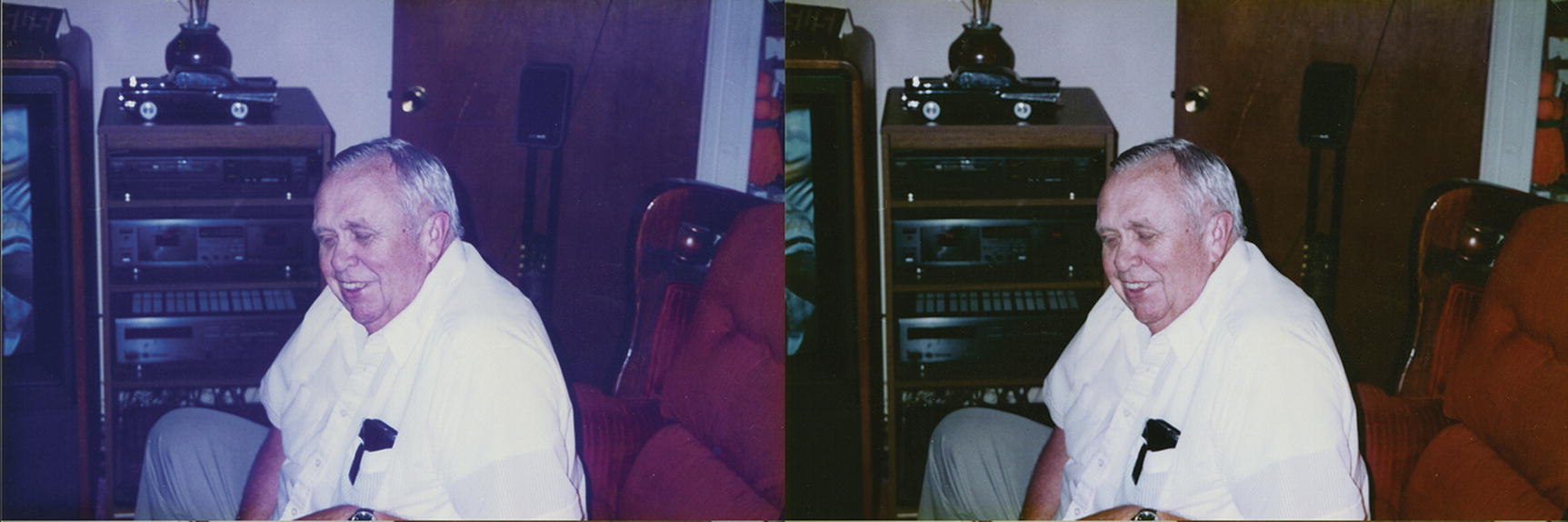
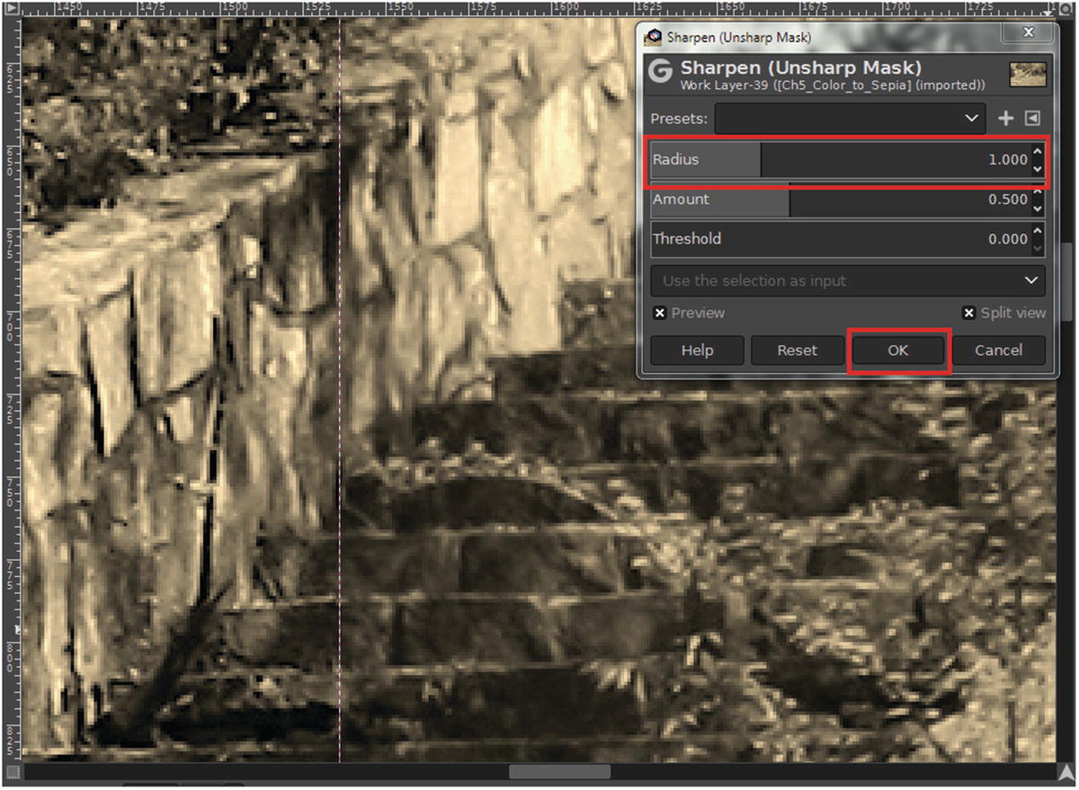
The last thing to do is to slightly sharpen the image. Open the Unsharp Mask dialog (Filters ➤ Enhance ➤ Sharpen (Unsharp Mask)).
- 7.
Set the Radius to 1.00, leaving Amount and Threshold at their default settings (Figure 5-4), then click OK.

Setting the Radius in the Unsharp Mask dialog
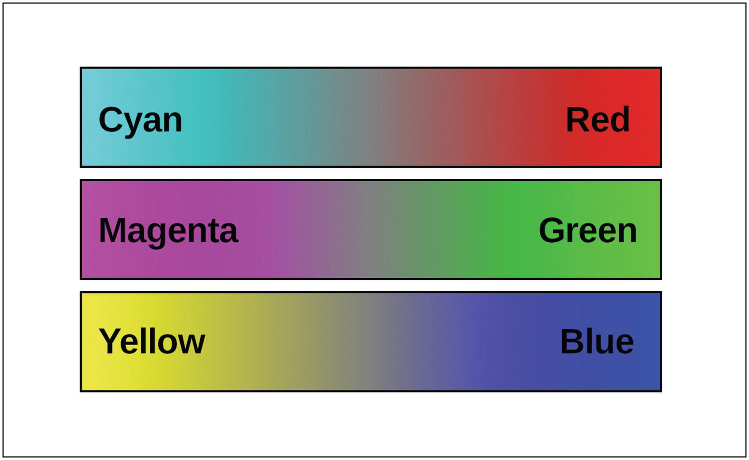
The before and after comparison
Tutorial 7: Correcting an Image Using Color Temperature
In this lesson, we’ll use the Color Temperature dialog to warm an image that has a cool color temperature that happened as a result of the camera’s white balance setting being improperly set.
Measured in Kelvin, color temperature refers how warm or cool the lighting in an image is. In this tutorial, the image is warmed by increasing the temperature from 6500 to 11000.
- 1.
Open the practice image Ch5_Cool_Temp in Glimpse.
- 2.
Create a duplicate of the background layer (Right-Click ➤ Duplicate Layer) and rename it (Work Layer, or something similar).
- 3.
Launch the Color Temperature dialog (Colors ➤ Color Temperature)—by ticking the Split view option, a side-by-side view comparing the effect applied shown against the original is displayed.
- 4.
Set the Intended Temperature slider to 11000, and click OK when done (Figure 5-6). This gives the image a noticeably warmer look, correcting the image.

Set the Intended Temperature to 11000
- 5.
The last thing to do is to slightly sharpen the image. Open the Unsharp Mask dialog (Filters ➤ Enhance ➤ Sharpen (Unsharp Mask)).
- 6.
Set the Radius to 1.00, leaving Amount and Threshold at their default settings (Figure 5-7), then click OK.
Note I zoomed in a great deal to show the subtle but noticeable difference that the Unsharp Mask filter made.
Setting the Radius in the Unsharp Mask dialog
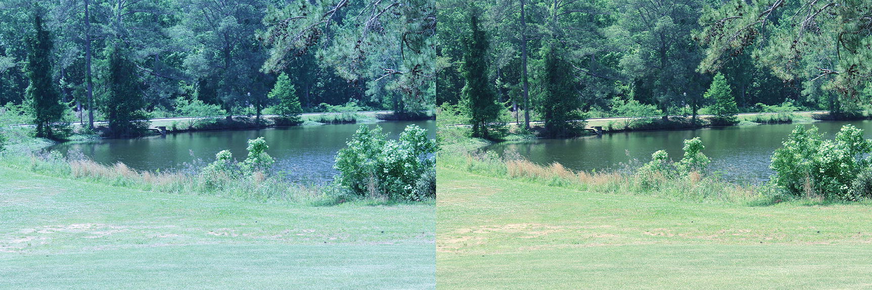
The before and after comparison
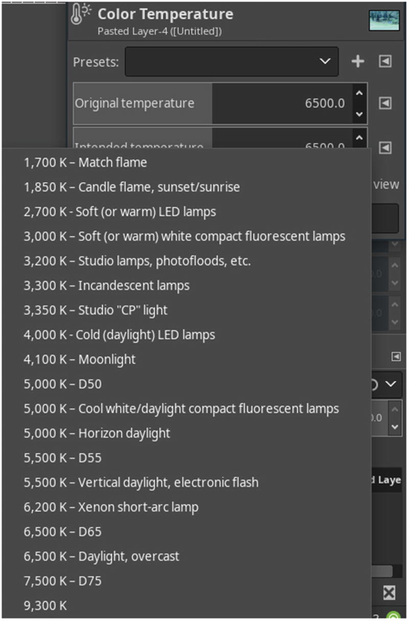
The Color Temperature dialog presets
Tutorial 8: Restoring Faded Colors Using Levels
In the last chapter, we used Levels to improve the contrast of a dull black-and-white image.
- 1.
Open the practice image Ch5_Faded_Color in Glimpse.
- 2.
Create a duplicate of the background layer (Right-Click ➤ Duplicate Layer) and rename it (Work Layer, or something similar).
- 3.
Open the Levels dialog (Colors ➤ Levels).
- 4.
Under the Channel setting, select Red—move the black slider to the right the numeric value is 68, then move the white slider to the left until the numeric value is 206 (Figure 5-10). Do not press the OK button yet.

Adjusting the Red Channel in Levels to the settings shown
- 5.
Under the Channel setting, select Green—move the black slider to the right the numeric value is 58, then move the white slider to the left until the numeric value is 200 (Figure 5-11). Do not press the OK button yet.
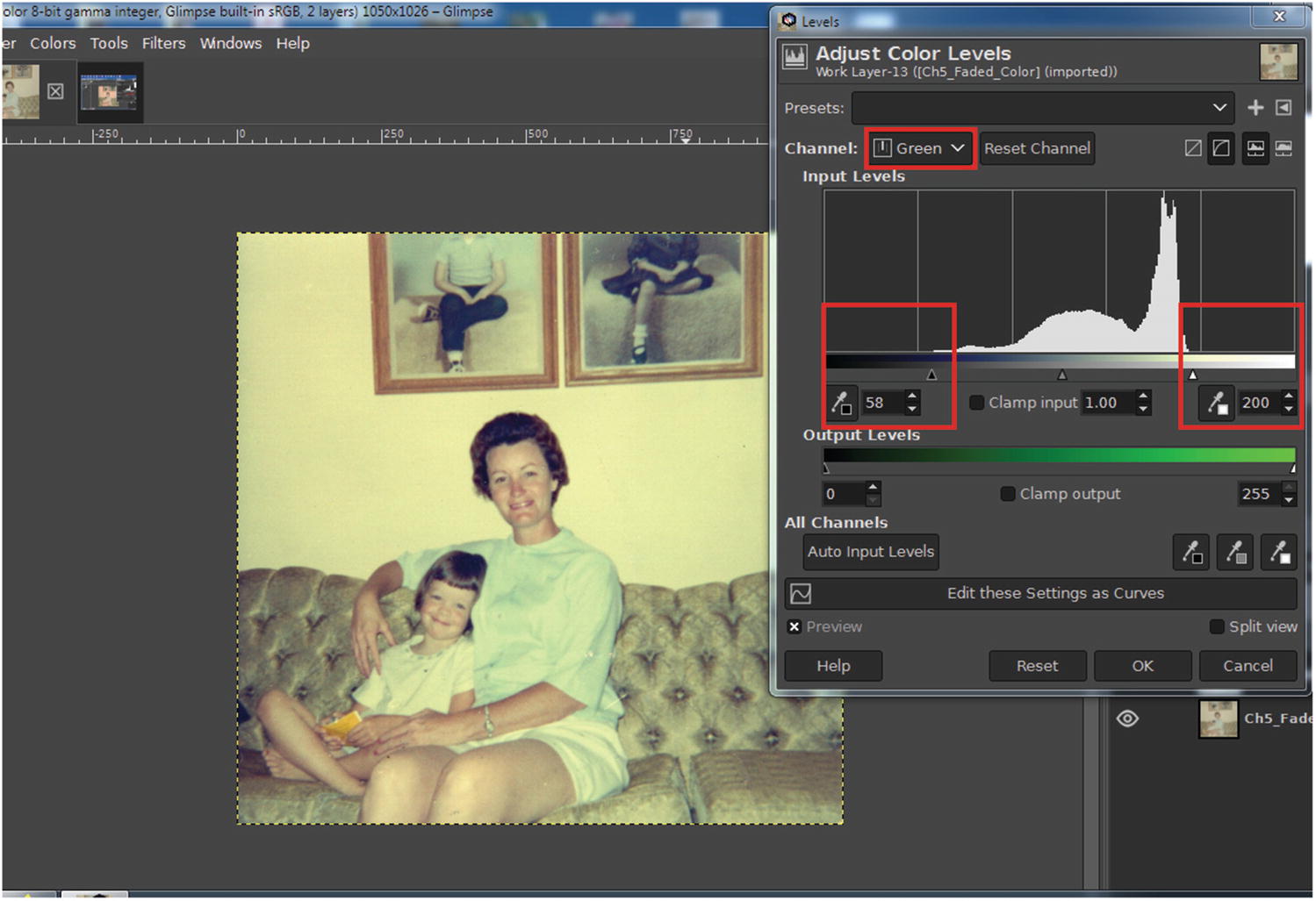
Adjusting the Green Channel in Levels to the settings shown
- 6.
Under the Channel setting, select Blue—move the black slider to the right the numeric value is 45, then move the white slider to the left until the numeric value is 175 (Figure 5-12). Press the OK button when finished.

Adjusting the Blue Channel in Levels to the settings shown
- 7.
We can see the image looks much better, but it could stand a bit of sharpening. Open the Unsharp Mask dialog (Filters ➤ Enhance ➤ Sharpen (Unsharp Mask)).
- 8.
Set the Radius to 2.00, leaving Amount and Threshold at their default settings (Figure 5-13), then click OK.

Setting the Radius to 2.00 in the Unsharp Mask dialog
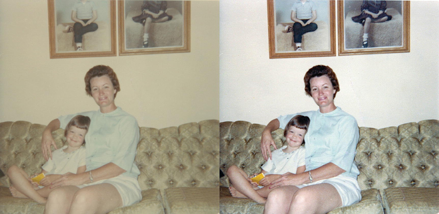
The before and after comparison
Tutorial 9: Restoring Color Using Auto White Balance
If you’re processing a large batch of old photographs (such as old family photos), using Auto White Balance can be a time-saver, although the results may be hit or miss. The results may be satisfactory, but not perfect.
- 1.
Open the practice image Ch5_White_Balance in Glimpse.
- 2.
Create a duplicate of the background layer (Right-Click ➤ Duplicate Layer) and rename it (Work Layer, or something similar).
- 3.
Initiate the Auto White Balance command as seen in Figure 5-15 (Colors ➤ Auto ➤ White Balance).

The Auto White Balance command
- 4.
There’s an immediate improvement; the colors look much more natural and the contrast improved. However, there’s a loss of density that results from years of degradation, so we’ll restore some of it.
- 5.
Create a duplicate of the Work Layer (Right-Click ➤ Duplicate Layer).
- 6.
Change the Blend Mode from Normal to Multiply, then lower the layer’s opacity from to 35–40% (Figure 5-16).
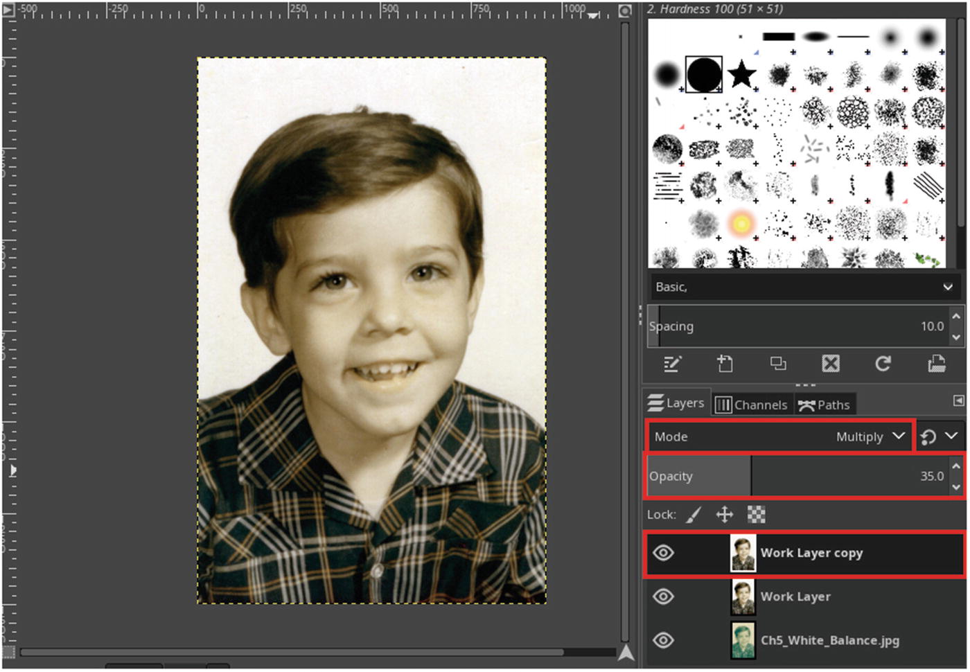
Changing the Blend Mode to Multiply restores some of the lost density
- 7.
Right-click the Work Layer Copy thumbnail, then select Merge Down.
- 8.
The last thing to do is to slightly sharpen the image . Open the Unsharp Mask dialog (Filters ➤ Enhance ➤ Sharpen (Unsharp Mask)).
- 9.
Set the Radius to 1.00, leaving Amount and Threshold at their default settings (Figure 5-17), then click OK.

Setting the Radius to 1.00 in the Unsharp Mask dialog
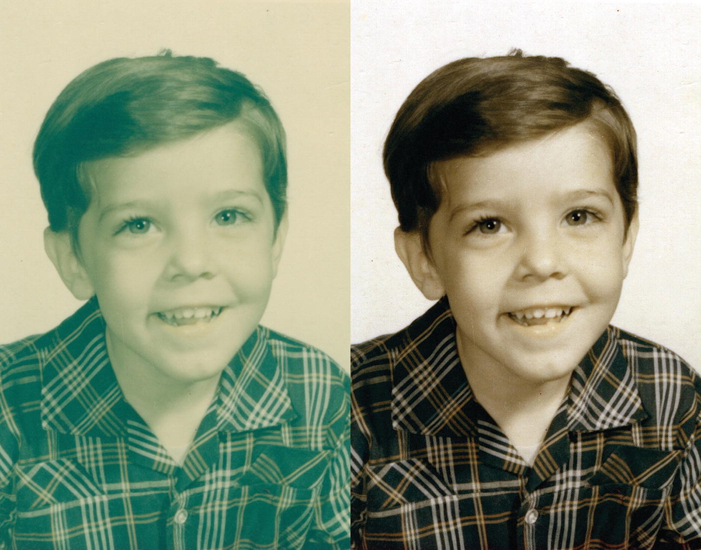
The before and after comparison
Tutorial 10: Turning a Color Image to Sepia Using Desaturate
- 1.
Open the practice image Ch5_Color_to_Sepia in Glimpse.
- 2.
Create a duplicate of the background layer (Right-Click ➤ Duplicate Layer) and rename it (Work Layer, or something similar).
- 3.
Open the Sepia dialog (Colors ➤ Desaturate ➤ Sepia)—by ticking the Split view option, a side-by-side view comparing the effect applied shown against the original is displayed.
- 4.
For the full sepia effect, leave the Effect Strength at the default setting of 1.00 (Figure 5-19), then click the OK button.

Leaving at the default setting creates a full sepia effect
- 5.
Now we’ll sharpen the image just a bit. Open the Unsharp Mask dialog (Filters ➤ Enhance ➤ Sharpen (Unsharp Mask)).
- 6.
Set the Radius to 1.00, leaving Amount and Threshold at their default settings (Figure 5-20), then click OK.
Setting the Radius in the Unsharp Mask dialog
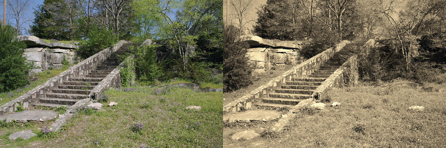
The before and after comparison

The strength of the sepia effect can be varied
A sepia effect can also be achieved by desaturating the image (removing the color) and using the Colorize dialog (Colors ➤ Colorize). By using the Hue, Saturation, and Lightness sliders, it’s possible to further customize the results.
Tutorial 11: Turning a Color Image to Black and White Using Mono Mixer
- 1.
Open the practice image Ch5_Color_to_Black_and_White in Glimpse.
- 2.
Create a duplicate of the background layer (Right-Click ➤ Duplicate Layer) and rename it (Work Layer, or something similar).
- 3.
Open the Mono Mixer dialog (Colors ➤ Components ➤ Mono Mixer)—by ticking the Split view option, a side-by-side view comparing the effect applied shown against the original is displayed (Figure 5-23).

The Mono Mixer dialog
- 4.
The default settings yield good results, but we’ll make a couple of slight adjustments to create a little more contrast between the railroad ties and the grass growing between them.
- 5.
As shown in Figure 5-24, adjust the Red Channel Multiplier to 0.75 and the Blue Channel Multiplier to 0.110—press OK when done.

Adjusting the Red and Blue Channel Multipliers
- 6.
Now we’ll sharpen the image just a bit. Open the Unsharp Mask dialog (Filters ➤ Enhance ➤ Sharpen (Unsharp Mask)).
- 7.
Set the Radius to 1.00, leaving Amount and Threshold at their default settings, then click OK.

The before and after comparison
The Desaturate Dialog

Navigating to the Desaturate dialog

The different modes available in the Desaturate dialog
Tutorial 12: Colorizing a Black-and-White Photo
- 1.
Open the practice image Ch5_Colorize_Pendant in Glimpse.
- 2.
Create a duplicate of the background layer (Right-Click ➤ Duplicate Layer) and rename it (Work Layer, or something similar).
- 3.
Normally, we save this for last, but for this tutorial, we’ll sharpen the image just a bit at this point. Open the Unsharp Mask dialog (Filters ➤ Enhance ➤ Sharpen (Unsharp Mask)).
- 4.
Set the Radius to 0.75, leaving Amount and Threshold at their default settings, then click OK.
- 5.
Launch the New Layer dialog and create a new layer (Layer ➤ New Layer). This will be used to colorize the felt background under the pendant.
- 6.
Name the layer Red Felt and change the blend mode to Multiply, then click OK. This blend mode will provide the felt a deep, rich scarlet/red color.
- 7.
Launch the Color Selection dialog by clicking in the active foreground color swatch in the Toolbox.
- 8.
Change the foreground color to 100% red by clicking and dragging to the upper-right corner as shown in Figure 5-28—press OK when done.

Change the foreground color to 100% red
- 9.
Select the Paintbrush Tool (P) and choose a soft brush tip (Hardness 025). Change the diameter to about 15 pixels.
- 10.
Paint an outline around the pendant.
- 11.
Select the Fuzzy Select Tool (U). Change the Threshold to about 50, and click in an area just outside the outline (Figure 5-29). Make sure the selection is made on the layer named Red Felt.

Use the Fuzzy Select Tool to make a selection just outside of the outline around the pendant
- 12.
Before applying color, let’s grow the selection a little to make sure the entire area is filled (Selection ➤ Grow). Enter a value of 5 pixels, then press OK when done (Figure 5-30).

Use the Grow Selection dialog to make sure the entire area will be filled
- 13.
Fill the selected area with red (Edit ➤ Fill with FG Color), then deactivate the selection (Select ➤ None).
- 14.
Duplicate the layer named Red Felt (Layer ➤ Duplicate), and change the blend mode to Overlay—reduce the opacity to 20%.
- 15.
Launch the New Layer dialog and create a new layer (Layer ➤ New Layer). This will be used to colorize the pendant.
- 16.
Name the layer Bronze and change the blend mode to HSL Color.
- 17.
Launch the Color Selection dialog by clicking in the active foreground color swatch in the Toolbox.
- 18.
Change the foreground color to a bronze color by entering these values: R-23.1, G-17.6, and B-9.0 (Figure 5-31).
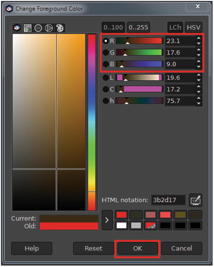
Change the Foreground color to a bronze color using these values
- 19.
Select the Paintbrush Tool (P) and choose a soft brush tip (Hardness 025). Apply the bronze color to the pendant, adjusting the brush size as needed.
- 20.
Check your work by changing the blend mode to normal—the color will opaque and reveal any overlooked areas. Change the mode back to HLS Color when completely colorized.
- 21.
Launch the New Layer dialog and create two new layers (Layer ➤ New Layer) for both the heart- and eye-shaped rhinestones; name one layer Heart and the other Eye.
- 22.
Change the blend mode of the layer named Heart to HSL Color, and the layer named Eye to LCh Color.
- 23.
Lower the opacity of each layer to 70% (this keeps the colors realistic looking and not overpowering).
- 24.
Change the foreground color to a deep pink by entering these values: R-100, G-0, and B-41.6.
- 25.
Select the Paintbrush Tool (P) and choose a soft brush tip (Hardness 025). Change the diameter to about 35 pixels, and apply the color in the heart-shaped rhinestone in the designated layer.
- 26.
Change the foreground color to a light blue by entering these values: R-0, G-89.4, and B-100.
- 27.
Select the Paintbrush Tool (P) and choose a soft brush tip (Hardness 025). Change the diameter to about 15–20 pixels, and apply the color in the eye-shaped rhinestone in the designated layer.
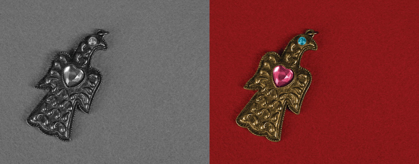
The before and after comparison
Chapter Conclusion
This chapter provided several tutorials on correcting color issues, as well as being a little artistic with color.
Correcting an unwanted color cast using Color Balance
The Color Temperature dialog
Correcting an image using Color Temperature
Restoring faded color using Levels
Restoring faded color using Auto White Balance
Turning a color image to sepia using Desaturate
Turning a color image to black and white using Mono Mixer
Colorizing a black-and-white photo
In the next chapter, we’ll look at modifying, retouching, and restoring damaged photos.