
If statistics is about taking samples of populations, it must be very important to know how we obtain these samples, and you'd be correct. Let's focus on just a few of the many ways of obtaining and sampling data.
There are two main ways of collecting data for our analysis: observational and experimentation. Both these ways have their pros and cons, of course. They each produce different types of behavior and, therefore, warrant different types of analysis.
We might obtain data through observational means, which consists of measuring specific characteristics but not attempting to modify the subjects being studied. For example, you have a tracking software on your website that observes users' behavior on the website, such as length of time spent on certain pages and the rate of clicking on ads, all the while not affecting the user's experience, then that would be an observational study.
This is one of the most common ways to get data because it's just plain easy. All you have to do is observe and collect data. Observational studies are also limited in the types of data you may collect. This is because the observer (you) is not in control of the environment. You may only watch and collect natural behavior. If you are looking to induce a certain type of behavior, an observational study would not be useful.
An experiment consists of a treatment and the observation of its effect on the subjects. Subjects in an experiment are called experimental units. This is usually how most scientific labs collect data. They will put people into two or more groups (usually just two) and call them the control and the experimental group.
The control group is exposed to a certain environment and then observed. The experimental group is then exposed to a different environment and then observed. The experimenter then aggregates data from both the groups and makes a decision about which environment was more favorable (favorable is a quality that the experimenter gets to decide).
In a marketing example, consider that we expose half of our users to a certain landing page with certain images and a certain style (website A), and we measure whether or not they sign up for the service. Then, we expose the other half to a different landing page, different images, and different styles (website B) and again measure whether or not they sign up. We can then decide which of the two sites performed better and should be used going further. This, specifically, is called an A/B test. Let's see an example in Python! Let's suppose we run the preceding test and obtain the following results as a list of lists:
results = [ ['A', 1], ['B', 1], ['A', 0], ['A', 0] ... ]
Here, each object in the list result represents a subject (person). Each person then has the following two attributes:
- Which website they were exposed to, represented by a single character
- Whether or not they converted (
0for no and1for yes)
We can then aggregate and come up with the following results table:
users_exposed_to_A = []
users_exposed_to_B = []
# create two lists to hold the results of each individual website
Once we create these two lists that will eventually hold each individual conversion Boolean (0 or 1), we will iterate all of our results of the test and add them to the appropriate list, as shown:
for website, converted in results: # iterate through the results
  # will look something like website == 'A' and converted == 0
  if website == 'A':
    users_exposed_to_A.append(converted)
  elif website == 'B':
    users_exposed_to_B.append(converted)
Now, each list contains a series of 1s and 0s.
To get the total number of people exposed to website A, we can use the len() feature in Python, as illustrated:
len(users_exposed_to_A) == 188 #number of people exposed to website A
len(users_exposed_to_B) == 158 #number of people exposed to website B
To count the number of people who converted, we can use the sum() of the list, as shown:
sum(users_exposed_to_A) == 54 # people converted from website A
sum(users_exposed_to_B) == 48 # people converted from website B
If we subtract the length of the lists and the sum of the list, we are left with the number of people who did not convert for each site, as illustrated:
len(users_exposed_to_A) - sum(users_exposed_to_A) == 134 # did not convert from website A
len(users_exposed_to_B) - sum(users_exposed_to_B) == 110 # did not convert from website B
We can aggregate and summarize our results in the following table, which represents our experiment of website conversion testing:
|
Did not sign up |
Signed up | |
|---|---|---|
|
Website A |
134 |
54 |
|
Website B |
110 |
48 |
The results of our A/B test
We can quickly drum up some descriptive statistics. We can say that the website conversion rates for the two websites are as follows:
- Conversion for website A: 154 /(154+34) = .288
- Conversion for website B: 48/(110+48)= .3
Not much difference, but different nonetheless. Even though B has the higher conversion rate, can we really say that version B significantly converts better? Not yet. To test the statistical significance of such a result, a hypothesis test should be used. These tests will be covered in depth in the next chapter, where we will revisit this exact same example and finish it using a proper statistical test.
Remember how statistics are the result of measuring a sample of a population. Well, we should talk about two very common ways to decide who gets the honor of being in the sample that we measure. We will discuss the main type of sampling, called random sampling, which is the most common way to decide our sample sizes and our sample members.
Probability sampling is a way of sampling from a population, in which every person has a known probability of being chosen but that number might be a different probability than another user. The simplest (and probably the most common) probability sampling method is a random sampling.
Suppose that we are running an A/B test and we need to figure out who will be in group A and who will be in group B. There are the following three suggestions from your data team:
- Separate users based on location: Users on the West coast are placed in group A, while users on the East coast are placed in group B
- Separate users based on the time of day they visit the site: Users who visit between 7 p.m. and 4 a.m. are group A, while the rest are placed in group B
- Make it completely random: Every new user has a 50/50 chance of being placed in either group
The first two are valid options for choosing samples and are fairly simple to implement, but they both have one fundamental flaw: they are both at risk of introducing a sampling bias.
A sampling bias occurs when the way the sample is obtained systemically favors some outcome over the target outcome.
It is not difficult to see why choosing option 1 or option 2 might introduce bias. If we chose our groups based on where they live or what time they log in, we are priming our experiment incorrectly and, now, we have much less control over the results.
Specifically, we are at risk of introducing a confounding factor into our analysis, which is bad news.
A confounding factor is a variable that we are not directly measuring but connects the variables that are being measured.
Basically, a confounding factor is like the missing element in our analysis that is invisible but affects our results.
In this case, option 1 is not taking into account the potential confounding factor of geographical taste. For example, if website A is unappealing, in general, to West coast users, it will affect your results drastically.
Similarly, option 2 might introduce a temporal (time-based) confounding factor. What if website B is better viewed in a night-time environment (which was reserved for A), and users are reacting negatively to the style purely because of what time it is? These are both factors that we want to avoid, so, we should go with option 3, which is a random sample.
A random sample is chosen such that every single member of a population has an equal chance of being chosen as any other member.
This is probably one of the easiest and most convenient ways to decide who will be a part of your sample. Everyone has the exact same chance of being in any particular group. Random sampling is an effective way of reducing the impact of confounding factors.
Recall that I previously said that a probability sampling might have different probabilities for different potential sample members. But what if this actually introduced problems? Suppose we are interested in measuring the happiness level of our employees. We already know that we can't ask every single member of staff because that would be silly and exhausting. So, we need to take a sample. Our data team suggests random sampling, and at first everyone high-fives because they feel very smart and statistical. But then someone asks a seemingly harmless question: does anyone know the percentage of men/women who work here?
The high fives stop and the room goes silent.
This question is extremely important because sex is likely to be a confounding factor. The team looks into it and discovers a split of 75% men and 25% women in the company.
This means that if we introduce a random sample, our sample will likely have a similar split and thus favor the results for men and not women. To combat this, we can favor including more women than men in our survey in order to make the split of our sample less favored for men.
At first glance, introducing a favoring system in our random sampling seems like a bad idea; however, alleviating unequal sampling and, therefore, working to remove systematic bias among gender, race, disability, and so on is much more pertinent. A simple random sample, where everyone has the same chance as everyone else, is very likely to drown out the voices and opinions of minority population members. Therefore, it can be okay to introduce such a favoring system in your sampling techniques.
Once we have our sample, it's time to quantify our results. Suppose we wish to generalize the happiness of our employees or we want to figure out whether salaries in the company are very different from person to person.
These are some common ways of measuring our results.
Measures of the center are how we define the middle, or center, of a dataset. We do this because sometimes we wish to make generalizations about data values. For example, perhaps we're curious about what the average rainfall in Seattle is or what the median height of European males is. It's a way to generalize a large set of data so that it's easier to convey to someone.
A measure of center is a value in the middle of a dataset.
However, this can mean different things to different people. Who's to say where the middle of a dataset is? There are so many different ways of defining the center of data. Let's take a look at a few.
The arithmetic mean of a dataset is found by adding up all of the values and then dividing it by the number of data values.
This is likely the most common way to define the center of data, but can be flawed! Suppose we wish to find the mean of the following numbers:
import numpy as np
np.mean([11, 15, 17, 14]) == 14.25
Simple enough; our average is 14.25 and all of our values are fairly close to it. But what if we introduce a new value: 31?
np.mean([11, 15, 17, 14, 31]) == 17.6
This greatly affects the mean because the arithmetic mean is sensitive to outliers. The new value, 31, is almost twice as large as the rest of the numbers and therefore skews the mean.
Another, and sometimes better, measure of center is the median.
The median is the number found in the middle of the dataset when it is sorted in order, as shown:
np.median([11, 15, 17, 14]) == 14.5
np.median([11, 15, 17, 14, 31]) == 15
Note how the introduction of 31 using the median did not affect the median of the dataset greatly. This is because the median is less sensitive to outliers.
When working with datasets with many outliers, it is sometimes more useful to use the median of the dataset, while if your data does not have many outliers and the data points are mostly close to one another, then the mean is likely a better option.
But how can we tell if the data is spread out? Well, we will have to introduce a new type of statistic.
Measures of the center are used to quantify the middle of the data, but now we will explore ways of measuring how to spread out the data we collect is. This is a useful way to identify if our data has many outliers lurking inside. Let's start with an example.
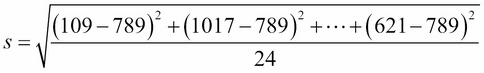
Consider that we take a random sample of 24 of our friends on Facebook and wrote down how many friends that they had on Facebook. Here's the list:
friends = [109, 1017, 1127, 418, 625, 957, 89, 950, 946, 797, 981, 125, 455, 731, 1640, 485, 1309, 472, 1132, 1773, 906, 531, 742, 621]

 np.mean(friends) == 789.1
The average of this list is just over 789. So, we could say that according to this sample, the average Facebook friend has 789 friends. But what about the person who only has 89 friends or the person who has over 1,600 friends? In fact, not a lot of these numbers are really that close to 789.
Well, how about we use the median? The median generally is not as affected by outliers:
np.median(friends) == 769.5
The median is 769.5, which is fairly close to the mean. Hmm, good thought, but still, it doesn't really account for how drastically different a lot of these data points are to one another. This is what statisticians call measuring the variation of data. Let's start by introducing the most basic measure of variation: the range. The range is simply the maximum value minus the minimum value, as illustrated:
np.max(friends) - np.min(friends) == 1684
The range tells us how far away the two most extreme values are. Now, typically the range isn't widely used but it does have its use in the application. Sometimes, we wish to just know how spread apart the outliers are. This is most useful in scientific measurements or safety measurements.
Suppose a car company wants to measure how long it takes for an airbag to deploy. Knowing the average of that time is nice, but they also really want to know how spread apart the slowest time is versus the fastest time. This literally could be the difference between life and death.
Shifting back to the Facebook example, 1,684 is our range, but I'm not quite sure it's saying too much about our data. Now, let's take a look at the most commonly used measure of variation, the standard deviation.
I'm sure many of you have heard this term thrown around a lot and it might even incite a degree of fear, but what does it really mean? In essence, standard deviation, denoted by s when we are working with a sample of a population, measures how much data values deviate from the arithmetic mean.
It's basically a way to see how spread out the data is. There is a general formula to calculate the standard deviation, which is as follows:
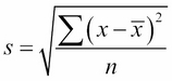
Let's look at each of the elements in this formula in turn:
- s is our sample's standard deviation
- x is each individual data point
 is the mean of the data
- n is the number of data points
Before you freak out, let's break it down. For each value in the sample, we will take that value, subtract the arithmetic mean from it, square the difference, and, once we've added up every single point this way, we will divide the entire thing by n, the number of points in the sample. Finally, we take a square root of everything.
Without going into an in-depth analysis of the formula, think about it this way: it's basically derived from the distance formula. Essentially, what the standard deviation is calculating is a sort of average distance of how far the data values are from the arithmetic mean.
If you take a closer look at the formula, you will see that it actually makes sense:
-
By taking
 , you are finding the literal difference between the value and the mean of the sample.
-
By squaring the result,
 , we are putting a greater penalty on outliers because squaring a large error only makes it much larger.
- By dividing by the number of items in the sample, we are taking (literally) the average squared distance between each point and the mean.
- By taking the square root of the answer, we are putting the number in terms that we can understand. For example, by squaring the number of friends minus the mean, we changed our units to friends squared, which makes no sense. Taking the square root puts our units back to just "friends."
Let's go back to our Facebook example for a visualization and further explanation of this. Let's begin to calculate the standard deviation. So, we'll start calculating a few of them. Recall that the arithmetic mean of the data was just about 789, so, we'll use 789 as the mean.
We start by taking the difference between each data value and the mean, squaring it, adding them all up, dividing it by one less than the number of values, and then taking its square root. This would look as follows:
On the other hand, we can take the Python approach and do all this programmatically (which is usually preferred):
np.std(friends) # == 425.2
What the number 425 represents is the spread of data. You could say that 425 is a kind of average distance the data values are from the mean. What this means, in simple words, is that this data is pretty spread out.
So, our standard deviation is about 425. This means that the number of friends that these people have on Facebook doesn't seem to be close to a single number and that's quite evident when we plot the data in a bar graph, and also graph the mean as well as the visualizations of the standard deviation. In the following plot, every person will be represented by a single bar in the bar chart, and the height of the bars represent the number of friends that the individuals have:
import matplotlib.pyplot as plt friends = [109, 1017, 1127, 418, 625, 957, 89, 950, 946, 797, 981, 125, 455, 731, 1640, 485, 1309, 472, 1132, 1773, 906, 531, 742, 621] y_pos = range(len(friends)) plt.bar(y_pos, friends) plt.plot((0, 25), (789, 789), 'b-') plt.plot((0, 25), (789+425, 789+425), 'g-')
plt.plot((0, 25), (789-425, 789-425), 'r-')
Here's the chart that we get:

The blue line in the center is drawn at the mean (789), the red line near the bottom is drawn at the mean minus the standard deviation (789-425 = 364), and finally the green line towards the top is drawn at the mean plus the standard deviation (789+425 = 1,214).
Note how most of the data lives between the green and the red lines while the outliers live outside the lines. There are three people who have friend counts below the red line and three people who have a friend count above the green line.
It's important to mention that the units for standard deviation are, in fact, the same units as the data's units. So, in this example, we would say that the standard deviation is 425 friends on Facebook.
So, now we know that the standard deviation and variance is good for checking how spread out our data is, and that we can use it along with the mean to create a kind of range that a lot of our data lies in. But what if we want to compare the spread of two different datasets, maybe even with completely different units? That's where the coefficient of variation comes into play.
The coefficient of variation is defined as the ratio of the data's standard deviation to its mean.
This ratio (which, by the way, is only helpful if we're working in the ratio level of measurement, where the division is allowed and is meaningful) is a way to standardize the standard deviation, which makes it easier to compare across datasets. We use this measure frequently when attempting to compare means, and it spreads across populations that exist at different scales.
If we look at the mean and standard deviation of employees' salaries in the same company but among different departments, we see that, at first glance, it may be tough to compare variations:
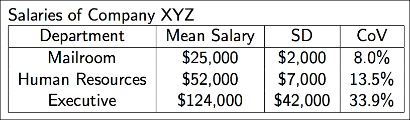
This is especially true when the mean salary of one department is $25,000, while another department has a mean salary in the six-figure area.
However, if we look at the last column, which is our coefficient of variation, it becomes clearer that the people in the executive department may be getting paid more but they are also getting wildly different salaries. This is probably because the CEO is earning way more than an office manager, who is still in the executive department, which makes the data very spread out.
On the other hand, everyone in the mailroom, while not making as much money, is making just about the same as everyone else in the mailroom, which is why their coefficient of variation is only 8%.
With measures of variation, we can begin to answer big questions, such as how to spread out this data is or how we can come up with a good range that most of the data falls into.
We can combine both the measures of centers and variations to create measures of relative standing. Measures of variation measure where particular data values are positioned, relative to the entire dataset.
Let's begin by learning a very important value in statistics, the z-score. The z-score is a way of telling us how far away a single data value is from the mean. The z-score of an x data value is as follows:
Let's break down this formula:
- X is the data point
 the mean
- s is the standard deviation
Remember that the standard deviation was (sort of) an average distance that the data is from the mean and now the z-score is an individualized value for each particular data point. We can find the z-score of a data value by subtracting it from the mean and dividing it by the standard deviation. The output will be the standardized distance a value is from a mean. We use the z-score all over statistics. It is a very effective way of normalizing data that exists on very different scales, and also to put data in the context of its mean.
Let's take our previous data on the number of friends on Facebook and standardize the data to the z-score. For each data point, we will find its z-score by applying the preceding formula. We will take each individual, subtract the average friends from the value, and divide that by the standard deviation, as shown:
z_scores = []m = np.mean(friends)  # average friends on Facebook
s = np.std(friends)   # standard deviation friends on Facebook

for friend in friends:
    z = (friend - m)/s  # z-score
    z_scores.append(z)  # make a list of the scores for plotting
Now, let's plot these z-scores on a bar chart. The following chart shows the same individuals from our previous example using friends on Facebook, but instead of the bar height revealing the raw number of friends, now each bar is the z-score of the number of friends they have on Facebook. If we graph the z-scores, we'll notice a few things:
plt.bar(y_pos, z_scores)
We get this chart:
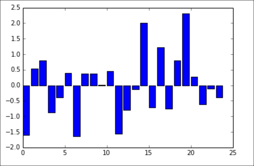
We can see that we have negative values (meaning that the data point is below the mean). The bars' lengths no longer represent the raw number of friends, but the degree to which that friend count differs from the mean.
This chart makes it very easy to pick out the individuals with much lower and higher friends on an average. For example, the individual at index 0 has fewer friends on average (they had 109 friends where the average was 789).
What if we want to graph the standard deviations? Recall that we earlier graphed three horizontal lines: one at the mean, one at the mean plus the standard deviation (x+s), and one at the mean minus the standard deviation (x-s).
If we plug these values into the formula for the z-score, we will get the following:
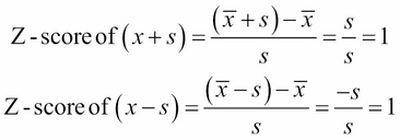
This is no coincidence! When we standardize the data using the z-score, our standard deviations become the metric of choice. Let's plot a new graph with the standard deviations added:
plt.bar(y_pos, z_scores)
plt.plot((0, 25), (1, 1), 'g-')
plt.plot((0, 25), (0, 0), 'b-')
plt.plot((0, 25), (-1, -1), 'r-')
The preceding code is adding the following three lines:
- A blue line at y = 0 that represents zero standard deviations away from the mean (which is on the x-axis)
- A green line that represents one standard deviation above the mean
- A red line that represents one standard deviation below the mean
Let's look at the graph we get:
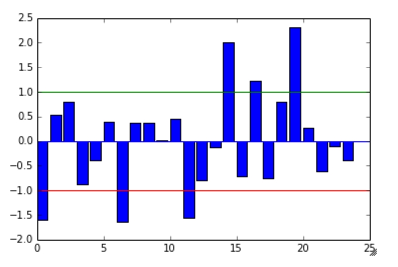
The colors of the lines match up with the lines drawn in the earlier graph of the raw friend count. If you look carefully, the same people still fall outside of the green and the red lines. Namely, the same three people still fall below the red (lower) line, and the same three people fall above the green (upper) line.
Z-scores are an effective way to standardize data. This means that we can put the entire set on the same scale. For example, if we also measure each person's general happiness scale (which is between 0 and 1), we might have a dataset similar to the following dataset:
friends = [109, 1017, 1127, 418, 625, 957, 89, 950, 946, 797, 981, 125, 455, 731, 1640, 485, 1309, 472, 1132, 1773, 906, 531, 742, 621]
happiness = [.8, .6, .3, .6, .6, .4, .8, .5, .4, .3, .3, .6, .2, .8, 1, .6, .2, .7, .5, .3, .1, 0, .3, 1]
import pandas as pd
df = pd.DataFrame({'friends':friends, 'happiness':happiness})
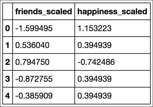
df.head()We get this table:
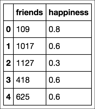
These data points are on two different dimensions, each with a very different scale. The friend count can be in the thousands while our happiness score is stuck between 0 and 1.
To remedy this (and for some statistical/machine learning modeling, this concept will become essential), we can simply standardize the dataset using a prebuilt standardization package in scikit-learn, as follows:
from sklearn import preprocessing

df_scaled = pd.DataFrame(preprocessing.scale(df), columns = ['friends_scaled', 'happiness_scaled'])

df_scaled.head()
This code will scale both the friends and happiness columns simultaneously, thus revealing the z-score for each column. It is important to note that by doing this, the preprocessing module in sklearn is doing the following things separately for each column:
- Finding the mean of the column
- Finding the standard deviation of the column
- Applying the z-score function to each element in the column
The result is two columns, as shown, that exist on the same scale as each other even if they were not previously:
Now, we can plot friends and happiness on the same scale and the graph will at least be readable:
df_scaled.plot(kind='scatter', x = 'friends_scaled', y = 'happiness_scaled')
The preceding code gives us this graph:
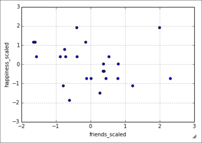
Now, our data is standardized to the z-score and this scatter plot is fairly easily interpretable! In later chapters, this idea of standardization will not only make our data more interpretable, but it will also be essential in our model optimization. Many machine learning algorithms will require us to have standardized columns as they are reliant on the notion of scale.
Throughout this book, we will discuss the difference between having data and having actionable insights about your data. Having data is only one step to a successful data science operation. Being able to obtain, clean, and plot data helps to tell the story that the data has to offer but cannot reveal the moral. In order to take this entire example one step further, we will look at the relationship between having friends on Facebook and happiness.
In subsequent chapters, we will look at a specific machine learning algorithm that attempts to find relationships between quantitative features, called linear regression, but we do not have to wait until then to begin to form hypotheses. We have a sample of people, a measure of their online social presence, and their reported happiness. The question of the day here is this: can we find a relationship between the number of friends on Facebook and overall happiness?
Now, obviously, this is a big question and should be treated respectfully. Experiments to answer this question should be conducted in a laboratory setting, but we can begin to form a hypothesis about this question. Given the nature of our data, we really only have the following three options for a hypothesis:
- There is a positive association between the number of online friends and happiness (as one goes up, so does the other)
- There is a negative association between them (as the number of friends goes up, your happiness goes down)
- There is no association between the variables (as one changes, the other doesn't really change that much)
Can we use basic statistics to form a hypothesis about this question? I say we can! But first, we must introduce a concept called correlation.
Correlation coefficients are a quantitative measure that describes the strength of association/relationship between two variables.
The correlation between the two sets of data tells us about how they move together. Would changing one help us predict the other? This concept is not only interesting in this case, but it is one of the core assumptions that many machine learning models make on data. For many prediction algorithms to work, they rely on the fact that there is some sort of relationship between the variables that we are looking at. The learning algorithms then exploit this relationship in order to make accurate predictions.
A few things to note about a correlation coefficient are as follows:
- It will lie between -1 and 1
- The greater the absolute value (closer to -1 or 1), the stronger the relationship between the variables:
- A positive correlation means that as one variable increases, the other one tends to increase as well
- A negative correlation means that as one variable increases, the other one tends to decrease
We can use pandas to quickly show us correlation coefficients between every feature and every other feature in the DataFrame, as illustrated:
# correlation between variables
df.corr()
We get this table:
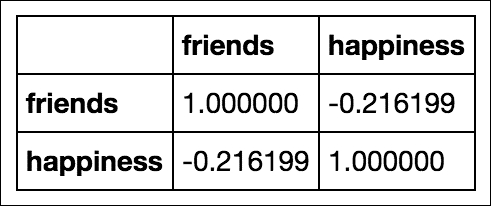
This table shows the correlation between friends and happiness. Note the first two things:
- The diagonal of the matrix is filled with positive is. This is because they represent the correlation between the variable and itself, which, of course, forms a perfect line, making the correlation perfectly positive!
- The matrix is symmetrical across the diagonal. This is true for any correlation matrix made in pandas.
There are a few caveats to trusting the correlation coefficient. One is that, in general, a correlation will attempt to measure a linear relationship between variables. This means that if there is no visible correlation revealed by this measure, it does not mean that there is no relationship between the variables, only that there is no line of best fit that goes through the lines easily. There might be a non-linear relationship that defines the two variables.
It is important to realize that causation is not implied by correlation. Just because there is a weak negative correlation between these two variables does not necessarily mean that your overall happiness decreases as the number of friends you keep on Facebook go up. This causation must be tested further and, in later chapters, we will attempt to do just that.
To sum up, we can use correlation to make hypotheses about the relationship between variables, but we will need to use more sophisticated statistical methods and machine learning algorithms to solidify these assumptions and hypotheses.
Recall that a normal distribution is defined as having a specific probability distribution that resembles a bell curve. In statistics, we love it when our data behaves normally. For example, we may have data that resembles a normal distribution, like so:
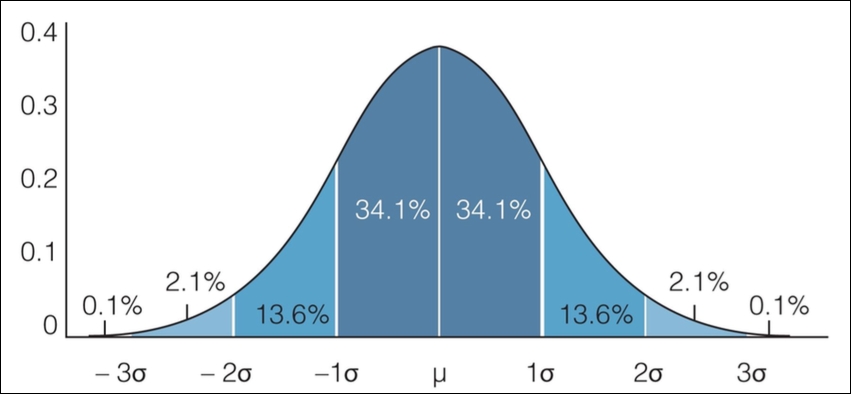
The empirical rule states that we can expect a certain amount of data to live between sets of standard deviations. Specifically, the empirical rule states the following for data that is distributed normally:
- About 68% of the data falls within 1 standard deviation
- About 95% of the data falls within 2 standard deviations
- About 99.7% of the data falls within 3 standard deviations
For example, let's see if our Facebook friends' data holds up to this. Let's use our DataFrame to find the percentage of people that fall within 1, 2, and 3 standard deviations of the mean, as shown:
# finding the percentage of people within one standard deviation of the mean
within_1_std = df_scaled[(df_scaled['friends_scaled'] <= 1) & (df_scaled['friends_scaled'] >= -1)].shape[0]
within_1_std / float(df_scaled.shape[0])
# 0.75


# finding the percentage of people within two standard deviations of the mean
within_2_std = df_scaled[(df_scaled['friends_scaled'] <= 2) & (df_scaled['friends_scaled'] >= -2)].shape[0]
within_2_std / float(df_scaled.shape[0])
# 0.916


# finding the percentage of people within three standard deviations of the mean
within_3_std = df_scaled[(df_scaled['friends_scaled'] <= 3) & (df_scaled['friends_scaled'] >= -3)].shape[0]
within_3_std / float(df_scaled.shape[0])
# 1.0
We can see that our data does seem to follow the empirical rule. About 75% of the people are within a single standard deviation of the mean. About 92% of the people are within two standard deviations, and all of them are within three standard deviations.
Example: Exam scores
Let's say that we're measuring the scores of an exam and the scores generally have a bell-shaped normal distribution. The average of the exam was 84% and the standard deviation was 6%. We can say the following, with approximate certainty:
About 68% of the class scored between 78% and 90% because 78 is 6 units below 84, and 90 is 6 units above 84
If we were asked what percentage of the class scored between 72% and 96%, we would notice that 72 is 2 standard deviations below the mean, and 96 is 2 standard deviations above the mean, so the empirical rule tells us that about 95% of the class scored in that range
However, not all data is normally distributed, so we can't always use the empirical rule. We have another theorem that helps us analyze any kind of distribution. In the next chapter, we will go into depth about when we can assume the normal distribution. This is because many statistical tests and hypotheses require the underlying data to come from a normally distributed population.
In this chapter, we covered much of the basic statistics required by most data scientists. Everything from how we obtain/sample data to how to standardize data according to the z-score and applications of the empirical rule was covered. We also reviewed how to take samples for data analysis. In addition, we reviewed various statistical measures, such as the mean and standard deviation, that help describe data.
In the next chapter, we will look at much more advanced applications of statistics. One thing that we will consider is how to use hypothesis tests on data that we can assume to be normal. As we use these tests, we will also quantify our errors and identify the best practices to solve these errors.