k-means clustering is our first example of an unsupervised machine learning model. Remember this means that we are not making predictions; we are trying instead to extract structure from seemingly unstructured data.
Clustering is a family of unsupervised machine learning models that attempt to group data points into clusters with centroids.
The preceding definition can be quite vague, but it becomes specific when narrowed down to specific domains. For example, online shoppers who behave similarly might shop for similar things or at similar shops, whereas similar software companies might make comparable software at comparable prices.
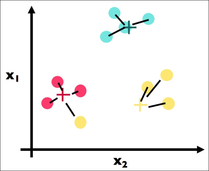
Here is a visualization of clusters of points:
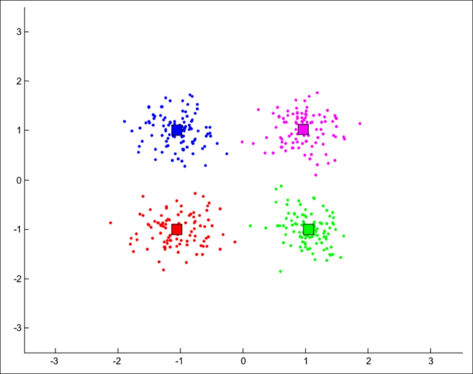
In the preceding diagram, our human brains can very easily see the difference between the four clusters. We can see that the red cluster is at the bottom-left of the graph while the green cluster lives in the bottom-right portion of the graph. This means that the red data points are similar to each other, but not similar to data points in the other clusters.
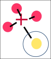
We can also see the centroids of each cluster as the square in each color. Note that the centroid is not an actual data point, but is merely an abstraction of a cluster that represents the center of the cluster.
The concept of similarity is central to the definition of a cluster, and therefore to cluster analysis. In general, greater similarity between points leads to better clustering. In most cases, we turn data into points in n-dimensional space and use the distance between these points as a form of similarity. The centroid of the cluster then is usually the average of each dimension (column) for each data point in each cluster. So, for example, the centroid of the red cluster is the result of taking the average value of each column of each red data point.
The purpose of cluster analysis is to enhance our understanding of a dataset by dividing the data into groups. Clustering provides a layer of abstraction from individual data points. The goal is to extract and enhance the natural structure of the data. There are many kinds of classification procedures. For our class, we will be focusing on k-means clustering, which is one of the most popular clustering algorithms.
k-means is an iterative method that partitions a dataset into k clusters. It works in four steps:
- Choose k initial centroids (note that k is an input)
- For each point, assign the point to the nearest centroid
- Recalculate the centroid positions
- Repeat Step 2 and Step 3 until stopping criteria is met
Imagine that we have the following data points in a two-dimensional space:
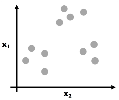
Each dot is colored gray to assume no prior grouping before applying the k-means algorithm. The goal here is to eventually color in each dot and create groupings (clusters), as illustrated in the following plot:
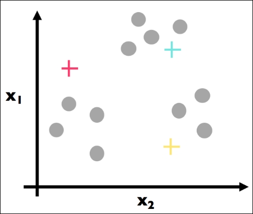
Here, Step 1 has been applied. We have (randomly) chosen three centroids (red, blue, and yellow).
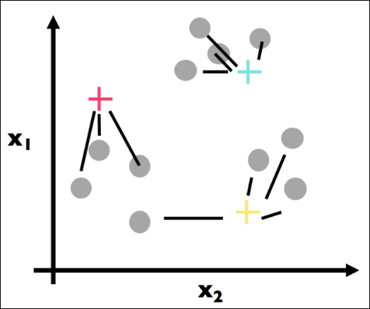
The first part of Step 2 has been applied. For each data point, we found the most similar centroid (closest):
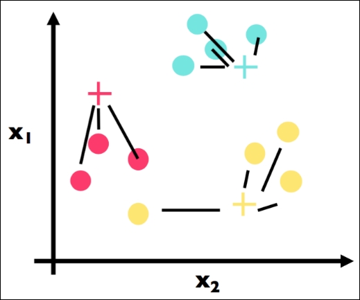
The second part of Step 2 has been applied here. We have colored in each data point in accordance with its most similar centroid:
This is Step 3 and the crux of k-means. Note that we have physically moved the centroids to be the actual center of each cluster. We have, for each color, computed the average point and made that point the new centroid. For example, suppose the three red data points had the coordinates: (1, 3), (2, 5), and (3, 4). The center (red cross) would be calculated as follows:
# centroid calculation
import numpy as np
red_point1 = np.array([1, 3])
red_point2 = np.array([2, 5])
red_point3 = np.array([3, 4])

red_center = (red_point1 + red_point2 + red_point3) / 3.

red_center
# array([ 2.,  4.])
That is, the (2, 4) point would be the coordinates of the preceding red cross.
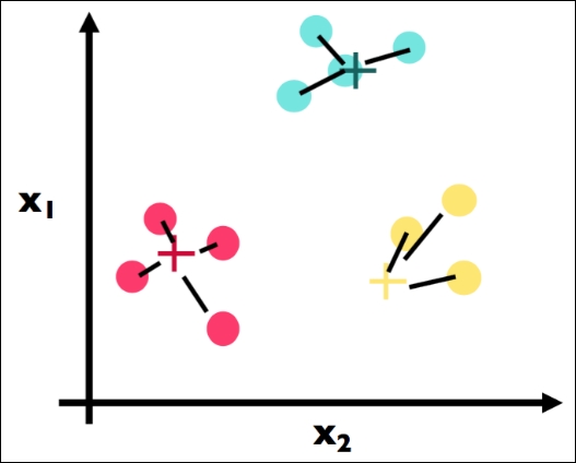
We continue with our algorithm by repeating Step 2. Here is the first part where we find the closest center for each point. Note a big change: the point that is circled in the following figure used to be a yellow point, but has changed to be a red cluster point because the yellow cluster moved closer to its yellow constituents:
Here is the second part of Step 2 again. We have assigned each point to the color of the closest cluster:
Here, we recalculate once more the centroids for each cluster (Step 3). Note that the blue center did not move at all, while the yellow and red centers both moved.
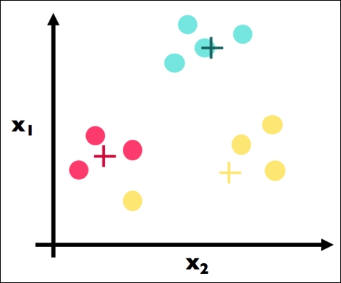
Because we have reached a stopping criterion (clusters do not move if we repeat Step 2 and Step 3), we finalize our algorithm and we have our three clusters, which is the final result of the k-means algorithm:
Enough data science, beer!
OK, OK, settle down. It's a long book; let's grab a beer. On that note, did you know there are many types of beer? I wonder if we could possibly group beers into different categories based on different quantitative features… Let's try! See the following:
# import the beer dataset
url = '../data/beer.txt'
beer = pd.read_csv(url, sep=' ')
print beer.shape
The output is as follows:
(20, 5)
beer.head()
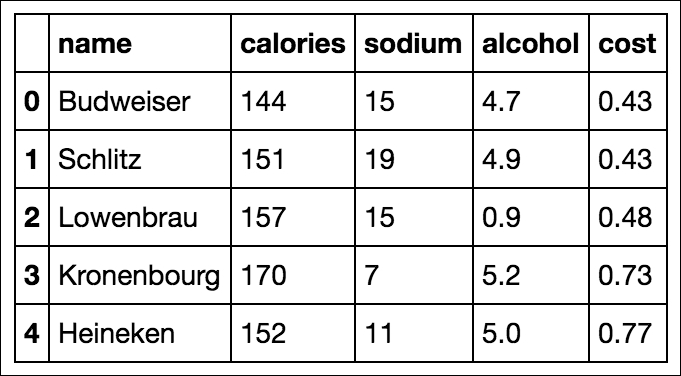
Here we have 20 beers with five columns: name, calories, sodium, alcohol, and cost. In clustering (like almost all machine learning models), we like quantitative features, so we will ignore the name of the beer in our clustering:
# define X
X = beer.drop('name', axis=1)
Now we will perform k-means using scikit-learn:
# K-means with 3 clusters
from sklearn.cluster import KMeans
km = KMeans(n_clusters=3, random_state=1)
km.fit(X)
Our k-means algorithm has run the algorithm on our data points and come up with three clusters:
# save the cluster labels and sort by cluster
beer['cluster'] = km.labels_
We can take a look at the center of each cluster by using a groupby and mean statement:
# calculate the mean of each feature for each cluster
beer.groupby('cluster').mean()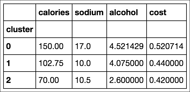
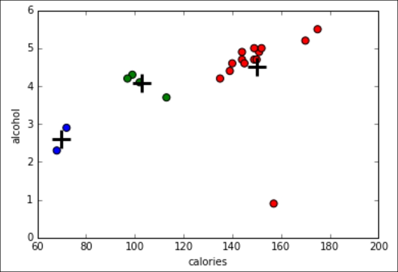
On human inspection, we can see that cluster 0 has, on average, a higher calorie, sodium, and alcohol content and costs more. These might be considered heavier beers. Cluster 2 has on average a very low alcohol content and very few calories. These are probably light beers. Cluster 1 is somewhere in the middle.
Let's use Python to make a graph to see this in more detail:
import matplotlib.pyplot as plt
%matplotlib inline


# save the DataFrame of cluster centers
centers = beer.groupby('cluster').mean()
# create a "colors" array for plotting
colors = np.array(['red', 'green', 'blue', 'yellow'])
# scatter plot of calories versus alcohol, colored by cluster (0=red, 1=green, 2=blue)
plt.scatter(beer.calories, beer.alcohol, c=colors[list(beer.cluster)], s=50)

# cluster centers, marked by "+"
plt.scatter(centers.calories, centers.alcohol, linewidths=3, marker='+', s=300, c='black')

# add labels
plt.xlabel('calories')
plt.ylabel('alcohol')