
This chapter takes you through the process of creating further text-based visualizations in Power BI Desktop. You will learn how to further develop the skills that you acquired in the previous chapter to create and enhance
- Matrices
- Cards
- Multirow cards
The techniques that you will learn in this chapter use a Power BI Desktop file that results from the application of much of what you saw in the last four chapters. This file is called C:PowerBiDesktopSamplesCH15CarSalesDataForReports.pbix. It is available on the Apress web site as part of the downloadable material that accompanies this book.
Creating a Matrix
In the previous chapter you saw how tables can be used to display the information as full columns of lists. Lists do not, however, always give an intuitive feeling for how data should be grouped at various levels. Presenting information in a neat hierarchy with multiple grouped levels is the task of a matrix visual.
Creating a Row Matrix
When creating a matrix, I find that it helps to think in terms of a hierarchy of information and to visualize this information flowing from left to right. For instance, suppose that we want to create a matrix with the country name as the highest level in the hierarchy (and consequently the leftmost item). Then we want the make of car to be the second level, and the next element in from the left. Finally, we want the color of car sold, followed by all the numeric fields that interest us. You can see this progression illustrated in Figure 15-1.
Figure 15-1.
An information hierarchy
When creating a matrix, it is important to have the Visualizations
pane reflect the hierarchy. Put another way, you must ensure that the order of the fields that you select for the matrix and that you place in the field well follows the display hierarchy that you want. Consequently, to create a matrix like the one just described, you need to do the following:
- 1.Use the C:PowerBiDesktopSamplesCH15CarSalesDataForReports.pbix file as your source of data.
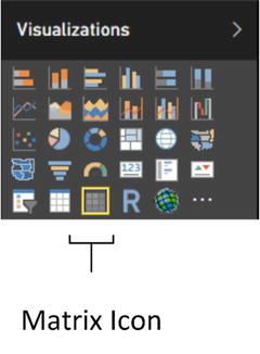
- 2.Click the Matrix icon in the Visualizations pane. This is shown in Figure 15-2. An empty matrix will appear on the report canvas.
Figure 15-2.
A matrix table
- 1.Drag the fields CountryName (from the Countries table), Make (from the Stock table), and Color (from the Colors table) in this order to the Rows well in the Visualizations pane. Then add the fields SalePrice and Cost Plus Spares Margin (from the InvoiceLines table) and Mileage (from the Stock table). The matrix should look something like Figure 15-3.
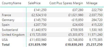 Figure 15-3.A matrix showing the top level of data
 - 2.Click the “Expand all down one level in the hierarchy” icon at the top of the matrix. This is the third icon from the left that looks like a small pitchfork (you can see this icon in Figure 15-11 if you want to jump ahead slightly). The matrix should look something like Figure 15-4 (note that it is perfectly normal that there is no country name for the first set of rows).
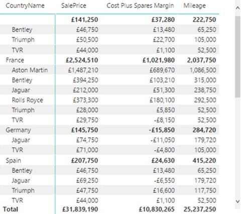 Figure 15-4.A two-level matrix
 - 3.Click the “Expand all down one level in the hierarchy” icon again. The matrix should look something like Figure 15-5.
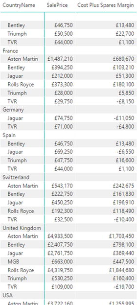
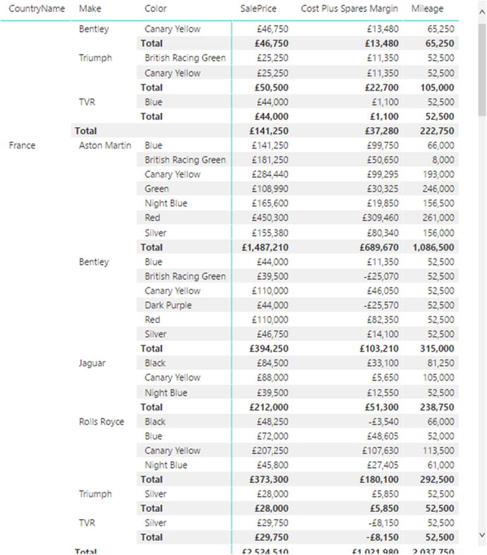
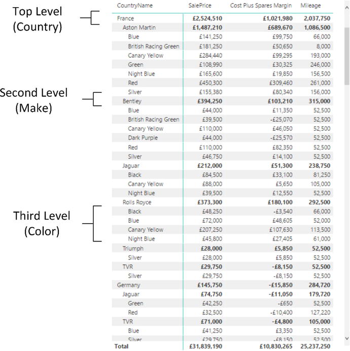 Figure 15-5.A three-level matrix
As you can see, a matrix
display not only makes data easier to digest, but it automatically groups records by each element in the hierarchy and adds totals for each level as well. What is more, each level in the hierarchy is sorted in ascending order. You can expand all the levels that are available in the data that you added to the matrix definition. This final level will display all available detail at that level.
You can also add fields directly to a table by dragging them onto the table. When you do this, Power BI Desktop always adds a text field to the right of existing fields. In a matrix, this means that any aggregate/numeric field is added to the right of existing aggregate fields (and appear in the Values box), whereas any text or date/time fields are added to the right of any existing hierarchy fields (and appear in the Rows box). However, it is always a simple matter to reorganize them by dragging the required fields up and down in the Rows and Values boxes to define the correct hierarchy and the overall type of display that you want to achieve. You can see how the Visualizations pane reflects the matrix hierarchy in Figure 15-6.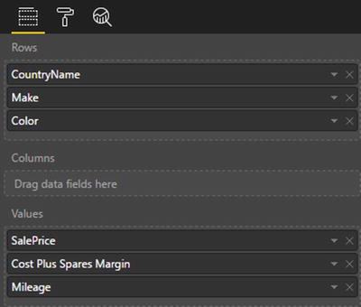
Figure 15-6.
The Visualizations pane showing the matrix hierarchy
When creating matrices
, my personal preference is to drag the fields that constitute the hierarchy of non-numeric values into the Rows box, which means I am placing them accurately above, below, or between any existing elements. This ensures that your matrix looks right the first time, which can help you avoid some very disconcerting double takes! Also as Power BI Desktop will add additional fields to the Columns well by default, it helps to be precise when building a matrix. This means carefully placing the fields for the row headers in the Rows well.
Adding or Removing Subtotals in a Matrix
By default, a new matrix will include the subtotals for every level of the data. Should you prefer to remove the subtotals from a matrix:
- 1.Select the matrix visual that you used in the previous section.
- 2.In the Visualizations pane, click the Format icon.
- 3.Expand the Subtotals section.
- 4.Click the Row Subtotals button to turn the row subtotals off. This will remove all the totals from the matrix, as you can see in Figure 15-7.
Figure 15-7.
A matrix without subtotals
Column Matrix
Power BI Desktop does not limit you to adding row-level hierarchies; you can also create column-level hierarchies, or mix the two. Suppose that we want to get a clear idea of sales and gross margin by country, make, and vehicle type, and how they impact one another. To achieve this, I suggest extending the matrix that you created previously by adding a VehicleType level as a column hierarchy.
Here is how you can do this:
- 1.Click inside the matrix that you created previously to select it. The Visualizations pane will display the fields that are used for this table in the Rows and Values boxes.
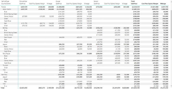
- 2.Drag the VehicleType field from the Stock table down into the Columns well in the Visualizations pane. This will add a hierarchy to the columns in the table. The table will look like Figure 15-8.
Figure 15-8.
A row and column matrix table
The Visualizations pane now looks like the snippet shown in Figure 15-9.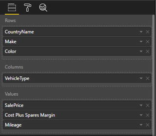
Figure 15-9.
The Visualizations pane for a row and column matrix table
As you can see, you now have the sales and gross margin by country name, color, make, and vehicle type, but it is in a cross-matrix, where the data is broken down by both rows and columns.
To conclude the section on creating matrices
, there are a few things that you might like to note:
- If you add totals, then every level of the hierarchy has totals.
- Adding non-numeric data to the aggregated data makes Power BI Desktop display the Count aggregation.
- Matrices can get very wide, especially if you have a multilevel hierarchy. Power BI Desktop matrices reflect this in the way in which horizontal scrolling works. A matrix table freezes the non-aggregated data columns on the left and allows you to scroll to the right to display aggregated (numeric) data.
- Moving the fields in the Columns and Rows wells of the Visualizations pane (using drag-and-drop, as described previously), reorders the aggregated data columns in the table.
Expanding and Drilling Down and Up
When creating the original matrix, you saw how to expand the matrix to include sublevels. However, Power BI Desktop offers a wide range of possibilities when it comes to navigating through layers of data
in a matrix. These cover:
- Displaying one or all sublevels of data in a hierarchy
- Displaying only a deeper level of data
- Drilling down to display only lower levels of a specific item
- Drilling up to show the only previous level of a hierarchy
Navigating between levels of data is done using a combination of three interface elements
:
- The Data/Drill ribbon
- The icons at the top of every matrix
- The context menu for a data element
It will probably help to get an overview of all three before learning to move through levels of data.
The Data/Drill Ribbon
One important tool when drilling through hierarchical data is the Data/Drill ribbon. The buttons that this ribbon contains are shown in Figure 15-10, and explained in Table 15-1.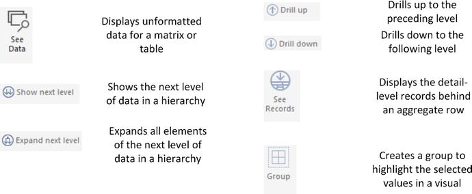
Figure 15-10.
The Data/Drill ribbon
Table 15-1.
The Available Matrix Styles
Button
|
Description
|
|---|---|
See Data | Shows the data, unformatted, in a separate pane. |
Show Next Level | Displays the data segmented by the data at the next level in the hierarchy. |
Expand Next Level | Shows all data items with the next level of data. |
Drill Up | Returns to the previous data level (expanded or drilled down). |
Drill Down | Shows the selected data item and any sublevel of data only for this item. |
See Records | Displays the data for the records making up an aggregate row. |
Group | Creates a group to highlight the selected values in a visual. |
The Matrix Navigation Icons
Any matrix has a series of icons above the data. You can see these in Figure 15-11. I suggest that you familiarize yourself with these as they are fundamental when drilling through hierarchies of information. This applies not only to matrices, but to certain types of chart, too.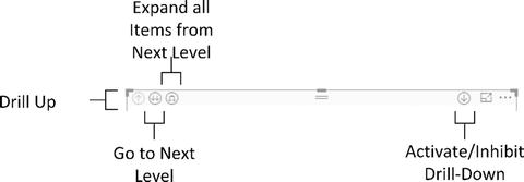
Figure 15-11.
The drill and expand icons for a matrix
The Context Menu for Matrix Items
The final approach that you might need when navigating through hierarchies of data in matrices is the popup menu that appears when you right-click any record in a matrix. You can see this in Figure 15-12.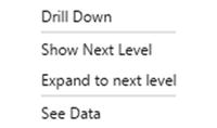
Figure 15-12.
The context menu for matrix items
Displaying Data at the Previous Level
A few pages back you saw how to expand all the sublevels when creating a matrix, so I do not need to repeat this here. However, what if you are currently showing, say, three levels of a data hierarchy and want to return to displaying only two levels?
- 1.Take the matrix with three levels of data displayed that you can see in Figure 15-5.
- 2.In the Data/Drill ribbon, click Drill Up.
The matrix will show only two levels of data and look, once again, like the image in Figure 15-4.
Displaying Data for a Sublevel
A matrix does not oblige you to display all levels of data at once. You can, if you prefer, display only the data for a lower level of the matrix hierarchy, as follows:
Figure 15-13.
Displaying a different level of data from a matrix
As you can see, the totals are identical. Only the data segmentation has changed.
To return to the previous level in the data hierarchy, simply click the Drill Up button in the Data/Drill ribbon—or the drill up icon at the top left of the matrix.
Drilling Down at Row Level
Another completely different option when navigating hierarchies of data is to drill up and down into a specific element of a hierarchy. The key difference between expanding and drilling are as follows:
- Expanding a hierarchy will display the next level of data for all top-level elements.
- Drilling down will only display the next sublevel for the selected data element.
To see this in practice, try the following:
- 1.Right-click any top-level data element in a matrix (I will take France in the matrix that you can see in Figure 15-5).
- 2.Select Drill Down from the context menu. The matrix will now look like the one in Figure 15-14.
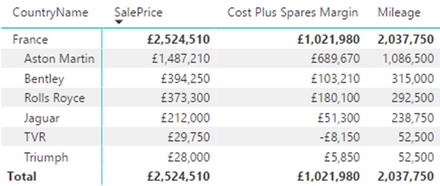 Figure 15-14.Drilling down in a matrix
 - 3.You can continue to drill down into further levels of data simply by right-clicking any data element at the second level and selecting Drill Down from the context menu (Bentley, for instance, in this example). The matrix will now look like the one in Figure 15-15.
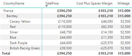 Figure 15-15.Drilling down further in a matrix
To return to a previous level, all you have to do is click the Drill Up button in the Data/Drill ribbon—or the drill up icon at the top left of the matrix. Alternatively, you can right-click a data item and select Drill Up from the context menu.
Drill Down Using Click-Through
If you find it a little wearing to right-click and select the Drill Down option, then you have an alternative solution. You can switch a matrix to drill down with a simple click on a data item. Here is how you can do this:
- 1.At the top right of a matrix, click the “Click to turn on drill down” icon. This will become a light arrow on a dark background.
- 2.Click any data element (a country, for instance). You will drill down to the next level.
You can turn off this option at any time by re-clicking the “Click to turn on drill down” icon. It will return to being a light arrow on a clear background, indicating that this form of drill down is deactivated.
Drilling Down at Column Level
The same drill-down and drill-up logic applies to columns as to rows. Take the column matrix that you created previously (and that you can see in Figure 15-8):
- 1.Add the Model (from the Stock table) to the data for the matrix to the Columns well, under the VehicleType field. A popup appears at the top left of the matrix containing the choice between rows and columns. You can see this in Figure 15-16.
 Figure 15-16.The drill-down option in complex matrices
 - 2.Click the popup and select Columns.
- 3.Click the “Go to the next level in the hierarchy” icon. You will see something like Figure 15-17, where the country has been replaced by make as the column header.
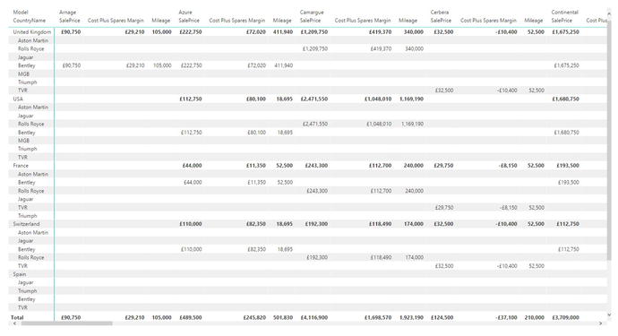 Figure 15-17.Drilling down in a multilevel column hierarchy
As you can see, a hierarchy can be applied equally to columns and rows. This boils down to
- Adding the field to the correct well in the Visualizations pane (Rows or Columns).
- Selecting the appropriate drill-down mode from the popup at the top of the matrix (Columns or Rows).
Visualize Source Data
If a formatted table or matrix becomes, paradoxically, too large or complex, you can opt to look at the underlying data without any formatting applied. This often lets you see more information than you can in a carefully formatted visualization.
- 1.Select the table or matrix whose data you want to display without formatting.
- 2.In the Data/Drill ribbon, click the See Data button. The unformatted version of the data for the selected table or matrix will be displayed in a second window. You can see this in Figure 15-18.
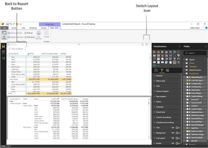 Figure 15-18.Visualizing source data
 - 3.Click the Back to Report button above the formatted table (or click again the See Data button in the Data/Drill ribbon) to return to the normal Power BI Desktop Report View.
Note
You cannot currently resize the two windows when viewing unformatted data. You can, however, scroll up and down in either window. If you prefer to see the data to the right of the visual (rather than underneath it), then click the Switch Layout icon at the top right of the window.
Viewing Records
When dealing with aggregated data, you can sometimes lose sight of valuable details. You might miss a large outlier that is skewing an average value, for instance. Or, perhaps, an excessive value for a single record is making a total higher than is normal—or healthy.
To help you follow your intuitions and weight aggregated values against detailed numbers, Power BI Desktop lets you view the underlying records “behind” a total at any time in a matrix. Here’s an example:
- 1.Create a matrix based on the following fields (all of them are from the Stock table):
- a.Make
- b.Model
- c.LaborCost
- d.CostPrice
- a.
- 2.Click Expand Next Level to see the complete hierarchy of makes and models.
- 3.Click the figure for the labor cost for Aston Martin Vanquish. You will see all the detail records that make up this total figure. This is shown in Figure 15-19.
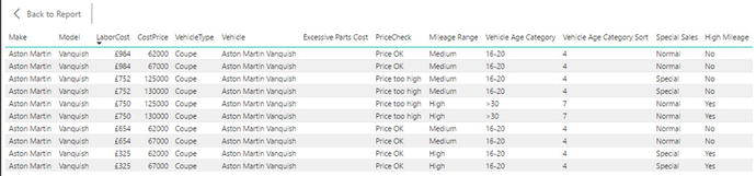 Figure 15-19.Displaying data records from a matrix
 - 4.Click the Back to Report button above the records that are now displayed to return to the normal Power BI Desktop Report View.
Note
Alternatively, you can right-click any value in a matrix and select See Records to drill through to the detailed records that give the selected aggregate figure.
Including and Excluding Matrix Elements
Some matrices can swamp you in data. So you might need to focus on a few selected elements. This is really simple in Power BI Desktop:
- 1.Re-create the matrix from the previous section (Make, Model, LaborCost, and CostPrice).
- 2.Click Expand Next Level to see the complete hierarchy of makes and models.
- 3.Control-click any element (make, model, or a value) for:
- a.Aston Martin DB4
- b.Bentley Arnage
- c.Jaguar XJ12
- a.
- 4.Right-click one of the selected elements and select Include from the popup menu. All other elements will be removed from the matrix. The result is shown in Figure 15-20.
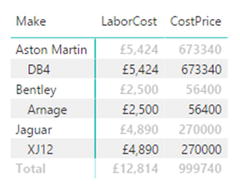 Figure 15-20.Including selected elements from a matrix
Note
As an alternative to including certain elements, you can select all the elements that you wish to exclude, and choose Exclude from the popup menu.
For the moment, the only way to return to a complete matrix
containing all the rows of data seems to be to press Ctrl-Z and undo this operation.
Displaying Multiple Values As Rows
A feature that has been added to Power BI Desktop fairly recently is the possibility of creating complex matrices where the columns of data can now be displayed as rows. That is, instead of seeing possibly multiple data values side by side for a complex column hierarchy, you can see all the numeric data displayed as rows.
This is possibly best appreciated with the help of an example:
- 1.Create a matrix using the following elements:
- a.Rows: CountryName from the Countries table and Make from the Stock table (in this order).
- b.Column: VehicleType (from the Stock table).
- c.Values: Mileage and LaborCost (in this order). Both are from the Stock table.
- a.
- 2.Expand all down one level. The matrix will look like the one shown in Figure 15-21.
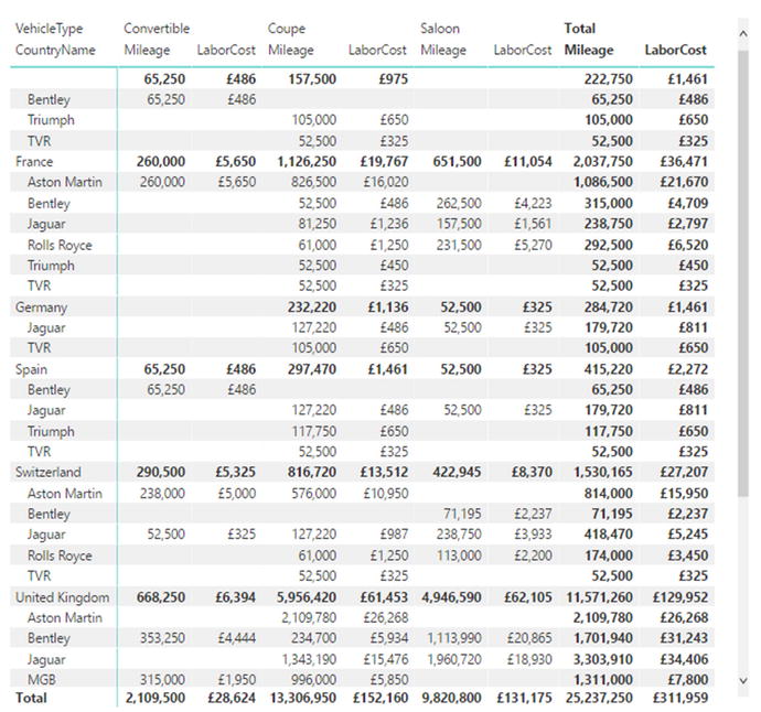 Figure 15-21.A standard matrix with values as columns
 - 3.In the Visualizations pane, click the Format icon and expand the Values section.
- 4.Set Show on Rows to On. The matrix will now look like the one shown in Figure 15-22, where the multiple columns of data have become rows of data.
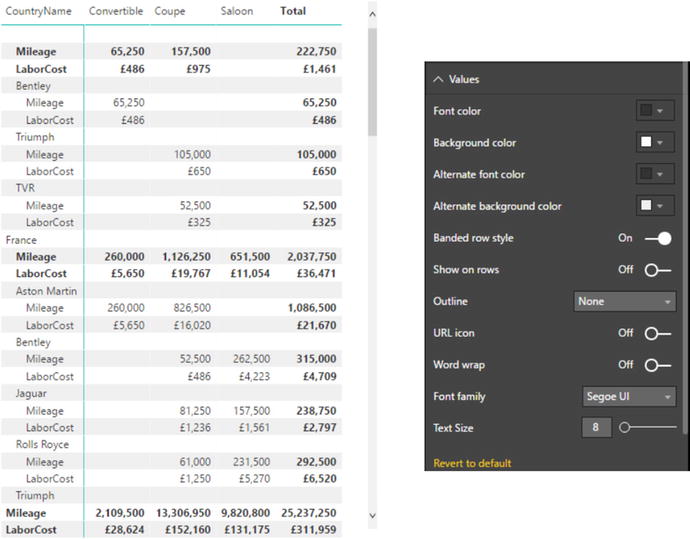 Figure 15-22.A matrix with values as rows
Simply switching Show on Rows to Off will revert the matrix to its initial format.
Formatting a Matrix
Fortunately, the techniques that you apply to format a matrix are largely identical to those you applied to tables. So I will not cover, again, the principles
that you saw in the last few pages to change the presentation of:
- Matrix style (this is the table style, but applied to a matrix)
- Grid
- Column headers
- Row headers
- Values
- Columns
- Title
- Background
- Conditional formatting
There are, nonetheless, a couple of extra formatting tweaks that you can add to matrices. These are stepped layout and subtotals. I will explain these in the following two sections.
Stepped Layout
In Figure 15-5 you can see the multiple levels of a matrix. These are shown using levels of indentation. However, you may prefer to display each level in a separate column. Here is how you can do this:
- 1.Select (or re-create) the matrix containing three visible levels that you can see in Figure 15-5.
- 2.In the Visualizations pane, click the Format icon.
- 3.Expand the Row Headers section.
- 4.Set Stepped Layout to Off.
- 5.Adjust the width of the matrix if necessary. The matrix will look like the one in Figure 15-23.
Figure 15-23.
A matrix without stepped layout
Subtotals
Whereas a table only has a grand total (assuming that you want to display it), a matrix can have subtotals for each level of data displayed. Although formatting subtotals is similar to formatting the total in a table, I prefer, for the sake of completeness, to describe the possibilities here:
- 1.Select the matrix visual that you used in the previous section.
- 2.In the Visualizations pane, click the Format icon.
- 3.Expand the Subtotals section.
- 4.Choose a different font color from the Font Color palette.
- 5.Select a different font from the Font Family popup list.
- 6.Enter a number in the Text Size field (or adjust the slider) to set a larger font size.
- 7.Set Apply to Labels to On—this will ensure that the subtotal labels as well as numbers are formatted. The matrix should look like the one in Figure 15-24.
Figure 15-24.
Formatting subtotals in a matrix
Note
As the grand total is essentially formatted in the same way as the Total for a table, I will not re-explain how to do this here. If you need to refresh your memory, then just flip back to the previous chapter.
Placing Subtotals
You can also decide whether the subtotals are placed above a group of elements, alongside the element header, or under a group, on a separate row. Simply do the following to place subtotals:
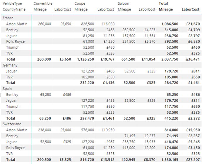
Figure 15-25.
Placing subtotals below groups
Custom Subtotal Settings per Level of Matrix
Power BI Desktop now lets you define whether subtotals are displayed for each level of the matrix hierarchy for both rows and columns. To see this in action:
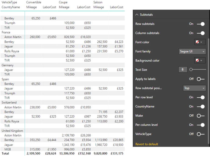
- 1.Re-create the matrix that you used in Figure 15-21 (following only steps 1 and 2).
- 2.In the Visualizations pane, click the Format icon and expand the Subtotals section.
- 3.Set Per Row Level to On. This will add the list of all the row data elements to the Visualizations pane.
- 4.Set Per Column Level to On. This will add the list of all the column data elements to the Visualizations pane.
- 5.Set the button to Off for both Make and VehicleType. As you can see in Figure 15-26, the subtotals have been removed for these elements.
Figure 15-26.
Selective subtotals
Sorting Data in Matrices
When you sort data in a matrix table, the sort order will respect the matrix hierarchy. This means that if you sort on the second element in a hierarchy (Make, in the example table we just created), then the primary element in the hierarchy (CountryName, the leftmost column) will switch back to the initial (alphabetical) sort order, as will any lower levels in the hierarchy of row elements.
If you sort by any value in a matrix
, then the total for the highest level of the hierarchy is used to reorder the whole table. You can see this in Figure 15-27, where the matrix from the previous figure has been sorted on the total gross margin in descending order. This has made the country with the most sales move to the top of the table. As well, if you have a column matrix (as in this example), then you will end up sorting on the grand total of the columns (the two rightmost columns in this example) to make the matrix sort by numeric values, albeit in ascending order.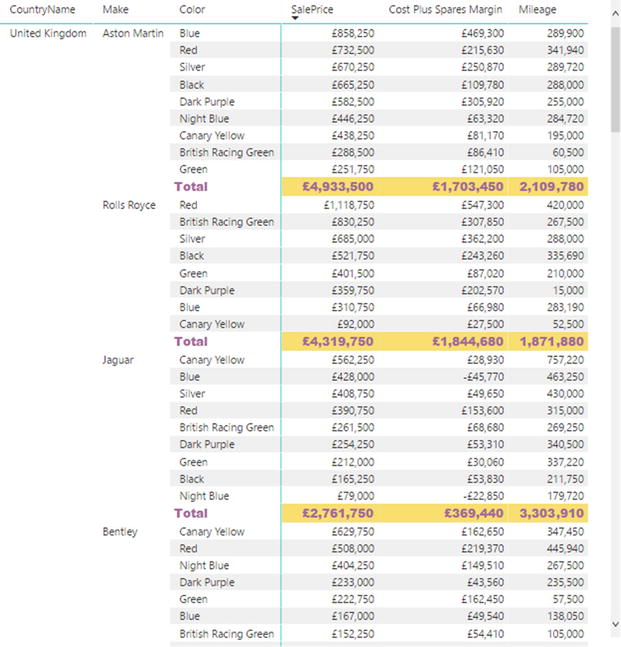
Figure 15-27.
Sorting a matrix on values
Note
As was the case with tables, there are no specific options for formatting the figures in matrices. You format the data by clicking the Data View icon on the left of the Power BI Desktop window, select the column to format, and, in the Modeling ribbon, select a number format.
Cards
On some occasions, you will want to display a single figure more prominently than others. Perhaps you need to attract the viewer’s attention to your new sales record, or you would like the boss to appreciate the customer satisfaction ratings that you have achieved.
Whatever the motivation, cards are the solution. Power BI Desktop
cards are a simple and powerful way to isolate and emphasize a single figure. Suppose that you want to display all vehicle sales to date in a dashboard, for instance; the following explains how you can do it:
- 1.Using the C:PowerBiDesktopSamplesCH15CarSalesDataForReports.pbix file as your source of data, click outside any existing visualizations.
- 2.In the gallery of available visuals, click the Card icon. You can see this icon in Figure 15-28. An empty card will appear on the dashboard canvas.
 Figure 15-28.The Card icon in the gallery of available visuals
 - 3.Expand the InvoiceLines table fields in the Fields list and select the SalePrice field. The total for all sales will appear in the card.
- 4.Resize the card so that the figure fits inside the card borders without any wasted space. The final card will look like Figure 15-29.
 Figure 15-29.A card visual
Formatting Cards
As you just saw, cards are an extremely effective way of focusing your audience’s attention on key data. Yet there is a lot more that you can do to extend this emphasis, including the following:
- Change the units, number of decimals, color, and text size of the data that is displayed
- Remove the label that is displayed automatically, as well as alter its text size
- Add a title that you can format independently
- Change the background color of the card
Let’s see how to tweak the card that you just created:

- 1.Select the card. In this example, I use the card that you saw in Figure 15-25.
- 2.In the Visualizations pane, click the Format icon (the small paint roller beneath the palette of available visualization types). The formatting options for the selected card will be displayed.
- 3.Expand the Background section by clicking the downward-facing chevron to the left of the word Background.
- 4.Make sure that the switch to the right of the word Background is set to On (if it is not, then click to the right of the empty circle to change this).
- 5.Click the popup menu triangle to the right of Color and select a color from the palette of available colors.
- 6.Click the Transparency slider switch and slide it to the left to intensify the background color by reducing the percentage of transparency.
- 7.Expand the Category Label section by clicking the downward-facing chevron to the left of the words Category Label.
- 8.Adjust the text size by dragging the slider to the right. You can change the color as well if you want to.
- 9.Expand the Title section by clicking the downward-facing chevron to the left of the word Title.
- 10.Set the title to On by clicking immediately to the right of the On/Off button to the right of Title.
- 11.Enter To Date as the Title Text.
- 12.Click the popup menu triangle to the right of Font Color and select a color for the font from the palette of available colors.
- 13.Click the popup menu triangle to the right of Background Color and select a background color from the palette of available colors.
- 14.Click the middle icon of the Alignment icons to center the card title.
- 15.Expand the Data Label section by clicking the downward-facing chevron to the left.
- 16.Click the popup menu triangle to the right of Color and select a data label color from the palette of available colors.
- 17.Adjust the text size by dragging the Text Size slider to the right or left.
- 18.Select a display unit for the figure in the card by clicking the popup list of Display Units.
- 19.Select the number of decimals to be used for the card data by clicking the up and down triangles to the right of the Precision box. You can also enter the number of decimals directly, if you prefer.
- 20.Expand the Border section and switch the border on. Change the border color if you want to. The card (along with the formatting palette) will now look something like the elements that you can see in Figure 15-30.
Figure 15-30.
A formatted card
The available display units for formatting the value in a card are described in Table 15-2.
Table 15-2.
Display Units
Display Unit
|
Description
|
|---|---|
Auto | Chooses an appropriate display unit from those available depending on the size of the figure. |
None | Displays the actual figure. |
Thousands | Displays the figure in thousands followed by a K. |
Millions | Displays the figure in millions followed by an M. |
Billions | Displays the figure in billions followed by a bn. |
Trillions | Displays the figure in trillions followed by a T. |
Multirow Cards
Tabular data can also be displayed in an extremely innovative way using the Power BI Desktop card style of output. As is the case with matrices, you begin by choosing the fields that you want to display as a basic table and then you convert this to another type of visual. Here is an example of how this can be done:
- 1.Using the C:PowerBiDesktopSamplesCH15CarSalesDataForReports.pbix file as your source of data, click outside any existing visuals.
- 2.In the Visualizations pane, click the Card icon. You can see this in Figure 15-31. An empty multirow card will appear on the dashboard canvas.
 Figure 15-31.The multirow card icon in the Visualizations pane
 - 3.Add the following fields, in this order:
- a.CountryName (from the Countries table)
- b.CostPrice (from the Stock table)
- c.LaborCost (from the Stock table)
- d.SpareParts (from the Stock table)
- a.
- 4.Resize the multirow card to display all the countries, with all of the figures on a single row per country. The visual will look like the one in Figure 15-32. Don’t worry about the (Blank) costs; these correspond to vehicles in stock that are not yet sold, and so do not have a client country yet.
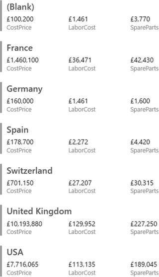 Figure 15-32.A card visualization
Card-type tables will display the selected fields in the order in which they appear in the field well in the Visualizations pane, and it is here that they can be reordered, as with any table. This makes each card into a data record. The fields will flow left to right and then on to the following line in each card. What is interesting here is that adjusting the size of the table can change the appearance of the table quite radically. A very narrow table will list the fields vertically, one above the other. If you can fit all the fields onto a single row, then you will get a highly original multiple-record display.
Formatting Multirow Cards
There are a few visual aspects of multirow cards that you can tweak for added effect. These include adding a title and changing the background color. Let’s try both of these:
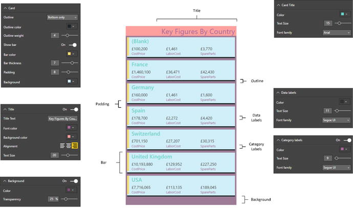
- 1.Select the multirow card visualization. In this example, I use the card that you saw in Figure 15-28.
- 2.In the Visualizations pane, click the Format icon (the small paint roller beneath the palette of available visual types). The formatting options for the selected multirow card are displayed.
- 3.Expand the Background section by clicking the downward-facing chevron to the left of the word Background.
- 4.Make sure that the switch to the right of the word Background is set to On (if it is not, then click to the right of the empty circle to change this).
- 5.Click the popup menu triangle to the right of Color and select a color from the palette of available tones.
- 6.Click the Transparency slider switch and slide it to the left to intensify the background color by reducing the percentage of transparency.
- 7.Expand the Title section by clicking the downward-facing chevron to the left of the word Title.
- 8.Set the title to On by clicking immediately to the right of the On/Off button to the right of Title.
- 9.Enter Key Figures By Country as the Title Text.
- 10.Click the popup menu triangle to the right of Font Color and select a color for the font from the palette of available colors.
- 11.Click the popup menu triangle to the right of Background Color and select a background color from the palette of available colors.
- 12.Slide the Text Size button to the right to set a larger font for the title.
- 13.Click the icon on the right for the Alignment. This will right align the title.
- 14.Click the popup menu triangle to the right of Card and select Bottom Only as the outline style.
- 15.Click inside the Outline Weight field and enter 4.
- 16.Select a different bar color from the palette of available bar colors.
- 17.Slide the Bar Thickness button to the right to increase the width of the bar.
- 18.Slide the Padding button to the left to reduce the padding between individual elements in the card.
- 19.Choose a background color from the palette of colors available for the Background.
- 20.Expand the Data Labels section and slide the Text Size button to the right to increase the size of the font.
- 21.Expand the Card Title section and increase the text size by sliding the Text Size button to the right.
- 22.Choose a text color from the palette of available colors.
- 23.Expand the Category Labels section and select a text color from the palette of available colors. The multirow card visual will now look like the one in Figure 15-33. You might have to tweak its size to get the correct effect.
Figure 15-33.
A formatted multirow card
Note
You can also fix the aspect ratio
of a multirow card visual just as you did for the initial table at the start of this chapter. Equally, you can add a border as you saw previously for a card visual.
Sorting Multirow Cards
Like tables and matrices, multirow cards can be sorted. However, there is a specific way to apply a sort order to this kind of visual:
- 1.Click the ellipses at the top right of the multirow card visual.
- 2.Select the column name to sort by from the list of columns in the popup menu.
The elements in the multirow card will now be ordered according to the values in the chosen column. You can see an example of the popup menu in Figure 15-34. This example uses the multirow card that you created previously.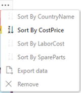
Figure 15-34.
Sorting a multirow card
Note
Sorting on the category in a multirow card (the country in this example) will initially sort in reverse alphabetical order (as a multirow card is initially ordered in alphabetical order). Re-selecting a sort on the category will reset the sort order to alphabetical. Sorting on a value will always order from highest to lowest—and re-clicking the value in the popup menu will remove the sort order and revert to the initial order.
Switching Between Table Types
One of the fabulous things about Power BI Desktop is that it is designed from the ground up to let you test ideas and experiment with ways of displaying your data quickly and easily. So, quite naturally, you can switch table types easily to see which style of presentation is best suited to your ideas and the message that you want to convey. To switch table types, all you have to do is select the current text-based visualization (table, multirow card, or matrix) and select one of these options from the gallery of available visuals:
- Table
- Matrix
- Multirow card
What is even more reassuring is that Power BI Desktop remembers the attributes of the previous table type you used. So, for instance, if you set up a matrix with a carefully crafted hierarchy and then switch to a card-type table, Power BI Desktop remembers how you set up the matrix should you want to switch back to it.
To see an example of how this works in practice, take a look at Figure 15-35. This shows the same initial visual that has been copied and then switched between the text-based core types of visual. I have added the Color field to the matrix and expanded the next level to make the difference between the table and matrix clearer.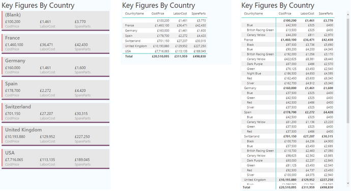
Figure 15-35.
Switching visuals using the same data and formatting
The following are the main things to note here:
- The visual remains the same size when you switch types. Consequently, you will probably have to resize it.
- All formatting that can be retained is retained. This can be seen in the titles and background of all three visuals in Figure 15-35.
Conclusion
This chapter extended the knowledge that you acquired in the previous chapter to show you how to create matrices. You then learned how to drill down into any matrix to display a hierarchy of information—or only a sublevel in the data hierarchy.
You then learned how to create card visuals and Power BI Desktop’s unique and effective multirow cards.
Now that you have mastered the basics of creating visuals, it is time to move on to the next level of dashboard creation. In the next two chapters you will discover how to create and enhance charts. This will allow you to give freer rein to your imagination and help you let your data speak for itself.