It is one thing to have a game-changing insight that can fundamentally alter the way your business works. It is quite another to be able to convince your colleagues of your vision. So what better way to show them—intuitively and instantaneously—that you are right than with a chart that irrefutably makes your point?
Power BI Desktop is predicated on the concept that a picture is worth many thousands of words. Its charting tools let you create clear and convincing visuals that tell your audience far more than a profusion of figures ever could. This chapter, therefore, will show you how simple it can be not just to make your data explain your analysis, but to make it seem to leap off the screen. You will see over the next few pages how a powerful chart can persuade your peers and bosses that your ideas and insights are the ones to follow.
A little more prosaically, Power BI Desktop lets you make a suitable dataset
into
- Pie charts
- Bar charts
- Column charts
- Line charts
- Area charts
- Scatter charts
- Bubble charts
- Funnel charts
- Waterfall charts
- Donut charts
- Ribbon charts
In this chapter, we get up and running by looking at all these types of charts, and then extend some of them to create stacked bar, stacked column, and stacked area charts, 100% stacked bar and stacked column charts, as well as dual-axis charts. Once you have decided upon the most appropriate chart type, you can then enhance your visualization with a title, data labels, and legends, where they are appropriate. Finally, you can format all of these elements to give your charts the wow factor that they deserve.
A First Chart
It is generally easier to appreciate the simplicity and power of Power BI Desktop by doing rather than talking. So I suggest leaping straight into creating a first chart. In this section, we will look only at “starter” charts that all share a common thread—they are based on a single column of data values
and a single column of descriptive elements. The data will include
- A list of clients
- Car sales for a given year
So, let’s get charting! In this chapter, you will use the C:PowerBiDesktopSamplesCH16CarSalesDataForReports.pbix Power BI Desktop file that is available on the Apress web site for download.
Creating a First Chart
Any Power BI Desktop chart begins as a dataset. So, let me introduce you to the world of charts by showing you how to make a bar chart in a few clicks; the following explains how to begin:
- 1.Open the file C:PowerBiDesktopSamplesCH16CarSalesDataForReports.pbix from the downloadable samples.
- 2.Click the Stacked Bar Chart icon at the top left of the Visualizations pane. This icon is illustrated in Figure 16-1. An empty bar chart visual will appear on the dashboard canvas.
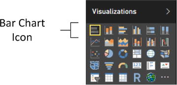 Figure 16-1.The Bar Chart icon in the Visualizations pane
 - 3.Leave the empty bar chart visual selected and expand the Clients table in the Fields list.
- 4.Select the box to the left of the ClientName field.
- 5.Leaving this new bar chart visual selected, expand the InvoiceLines table In the Fields list.
- 6.Click the check box to the left of the SalePrice field. This will add the cumulative sales per client to the chart.
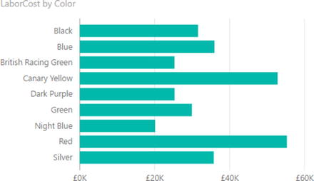
- 7.Resize the chart (I suggest widening it and increasing the height) until the axis labels are clearly visible, as shown in Figure 16-2.
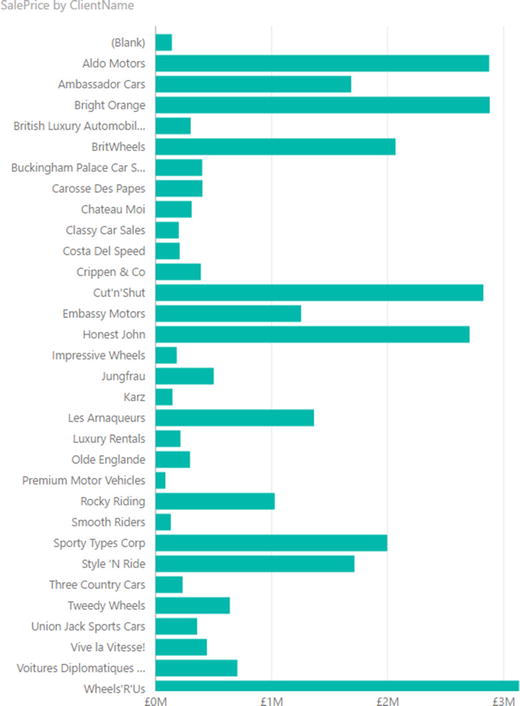 Figure 16-2.A bar chart after resizing
And that is all that there is to creating a simple starter chart. This process might only take a few seconds, and once it is complete, it is ready to show to your audience, or be remodeled to suit your requirements.
Nonetheless, a few comments are necessary to clarify the basics of chart creation in Power BI Desktop:
- When using only a single dataset, you can choose either clustered or stacked as the chart type for a bar or column chart; the result is the same in either case. As you will see as we progress, this will not be the case when the chart is based on multiple data fields.
- Power BI Desktop will add a title at the top left of the chart explaining what data the chart is based on. You can see an example of this in Figure 16-2.
- Creating a chart is very much a first step. You can do so much more to enhance a chart and accentuate the insights that it can bring. All of this follows further on in this chapter and in the next one.
Converting a Table into a Chart
Another way to create a chart is to create a table first (by dragging the data fields onto the Power BI desktop canvas without first clicking a chart icon, for instance). Then select the table and click a chart icon in the Visualizations pane to convert the table into a chart.
However, if you create a table first, then transform a table into a chart (by selecting a table and clicking the Stacked Bar chart icon), the field well of the Visualizations pane changes to reflect the options available when creating or modifying a chart. If you select the chart that you just created, you will see that the ClientName field has been placed in the Axis box, and the SalePrice field has been placed in the Value box. Neither of these boxes exists if the visual is a table. This can be seen in Figure 16-3.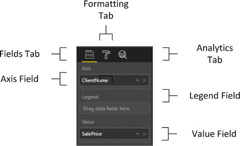
Figure 16-3.
The Fields list
for a bar chart
Deleting a Chart
Deleting a chart is as simple as deleting a table, a matrix, or a card. All that you have to do is
- 1.Click inside the chart.
- 2.Press the Delete key.
If you remove all the fields from the Layout section of the field well of the Visualizations pane (with the chart selected), then you will also delete the chart.
Basic Chart Modification
So you have an initial chart. Suppose, however, that you want to change the fields on which the chart is based. Well, all you have to do to change both the axis elements (the client names and the values represented) is
- 1.Click the bar chart that you created previously. Avoid clicking any of the bars in the chart for the moment.
- 2.In the field well of the Visualizations pane, click the small cross at the right of SalePrice in the Values well (or click the popup menu for SalePrice, and select Remove Field). The bars will disappear from the chart.
- 3.Drag the field LaborCost from the Stock table in the Fields list into the Values well.
- 4.In the field well of the Visualizations pane, click the popup menu for ClientName in the Axis box, and select Remove Field. The client names will disappear from the chart and a single bar will appear.
- 5.In the Fields list, expand the Colors table and drag the Color field from the Colors table into the Axis box. The list of colors will replace the list of clients on the axis, and a series of bars will replace the single bar. Look at Figure 16-4 to see the difference.
Figure 16-4.
A simple bar chart with the corresponding Layout section
That is it. You have changed the chart completely without rebuilding it. Power BI Desktop has updated the data in the chart and the chart title to reflect your changes.
Basic Chart Types
When dealing with a single set of values, you will probably be using the following six core chart types to represent data:
- Bar chart
- Column chart
- Line chart
- Pie chart
- Donut chart
- Funnel chart
Let’s see how we can try out these types of chart using the current dataset—the colors and Gross Margin that you applied in the previous chapter.
Column Charts
A column chart
is, to all intents and purposes, a bar chart where the bars are vertical rather than horizontal. So, do the following to switch your bar chart to a column chart:
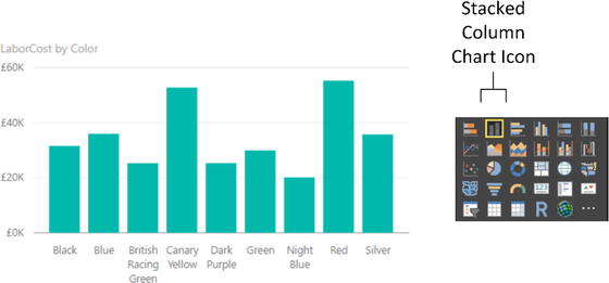
Figure 16-5.
An elementary column chart
Line Charts
A line chart displays the data as a set of points joined by a line. Do the following to switch your column chart to a line chart:
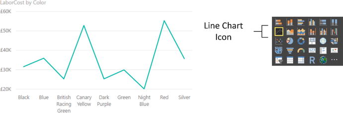
- 1.Click the column chart that you created previously. Avoid clicking any of the columns in the chart for the moment.
- 2.In the Visualizations pane, click the Line Chart icon. Your chart should look like Figure 16-6.
Figure 16-6.
A simple line chart
Pie Charts
Pie charts
can be superb at displaying a limited set of data for a single series, like we have in this example. To switch the visual to a pie chart:
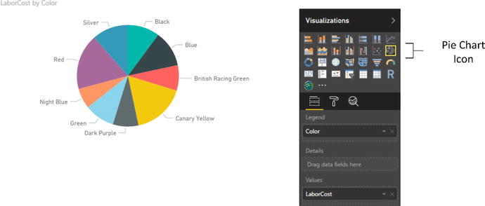
- 1.Click the line chart that you created previously. Avoid clicking any of the lines in the chart for the moment.
- 2.In the Visualizations pane, click the Pie Chart icon. The line chart will become a pie chart.
- 3.Resize the pie chart, if necessary, to display the text for all the colors correctly. Your chart should look like Figure 16-7. You will notice that the Layout section has changed slightly for a pie chart, and the Axis box has been replaced by a Legend box.
Figure 16-7.
A basic pie chart
A pie chart is distorted if it includes negative values at the same time as it contains positive values. Power BI Desktop will not display the negative values. If your dataset contains a mix of positive and negative data, then Power BI Desktop displays an alert above the chart warning “Too many values. Not showing all data.” What this nearly always really means is that the pie chart contains positive and negative values, and that the negative values are not displayed. This also applies to donut charts. Negative values can make funnel charts appear a little peculiar, too. If you want to see this for yourself, try creating a table of makes and gross margin. You will see that the table contains seven rows, but the corresponding pie or donut chart only displays six sections. This is because the make with a negative gross margin (TVR) does not appear in the pie chart.
In practice, you may prefer not to use pie or donut charts when your data contains negative values, or you may want to separate out the positive and negative values into two datasets and display two charts, using filters (this is explained in Chapter 20).
Note
Juggling chart size and font size to fit in all the elements and axis and/or legend labels can be tricky. One useful trick is to prepare “abbreviated” data fields in the source data, as has been done in the case of the QuarterAbbr field in the Date table that contains Q1, Q2, and so on, rather than Quarter 1, Quarter 2, and so on, to save space in the chart. Techniques for this sort of data preparation are given in Chapters 11 and 13.
Essential Chart Adjustments
I hope you will agree that creating a chart in Power BI Desktop is extremely simple. Yet the process of producing a telling visualization does not stop when you take a dataset and display it as a chart. At the very least, you want to make the following tweaks to your new chart:
- Resize the chart
- Reposition the chart
- Sort the elements in the chart
- Alter the size of the fonts in the chart
None of these tasks is at all difficult. Indeed, it can take only a few seconds to transform your initial chart into a compelling visual argument—when you know the techniques to apply.
Resizing Charts
A chart is like any other visual on the Power BI Desktop dashboard canvas and can be resized to suit your requirements. The following explains how to resize a chart:
- 1.Click inside the chart (but not on any of the bars, columns, lines, or pie segments).
- 2.Place the mouse pointer over any of the eight handles that appear at the corners and in the middle of the edges of the chart that you wish to adjust. The pointer becomes a two-headed arrow.
- 3.Drag the mouse pointer to resize the chart.
Note
Remember that the lateral handles let you resize the chart only horizontally or vertically, and that the corner handles allow you to resize both horizontally and vertically.
Resizing a chart can have a dramatic effect on the text that appears on an axis. Power BI Desktop always tries to keep the space available for the text on an axis proportionate to the size of the whole chart.
For column, line, and bar charts, this can mean that the text can be truncated, with an ellipsis (three dots) indicating that not all the text is visible. With column and line charts, the text may even be angled at 45 degrees or possibly swiveled to appear vertically.
If you reduce the height
(for a bar chart) or the width (for a column or a line chart) below a certain threshold, Power BI Desktop will stop trying to show all the elements on the non-numeric axis. Instead, it only shows a few elements and adds a scroll bar to allow you to scroll through the remaining data. What is more, if axis labels cannot be displayed in their entirety, they will be truncated (and ellipses added). You can see an example of these outcomes for a bar chart in Figure 16-8.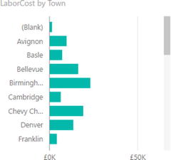
Figure 16-8.
A chart with a scroll bar visible
All that this means is you might have to tweak the size and height-to-width ratio of your chart until you get the best result. If you are in a hurry to get this right, I advise using the handle in the bottom-right corner to resize a chart, as dragging this up, down, left, and right will quickly show you the available display options.
Repositioning Charts
You can move a chart anywhere inside the Power BI Desktop report, as follows:
- 1.Place the mouse pointer over the border of the chart. The pointer changes into a hand icon.
- 2.Drag the mouse pointer.
Sorting Chart Elements
Sometimes you can really make a point about data by changing the order in which you have it appear in a chart. Up until this point you have probably noticed that when you create a chart, the elements on the axis (and this is true for a bar chart, column chart, line chart, or pie chart) are in alphabetical order by default. If you want to confirm this, then just look at Figures 16-5 to 16-8.
Suppose now, for instance, you want to show the way that the gross margin is affected by the color of the vehicle. In this case, you want to sort the data in a chart from highest to lowest so that you can see the way in which the figures fall, or rise, in a clear order. The following steps explain how to do this:
- 1.Select the bar chart type for Color and LaborCost, as described earlier (and shown in Figure 16-4).
- 2.Place the mouse pointer over the chart. You will see that the chart border and options button (the ellipses at the top right) appear.
- 3.Click the ellipses to display the chart menu and then click the chevron to the right of Sort By Color (or the appropriate field to order the data). This is shown in Figure 16-9, where the columns are sorted in reverse alphabetical order.
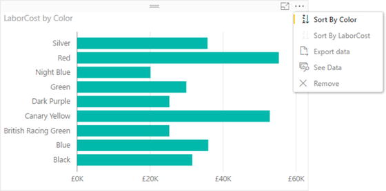 Figure 16-9.Using the popup menu in a chart to sort data
 - 4.In the popup menu, click the option Sort By LaborCost. This will change the sort order of the elements in the chart. You will now see a chart looking like the one in Figure 16-10.
 Figure 16-10.Sorting data in a bar chart
As you can see, the initial sort
is in descending order when you sort by a numeric value. Let’s suppose now that you want to see the sales by color in ascending order. All you have to do is repeat the operation that you just carried out and the chart will be resorted. Only this time, it is sorted in ascending order. Equally, the first time that you sort on a text element the chart is sorted in ascending order and the second time it is sorted in descending order.
I should add just a short remark about sorting pie charts. When you sort a pie chart by a numeric field, the pie chart is sorted clockwise, starting at the top of the chart. So if you are sorting colors by LaborCost in descending order, the top selling color is at the top of the pie chart (at 12 o’clock), with the second bestselling color to its immediate right (2 o’clock, for example), and so on. An example of this is shown in Figure 16-11.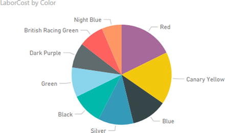
Figure 16-11.
Sorting data
in a pie chart
Donut Charts
Donut charts
are essentially a variation of a pie chart. However, they can make a welcome presentational change from their overexposed older sibling. Fortunately, they are equally easy to create. In this example, you are going to see how to visualize the parts cost incurred for each make of vehicle purchased. To vary the approach, in this example you will first create a table and then convert it to a donut chart.
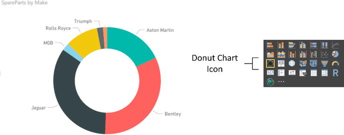
- 1.Continue using (or open) the file C:PowerBiDesktopSamplesCH16CarSalesDataForReports.pbix.
- 2.Ensure that no current visual is selected.
- 3.Expand the Stock table in the Fields list.
- 4.Select the box to the left of the Make field. A table containing the list of makes purchased will appear in the dashboard canvas.
- 5.Leave this new table selected and click the check box to the left of the SpareParts field. This will add the cumulative cost of spare parts per make to the table.
- 6.Click the Donut Chart icon in the Visualizations pane. This will convert the table to a donut chart.
- 7.Resize the chart if necessary to show the names of the makes clearly, as shown in Figure 16-12.
Figure 16-12.
A donut chart
Funnel Charts
Funnel charts
are excellent when it comes to comparing the relative values of a single series of figures. As you are now well-versed in the art of creating charts with Power BI Desktop, designing a funnel chart that displays parts cost per color should not be a problem for you.
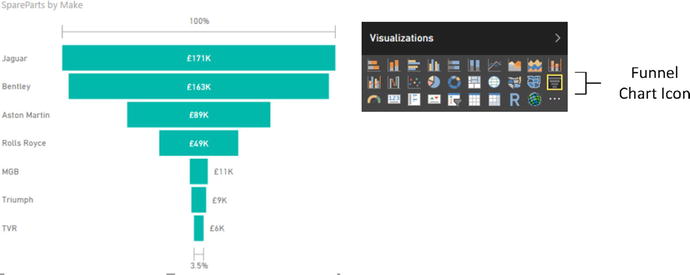
- 1.Carry on using the file C:PowerBiDesktopSamplesCH16CarSalesDataForReports.pbix.
- 2.Expand the Colors table in the Fields list.
- 3.Drag the Color field onto an empty part of the dashboard canvas. A table containing the list of vehicle colors will appear.
- 4.Leave this new table selected and click the check box to the left of the SpareParts field in the Stock table. This will add the cumulative cost of parts per make to the table.
- 5.Click the Funnel Chart icon in the Visualizations pane. This will convert the table to a funnel chart.
- 6.Place the mouse pointer over the chart. You will see that the chart border and options button (the ellipses at the top right) appear.
- 7.Click the ellipses to display the chart menu and then click Sort By SpareParts. The funnel chart will display the color with the highest value for the cost of spare parts at the top of the visual.
- 8.Resize the chart if necessary to show the names of the colors clearly as well as making the relative weights for all the colors more clearly comprehensible, as shown in Figure 16-13.
Figure 16-13.
A funnel chart
Multiple Data Values in Charts
So far in this chapter, we have seen simple charts that display a single value. Life is, unfortunately, rarely that simple, and so it is time to move on to slightly more complex, but possibly more realistic, scenarios where you need to compare and contrast multiple data elements.
For this set of examples, I will presume that we need to take an in-depth look at the following indirect cost elements of our car sales to date:
- Parts
- Labor
Consequently, to begin with a fairly simple comparison of these indirect costs, let’s start with a clustered column chart:
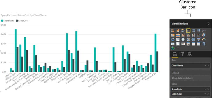
- 1.Open the file C:PowerBiDesktopSamplesCH16CarSalesDataForReports.pbix from the downloadable samples.
- 2.Starting with a clean Power BI Desktop report, create a table that displays the following fields:
- a.ClientName (from the Clients table)
- b.SpareParts (from the Stock table)
- c.LaborCost (from the Stock table)
- a.
- 3.Leaving the table selected, click the Clustered Column icon in the Visualization pane.
- 4.Resize the chart to make it clear and comprehensible , as shown in Figure 16-14. (I have included the fields from the Visualizations pane so that you can see this, too.)
Figure 16-14.
Multiple data values in charts—a clustered column chart with the Layout section shown
You will notice that a chart with multiple datasets has a legend by default, and that the automatic chart title now says SpareParts and LaborCost By ClientName.
The same dataset can be used as a basis for other charts that can effectively display multiple data values:
- Stacked charts
- Clustered column and stacked column
- Line charts
- Area charts
- Stacked area charts
Since column charts
are essentially bar charts pivoted 90 degrees, I will not show examples. However, in Figures 16-15, 16-16, 16-17, and 16-18, you will see examples of a stacked column chart, a line chart, an area chart, and a stacked area chart-all created from the same data. You also see that when creating these types of visualization, the Layout section of the field well of the Visualizations pane remains the same for all of these charts.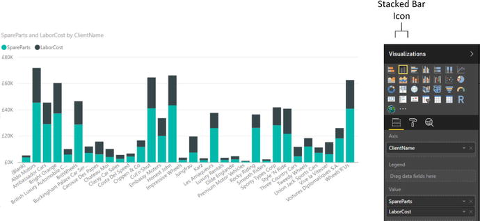
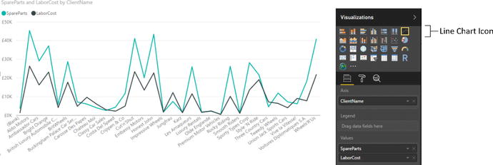
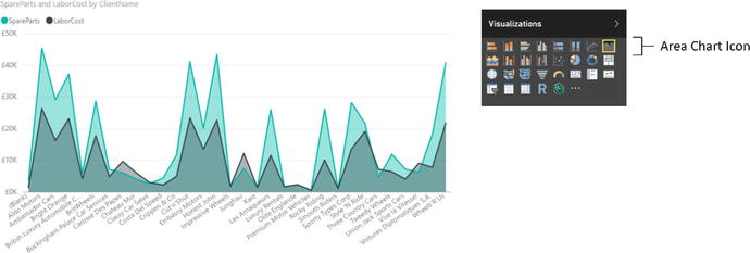
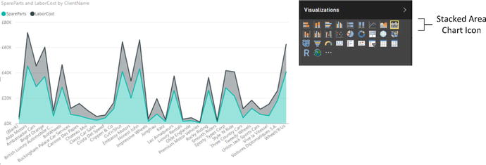
Figure 16-15.
A simple stacked bar chart
Figure 16-16.
A line chart that displays multiple values
Figure 16-17.
An area chart displaying multiple values
Figure 16-18.
A stacked area chart based on multiple values
These four charts all display the same data in different ways. Knowing this, you can choose the type of chart that best conveys the information and draws your reader’s attention to the point that you are trying to make.
If you are not sure which chart best conveys your message, then try them all, one after another. All it takes is a single click of the relevant icon in the visuals gallery to convert a chart to another chart type. Indeed, sometimes the differences can be extremely subtle. For instance, the essential difference between the area chart and the stacked area chart is the X (vertical) axis. In the case of Figure 16-18, this is a cumulative value. Figure 16-17, in contrast, shows two values directly compared one to the other with the higher value placed behind the lower value.
Note
Any of these chart types can be used to display a single data series if you want to. It all depends on the effect and the clarity of the insights that you are projecting using the chart.
100% Stacked Column and Bar Charts
One way to compare data from multiple datasets is to present each individual data series as a percentage of the total. Power BI Desktop includes two chart types that can do this “out of the box.” They are the 100% stacked column and 100% stacked bar charts.
Since you now know how to create charts that use multiple series of data, I will not explain how to produce these two chart types in detail; all you have to do is select the correct chart icon from the Visualizations pane. So instead, I suggest that you look at Figures 16-19 and 16-20, which show an example of each of these charts using the same data that you used to create the clustered column chart shown in Figure 16-14.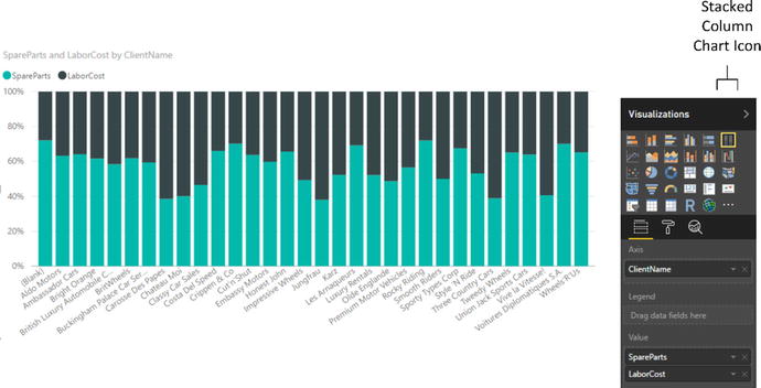
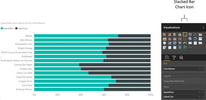
Figure 16-19.
A 100% stacked column chart
Figure 16-20.
A 100% stacked bar chart
Scatter Charts
A scatter
chart is a plot of data values against two numeric axes, and so by definition, you need two sets of numeric data to create a scatter chart. To appreciate the use of these charts, let’s imagine that you want to see the sales and margin for all the makes and models of car you sold overall. Hopefully, this allows you to see where you really made money. The following explains how to do it:
- 1.Using the file C:PowerBiDesktopSamplesCH16CarSalesDataForReports.pbix, delete any existing visualizations.
- 2.Create a table with the following fields in this order:
- a.Vehicle (from the Stock table)
- b.RatioNetMargin (from the InvoiceLines table)
- c.SalePrice (from the InvoiceLines table)
- a.
- 3.Convert the table to a scatter chart by clicking the Scatter Chart icon in the Visualizations pane. Power BI Desktop will display a scatter chart that looks like the one shown in Figure 16-21. Resize the chart to suit your taste.
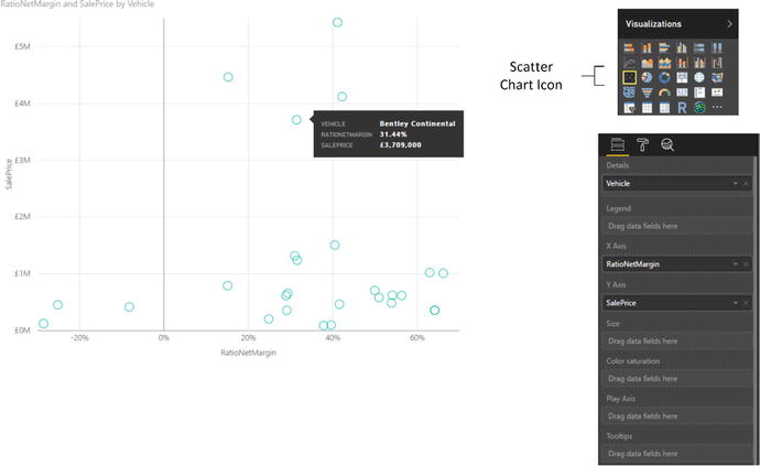 Figure 16-21.A scatter chart
If you look at the Fields area of the Visualizations pane (which is also shown in Figure 16-21), you will see that Power BI Desktop has used the fields that you selected like this:
- Vehicle: Placed in the Details box.
- RatioNetMargin: Placed in the X Axis box. This is the vertical axis.
- SalePrice: Placed in the Y Axis box. This is the horizontal axis.
If you hover the mouse pointer over one of the points in the scatter chart, you see the data for the specific car model. Figure 16-21 shows this.
Note
By definition, a scatter chart requires numeric values for both the X and Y axes. So if you add a non-numeric value to either the X Value or Y Value boxes, then Power BI Desktop converts the data to a count aggregation.
We made this chart by adding all the required fields to the initial table first. We also made sure that we added them in the right order so the scatter chart would display correctly the first time. In the real world of interactive data visualization, things may not be quite this coherent, so it is good to know that Power BI Desktop
is very forgiving. And, it lets you build a scatter chart (just like any other chart) step by step if you prefer. In practice, this means that you can start with a table containing just two of the three fields that are required at a minimum for a scatter chart, convert the table to a scatter chart, and then add the remaining data field. Power BI Desktop always attributes numeric or time fields to the X and Y axes (in the order in which they appear in the Fields box) and places the first descriptive field into the Details box.
Once a scatter chart has been created, you can swap the fields around and replace existing fields with other fields from the tables in the data to your heart’s content.
Bubble Charts
A variant of the scatter chart is the bubble chart. This is one of my favorite chart types, though of course you cannot overuse it without losing some of its power. Essentially, a bubble chart is a scatter chart with a third piece of data included. So whereas a scatter chart shows you two pieces of data (one on the X axis, one on the Y axis), a bubble chart lets you add a third piece of information, which becomes the size of the point. Consequently, each point becomes a bubble.
The best way to appreciate a bubble chart is to create one. So here we assume that you want to look at the following for all makes of car sold in a single chart:
- The total sales
- The net margin ratio
- The gross margin
This explains how a bubble chart can do this for you:
- 1.Using the file C:PowerBiDesktopSamplesCH16CarSalesDataForReports.pbix, delete any existing visualizations.
- 2.Create a table with the following fields from the SalesData table, in this order:
- a.Make (from the Stock table)
- b.SalePrice (from the InvoiceLines table)
- c.RatioNetMargin (from the InvoiceLines table)
- d.Gross Margin (from the InvoiceLines table)
- a.
- 3.Convert the table to a scatter chart by clicking the Scatter Chart icon. Yes, a bubble chart is a scatter chart, with a fresh tweak added.
- 4.Drag the ClientSize field from the Clients table into the Legend well of the Visualizations pane. Power BI Desktop will display a bubble chart that looks like that shown in Figure 16-22.
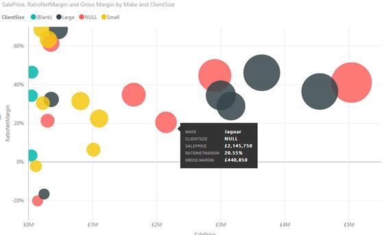 Figure 16-22.An initial bubble chart
 - 5.Resize the chart if you need to.
If you look at the field well in the Visualizations pane (shown in Figure 16-23), you will see that Power BI Desktop has used the fields that you selected like this: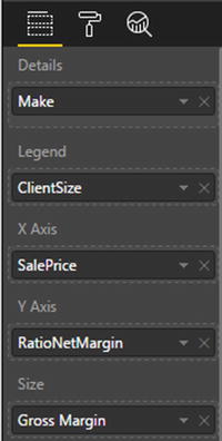
Figure 16-23.
The Fields well
of the Visualizations pane for a bubble chart
- Make: Placed in the Details box . This defines the core bubbles.
- ClientSize: Added to the Legend box. This creates bubbles for each combination of the detail element (make) and legend item (client size).
- SalePrice: Placed in the X Axis box. This is the vertical axis.
- RatioNetMargin: Placed in the Y Axis box. This is the horizontal axis. Each bubble is placed at the intersection of the values on the vertical and horizontal axes.
- Gross Margin: Placed in the Size box. This defines the size of the points, which have consequently become bubbles of different sizes.
Hover the mouse pointer over one of the points in the bubble chart. You will see all the data that you placed in the Fields list Layout section for each make, including the Gross Margin. You can see this in Figure 16-23.
If a bubble chart containing this many data points is simply too overloaded to be truly useful, then you have an alternative way of presenting the data. Continuing with the chart that you just created:
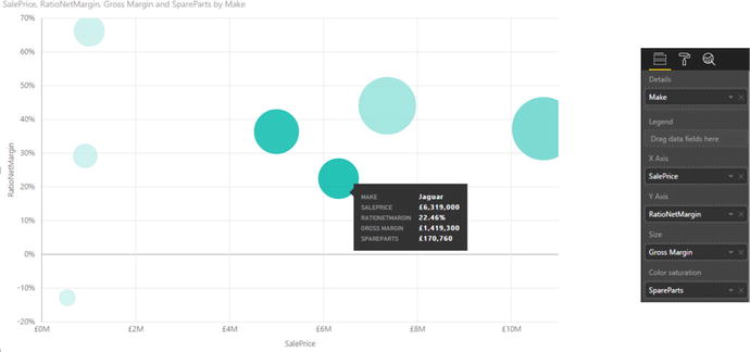
- 1.Remove the ClientSize field from the Legend well in the Visualizations pane.
- 2.Drag the SpareParts field from the Stock table into the Color Saturation well of the Visualizations pane. The chart will now look like the one shown in Figure 16-24, where the relative intensity of the color of each bubble is defined by the spare parts value.
Figure 16-24.
A bubble chart using color saturation
Waterfall Charts
We are very near the end of our tour of Power BI Desktop chart types. What I want to look at now is the antepenultimate chart type Power BI Desktop offers—the waterfall chart. This chart type is excellent at displaying the component parts of a final figure; in this example, it is used to show how the various makes sold make up the total sales figure.
- 1.Open the file C:PowerBiDesktopSamplesCH16CarSalesDataForReports.pbix and delete any existing visualizations.
- 2.Click the Waterfall Chart icon You can see this in Figure 16-25. An empty waterfall chart will appear on the dashboard canvas.
- 3.Expand the Stock table and check the following fields:
- a.Make
- b.CostPrice
- a.
- 4.Resize the chart to suit your aesthetic requirements. It should look something like Figure 16-25.
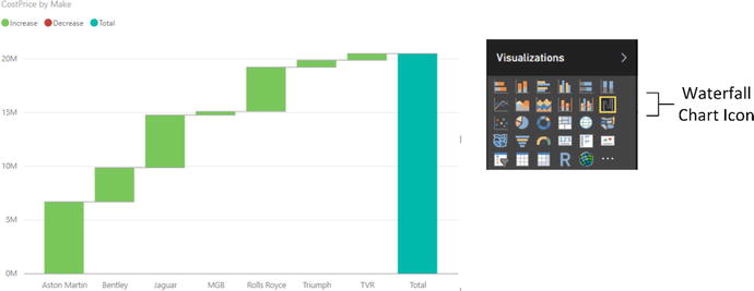 Figure 16-25.A waterfall chart
Waterfall charts can be extremely useful when you are analyzing the constituent elements of a whole. For instance, you could try using one to break down all the cost elements of a sale.
Ribbon Charts
A fairly recent addition to the range of chart options that Power BI Desktop has on offer is the ribbon chart. Ribbon charts virtually always use a time element as the X axis, and are designed to show evolution over time. More specifically, they always place the highest value as the upper ribbon of the chart.
This is probably best understood with the help of an example. So I suggest that you try out the following:
- 1.Click the Ribbon Chart icon in the Visualizations pane (this is shown in Figure 16-26).
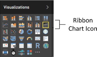 Figure 16-26.The Ribbon Chart icon
 - 2.In the Fields list, click the following fields:
- a.MonthAndYear (in the DateDimension table)
- b.SalePrice (in the InvoiceLines table)
- c.Make (in the Stock table)
- a.
- 3.
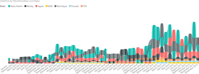
As you can see, the ribbon chart shows the ebb and flow of sales of different makes of vehicle over time. Indeed—and at the risk of anticipating the contents of Chapter 21—I suggest that you click one of the makes in the chart legend. This will highlight the make and show its evolution over time.
Dual-Axis Charts
To conclude our tour of chart types, let’s take a look at a couple of charts that combine two of the basic chart types that you have seen previously in this chapter:
- Line and clustered column chart
- Line and stacked column chart
Let’s discuss each of these in turn.
Line and Clustered Column Chart
Suppose that the CEO of Brilliant British Cars has decided to embark on an analysis of vehicle purchases. He wants to isolate any interesting correlations that could influence purchases in order to maximize profits. So, determined to satisfy his request (or possibly to humor him) you have in turn decided to take a look at indirect costs and mileage to see if there are any correlations.
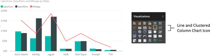
- 1.Open the file C:PowerBiDesktopSamplesCH16CarSalesDataForReports.pbix and delete any existing visual.
- 2.Click the Line and Clustered Column Chart icon. An empty line and clustered column chart will appear on the dashboard canvas.
- 3.Expand the Stock table and check the following fields:
- a.Make (this will be added to the Shared Axis box)
- b.LaborCost (this will be added to the Column Values box)
- c.SpareParts (this will be added to the Column Values box)
- a.
- 4.Also from the Stock table, drag the Mileage field into the Line Values box in the field well of the Visualizations pane.
- 5.Resize the chart to suit your aesthetic requirements. It should look something like Figure 16-28.
Figure 16-28.
A line and clustered column chart
As you can see, this chart combines a clustered column chart that displays the labor and parts costs using the left axis with a line chart that displays the mileage using the right axis. Both of these charts share the X (or horizontal) axis.
Moreover, this kind of analysis makes it immediately clear that there is one make where low mileage does not necessarily mean lower repair costs. So the boss should be happy that you have isolated this unexpected correlation.
Line and Stacked Column Chart
One of the key advantages of dual-axis charts is that the two X axes can have vastly different scales. So, for instance, when you want to see how the parts and labor cost relate to the purchase cost (which is orders of magnitude higher than the other two costs), a line and stacked column chart can be really useful to get a clearer view of the data.
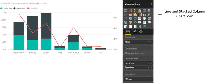
- 1.Open the file C:PowerBiDesktopSamplesCH16CarSalesDataForReports.pbix and delete any existing visualizations.
- 2.Expand the Stock table and check the following fields to display a table on the dashboard canvas:
- a.Make
- b.LaborCost
- c.SpareParts
- a.
- 3.Click the Line and Stacked Column Chart icon. The table will be converted to a line and stacked column chart.
- 4.Also from the Stock table, drag the CostPrice field into the Field well of the Visualizations pane. Place it in the Line Values box.
- 5.Resize the chart to suit your aesthetic requirements. It should look something like Figure 16-29.
Figure 16-29.
A line and stacked column chart
This way you can compare values
where the use of a single chart type would lead to one value (the cost price in this example) dwarfing the other values to the point of making them unreadable.
Data Details
To conclude our tour of chart types, I just want to make a few comments:
- You can always see exactly what the figures behind a bar, column, line, point, or pie segment are just by hovering the mouse pointer over the bar (or column, or line, or pie segment). This works whether the chart is its normal size or has been popped out to cover the Power BI Desktop report area.
- However much work you have done to a chart, you can always switch it back to a table if you want. Simply select the chart, and select the required table type from the Table button in the Design ribbon. If you do this, you see that the table attempts to mimic the design tweaks that you applied to the chart, keeping the font sizes the same as in the chart, and the size of the table identical to that of the chart. Should you subsequently switch back to the chart, then you should find virtually all of the design choices that you applied are still present—unless, of course, you made any changes to the table before switching back to the chart visualization.
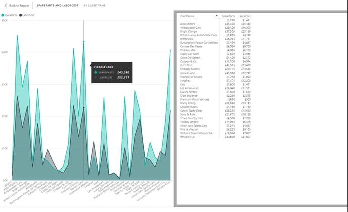
- You can always juxtapose the raw data that powers a chart under the chart itself, as you could with text-based visuals. Simply click the ellipses at the top right of a chart and select See Data to display the source data. You can see an example of this in Figure 16-30 (where you can also see how a data point is displayed in line, area, and stacked area charts).
Figure 16-30.
Displaying pop-out data for a chart
To switch back to the dashboard canvas, simply click Back to Report at the top left of the chart.
Drilling into and Expanding Chart Data Hierarchies
An extremely useful aspect of Power BI Desktop charts is that you can use them as an interactive presentation tool. One of the more effective ways to both discover what your data reveals and deliver the message to your public is to drill into, or expand, layers of data. All the standard Power BI chart types let you do just this.
Drill down
works with all the standard chart types. This means that you can drill into:
- Stacked bar charts
- Stacked column charts
- Clustered bar charts
- Clustered column charts
- 100 % stacked bar charts
- 100 % stacked column charts
- Line charts
- Area charts
- Stacked area charts
- Line and stacked column charts
- Line and clustered column charts
- Waterfall charts
- Scatter charts
- Bubble charts
- Pie charts
- Funnel charts
- Donut charts
- Tree map charts
The key point to remember when you are creating drill-down charts is that you must place the fields that you wish to drill into in the Axis area (the Shared Axis area for double-axis charts) of the field well, not in the Legend area (and not in the Details area for a pie chart).
Drill Down
Fortunately, you use the same techniques that you saw in the previous chapter when navigating data hierarchies to drill down into charts. So extending this approach from tables and matrices to charts is really easy. Here, then, is a simple example of how you can analyze the hierarchy of makes, models, and colors of vehicles sold in a drill-down chart:
- 1.Click the Clustered Column Chart icon in the Visualizations pane. An empty chart visual will be created on the dashboard canvas.
- 2.Drag the following fields into the Axis area of the field well in this order:
- a.Make (from the Stock table)
- b.Model (from the Stock table)
- c.Color (from the Colors table)
- a.
- 3.Drag the SalePrice (from the InvoiceLines table) and the Mileage (from the Stock table) fields onto the chart. The chart will look like the one in Figure 16-31. As you can see, it only displays the top-level element from the Axis field well—the make of vehicle.
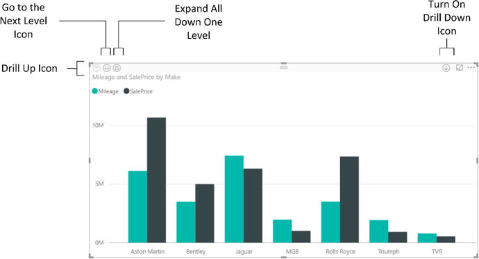 Figure 16-31.A column chart displaying the top level of data in a hierarchy
 - 4.Click the Turn on Drill Down icon at the top right of the chart. This icon will become a white arrow on a dark background.
- 5.Click the column for Aston Martin. The chart will now display the models of Aston Martin sold, as you can see in Figure 16-32.
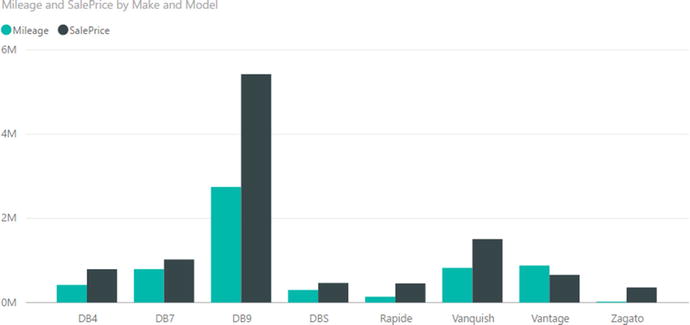 Figure 16-32.A column chart displaying the second level of data in a hierarchy
 - 6.Click the column for DB9 . The chart will now display the colors of Aston Martin DB9 sold, as you can see in Figure 16-33.
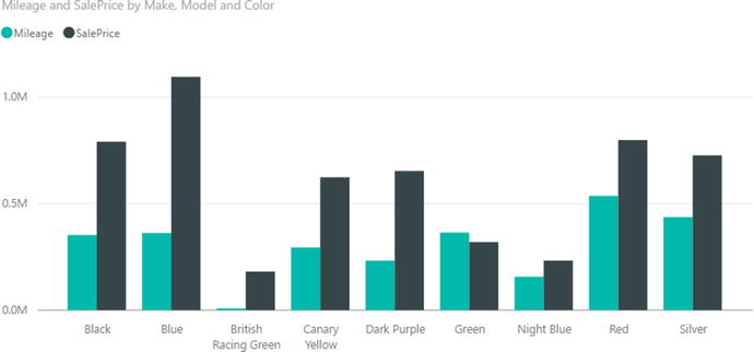 Figure 16-33.A column chart displaying the lowest level of data in a hierarchy
Once you have drilled down to a lower level in a chart, you can always return to the previous level (and from there continue drilling up until you reach the top level) by clicking the Drill Up
icon at the top left of the chart.
Expand All Down One Level
The Expand All Down One Level icon
produces a different result to drilling down by clicking a bar in the chart. If you click the Expand All Down One Level icon, you see all the elements at the next level down, not just the elements in the hierarchy that are a subgroup. To see this, try out the following steps:
- 1.Re-create the chart from the previous section (follow steps 1 through 3) until you can once again see the chart from Figure 16-31.
- 2.Click the Expand All Down One Level icon.
- 3.Resize the chart to enhance its visibility. You will see a chart that looks like the one shown in Figure 16-34.
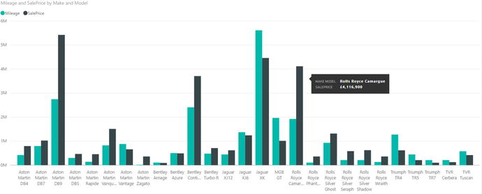 Figure 16-34.Expanding a chart down one level
 - 4.Click the Expand All Down One Level icon a second time.
- 5.Resize the chart if necessary. This time the chart looks like the one shown in Figure 16-35.
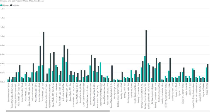 Figure 16-35.Expanding a chart down one more level
Go to the Next Level
The final hierarchy navigation technique that you can apply is to go to the next level. To test this, try out the following steps:
- 1.Re-create the chart from the last but one section (follow steps 1 through 3).
- 2.Click the Go to the Next Level icon.
- 3.Resize the chart to enhance its visibility. You should see a chart like the one shown in Figure 16-36.
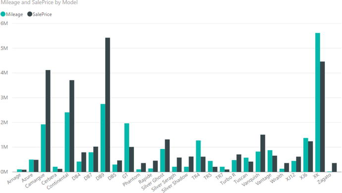 Figure 16-36.Going to the next level in a chart
 - 4.Click the Go to the Next Level icon one more time. You will see a chart that looks like the one shown in Figure 16-37.
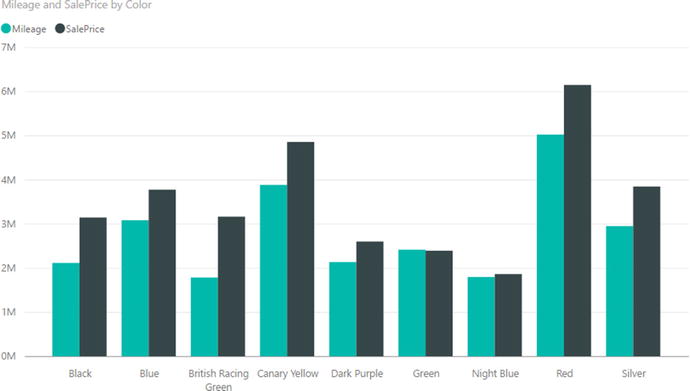 Figure 16-37.Going to a deeper level in a chart
To resume, the three options that you can use to navigate a chart hierarchy are
- Drill Down: This will only show the data at the next level for the specific element that you clicked.
- Expand All Down One Level : This will show the data at the next level for all elements.
- Go to the Next Level: This will display data only for the lower level in the data hierarchy.
Note
Whichever technique you used to display a lower level of data, you can always go up to the previous level by clicking the Drill Up icon.
Including and Excluding Data Points
You saw in Chapter 15 that you can include and exclude records from a matrix. Well, you can apply this technique to charts as well. This can help you to remove clutter, discard outliers, or simply focus on a selected set of data points. Here’s an example of how to exclude data points:
- 1.Create a clustered column chart like the one shown in Figure 16-38 using the following data elements:
- a.Axis: Make (from the Stock table)
- b.Legend: Model (from the Stock table)
- c.Value: SalePrice (from the InvoiceLines table)
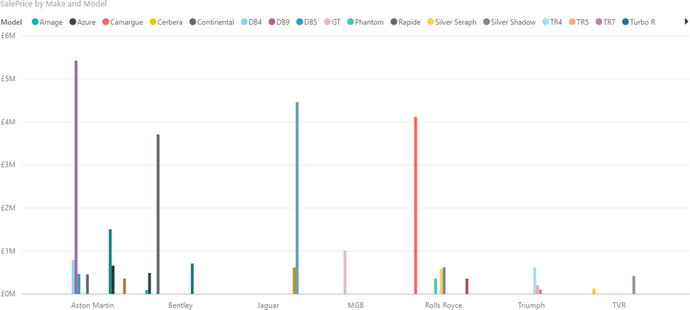 Figure 16-38.A column chart before excluding data points
 - a.
- 2.Ctrl-click to select the four tallest columns.
- 3.Right-click any of the selected columns and choose Exclude from the popup menu. The chart will look like the one shown in Figure 16-39.
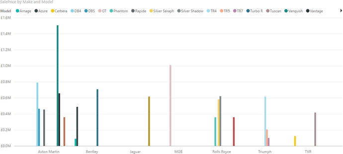 Figure 16-39.A column chart after excluding data points
The remaining data is exactly the same as before, but removing the very tall columns allows you to see more clearly any differences among the remaining data elements.
As a final point
, you can see from Figure 16-39 that a chart whose legend contains too many elements to view comfortably has a scroll arrow to allow you to view the remaining items in the legend.
Conclusion
This chapter took you on a tour of the available chart types that you can use in your Power BI Desktop reports and dashboards. These extend from the classic pie, line, column, and bar charts to the less common funnel, donut, area, scatter, bubble, and waterfall charts. You saw that there are charts to suit a single data series and others that can handle multiple series of data. To add extra effect, you saw how to create mixed chart types, create 100% bar and column charts, and tweak axis elements.
However, these charts can be presented at a higher level if you decide to add some compelling formatting. This is what you will learn to do in the next chapter.