While text-based visuals and charts can often make your point, there are times when you need to deliver your insights in ways that go beyond the more traditional data displays. This is where Power BI Desktop really comes to your aid. With the right data—and only a few clicks—you can revitalize your dashboards with
- Tree maps
- Gauges
- KPIs
- R visuals
Most of these visualization types are as simple to create as the text-based visuals and charts that you saw in the preceding four chapters. Yet their very ease of use should not distract you from the clarity and power that they can bring to your reports and presentations.
Yet this is only the starting point. As a freely extensible platform, Power BI Desktop also hosts a wide and growing variety of visuals developed by both Microsoft and third parties. This gallery of visual extensions is continually growing and incredibly easy to access and use. The final part of this chapter shows you some of the current visuals and how to find, add, and use them in your Power BI Desktop dashboards. This chapter will use the file C:PowerBiDesktopSamplesCH18CarSalesDataForReports.pbix as the basis for the visuals that you will create.
Tree Maps
One type of visual that can really help your audience to see the way that individual values relate to a total is the tree map. While this is not a map in any geographical sense, it can certainly assist users in finding their way around a set of figures.
As, yet again, seeing is believing in the world of visuals, let’s take a look at a tree map showing how the labor costs stack up for each make and model of car purchased:
- 1.Open the C:PowerBiDesktopSamplesCH18CarSalesDataForReports.pbix file, or click an empty part of the dashboard canvas.
- 2.Click the Tree Map icon in the Visualizations pane. A blank tree map will appear.
- 3.Expand the Stock table and drag the Make field on to the Group box in the field well.
- 4.Drag the Model field on to the Details box in the field well.
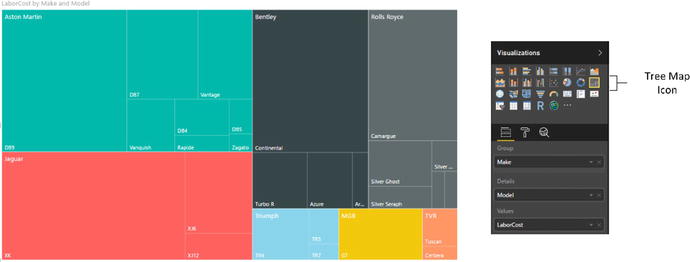
- 5.Drag the LaborCost field on to the Values box in the field well. The tree map should look like the one in Figure 18-1.
Figure 18-1.
A tree map showing labor cost
for each make of car
As you can see in Figure 18-1, the tree map has grouped each model of car by make, and then displayed the labor cost as the relative size of each box in the tree map. This way, your viewers can get a rough idea of
- How the labor cost for each model compares to the total labor cost for the make.
- How the labor cost for each make compares to the total labor cost.
As you are probably expecting by now, you can hover the mouse over any box in the tree map and see a popup tooltip of the exact data.
Power BI Desktop will decide how best to organize the tree map. However, the final appearance will depend on how wide and how tall the visual is. So don’t hesitate to resize this particular kind of visualization and see how it changes as you adjust the relative height and width.
There could be cases when a tree map cannot display all the available data, possibly because there are too many data points, or the range of values is too wide to be shown properly, or (as the case with the pie charts) because there are negative values in the data. In these circumstances, the tree map shows a warning triangle in the top left of the visual. If you hover the mouse pointer over this icon, you will see a message like the one shown in Figure 18-2.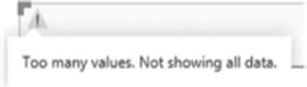
Figure 18-2.
The tree map data alert
If you see this warning, then you could be advised to apply filters to the data (as described in Chapter 20) to filter out the data that is causing the problem.
Drill Down and Tree Maps
The same drill-down and expand lower-level logic that you have already seen for matrices, charts, and maps also applies to tree maps. As you are used to the concept by now, I will only show a short example of drill down using a tree map:

- 1.Select the tree map that you just created.
- 2.Drag the Color field from the Colors table to the Group well of the Visualizations pane. Place this under the Make field.
- 3.Activate Drill Mode by clicking the drill mode icon at the top right of the visual.
- 4.Click any of the elements for Aston Martin. You will drill down to the next level (color) and the visual will look like the one shown in Figure 18-3.
Figure 18-3.
Drilling down into a tree map visual
Formatting Tree Maps
Tree maps can be formatted just like any other visual. The following are the available options in the Format icon in the Visualizations pane:
- Legend
- Data Colors
- Data Labels
- Category Labels
- Title
- Background
- Lock Aspect
- Border
Since applying all of these options was explained (for other types of visual) in the four previous chapters, I will not explain them in detail again, but I will provide a few comments about the available options.
Legend
In my opinion, a legend is superfluous as it duplicates the information about the grouping data that is already displayed in the tree map. You may find a legend necessary if you choose not to display the category labels, however.
Data Colors
This palette lets you choose a specific color for each grouping element.
Data Labels
You can display (or hide) the actual figures that are behind each segment of a tree map if you wish. This entails switching the Data Labels button to On or Off. If you expand the Data Labels section of the Formatting pane, you can also modify the color, units, number of decimals, and text size and font of the data labels.
Category Labels
This option lets you decide whether or not to display the grouping elements and the detail element information inside the tree map. If your tree map contains dozens (or hundreds) of data points, then you might want to hide the category labels. If you expand the Category Labels section of the Formatting pane you can also modify the color, font, and size of the category labels.
Title
As is the case with most visuals, you can choose to show or hide the title, as well as alter its text, font size, and background color.
Background
You can apply a colored background to the kind of visuals that you can see in this chapter, too.
Lock Aspect
If you set Lock Aspect to On, then you can resize the visual while keeping it proportionally sized.
Border
AS is the case with just about any visual, you can add or remove a border to tree maps, too.
Gauges
After nearly five chapters of delving into the range of visuals that Power BI Desktop has to offer, there is one final built-in visual to look at. This is the Power BI dashboard gauge. These kinds of visuals are particularly effective when you want to compare actuals to targets or see how a metric compares to a key performance indicator (KPI)
, for instance. In this example, you will use a gauge to see how the total cost of purchases
and spares compares to the threshold set by the finance director:
- 1.Open the C:PowerBiDesktopSamplesCH18CarSalesDataForReports.pbix file, or click an empty part of the dashboard canvas.
- 2.Click the Gauge icon in the Visualizations pane. A blank gauge visual will appear.
- 3.Expand the InvoiceLines table and drag the Cost Plus Spares Margin field into the Value box in the field well. Alternatively, drag this field directly onto the gauge that you just created.
- 4.Drag the SalePrice field into the Maximum Value box in the field well.
- 5.Drag the TotalCost field from the Stock table into the Target Value box in the field well.
The gauge will look like Figure 18-4.
Figure 18-4.
A gauge in Power BI Desktop
Gauges are designed to show progress against a target or a total. Consequently, you can set the elements described in Table 18-1 for a gauge.
Table 18-1.
The Specific Data Requirements
for Gauges
Element
|
Description
|
|---|---|
Value | The element that appears as a colored bar in the gauge. |
Minimum Value | The minimum value to alter the perceptual effect of the gauge. |
Maximum Value | The maximum value to alter the perceptual effect of the gauge. |
Target Value | A metric that is defined as something to be attained. |
In fact, all that a gauge needs is a value. It will work without any of the other three elements. However, the real visual power of a gauge comes from the way that it uses the viewer’s presumption of a target or value to be achieved. Consequently, it is usually best to apply a target at least, and a maximum value to convey an idea of success or failure for the reader.
Note
Remember that you can define a specific value as a measure in the data model. This can be extremely useful if you need to set the maximum, minimum, or target values for gauges. This way you can modify a threshold once without having to change the attributes of multiple visuals independently.
Formatting Gauges
Many of the gauge formatting options are highly specific to gauge visuals. So here is a quick trip through the available presentation techniques that you need to know to enhance this type of visual:

- 1.Click the gauge that you created previously.
- 2.In the Visualizations pane, remove the Target value (the CostPlusSpares field).
- 3.Remove the Maximum value (the SalePrice field).
- 4.In the Visualizations pane, click the Format icon.
- 5.Expand the Gauge Axis section.
- 6.Enter 2000000 as the minimum value.
- 7.Enter 30000000 as the maximum value.
- 8.Enter 10000000 as the target.
- 9.Expand the Data Labels section.
- 10.Ensure that the Data Labels switch is set to On.
- 11.Choose a color from the popup palette for colors for the data label fill.
- 12.Choose a color from the popup palette for colors for the target.
- 13.Expand the Callout Value section.
- 14.Ensure that the Callout Value switch is set to On.
- 15.Choose a color from the popup palette for colors for the callout value.
- 16.Expand the Data Colors section and select a color for the fill and the target.
- 17.Expand the Target section and increase the text size. The gauge will look something like Figure 18-5.
Figure 18-5.
A formatted gauge
If you wish, you can also alter the background data labels, border, and title just as you did previously for other visuals. You can also choose not to display the data labels or the callout value (the value of the gauge) if you prefer. All you have to do is to set their respective switches to the Off position.
Note
When entering figures in the Formatting pane (referenced earlier in the chapter) of the Visualizations pane, you must not add any numeric formatting, such as thousands separators. If you do, the formatting will not work and Power BI will wait until you have entered the numbers in their raw form.
Gauges
are a simple yet effective visual. A set of gauges can also be a truly effective way of displaying high-level key metrics on a dashboard.
The remaining gauge formatting options are common to most of the visuals that you have already seen:
- Title
- Background
- Lock Aspect
- Border
KPIs
Power BI Desktop can also create key performance indicator visuals that illustrate how a data element is trending compared to a target value. Here is one example of this:

- 1.Create a clustered column chart visual.
- 2.Add the SalesPrice field (from the InvoiceLines table) as well as the MonthAndYear field (from the DateDimension table).
- 3.Click the popup menu at the top right of the chart and select “Sort the chart by month and year.”
- 4.Click the KPI icon to convert the chart to a KPI. You can see this in Figure 18-6.
- 5.Add the HighNetMarginSales field from the InvoiceLines table to the Target Goals well of the Visualizations pane.
- 6.Click the Format icon in the Visualizations pane.
- 7.Expand the Indicator section and select Thousands as the display unit.
- 8.Expand Color Coding and select another color for the Good Color. The KPI will look like the one shown in Figure 18-6.
Figure 18-6.
A KPI visual
Note
You cannot currently sort a KPI visual. So you need to be sure that you have sorted the chart visual before you convert it to a KPI.
R Visuals
Should you find that even the wide range of built-in visuals that Power BI Desktop has to offer are just not enough to make your point, then you can take visuals to another, higher level using the R language. “R” as it is known is a language that is used to analyze data and create visualizations of statistical data. It can be used inside Power BI Desktop reports and dashboards to extend the analysis that you are delivering using the data that you have prepared for your existing visuals.
R is not an intuitive language, but it is extremely powerful. So here is an example of how you can add an R visual to a dashboard
using the CarSales data that you have already loaded:
Note
Creating R visuals implies installing an R engine on the PC that hosts Power BI Desktop. You can find one of the available R downloads at
https://mran.revolutionanalytics.com/download/
.
- 1.Open the Power BI Desktop file C:PowerBiDesktopSamplesCH18CarSalesDataForReports.pbix.
- 2.Click the R visuals icon in the Visualizations pane, the Enable Script Visuals dialog will be displayed, like the one shown in Figure 18-7.
 Figure 18-7.The Enable Script Visuals dialog
 - 3.Click Enable. An empty R visual will be added to the desktop canvas and a pane containing the R script editor will appear under the report. You can see this in Figure 18-8.
 Figure 18-8.Adding an R visual
 - 4.Drag the following fields onto the R visual (both are from the Stock table):
- a.Make
- b.CostPrice
- a.
- 5.Add the following script under the header lines in the R script editor (this script is available in the file C:PowerBiDesktopSamplesCH18Rscript.txt). Once you have done this the script editor will look like Figure 18-9.rdata <- table(dataset)barplot(rdata,axes=F,main="Make",xlab="Cost Price",ylab = "Number Sold per Price Point",legend = rownames(rdata),col=c("darkblue","red", "green", "yellow", "pink", "orange", "darkgreen") )
 Figure 18-9.The R script editor with a functioning script
 - 6.Click the Run Script icon at the top right of the script editor.
- 7.The R visual will appear in Power BI Desktop.
- 8.Resize the R visual as necessary. The visual could end up looking like the one shown in Figure 18-10.
 Figure 18-10.An R visual
You can, of course, only create R visuals if you are prepared to learn the R language. As this is the subject of entire tomes, I will not be describing the language here. Instead I suggest that you refer to the many excellent resources that are already available on this subject.
The R script editor icons
are described in Table 18-2.
Table 18-2.
The R Script Editor Icons
Icons
|
Description
|
|---|---|
Run Script | Runs-or reruns-the R script and re-creates the R visual in Power BI Desktop. |
R Script Options | Displays the dialog with available R script options. |
Edit script in external R IDE | Runs an external R editor, using the script from the Power BI Desktop R visual. |
Minimize the script pane | Hides (or redisplays) the R script pane. |
R Options
There are a couple of R options
that you can adjust if this proves really necessary. You can find these by choosing File ➤ Options and Settings ➤ Options and then clicking R scripting in the left-hand pane of the Options dialog that you can see in Figure 18-11.
Figure 18-11.
R options
There are, essentially
, only a couple of possible tweaks that you could have to make:
- R Scripting Engine : Power BI Desktop should detect the R scripting engine that you have previously installed. Should it not do this, then you can browse to the directory containing the R scripting engine. Simply select Other in the popup list and click the Browse button.
- IDE: If you prefer to use a different external R integrated development interface (IDE), then simply click the Browse button to select a preferred R IDE. This will then be invoked the next time that you click the External Editor icon at the top right of the R script editor.
Note
The vast majority of formatting for an R visual is done inside the R script itself.
Additional Visuals
By now, you must surely have come to appreciate the sheer range of visual possibilities that Power BI Desktop has to offer. From a range of chart types to gauges, tables, and cards, it delivers a wealth of easy-to-use ways of delivering insight into your data clearly and effectively.
Yet Power BI Desktop does not stop with the built-in visualizations that you have seen so far. It has been designed to be a completely open and extensible business intelligence application that will allow third parties (and even Microsoft) to add other visuals. This means that the core elements that you have met so far are only a starting point. There are many other chart, text, and map visuals that you can add to Power BI Desktop in a few clicks-and then literally stun your audience with an eye-catching variety of dashboard elements.
Adding and using these enhancements is both quick and easy. This is because all Power BI visualizations use the same interface and they are based on the underlying data model in exactly the same way. Consequently, learning to use a new visual will most likely only take a couple of minutes, as you are always building on the knowledge and techniques that you have already acquired.
Note
You need to be aware that not all the custom visuals that are available are entirely bug-free. Also, they might not have all the formatting attributes or interactive capabilities available that you might wish for. However, this does not make them any less useful—or any less fun to use. In any case, we can reasonably expect them to be enhanced and improved over time.
The Power BI Visuals Gallery
The first thing to do is become acquainted with the Power BI visuals gallery. This is a central hub where you can find a range of free visuals, developed either by Microsoft or by third parties, that are ready to be added to your Power BI dashboards.
The following explains how to connect to the Power BI visuals gallery:
- 1.
- 2.Enter your password and sign in. You will see the dialog from Figure 18-13.
 Figure 18-13.The Custom Visuals gallery
 - 3.Select a visual from among those available (you can search for a specific visual by entering a search term in the Search box or see them grouped and filtered by type if you click a type of visual on the left of the dialog).
- 4.Click Add. You will see a dialog like the one in Figure 18-14.
 Figure 18-14.Selecting a third-party visual
 - 5.Click Add. The visual will be added to the palette of available visualizations and the dialog that you can see in Figure 18-15 will be displayed.
 Figure 18-15.Confirmation dialog for visual import
 - 6.Click OK. You can now use the visual in the current Power BI Desktop report.

This selection of third-party visuals has undoubtedly evolved considerably since this book went to print, and so I imagine that what you are looking at now is very different. Hopefully, though, you should be excited to see lots of new and amazing types of data visualization that will allow you to add unparalleled pizzazz to your dashboards.
Loading Custom Visuals
Another way to access this treasure trove of extra presentation elements for your reports is to download them to your PC and then add them to Power BI Desktop. Here is how to do this:
- 1.In your web browser, navigate to https://app.powerbi.com/visuals . You will see the Custom Visuals for Power BI web page. As things stand, it looks like Figure 18-16.
 Figure 18-16.The Custom Visuals for Power BI web page
 - 2.Click the visual that you want to download. A second web page devoted to this specific visual will be displayed. It will look something like Figure 18-17.
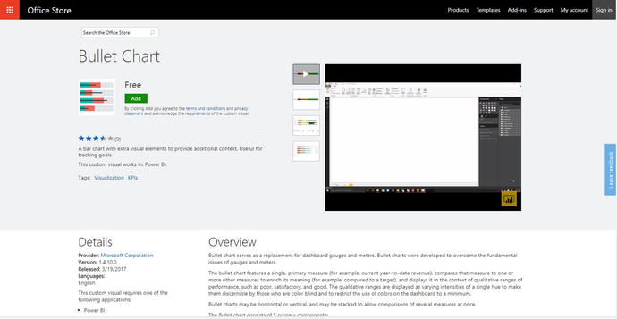 Figure 18-17.The visuals download dialog
 - 3.Click Add. The web page shown in Figure 18-18 will be displayed.
 Figure 18-18.The visuals community agreement dialog
 - 4.Click Select to Download. The visual will be downloaded. Depending on your version of Windows (and any machine-specific configuration), it will be placed in a specific folder or give you the choice of a folder.
- 5.In Power BI Desktop, click From File in the Home ribbon. A cautionary dialog like the one in Figure 18-19 will appear.
 Figure 18-19.The import visuals dialog
 - 6.Click Import. The Windows File Open dialog will appear.
- 7.Navigate to the folder where you downloaded the visual file in step 3. Click the visual file. You can see an example of this in Figure 18-20.
 Figure 18-20.Loading a visual from file
 - 8.Click Open. The confirmation dialog will appear, as shown in Figure 18-21.
 Figure 18-21.The visual import confirmation dialog
The icon for the visual will appear at the bottom of the visuals gallery in the Visualizations pane. You can then use this visual just like any other Power BI visual.
Tip
Visuals are added as required to each individual Power BI Desktop file. So while you only download the visuals once, you have to load them into each Power BI Desktop (.pbix) file that you want to use them in. If you find yourself frequently using the same third-party visuals, you should create a Power BI Desktop file that contains all the visuals that you use, and then save it as a template for your future dashboard development. This was explained in Chapter 9.
Another way to import custom visuals that you have already downloaded is to click the ellipses in the gallery of visuals in the Visualizations pane. This will display a popup menu with the option to import visuals-either from the Power BI Store or from your collection of downloaded visuals.
If you wish to remove a third-party visual from the Visualizations pane
:
- 1.Click the ellipses in the gallery of visuals in the Visualizations pane
- 2.Select Delete a Custom Visual. The dialog that you can see in Figure 18-22 will appear.
 Figure 18-22.Deleting a custom visual
 - 3.Select the visual to remove from the current report.
- 4.Click Delete. The dialog shown in Figure 18-23 will be displayed.
 Figure 18-23.The custom visuals delete dialog
 - 5.Click Yes, Delete.
Note
This will not remove any files that you have previously downloaded. You delete those as you would any standard file.
A Rapid Overview of a Selection of Custom Visuals
As the gallery of custom visuals is in a state of permanent flux, it is impossible to discuss all the currently available extensions to Power BI. However, to give you an idea of some of the possible enhancements that are available, the next few pages show some of the added visuals made available by Microsoft. Since there is no guarantee that these visuals will still be available in their current state by the time that you are reading this book, I do not explain how to create them, but merely show some examples of other chart types using the data available in the sample data that you have been using in this book.
Aster Plots
An
aster plot
is derived from the standard donut chart. However, it uses an extra data value to provide the “sweep” that you see in Figure 18-24.
Figure 18-24.
An aster plot
Radar Charts
Radar charts
are often used in performance analyses to display metrics. They allow you to show multiple values relative to a shared axis, as you can see in Figure 18-25.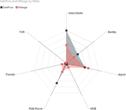
Figure 18-25.
A radar chart
Bullet Charts
Bullet charts
are extremely useful for tracking KPIs against targets. They frequently require you to add data that provides the thresholds against which performance is measured, either as absolute values or as percentages. However, they can be extremely effective at displaying how results compare to targets, as Figure 18-26 shows.
Figure 18-26.
A bullet chart
Word Clouds
A
word cloud
shows the number of times that words in a dataset appear relative to each other. It can be a uniquely visual way to show relative weights of values, as you can see in Figure 18-27.
Figure 18-27.
A
word cloud
Sunburst Charts
Sunburst charts
are essentially multilevel donut charts. However, as you can see in Figure 18-28, they are good at showing hierarchies of data. The inner ring represents each car make and the corresponding segments of the outer ring show the sales for each model compared to the sales by make and the whole.
Figure 18-28.
A sunburst
chart
Streamgraphs
A
streamgraph
is a smoothed, stacked, area chart. As you can see in Figure 18-29, a streamgraph is good at showing how values change over time.
Figure 18-29.
A streamgraph
Interestingly, a streamgraph has many more formatting options available than is the case for some other imported visuals, as you can see in this example.
Tornado Charts
A
tornado chart
is a variation of a bar chart, only the separation between two sets of values is made clearer by the vertical separation, as you can see in Figure 18-30. As was the case with bar charts, you can sort tornado charts by any of the data elements in the chart.
Figure 18-30.
A tornado chart
Chord Charts
A
chord chart
is an interesting—and somewhat less traditional—way of displaying the relationship between values in a matrix structure. Figure 18-31 shows how colors and countries relate by sales.
Figure 18-31.
A
chord chart
Sankey Diagrams
The
Sankey diagram
in Figure 18-32 also displays how colors and country sales relate. This chart has been filtered so that it only displays data for four countries.
Figure 18-32.
A Sankey diagram
Correlation Plots
The correlation plot
in Figure 18-33 shows how spare parts and labor costs relate.
Figure 18-33.
A correlation plot
It is worth remarking that this visual (like many of the third-party visuals available) uses the R language. This kind of visual will require you to have one or more R packages installed on your computer. If these packages are not already installed, you will see a dialog like the one shown in Figure 18-34.
Figure 18-34.
R packages that need installing locally
Clicking Install will install the R packages, and then cause the dialog that you can see in Figure 18-35 to be displayed.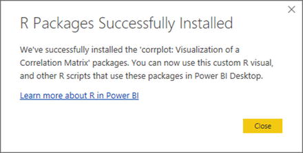
Figure 18-35.
Successfully installed R packages for a custom visual
Countdown
The countdown
shows the number of days, hours, minutes, and seconds in a “clock” that decrements in real time in any report. You can see an example in Figure 18-36.
Figure 18-36.
The countdown
Custom Slicers
There are several excellent custom slicers
available in the Microsoft App Store. I will introduce a few of these in Chapter 21.
Conclusion
Over the course of the previous five chapters, you have met a wide range of visuals that let you express the trends hidden in your data. This chapter built on the previous chapters, by adding tree maps, gauges and R-based visuals to the mix.
Then, just as you thought that it could not get any better, you discovered the jewel in the crown of Power BI Desktop: an extensive range of freely available extensions that you can add to your dashboards to deliver your insights in ways that leave other analytics tools in the dust.