After spending a little time working with Power BI Desktop, I can assume that you have analyzed your data. In fact, I imagine that you have been able to tease out a few extremely interesting trends and telling facts from your deep dive into the figures—and you have created the tables, charts, maps, and gauges to prove your point. To finish the job, you now want to add the final tweaks to the look and feel of your work so that it will come across to your audience as polished and professional.
Fortunately, Power BI Desktop is on hand to help with all of these final touches, too. It can propel your effort onto a higher level of presentation—without you needing to be a graphic artist—so that your audience is captivated. With a few clicks, you can
- Align and distribute objects on the report canvas.
- Add free-form text.
- Add images to a report.
- Apply a report background.
- Add basic shapes to enhance your visuals.
- Superpose objects and define how they are placed one on top of another.
- Prepare reports ready for smartphone use.
So, while not attempting to rival expensive drawing applications, Power BI Desktop can certainly add the necessary design flourishes that will help you to seize your audience’s attention and convince them of the value of your analysis.
This chapter takes you through these various techniques and explains how to use them to add real pizzazz to your analysis. We will use the C:PowerBiDesktopSamplesCH22CarSalesDataForReports.pbix file as the source data and as an example of all the dashboards in this chapter. You will also have to download the image files to the C:PowerBiDesktopSamplesImages folder from the Apress web site, as described in Appendix A.
Formatting Ribbons
When enhancing dashboards, you will need to use two further ribbons:
- The View ribbon
- The Format ribbon
These two ribbons are described in the following sections.
The View Ribbon
The View ribbon options
are illustrated in Figure 22-1 and explained in Table 22-1.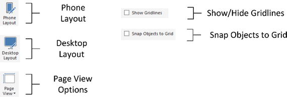
Figure 22-1.
The View ribbon
Table 22-1.
View Ribbon Options
Option | Description |
|---|---|
Phone Layout | Switches from desktop layout to phone layout. |
Desktop Layout | Switches from phone layout to desktop layout. |
Page View: Fit to Page | Scales the display to fit the available screen dimensions. |
Page View: Fit to Width | Scales the display to fit the width of the screen. |
Page View: Actual Size | Displays the page at its actual size. |
Show or Hide Gridlines | Displays or hides the underlying grid. |
Snap Objects to Grid | Forces visuals to align to the grid (hidden or visible) or leaves them free-floating. |
The Format Ribbon
The Format ribbon options
are illustrated in Figure 22-2 and explained in Table 22-2.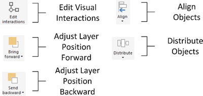
Figure 22-2.
The Format ribbon
Table 22-2.
Format Ribbon Options
Option | Description |
|---|---|
Edit Interactions | Changes how visuals react when data points in other visuals are selected. |
Bring Forward | Brings a visual toward the top of a layer of objects. |
Send Backward | Sends a visual toward the bottom of a layer of objects. |
Align Objects | Aligns two or more visuals. |
Distribute Objects | Distributes three or more visuals. |
Formatting the Page
Before you spend a certain amount of time and effort finalizing a presentation, it is vital to define one fundamental aspect of the output—the page format. Power BI Desktop lets you select from among the following output device formats:
- 16:9
- 4:3
- Cortana
- Letter
- Custom size
To change the page size, follow these steps:
- 1.Click anywhere on the report canvas (and not on a visual).
- 2.In the Visualizations pane, click the Format icon.
- 3.Expand the Page Size section.
- 4.Select one of the page size presets from the Type popup list.
Should you wish to specify your own page size, simply select Custom from the Type popup list and then enter the required page height or width in pixels. You can use the scroll arrows to set the required figure if you prefer. You can see the results of this in Figure 22-3.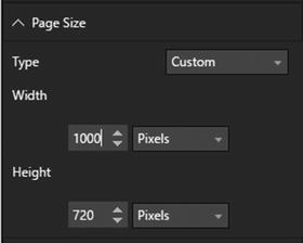
Figure 22-3.
Custom page size settings
Note
Currently, the only available unit of measure is pixels.
Aligning and Distributing Visuals
There is one quick and easy tweak that is capable of adding a polished look to any dashboard. This is the simple decision to align visuals flawlessly so that you avoid giving an impression of ragged positioning. Like it or not, well-aligned visuals will help convince your audience that your analysis is valid.
To be clear, when I say align visuals, I include distributing visuals in the concept. So here is how you can apply both techniques to give a patina of professionalism to your dashboards.
Aligning Visuals
A set of neatly aligned elements on a page will always please an audience. What is more, it literally only takes a couple of seconds to take a set of existing visuals and to present them harmoniously. The following explains what you do:
- 1.Select the visuals that you want to align (Ctrl-click each one).
- 2.In the Format ribbon, click the Align button to display the popup menu. It will look like Figure 22-4.
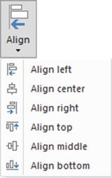 Figure 22-4.Alignment options
 - 3.Select the required option.
The selected elements will be aligned along their tops, bottoms, left or right sides, or centered, depending on the choice that you made. The available alignment options are outlined in Table 22-3.
Table 22-3.
Alignment Options
Option | Description |
|---|---|
Align Left | Aligns all the selected visuals along their left sides. |
Align Center | Centers all the selected visuals. |
Align Right | Aligns all the selected visuals along their right sides. |
Align Top | Aligns all the selected visuals along their top edges. |
Align Middle | Aligns all the selected visuals in the middle of the elements. |
Align Bottom | Aligns all the selected visuals along their bottom edges. |
Distributing Visuals
One way to add a final touch that implies “attention to detail” to a dashboard is to make sure that all visuals are neatly distributed horizontally and/or vertically. This will simply guarantee that there is always the same amount of space between each element.
- 1.Select the visuals that you want to distribute (Ctrl-click each one).
- 2.In the Format ribbon, click the Distribute button to display the popup menu. It will look like Figure 22-5.
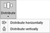 Figure 22-5.Distribution options
 - 3.Select the required option.
- 4.The selected elements will be distributed horizontally or vertically, depending on the choice that you made. The available distribution options are outlined in Table 22-4.Table 22-4.Distribution OptionsOptionDescriptionDistribute HorizontallyDistributes a selected series of visuals along a horizontal plane.Distribute VerticallyDistributes a selected series of visuals along a vertical axis.
Note
You may need to distribute a collection of visuals both horizontally and vertically to get the best effect. You will need to carry out the two alignment operations successively to obtain this result.
Aligning to the Grid
The Power BI Desktop canvas includes a grid (like a sheet of squared paper) that you can use to align visuals and other objects. This can help you create more polished-looking presentations. To align to the grid
, simply
- 1.Activate the View menu.
- 2.Select Snap Objects to Grid.
Now, whenever you move or resize an object, it will align to the grid or increase/decrease in size by one grid point (or pixel).
Displaying the Grid
If you prefer you can also display the grid to help you align objects:
- 1.Activate the View menu.
- 2.Select Show Gridlines.
You will now see a pattern of dots (one every 10 pixels) representing the hidden grid. You can see a page with a grid displayed in Figure 22-9, later in the chapter.
Note
The number of pixels in the Power BI Desktop report canvas will depend on the selected page size.
Specifying the Exact Position of a Visual
A final option that you can apply when placing visuals is to specify their exact position, height, and width. This feature is particularly useful when you want to make a series of visuals the same size. Follow these steps:
- 1.Select the visual that you want to resize and/or reposition.
- 2.In the Visualizations pane, click the Format icon.
- 3.Expand the General section.
- 4.Set the X (horizontal starting) position, Y (vertical starting) position, height, and width.
Power BI Desktop uses pixels as the unit of placement as it does for the underlying grid.
Adding Text Boxes to Annotate a Report
Let’s begin at the start. You have spent quite a while digging into data and have found effective ways of drawing your audience’s attention to the valuable information that it contains. However, you need the one, final, cherry on the cake—a title for the report. As a title is nothing other than a text box, this is your introduction to adding, formatting, and modifying text boxes.
A text box is a floating text entity that you can place anywhere on the Power BI Desktop report canvas. They are especially useful for annotating specific parts of a dashboard.
Adding a Text Box
Adding
a text box is so easy that it takes longer to describe than to do, but nonetheless, this is how you do it:
- 1.In the Home ribbon, click the Text Box button. An empty text box will appear on the dashboard canvas.
- 2.Type in the text that you want to add; it will be a title. I entered Sales for 2017.
- 3.Place the mouse pointer over either the corner or lateral central indicators of the title box and drag the mouse to resize the title box.
- 4.Click the text box header bar (the gray area at the top of the text box) and drag the text box to the top center of the page.
- 5.Click outside the title anywhere in the blank report canvas.
Figure 22-6 shows you a text box a report. Moreover, should you want to modify a text, it is as easy as clicking inside the text box and altering the existing text just as you would in, say, PowerPoint.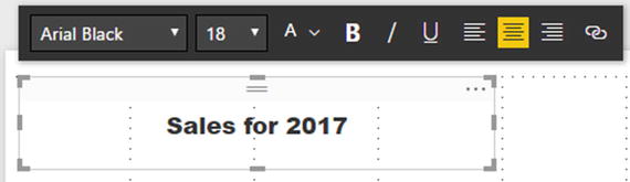
Figure 22-6.
Adding a text box to a report
Note
If a text box is too small to hold the entire text, then scroll bars are added to the text box when you select it.
Moving Text Boxes
Text boxes are a Power BI Desktop visualization like any other, and consequently, they can be moved and resized just as if they were a table or a chart. So all you have to do to move a title is to
- 1.Hover the mouse pointer over the text box. A container will appear indicating the text box shape.
- 2.Click the top bar of the text box and drag the text box elsewhere on the dashboard canvas.
Alternatively, you can select the text box and then place the mouse pointer over the edges of the text box (but not on the corner or side handles) and drag the text box to a new position.
Formatting a Text Box
A text box can be formatted specifically so that you can give it the weight and power that you want. Even though this is completely intuitive, for the sake of completeness here is a short example of what you can do:
- 1.Select the text box that you created previously. The Format palette will be displayed under or above the text box.
- 2.Select the text that you wish to modify.
- 3.Click the Font popup and select the font that you want to apply to the selected text.
- 4.Click the Font Size popup and select the size (in points) that you want to apply.
- 5.Apply any font attributes that you require (bold, underline, italic) by clicking the relevant icons.
- 6.Align the text by clicking one of the three alignment icons. This will apply to all the text in the box.
Tip
Remember that you must highlight the text to format it. If you select the text box itself, then you can only alter the alignment of the text in the text box.
The formatting options for text boxes are explained in Table 22-5.
Table 22-5.
Formatting Options for Text Boxes
Element | Icon | Description |
|---|---|---|
Font | Lets you choose a font from those installed on the computer. | |
Font Size | Lets you choose a font size. | |
Theme Colors | Lets you choose a color. | |
Bold | Makes the text appear in boldface. | |
Italic | Makes the text appear in italics. | |
Underline | Underlines the text. | |
Left | Places the text on the left of the text box. | |
Center | Centers the text in the text box. | |
Right | Places the text on the right of the text box. | |
Hyperlink | Adds a hyperlink for the selected text. |
Adding a Hyperlink
Power BI Desktop dashboards certainly do not exist in isolation. It follows that you can use them as a starting point to link to other documents or web pages. Remember, however, that a hyperlink will only work once a Power BI Desktop file has been deployed to the Power BI Service in the cloud.
To add a hyperlink:
- 1.Select the text box that you created previously.
- 2.Select the text that will be the hyperlink.
- 3.Click the Hyperlink icon. The Format palette will expand to display the hyperlink box.
- 4.Enter or paste in a URL.
- 5.Click the Done button in the Format palette.
Removing a Hyperlink
To remove a hyperlink that you have already added:
- 1.Select the text box containing a hyperlink that you created previously.
- 2.Click inside the hyperlink. The Format palette will expand.
- 3.Click the Remove button.
If you prefer, you can always simply remove the text that is the link.
Deleting Text Boxes
If you want to delete a text box, then be sure to
- 1.Select the text box.
- 2.Click the popup menu for the text box (the ellipses at the top right of the text box).
- 3.Select Remove. The text box will be deleted.
An alternative way to delete a text box is to select the text box and press the Delete key.
Note
Merely selecting and deleting the text inside the text box will not remove the text box itself; so to be sure that you do not leave any unnecessary clutter in a report, delete any unwanted and empty text boxes.
Modifying the Page Background Color
Power BI Desktop does not condemn you to presenting every report with a white background. To avoid monotony you can add a different color background to each page in a report individually with a couple of clicks.
To apply a background to a report, all you have to do is
- 1.Click inside the dashboard canvas, but not on any existing visuals.
- 2.In the Visualizations pane, click the Format icon.
- 3.Expand the Page Background section. The available options will look like they do in Figure 22-7.
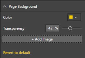 Figure 22-7.Page background options
 - 4.Select a color from the palette of available colors.
- 5.Slide the Transparency button left or right to select a level of intensity for the chosen color.
Note
You have to format every page in a report individually. You cannot Control-click to select multiple pages simultaneously.
Images
We all know what a picture is worth. Well, so does Power BI Desktop. Consequently, you can add pictures, or images, as they are generically known, to a Power BI Desktop report to replace words and enhance your presentation. The images that you insert into a Power BI Desktop report can come from the Web or from a file on a disk—either local or on an available network share. Once an image has been inserted, it is not linked to the source file. So if the source image changes, you will have to reinsert it to keep it up to date.
The following are some of the uses
for images in Power BI Desktop:
- As a background image for a report.
- Images in tables instead of text. An example could be to use product images.
- Images in slicers. These could be flags of countries, for instance.
- Independent images—a logo, for instance, or a complement to draw the viewer’s attention to a specific point.
- Images as a chart background.
Once we have looked at the types of image formats available, we will see how images can be used in all these contexts.
Image Sources
There are multitudes of image formats. Power BI Desktop accepts all of the following industry-standard image types:
- JPEG: This is a venerable standard image file format.
- PNG: This is a standard file format for Internet images.
- BMP: This is a standard image type produced by MS Paint, for instance.
- GIF: This is a venerable image format frequently used in web pages.
- TIFF: This is a standard format for scanned images.
- DIB: The Device Independent Bitmap format.
- WEBP: A “lossy” image file format.
- SVGZ: A Scalable Vector Graphics file.
- ICO: An image format mostly used for Windows icons.
- SVG: The Scalable Vector Graphics format, developed by the World Wide Web Consortium (W3C).
- XBM: The X-windows bitmap format.
- PJPEG: The progressive JPEG bitmap format.
- PJP : The JPEG/MIME image format.
All of these formats (and their various descendant formats that Power BI Desktop can handle) can deliver reasonable quality images that should certainly suffice for Power BI Desktop reports. However, if you attempt to insert an image that is not in a format that Power BI Desktop can handle, you will get an alert and the image will not be inserted.
Note
When you attempt to insert an image from a file, the Open dialog filters the files so that only files with one of the acceptable extensions are visible. You can force the dialog to display other file formats, but Power BI Desktop may not be able to load them.
Adding an Image
You may still want to add completely free-form floating images to a report. However, before getting carried away with all that can be done with images, remember that Power BI Desktop is not designed as a high-end presentation package. If anything, it is there to help you analyze and present information quickly and cleanly. Inevitably, you will find that there are things that you cannot do in Power BI Desktop that you are used to doing in, say, PowerPoint. Consequently, there are many presentation tricks and techniques that you may be tempted to achieve in Power BI Desktop using images to get similar results. Indeed, you can achieve many things in a Power BI Desktop report by adding images. Yet the question that you must ask yourself is “Am I adding value to my report?” I am a firm believer that less is more in a good presentation. Consequently, although I will show you a few tricks using images, many of them go against the grain of fast and efficient Power BI Desktop report creation and can involve considerable adjustment whenever the data in a visualization changes. So I advise you not to go overboard using images to enhance your presentations unless it is really necessary.
Despite these caveats, let’s add a floating, independent image to a Power BI Desktop report. In this example it is a company logo—that of Brilliant British Cars, the company whose metrics we are analyzing throughout the course of this book.
Adding
an image is really simple. All you have to do is
- 1.In the Power BI Desktop Home ribbon, click the Image button. A classic Windows dialog will appear; it lets you choose the source image, as shown in Figure 22-8.
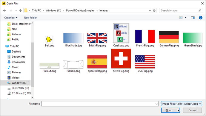 Figure 22-8.Navigating to an image file
 - 2.Navigate to the directory containing the image that you wish to insert. There are several sample images in the C:PowerBiDesktopSamplesImages folder, which you can install as described in Appendix A.
- 3.Click the image file. I use the example image CarsLogo.png in this example.
- 4.Click Open. The selected image will be loaded into the page.
- 5.Drag the image to the top left of the page. The dashboard will look like it does in Figure 22-9.
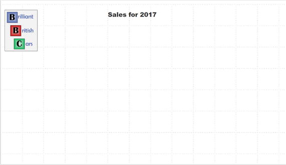 Figure 22-9.An image added to a dashboard
Removing an Image
To remove an image, all you have to do is
- 1.Select the image.
- 2.Click the popup menu for the image (the ellipses at the top right of the text box).
- 3.Select Remove. The image will be removed from the report. The original image file, of course, will not be affected in any way.
An alternative way to delete an image is to select the image and press the Delete key. The selected image will disappear from the report.
Resizing Images
An image is just like any other visual in a Power BI Desktop dashboard in that any of these elements can be moved and resized in exactly the same way. Simply do the following:
- 1.Select the image that you want to resize.
- 2.Place the mouse pointer over either the corner or lateral central indicators of the image and drag the mouse to resize the image.
Formatting Images
Once you have added an image, it can be tweaked to some extent in Power BI Desktop. The following are the parameters that you can modify:
- Image scaling
- Image title
- Image background
- Image border
- Aspect ratio
- Exact position and size
All of these modifications except for the first are common to most of the visualizations in Power BI Desktop. Indeed, you have come across some of them several times already. Consequently, I will not waste your time repeating things that you already know, or can find elsewhere in this book.
Image scaling is completely new, however. Here is how you can alter the way that an image is altered if you resize it:
- 1.Select the image whose scaling you want to modify.
- 2.In the Visualizations pane (which has switched automatically to show only formatting options), expand the Scaling section.
- 3.In the Scaling popup, select Fill.
The image will adjust to take up all the available space in the image placeholder.
The three available image scaling options are explained in Table 22-6.
Table 22-6.
Image Scaling Options
Option | Description |
|---|---|
Normal | The image maintains its height-to-width ratio (whatever the Lock Aspect setting) and resizes to fill the image placeholder as well as it can. |
Fill | The image fills the image placeholder but distort the image. |
Fit
| The image fills the image placeholder but cuts off parts of the image rather than distort the image. |
Background Images
One major, and frequently very striking, use of images is as a background to a report—and possibly even to a whole series of reports. So, let’s take a look at how to use images for report backgrounds.
Adding a Background Image
Before anything else, you need to add a background image. This is, once again, extremely simple:
- 1.Click the dashboard canvas for the page where you want to add a background image. Make sure that no visuals are selected.
- 2.In the Visualizations pane, click the Format icon.
- 3.Expand the Page Background section.
- 4.Click Add Image. A classic Windows dialog will appear; it lets you choose the source image.
- 5.Navigate to the directory containing the image that you wish to insert. In this example, it will be C:PowerBiDesktopSamplesImages.
- 6.Click the image file. I will use the example image GreenShade.jpg in this example.
- 7.Click Open. The selected image will be loaded into the page.
- 8.In the Image Fit popup list, select Fit.
The selected image will cover the entire page behind any visuals.
There are three possible ways of adjusting the size of an image. These are given in Table 22-7.
Table 22-7.
Background Image Sizing Options
Option | Description |
|---|---|
Normal | The image stays the size it was created. |
Fit | The image expands (and may be deformed) to cover the entire dashboard area. |
Fill | The image is expanded proportionally to cover as much of the dashboard area as possible. |
Moreover, you can alter a background image’s intensity once it has been added to a page. To do this:
- 1.With the Page Background section of the Format panel expanded, slide the Transparency slider left or right.
Note
There is nothing that you can do to resize an image manually in Power BI Desktop. If you need an image to be a certain size, you have to create it at the exact required size in an image creation application.
Some Uses for Independent Images
The limits of what images can do to a report are only those of your imagination, so it is impossible to give a comprehensive list of suggestions. Nonetheless, the following are a few uses that I have found for free-form images:
- Company logos, as we have just seen.
- Images added for a purely decorative effect. I would hesitate before doing this at all, however, as it can distract from the analysis rather than enhance it. Nonetheless, at times, this may be precisely what you want to do (to turn attention away from some catastrophic sales figures, for instance). So add decoration if you must, but please use sparingly!
- To enhance the text in a text box by providing shading that is in clear relief to the underlying image or background.
- As a background to a specific column in a table. Be warned, however, that the image cannot be made to move with a column if it is resized.
Adding Shapes
Sometimes your figures may need just a little help to stand out from the crowd. Maybe a small set of visuals (gauges or cards perhaps) are best grouped together. Whatever the need, Power BI Desktop can add a few final touches to your dashboards by adding one or more shapes to a page.
The following are built-in shapes that you can choose from:
- Rectangle (which means squares, too)
- Oval (including circles)
- Line
- Triangle
- Arrow
Let’s suppose that you want to add a decorative arrow to a dashboard to draw the reader’s attention to a specific figure. The following explains how you can do this:
- 1.In the Home ribbon, click the Shapes button to see a popup list of available shapes. You can see this in Figure 22-10.
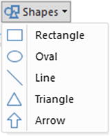 Figure 22-10.The Shapes popup
 - 2.Select Rectangle. A square will be added to the dashboard canvas.
- 3.Resize the square in the same way that you would resize a chart or an image. If you use the top, bottom, or side handles, then the square will become a rectangle.
As the other available shapes can be inserted in exactly the same way, I will not explain them individually, but will let you have some fun by adding different shapes to a page to see how they can enhance a dashboard.
Formatting Shapes
You can tweak the following aspects of shapes:
- Lines
- Fill
- Rotation
- Title
- Background
- Aspect ratio
- Exact position and size (X and Y coordinates)
As it is only the first three that are new as far as formatting visuals is concerned, let’s see them in action.
Lines and Fill Color in Shapes
When we say “lines” in shapes, we are really talking about the exterior boundary of the shape. Power BI Desktop lets you alter its
- Color
- Thickness (or weight, as it is known)
- Transparency
As well as you can set the fill color of the shape. Here is how you can alter basic characteristics for any of the available shapes:
- 1.Select the shape to format.
- 2.In the Visualizations pane (that now displays only the Format Shape options), expand the Line section.
- 3.Select a color for the line from the popup palette of available colors. The exterior line of the shape will change color.
- 4.Move the Weight slider to the right to adjust the line thickness. The exterior line of the shape will grow thicker.
- 5.Move the Transparency slider to the left to adjust the intensity of the color.
- 6.Expand the Fill section.
- 7.Select a color for the fill from the popup palette of available colors. The interior of the shape will change color.
- 8.Move the Transparency slider to the right to adjust the intensity of the color. The Visualizations pane and the shape will look like they do in Figure 22-11.
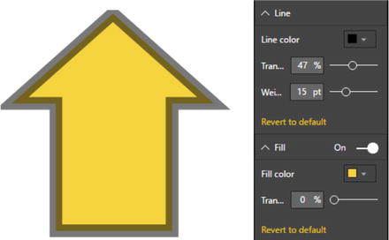 Figure 22-11.Formatting a shape
Shape Rotation
Some shapes need to be rotated to point in the right direction for the effect that you are trying to produce. The shapes that generally need adjusting in this way are arrows and triangles-though this technique can be applied to any shape. To rotate a shape:
- 1.Select the shape to rotate.
- 2.In the Visualizations pane (that now displays only the Format Shape options), expand the Rotation section.
- 3.Drag the Rotation slider left and/or right to set the arrow to point in the direction that you want. Alternatively, you can enter the exact rotation value in the Rotation box to the left of the slider. The shape and Visualizations pane will look like they do in Figure 22-12.
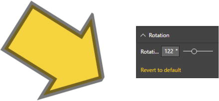 Figure 22-12.Rotating a shape
It is worth noting that you can enter a precise rotation value in the Rotation box if you prefer. This is particularly useful when swiveling a shape through multiples of 45 or 90 degrees.
Note
When adding an ellipse or a rectangle, you will discover that Power BI Desktop begins by creating these as, respectively, circles and squares. To ensure that they stay perfectly formed (if that is what you want), ensure that the Lock Aspect formatting option is set to On before you resize the shape.
Removing Shapes
To remove a shape, all you have to do is
- 1.Select the shape to remove.
- 2.Click the popup menu for the shape (the ellipses at the top right of the text box).
- 3.Select Remove. The shape will be deleted.
An alternative way to delete a shape is to select the shape and press the Delete key. The selected shape will disappear from the report.
Standardizing Shapes
If you are adding the final decorative (and hopefully also illustrative touches) to a dashboard, you might want to make a series of shapes all look identical. After all, you never want a dashboard to look like a patchwork quilt. A trusted tool from MS Office is available to help you rationalize dashboards in this way-the Format Painter.
- 1.Select the shape that will serve as the model for other shapes.
- 2.Click the Format Painter button in the Home ribbon.
- 3.Click the shape that you want to see formatted identically to the first shape.
Note
You cannot double-click the Format Painter to apply the same format several times to different shapes as you can when formatting in MS Word or Excel.
Organizing Visuals on the Page
A complex dashboard can consist of many elements (though hopefully not so many that you end up confusing your public). This is where some elementary polishing of the final appearance can help. Put simply…
- An audience gives more credence to a slickly organized dashboard.
- Clarity of layout is interpreted as clarity of thought—and so adds to the credibility of the facts and figures that you are presenting.
- Good aesthetics add to, rather than detract from, the points that you are making.
So to finish our tour of the ways that you can finalize and perfect your dashboards, you need to learn how to adjust the way that visuals (whether they are tables, charts, gauges, images, or shapes) relate to one another on the page; this essentially means layering visuals vertically.
Layering Visuals
As a report gets more complex, you will inevitably need to arrange the elements that it contains not only side by side, but also one on top of the other. Power BI Desktop lets you do this simply and efficiently.
As an example of this, let’s create a chart with another chart superposed on it:
- 1.Create a donut chart using the following two fields:
- a.CostPlusSpares (from the InvoiceLines table)
- b.CountryName (from the Countries table)
- a.
- 2.Create a (clustered) column chart using the following two fields:
- a.Make (from the Stock table)
- b.RatioNetMargin (from the InvoiceLines table)
- a.
- 3.Order the column chart by RatioNetMargin, in descending order.
- 4.In the donut chart, add a legend and set it to appear on the right. Also, set the Detail Labels option to Off. Set the Donut Background option to Off.
- 5.Place the donut chart in the top right-hand corner of the bar chart.
- 6.With the donut chart selected, choose Bring Forward ➤ Bring To Front from the Power BI Desktop Format ribbon.
Your composite chart should look like Figure 22-13. Bringing the donut chart to the front means that the gridlines for the column chart are now under the donut chart.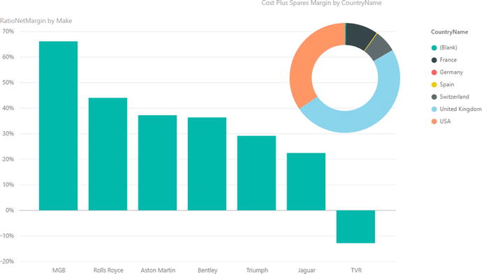
Figure 22-13.
Layering charts
This technique is particularly useful when you are adding independent images as was described in the previous section. It is also handy when you are combining elements such as images and text boxes, as you will see in the next section.
Drill-Through
A new function that has recently been added to Power BI Desktop is the ability to drill through to another page based on a filter criteria. This enables you to click an item and request detailed information about one aspect of the data.
Drill-through is a function that requires at least two pages in a report:
- The source page that contains data about many elements
- A destination (or detail) page that is focused on a single element
Let’s see this in action. To avoid pages of instructions, I will only ask that you create two very simple report pages. In practice, of course, your pages could be much more complicated than these.
Note
If you merely want to test drill-through, then the sample file C:PowerBiDesktopSamplesCH22DrillThroughExample.pbix contains the necessary elements for you to do this.
The Source Page
This is a perfectly ordinary Power BI Desktop report. For argument’s sake, let me specify it like this:
- 1.Open the Power BI Desktop file C:PowerBiDesktopSamplesCH22CarSalesDataForReports.pbix.
- 2.Rename the page Make Details.
- 3.On this page, create a table using the following fields, in this order:
- a.Client Name
- b.ClientType
- c.Make
- d.SalePrice
- a.
- 4.Create a stacked area chart using the following fields:
- a.Make
- b.Color
- c.SalePrice
- a.
- 5.Adjust the size and position of these two visuals until you have something like the report shown in Figure 22-14.
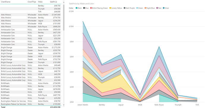 Figure 22-14.A drill-through source page
The Destination Page
This page will have a couple of specific tweaks added-as you will see. However, it must be designed to show data that is relevant to the single element that you want it to display. In this example that means information about a make of vehicle.
- 1.Add a new page to the existing report.
- 2.Rename this page Make Details.
- 3.Add a card using the field Make.
- 4.In the Formatting pane for the card, set the Category Label to Off.
- 5.Add an area chart using the following fields:
- a.Color
- b.TotalCost
- c.SalePrice
- a.
- 6.Add a filled map using the following fields:
- a.CountryName
- b.SalePrice
- a.
- 7.Add a table map using the following fields:
- a.ClientName
- b.CostPrice
- c.Gross Margin
- a.
- 8.Click the report canvas (outside any visual) and drag the Make field into the Filters area of the Visualizations pane. Place this field in the Drillthrough Filters well. You can see the result in Figure 22-15.
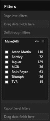 Figure 22-15.The Drillthrough Filters well
 - 9.A “Back” button will be added to the report. Format it as you think fit using the techniques described for shapes earlier in this chapter.
- 10.Adjust the size and position of all the visuals until you have something like the report shown in Figure 22-16.
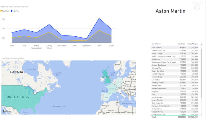 Figure 22-16.A drill-through destination page
Applying Drillthrough
You can now use your drillthrough report.
- 1.Go to the Sales page.
- 2.Right-click any line in the table or any data point in the chart. You will see the popup menu that is shown in Figure 22-17.
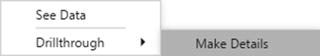 Figure 22-17.The drill-through context menu
 - 3.Select Drillthrough ➤ Make Details.
- 4.Control-click the back button to return to the source report.
The Make Details report will be displayed and will filter the data to display the make of the row or data point that you right-clicked.
The Back Button
Power BI Desktop created a back button
automatically on the drill-through report (the “destination” report page). However, you do not have to use this button if you do not want to. In fact, any shape or image can become a back button. Here is how you set this:
- 1.Add an image or shape to a drill-through “destination” report.
- 2.Select the image or shape.
- 3.In the Visualizations pane, set the Back Button option to On. You can see this in Figure 22-18.
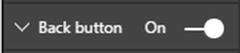 Figure 22-18.Specifying that a visual acts as a back button
Note
Once a report is deployed to PowerBI.com (that you will discover in the next chapter), simply clicking the back button will return the focus to the “source” report.
Phone Layout
More and more information workers need their data on the move. This means consulting Power BI dashboards on their mobile phones. To make this easier, the Power BI team at Microsoft has added a valuable feature to Power BI Desktop—phone layout.
This technique lets you take an existing report and define how each of the visuals that make up the dashboard are displayed on a smartphone. There are several advantages to this approach:
- You do not have to create duplicate reports, one for a computer screen and another for a phone, and then update them both.
- You do not have to include all the visuals in a dashboard on the phone version.
- Any changes in a visual for the dashboard are reflected in the corresponding phone layout.
As a simple example of this, here is how to create a phone report from the dashboard containing the superposed charts
that you just created:
- 1.Open, or create, a Power BI Desktop dashboard.
- 2.In the View ribbon, click the Phone Layout button. You will see a screen like the one shown in Figure 22-19.
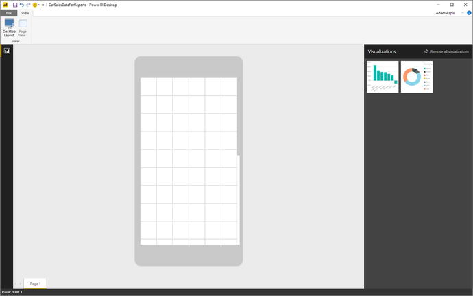 Figure 22-19.Phone layout
 - 3.Drag the first visual that you want to use in a phone version of this report to the phone image.
- 4.Resize the visual so that it covers the required phone screen real estate.
- 5.Add any other visuals that you wish to use and position them to suit your requirements. The phone layout screen could look like Figure 22-20.
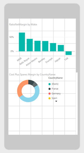 Figure 22-20.A completed phone layout
 - 6.Switch back to desktop layout by clicking the Desktop Layout button.
Now, once this report is published to the Power BI Service (or an on-premises Power BI Report Server), any mobile users will see the phone layout on their smartphones.
Note
If a visual is not completely visible in phone layout, you will see ellipses and a small down-facing triangle in the visual to indicate that visibility may be an issue. You can see this in the donut visual in Figure 22-20.
Report Themes
You can define your own set of colors that will be applied automatically to tables, matrices, and data in charts if you so wish. This involves creating a simple file in a specific format that you then load into Power BI Desktop. This file must contain the following elements:
- A name for the theme
- A set of data colors enclosed in square brackets and comma-separated
- A background element
- A foreground element
- An accent element for tables
You can see a sample file in step 1 of the following example:
- 1.Create a text file named BrilliantBritishCars.json that contains the following code :{"name": "Brilliant British Cars","dataColors": ["#000000", "#0000CC", "#006600", "#FFFF00", "#F90FF9","#5BD078", "#000099", "#FF0000", "#C0C0C0"],"background":"#99CCFF","foreground": "#0000FF","tableAccent": "#FF0000"}
- 2.In the Home ribbon, click Switch Theme ➤ Import Theme and browse to the file that you just created.
- 3.Click Open. A dialog like the one in Figure 22-21 will confirm that the theme file has been loaded successfully.
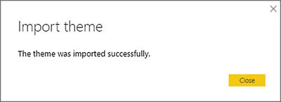 Figure 22-21.The Import Theme dialog
The background, foreground, and table accent colors will now apply to every table and matrix in the report. Moreover, the data colors will, by default, be those specified in the themes file. You can see this in Figure 22-22.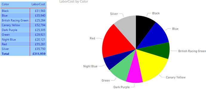
Figure 22-22.
Applying a theme to a report
This theme file is also available in the folder C:PowerBiDesktopSamplesCH22 (assuming that you have downloaded the sample files from the Apress web site).
Note
To remove the theme that you have just loaded and revert to the default theme, click Switch Theme ➤ Default Theme in the Home ribbon.
Report themes are very much a work in progress in Power BI Desktop, and are currently in a constant state of flux. I imagine that the structure of the JSON file will have evolved considerably by the time that this book is published. So I cannot, with any certainty, delve any deeper into the question of report branding in this edition of this book.
Exporting Data from a Visualization
Finally, it is worth noting that you can export the data that underlies a visualization. This applies to any visual, from tables to charts. All you have to do is
- 1.Click the menu for the visual—the ellipses at the top right of the chart, table, or map. Then select Export Data from the popup menu.
- 2.Select a destination directory and file name
- 3.Click OK and the relevant data will be exported. The only current export format is a CSV file .
Note
Any existing filters are applied when the data is exported. This means that, potentially, only a subset of the data will be exported to the CSV file.
Conclusion
In this chapter, you saw how to push the envelope when using Power BI Desktop to deliver particularly compelling presentations. You saw how adding images can turbocharge the impression that your analysis gives when you add graphic elements to tables and slicers. And, used sparingly, images, shapes, and free-form text elements can draw your audience’s attention to the most salient features of your presentation. So now it is up to you to use these powerful Power BI Desktop features to deliver some really compelling interactive analyses to your audience.
In this chapter you also saw how to take existing reports and prepare them for display on a smartphone. With very little extra effort you were able to ensure that a complex report becomes perfectly adapted for a mobile device.
Finally, you learned how to create your own “branding” for Power BI Desktop reports. This lets you create a standardized look and feel across a range of reports automatically.
So, now that you have finished your tour of report creation with Power BI Desktop, it only remains to discover how to share your work with colleagues and friends. You will find this in the next-and final-chapter.