
Chapter 12
Branding SharePoint
WHAT’S IN THIS CHAPTER?
- Understanding Branding from a SharePoint Perspective
- Components of SharePoint Branding
- What’s New in Branding for SharePoint 2013
- Understanding the SharePoint 2013 Branding Process
- Upgrading Branding to SharePoint 2013
- Controlling Access to SharePoint
In this chapter, you’ll learn what it takes to brand a SharePoint 2013 site, including some of the various components you’ll likely encounter when dealing with branding, and what changes have been introduced with SharePoint 2013 and how they relate to your job as an administrator. By the end of this chapter, you will be able to achieve the nirvana that is known as “making SharePoint not look like SharePoint.”
WHAT IS BRANDING?
Branding is a familiar term whose meaning varies depending on the context in which it is used. If you’re in the supermarket, maybe you’re trying to decide whether to get the known name brand of a bag of chips, or if you should save a little money and go with the store brand instead. If you are a ranch hand, maybe you’re thinking of marking cattle with red-hot branding irons. If you are in marketing, you understand how a company’s product or service can be represented through its logo, colors, slogan, website, and advertisements. With these variations in mind, it might be useful to spend a bit of time considering what branding means to you, the SharePoint administrator, and why you should care about it.
When you think of well-known products or companies with good reputations, what comes to mind? Maybe it is a familiar logo or a set of colors or images that remind you of that product or company. Companies that offer products or services with strong brand recognition among consumers nearly always have a marketing and branding strategy that applies the same set of colors, logos, and images across all forms of media: television, print ads, billboards, and websites. Indeed, this recognition can be so strong that companies that want to change their branding, even in small ways, often meet with fierce customer resistance. This close association of a design with a company or product can be translated to a SharePoint site as well. In this sense, the definition of branding a SharePoint site aligns closely with a marketer’s view of branding.
To “brand” a SharePoint site, you apply custom master pages, page layouts, CSS, XML, images, and Web Parts to it to make it unique. This means it will look (and in some cases behave) much different than it does out of the box. In other words, you are branding a SharePoint site to make it look, well, not like SharePoint. You can think of branding as being synonymous with “user interface design,” but with the added purpose of applying a unique and consistent appearance. You are essentially applying a brand to a website that represents your company, department, or team.
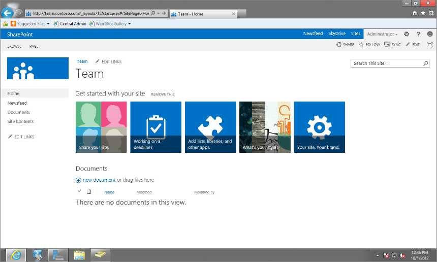
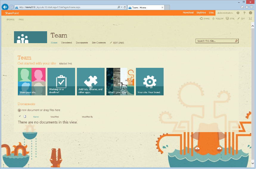
Microsoft put a lot of effort into making SharePoint look a certain way out of the box. The visual style of SharePoint 2013 is very much in line with the visual style of Office 2013 and the Windows 8 UI. Changes have also been made to make the interface easier to use for end users. However, Microsoft has also ensured that the interface of SharePoint 2013 is fully customizable, enabling designers and nondesigners alike to make SharePoint look and respond in whatever way works best for them. Later in this chapter we’ll spend some time covering the various methods that allow you to change the look of a SharePoint site, from the simple to the complex. Figure 12-1 shows the SharePoint team site as it looks out of the box.
BRANDING CONSIDERATIONS
Just as you can’t create the content in your SharePoint site without some prior planning and organization, you need to spend some time analyzing your branding requirements. What kind of site are you building? Is it going to be a public-facing Internet site or a company intranet? What information are you going to be presenting? How important is the look and feel of the site in relation to the overall company branding? Does the site need to be branded at all?
These are just a few of the questions that should be given some thought before beginning a branding project. Another important consideration is the level of effort that you are willing to put into changing the look of SharePoint. You can roughly divide these levels of effort into three basic categories:
- Low Effort | High Impact — Changing the look and feel of the site using an out-of-the-box composed look.
- Medium Effort | Medium to High Impact — Changing the look and feel of the site by applying alternate CSS to the site.
- High Effort | High Impact — Changing the look and feel of the site through a completely custom branding effort.
Low-effort branding is achieved by using a composed look that you can select from a gallery included with SharePoint. Medium-effort branding involves creating an alternate CSS file and applying it to the site in order to modify some of the site’s look and feel while keeping much of the overall structure the same. Finally, high-effort branding involves creating a custom design, custom master pages, page layouts, CSS, and more. You’ll be looking at more of the various components of these different levels of effort later in the chapter. With the many changes and enhancements made to SharePoint 2013 branding, you can certainly find an option that will fit your needs. In addition, you don’t need to worry about choosing the “wrong” level at first. If you’re not sure where to start, start with the low-effort option and see how it goes. If you decide you need more flexibility, or just hate the idea of having free time, then move up to the medium-effort option. If that is too limiting, you can break out the big guns and move up to the high-effort option. Everything you’ve learned in earlier methods will help as you move up the branding ladder.
Another important factor that comes into play is the type of site you are working with. Generally speaking, an internal collaborative site such as an intranet has a different set of branding requirements than a public-facing Internet site. The type of branding and level of effort needed varies according to how the site is going to be used and what options are available in the various site templates included with SharePoint 2013. Table 12-1 outlines key differences between the two most common types of sites, an Internet-facing site and an internal, intranet site.
TABLE 12-1 Internet Sites vs. Intranet Sites
| INTERNET | INTRANET |
| Public facing | Internal facing |
| Usually anonymous users | Usually authenticated users |
| Driving information to the public | Communicating among a smaller group |
| Many visitors, fewer authors | More authors, contributors, and visitors |
| Content more tightly controlled Slower connection to server |
Some freely created content Fast connection to server |
SHAREPOINT AND PUBLISHING
Like SharePoint 2010 and SharePoint 2007 before it, SharePoint 2013 also includes a Publishing feature. If you have used the Standard or Enterprise versions of either of the previous editions of SharePoint, you likely know what publishing is. If you have only used Windows SharePoint Services (WSS) 3.0 or SharePoint Foundation 2010, or are using SharePoint Foundation 2013, you may not be familiar with the concept of publishing. Publishing is important from a SharePoint branding perspective because it opens up more options for controlling the look of your site, such as being able to easily change the master page, navigation, and using custom page layouts.
In SharePoint terms, publishing is a feature that enables content authors to make pages available when they are ready to be shared with the rest of the team, the company, or the world. Essentially, its main purpose is to give authors more control over when their content is consumed on the web. However, the SharePoint Publishing feature also gives designers much more flexibility when creating their sites. It enables the creation of custom page layouts (you’ll learn more about these in the section “Page Layouts and Wiki Pages”), which are basically templates for displaying content on a page. It also provides much more flexibility in terms of how navigation is structured, and enables you to choose whether you want to build your navigation from a managed meta data term set (called managed navigation) or use the traditional SharePoint navigation structure (called structured navigation). Finally, with a Publishing Site template, you can more easily change master pages within the browser. Without publishing it is still possible to change a master page, but doing so requires SharePoint Designer 2013. Using composed looks (which are covered in the “Composed Looks” section later in this chapter), it is possible to change master pages in the browser; but without some sweating, and maybe even some swearing, you won’t be able to select any custom master pages until a composed look has been built around it.
If you plan to do a good deal of custom branding for your website, whether it is for an intranet or Internet site, you should consider enabling the publishing features to take full advantage of what it has to offer. The publishing features are available only on SharePoint Server 2013, Standard and Enterprise editions. They are not available for SharePoint Foundation 2013. This isn’t to say that you can’t brand a SharePoint Foundation 2013 site, but you have fewer options and features available for creating a custom-branded site than you do with the full server versions.
Even if a site is going to be an internal collaboration site, you might want to consider using a publishing site template as the root site when creating your site collection. You can still build team sites underneath it, but with the added benefit of being able to take advantage of some of the publishing features that allow management of the master page throughout the site collection.
Here’s how you can create a publishing site collection from Central Administration (note that you’ll need to have administrative access to Central Administration in order to perform these steps):
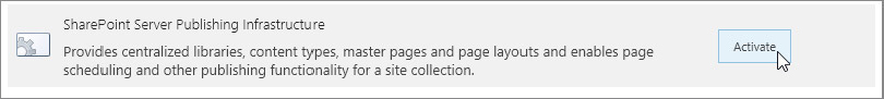
You can also enable publishing features for a non-publishing site with a few button clicks (note that in order to perform these steps, you need to be logged in as a site collection administrator):
When the SharePoint Server Publishing feature is activated, any new pages created will automatically be created in the Pages library (which was provisioned by the Publishing feature) instead of the Site Pages library, which team sites use by default for storing wiki pages.
One final thing you may need to do, depending on your requirements, is set a publishing page as the site’s home page:
COMPONENTS OF SHAREPOINT BRANDING
Early websites were usually built with all the HTML and styles needed to attain the site’s look on every single page. This approach quickly fell out of favor, however, because if an update was wanted to the overall look of the site, generally every single page in the site needed to be changed. Later techniques alleviated some of the pain of maintaining a sizeable HTML website (Cascading Style Sheets, for example), but it wasn’t until other technologies such as ASP.NET 2.0 emerged that maintaining websites became much less tedious. With ASP.NET, a web designer could define the common elements of a site in a centralized location, called a master page. This approach had two main benefits.
First, it enabled mass changes to the site’s look by changing one or two central files, which was very convenient. Second, it also decoupled the responsibility of creating the site’s content from the site’s look. This enabled people to create content without needing to concern themselves with making a site look pretty. It also created opportunities for people to just brand websites without having to contribute content.
A custom branded SharePoint site isn’t all that much different from a traditional website in many ways. It relies on HTML, Cascading Style Sheets (CSS), and images to achieve the desired look you’re seeking. The major difference is that SharePoint, being built on the .NET platform, utilizes master pages and page layouts to control where the various site elements are positioned.
Master Pages
Master pages can be thought of as the skeleton of the site; it is what the rest of the site is built upon. Generally speaking, the master page contains the major, common elements that are found on every page of a site, such as the site’s header, search box, navigation, and footer, among other common elements. It contains a place where each individual page’s content will be injected as the browser renders the page. A master page is used to control the overall look and structure of the site.
A major change to the way that SharePoint 2013 uses master pages compared to previous versions is that each master page is tied to a corresponding .html file. When the HTML file is edited, the changes are reflected in the master page file. This approach is designed to provide more flexibility to the process of editing and maintaining a master page. You’ll learn about this topic later in the chapter in the “Using the Design Manager” section.
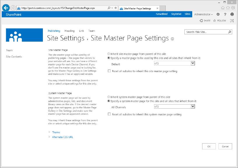
In a publishing site, the master page can be changed in the browser. Out of the box, SharePoint 2013 comes with several master pages:
- v15.master — The default master page used throughout SharePoint 2013, particularly on team sites.
- overlay.master — A centered design that overlays the main content on a transparent container so some of the background image is visible.
- belltown.master — No left navigation, this focuses more on content. This combines elements of v15.master and overlay.master. It is partially full width with some centered content.
Changing the master page uses the same process used in previous versions of SharePoint. The only difference this time is that with device channels (discussed in the “Device Channels” section of this chapter), you can apply a different master page for displaying in different browsers or devices that access the site.
The following steps will show you how to change the master page for your publishing site:
Traditionally, team sites didn’t have an interface for choosing the master page from within the browser. Without enabling publishing, the only way to set a custom master page previously was to manually set it using SharePoint Designer. This hasn’t changed much in SharePoint 2013, but the interface for setting composed looks (also discussed later in this chapter) enables you to choose out-of-the-box master pages along with the rest of the composed look settings.
Page Layouts and Wiki Pages
Content on each page in a SharePoint site is stored in a page layout or text layout.
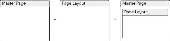
Page layouts in SharePoint can be thought of as templates for content layout on a page. In the master page/page layout relationship, a page layout fits in the main content placeholder of the master page (see Figure 12-5). Page layouts, which are found only on sites with the Publishing features enabled, offer the most flexibility to designers and content managers alike, as designers can create custom page layouts to display content on a page. If none of the numerous out-of-the-box layouts are suitable, a custom page layout can be easily created in the site, with custom fields to capture more content and custom zones to add Web Parts to the page.
Page layouts rely on field controls on the page to display text and/or images. A Web Part zone is an area on the page where you can add one or more Web Parts to enhance the page’s functionality, such as adding additional text areas or rolling up content.
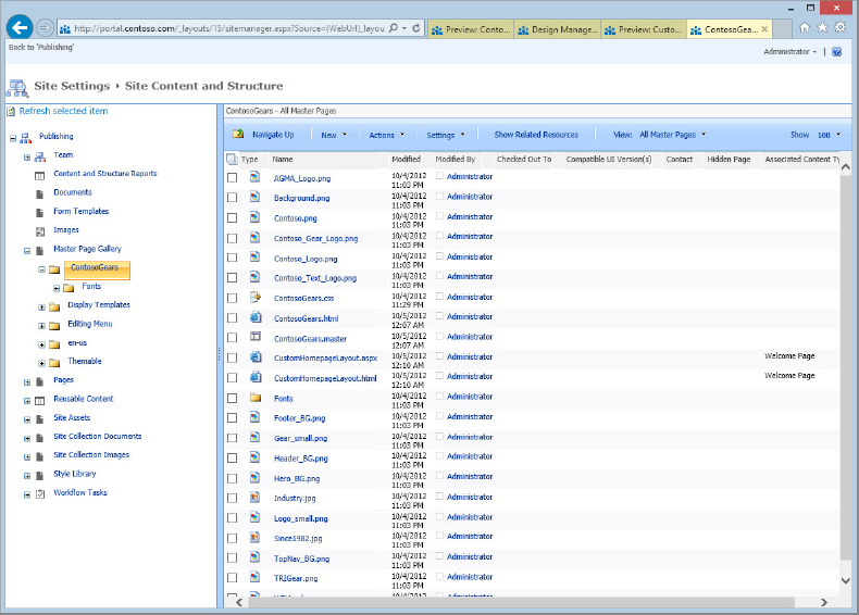
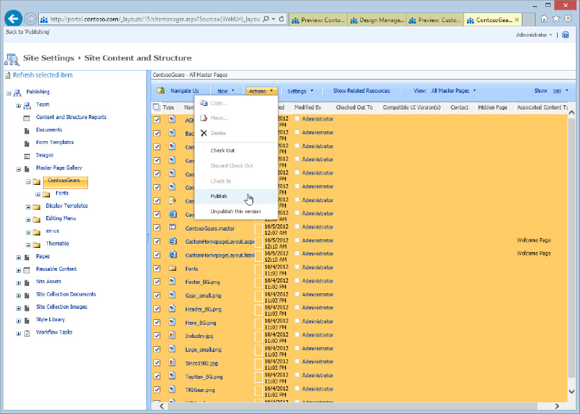
Out of the box, SharePoint 2013 contains many text areas. You can find them in the master page gallery by clicking Site Actions ⇒ Site Settings ⇒ Master Pages and Page Layouts. Generally speaking, any file that ends in .aspx is a page layout. Much like master pages, page layouts in SharePoint 2013 are tied to a corresponding HTML file that can be edited in an editor of your choice. What that means is discussed in more detail later in the “Using the Design Manager” section.
If you want to see how page layouts can affect the appearance of your page, simply select a new layout by following these steps:
Page Layout Content Types
Page layouts are based on content types, which help define what fields are available on a page. The basic definition of a content type is a grouping of site columns that help define a category of content in SharePoint. You can also think of them simply as templates for new objects, whether pages or documents. In other words, the type of meta data collected in a list’s or library’s columns determines whether an object in SharePoint is a document, a link, or a web page, for example. When creating custom page layouts, you select an existing content type that serves as the parent of the page. This parent content type determines the fields that are available when creating your page.
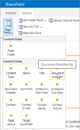
Content types live at the site-collection level and are composed of site columns, a large set of which is used repeatedly throughout SharePoint. Content types are simply groupings of these columns that hold information about an object in a site. For the purpose of page layouts, some site columns are designed to store content, and these are the fields that are available to be displayed on a page layout. For instance, an Article page content type consists of a title field, a byline field, a date field, an image picker field, an image caption field, and a page content field.
Wiki Pages and Text Layouts
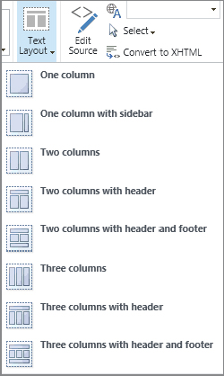
Wiki pages are similar to page layouts, but they are found primarily on team sites. Their function is to help content authors add information to a page quickly and without much hassle. Much like the page content area of a page layout, wiki pages enable click-and-type functionality. Both Web Parts and rich content can be added to a page using the familiar Ribbon interface. So how do wiki pages differ from page layouts? Wiki pages use what are called text layouts, which also act as templates for storing content on individual pages within a SharePoint site; however, text layouts offer less flexibility than a page layout. For example, site designers can’t edit the zones of a text layout or add additional text layouts. The eight text layouts included with SharePoint are the only eight you can use. If you need additional layouts or customized layouts for your site, then a wiki page will not be adequate; you need to look to page layouts to meet your requirements.
To change the text layout of a wiki page, put the page in edit mode and click the Format Text tab in the Ribbon. Click the Text Layout drop-down button and choose one of the styles. The location to set a text layout in SharePoint 2013 is different from SharePoint 2010, where the Text Layout button was found under the Page tab in the Ribbon. Figure 12-6 shows the available text layouts from which you can choose.
HTML, Cascading Style Sheets, and More
Another important component of a complete SharePoint brand includes straight HTML, CSS, images, and scripts. Together, these will determine the overall look of the site. HTML tells the browser what to render and provides structure to the page; CSS tells the browser how to style the HTML; images add to the overall design of the page; and scripts add functionality.
In previous incarnations of SharePoint, the main location for storing images, scripts, and CSS was in the Style Library, a special document library to which all users had access. The Style Library still exists in SharePoint 2013, but the recommended place for storing branding assets for a custom design is now in a folder within the master page gallery. That’s because you can now map a drive directly to the master page gallery to upload your design assets, making it a convenient place to access everything for editing later.
WHAT’S NEW IN BRANDING FOR SHAREPOINT 2013
When you buy a new version of an existing product, chances are you will get some new or enhanced features. For example, when you buy a newer model of a car, you can expect it has some worthwhile upgrades, like that back up camera that lets you watch your kid’s bike when you run over it. When you upgrade your phone, you take advantage of the latest technology. From a branding perspective, SharePoint 2013 is no different. It includes a lot of the technology you have become familiar with over the years, but with some nice new features that make the upgrade compelling. This section covers some of the bells and whistles that SharePoint 2013 includes to make your site branding experience easy and fun.
Composed Looks
In SharePoint 2003, the concept of themes was introduced. Themes were intended to enable you to change the basic look and feel of a site with some CSS and images, but they were somewhat tricky to make and required knowledge of CSS and direct access to the SharePoint server. They weren’t much better in SharePoint 2007.
SharePoint 2010 changed the underlying model of themes quite a bit with the theming engine, which simplified their creation, but some users argued that they were not as flexible and customizable as in SharePoint 2003 or 2007. Applying themes essentially recolored the site and in some cases swapped out the fonts used on a site, but that was basically the extent of what they offered. Some customization of themes was possible within the browser, or theme files could be created in the Office client and uploaded to a SharePoint site.
SharePoint 2013 combines the best parts of these two theming approaches into what are called composed looks. You can think of composed looks as the next evolution of theming a site: You get to choose images, fonts, and a color scheme, and you can build the composed look easily within in the browser.
Composed looks consist of a background image or color, an overall color scheme, a master page selection, and fonts. Out of the box, 14 composed looks are available. Each composed look can be customized, enabling you to give your site a unique look with minimal effort.
Creating a composed look in the browser is simple. Just execute the following steps to create a composed look:
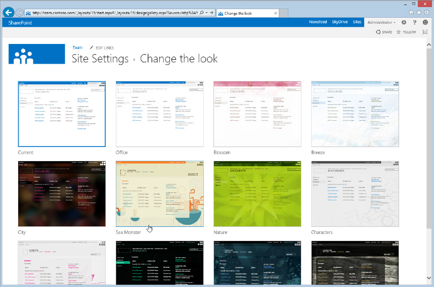
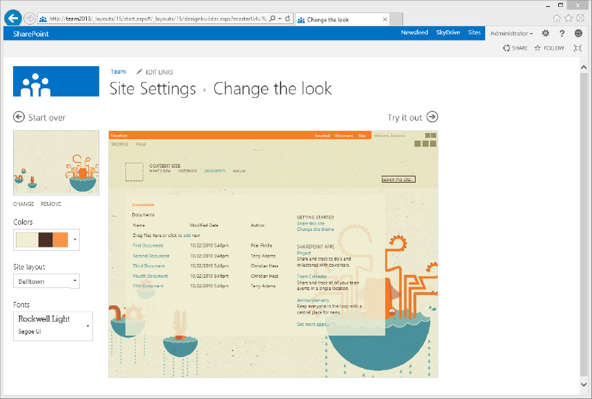
When you apply the theme, your site will have the new look. Figure 12-10 shows a site with a composed look applied.
If you want to use composed looks with custom master pages, you need to put some effort into the master page in order to integrate it with the various changes that result from composed looks. Generally speaking, most projects that need custom master pages will probably have a unique look already and therefore won’t gain anything from the composed looks. Composed looks are useful when you want a quick, easy way to change SharePoint’s appearance without getting your hands too dirty.
Device Channels
The rapid adoption of mobile devices, including smartphones and tablets, to browse the Internet has been unprecedented. As this mobile device technology continues to explode, many website owners have started creating customized versions of their site to give visitors using a mobile device a better experience. For instance, a smartphone browser can benefit from a condensed version of the same site displayed on a desktop browser. Although the phone’s browser may be capable of handling the full version of a site, it may not be practical to navigate a traditional website on a phone or tablet for a variety of reasons, such as the touch interface, screen size, or hardware limitations. In order to offer mobile device users the best experience, many websites default mobile traffic to an optimized version of the site. This practice isn’t limited to phones or desktop PCs, of course. For years now sites have been offering different optimized versions for various browsers, which vary according to the browser’s capabilities. Typically, older browsers see a version of the site with fewer bells and whistles than a modern browser, which are optimized for the latest technologies.
SharePoint 2013 offers a similar approach to this practice. Through the use of device channels, administrators and designers can assign different master pages to the SharePoint site depending on the browser used to access it. Note that the use of device channels is limited to publishing sites. Team and other collaboration sites can still use a URL query string to access the built-in mobile version of a site. For example, http://sharepointsite/?Mobile=1 will render the site as a mobile version. The mobile version of the site is similar to the SharePoint 2010 mobile site, though in SharePoint 2013 the mobile version has some minimal styling and is optimized for touch devices.
When setting up a device channel, you are essentially telling the SharePoint server to look at the browser’s user agent string (which is a string of text that all browsers send to a server when a page is requested), and match up keywords that you specify with the user agent string. For instance, you can be very specific and add the following browser user string for Firefox 14.0.1:
Mozilla/5.0 (Windows; U; Windows NT 6.1; WOW64; en-US; rv:2.0.4) Gecko/20120718
AskTbAVR-IDW/3.12.5.17700 Firefox/14.0.1
Alternately, you can simply add the keyword “Firefox” to your device channel, and SharePoint will pick “Firefox” out of the long user string name that the browser sends. You can add multiple keywords or full user agent strings to a particular channel. SharePoint 2013 has a limit of 10 device channels, and you can define a maximum of 150 different keywords or user agents per channel. That should be enough to satisfy just about every scenario! Once you have your device channel set up, you can open the Master Page settings page and apply a different master page to each channel you created.
For example, say you want to set up a specific channel for mobile phones and display a simplified master page when these devices access the site. You could create a device channel called “Mobile Phones” and insert keywords such as “Android,” “iPhone,” and “Windows Phone.” Or, if you wanted to target every mobile device, you could use the string $FALLBACKMOBILEUSERAGENTS; in the Device Inclusion Rules field.
After creating your device channel, you would go to the master page settings screen, where you could apply a mobile-optimized master page to your Mobile Phones channel. When a user visits the site on a mobile device, the site will be displayed with the custom mobile master page loaded.
Although device channels are intended mainly for mobile devices, you can test the functionality using desktop browsers and the out-of-the-box master pages to see how it works:
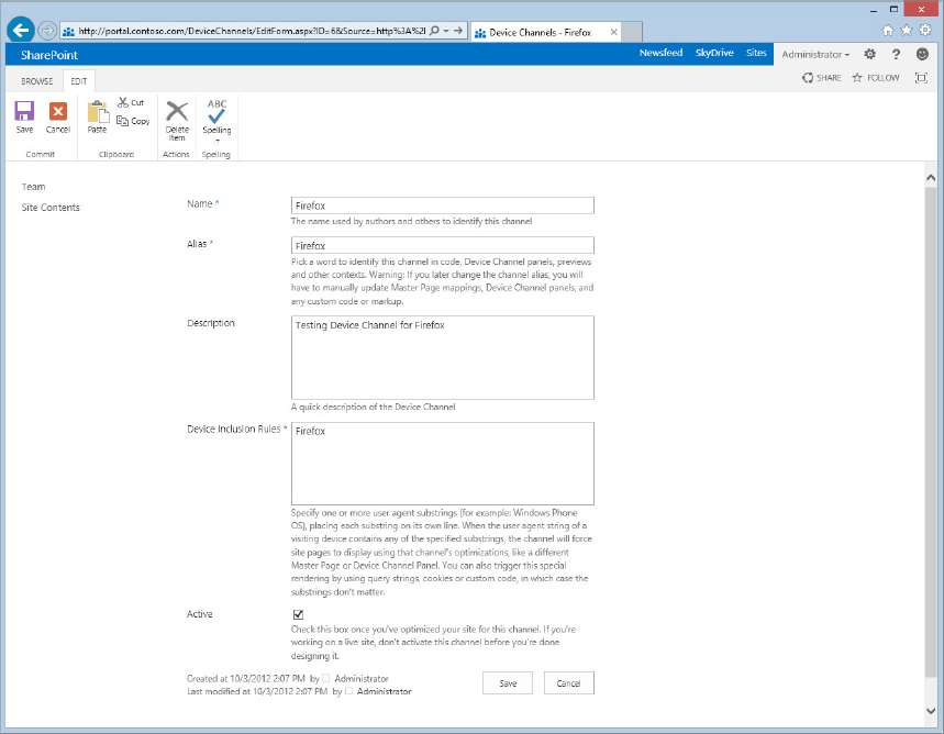
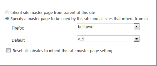
Figure 12-13 shows the site loaded in Internet Explorer, and Figure 12-14 shows the same site loaded in Firefox, with a different master page applied thanks to the device channel. Notice that the Firefox version does not have a left navigation pane, which is a feature of the Belltown master page.
Device Channel Testing
You can also test your different device channels regardless of what browser you are using by appending ?DeviceChannel=AliasOfDeviceChannel to the URL of the site (replacing AliasOfDeviceChannel with the name you provided for the device channel’s alias. For example, you could test the device channel we created for Firefox within Internet Explorer by adding ?DeviceChannel=Firefox to the end of the URL and pressing Enter. This loads the specified device channel’s master page. This would be a good way to preview a mobile version of your master page without needing various mobile devices to test with, or having to download the various mobile SDKs from each manufacturer’s website.
Device Channel Panel
Page layouts in SharePoint 2013 should display no matter what master page is being called in using device channels, but should you want to display or hide certain content on a page layout, you can use what is called a device channel panel in your master page code. You can add a device channel panel to a page layout and define its specific channel or channels. Device channel panels could be used in conjunction with a custom master page in order to hide certain elements on a page layout, such as images or entire sections of your page. You could also show elements within a device channel panel.
When you add a device channel panel to your page, a large yellow block of text appears as a placeholder to help you determine where to put your specific content, such as HTML or CSS that should be rendered when browsing the site with a device that has a channel specified.
Image Renditions
A problem familiar to many SharePoint site administrators is users uploading gigantic (3MB or more) photo files to an image library and displaying them on a page. Even with the fastest current bandwidth capabilities, downloading such large images is going to slow things down, especially when there is considerable distance between the SharePoint server and the user viewing the page.
SharePoint 2013 introduces a new way to manage images intended to solve this issue. This method uses what SharePoint calls image renditions, a group of “profiles” that administrators can create for rendering images on the site. It uses the BLOB cache storage and a set of templates that define the width and height of the image. Therefore, when John uploads a 3MB photo of his cat to the site, or Mary uploads a 4MB photo of her new car, they can choose one of the preconfigured templates to display the image in a much smaller format. This isn’t simply resizing the image on the page; image renditions are actually pulling a physically smaller file from the BLOB cache to serve to the end user.
Before you can take advantage of image renditions, you’ll need to enable BLOB caching for the web application you are working in. This requires making a change to the web.config file, so be sure to make a backup of the original before you start making changes. Follow these instructions to enable BLOB caching:
Now that the BLOB cache is enabled, you can take full advantage of SharePoint 2013’s image renditions.
Out of the box, SharePoint 2013 includes four predefined image renditions, which you can use, modify, or delete depending on your needs. To create your own image rendition, follow these steps (this section assumes you have uploaded images to your site already and that BLOB cache has been enabled on the web application):
Remember that this isn’t simply displaying the original image on the page with new dimensions: SharePoint has created new image files in the BLOB cache folder from the original image and is pulling them from the server’s hard drive. You can verify for yourself that the image’s dimensions and file sizes are smaller by examining the image’s properties: Open your page in edit mode again and select the image. In the Ribbon, click the Image tab, then click the Pick Rendition button and select “Full size image.” Click Save & Close, then right-click on the image and select Properties (or View Image Info, depending on the browser you are using). Note the image file size. Apply your new image rendition to the image and right-click the smaller image and view its properties to see its smaller file size.
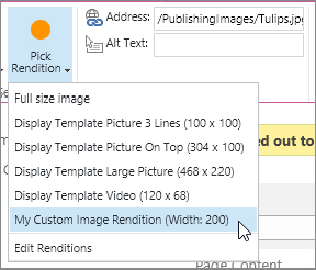
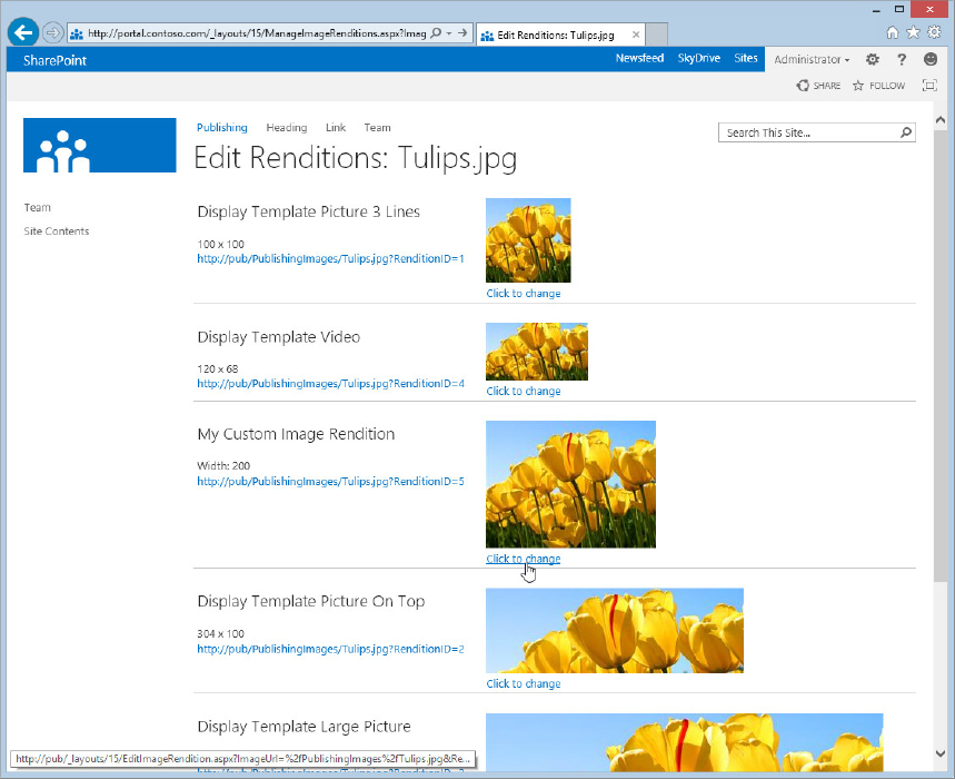
If you don’t like the way your image has been cropped in your custom image rendition (or any of the out-of-the-box image renditions), you can edit the display area of an image rendition for a specific image. There are several ways to access the editing screen for an image. You can edit the image that you are using on your page by clicking the Pick Rendition button in the Ribbon and selecting Edit Renditions; or you can open your image library, click the ... (ellipses) on the bottom-right corner of the image thumbnail to open the menu, and select Edit Renditions (see Figure 12-16).
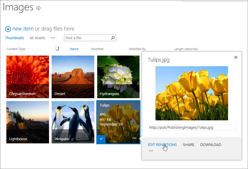
Now find the rendition that you want to change and click the Click to Change link under the preview image (see Figure 12-17). Here you can select the display area of the image and see a preview below the selection area. Click the Save button to save your new selection, but be aware that changing the display area for a particular image rendition will update all instances of the image rendition that are referenced throughout the site.
You can see how reducing image size will drastically reduce the page load for SharePoint. That means reducing the amount of time it will take to download all those photos from the last company Christmas party — at least the ones that can be shared.
Display Templates
In past iterations of SharePoint, search result pages were driven by XSLT, which many developers and designers agree is not the friendliest language to work with for creating good-looking results. Most users have resigned themselves to the look and feel of out-of-the-box search results.
Display templates, new to SharePoint 2013, will make it much easier to customize search results and search-driven Web Parts such as the new Content By Search Web Part. A display template offers additional options for customizing the display of search-driven content. When search results match a set of predefined templates, known as result types, search will display those results according to the selected display template. For example, if PDF results appear in search, a PDF display template will be loaded and displayed in the results.
The new search-driven Content By Search (CBS) Web Part also takes advantage of display templates. Previous versions of SharePoint used the Content Query Web Part for rolling up content. The look and feel of the web part’s results was driven by itemstyle.xsl. With the new CBS Web Part, the look and feel is controlled by display templates. Essentially, the CBS Web Part is the new version of the Content Query Web Part. Its styling will be much easier than writing XSL to achieve the same results, and its performance will be better because it is leveraging the search index.
Display templates consist of an HTML file and a corresponding JavaScript file. All display templates can be found in the master page gallery in the Display Templates folder. Because search results are no longer driven by XML and XSLT, creating a custom display template is much easier. The recommended method is to copy a display template that is close to the look you want to achieve and modify it to meet your needs.
Improving Speed with Minimal Download Strategy
Because no one has ever accused SharePoint of being too fast, a new concept in SharePoint 2013 is the Minimal Download Strategy (MDS). Generally speaking, as you browse around in a SharePoint site, every element on each page is reloaded each time a page is opened. Between the CSS files, JavaScript files, images, and HTML that are repeatedly reloaded, a SharePoint site is pretty bulky. The idea behind the MDS is to reload only those elements on a page that differ from the previously loaded page. This means that anything that stays the same on a page — such as the header area, the navigation, and the search box — are cached. By reloading only the new content on a page, the amount of content that needs to be sent from the server to the client machine each time a page is loaded is drastically reduced.
The Minimal Download Strategy is a SharePoint feature found at the web level. You can enable or disable it, but in general there is no reason not to use it in collaboration scenarios, as it will greatly improve the overall performance of SharePoint on the client side.
The MDS is made possible by <SharePoint:AjaxDelta> controls wrapped around SharePoint content on the master page. Nearly every content placeholder in an out-of-the-box SharePoint 2013 master page is wrapped in the AjaxDelta tag. When the MDS feature is enabled, SharePoint looks at the content in this tag to determine whether the content has changed. If not, no new information is sent from the server to fill those areas. Instead, cached information is used. When the MDS feature is disabled, SharePoint simply ignores the AjaxDelta tags and serves up the entire page regardless of whether anything has changed from the previous page.
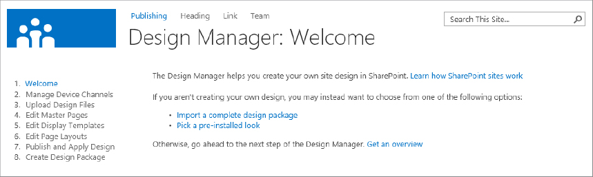
Design Manager
The approach to creating branding in SharePoint 2013 is quite different from previous versions, and one of the biggest reasons is the new Design Manager, which is found in SharePoint publishing sites. Although a new version of SharePoint Designer has been released to coincide with SharePoint 2013, and it’s still freely available from Microsoft for working with SharePoint sites, it is deprecated as a tool to use for creating branding. As mentioned elsewhere, the Design View has been removed from SharePoint Designer. Although it seems counterintuitive to remove a Design View from an application with “Designer” in its name, designers are now encouraged to use whatever web design tools they are accustomed to working with in order to create and maintain the branding for their site.
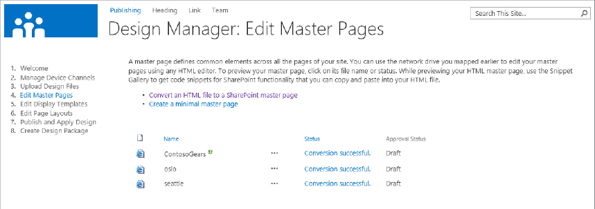
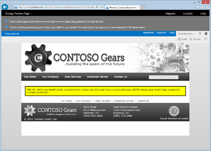
Once an HTML version of a design has been created, it can be imported into SharePoint and converted to a master page file, which you can accomplish using the new Design Manager. The Design Manager is a new component of a SharePoint 2013 Publishing site. It is more or less a wizard that walks you through the process of mapping a network location from the SharePoint server to your local computer, uploading your HTML files and site assets, and converting the plain HTML version of your branding into SharePoint master pages and page layouts. The wizard also provides some guidance in the form of steps, such as creating custom design templates if necessary, publishing and applying your custom design, and creating a design package for saving your custom branding. Figure 12-18 shows the Design Manager interface.
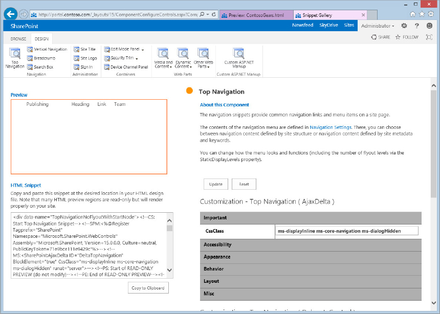
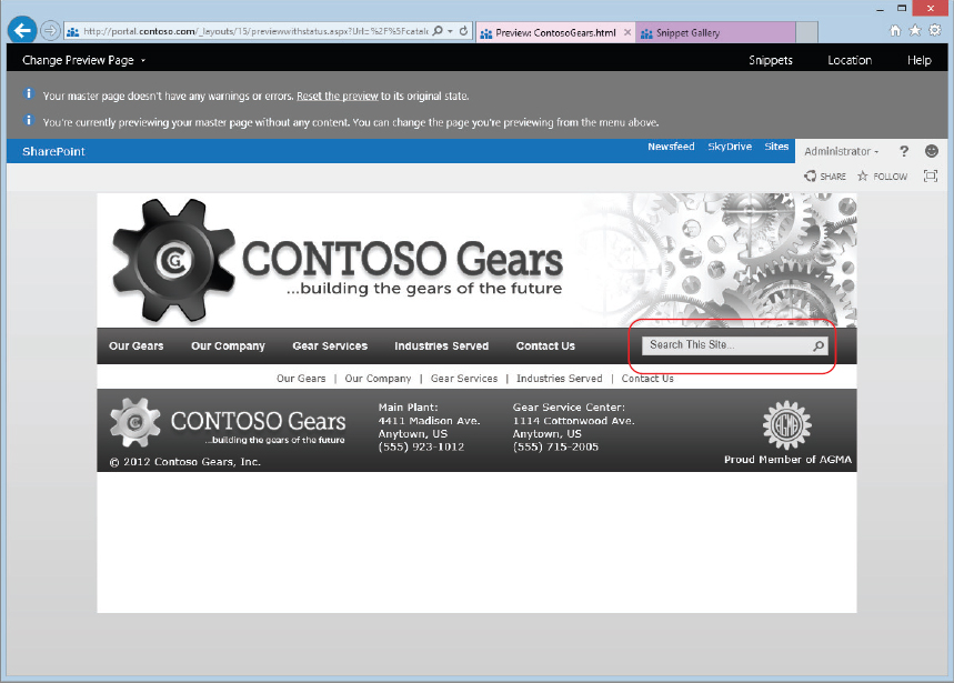
SharePoint 2013 automatically converts your HTML page to a master page and adds several placeholders. You can preview your master page to see how it functions before you actually apply it to the site. After your master page has been converted, you use what’s known as the Snippet Gallery to add SharePoint-specific controls such as the search box, navigation elements, site logo, breadcrumb trails, and even Web Parts. The Snippet Gallery enables you to customize a control’s properties, including the capability to apply a custom CSS class if you wish or changing other properties. You can select your control, make changes to its properties if you wish, and SharePoint provides a code snippet that you can copy and paste in the correct location of your original HTML file. SharePoint will make the same update automatically in the corresponding .master file.
After configuring your master page and page layouts, the Design Manager provides links for publishing and applying your custom master page to the site. Finally, you can save your work as a design package for reuse in another site if needed.
UNDERSTANDING THE SHAREPOINT 2013 BRANDING PROCESS
As mentioned earlier, one of the biggest changes to SharePoint 2013’s approach to branding is that designers are no longer restricted to using only SharePoint Designer for creating and maintaining a custom look and feel for a site. Indeed, they are discouraged from doing so. Thanks to the new Design Manager in SharePoint 2013, designers can use just about any common web design tool, including Dreamweaver, Microsoft Expression Web, Notepad, or any plain text editor. Even vi! This flexibility removes some of the obstacles to creating SharePoint branding by enabling designers to use tools they are already familiar with and prefer.
Most major branding projects start out with a creative mockup, usually done in a photo-editing program such as Photoshop or GIMP. A designer can then slice up the mockup into image components and begin turning the static image into a working HTML page. Many web design tools are available for this purpose, the most popular choices being Adobe Dreamweaver and Microsoft Expression Web. Of course, some web designers prefer to use text-based programs such as Notepad++ (a free alternative to the standard Windows Notepad that has nice features such as code highlighting).
Other useful tools you’ll likely need as you brand your site are the IE Developer Toolbar (included with Internet Explorer since IE 8), and the useful Firebug plug-in for Firefox. These tools will assist you in identifying what CSS class(es) are being applied to a particular element on the page, which is very helpful when you are trying to override an out-of-the-box SharePoint style with your custom styles.
Because this book is primarily focused on SharePoint administration, not the full web design process, this chapter assumes you have a basic HTML design ready to go at this point and skips right ahead to the fun stuff: importing your file into SharePoint to let the magic begin!
Using the Design Manager
You spent some time earlier going over the basic idea of the Design Manager. In this section you can dive in and see how it actually works. When you first load a publishing site, you’ll see two columns of links. On the left is a set of links for information architects to start setting up permissions, content types, and navigation. On the right are links specifically for designers. These links are shortcuts to some common locations that designers need to access to start branding their site. One of these links, “Design your site,” opens the Design Manager, where you can start converting your HTML. There is also a link in the Site Actions menu that takes you directly to the Design Manager.
Converting an HTML File to a SharePoint Master Page
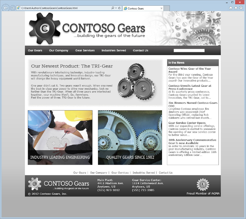
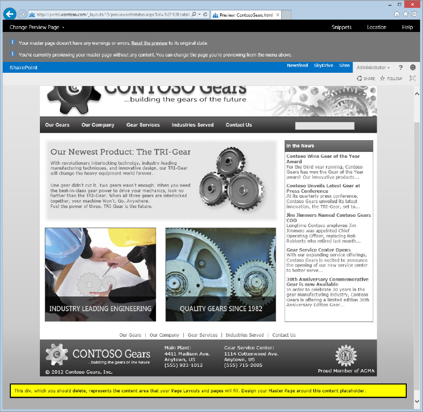
The following steps describe how to convert an HTML file to a SharePoint master page. Figure 12-19 shows an example of a full HTML mockup of a site that will be converted to a SharePoint master page and page layout.
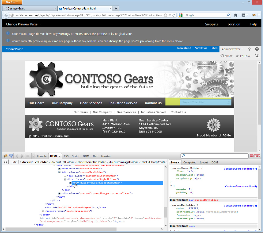
You will likely need to make some adjustments and do some additional styling in order for some of the SharePoint controls to match your initial HTML mockup. As mentioned earlier, some useful tools for helping with this process are the IE Developer Toolbar and Firebug for Firefox. In the browser, each of these components can be opened with the F12 key, enabling you to select an element and click through the HTML to see what classes are being applied. Figure 12-26 shows an example of using Firebug in Firefox to check the styles of the various page elements.
Another potential “gotcha” when converting your HTML page is that all the extra code added by SharePoint may make it difficult to find locations for some of the elements from the Snippet Gallery. Therefore, when the design is in its HTML form, it might be helpful to spend some time adding beginning and ending comments around elements that you know will be replaced with a snippet, such as a top navigation control, a search box, and breadcrumbs. That way, when you are ready to insert your snippets, you will know exactly where to paste them.
Creating Page Layouts with the Design Manager
When you are previewing your page and working with the Snippet Gallery, you may accidentally lose the window containing the Design Manager. The easiest way to return to the Design Manager is to click the Site Actions menu in the Snippet Gallery and select Design Manager.
You’ll recall from earlier in the chapter that page layouts fill in the main content area of a publishing site. When you converted your HTML file to a master page and moved the yellow block of content around on it, you were setting the area of the master page in which page layouts are rendered.
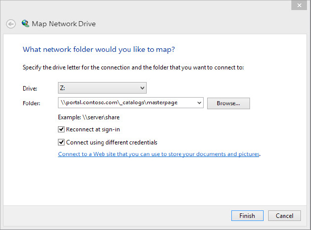
Page layouts also live in the master page gallery alongside master pages, so everything is neatly organized in one location. With your mapped drive, you have access to all the master pages, page layouts, and site assets for your branding.
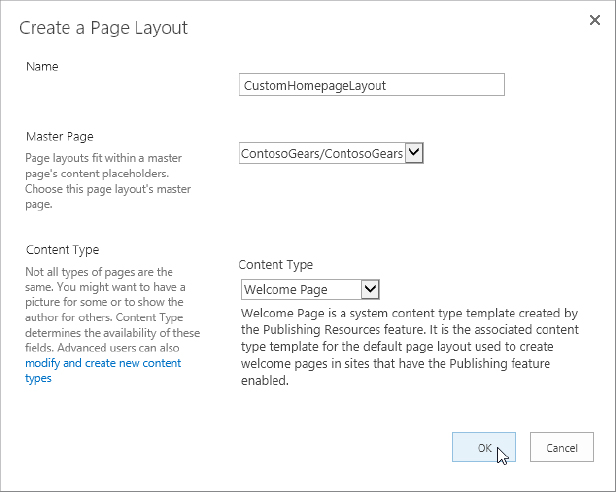
In this example, you’ll create a custom page layout:
This was a basic example of creating a page layout from scratch. If you are working from an existing HTML design, you could paste the main content from your HTML file into the page layout and add any additional controls from the Snippet Gallery. If you do this, you will want to find the tag <!--MS:<asp:ContentPlaceHolder ID="PlaceHolderMain" runat="server">--> and place your content between that tag and the corresponding closing tag <!--ME:</asp:ContentPlaceHolder>--> near the bottom of the page. This is the placeholder SharePoint uses to display content on page layouts. Figure 12-30 shows the example site fully branded and working within SharePoint.
Publishing and Applying Your Design
When you have added all the content to your master page and page layouts and are satisfied with the results, you need to publish all the contents of the design, including the master page(s), page layout(s), all images, CSS, and script files. Then you need to actually apply the master page to the site (and to any Device Channels that you plan to use). Fortunately, the Design Manager provides convenient links for accomplishing both these tasks:
Note that in SharePoint 2013, it isn’t necessary to approve files in the master page gallery after they have been published, which was the default in previous versions. You can still enable approval for items in the master page gallery if you prefer, and the process is unchanged from SharePoint 2007 and 2010: In the Ribbon, select the Library tab. Click the Library Settings button, and then click Versioning settings. Select Yes for “Require content approval for submitted items?”, and then click OK.
Deploying Branding Assets
You have a couple of options for deploying your SharePoint branding. Ideally, branding is created in a development environment (or at least a development site) before being deployed to the production environment. The simplest method for deploying your custom branding is to simply copy your master page, page layouts, and assets over to the production environment. However, this is a labor-intensive manual process, and it doesn’t create reference versions of the files on the server, as creating a branding WSP does.
A WSP file (which stands for Windows Solution Package) is essentially a .cab file with a different extension. It packages up all the custom elements of your branding and, following a set of instructions included in the package, deploys the files to their correct locations. WSP files are the preferred and recommended method for deploying branding files (and usually any other type of custom code as well) to the SharePoint farm. Inside the WSP are instructions for a SharePoint feature (or set of features) that activate the branding on a site. The only real downside to this method is that creating a WSP requires Visual Studio and some understanding of the process.
In SharePoint 2013, the Design Manager includes the capability to package up your customizations into a WSP, which previously could only be done using Visual Studio. While this sounds like an easy solution, there are some caveats for using it. Generally speaking, creating a WSP file in Visual Studio is still going to be the recommended and preferred method, but in some instances the WSP Design Manager will work fine. First and foremost, when the Design Manager creates a WSP it creates it as a sandbox solution. Depending on how you have your site set up, this may not be an ideal way to deploy the branding, as sandbox solutions have some limitations, such as having to deploy the WSP to every site. Second, the Design Manager grabs everything that you customized and then some. If you started with only a handful of files that you added to SharePoint in addition to your master page and page layouts, you might end up with a barrel full of files in your WSP. The Design Manager grabs just about everything it can get its hands on and adds it to the WSP. Fortunately, the WSP shouldn’t overwrite any existing files that it finds when the design package is imported into SharePoint.
If you are importing a design into an Office 365 site, creating the WSP file using the Design Manager would probably be a good way to go, but for many other cases, you’re better off creating a WSP in Visual Studio to take advantage of some of the extra features that you get there, such as being able to use event receivers to automatically swap out the master page and set subsites and team sites to use the custom master page without any effort.
Customizing SharePoint Files
Once your files have been deployed to the SharePoint farm through a WSP, they are in what is known as an uncustomized state. (You may also hear these files referred to as “ghosted” but according to many surveys that have been done, users find this term too scary.) When a file is uncustomized, it means that a reference file on the drive of the server is provisioned to the database server when a site is created. When a user visits a page, SharePoint checks the database, sees that a reference file exists on it, and serves that file up when rendering the page. Many pages can reference the same page layout and master page; even CSS and image files can be in an uncustomized state.
When an uncustomized file is edited, either through an editing program such as Dreamweaver or SharePoint Designer, a file is said to be customized, or unghosted. The file’s reference remains unchanged on the server drive, but its pointer file in the database has been changed from the reference file. The file is then in a customized state. This can start to cause issues when updates need to be made to the WSP file and deployed to the server. A customized file won’t be automatically updated with the latest version. For instance, if a page layout on a subsite is edited to include an extra zone, and the WSP is updated with a newer version of that page layout that includes two extra zones, the customized page layout won’t get the changes. While this might not seem like such a big deal, consider this scenario: You make a small change to your CSS file after it was deployed, and now have several more updates to make. You want to redeploy an updated WSP, but your style sheet won’t update with the new WSP. This is because of the change you made to it earlier. Now, although the WSP has been updated and deployed, none of the new styles are showing.
It’s possible to reset a customized file back to its uncustomized state using SharePoint Designer. You can identify your customized files by the “i” in the blue circle next to a filename in the SharePoint Designer interface. When you see this, you can right-click on the file and select Reset to Site Definition. This reverts the customized file back to match the contents of the reference file on the server, and it can pick up any updates that have been made to the files deployed via WSP.
UPGRADING BRANDING TO SHAREPOINT 2013
When SharePoint 2007 was released, designers jumped for joy at the news that SharePoint would be much easier to customize because it was rewritten on the .NET platform. This meant that custom master pages and page layout could be created. No longer would they be constrained by FrontPage 2003 and hacking their way through customizing a SharePoint 2003 site. While not too many brave souls attempted to customize SharePoint 2003, the ones who did likely still have nightmares about the experience. The product simply didn’t lend itself to easy customization. SharePoint 2007, with its flexibility, surely seemed like a breath of fresh air.
Some of the changes that arrived with SharePoint 2010 took some time getting used to, most notably the Ribbon. Close behind was the implementation of the new theming engine, which was completely different from how SharePoint 2003 and 2007 used themes. This meant that any custom themes created in SharePoint 2007 needed to be recreated as master pages if they contained extensive customization.
SharePoint 2013 looks a lot like SharePoint 2010 from a user-interface perspective, aside from a more minimal, modernized appearance. Most of the familiar features from SharePoint 2010 are still around, and in some cases pages and settings are laid out almost identically. The Ribbon is present with a slightly new look. The Site Actions menu has been moved back to the right side from its new home on the left in SharePoint 2010. It is now a gear icon instead of an actual menu button, which is sure to give some users pause, as it sits beneath the Internet Explorer gear icon.
This brings us to our main point here: How do you take your 2010 branding and upgrade it to work in 2013? Fortunately, the answer is that branding upgrades should be much less painful going from 2010 to 2013. While SharePoint 2010 featured the Visual Upgrade mode, whereby a site’s branding could exist in a pseudo-2007 environment until branding could be fully upgraded, SharePoint 2013 offers a full 2010 experience right in the product. In fact, when creating a new site collection you can choose whether to use the 2010 interface or the 2013 interface.
When upgrading a SharePoint 2010 site, a full preview mode is offered. This is different from the visual upgrade in SharePoint 2010. A full copy of the site is created and rendered in SharePoint 2013, and actions taken on the preview site won’t affect the original. This enables you to see how your custom branding behaves and gives you a chance to make changes to the controls and CSS if necessary. SharePoint 2013 uses some new controls and some new CSS classes. If you were overriding some of the out-of-the-box styles from SharePoint 2010, many of those classes began with .s4- to designate that the class was from SharePoint version 4. In SharePoint 2013, many out-of-the-box classes have been renamed to begin with .ms- instead, which is what many classes in SharePoint 2007 used. For example, in SharePoint 2010, you could use the class .s4-notdlg to hide an element from appearing in the modal dialogs. In SharePoint 2013, that class has been renamed to .ms-dialogHidden. Another big-ticket item to switch out is replacing the SharePoint 2010 Ribbon control with the SharePoint 2013 Ribbon control.
Depending on your desired level of customization and how the site renders in SharePoint 2013, you can either make the changes to your existing master page or create a minimal master page from the Design Manager and transfer the HTML from your existing page to the new master page, adding in control snippets and placeholders from the Snippet Gallery as you go.
Many organizations view the switch to a new product version as a good opportunity to evaluate the site’s branding and potentially create a new upgraded look to go with the upgraded functionality of the product. If your company decides to go that route, then you don’t have to worry about upgrading your existing branding to look exactly the same in SharePoint 2013, which is nice, but that means starting from scratch and designing a whole new look and feel. Another upside to creating a new design for your site is that when you redesign your site for SharePoint 2013, you’re more likely to work with some of the new SharePoint 2013 design ideas and functionality. If you simply upgrade your look from SharePoint 2010 to SharePoint 2013, then you might not incorporate some of the elements of the fancy new interface (formerly known as Metro). Even worse, if you upgraded your branding from SharePoint 2007 to SharePoint 2010, you might be two generations behind. That’s just embarrassing.
CONTROLLING ACCESS TO SHAREPOINT BRANDING
With SharePoint 2007, Microsoft initially released SharePoint Designer 2007 as a paid-for program. About halfway through the product’s life cycle, the decision was made to make SharePoint Designer a free download. Unfortunately for many site administrators, there wasn’t a way to lock down the SharePoint site and protect it from inexperienced SharePoint Designer users. As SharePoint 2007 administrators soon discovered, a user with SharePoint Designer and some spare time could make a pretty good-size mess of a defenseless SharePoint 2007 site.
In SharePoint 2010, site administrators breathed a collective sigh of relief when access to Share Point Designer 2010 could be controlled granularly. The story is largely the same with SharePoint Designer 2013; however, because it is not the preferred method for creating branded SharePoint sites, this issue doesn’t come into play as much from a branding perspective.
The most effective way to control access to SharePoint’s branding is through the Design and Administrators groups. Administrators, of course, have access to all components of the SharePoint site, including the branding files in the master page gallery. Users in the Design group also have access to edit files and map a drive to the master page gallery.
If a user with permissions lower than Design attempts to map a drive to the master page gallery to upload an image gallery of his cat’s birthday party, he won’t be allowed. The Design Manager is also off limits, so he’s out of luck there too. If you end up feeling sorry for him and he proves to have some design skill, you can add him to the Designers group to create his cat gallery. For more information, see Chapter 6, “Claims and Security” for instructions on adding and removing users from groups.
SUMMARY
From a branding perspective, SharePoint 2013 brings a lot to the branding party. Although a lot has remained the same, from master pages and page layouts to SharePoint’s publishing features, there are also lot of changes in SharePoint 2013’s approach to branding. No matter what your branding requirements may be, there are several tools at your disposal for achieving the look you’re after. Composed looks, which can be thought of as the next evolution of SharePoint 2010 themes, offer a lot of possibility for adding a high impact design to your site with minimal effort. Or, you can create a highly customized look and feel by using the new Design Manager to convert HTML files to master pages and page layouts in order to meet your design goals for your SharePoint site. Perhaps one of the biggest changes to the branding approach in SharePoint 2013 is that designers now have the ability, and are encouraged, to use just about any web editing tool they’d like in order create and maintain the branding of the site.
Although composed looks, the Design Manager, and the ability to use any web design tool to create branding are some of the most noticeable changes, there are also a lot of other smaller changes that Microsoft has incorporated into SharePoint 2013 that are sure to make administrators’ and designers’ lives easier. For example, image renditions will greatly improve page load times for SharePoint sites by taking advantage of BLOB storage and creating smaller versions of images uploaded to the site. Another significant addition to SharePoint 2013 is the idea of device channels, which allow administrators to display an alternate master page depending on the type of browser or device accessing the site. Other additions to SharePoint 2013’s branding arsenal are the minimal download strategy, which significantly reduces page loading times on team sites by only delivering the content that has changed from the previously loaded page, and display templates, which make styling search results and Content By Search Web Parts much easier than styling Content Query Web Parts was in SharePoint 2010.
Upgrading your SharePoint 2010 site’s branding to SharePoint 2013 is going to be a much easier task this time around. SharePoint 2013 includes a SharePoint 2010 mode where sites can exist as 2010 versions and previewed as a SharePoint 2013 site independent of the original. This gives you a chance to test out your custom 2010 branding and make any adjustments as needed before fully committing to upgrading the branding.
Now that we’ve covered the many aspects of branding a 2013 site, don’t you feel inspired to go create a beautiful site? Sure, SharePoint 2013 looks nice on the surface, but get those creative juices flowing and create a site your mom (or your boss) will be proud of! Or, at the very least, you can tear this chapter out of this book and hand it to your web designers. You’ll be glad to know that they are on the same page as you when it comes to developing and deploying SharePoint branding.