
Chapter 8: Reactive UI Development
All we've learned so far is about the bones and muscles of our applications. Now we need to put the skin on, preferably obtaining a beautiful, simple, and effective result.
For this, the OutSystems platform offers, through Service Studio, a set of pre-made components, screen templates, and accelerators for construction under the OutSystems UI framework. It should be noted that, in order to make all these features available, OutSystems carried out market analysis in order to understand the needs of customers and businesses. That is, if we need it, it almost certainly already exists. If it doesn't exist, it's quick and easy to develop.
To better understand how all this works, the chapter is divided into the following sections:
- Reactive patterns and templates
- Reactive widgets
- Scaffolding screens
- CSS themes and styles
- JavaScript in OutSystems
- Screen and block lifecycle events
- Events to propagate changes from a block to the parent
- Exercise 4 – Creating application screens
By the end of this chapter, we should be able to identify the widgets and patterns needed for our screens, how to use them, and how to automatically create them through scaffolding (dragging database entities from the module tree on the right and dropping them on a web flow).
Furthermore, we will understand how we can customize our frontend with CSS and JavaScript and how we can take advantage of screen and block events.
Ready to start this new challenge? Let's start by discovering widgets and patterns!
Technical requirements
Check out the following video to see the code in action: https://bit.ly/3nNd0el.
Reactive patterns and templates
OutSystems provides for a framework to accelerate the development of our frontend: OutSystems UI. OutSystems UI is a unified library of UI patterns, actions, and pre-built themes that respect the best trends and practices in the market.
Tip
If you are curious to explore the OutSystems UI framework in detail, you can see it here: https://outsystemsui.outsystems.com/.
Every time we create a frontend module, whenever we have a block or a screen on the canvas, the Service Studio toolbox immediately makes available a huge set of pre-designed and ready-to-use patterns – just drag and drop them to the site that we want from our screen or block.
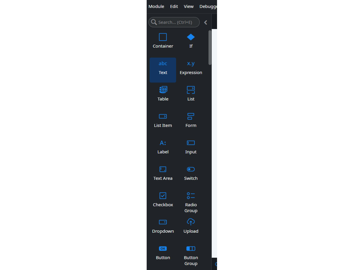
Figure 8.1 – Service Studio toolbox with reusable patterns
In this way, development is abstracted, avoiding having to worry about what is inside.
The only thing we have to do is fill in the property attributes so the pattern behaves as expected and with the correct data.
Tip
We can add more patterns if we want to. Just click on the Manage Dependencies button, select the producer module and choose the desired patterns from the list presented. Finally, click on the Apply button.
All patterns respect the current best development practices in terms of HTML and CSS, being fully responsive. Also, if we want to customize them, we can always extend their CSS classes in properties through the ExtendedClass attribute. To take advantage of the ExtendedClass attribute, we can create the CSS class in the theme's stylesheet and, in this attribute, just put the name of this class, applying it to the component in question.
Tip
If you are curious, you can see the official documentation on patterns here: https://success.outsystems.com/Documentation/11/Developing_an_Application/Design_UI/Patterns/Using_Mobile_and_Reactive_Patterns.

Figure 8.2 – Extend pattern CSS attribute in the Properties area
In the case of templates, we have something even more complete. A list of screens built end to end within the following categories is provided:
- Banking
- Dashboards
- Details
- Forms
- Galleries
- Insurance
- Lists
- Onboardings
The good thing about all this is that, from time to time, OutSystems updates this list, providing new templates or removing those that no longer make sense to the market and current trends.

Figure 8.3 – Popup for screen template selection in Service Studio
For the creation of the screen, OutSystems also provides sample data. How can we put real data on our screen? Simple. Just drag the desired entities to the top of the screen until the indication Replace data with ticket as in screenshot appears and make the drop. Done!
After replacing the sample data with real data, we should remove the dependencies from the OutSystems Sample DB module so that we don't have unnecessary dependencies.
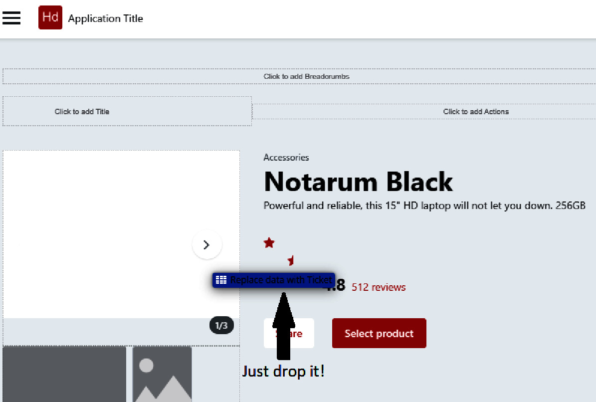
Figure 8.4 – Drag and drop entity to replace sample data with real data
These accelerators ensure that the development complies with the best security and performance practices, being easily inspected and with an extremely low margin of bugs (and normally they only happen due to some specificity of our business rules or data).
Both patterns and templates are the available macro elements. If we develop something more custom, we can continue to take advantage of pre-built components, in this case, widgets.
Reactive widgets
Reusable widgets are small components that we use in creating our screens for viewing and using them uniformly across all screens.

Figure 8.5 – Service Studio toolbox with reusable widgets
These already come precomposed with their HTML/CSS, without us needing to worry about their construction from scratch, thus allowing developers with a lack of experience in these languages to create intuitive and attractive applications.
But what is the difference between patterns and widgets then? This is one of the most frequently asked questions!
Well, it's all about approach. The widget is an element that we use on our screens, while the pattern is more related to the user experience. Some even argue that all patterns are widgets, but not all widgets are patterns. At the moment, there is no formalization on the topic (a good topic for discussion these days).
Right now, through a module provided by OutSystems natively, we find widgets in the following categories:
- Adaptive – widgets that react and adapt to the resolution and device they are displayed on
- AppFeedBack – widgets used to get feedback on the application the user is using
- Content – widgets used to aggregate data and other widgets in an organized and understandable way
- Interaction – widgets used to allow user interaction and animations, making viewing more dynamic
- Licenses – platform licensing related widgets
- Navigation – widgets related to in-app navigation, such as paging and breadcrumbs
- Numbers – widgets related to displaying numbers and counters in an intuitive way
- Private – widgets that allow functionality to occur in the background
- Utilities – widgets with extended CSS capabilities to simplify the implementation of UX/UI behaviors, such as align at center, button loading, and touch/mouse events
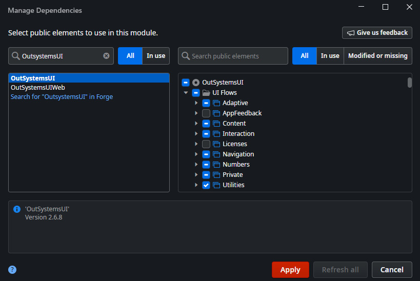
Figure 8.6 – Widget categories available in OutSystems UI
However, we can create our own widgets, either from scratch based on the pre-existing ones or by overriding or manipulating them through a clone (since the OutSystems UI module is not editable).
We must bear in mind that, from the moment we clone something and stop using OutSystems UI widgets, we no longer benefit from its updates. Furthermore, we must always ensure security at least to the same level as the system components.
Note that OutSystems accelerators, when creating screens, whether using templates or scaffolding, use these same widgets in order to standardize development and ensure that everything becomes simpler to maintain and change by the developer.
Hey, one minute! Scaffolding? What is that?
Scaffolding screens
Screen scaffolding is based on the platform's ability to infer the two types of base screens normally needed by an entity: listing and detailing.
Basically, the system is so well designed that we just drag and drop the intended entity onto the canvas of a flow and it automatically creates the list and detail pages related to the respective entity and predictable fields. We may of course have to make some adjustments to the rules and visible fields.
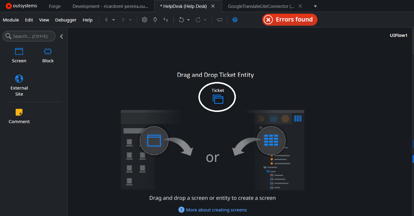
Figure 8.7 – Drag and drop an entity to the UI flow canvas
All widgets and base functionality are created automatically, such as listing ordering, pagination, direct links to details, back functionality, mandatory fields – all that!
Info
In cases of simplistic scenarios, where entities are exposed without being just read-only or if the entities belong to the same frontend module (by default, this is not good architecture, but everything depends on the use case), scaffolding automatically creates the save action and the widgets necessary for the user to enjoy this functionality (such as the Save button).
Through the scaffolding technique, the screens are created based on the base Flow Theme to which the screen belongs, automatically creating all the necessary functionalities. In the case of a listing screen, a table is created with the first four attributes of the Entity that provides the data, a link to create a new record, links to access the detail pages of each record in the table, search field, and the paging functionality of the table.
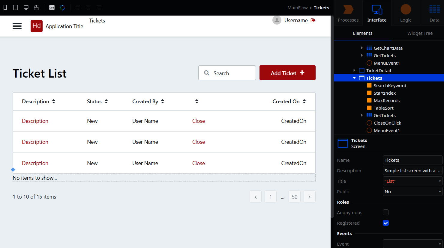
Figure 8.8 – List screen created with scaffolding technique
One of the interesting parts of scaffolding is the automatic generation of the link in the application menu to the concept to which we applied the technique. For example, if we drag and drop the Ticket entity to the MainFlow canvas, the menu link to the Tickets list page is generated. Cool, isn't it?
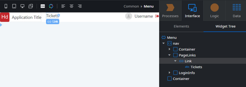
Figure 8.9 – Menu link autogenerated by scaffolding for list screen
With this in mind, we can also scaffold inside existing screens. In other words, if we have relationships between entities, when dragging the associated entity onto the detail screen, it creates a table to visualize the data.
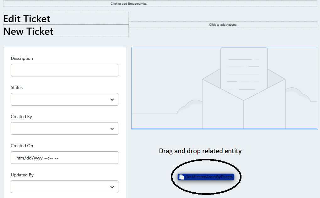
Figure 8.10 – Drag and drop associated entity to the detail screen
After dragging and dropping, we just make the necessary adjustments quickly so that everything is as intended (we can add a label at the top of the table, delete, reorder, or add the necessary columns).
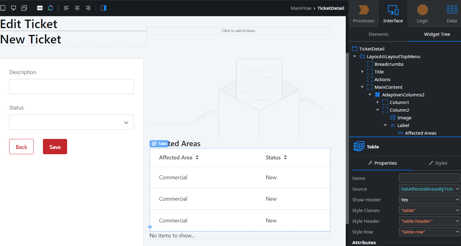
Figure 8.11 – Table created with drag and drop in the detail screen
In a way, scaffolding allows you to create the frontend of an application in minutes, always ensuring a very attractive UI and an excellent UX.
The details to customize, in most cases, are minimal and, considering the visual paradigm and the way that Service Studio provides us with information and tools, everything is done extremely quickly and in a way that allows developers to shift their focus more to business concepts.
Note that at any time, we can customize our screens, such as changing the location of widgets/patterns, changing their characteristics in properties, changing the CSS classes that support them, and even adding or removing them in order to obtain the expected result. Everything that is automatically generated remains customizable.
In addition, we can always assemble our screens or blocks manually, dragging and dropping the desired widgets and patterns into them and assigning the desired fields.
Although many of the scenarios provided at the UX/UI level are already covered by all these techniques, all of this, like any application, is based on CSS themes and styles. OutSystems has also focused a lot on this, offering a great acceleration capacity in this regard. For a better understanding, we will analyze in the next section how CSS themes and styles work on the platform.
CSS themes and styles
Layout and styling components are another focus of OutSystems accelerators, thus also reducing the need for knowledge of native technologies in order to create an application with an excellent UX/UI. With this, we are able to deliver an application to users capable of making them very satisfied with their experience.
When creating our frontend modules, Service Studio automatically adds HTML layout patterns, making them immediately available for consumption.
The practical meaning of all this is that we do not need to waste time developing this component.

Figure 8.12 – HTML layout patterns to use in our frontend modules
Regarding styles, also when creating frontend modules, Service Studio generates the CSS file with all the necessary classes to satisfy the latest visual trends at the application level. All widgets and patterns available out of the box feed from these same classes to get the desired look.
The great particularity of CSS is that OutSystems allows its customization with native code, by using a CSS editor.
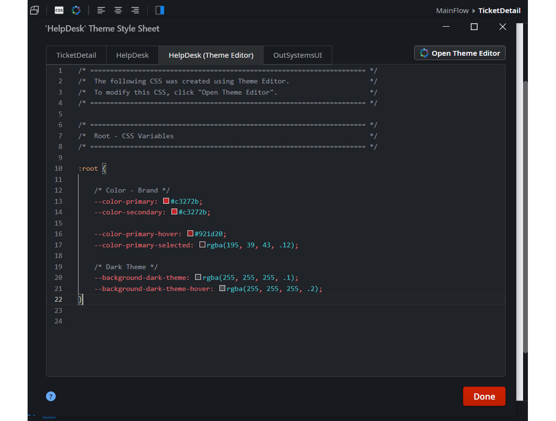
Figure 8.13 – CSS editor in Service Studio
In this editor, we can create our classes on different theme sheets and perform overrides. The CSS classes we created can then be used in our widgets and patterns, either in the Style Classes property (in the case of widgets) or in the Extended Class property (in the patterns).
With this, we were able to achieve a wide spectrum customization, and at no time were we limited by the automatic generation of our screens (or blocks) or by the use of pre-built widgets/patterns.
Tip
If you are curious, you can see the official documentation on CSS here: https://success.outsystems.com/Documentation/11/Developing_an_Application/Design_UI/Look_and_Feel/Cascading_Style_Sheets_(CSS).
Note that the HTML/CSS system generated by Service Studio complies with the best practices of the respective languages. It is based on the Grid model, with pre-conceived media queries, thus ensuring one of the most important features nowadays in web applications: responsiveness.
Although all these accelerators make our work easier, we often have custom cases that need some manipulation of elements and behavior changes, and JavaScript is perfect for these situations. In the next section, we will learn how JavaScript fits into our applications and its role in our development.
JavaScript in OutSystems
As is often said in web programming circles, the frontend is made up of three strands: HTML, which is the bones, CSS is the skin, and…muscles are missing!
The muscles, or the application's ability to respond and have dynamic behaviors, such as adopting certain behaviors according to the user's orders, are given by another language: JavaScript!
As in the previous cases, Service Studio automatically generates the JavaScript necessary for the correct functioning of the application, either inserted as a resource or indirectly in function calls of certain components.
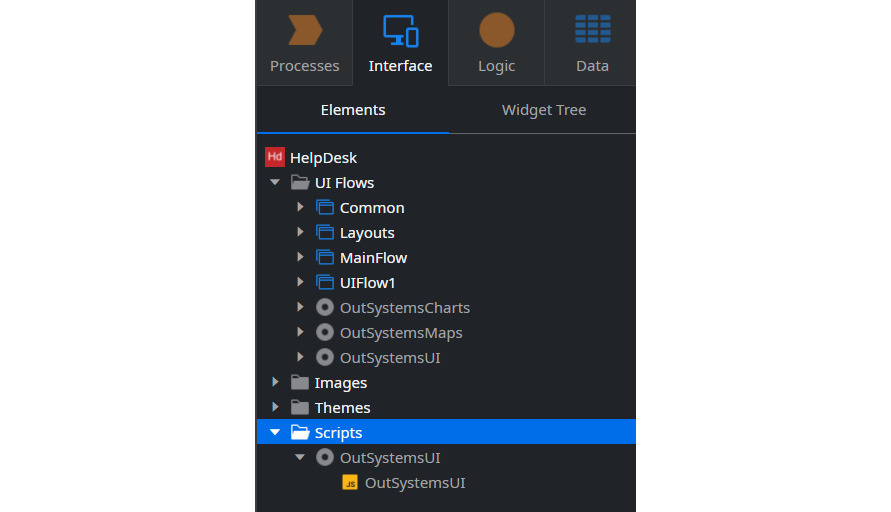
Figure 8.14 – JavaScript Scripts folder in Service Studio
The autogenerated scripts are saved in the Scripts folder in the Interface tab, and if we want to extend or customize something in our application that needs more scripts, we can add our files to that same folder. Note that the OutSystems platform accepts minified or formatted code, as JavaScript is a browser-interpreted language and not compiled.
However, we can go even further in JavaScript. We can create our own custom code for a given event exactly in the flow that we need in our client actions (which we'll study in Chapter 10, Client-Side Logic). With this, we get much greater power in handling the behaviors expected by the application, improving and adjusting the UX of our applications in order to match users' needs.
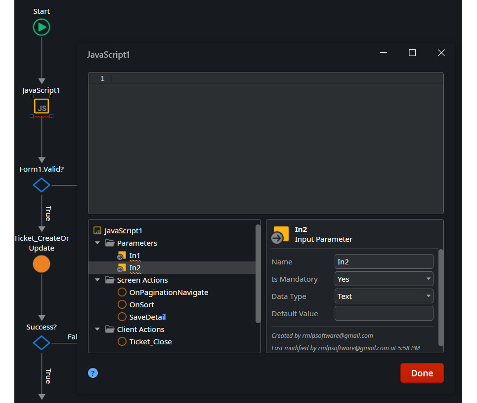
Figure 8.15 – JavaScript node and editor
In these JavaScript nodes, an editor is made available that allows you to insert your own customized JavaScript code, and it has characteristics normally used by editors in the market, such as an error identifier, suggestions, and a color scheme.
Tip
If you are curious, you can see the official documentation on JavaScript here: https://success.outsystems.com/Documentation/11/Extensibility_and_Integration/JavaScript/Extend_Your_Mobile_and_Reactive_Apps_Using_JavaScript.
As we can see, despite OutSystems pre-conceiving much of the code needed for our UX/UI, it has immense flexibility when it comes to customizations, tweaks, and extensibility. We can leverage all our knowledge of HTML, CSS, and JavaScript to expand our ideas and improve whatever is necessary to fit our needs.
With OutSystems, a baby is born as an adult, and we don't need to take it to the gym to make it big and strong!
But, how is this all managed on the screens, and how can we take full advantage of all those capabilities? For that, we need to understand the screens and blocks lifecycle.
Screen and block lifecycle events
Pages and blocks in OutSystems follow a set of steps in their rendering and responding to changes. These steps are called event handlers. These events occur when we open the application, when we change screens, or when the application reacts to a change in data. These events can be defined in the screen properties or in the properties of data fetch actions (aggregates or fetching data from other sources) in order to cover the full scope of occurrences that may exist.
In the application launch scenario, the normal lifecycle is as follows:
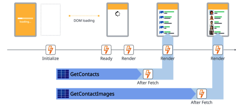
Figure 8.16 – On opening the application lifecycle
In this case (opening an application), the app shows the splash screen and then navigates to the default screen.
The other case where a screen is loaded is when we navigate from a regular screen to another regular screen, the behavior being slightly different:
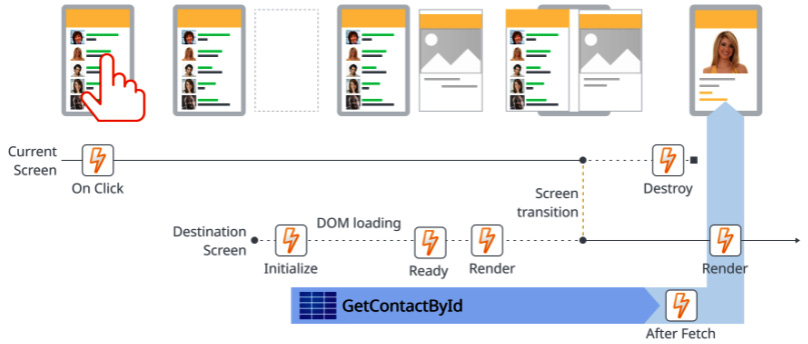
Figure 8.17 – On navigating between screens
Navigating from one screen to another is one of the most common scenarios in our applications.
This can happen with the use of links or buttons that directly call other screens or when the screen actions associated with them end on another screen (instead of the End node).
This capacity is usually associated with blocks that are consumed on screens. Furthermore, the block runs events whenever the data changes so that the information presented to us is correct. Basically, there are events that check if the input data has changed, and we, developers, can program the necessary data updates or other types of manipulations. These events work as follows:

Figure 8.18 – On changing parameters screen lifecycle
In summary, the events that occur are as follows:
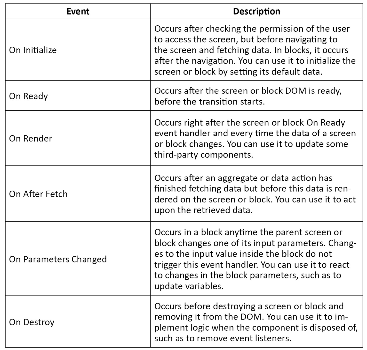
Figure 8.19 – Lifecycle event handlers
Through all these events, we can control the expected behavior of our pages and blocks in order to meet users' expectations and to avoid bad information, excessive processing in certain phases, or more iterations than necessary by those who use the applications.
Tip
If you are curious, you can see the official documentation on screen and block lifecycle events here: https://success.outsystems.com/Documentation/11/Developing_an_Application/Implement_Application_Logic/Screen_and_Block_Lifecycle_Events.
Note that these events must be handled and used with great care. We can often go wrong in choosing the right event and cause unwanted behavior.
This topic is equal in both reactive web and mobile applications. In other words, mobile uses the same events and its screens and blocks have the same lifecycle as we saw here.
There are other types of events in reactive web (and mobile) applications, these being to allow you to react to changes in interactions and data. In the next section, we will understand how these events work and in what context.
Events to propagate changes from a block to the parent
We can develop our frontend in pages or blocks. The latter are considered groupings of certain features and samples that live in their own lifecycle and with their own scope and can be reused within other blocks and/or screens. Direct or indirect recursion using blocks is not possible, that is, a block has an instance of itself in its content.
Since a block has its own scope, in order to communicate with its parent, be it another block or a screen, you need to trigger events to do so. These same events can carry data, defined as input variables.
When we define an event in a certain block, if it has its Is Mandatory property set to Yes, the parents of that block must define a handler, which can be a screen action or another event, to respond to the change made to the child block.
Tip
If you want to see a brief explanation and example of how to set up an event and its handler between a block and a parent, you can see one here: https://success.outsystems.com/Documentation/11_x_platform/Developing_an_Application/Design_UI/Reuse_UI/Use_Events_to_Propagate_Changes_From_a_Block_to_the_Parent.
In summary, to propagate changes from a block to a parent, there are two main points: event triggering on the child block side and handler development on the parent side.
Now, to better understand the content of this chapter, how about doing an exercise?
Exercise 4 – Creating application screens
Now let's apply what we've seen in this chapter in this exercise. To do this, we will create the necessary screens, using templates and scaffolding to create our screens for the My Help Desk application. Let's better understand how fast and easy it is to build the frontend of an application using the accelerators provided by OutSystems.
So, to start the exercise, we must follow these steps:
- Create a Reactive Web App module with the name HelpDesk:
- To do this, we open our My Help Desk application, click on the Add module button, name it HelpDesk and select a module type of Reactive Web App. Then click on the Create Module button:
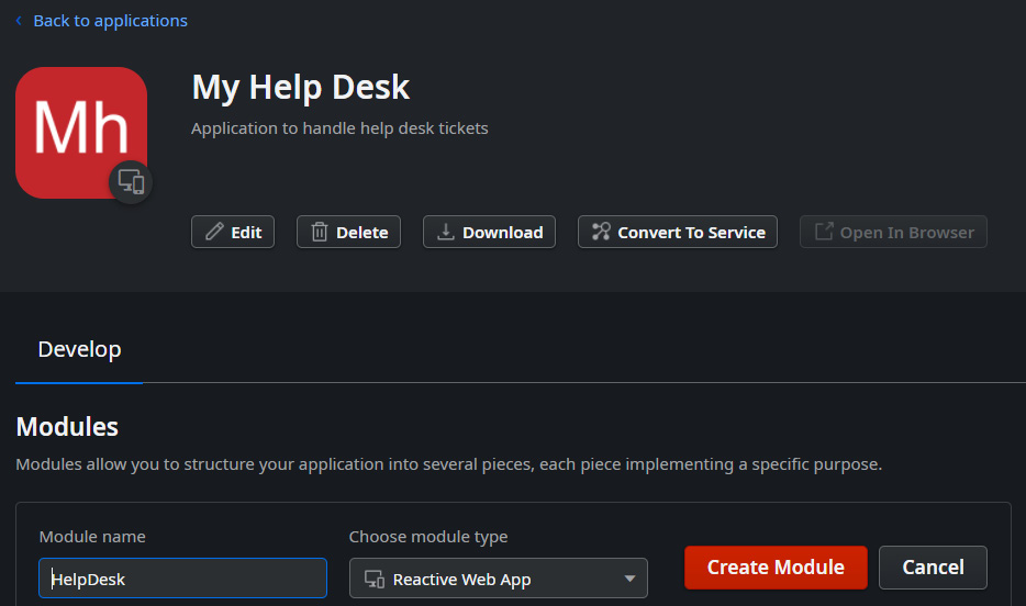
Figure 8.20 – Create a Reactive Web App module for the frontend
- Next, we click on the green Publish button so that the module is generated in our environment:
Figure 8.21 – Published frontend module
- Create our home page from a template:
- First, we have to get the necessary dependencies on entities and actions. We click on the Manage Dependencies button, select the HelpDesk_CS module, and choose all entities and actions related to tickets. Finally, we click on the Apply button:

Figure 8.22 – Manage Dependencies popup with all dependencies selected from HelpDesk_CS
- Next, click on the Interface tab and right-click on MainFlow, selecting the Add screen option. We click on Dashboards in the left column and select the template Dashboard:
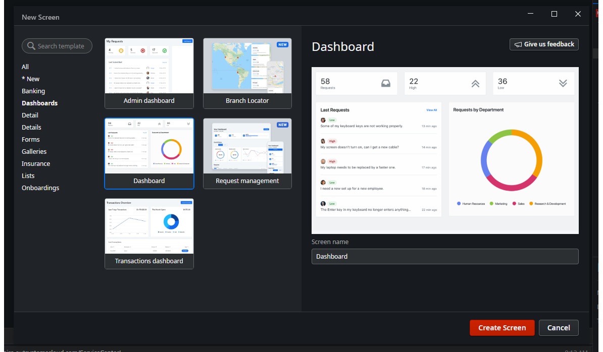
Figure 8.23 – Template selection popup with the Dashboard template selected

Figure 8.24 – Dashboard screen in MainFlow
- Now we have to replace the sample data with the real data. To do this, click on the Data tab and drag and drop the Ticket entity to the top of the list on the left until the option Replace data appears, and we do the same for the graph on the right. It should look something like what is shown in Figure 8.25:
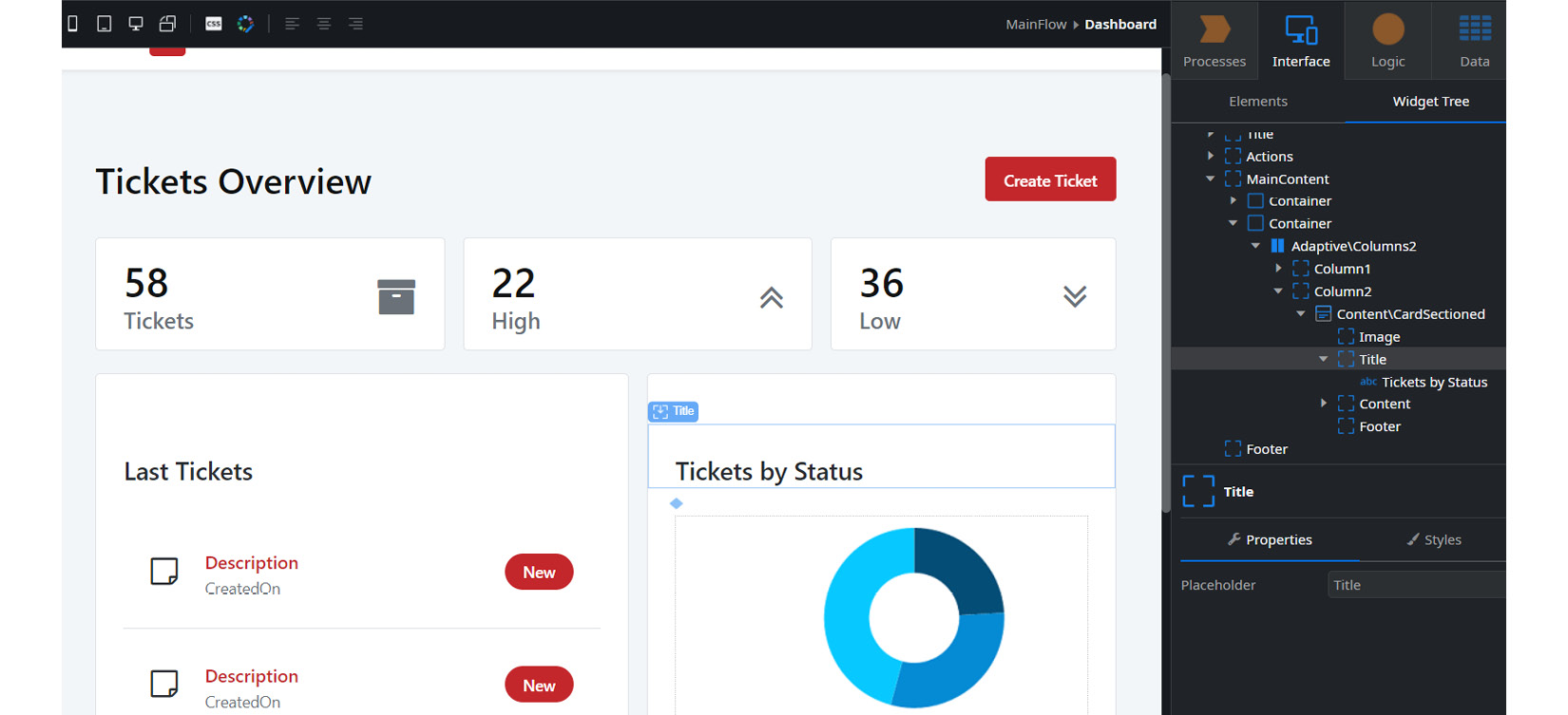
Figure 8.25 – Dashboard screen with real data
- Now we can click on the green Publish button. After publication, the button changes to blue, informing us that we can open it in the browser. Let's do that to see the result:

Figure 8.26 – Dashboard screen in the browser
Challenge
As a challenge, adjust the card at the top of the dashboard page to show real data!
This page has a different feature from the others we are going to create. If you notice, it shows the symbol of a house in Service Studio. That means it's our home page.
Tip
If we want to define another page as the home page, we just right-click on it and select Mark as default screen.
There are other accelerators to create our screens besides templates. We can do it with drag and drop, immediately creating oriented screens for the final data. So, let's create list and detail screens for tickets using the drag and drop technique:
- For this purpose, we select the Interface tab and double-click on MainFlow in order to open the canvas. We drag and drop the Ticket entity in the Data tab to the canvas:

Figure 8.27 – MainFlow canvas with Tickets and TicketDetail screens created with drag and drop
- Now, we open the TicketDetail screen by double-clicking on it in the Interface tab and click on the Widget Tree subtab so that we have the HTML component tree view visible:

Figure 8.28 – Widget tree view for HTML components in the TicketDetail screen
- We select the containers that group the attributes Created By, Created On, Updated By, and Updated On, right-click on them, and select the Delete option:
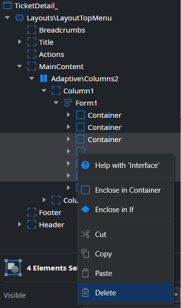
Figure 8.29 – Delete attribute frontend components from the TicketDetail screen
Note
These fields that we eliminated are automatically filled by the action that we created in the HelpDesk_CS module and that we are going to use in the action related to the functionality of creating or updating a ticket.
- Associate the Ticket_CreateOrUpdate action to the Save button functionality:
- To have functionality on the Save button on the TicketDetail screen, let's open the client action SaveDetail on the screen, expand the HelpDesk_CS module, and drag the Ticket_CreateOrUpdate server action to after the If in the branch of True:
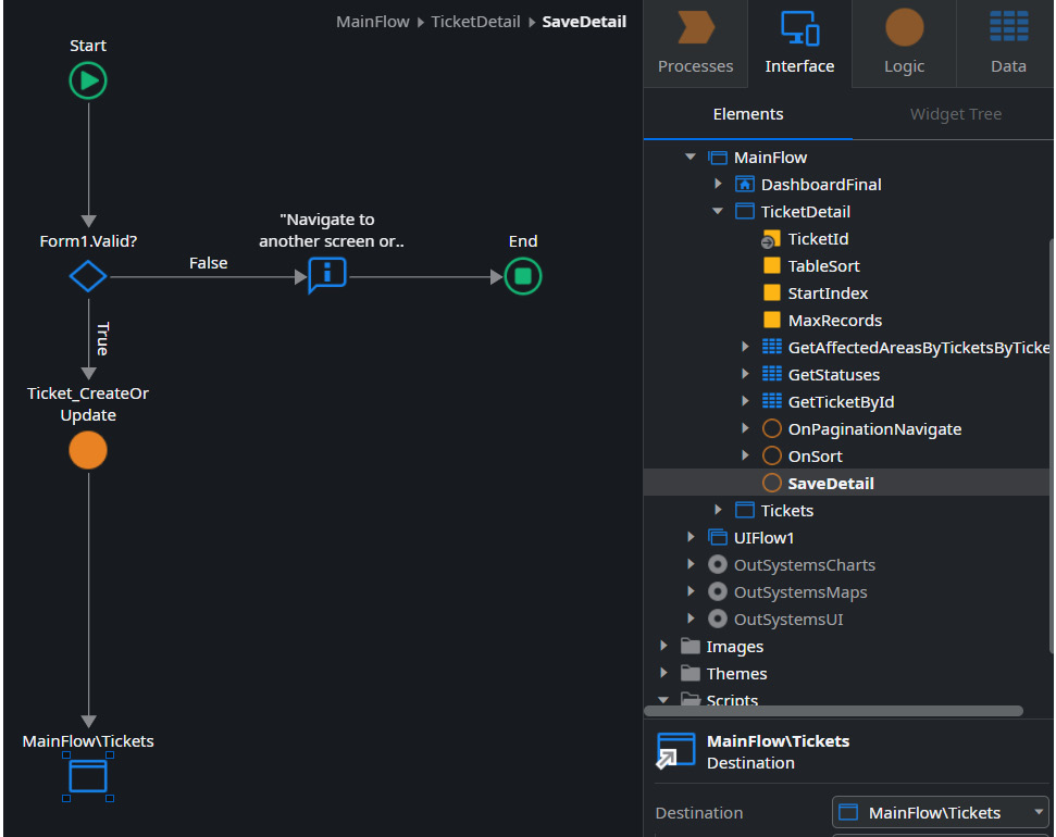
Figure 8.30 – Server action Ticket_CreateOrUpdate added to client action SaveDetail
- Let's add the existing record on the screen to the action server input. The input value must be GetTicketById.List.Current.Ticket (it is the record that is mapped on the screen through the aggregate that was called):
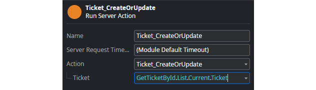
Figure 8.31 – Mapped input record to the server action
- Now we add an If after the server action to check if it returned successfully. For this, the condition of this If must be the verification of the OutputStatusHasSuccess output of the action:

Figure 8.32 – Verify with an If the returned status from the server action
- On the True branch, we put a success message followed by a redirect to the listing page. In the False branch, we put an error message, map the server action error (OutputStatus.Message) and end up in an End node:

Figure 8.33 – Definition of If branches in the verification of server action success
- Finalize the last details:
- Eliminate the fetch data aggregate GetUsers (since we eliminate the dropdowns on the screen for CreatedBy and UpdatedBy, we no longer need the popular ones, so this aggregate is no longer accurate). Expand the TicketDetail screen, right-click on GetUsers, and select the Delete option:

Figure 8.34 – Delete the GetUsers aggregate from the fetch data screen
- Link the Create Ticket button from the Dashboard page to the TicketDetail page. Open the Dashboard page, select the Create Ticket button, and in the Properties section, set the On Click event as the redirect to the TicketDetail page. Set TicketId to NullIdentifier(). We can delete the Not Implemented action from the Dashboard screen:
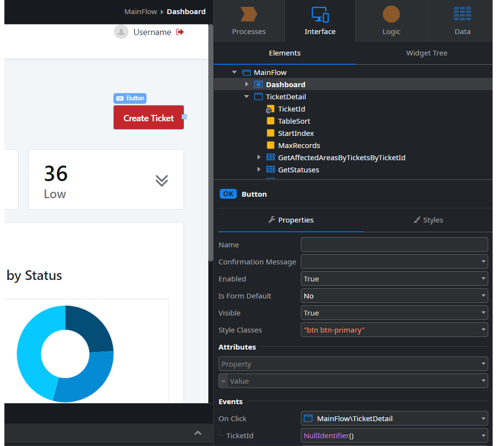
Figure 8.35 – Define the Create Ticket button link to the TicketDetail screen
- Now we can publish the application. We click on the green Publish button and it becomes available to browse:
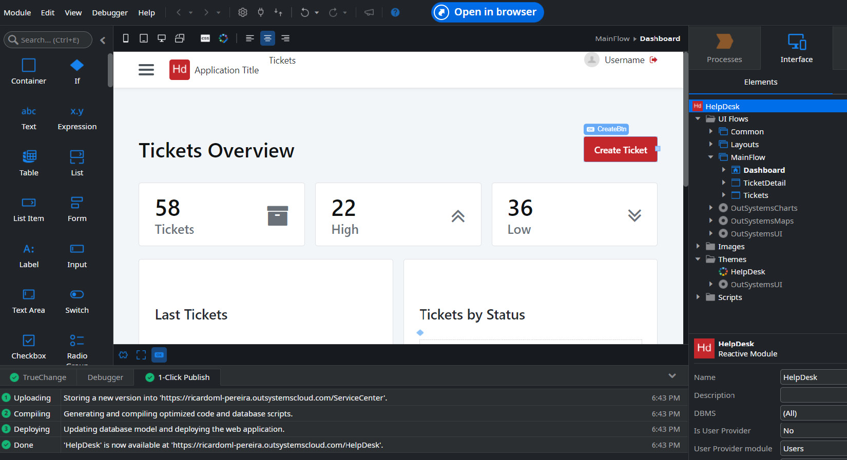
Figure 8.36 – Published app ready to use
At this moment, our application already meets the minimum standards of a ticket support web application, using the pre-conceived standards of UX/UI, security (authentication and authorization), and performance.
From here, we can evolve the application simply and quickly in order to adjust it to business needs.
Summary
In this chapter, we understood that the OutSystems platform provides a huge number of accelerators, such as pre-designed patterns and templates, automatic screen creation features such as scaffolding, and the ability to easily and quickly customize our UX styles and functionality through the CSS and JavaScript editors.
We also saw that all automatic developments respect the best performance and security rules, ensuring an excellent UX/UI, something that is one of the most important metrics nowadays for the end user.
Even without mastering native frontend technologies (HTML, CSS, and JavaScript), we were able to create fantastic applications that meet the expectations of our customers.
In the next chapter, we will see that, for developing mobile applications, things are not that different. By the way, one of the great quick wins is that the development paradigm is the same as the reactive web! The platform is so well thought out that, in order to focus on the difference in expectations between the two types of applications, the programming method is the same!
In the next chapter, we will see how easy it is to develop a mobile application!