
Are your customers spending more or less with you year after year? Which customers have had the biggest increase in revenue over the last year? Or, the biggest increase in gross margin over the last year? This report is all about comparing these types of statistics, using data from the receivables management module.
This report is for a company that has limited sales staff, so they need to know whether customers are increasing or decreasing their sales, in order to know which customers deserve rewards (for increasing sales) and which customers deserve some extra attention (for declining sales).
This company wants to track which of their customers have the largest revenue increase and decrease. They also want to know which customer has the largest gross margin increase and decrease. The staff members who need this information are not GP users.
Our goal is to have one report that allows you to compare numbers year after year in a very visual format. Plus, we want to create a report that can be used interactively.
For this report, we will use a Power View report within Excel. We will make this a refreshable report as well.
There are two parts to these steps. The first part is technical, containing steps that involve work in SQL Server. The second part is the actual building of the report. You may choose to obtain assistance with the technical part, especially if you do not have access to SQL Server.
If you created the receivables shared aged trial balance previously, move to the next step. If you did not create this previously, complete the technical steps for that report.
With the SQL Server part completed in the previous section, let's build a report!
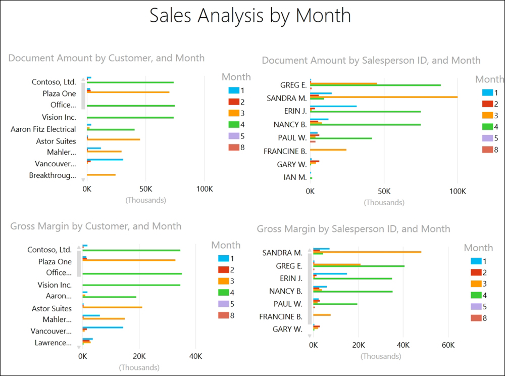
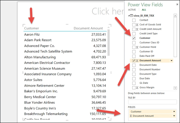
Know what you want. The following screenshot shows how we want our report to look like:
Let's make a connection to the GP data:
- Select Data from the menu bar, and then choose Existing Connections from the Get External Data portion of the ribbon. Scroll down your connections until you find the one that is labelled
<Server Name> <COMPANY> view.BI_RM_trx, select it and click on Open.Our
Server Nameis cherry.Our
COMPANYis TWO01:
You can also repeat the steps for creating a connection in the previous report, Sharable aged trial balance, instead of looking for the existing connection.
- If you used the Data Connection Wizard for this view previously, it will prompt you to override the previous
Office Data Connectionfile or*.odcfile. Go ahead and override it, it will not create any problems.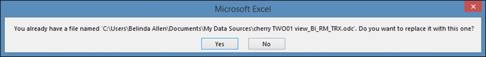
- Enter your Server name and your network or AD login credentials. Then, click on Next.
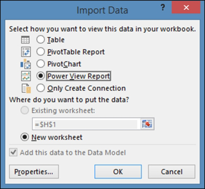
Let's build the first PivotTable report:
- On the Import Data window, select Power View Report and click on OK:
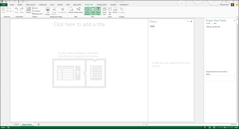
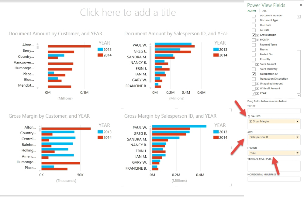
- The Power View work area will open as a new tab. The canvas will be on the left-hand side and the Power View Fields list will be on the right-hand side, with Filters in the middle:
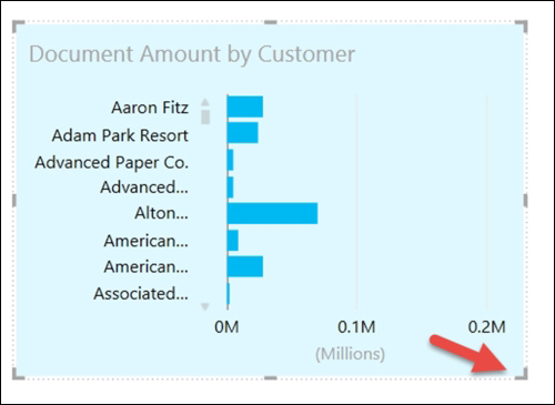
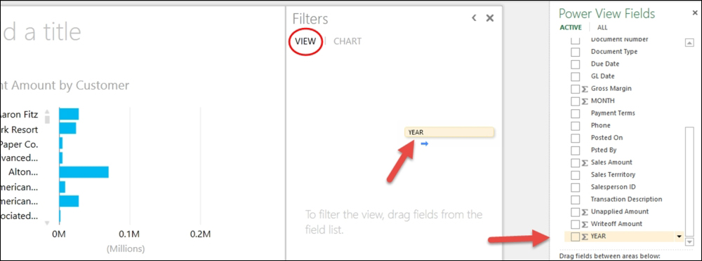
- In the Power View Fields list, drag the Customer field to the FIELDS area below. Then, drag Document Amount (below Customers) to the FIELDS area. You'll notice that a table begins to appear on the canvas:
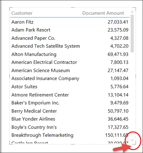
- Click on the table on the canvas. You'll notice that the entire table will be selected with a dotted line around it, and the corners are solid (for resizing):
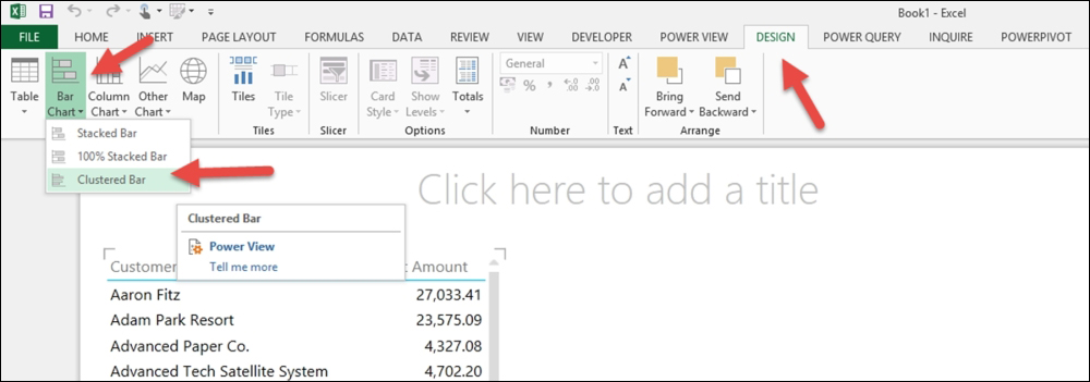
- Now that we are working on a Pivot View canvas, we have some additional Power View options on our menu bar. From the menu bar, select DESIGN. Choose Bar Chart and then Clustered Bar from the Switch Visualizations area of the ribbon:
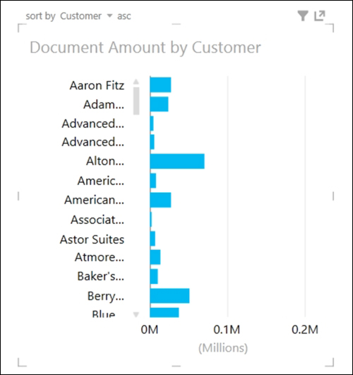
- Your chart will then change to look like the following:
- Click on a corner, and while holding your left mouse button down,resize the chart until it only takes up to one-fourth of the page to allow for three more charts:
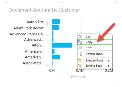
- Click on the chart again to highlight it, and then right-click and choose Copy:
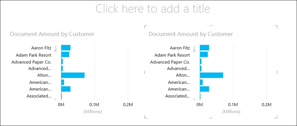
- Then, click on a blank area of the canvas to the right-hand side of this chart, and right-click and choose Paste. You'll then have two charts side by side:
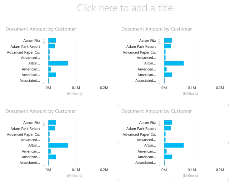
- Repeat these steps until you have four charts on the canvas. It should look similar to the following screenshot:
Let's customize each visualization:
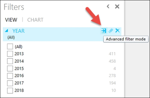
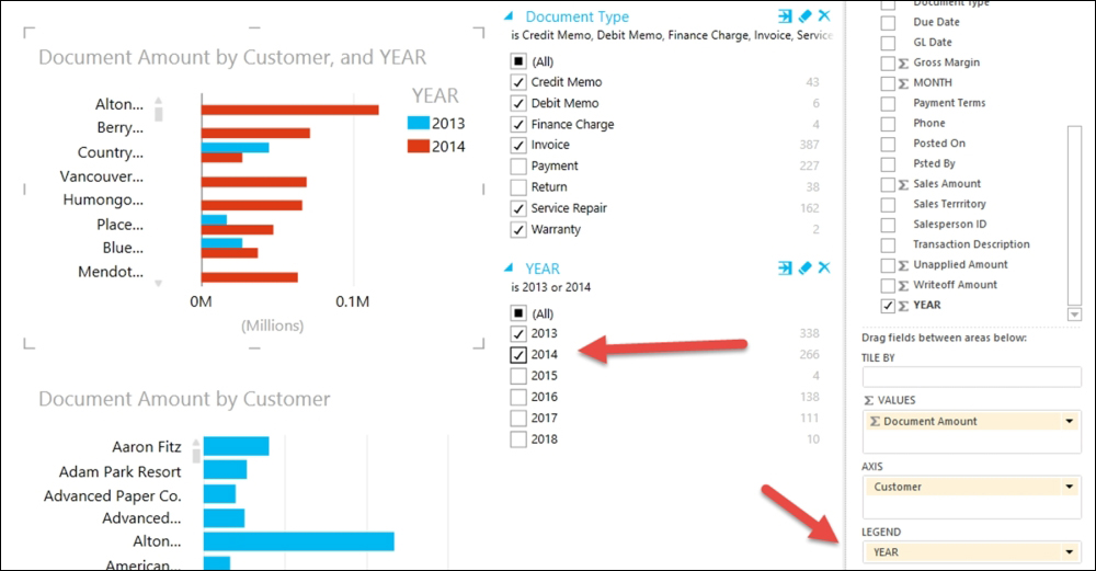
- In the Power View Fields list, drag the YEAR field to the middle area called Filters. Make sure the VIEW section is selected (bold) and not the CHART section. The VIEW filters will work for every chart, while the CHART filter will only affect the selected charts:
- In the Filters area, click on the Advanced Filter Mode icon until you see a list of years:
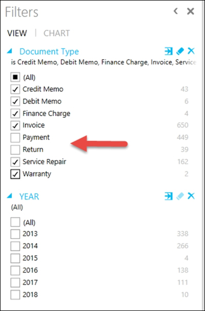
- Then, drag the Document Type field over as well. Our view includes all document types including payments. We'll want to exclude payments from this report, so we will see the net effect of invoices, returns, credit memos, and so on. Repeat the previous step for the Document Type to see a list.
- In the Filters area, select (All) for document type, and then unselect payment. After you handle the document type, you can select the years you want to compare:
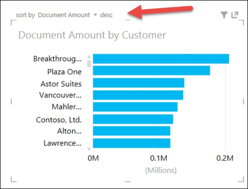
- For the top-left chart, click on the drop-down arrow next to sort by in the top-left corner of the chart. Now, select Document Amount:
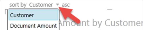
- Next to sort by Customer, click on asc to change it to desc. This will put the chart in descending order by document amount, making the customer with the highest revenue appear first:
- With the first visualization still highlighted, in the Power View Field list, drag the YEAR field to the LEGEND area. You'll then notice the comparison by year in the chart, and each year is in a different color:
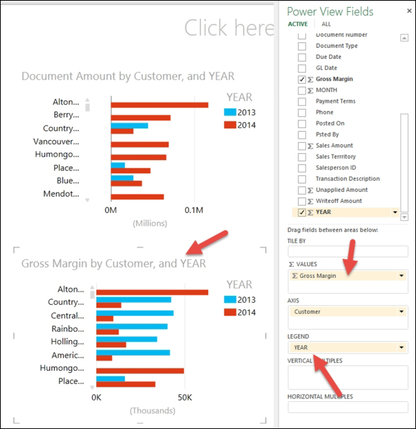
- Click to select the chart on the bottom left. Drag Gross Margin to the VALUES section and remove Document Amount. Add YEAR to the LEGEND area, and change the sort to sort by Gross Margin desc:
- Click to select the chart on the top right. Drag Salesperson ID to the AXIS section and remove Customer. Add Year to the LEGEND area, and change the sort to sort by Document Amount desc:
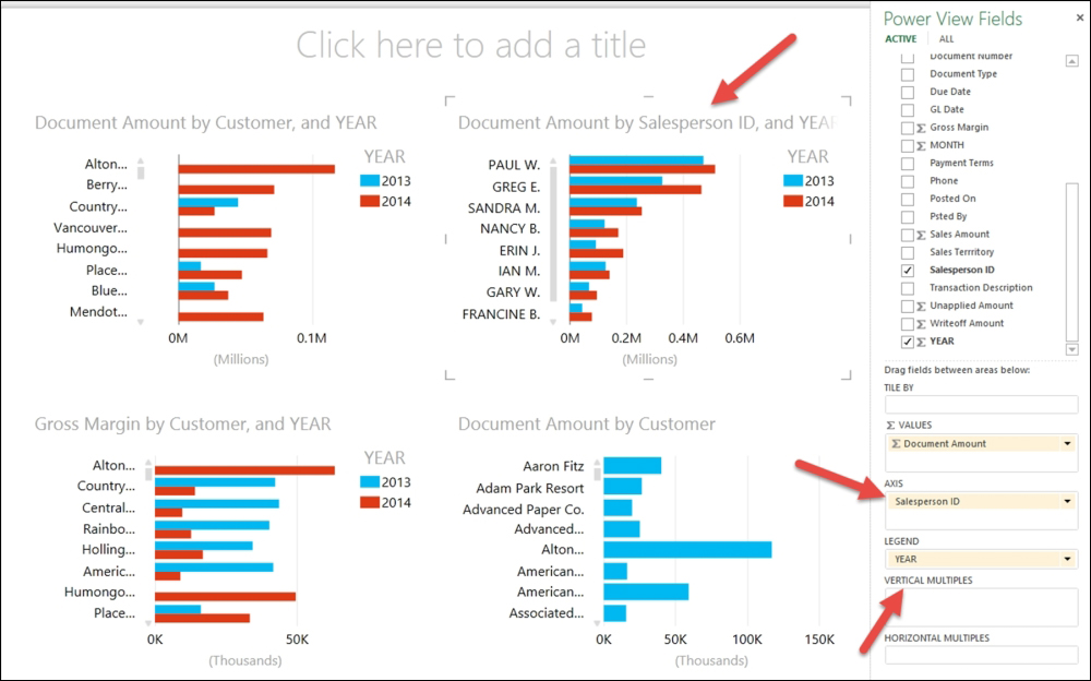
- Click to select the chart on the bottom right. Drag Salesperson ID to the AXIS section and remove Customer; drag Gross Margin to the VALUES section and remove Document Amount. Add YEAR to the LEGEND area, and change the sort to sort by Salesperson ID desc:
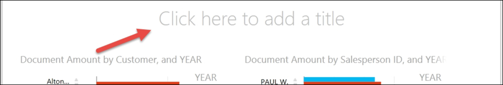
- At the top, click where it reads Click here to add title and enter the name of your report:
- Your report is completed. This report is totally interactive. If you click on any bar or item in a legend, the entire report reflects what you selected by dimming out all parts of all charts that do not pertain to the filter (selection):
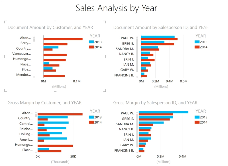
This report visually displays the top customers by both revenue and gross margin. It also displays the top salespeople by both revenue and gross margin. Since this report is in charts (visualizations) rather than tables, it is easy and fast to read. With a few clicks, you can compare any year to any other year (more than two years if desired). This is a great way to check whether your customers are slowly increasing or decreasing their sales and/or gross margins.