
In this hour, we will cover
Ideal times for using Web controls other than the TextBox Web control
Adding DropDownList Web controls to an ASP.NET web page
Programmatically accessing a selected value and text from a DropDownList Web control
Using the RadioButton Web control
Grouping related RadioButton Web controls
Using the CheckBox Web control
Programmatically determining whether a particular CheckBox Web control is checked
In the preceding hour we saw how to collect user information through the TextBox Web control. The text box, however, is not always the best tool for collecting a user input. For example, imagine that you wanted to create a web page where the user answered a bunch of yes/no questions. Would it make sense to require the user to type in the words “Yes” or “No” for each question?
Fortunately, alternative Web controls exist for collecting user input, such as the DropDownList Web control, the RadioButton Web control, and the CheckBox Web control. We examine these three Web controls in this hour.
So far we have explored only one Web control for collecting user input, the TextBox Web control. As we have seen in the examples thus far in the book, the TextBox Web control presents users with a text box into which they can type their input.
Text boxes, however, are not the only means by which user input can be collected. As we will see in this hour, other input collection Web controls include the DropDownList, the CheckBox, and the RadioButton. The DropDownList Web control presents users with a list of options, from which they may choose one. The CheckBox Web control displays a box that can be ticked or cleared to indicate a yes or no type answer. And the RadioButton Web control presents users with a single, selectable option. Typically, a series of RadioButton controls are used, with each radio button representing a single option from which the visitor can select only one of the available choices.
Given that a number of Web controls are designed to collect user input, you may be wondering when you should use a TextBox versus a DropDownList, CheckBox, or RadioButton. The type of Web control you use depends on the kind of input that is being collected.
Input collected from users can be classified into various types. The following classifications group input in terms of their restrictiveness, from the most restrictive form of input, to the least:
Boolean input
Input selected from an allowable list of choices
General text input
The first classification, Boolean input, is input that can be inputted in only one of two ways. For example, an online survey may ask you for your gender, which can be only one of two values, Male or Female. A sign-up web page may ask if you want to receive their weekly email newsletter, which can be answered in one of two ways: yes or no.
A slightly more general input classification is input selected from a list of acceptable choices. If you live in the United States and are filling out your address on an online form, you are asked to specify the state you live in from a list of the 50 states.
General text input is the most flexible of the three categories. Input that falls into this category includes filling in your name and address on an online form or entering your comments on an online messageboard site.
When collecting user input, you must decide what Web control to use. For example, when prompting users for their gender, you could use a TextBox Web control, having them type in whether they are Male or Female. However, this approach lends itself to user error. A visitor may misspell Female or type in Woman instead. A less error-prone approach would be to use a DropDownList Web control with two options: Male and Female.
Other Boolean inputs work best with check boxes. For example, many websites require you to create an account to access certain portions of the site. When registering for a user account, you typically find a check box labeled something like I Agree to the Terms or Keep Me Abreast of New Products from Your Company.
In this same account-creation page, users may be prompted to specify how they learned about the website. Rather than requiring users to type in an explanation, many websites will provide a drop-down list that contains a number of potential choices, such as Read About It in Print, Heard About It from a Friend, and so on. A drop-down list or a series of radio buttons work well here.
Did you Know?
When you’re prompting the user to select one choice from a series of acceptable answers, either a drop-down list or a series of radio buttons will suffice. If users can choose from many available options, however, a list of radio buttons can become cumbersome and take up valuable screen real estate. A good general rule is to stick with the drop-down list when presenting more than five options. For five or fewer options, either a series of radio buttons or a drop-down list will get the job done.
Input that falls into the general text input category, such as a person’s name or mailing address, must be entered via text boxes.
The point of this discussion is to highlight that different classes of user input exist, and the best Web control for one class of input may not be the best for another. Keep this in mind as you work through this hour.
Table 11.1 summarizes the classifications of user input and what types of Web controls typically work best.
Table 11.1. Choose an Appropriate Web Control Based on the Data Being Collected
Description | Web Control(s) to Use | |
|---|---|---|
Boolean | The user can select only one of two potential values. | DropDownList, CheckBox, or two RadioButtons |
One selection from a list of acceptable answers | The user must select one option from a finite list of acceptable options. | DropDownList or a series of RadioButtons |
General text | The user can provide text input in any form. | TextBox |
For certain forms of input, users must select precisely one option from a list of suitable choices. For example, a software company might want to create a support site where users can find answers to common questions about the company’s various software products. When a user is searching for an answer to his question, it would be helpful if, along with searching for certain keywords, he could select what particular software product he was having trouble with.
In such a scenario, a suitable Web control for collecting this bit of input would be a DropDownList Web control. The DropDownList Web control creates a drop-down list of one to many options from which the user can choose.
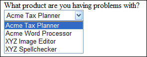
Figure 11.1 shows an example of a drop-down list in an HTML web page.
When using the DropDownList Web control, you must specify the drop-down list’s list items. The list items are the allowable choices that the user can select from. Each individual option in the list of choices is a list item.
There are two ways to specify a DropDownList Web control’s list items. This first method, which we’ll examine in this hour, is to enter the list items by typing them in, one after another. This approach works well if you know in advance what list items the user should be presented with. For example, if you are using a DropDownList Web control to present the user with a list of the 50 states in the United States, this method is sufficient.
Imagine, however, that you wanted to populate the choices shown in the DropDownList Web control based on some external input. An online banking website, for example, might allow customers to have more than one account, such as a savings account, a checking account, a money market account, and so on. Some customers may have only a checking account, whereas others may have checking and savings accounts.
When the user first logs on to the website, you might want to have the user select which of her accounts (assuming she has multiple accounts) she wants to start working with. These options could be presented in a DropDownList Web control. However, the accounts shown depend on what accounts the customer has opened with the bank. Therefore, the list items shown in the DropDownList Web control depend on external input—namely, the currently logged on user’s open accounts.
To handle situations like this, you can store the list items in a database. Then, when using the DropDownList Web control, you can indicate that the list items to be displayed in the drop-down list should come from the database. We’ll examine this mode of specifying list items in Hour 17, “Working with Data-Bound DropDownLists, RadioButtons, and CheckBoxes.”
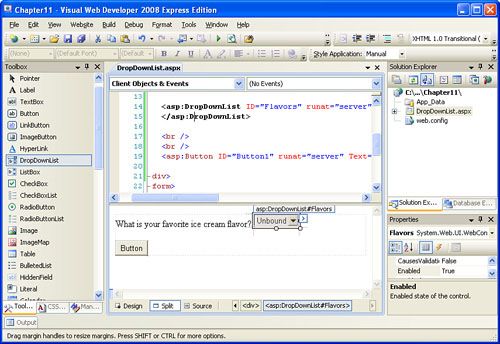
To demonstrate using a DropDownList Web control and adding list items to it, create a new ASP.NET page named DropDownList.aspx. Type in the text What is your favorite ice cream flavor? and then drag a DropDownList Web control from the Toolbox onto the page. Set the DropDownList control’s ID property to Flavors.
Watch Out!
Be certain that you add a DropDownList Web control to the ASP.NET web page, not a ListBox Web control. The DropDownList Web control allows the user to select precisely one item from a list of acceptable ones. The ListBox Web control, on the other hand, allows the user to select zero or more list items. (We will not cover the ListBox Web control in this book.)
Next, add a Button Web control beneath the DropDownList. At this point your screen should look similar to Figure 11.2.
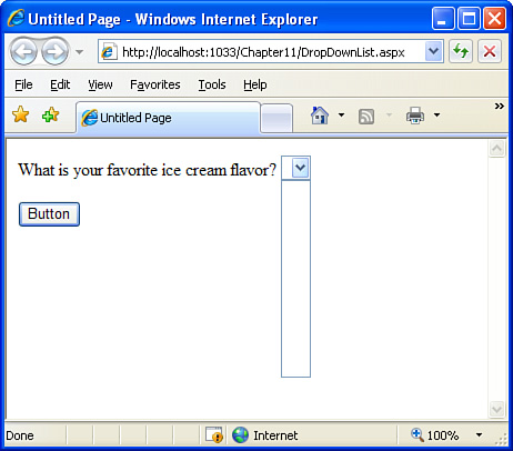
At this point we’ve yet to add any list items to the DropDownList Web control. If you view the ASP.NET web page through a browser at this point, you’ll be presented with an empty drop-down list, as shown in Figure 11.3.
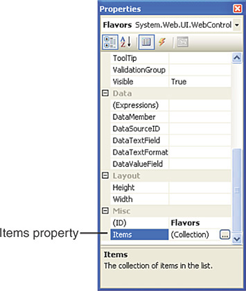
The DropDownList control’s list items are contained in the control’s Items property. To add list items to the DropDownList Web control, we need to edit this property. Select the DropDownList so that its properties are loaded in the Properties window, and then scroll down to the Items property. You should see that the property value currently reads (Collection). As Figure 11.4 shows, if you click this property value, a button with a pair of ellipses will appear to the right of (Collection).
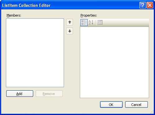
Go ahead and click this button; when you do so, the ListItem Collection Editor dialog box will appear. This dialog box, shown in Figure 11.5, allows you to add and remove list items from the DropDownList Web control.
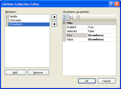
Let’s add the ice cream flavors Vanilla, Chocolate, and Strawberry to the DropDownList. To add a new list item, click the Add button.
After you click the Add button, a new list item is added; its properties are displayed on the right. As Figure 11.6 shows, list items have four properties: Enabled, Selected, Text, and Value.
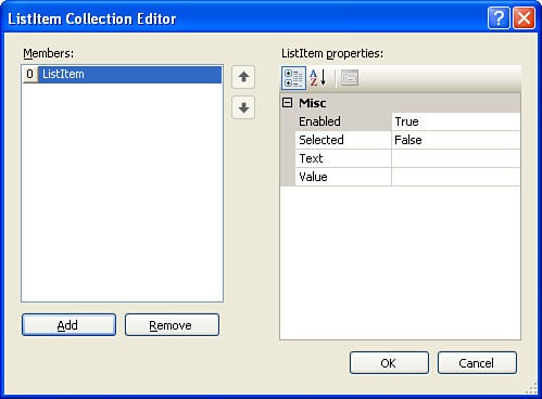
The first property, Enabled, expects a Boolean value (either True or False). Enabled indicates whether the particular list item is present in the rendered drop-down list. For example, if you have a DropDownList Web control with three list items—Vanilla, Chocolate, and Strawberry—and set Chocolate’s Enabled property to False, the drop-down list shown in the user’s browser would have only two items—Vanilla and Strawberry.
The second property, Selected, also expects a Boolean value and indicates whether the list item is the item that is selected by default when the web page loads. Because many list items may be in a drop-down list, and because only one item is shown at a time, the Selected property specifies what list item is selected when the web page is first loaded. For example, when visiting our ASP.NET page, the drop-down list will, by default, show the first option—Vanilla. If you want the Strawberry option to be the item selected by default, you can either make it the first list item or set its Selected property to True.
The Text and Value properties expect string values. The Text property is the text that is displayed to the user in the drop-down list. For our flavors of ice cream, we’d want the Text property to be Vanilla for the first list item, Chocolate for the second, and Strawberry for the third. The Value property, on the other hand, is not seen by the user. It serves as a means to pass along additional information with each list item.
By the Way
The Value property is typically used when displaying list items from a database. In this hour we won’t examine the Value property further; instead, we will be setting only the Text property.
Now that you understand the roles of the four list item properties, go ahead and set the Text property for the list item just added to Vanilla. Add another list item and set its Text property to Chocolate. Finally, add a third list item and set its Text property to Strawberry.
By the Way
If you don’t specify a Value property for a list item, the ListItem Collection Editor automatically sets the Value to the same value as the Text property.
After you have added the Vanilla, Chocolate, and Strawberry list items, the ListItem Collection Editor should look similar to the one shown in Figure 11.7.
Did you Know?
You can rearrange the order of the list items through the ListItem Collection Editor. To do so, click the list item in the left text box whose position you want to alter. Then click the up and down arrows in the middle of the ListItem Collection Editor dialog box to move that particular list item up or down with respect to the other list items.
Finally, click OK on the ListItem Collection Editor dialog box. Note that the DropDownList Web control in the designer has changed so that it shows the word Vanilla as its selected list item.
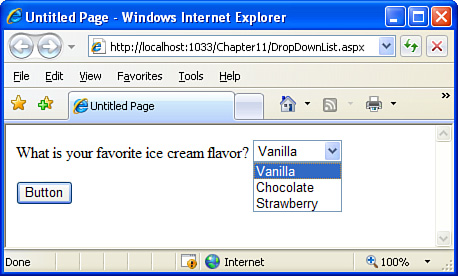
Let’s check out our progress by visiting DropDownList.aspx through a browser (see Figure 11.8). Note that all three ice cream flavors, which weren’t present before we added the three list items via the ListItem Collection Editor, are now listed. (Refer to Figure 11.3 to see the output prior to adding list items.)
By the Way
When you’re visiting the DropDownList.aspx web page, if you choose a list item from the drop-down list (for instance, the Strawberry list item) and then submit the form by clicking the button, the page will be posted back and the Strawberry item will remain selected. This indicates that the DropDownList Web control maintains the selected item across postbacks, just like the TextBox Web control maintains its Text property value across postbacks.
To have the ASP.NET page take some action when the form is submitted, we need to create a Click event handler for the Button Web control.
For now, let’s just output the ice cream choice selected by the user in a Label Web control. To facilitate this, add a Label to DropDownList.aspx, setting its ID property to Results and clearing out its Text property. Also, set the Button Web control’s ID property to SubmitButton and its Text property to “Click Me.”
Next, double-click the Button Web control. This will, as you know, add an event handler for the Button’s Click event. Add the following line of code to the event handler:
Results.Text = "You like " & Flavors.SelectedItem.Text
As this source code illustrates, the DropDownList Web control’s selected list item can be accessed using
DropDownListID.SelectedItemRecall that each list item has the properties Enabled, Selected, Text, and Value. So, to retrieve the Text property, we use
DropDownListID.SelectedItem.TextIf we wanted to work with the Value property, we could use
DropDownListID.SelectedItem.ValueBy the Way
In addition to the Enabled, Selected, Text, and Value properties of the DropDownList Web control’s SelectedItem property, you may have noticed a fifth property: Attributes. You can use this property to set HTML attributes in the markup rendered by the DropDownList Web control. This property is rarely needed in practice, so we won’t discuss it further.
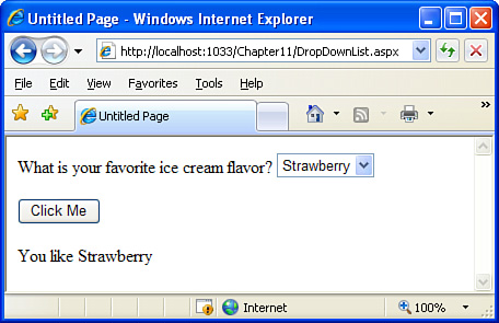
After you have added the code to the Button Web control’s Click event handler, view the page through a browser. When the page loads, select a particular flavor and click the Click Me button. This will cause the form to postback, at which point you should see the message “You like flavor” (where flavor is the ice cream flavor you selected from the drop-down list).
Figure 11.9 shows DropDownList.aspx after the Strawberry flavor has been selected and the Click Me button has been clicked.
The DropDownList Web control has a handful of formatting properties. These formatting properties function the same way as those found in the Label and TextBox Web controls. Table 11.2 lists these formatting properties.
Table 11.2. The Formatting Properties of the DropDownList Web Control
Property | Description |
|---|---|
| Specifies the background color of the drop-down list. |
| Specifies the font properties for the text entered by the user into the drop-down list. Recall that the |
| Specifies the color of the text in the drop-down list. |
By the Way
You may have noticed that Table 11.2 is missing some of the formatting properties examined in earlier hours, namely the border-related properties. Although these are, technically, properties of the DropDownList Web control, you won’t find them in the Properties window in Visual Web Developer.
These border-related formatting properties are omitted from the Properties window because most browsers do not render border-related CSS settings for drop-down lists.
Radio buttons offer an alternative means for choosing one option from a list of allowable choices. You have probably seen and used radio buttons on web pages before. Radio buttons are small circles that, when selected, have a black circle displayed within them. See Figure 11.10.

Radio buttons can be grouped into a series of related radio buttons. In a related group of radio buttons, only one of the radio buttons from the group can be selected at a time. For example, if there are three related radio buttons and the first one is selected, neither the second nor the third one can be selected; if the second is selected, neither the first nor the third one can be selected; and so on. Another way to put it is that related radio buttons are mutually exclusive.
To create a radio button in an ASP.NET page, use the RadioButton Web control. The RadioButton Web control, when rendered, produces the HTML for creating a single radio button. Therefore, if the user is to select one option from a list of three, for instance, we must add three RadioButton Web controls to the page.
Create a new ASP.NET page named RadioButton.aspx. This page will function like the DropDownList.aspx page, prompting the users to select their favorite ice cream flavor.
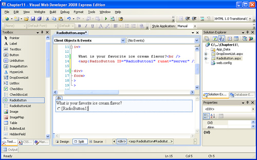
After you creating the new ASP.NET page, type in the text What is your favorite ice cream flavor?. Beneath this text, add the first RadioButton Web control to the page. The designer displays the RadioButton control as a radio button followed by the value of the RadioButton control’s ID property (in brackets).
By the Way
You may have noticed that the Toolbox contains both a RadioButton Web control and a RadioButtonList Web control. The RadioButtonList Web control is used when the options for the radio buttons are stored in a database. We will look at using the RadioButtonList Web control in Hour 17.
Figure 11.11 shows the designer after the first RadioButton Web control has been added.
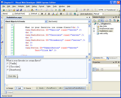
Now change the ID property of the RadioButton Web control you just added from RadioButton1 to Vanilla. Add two more RadioButton Web controls, each one beneath the other, and set their ID properties to Chocolate and Strawberry. Finally, add a Button Web control beneath all three RadioButton Web controls. Set the Button’s ID property to SubmitButton and its Text property to “Click Me”.
Figure 11.12 shows Visual Web Developer after the additional RadioButton controls and the Button have been added.
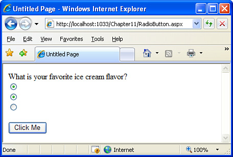
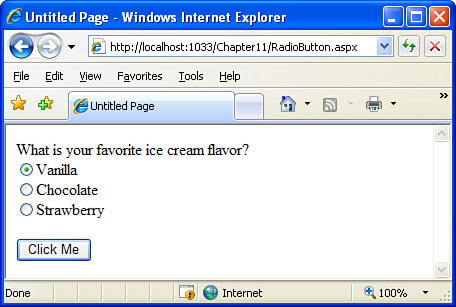
Take a moment to view the RadioButton.aspx ASP.NET web page through a browser. As you do this, take note of two things. First, there are only three radio buttons and no text explaining what each radio button represents. Second, you can select more than one radio button. (To see this, click the first radio button and then click the second—both radio buttons will be selected.) Figure 11.13 shows the RadioButton.aspx web page when viewed through a browser, highlighting these two issues.
As Figure 11.13 shows, there is no text next to the radio buttons. We need to add some text explaining what choice the resulting radio button represents. To accomplish this, set the RadioButton Web control’s Text property to the appropriate text. For the RadioButton.aspx web page, set the first RadioButton Web control’s Text property to “Vanilla,” the second’s to “Chocolate,” and the third’s to “Strawberry.” After you do this, your screen should look similar to Figure 11.14.
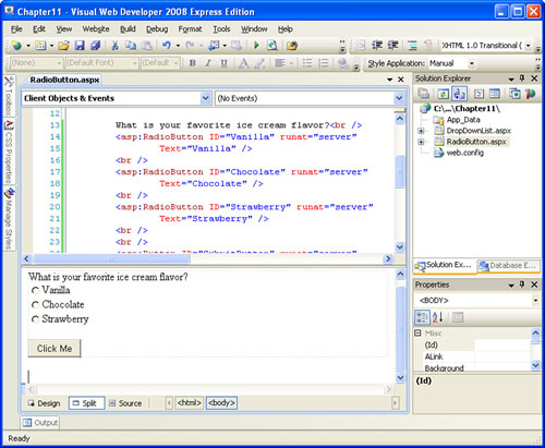
Now we need to group the three RadioButton Web controls so that the user can select only one option from the three. The RadioButton Web control contains a string property named GroupName. Those RadioButton Web controls on a web page that have the same value for their GroupName properties are considered to belong to the same group. Therefore, to group the three RadioButton Web controls (so that the user can select only one flavor of the three), set the GroupName property for the three RadioButton Web controls to the value Flavors.
By the Way
What value you use for the GroupName property isn’t important; what matters is that all related RadioButton Web controls have the same GroupName value. We could have set the GroupName property of all three RadioButton Web controls to “ScottMitchell,” and the result—the user now being able to select only one of the three radio buttons—would be the same.
View the RadioButton.aspx web page through a browser. Now that we’ve specified the Text and GroupName properties for each of the three RadioButton Web controls, each radio button includes descriptive text and the three radio buttons are mutually exclusive. Figure 11.15 shows the page when visited through a browser.
Adding the RadioButton Web controls to the ASP.NET page, setting their Text properties, and making them mutually exclusive is only half of the battle in collecting and processing user input via radio buttons. The other half is determining what option the user selected. Each RadioButton Web control has a Checked property, which returns True if the RadioButton control is selected, False otherwise.
Therefore, to determine if the Vanilla RadioButton control was selected, we can use an If statement like this:
If Vanilla.Checked then
  'The vanilla radio button was selected.
End If
Let’s have this page display the flavor the user chose using a Label Web control, much like we did with the DropDownList Web control example earlier in this hour. Add a Label to the page, clear out its Text property, and set its ID property to Results.
Next, create an event handler for the Button control’s Click event and add the code shown in Listing 11.1 to it.
Example 11.1. The Code for the Button’s Click Event Handler
1:  If Vanilla.Checked then
2:    Results.Text = "You like Vanilla"
3:  ElseIf Chocolate.Checked Then
4:    Results.Text = "You like Chocolate"
5:  ElseIf Strawberry.Checked Then
6:    Results.Text = "You like Strawberry"
7:  End If
The code in Listing 11.1 starts by checking to see if the first RadioButton Web control, Vanilla, was selected (line 1). If it was (that is, if Vanilla.Checked is True), then the Results Label Web control has its Text property set to “You like Vanilla” on line 2. Similarly, if Chocolate was the selected RadioButton, then the Results Label’s Text property is set to “You like Chocolate” (lines 3 and 4). Finally, if the Strawberry RadioButton control is checked, “You like Strawberry” is displayed (lines 5 and 6).
Did you Know?
Realize that all three conditionals—Vanilla.Checked, Chocolate.Checked, and Strawberry.Checked—may be False. This case occurs if the user does not select a radio button before clicking the Click Me button. If you want to ensure that at least one option in a radio button will be selected, set one of the RadioButton control’s Checked properties to True. Doing so will cause the browser to select that radio button when the page loads, thereby ensuring that one of the radio buttons in the group will be selected.
Just like the DropDownList, TextBox, and Label Web controls, the RadioButton Web control offers the same set of formatting properties. As you may have already guessed, all Web controls contain these properties. (For this reason I won’t mention the formatting properties when discussing future Web controls.)
In the “Examining the Different Types of User Input Classifications” section at the beginning of this hour, we examined three classes of user input. The most restrictive class of user input was the Boolean input class, as it is input that can be answered in only one of two ways. The check box is an ideal candidate for collecting user input that falls into this category. The check box, as you’ve no doubt seen in use before, is a square box that can be checked or unchecked.
Check boxes can also be used for presenting a list of options from which the user can select multiple choices. In our previous two examples—DropDownList.aspx and RadioButton.aspx—users can select only one flavor of ice cream as their favorite. If we use three check boxes, however, users can select zero, one, two, or three flavors.
The CheckBox Web control adds a check box to an ASP.NET page. Like the RadioButton Web control, a single CheckBox Web control displays a single check box, so to create a page with three check boxes, for example, we must add three CheckBox Web controls.
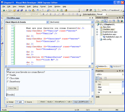
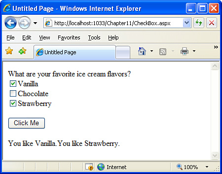
Let’s create an ASP.NET page to demonstrate using the CheckBox Web control. Create a new page named CheckBox.aspx. This web page will be similar to the previous two examples in that we will be prompting users for their favorite ice cream flavors. With check boxes, however, users will be able to choose more than one flavor if they so desire.
After you have created the new ASP.NET page, type in the text What are your favorite ice cream flavors?. Next, drag three CheckBox Web controls from the Toolbox onto the page, one after another. Place a Button Web control beneath the CheckBox controls and a Label Web control underneath the Button.
By the Way
In addition to the CheckBox Web control, the Toolbox includes a CheckBoxList Web control. The CheckBoxList Web control generates a list of check boxes from data found in a database. We’ll examine using the CheckBoxList in Hour 17.
Set the properties for the Web controls we just added. First, clear the Label Web control’s Text property and set its ID to Results. Next, set the Button control’s Text property to “Click Me” and its ID property to SubmitButton. For the three CheckBox Web controls, set their Text and ID properties just like we did for the three RadioButton Web controls in the previous example: set the first CheckBox Web control’s Text property to Vanilla and its ID to Vanilla; set the second CheckBox Web control’s Text property to Chocolate; and so on.
After you have set these Web controls’ properties, your screen should look similar to Figure 11.16.
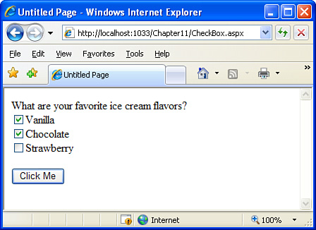
Take a moment to view CheckBox.aspx through a browser. In Figure 11.17 you can see that the page lists three check boxes and that more than one of the three check boxes can be checked.
To determine what CheckBox Web controls have been checked, we use the same syntax as with the RadioButton Web controls, namely:
CheckBoxID.CheckedThe Checked property returns True if the check box is checked, False otherwise. Consequently, to determine if the Vanilla check box is checked, the following code will suffice:
If Vanilla.Checked then
  'The vanilla CheckBox is checked
End If
Add an event handler for the Button Web control’s Click event. You may be tempted to use the same code that was used in Listing 11.1 for the RadioButton Web controls example. However, if you look back over Listing 11.1, you will see that ElseIf statements are used on lines 3 and 5, which means the conditional statements following them will be evaluated only if the previous conditional statement was False. To put it another way, line 3 in Listing 11.1 will be evaluated only if the condition on line 1—Vanilla.Checked—is False.
Therefore, the code in Listing 11.1 displays only the name of the first selected ice cream flavor. This is not a problem for the RadioButton Web control example because the user can select only one of the three radio buttons. However, with check boxes we need to allow for multiple ice cream flavors to be listed in the Label Web control because multiple ice cream flavors may be selected. Therefore we need to use three separate If statements.
Listing 11.2 contains the source code to add to the Click event handler.
Example 11.2. The User’s Ice Cream Preferences Are Displayed
 1:   'Clear out the value of the results Text property
 2:   Results.Text = ""
 3:
 4:   If Vanilla.Checked then
 5:     Results.Text &= "You like Vanilla."
 6:   End If
 7:
 8:   If Chocolate.Checked then
 9:     Results.Text &= "You like Chocolate."
10:   End If
11:
12:   If Strawberry.Checked then
13:     Results.Text &= "You like Strawberry."
14:   End If
The code in Listing 11.2 starts by clearing out the Results Label Web control’s Text property (line 2). Next, on lines 4, 8, and 12, the Checked property is examined for the three CheckBox Web controls. If the check box is checked, an appropriate message is concatenated with the current value of the Results Label control’s Text property.
For example, on line 8, the Chocolate.Checked property is examined. If this property returns True, that means the Chocolate check box was selected, and line 9 is executed. On line 9, the Results Label Web control’s Text property has its current value concatenated with the string “You like Chocolate.”
By the Way
Recall from Hour 5, “Understanding Visual Basic’s Variables and Operators,” that the &= operator takes the value of the variable on its left side, concatenates it with the expression on the right side, and then assigns the resulting concatenated value to the left-side variable. That is, the following two statements are equivalent:
Variable = Variable & "Some string"
and
Variable &= "Some string"Figure 11.18 shows the CheckBox.aspx web page when viewed through a browser. Here the visitor has selected multiple check box choices and submitted the form. Note that all of the user’s checked choices are listed in the Label Web control at the bottom of the web page.
In this hour we examined three Web controls commonly used to collect user input: the DropDownList, RadioButton, and CheckBox Web controls. These Web controls are typically used when the user’s input is restricted to either a subset of available options or just one of two options.
When adding a DropDownList Web control to an ASP.NET page, we need to explicitly specify those list items that should appear in the drop-down list. Fortunately, this is a simple task through Visual Web Developer’s ListItem Collection Editor dialog box (refer to Figure 11.5). In the ASP.NET source code portion, the list item that was selected can be determined via the DropDownList Web control’s SelectedItem property.
Like drop-down lists, radio buttons allow the user to select one option from a series of allowable choices. Specifically, a radio button is needed for each option, and these radio buttons must be made mutually exclusive with one another so that the user can select only one radio button from the group of related radio buttons. The RadioButton Web control creates a single radio button. To group multiple RadioButton Web controls (so that the user can select only one radio button from the group), give each grouped RadioButton control the same value for its GroupName property. Use the RadioButton Web control’s Checked property to determine whether the user selected a particular RadioButton control.
With radio buttons and drop-down lists, the user can choose only one option from a list of options. A list of check boxes, however, permits the user to choose multiple options. Use the CheckBox Web control to render a check box in the browser. Like the RadioButton, the CheckBox Web control has a Checked property that indicates whether the check box was selected.
Now that we’ve examined the most common Web controls used for collecting input, we’re ready to learn how to ensure that the entered input is valid. For example, if users are prompted to enter their age, the value entered should be numeric and within an acceptable range (for instance, between 0 and 110). In the next hour we’ll examine ASP.NET’s validation Web controls, which are Web controls designed to validate input data.
If I use a DropDownList or series of RadioButton Web controls to let the user choose one option from, for example, 50 legal choices, does this mean I have to enter in all 50 choices by hand? | |
With what you know now, the answer is yes. In Hour 17, we will examine how to populate the DropDownList Web control with data from a database. Furthermore, we will see how to create a series of radio buttons or check boxes from database data using the RadioButtonList and CheckBoxList Web controls. | |
I have created a DropDownList with 10 list items on an ASP.NET page. Now I want to provide this same DropDownList Web control on a different ASP.NET page. Obviously, I can accomplish this by creating a new DropDownList control on the second page and reentering the 10 options by hand. Is there an easier or quicker way? | |
If you want to copy a DropDownList Web control and its list items from one ASP.NET page to another, start by opening both pages in Visual Web Developer. From the designer, select the DropDownList from the source page and copy it to the Clipboard by pressing Ctrl+C or by going to the Edit menu and choosing Copy. Then go to the target page and paste the control in the appropriate location on the page. | |
When I’m displaying a series of radio buttons, none of the radio buttons are selected by default. This means that a user can submit the Web Form without having picked one of the options. How do I require the user to select one of the radio buttons? | |
When a user first visits a page, none of the radio buttons are selected. This means a user can simply not choose one of the options in the group by virtue of not clicking on any radio button in the group. Usually, you want the user to select one of the options. To accomplish this, have one of the radio buttons in the group selected by default. In Visual Web Developer, click the RadioButton Web control that you want selected by default. This will load its properties in the Properties window. From there, set the RadioButton control’s Keep in mind that only one of the radio buttons in the group can be selected by default. If you set the |