The basics of site navigation with ASP.NET
Creating and defining your website’s structure
Showing the user’s current location in the site’s structure using a breadcrumb
Displaying the site’s structure using the TreeView Web control
Using the Menu Web control
At its most granular level, a website is nothing more than a collection of discrete web pages. Typically these pages are logically related and categorized in some manner. For example, Amazon.com has its site broken into product categories, such as books, music, DVDs, and so forth. Each of these sections is further categorized by genre. The classification of a website’s pages into logical categories is defined by a site map.
After a site map has been defined, most web developers create the site navigation. The site navigation is the collection of user interface elements that assist users in browsing the site. Common navigation elements include menus, treeviews, and breadcrumbs. These user interface elements serve two tasks: They let the users know where in the site they are currently visiting, and they make it easy for the users to quickly jump to another part of the site.
ASP.NET provides a means to specify a hierarchical site map and includes Web controls for displaying site navigation controls based on a structure specified by the site map. The site map is implemented as an XML file that defines the logical sections of the site and optionally ties each section to a particular URL.
By the Way
XML, which stands for eXtensible Markup Language, is a technology for expressing data in a text-based format using elements that can contain attributes and text content, much like the static HTML and Web controls are expressed through the HTML portion of an ASP.NET page. XML documents, however, are more flexible than HTML’s syntax, allowing the creator of the XML document to define the elements that may appear in the markup. ASP.NET uses a special set of elements in the site map file.
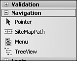
ASP.NET provides three navigation Web controls:
SiteMapPath—. This Web control provides a breadcrumb, which is a single line of text showing the user her location in the website’s structure. For example, at an online bookstore, if a user had drilled down to Visual Studio Hacks, the breadcrumb might look like Home, Computers, Programming, Visual Studio Hacks, with each section—Home, Computers, and so forth—rendered as links back to the previous section. A breadcrumb allows the user to quickly see where she is in the site and to navigate back through the logical hierarchy. (Figure 20.7 shows the SiteMapPath control when viewed through a browser.)
TreeView—. This Web control provides a hierarchical view of the site’s structure. For an online bookstore, the top level would contain the main categories—Computers, Fiction, History, and so on—and each of those main categories could be expanded to show subcategories. (Figure 20.8 shows the TreeView control when viewed through a browser.)
Menu—. A menu offers the same data as in the treeview; the only difference is in how the data is displayed. The treeview renders as an expandable/collapsible tree, whereas the menu is composed of menu items and submenus. (Consult Figure 20.11 to see the Menu control in action.)
Because the navigation Web controls’ contents are rendered based on the page being visited and the contents of the site map, updating the site map immediately updates the navigation controls used throughout the site. If you want to add a new section to your website, create the appropriate ASP.NET pages and then tie those new pages into the site map. As soon as these changes are made and saved, the navigation Web controls used throughout the site will automatically be updated to include this new section!
Before we can start using the navigation Web controls, we need to define our website’s structure in a site map. In the next section we create the site map file. In the sections after that, we examine each of ASP.NET’s three navigation Web controls.
Although a very small and trivial website composed of only a handful of pages might not have an easily identifiable site structure, all sufficiently large websites possess a logical structure that is usually easy to identify. The contents of the site, whether items for sale, discussions in online forums, or informational articles, can be classified in some manner. These classifications define the structure of a site.
Because we’ve yet to create any multipage websites, let’s take a minute to build a website with a number of related web pages. These pages won’t do anything interesting; rather, we’ll use them simply to create a mock website structure. For this example, imagine that we are building an online bookstore.
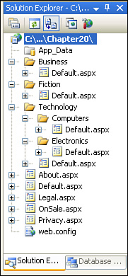
Start by creating a new ASP.NET website project in Visual Web Developer. This new project should already include one ASP.NET page, Default.aspx. (If you used a project type that does not include Default.aspx, add it now.) Next, add four new ASP.NET web pages: OnSale.aspx, Legal.aspx, Privacy.aspx, and About.aspx. Add three folders to the website: Business, Fiction, and Technology. In each of these folders, add a single ASP.NET page, Default.aspx. Finally, in the Technology folder, add two subfolders, Computers and Electronics, adding a Default.aspx page to each of these subfolders.
Did you Know?
To add a new folder, right-click the project name in the Solution Explorer and choose the New Folder menu option. To add a web page to a particular folder, right-click that folder in the Solution Explorer and choose Add Item.
After you have added these web pages and folders, your Solution Explorer should look similar to Figure 20.1.
In each of these pages, add a short bit of text in the page, providing a summary of the page’s functionality. For example, in the root directory’s Default.aspx page, I put Welcome to my online book store!; in OnSale.aspx, I used This lists the books currently on sale.; in the Business folder’s Default.aspx page, I added This lists the books in the Business genre. Add a similar brief summary for each page in the site.
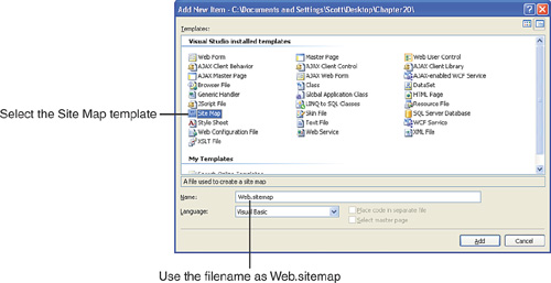
Now that we have created the pages for our mock website, we’re ready to add the site map. To create the site map, follow the same steps as you normally would to add an ASP.NET web page to the project—right-click the project name in the Solution Explorer and choose the Add Item menu option. From the Add Item dialog box, choose the Site Map option (see Figure 20.2) and click the Add button. This adds a site map named Web.sitemap to your project.
Watch Out!
When adding a site map to your project, put the site map in the root directory and leave the name of the file as Web.sitemap. If you place this file in another folder or choose a different name, the navigation Web controls won’t be able to find the site map because, by default, they look for a file named Web.sitemap in the root directory.
After you have added the site map, open it by double-clicking the Web.sitemap file in the Solution Explorer. Listing 20.1 shows the default site map markup.
Example 20.1. The Default Content of the Site Map
1: <?xml version="1.0" encoding="utf-8" ?>
2: <siteMap xmlns="http://schemas.microsoft.com/AspNet/SiteMap-File-1.0" >
3:     <siteMapNode url="" title=""  description="">
4:          <siteMapNode url="" title=""  description="" />
5:          <siteMapNode url="" title=""  description="" />
6:     </siteMapNode>
7: </siteMap>
The site map file is an XML file that expresses the logical structure of the website. To define the site map, you need to edit this file manually. Don’t forget that XML documents impose strict formatting rules. One rule is that XML is case sensitive. If you try to add a <siteMapNode> element using improper casing, such as <SITEMapNode>, you’ll get an exception when attempting to use the navigation Web controls. Another rule of note is that all elements must have opening and closing tags. Notice how the <siteMap> element has an opening tag on line 2 and a closing tag on line 7. The <siteMapNode> element on line 3 has its opening tag there and its closing tag on line 6. The two <siteMapNode> elements on lines 4 and 5 don’t have an explicit closing tag because they use the shorthand notation, />.
By the Way
An XML element with no inner content can have its closing tag expressed in one of two ways: verbosely, such as <myTag attribute1="value1" ...></myTag>, or more tersely, using /> like so: <myTag attribute1="value1" ... />.
The site map begins with a <siteMap> element (line 2), which contains a number of <siteMapNode> elements within. The url, title, and description attributes provide information about a particular section of the website’s structure, and the location of the <siteMapNode> element relative to the other <siteMapNode> elements determines the position of the section relative to other sections.
If this isn’t clear yet, don’t worry; a more concrete example ought to help.
Did you Know?
Visual Web Developer notifies you if you enter invalid XML when creating the site map. If you enter an element that the site map does not know about, either because of a misspelling or improper casing, Visual Web Developer underlines the suspect tag in blue. If you forget to close an element, Visual Web Developer underlines the element in red.
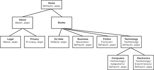
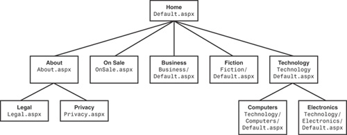
Given the mock website we’ve created, let’s define a site map that exhibits the logical hierarchy shown in Figure 20.3. Each node in the hierarchy shows the title and URL for the section along with the section’s place in the hierarchy.
To implement this site structure in an ASP.NET site map, start by clearing out the <siteMapNode> elements from the default site map (remove lines 3 through 6 in Listing 20.1). Next, begin at the top section and work your way down the hierarchy, adding a <siteMapNode> for each section. Those sections that appear beneath a given section in the hierarchy will be nested within a <siteMapNode> element.
To put these concepts into practice, add a <siteMapNode> element for the Home section, like so:
<siteMapNode url="Default.aspx" title="Home" description="" />
Notice that I used the section URL in Figure 20.3 as the value for the url attribute and the section title as the title attribute value. I am going to leave the description attribute blank, but feel free to enter a meaningful value here if you like. Also, note that for the Home <siteMapNode> element, I used the terse closing tag syntax, />. After you add this element, your site map should look like this:
<?xml version="1.0" encoding="utf-8" ?>
<siteMap xmlns="http://schemas.microsoft.com/AspNet/SiteMap-File-1.0" >
   <siteMapNode url="Default.aspx" title="Home"  description="" />
</siteMap>
Because the next sections in the hierarchy exist as descendents of the Home section, the corresponding <siteMapNode> elements will be nested within the Home <siteMapNode> element. There are five such sections, requiring five <siteMapNode> elements:
<siteMapNode url="About.aspx" title="About" description="" />
<siteMapNode url="OnSale.aspx" title="On Sale" description="" />
<siteMapNode url="Business/Default.aspx" title="Business" description="" />
<siteMapNode url="Fiction/Default.aspx" title="Fiction" description="" />
<siteMapNode url="Technology/Default.aspx" title="Technology" description="" />
Watch Out!
XML’s formatting rules prohibit the characters <, >, &, and " from appearing within an element’s text content or as the value for an attribute. If you want to include any of these characters in the title or description attributes, you instead need to use <, >, &, or ", respectively. For example, if you wanted to have the title attribute for a site map node be Business & Investing, you need to use the text Business & Investing.
These five <siteMapNode> elements should be nested within the Home <siteMapNode> element, resulting in the following site map:
<?xml version="1.0" encoding="utf-8" ?>
<siteMap xmlns="http://schemas.microsoft.com/AspNet/SiteMap-File-1.0" >
   <siteMapNode url="Default.aspx" title="Home"  description="">
      <siteMapNode url="About.aspx" title="About"  description="" />
      <siteMapNode url="OnSale.aspx" title="On Sale"  description="" />
      <siteMapNode url="Business/Default.aspx" title="Business" description="" />
      <siteMapNode url="Fiction/Default.aspx" title="Fiction" description="" />
      <siteMapNode url="Technology/Default.aspx" title="Technology" description="" />
   </siteMapNode>
</siteMap>
Notice how the Home <siteMapNode>’s closing tag was changed from the terse dialect (/>) to the more verbose form (</siteMapNode>). The reason is that the verbose form is needed when an element contains inner content; because the Home <siteMapNode> element now contains children elements, we have no choice but to use the verbose syntax.
Watch Out!
Each <siteMapNode> element must contain a title attribute; the url and description attributes are optional. Furthermore, each provided url attribute must be unique. You cannot have two <siteMapNode> elements with the same value.
If you continue this process through the remainder of the sections in Figure 20.3, you’ll eventually wind up with the site map shown in Listing 20.2.
Example 20.2. The Completed Site Map Contents
 1: <?xml version="1.0" encoding="utf-8" ?>
 2: <siteMap xmlns="http://schemas.microsoft.com/AspNet/SiteMap-File-1.0" >
 3:     <siteMapNode url="Default.aspx" title="Home" description="">
 4:       <siteMapNode url="About.aspx" title="About" description="">
 5:         <siteMapNode url="Legal.aspx" title="Legal" description="" />
 6:         <siteMapNode url="Privacy.aspx" title="Privacy" description="" />
 7:       </siteMapNode>
 8:       <siteMapNode url="OnSale.aspx" title="On Sale" description="" />
 9:       <siteMapNode url="Business/Default.aspx" title="Business" description="" />
10:       <siteMapNode url="Fiction/Default.aspx" title="Fiction" description="" />
11:       <siteMapNode url="Technology/Default.aspx" title="Technology"description="">
12:         <siteMapNode url="Technology/Computers/Default.aspx"title="Computers" description="" />
13:         <siteMapNode url="Technology/Electronics/Default.aspx"title="Electronics" description="" />
14:       </siteMapNode>
15:     </siteMapNode>
16: </siteMap>
By the Way
Although a page developer can use folders to help organize the files in his website, the site’s structure as defined in the site map need not model this folder hierarchy. For example, in the site map hierarchy shown in Figure 20.3, the Privacy and Legal sections are subsections of the About section, even though About.aspx, Privacy.aspx, and Legal.aspx all exist in the same folder.
Often, though, there is a correlation between the site’s folder structure and the site map. The book genre sections illustrate this: Technology is one section with subsections for Computers and Electronics, and there’s a Technology folder in the website with Computers and Electronics subfolders.
ASP.NET provides three navigation Web controls for displaying a navigation user interface based on the site map: the SiteMapPath, the TreeView, and the Menu. The SiteMapPath control, which is the focus of discussion in this section, displays a breadcrumb, showing the user where in the site he is currently visiting. All three of these controls are available from the Navigation section of the Toolbox (see Figure 20.4).
Watch Out!
If you want to work with the SiteMapPath—or any of the other navigation Web controls, for that matter—it’s imperative that a legally formatted site map exist in the root directory and be named Web.sitemap. If you followed along with the steps in the previous section, you should have, at this point, a valid Web.sitemap file in your root directory containing the contents in Listing 20.2.
Did you Know?
Breadcrumbs are especially useful for sites that have a particularly deep structural hierarchy. As users drill down through the levels of hierarchy in a site, they can easily become disoriented. A breadcrumb control shows them where in the hierarchy they are currently visiting and provides a means to quickly move back to a higher level, if necessary.
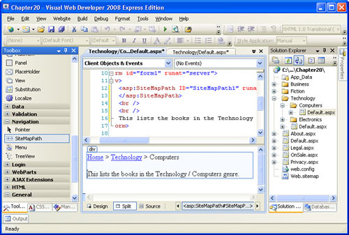
To add the SiteMapPath control to an ASP.NET page, drag it from the Toolbox onto the page. Take a moment to add the SiteMapPath control to the Default.aspx pages in the root directory, in the Technology folder, and the Computers subfolder. When we view the SiteMapPath in the pages’ Design views, the SiteMapPath control shows the layout based on the values in the site map. Figure 20.5 shows the Visual Web Developer Design view for the Default.aspx page in the Computers subfolder.
By the Way
If you do not see the SiteMapPath rendered in the Visual Web Developer Design view, as shown in Figure 20.5, one of several things could be awry. If you see a gray box with a warning message, the Web.sitemap file contains invalid XML, returning to the site map and fixing the specified problems should remedy this situation.
If you see Root Node > Current Node > Parent Node in the Design view, you likely have not created a site map (or you have not named it Web.sitemap and placed it in the root directory). If you have a properly named and placed site map file, go to the View menu and choose Refresh.
At this point we’ve successfully added three SiteMapPath controls to our ASP.NET website! That was easy. Take a minute to try out these three pages in a browser. The SiteMapPath renders the same as in the Design view; clicking the links in the breadcrumb whisks you back to the appropriate section. (Refer to Figure 20.7 to see the SiteMapPath control on Technology/Computers/Default.aspx when viewed through a browser.)
Like most of the Web controls we’ve examined throughout this book, the SiteMapPath control has a number of properties that can be used to customize its appearance. These properties can be set manually through the SiteMapPath’s properties listed in the Appearances and Styles sections of the Properties window.
To understand how these properties affect the rendered appearance of the SiteMapPath, we first need to discuss the components of the SiteMapPath. The SiteMapPath builds up a list of nodes and path separators. A node is a section in the site map hierarchy (a <siteMapNode> element); the path separator is what separates each node. For example, the SiteMapPath in the Technology/Computers/Default.aspx page has three nodes: Home, Technology, and Computers. Each node is separated by a path separator: >, by default. There are three possible types of nodes:
Root Node—. A SiteMapPath contains a single Root Node; it’s the node that contains the section at the top of the site map hierarchy. In all pages that use the site map in Listing 20.2, the Root Node is Home.
Current Node—. A SiteMapPath contains a single Current Node. The Current Node is the section that corresponds to the page the user is visiting. In the SiteMapPath in the
Technology/Computers/Default.aspxpage, the Current Node is Computers.General Nodes—. A SiteMapPath contains zero to many General Nodes, depending on the depth of the Current Node in the site map hierarchy. In the
Technology/Computers/Default.aspxpage, there’s a single General Node, Technology.
Table 20.1 lists the SiteMapPath’s appearance-related properties, along with a brief description. Some of these properties affect the look and feel of the entire SiteMapPath, whereas others affect particular components of the SiteMapPath, such as only the Current Node or only the path separators.
Table 20.1. The SiteMapPath’s Appearance Properties
Property Name | Description |
|---|---|
| Specify the background and foreground colors for the entire |
| SiteMapPath. |
| Indicate the border settings for the SiteMapPath. |
| Specifies the name of the cascading style sheet (CSS) class to be applied to the SiteMapPath’s rendered HTML element. |
| Specifies the font-related settings for the entire SiteMapPath. |
| Can be one of two values: |
| Specifies the string that separates each node. Defaults to |
| Specifies a Boolean value that indicates whether the Current Node is rendered as a link. Defaults to |
| Specifies the default style for all the nodes in the breadcrumb. Applies to the Root Node, Current Node, and General Nodes. This and the other style properties have subproperties such as |
| Indicates the appearance settings applied to the Current Node. Any settings here override the |
| Specifies the appearance settings applied to the Root Node. Any settings here override the |
| Indicates the appearance settings applied to the path separator. |
Take a moment to tinker with these properties and note the results in the Design view.
If you don’t trust your artistic skills, the SiteMapPath contains an Auto Format option, just like the GridView and DetailsView controls we examined back in Hour 15, “Displaying Data with the Data Web Controls.” For some assistance in formatting the SiteMapPath, click the Auto Format link in the control’s smart tag. Figure 20.6 shows the SiteMapPath’s AutoFormat dialog box, and Figure 20.7 shows the SiteMapPath control in Technology/Computers/Default.aspx when viewed through a browser after the AutoFormat dialog box’s Colorful setting has been applied.

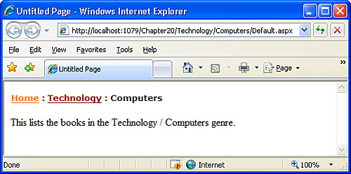
As Figure 20.7 shows, the SiteMapPath control displays only the current section based on the page where the user is visiting and those immediate ancestor sections. Although the breadcrumb interface provided by the SiteMapPath makes it easy for a visitor to pinpoint his location in the site’s navigational hierarchy and navigate further up the hierarchy quickly, it does not enable him to easily jump to any section of the site.
For example, imagine that a visitor comes to our online bookstore’s home page. Although only text exists right now, imagine that the page has links to the various genre pages titled Business Books, Fiction Books, and Technology Books. Our imaginary visitor might click Technology Books, which would take her to the Technology/Default.aspx page, where there might be some technology books listed as well as links to drill down into the subcategories Computer Books and Electronics Books. Suppose that our user clicks the Computer Books link. On this page the SiteMapPath shows Home > Technology > Computers and would list the computer books for sale. However, at this point if the user decides that she wants to look at books on electronics instead, or if she realizes technology books aren’t her thing and she’d rather browse the fiction titles, she has to click her browser’s Back button or go back via the breadcrumb to the appropriate parent level, and then drill down into whatever category she’s interested in. The point is, the user can’t jump directly from the computer books page to the electronics books or fiction books pages.
To allow a visitor to quickly hop to any section from any page, we need to use a navigation user interface element that lists the entire site structure. The final two ASP.NET navigation Web controls—the TreeView control and the Menu control—provide this functionality.
The Menu and TreeView controls are similar to the GridView and DetailsView controls examined in Hour 15 in that they require a data source control that contains the data to display. ASP.NET provides a SiteMapDataSource control that automatically retrieves the data from the site map and provides it in a manner that the TreeView and Menu controls can work with. Unlike the SqlDataSource control we used when working with the GridView and DetailsView, the SiteMapDataSource control doesn’t have any wizard or require any configuration on our part.
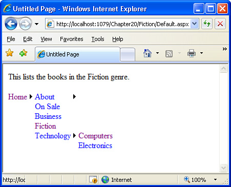
The TreeView control lists the sections of the website as defined in the site map in a collapsible tree. A visitor can quickly see all the sections of the site and his position in the site structure hierarchy. Each node in the tree is rendered as a hyperlink that whisks the user to the appropriate section when clicked.
Let’s add a TreeView to the Home section (Default.aspx in the root folder). To do so, we must first add a SiteMapDataSource control to the page; this control can be found in the Data section of the Toolbox. Next, add the TreeView control to the page and, from its smart tag, specify the data source as the SiteMapDataSource we just added to the page. After the TreeView’s data source has been specified, its appearance in the Design is updated, mirroring the hierarchy expressed in site map.
Take a moment to visit this page through a browser (see Figure 20.8). When trying out this control, notice that you can jump to any section in the site by clicking the appropriate section title in the TreeView. Furthermore, you can expand or collapse the TreeView’s nodes by clicking the + or − icons on the left of those nodes that have child nodes. Also, note that the SiteMapDataSource control does not result in any visual effect in the browser. Like the SqlDataSourceControl examined in previous hours, the SiteMapDataSource simply retrieves data from a source—in particular, the site map—and does not render any HTML.

Like the SiteMapPath control, the TreeView contains a number of appearance-related properties, as well as an Auto Format option, that we can use to highly customize the look and feel of the TreeView. The TreeView is made up of a number of nodes, with each node representing a section defined in the site map. Each node has zero or one parent nodes and zero to many children nodes. For example, in the TreeView shown in Figure 20.8, the Home node has no parent and five children—About, On Sale, Business, Fiction, and Technology. The About node has one parent—Home—and two children—Legal and Privacy. The Business node has one parent—Home—and no children.
The four types of nodes in a TreeView are
Root Nodes—. These nodes have no parent (Home).
Parent Nodes—. These are nodes other than the Root Nodes that have children nodes (About and Technology).
Leaf Nodes—. These nodes have a parent but no children nodes (Legal, Privacy, Business, Fiction, Computers, and Technology).
Selected Node—. The selected node is the one that corresponds to the current page being visited. So when we’re visiting the Home section, the Home node is the Selected Node; when we’re visiting the business books section, Business is the Selected Node.
Each of these types of nodes has style properties, which can be found in the Styles section of the Properties window. These style properties, which have subproperties like BackColor, BorderColor, BorderWidth, BorderStyle, Font, and so on, affect the appearance of these classes of nodes. For example, setting the LeafNodeStyle property’s BackColor subproperty to Red will cause all Leaf Nodes to have a red background color.
In addition to the RootNodeStyle, ParentNodeStyle, LeafNodeStyle, and SelectedNodeStyle style properties, there are two additional node-related style properties: NodeStyle and HoverNodeStyle. NodeStyle specifies the default style applied to all nodes in the TreeView. HoverNodeStyle indicates the style settings to be applied when the user hovers his mouse pointer over a particular node.
Did you Know?
Using the HoverNodeStyle property helps to provide feedback to the visitor, showing him what node he’s currently hovered over. Personally, I like to set the HoverNodeStyle’s ForeColor and BackColor properties to complementary values, both of which stand out from the default node style.
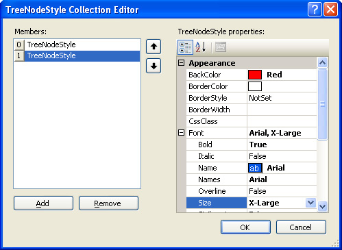
The Styles section in the Properties window also includes a LevelStyles property. This property allows you to specify style information for particular levels of the TreeView, with the first level being the set of Root Nodes, the second level being those nodes that are children of the first-level nodes, the third level being the children of the second-level nodes, and so on. To specify a unique style for each level, go to the LevelStyles property in the Properties window and click the ellipses icon to the right of the property name. This brings up the TreeNodeStyle Collection Editor dialog box, from which you can define the style for each level.
Click the Add button to add a new level to the list of levels on the left. For each level, you can specify its appearance-related properties from the list on the right. Note that the topmost level in the list on the left corresponds to the first level (the set of Root Nodes), the second level from the top corresponds to the second level (the children of the Root Nodes), and so on. Figure 20.9 shows the TreeNodeStyle Collection Editor dialog box for a TreeView control that has the style settings made for the first two levels.
In addition to the properties in the Styles section of the Properties window, the TreeView contains a number of styles in the Appearances section worth noting. Of course, the usual properties exist—BackColor, CssClass, Font, and so on—but there are also a number of TreeView-specific properties. These appearance-related TreeView-specific properties are listed in Table 20.2.
Table 20.2. The TreeView-Specific Appearance Properties
Description | |
|---|---|
| Indicate the tooltip shown to the end user when she hovers the mouse pointer over the collapse or expand icons for a node. Any instances of |
| Specify the image URLs to use for the collapse and expand icons for non-Leaf Nodes (those that can be expanded or collapsed), as well as the image to use for Leaf nodes (those nodes that cannot be expanded or collapsed because they have no children). You can also use the |
| Allows the TreeView’s images to be custom defined or based on a packaged set of predefined images. Set this property to |
| Specifies the number of pixels to indent each level of the TreeView. Defaults to 20. |
| Specifies a Boolean property that indicates whether a node’s text should be wrapped. Defaults to |
| Specifies a Boolean property that indicates whether the expand and collapse icons are shown. Defaults to |
| Specifies a Boolean property that indicates whether lines are drawn between each node and level in the TreeView. This property can also be turned on or off from the TreeView’s smart tag. |
The ImageSet property provides a list of packaged images to display next to each icon. This list includes choices such as WindowsHelp, BulletedList, Events, and Contacts, each providing a different set of images for expand and collapse icons for non-Leaf Nodes, as well as images for the nonexpandable, noncollapsible Leaf Nodes. (Figure 20.10 shows the icons used when the ImageSet property is set to Contacts.) If you want to provide your own images, set ImageSet to Custom and then provide the URLs to your custom images in the CollapseImageUrl, ExpandImageUrl, and NoExpandImageUrl properties.

If you would rather let Visual Web Developer choose the appearance-related property settings, you can always use the Auto Format option, which is available through the TreeView’s smart tag. Figure 20.10 shows the TreeView’s AutoFormat dialog box when choosing the Contacts Auto Format option.
Like the TreeView control, the Menu control displays the entire contents of the site map. Rather than displaying the contents of the site map as a tree, however, the Menu control displays the items using a menu interface. By default, each section defined in the site map is rendered as an item in the menu with submenus used to reflect the hierarchy. To display navigation using a Menu control, we must first add a SiteMapDataSource control to the page.
Let’s add a Menu control to the Default.aspx page in the Fiction folder. Open this page in Visual Web Developer and start by adding a SiteMapDataSource control; next, add the Menu control and bind it to the SiteMapDataSource control just added. After you specify the Menu control’s data source, the Menu will be updated in the Design view to reflect the structure of the site map. By default, the menu shows just the top-level element in the site map hierarchy—Home, for our site map.
After setting the data source, take a minute to view this page in a browser. The menu displays a single, visible menu item, Home. If you move your mouse pointer over the Home item, though, a submenu appears, listing Home’s children nodes: About, On Sale, Business, Fiction, and Technology. If you move your mouse pointer over About or Technology, another submenu appears, listing the appropriate items (see Figure 20.11). Clicking a menu item whisks you to the corresponding section in the site.
A Menu control is composed of both a static and a dynamic portion. The static portion of the menu is always shown when viewing the page, whereas the dynamic portion is shown only when the user interacts with the menu. By default, only the top-level node in the site map is static; all other site map sections are placed in the dynamic portion. In Figure 20.11, only the Home menu item is shown when the page loads; the other sections are displayed only when the user hovers her mouse pointer over the Home menu item.
The number of levels in the site map hierarchy that make up the static portion of the menu can be specified by the Menu control’s StaticDisplayLevels property. The default value for this property is 1. If we change this to 2, however, all the sections in the first and second levels of the site map hierarchy—Home, About, On Sale, Business, Fiction, and Technology—are shown as static menu items. Figure 20.12 shows the Menu control in the Visual Web Developer Design view after the StaticDisplayLevels property has been set to 2.

Now instead of just the Home menu item showing when the page loads, Home, About, On Sale, Business, Fiction, and Technology will be displayed. The third level, which includes Legal, Privacy, Computers, and Electronics, will still be displayed in the dynamic portion. That is, the user will have to hover her mouse pointer over the About menu item to be able to see the Privacy or Legal menu items.
Did you Know?
When the user’s mouse pointer leaves a dynamically displayed submenu, the submenu remains visible for a period specified by the Menu control’s DisappearAfter property. This value defaults to 500 milliseconds, which leaves a dynamic menu displayed for 0.5 seconds after the user’s mouse pointer leaves the submenu. You can increase or decrease this time as needed.
The Menu control contains a wide array of appearance-related properties—far too many to cover in this hour. Rather than enumerate all these properties, let’s instead look at the more germane ones and focus on the concepts rather than the specifics.
By the Way
As always, I encourage you to tinker around with all the Menu control’s properties, not just those that we cover here. Try changing them and observe the effects when viewing and interacting with the menu through a browser. Review the description of the properties using the MSDN Library. (We discussed using the MSDN Library in Hour 3, “Using Visual Web Developer.”)
You should not be surprised that the Menu control has the base set of appearance-related properties: BackColor, ForeColor, Font, and the like. In addition to these properties, it has appearance-related properties for the dynamic and static portions of the Menu. The names of these properties start with either Static or Dynamic, such as StaticItemFormatString and DynamicItemFormatString. The prefix indicates whether the property value applies to the dynamic or static portion of the Menu control.
Table 20.3 lists a number of the Menu control’s appearance-related properties. Figure 20.13 shows a Menu control after a number of these properties have been set.
Table 20.3. The Menu Control Contains Properties That Apply to Its Dynamic and Static Portions
Property Name | Description |
|---|---|
| Specify a Boolean property that indicates whether an image is displayed to show that an item has a submenu. Defaults to |
|
| Specify the text displayed in the menu item. Use |
| Specify the tooltip text displayed for the pop-out image. Include a |
| Specify the URL to your own image if you want to use a pop-out image other than the default arrow. |
| Specifies the indentation between a static menu item and its static submenu. As Figure 20.12 shows, when displaying multiple levels in the static portion, there’s an indentation between levels. Use this property to tailor the amount of indentation. (Defaults to 16 pixels.) |
| Specifies whether the menu is laid out horizontally or vertically. Can be either |
| Specify the offset in pixels between the right border of a menu item and the left border of its submenu item (or of the bottom border of a menu item and the top border of its submenu item). Both properties default to 0. |
| Specifies a Boolean property that indicates whether the text in a menu item should be wrapped. Defaults to |

By the Way
Like the SiteMapPath and TreeView controls examined earlier in this hour, the Menu control also offers an Auto Format option, which is available through its smart tag.
Furthermore, the Menu control has a number of properties in the Styles section of its Properties window that you can use to customize the appearance of the static and dynamic submenus and menu items.
In this hour we saw how to create a site map and navigation user interface. The site map is an XML-formatted file that expresses the structural hierarchy of a website. Often it helps to first sketch out the proposed site structure (as we did in Figure 20.3) and then convert the items in the sketch into the appropriate XML elements in the site map file.
After the site map file has been created, the three ASP.NET navigation Web controls can be used to render the site map information into a user interface. The SiteMapPath displays a breadcrumb, showing the user the current page he is visiting and its location in the site map hierarchy. The TreeView and Menu controls display the entire site map, either as a tree or a menu. To use either of these controls, you need to first add a SiteMapDataSource control to the page.
All three of these controls offer a high degree of customization, making it easy to tailor the appearance of the navigation controls to fit your site’s look and feel. Furthermore, there is a clean separation between the navigation controls and the site map, making updating the site’s structure a breeze. To add a new section to your site or remove some existing sections, simply update the site map file. The navigation controls used throughout the site automatically reflect these changes.
Why does ASP.NET require that the site map be expressed as a particularly formatted XML file? What if I already have a database or my own custom XML file with site map information? Or what if I want the site map to be based on my website’s folder structure and don’t want to have to bother with mirroring the folder structure in the site map file? Does that mean I can’t use the ASP.NET navigation controls? | |
Actually, ASP.NET allows for developers to specify their own site map formats. You can create your own site map provider that would allow for a different mechanism for storing the site map information. A site map provider is a class that you would write to instruct ASP.NET on how to retrieve site map information. The default site map provider uses an XML file with the format we examined in this hour; however, there’s no reason why you couldn’t create your own provider. A discussion on creating and working with custom providers is beyond the scope of this book. If you are interested in learning more, though, be sure to check out “Examining ASP.NET’s Site Navigation” at http://aspnet.4guysfromrolla.com/articles/111605-1.aspx. | |
In this hour we added various navigation controls to various pages. If I want the Menu or the SiteMapPath control to exist on all pages in my site, must I manually go to each page and add the appropriate controls, or is there a better way? | |
When creating a website, typically we want all pages to have a similar look and feel, such as all pages having a menu across the top. A simple way to accomplish this is to repeat the desired look and feel on each page. This approach, though, is asking for trouble, because if we decide to update our site’s look, we then need to make changes to each and every page in the site! A better approach is to use master pages. Master pages allow us to create a single page that specifies a standard look and feel. For example, the master page may contain a menu along the top and a list of common links at the bottom of the page. Then, when creating a new page, we can specify that it use the master page. The result is that all pages that use the master page have a consistent look and feel. Furthermore, any changes to the master page are immediately reflected on those pages that use that master page, thereby making updating the site’s appearance as easy as editing the master page. We’ll examine master pages in depth in Hour 22, “Using Master Pages to Provide Sitewide Page Templates.” |
1. | Alter the site map created during this hour so that a new section titled Books is created. When specifying the Books section in the site map file, do not provide a value for the Move the Business, Fiction, and Technology sections (and their subsections) to reside underneath this new Books section. Additionally, move the On Sale section here as well. Figure 20.14 shows the new site structure hierarchy. |
2. | In this hour we looked at only a handful of the Menu control’s appearance-related properties. In particular, we didn’t examine any of the properties in the Styles section of the Properties window. Add a Menu control (and, of course, a SiteMapDataSource control) to the |