
Hour 14 Building the Framework
What You’ll Learn in This Hour:
 How to design the layout of your page using pen and paper
How to separate the of the layout using boxes
How to understand and use CSS positioning
How to create CSS layouts using the prepackaged layouts featured in Expression Web 2
How to apply a separate layout style sheet to existing pages
How to use Eric Meyer’s CSS Sculptor to create advanced CSS layouts
Introduction
Designing a web page or website is more than just adding content and applying styles. Layout is also an important consideration. A good layout means better readability and, from that, better communication between the author and the reader. Likewise a bad layout can easily lead to the message getting lost and the reader ending up with a poor understanding of what the author meant to communicate.
So far you have focused mainly on content and learned how to style it. Now that you have a firm grasp on how to do that, it’s time to start thinking about how to position the content on the page to make it more accessible, more pleasant, and easier to read. And you want to do this without adding any unnecessary content into your markup. You can do this in several different ways, but in this book the focus is on using groups of divs to contain and separate the content into a cohesive and intuitive layout.
In past hours, you have made some small layout changes to pages using Cascading Style Sheets (CSS). But in this hour, you fully immerse yourself in CSS layouts and learn how to apply them to existing content. You will also be introduced to the CSS Reset and see how it works to make your layouts cross-browser compatible.
The last portion of this hour will introduce you to a third-party application called Eric Meyer’s CSS Sculptor. This application greatly simplifies the process of building advanced CSS layouts but is not a part of the standard Expression Web 2 package. It is included in this book because it is an excellent tool for beginners as well as advanced users that want to build CSS layouts without the hassle of having to muck around with the code.
Starting with Pen and Paper
This might come as a bit of a surprise, but it is often a good idea to start designing a website by sketching it out on a piece of paper (see Figure 14.1). Not only is a sketch faster and easier to change than any other design method, it also gives you a blueprint of sorts to go by when you start building the framework to display the content of your site.
Figure 14.1 Drawing a sketch of your site layout on paper is a good starting point that gives you an idea of how to section out the page.
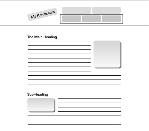
The benefit of starting with a sketch is that you can see almost right away whether the overall layout works and, if it does, what sections you need to define to make it work. As you learned earlier in this book, creating layouts using CSS means creating boxes within boxes within boxes, and you need to know and understand the relationship between these boxes before you build them.
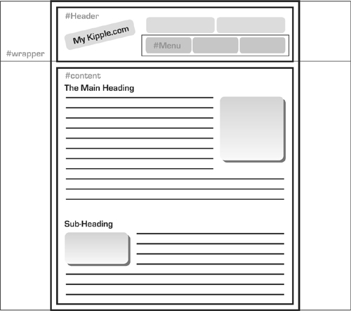
Figure 14.1 shows a rough sketch of the layout of the main page of myKipple.com. The layout has two main sections: the header and the content. Within the header are several elements: a tiled image background that goes across the screen, an image background that shows a box, an image that shows the page title, and a row of buttons. You can see that the page’s content page will be centered. From this information you can draw a set of boxes to indicate how to separate the content (see Figure 14.2).
Figure 14.2 With the sketch of the page complete it is easy to draw boxes around content and get a clear picture of how the site will come together.
Building the Framework from Boxed Parts
Now that you know how you want to section the page, it’s time to build the actual framework. There are many ways of doing this and none of them is wrong. Many designers prefer to build the framework from scratch, but it can be nice to get some help if you are new at design. Expression Web 2 has a series of ready-to-use, prepackaged CSS layouts that give you a bit of a head start.
1. Click New, Page from the File option on the menu bar. This opens the New dialog with the Page tab selected (see Figure 14.3).
Figure 14.3 From the New dialog, you can select a series of different prepackaged layouts for different applications including CSS.
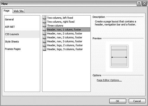
2. Click CSS Layouts in the first list to open the prepackaged CSS layouts in Expression Web 2. By clicking each of the options in the second list, you get a short description of the layout along with a preview.
3. Select the layout closest to the framework you drew in your sketch. In this case, it is the Header, Nav, 1 Column, Footer design. Select this option and click OK.
After you click OK, Expression Web 2 opens two new files: Untitled_1.css and Untitled_1.html. Both are empty except for the layout styles. This gives you the ability to work with the layout boxes without content and to match the overlay drawings you created earlier. Because you already have a series of styles defined for your pages, what you want to do is create a separate style sheet that contains only the layout portions of the pages. That way you can make quick changes to the layout without bothering with all the other styles.
Employing CSS Reset
Before you do this it is a good idea to insert a CSS reset into your style sheet. A CSS reset is a block of CSS code that removes all the preconceived notions that a browser might have about your page by setting everything to zero. Eric A. Meyer created the most comprehensive CSS reset around, and you can find it here: http://meyerweb.com/eric/tools/css/reset./
To apply the CSS reset, simply copy the code in its entirety from the web page and paste it into the top of the Untitled_1.css file you just created. Save the CSS file as layout.css. Because the Untitled_1.html file already links to the CSS file, the link updates automatically. Save the Untitled_1.html file as layoutTest.html.
Updating the ID Names
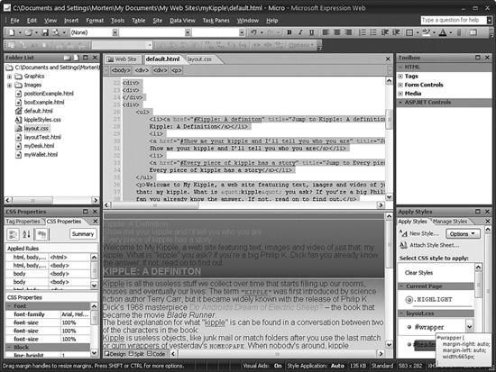
The next step is to change the ID names to match your drawing. You can do so directly in the CSS file or using the Modify Style option from the Manage Styles task pane. Change the name of #masthead to #header, #top-nav to #menu, and #page-content to #content. Leave #footer as it is. In layoutTest.html, go to Split view and make the same changes to the div IDs.
According to Figure 14.2, the menu ID should reside within the header ID. Go to Code view and move the </div> end tag for the header ID below the one for the menu ID—now the header div wraps the menu div.
Finally wrap all the boxes in an outside box with the #wrapper ID attached. To wrap all the other IDs, create a new <div> on the line before the first div and give it the ID wrapper. With all the changes made, the page’s code inside the <body> tags should look like this (comments added to make it easier to read):
<body>
<div id=″wrapper″>
<div id=″header″>
<div id=″menu″>
</div> <!— end menu —>
</div> <!— end header —>
<div id=″content″>
</div> <!— end content —>
<div id=″footer″>
</div> <!— end footer —>
</div> <!— end wrapper —>
</body>
Now that you have inserted a call to the ID wrapper, you need to add another one either directly in the layout.css file or by using the New Style button in the Manage Styles pane.
Styling the Layout Boxes
With the layout boxes created, it is time to style them to make the page match the sketch. This requires the use of all the techniques you learned in earlier hours as well as some new ones. The goal here is to remove all the layout styling from the kippleStyles.css file and store it in the new layout.css file. You can choose to make the following style modifications using the Modify Style dialog, directly in the layout.css file using IntelliSense, or both.
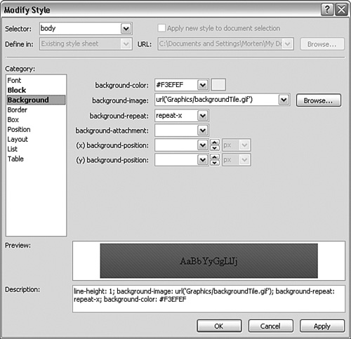
1. The layout drawing calls for a tiled graphic background that goes across the top of the page. Modify the body style by setting background-image to the backgroundTile.gif file found in the Graphics folder, with a background-repeat value of repeat-x and background-color set to #F3EFEF (see Figure 14.4).
Figure 14.4 Change the body style to add a tiled background that repeats along the top of the page.
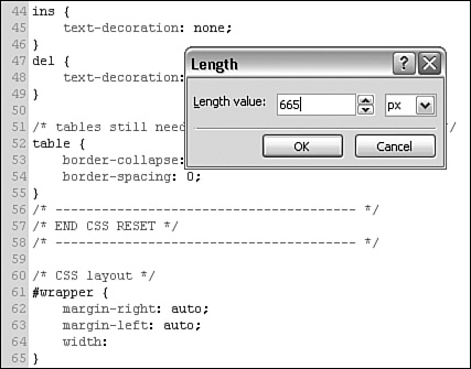
2. The content of the page hovers in the middle of the page with a specific width. Center the content by setting the #wrapper ID margin-left and margin-right attributes to auto. Set the width attribute to 665px (see Figure 14.5).
Figure 14.5 It’s often just as easy to make quick changes to the styles in a CSS page by editing the code directly. Here the width attribute in the #wrapper style is set using IntelliSense.
3. The #header ID has a background image as well. Set background-image to the headerBack.png file in the Graphics folder and set background-repeat to no-repeat. Because the headerBack.png file is transparent, leave background-color blank to allow the body background to shine through. The #header should have a fixed size no matter what content you add, so set the height value to 130px. That height matches the height of the headerBack.png image. To make the background image for the #header ID line up with the background tiles, set the margin-top value to 7px.
4. On the drawing, the #menu ID is along the bottom and close to the right corner of the #header box. To make this happen you need to make some changes to the position attributes of both #header and #menu. First change the position of the #header ID to relative. Then set the position attribute for the #menu ID to absolute and the bottom and right attributes (under the Position category in the Modify Style dialog) to 0px. Finally set the margin-right attribute to 25px so that the content you put inside the menu div displays on top of the background graphic rather than to its side.
Figure 14.6 When everything is set correctly the #menu ID should hover to the lower-right side of the #header box, independent of the remaining content.
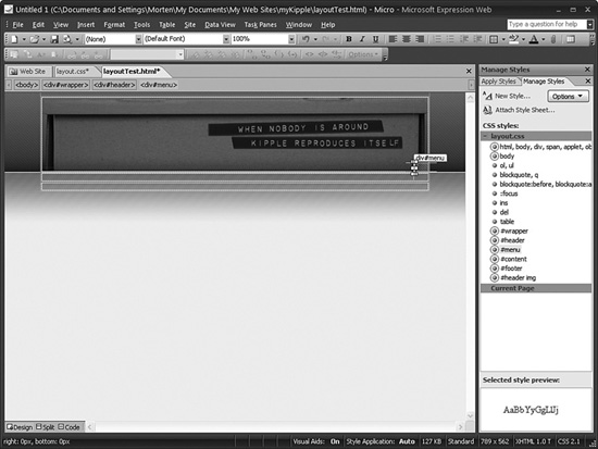
As you can see from figure 14.6 you now have the basic framework for the page as it appears in the drawing. And all this was done using only CSS which means the HTML markup has not changed.
In step 4 you used the position attribute to force the menu div down into the right hand corner of the header. This gives you a first glimpse of the powerful and often misunderstood CSS tool called positioning. Understanding positioning means you have the power to control your content in ways you could never do before.
Understanding Positioning
In the last part of the preceding example you used the position attribute to place a div in the lower-right corner of another div. This is a nice segue into the confusing and often misunderstood issue of positioning in CSS.
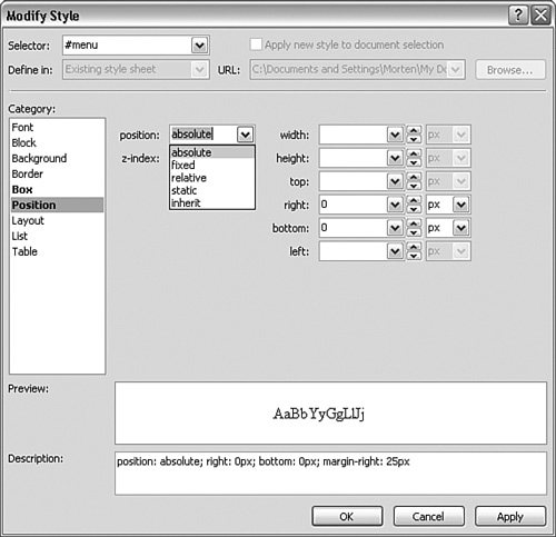
If you open the Modify Style dialog for any of the current styles, classes, or IDs, you see that the position attribute (found under the Position category) has five options: absolute, fixed, relative, static, and inherit (see Figure 14.7). The physical position of any object in a page depends on what this attribute is set to in the current style and whatever style that wraps it.
Figure 14.7 You can set the position attribute found under the Position category in the New and Modify Style dialog to absolute, fixed, relative, static, or inherit.
position: absolute;
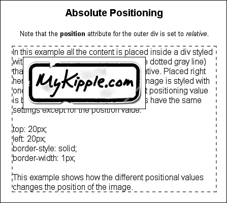
The easiest way to explain an element with an absolute position is to think of it as an image (or any other object) pasted onto a page and largely ignoring the rest of the content. The physical placement of an element with an absolute position is decided by setting the pixel value of its distance from the nearest positioned container with the top, right, bottom, and left attributes. In other words, an object with absolute position that has a top value of 20px and a left value of 30px appears exactly 20 pixels from the top and 30 pixels to the left of the edge of the page or the closest container box that has a position value other than static. Setting an object’s position attribute to absolute removes it from the flow of the page. That means unless you pay close attention, you might accidentally place objects with absolute positions directly on top of other content.
In the layoutTest.html page, the #menu div has an absolute position zero pixels from the bottom and zero pixels from the right side of the #header div because the #header position is set to relative. If you change the #header position attribute to static, the #menu div is positioned absolutely in relation to the nearest parent with a position other than static, in this case the body, which means it aligns itself with the edge of the page and ends up in the lower right of the window.
If you set the position attribute of a style, class, or ID to absolute without setting values for top, right, bottom, and left, the object appears in the default upper-left corner position (see Figure 14.8).
Figure 14.8 In this example, the image style has its position attribute set to absolute. Because the containing div has its position set to relative, the position of the image is relative to this div rather than to the page as a whole.
position: fixed;
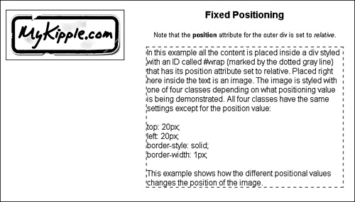
Fixed positioning works similarly to absolute positioning except that where the physical position of an object with an absolute position can relate to other positioned objects, the physical position of a fixed object is always based solely on the outer edges of the page as a whole (see Figure 14.9).
The first version of Microsoft Internet Explorer to support the fixed value for the position attribute was Internet Explorer 7. Older versions of Internet Explorer do not understand the value and your layout will not work properly in them.
Figure 14.9 In this example the image style has the position attribute set to fixed. Unlike Figure 14.8, the positioning of the image in this page is relative to the page as a whole.
position: relative;
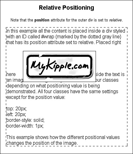
The easiest way to explain relative positioning is to imagine that you cut an image out of a printed page and repositioned it somewhere else on the page. Because you cut out the image from the page, there is a hole where it was and the image covers content wherever you glue it.
Placement of an object with a relative position is in relation to its original location in the flow of the page. As an example, that means an image with its position attribute set to relative and its bottom attribute set to 20px appears 20 pixels above the location at which it was originally inserted. If you compare Figure 14.10 and Figure 14.11 (in the next section) you can see the differences in the object’s placement.
Figure 14.10 In this example, the image style has its position attribute set to relative. The space the image would normally occupy is left empty but the image is shifted to the right and down because of the top and left values.
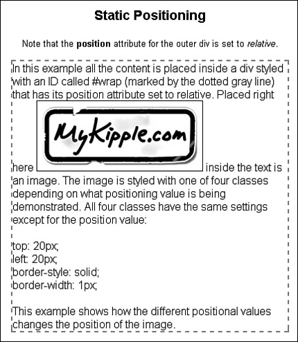
position: static;
static is the default setting for any style. Setting an object’s position attribute to static places the object in the flow as normal. The object is unaffected by the top, right, bottom, and left attributes (see Figure 14.11).
Figure 14.11 In this example, the image style has its position attribute set to static. The image lines up with the rest of the text and is not displaced despite the top and left attribute values being the same as in Figures 14.8, 14.9, and 14.10.
position: inherit
If you look closely you’ll see that the value inherit appears in almost every drop-down menu when you create CSS. Inherit literally means that the current elements inherits this style from whatever elements is directly above it in the cascade.
Applying the Framework to Existing Pages
Now that you have created the framework for the myKipple site in a different style sheet from the one you were working on before, you need to alter the existing markup files and style sheet. Because default.html is the home page, it is a good place to start. Before you go any further, remove the big sticker graphic in the header and move the rest of the content in the header down into the content area.
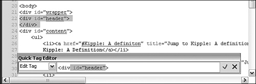
The first step is to remove the existing IDs and classes from the <div> tags within the page. You’re doing so because you created a new set of IDs and classes to handle the overall layout of the page. The easiest way to remove the IDs and classes is to do it from Code view, but you can use the Edit Tag function found under the Quick Tag Selector.
Place your cursor anywhere inside the page and click the menu arrow on one of the <div> tags in the Quick Tag Selector. Select Edit Tag from the drop-down menu and remove the class or ID portion of the tag (see Figure 14.12).
Figure 14.12 Using the Edit Tag function to change your tags ensures that the change applies only to the tag in question and you won’t accidentally delete other code.
After you remove the IDs from the containing tags, you can see that they are no longer in use by looking at the Manage Styles task pane. The dots prefixing #wrapper, .header, and .content no longer have a gray ring around them. You can delete these IDs and classes directly from the task pane by highlighting them and pressing the Delete button on your keyboard or by right-clicking and selecting Delete from the context menu.
With the old layouts removed, it is time to apply the new ones. To do this you first have to attach the new layout.css style sheet to the file. As you learned earlier, you do this by clicking the Attach Style Sheet button in the Apply and Manage Styles task panes. Select the layout.css file with the Browse button and be sure to enable the Attach to All HTML Pages option.
With the new style sheet attached, you see a dramatic change in how the page appears in Design view. That is because the new style sheet contains the CSS reset that removes all default styling from the content (see Figure 14.13). Furthermore, when you attach a second style sheet, you insert it below the first one in the HTML code and this means it gets more weight or importance in the style cascade. The CSS reset affects all default selectors, but in the kippleStyles.css file you have already styled several of these so you want your old styles to have more weight. To give kippleStyles.css more weight than layout.css, simply change the order of the two styles as they appear in the HTML code so that layout.css is first and kippleStyles.css is second. After the change, the two lines of code directly before the </head> end tag should read:
<link href=″layout.css″ rel=″stylesheet″ type=″text/css″ />
<link href=″kippleStyles.css″ rel=″stylesheet″ type=″text/css″ />
Figure 14.13 After applying the CSS reset to your page, all the content that has not been styled will be crammed together. It might look weird but this is actually what you want because it means you now have a clean slate to work with.
If you preview the page in your browser at this point, you will notice two things: First, the text spreads out over the entire width of the page because no you have not applied layout styling. Second, all the text is jammed together; that is, there is no breathing room between the paragraphs, headings, and block quotes except for the h2 headings. This might look like a big problem, but it is exactly what you want: If the different selector boxes are stacked directly on top of one another (meaning there is no breathing room between the paragraphs, headings, and so on), the browser is not making any assumptions about your styles if you do not provide a style. In other words, your page looks the same in all browsers.
Try it Yourself
Apply the New Framework to the Page
Now that you have attached the new style sheet, you can apply the new framework to the page:
1. In Design view, place your cursor anywhere within the content. In the Quick Tag Selector, click the <div> tag that immediately follows the <body> tag. This is the outermost div that contains all the content, so all the content should highlight.
2. With the first <div> tag highlighted, go to the Apply Styles task pane and click the #wrapper ID under the layout.css file (see Figure 14.14). This applies the new ID to the tag.
Figure 14.14 Using the Quick Tag Selector in conjunction with the Apply Styles task pane ensures that you apply the correct style, class, or ID to the correct tag.
3. In Code View, find the <div> tag directly under the one you just changed (which now reads <div ID=″wrapper″>). Place your cursor anywhere inside the new tag and click the #header ID in the Apply Styles task pane. When you click Design view to refresh it, the box graphic you earlier set as a background appears.
4. Place the cursor anywhere inside the main content of the page and use the Quick Tag Selector to select the one remaining unstyled <div> tag. Apply the #content ID to it to wrap the content of the page.
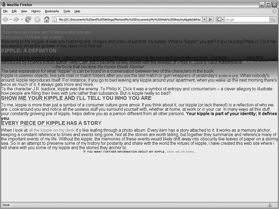
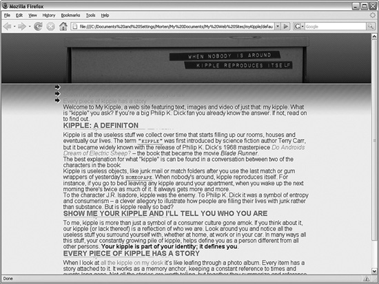
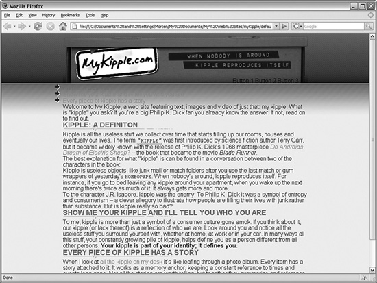
If you save and preview the page in your browser, you see that the page has started to look like the layout drawing from the start of this hour (see Figure 14.15).
Although this page has started to look complete, a few items are still missing: There is no big sticker in the header and there is no menu to the right.
Try it Yourself
Add a Header Image and a Menu
In the sketch of the page layout (refer to Figure 14.1), the header features a large MyKipple.com sticker and a menu. These are important elements of any website—the header image (or site name) provides as an intuitive link back to the home page and the main menu. In effect, the header functions as a primary navigational tool for the visitor.
Figure 14.15 With the framework applied, the page has started to look like the drawing in Figure 14.1.
1. The Graphics folder contains the image file kippleSticker.png. Click and drag the image into the header in Design view and give it the alternative text MyKipple.com.
2. When inserted, the image has both padding and a one-pixel gray border (see Figure 14.16). This is because it is being styled by the img style you created in an earlier hour. To ensure that the img style applies only to images within the #content area, use the Manage Styles task pane to change the Selector Name of the img style to #content img. When you change the style name, the kippleSticker.png changes position to hug the upper-left corner of the #header box.
3. To line up the kippleSticker.png image with the background, you have to create a new style. Click the New Style button in the Manage Styles task pane and set the Selector Name to #header img. This style applies only to images within the #header ID. Change the Define In field to Existing Style Sheet and select kippleStyles.css from the drop-down menu. Under the Box category, set padding-top to 30px and padding-left to 33px. Click OK to apply the style. The header image now lines up perfectly with the background image (see Figure 14.17).
Figure 14.16 When inserted, the kippleSticker.png image has both a border and padding applied by the img style created in an earlier hour.
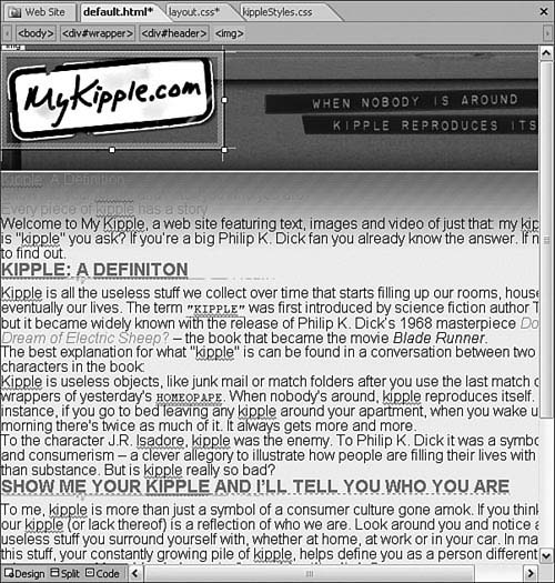
Figure 14.17 With the new #header img style applied, the image lines up perfectly with the background image.
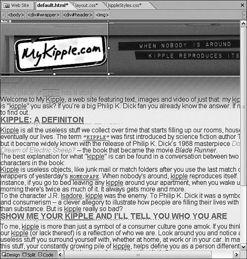
4. Change to Split view and click the image to find the corresponding code. In Code view, find the end </div> tag, create a new line before it and type <ul> (both the image and the unordered list must be contained within the <div>). IntelliSense will create the closing </ul> tag for you. Press Enter to create a new line and type <li> to create a list item. Between the <li> and </li> tags, type Button 1. Repeat the process to create three list items called Button 1, Button 2, and Button 3. In the end, the code looks like this:
<div id=″header″>
<img alt=″MyKipple.com″ height=″93″ src=″Graphics/kippleSticker.png″
width=″229″ />
<ul>
<li>Button 1</li>
<li>Button 2</li>
<li>Button 3</li>
</ul>
</div>
5. In Design view, the new list you created appears on top of the other list on the page. To solve this problem, click the list in Design view, select the <ul> tag, and apply the #menu ID using the Apply or Manage Styles task pane. This moves the list to the lower-right corner of the #header box (see Figure 14.18).
Figure 14.18 With the #menu ID applied to the <ul> tag, the list appears at the lower- right corner of the header.
6. To make the list items appear one next to the other rather than in a stack, as they are now, create a new style with the Selector Name #menu li to be defined in kippleStyles.css and set the display attribute under the Layout category to inline. Click OK to apply the change, and then save and preview the page in your browser. The result should look similar to Figure 14.19.
Figure 14.19 Adding the header image and a dummy menu to the page.
Building the Framework Using Eric Meyer’s CSS Sculptor
Not surprisingly, the framework of your page plays an integral role in the design process: Without a solid framework, your page will never look and work the way you intend for it to. Using the prepackaged CSS layouts that come with Expression Web 2 is a good place to start, but as you have seen there are only a few options available. Even after you apply those options, there is still a lot of work to do before they work properly.
In conjunction with the release of Expression Web 2, WebAssist released Eric Meyer’s CSS Sculptor—a plug-in that simplifies the CSS-building process. Even though it is a third party application, the extent to which it helps new and experienced designers and developers create solid CSS layouts make it a worthwhile consideration for Expression Web 2 users.
Eric Meyer’s CSS Sculptor from WebAssist is third-party software and is a separate purchase from Expression Web 2. As of this writing, the price is $99.99 from the WebAssist store. I advise you to look through the following tutorials and the examples on the WebAssist website, and carefully consider future projects before you purchase the application. The question you should ask yourself is this: Will I be making a lot of different CSS layouts in the future using the prepackaged layouts in Expression Web 2? If the answer is yes, there is a good chance CSS Sculptor will be a useful addition to your program package. That said, CSS Sculptor is not an application you need to create CSS layouts—it just makes the process a lot easier. In the end, all CSS Sculptor does is build advanced style sheets so that you don’t have to do all the styling manually.
To get Eric Meyer’s CSS Sculptor, visit the WebAssist website at https://www.webassist.com/professional/expressionweb/ and select the application. After you download and install the application, it automatically shows up in Expression Web 2 under File on the menu bar (see Figure 14.20).
Figure 14.20 After installation, CSS Sculptor automatically shows up in the File, New menu in Expression Web 2.
What makes using CSS Sculptor different from using the prepackaged CSS layouts found under CSS Layouts in the New Page option is that CSS Sculptor gives you complete control of all elements of the layout before you actually apply it to a page. The basic premise of the application is that you should have complete control of all aspects of your layout, not just how many boxes it contains. To get a better understanding of what CSS Sculptor does and how it can help you, let’s go through the options and see how they work.
The Layout Tab
When you select New CSS Sculptor Page from File on the menu bar, the CSS Sculptor dialog opens to the Layout tab in Expression Web 2 (see Figure 14.21). From this tab, you set the basic layout and design using the drop-down menus. The application provides 30 preset layouts and 11 design schemes. The layouts vary from one to three columns with varying width and position settings and options of headers, footers, and menu bars. The designs are different color schemes that apply to the components.
Figure 14.21 The Layout tab in CSS Sculptor lets you set the basic layout and color scheme for your layout.
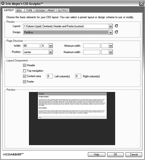
After you have picked a layout and design scheme, you can change the width and position of the content through the options under Page Structure.
If you are dissatisfied with your changes or you want to start over you can click the Reset buttons next to either the Layout menu (resets everything except the layout) or the Design menu (resets everything except layout and design) to get back to where you started.
From the Layout Components section, you can turn Header, Top Navigation, Content Area, and Footer on and off with the check boxes and change the number of left and right columns or sidebars to be added to the content area.
The Box Tab
When you are satisfied with the overall layout and design scheme, you move on to the Box tab (see Figure 14.22). This tab is very similar to the Box category found in the New and Modify Styles dialogs in Expression Web 2. From here you see the layout’s order in the cascade, and you can control the Box Model aspects of each component.
Figure 14.22 The Box tab shows you the order of the layout boxes in the cascade, and lets you control the Box Model aspects of each component.
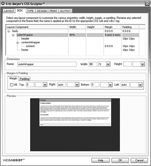
The top window in the Box tab shows you the layout tree and the box values attributed to each layout component. You can select individual components in the tree by clicking them to activate the editing features for each.
After you select a component, you can change its name, width, and height from the Dimensions area. These changes apply throughout the application, so if you change the name, the new name applies to all the relevant components in the page.
Directly underneath you find the tabs for Margin and Padding, where you can set values for each side individually or for all sides at once. These values can be set for each component in the layout tree.
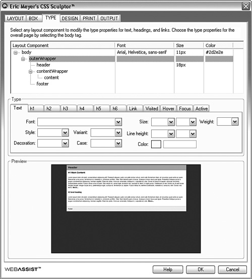
The Type Tab
Next on the list is the Type tab (see Figure 14.23). From here you can set most of the standard type (text) selectors for each layout component you have created.
Just as in the Box tab, the Type tab starts with a layout tree showing all the components and the type styles attached to them. You can select each component individually from the layout component tree to style the content within it further.
In the Type area, you can set all the standard type attributes such as font, size, weight, color, and so on for each main type selector. These styles apply to the currently selected layout component. Using this feature, you can easily set font attributes for the entire page, parts of the page, or elements within a particular box.
Figure 14.23 The Type tab gives you control of most of the standard type selectors for each layout component.
The Design Tab
The Design tab has all the options for the visual aspects of each of the layout components (see Figure 14.24). You can select each component from the layout component tree to edit its features.
Figure 14.24 The Design tab lets you control the visual aspects, such as background color and borders, of each of your layout boxes.
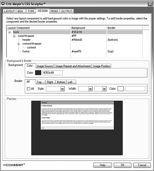
In the Background section, you can set the background color and background image attributes. The Image Source, Image Repeat and Attachment, and Image Position tabs let you micromanage the background image placement and behavior just like you did in the New and Manage Style dialog earlier in this hour. Likewise, the Border section gives you complete control of every aspect of the border for all the elements in the layout component tree.
The Print Tab
When you style a page using CSS, you have the option of creating a separate style sheet that applies only when the visitor prints out the page on paper. CSS Sculptor automates this process for you through the Print tab (see Figure 14.25). From here you can turn off styling elements such as width, background colors, and images and create a printer-friendly version of your layout.
Figure 14.25 The Print tab provides separate controls for the style sheet used if a visitor wants to print out the page on paper.
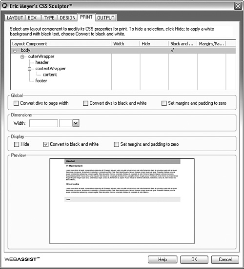
You can change the attributes of each individual component on the Print tab by selecting it from the layout component tree, just as with the other tabs, but you can also make global (pagewide) changes using the Global options. As their names suggest, Convert Divs to Page Width sets all the containing boxes to the width of the printable area on the page; Convert Divs to Black and White removes all color information from the divs and their content; and Set Margins and Padding to Zero resets the margins and padding. These options are useful because designers often use div widths, colors, margins, and padding to achieve layouts that work well on a screen but waste ink and space when printed.
The Dimensions option lets you set the width of the components independently. The Display options let you control individual components by hiding them, converting them to black and white, or setting margins and padding to zero just as in the Global options.
The Output Tab
Output is the final tab in CSS Sculptor (see Figure 14.26). From here you can set whether you want the styles embedded in the <head> tag of the current page, placed in a new style sheet, or inserted in an existing style sheet. This is set for the screen and print styles individually.
Figure 14.26 Among other things, the Output tab lets you decide how you want to save the styles you created using CSS Sculptor.
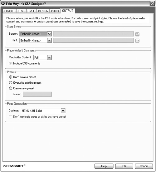
Under Placeholder & Comments, you control what kind of extra content CSS Sculptor inserts in your pages. The Placeholder Content option lets you choose whether you want CSS Sculptor to include full, minimal, or no dummy content into the layout you create. This feature is useful because, with no content inserted, it can be hard to navigate among different layout components. The Include CSS Comments option inserts nonfunctional content into the CSS code to explain, for future reference, what the different components do.
Presets lets you save and overwrite the existing preset with your current layout or save the layout as a new preset. With this feature, you can create a series of highly customized layouts that you can access from the Layout drop-down menu under the Layout tab.
Finally the Page Generation options let you set the doctype of the pages generated. The doctype tells the browser how to interpret the code in the page. For most purposes, you don’t need to change this option. If you chose Overwrite Existing Preset or Create New Preset in the Presets area, you can check the Don’t Generate Page or Styles but Save Preset option.
The Final File(s) Generated by CSS Sculptor
When you are satisfied with all the settings and you click OK, CSS Sculptor produces a new HTML file. It also creates any corresponding CSS files if you chose to keep the styles separate. The CSS files contain an abbreviated version of the CSS reset you inserted earlier, and you attach the external style sheets to the HTML page using the @import technique. After CSS Sculptor creates the pages and style sheets with all their dummy content and comments, they work exactly like any other page or style sheet in Expression Web 2.
In the lesson files for this hour is a CSS Sculptor folder that contains an HTML page and two style sheets generated by CSS Sculptor. Look at those files to get an idea of what kind of output this application generates.
Summary
When it comes to communicating a message with visual media, whether printed or on screen, design and layout are paramount. If the content doesn’t look inviting, no one will give it a second look. Nowhere is this truer than when it comes to the Web. With the millions upon millions of websites out there, your site has to stand out if it is to generate an audience. To do that it needs to have a solid and easy-to-understand layout and it has to look the same no matter who is viewing it.
In this hour, you learned to use CSS to create layouts. By using CSS, you are separating the layout information from the content information and thereby making it easier for everyone to access the information you are communicating through your site. You learned how to use the prepackaged CSS layouts as a starting point to create a proper framework to house all your content, and you learned how to apply this framework to existing pages using a variety of methods in Code view and Design view.
To ensure that your page looks the same across all browsers, it is necessary to remove all assumptions that a browser might make about the styling of your content. You can achieve this by inserting a CSS reset in your style sheet. This code resets all the styles on the page so that you have a clean slate to start with. And because of the cascade, applying a CSS reset in the top of your CSS file means you can restyle all the content further down in the cascade to get the results you want.
CSS positioning is a topic that can be confusing even to seasoned professionals. This hour presented a thorough walkthrough of what the four different positioning values (absolute, fixed, relative, and static) mean and how they work. Understanding these values, and how to use them, means you can easily create advanced layouts that go outside the norm.
Because creating CSS layouts can be incredibly time-consuming, this hour also covered a third-party application: Eric Meyer’s CSS Sculptor. This application gives you far greater flexibility in creating layouts from scratch and is a great help for anyone who works a lot with CSS. With that said, you did the same job yourself in the tutorials in this hour, so CSS Sculptor is not a tool you must have in your arsenal. CSS Sculptor is, however, a tool that can help you work more efficiently.
In the next hour, you will learn about buttons and how to use Expression Web 2’s built-in functions Expression Web 2to create advanced buttons.
Q&A
Q. When I create a new CSS layout, all I get is a series of empty boxes. Why is that?
A. The prepackaged CSS layouts in Expression Web 2 are little more than empty divs with some very basic positioning in them. The intention is to give the user a clean slate to work with, but in reality there is very little difference between using the prepackaged layouts and creating the layouts from scratch. The one advantage of using the layouts is that all the divs have proper names and positions, so you don’t have to keep tabs on absolutely everything.
Q. When I created new menu buttons in the header from Design view, the header image became part of the first line item. What am I doing wrong?
A. It can be extremely hard to avoid including objects such as images in lists when you create them in Design view. This is why the tutorial specifically asked you to use Code view to create the list. However, there is nothing wrong with using Design view to do this task. The problem of including the image in the list item is easy to fix: All you have to do is go to Code view and move the <ul> and <li> tags from their current location before the <img> tag to a new line directly after the end of the image line (which as you know from an earlier hour is /> ). Now the image is outside of the list.
Q. When I added the new layout.css style sheet, I noticed that there are now many different versions of the styles such as body and p. Isn’t that a problem?
A. The new style sheet includes the CSS reset, which has all the available selectors listed and set to 0. Further down in the style sheet and in the kippleStyles.css style sheet, the same selectors are styled a second and sometimes even a third time. This isn’t a problem as much as a deliberate exploitation of the cascade: You reset the styles to 0 at the start and then create new styles that apply fresh styles farther down the line. This piling of styles is a good illustration of how the cascade works and is something you should take note of for future reference: The farther down in the style sheet a style is, the more weight or importance it has.
Workshop
The Workshop has quiz questions and exercises to help you put to use what you have just learned. If you get stuck, the answers to the quiz questions are in the next section. But try to answer them first. Otherwise you’ll only be cheating yourself.
Quiz
1. What is the benefit of using CSS to create page layouts?
2. What is a CSS Reset and why should you always use it?
3. Given an image placed in the middle of a block of text, briefly describe what happens to the image when its position is set to absolute, fixed, relative and static.
Answers
1. CSS layouts have many benefits but the most important one is that they give you the ability to completely change the layout of multiple pages without actually changing the pages themselves. You can also create multiple layouts the visitor can choose from to suit her preference without cluttering the markup. Finally you can “port” a good layout to a new page easily by attaching the existing style sheet to the new page and just adding some classes and IDs to the <div>s in the new page.
2. A CSS Reset is a block of CSS code that sets all the different styles and selectors browsers usually make assumptions about to zero. By applying it to your designs you ensure that different browsers don’t start changing your designs or layouts on a whim just because the browser designer thinks all paragraphs should have a 15px top padding for instance.
3. With absolute positioning the image is taken out of the flow of the page and will appear in the top left hand corner of the page or whatever containing element has a positioning other than static. With fixed positioning the image is taken out of the flow of the page and will appear in the top left hand corner of the page no matter what. With relative positioning the area the image takes up remains in the flow of the page and the image itself appears in a set position relative to its original location. With no other values attached it will appear where it was placed. Static positioning is the default position and the image will appear in the flow of the text where it was placed.
Exercise
The new layout.css style sheet includes a CSS reset that removes all the regular styling from the content within your page. As a result most of, if not all, the text is crammed together. Create and modify styles to space out the text and make it more approachable by using what you learned in this and previous hours. In particular, create or modify the styles for #content p, #content ul, and #content blockquote.
Using what you learned about positioning, try to change the location of different content in the page. For example, see whether you can move the menu in the header to the upper-right corner of the page.