
Hour 15 Buttons, Buttons, Buttons
What You’ll Learn in this Hour:
 How to create buttons using Expression Web 2’s Interactive Buttons feature
How to create simple box buttons using CSS
How to make the simple box buttons more advanced by using background images
How to use the sliding doors technique to use one background image for multiple button stages
How to hide the button text from the browser without removing it entirely
Introduction
What makes a website different from all other visual media is the ability to navigate through content with the use of hyperlinks. But plain text hyperlinks are not always the best option. If you want to showcase a particular link or if you are creating a menu, you need to turn those links into buttons.
There are many ways to create buttons, some easy and some more complicated. This hour will explain how to use some button-making techniques and describe their advantages and disadvantages.
As before, accessibility is a primary focus of this chapter. In other words, if you strip away all the styles, graphics, and scripting, there should still be an understandable hyperlink left in the markup. Designers often ignore this aspect that can, in some cases, prevent the visitor from navigating through a site when the images, Flash movies, or other elements don’t load properly. But because making buttons accessible is easy, there is no good reason not to do it.
Buttons: A Brief Definition
What is a button in web terms? In the absolute basic form, a button is a clearly defined and contained visual object on a web page that functions as a hyperlink. This object can be plain text with a background, text with an image background—just a static image or an interactive or animated graphic element that changes with the mouse behaviors. A button differs from a hyperlink in that it is not merely a string of text but is some form of graphic element with a clearly defined active area.
Of course, as with all definitions, experts can question and dispute this one. For this book, however, this definition will suffice.
Creating Interactive Buttons Using Expression Web 2
Expression Web 2 has a built-in feature that lets you build advanced and modern-looking buttons without creating graphics or importing images from a different program. The Interactive Buttons feature works by creating several different images for the different button states that switch out depending on how the user interacts with the button using JavaScript. As with everything else in Expression Web 2, the code generated for the Interactive Buttons is standards-based and, as a result, the buttons look and work the same in all browsers as long as they support JavaScript. If the user turned off JavaScript or the browser is too old, the viewer sees only the inactive state of the button, but the links within it still work.
Making an Interactive Button
The Interactive Buttons function in Expression Web 2 gives you the ability to create advanced interactive buttons without ever leaving the program or importing graphics or images.
1. Create and open a new HTML page called buttons.html in Design view. Give it the h1 heading Button Examples and create the h2 subheading Interactive Buttons. Press Enter to create a new line underneath the sub-heading.
2. To create a new interactive button, open the Insert menu and scroll down to Interactive Button. Click the option to open the Interactive Buttons dialog.
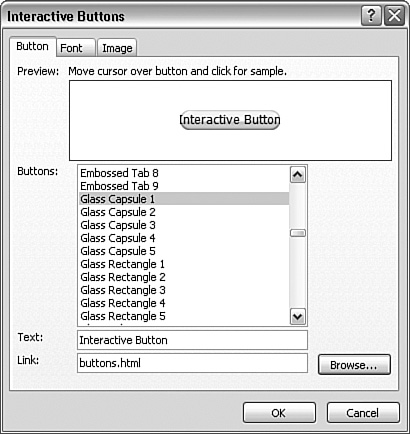
3. The Interactive Buttons dialog has three main tabs: Button, Font, and Image. The first step in creating a new button is to select the look of the button from the Buttons menu. The different designs are grouped in categories such as Border, Corporate, Glass, Jewel, and Metal and each category has subcategories. Most of the designs feature text contained inside some form of box, but a few of them are icons with text next to them.
4. After you have selected a design you like, insert the text you want to display on the button in the Text box and set the link you want the button to point to in the Link box. You can link to pages within your site or to any other site on the Web. For this example, give the button the text Interactive Button and link it back to the buttons.html page (see Figure 15.1).
Figure 15.1 Under the Button tab in the Interactive Buttons dialog, you can pick the design of your button, set the text to display on the button, and define the link to which it should point.
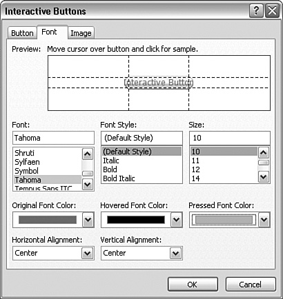
5. Under the Font tab you can control the font family, style, and size for the text inside the button. Because the button with the font will be converted to an image, you are not restricted by the web-safe fonts and you can pick whatever font you have on your computer. Below the font, style, and size options you can set the font color for each of the three main states of the button: original font color, hovered font color, and pressed font color. Set the original font color to gray, hovered front color to black, and pressed font color to silver. Below these options you can set the horizontal and vertical alignment of the text in relation to the button. The Preview window lets you test the button in real-time to see the changes you have made (see Figure 15.2).
The horizontal and vertical dotted lines in the Preview window are guides to tell you whether your text is properly placed within the button. If the text spills over the lines, the button is too small or the text is too long. You can change the size of the button from the Image tab to make it fit the text.
Figure 15.2 The Font tab gives you easy control of the text in your button.
6. The last tab is Image. From here you can change the overall size of the button by using the Width and Height attributes. As long as the Maintain Proportions box is checked, the button retains its shape. Leave the Maintain Proportions box checked and change the width of the Change the Size of the Button to 125px so that the text fits well within the button area (see Figure 15.3).
Figure 15.3 From the Image tab, you can control the size, background color, and file type of the images created by the function.

7. Below the size settings you can choose whether you want the program to create separate images for each of the three button states and whether these images should be preloaded by the browser when the page loads. By default Expression Web 2 creates three images: one for the button in its resting state, one for when the user hovers over it, and one for when the user clicks it. By unchecking one or more of these boxes, you are reducing the number of images created and one of the remaining images displays in place of the missing image. For example, if you turn off Create Hover Image the regular state image appears when the visitor hovers over the button. If you turn off Create Pressed Image the hover image appears when the button is pressed. Leave the boxes checked.
If you uncheck this box and resize the button, the graphic elements stretch. This makes little difference in the case of square-cornered buttons, but if you are working with circles or oval corners, unchecking this box makes the button look strange
8. The final two options let you decide the background color and file type of the button images after export. If you leave the default option checked, you can pick a background color from the drop-down menu. If you want the button background to be transparent, you have to select the GIF option. When choosing this option, pay close attention to the Preview window to ensure that the outer borders of the button are not too jagged. Leave the background color as it is and click OK. The button is inserted into your page.
The Interactive Buttons function goes through your existing page and finds all the colors you have used so far. These colors display in the color drop-down menus under Document Colors and help you keep the colors throughout your site consistent.
Saving and Editing Interactive Buttons
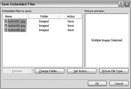
The interactive button you just created is now in your page, but if you look at your file tree in the Folder List task pane, you can see that no image files have been created. To finalize the process of creating an interactive button, you need to save the page. This opens the Save Embedded Files dialog from which you can define where to save the new button images (see Figure 15.4).
Figure 15.4 When you save the page, you also save the images you created using the Interactive Buttons feature.
After you save the files, they behave like any other image on the page, which means that even if you delete the button from your page, you do not delete the image files from your file tree.
As with the Photoshop Import feature, Expression Web 2 keeps track of the interactive buttons you create in your pages. This means that if at some point you want to make changes to the interactive buttons, you don’t have to make new ones or open each image file individually. To edit an interactive button, all you have to do is right-click it while in Design view and select Button Properties from the context menu. This opens the Interactive Buttons dialog. From this dialog, any changes you make to a button are applied to the page when you click OK. When you save the page again, the new images overwrite the old ones.
Creating Buttons from Scratch Using CSS
Although the interactive buttons that Expression Web 2 creates are great, they don’t always work with the design you have envisioned. Designers often have to create their own buttons from scratch to achieve a particular look in their sites. Using the techniques you learned in earlier hours, you can use CSS (Cascading Style Sheets) to make advanced buttons that both rival and sometimes even outdo the interactive buttons you just created.
Creating a Basic Box Button
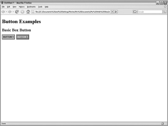
When designers first started to focus on buttons as a navigational tool they could rely on only basic functionality. The most basic button of all is a string of text with a colored box around it (see Figure 15.5).
Figure 15.5 The basic box button was the staple of web design for many years.
Although you could use tables to make this type of button, the “proper” way is to build the button is through the use of CSS like in this next tutorial:
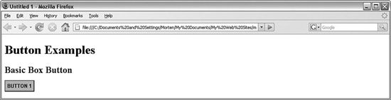
1. In the same page as before, create a subheading and name it Basic Box Button. Under that heading, create a new paragraph with the text Button 1.
2. Highlight the button text and make it a hyperlink pointing back to the current buttons.html page.
3. Click the New Style button and create a new class called .basicBox. In the Font category, set font-family to Arial, Helvetica, sans-serif, font-size to 0.8em, font-weight to bold, text-transform to uppercase, font-color to black (#000000), and check the None box under text-decoration to get rid of the line under the text.
4. Under Background, set background-color to silver (#C0C0C0). Under Border, set border-style to solid for all, border-width to 2px for all, set the border-top and border-left colors to gray (#808080), and set the border-bottom and border-right colors to black (#000000). This gives the button the appearance of popping out from the screen (see Figure 15.6).
Figure 15.6 Setting different colors for the top and left borders and bottom and right borders can create the illusion of the button either hovering over the page (if the top and left borders are lighter) or being pushed into the page (if the top and left borders are darker).
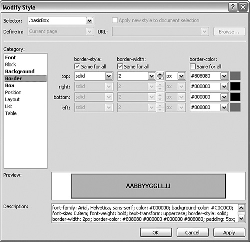
5. In the Box category, set padding to 5px for all four sides. Click OK to create the new class.
6. Select the button text you created and use the Apply Styles task pane to apply the new class.
7. To make the button react when the user hovers the mouse over it, you also have to make a :hover pseudoclass with different styles. Because you want to retain most of the styles, the easiest way to make a new and similar class is to copy and paste the CSS code in Code view and give the new class the selector name .basicBox:hover. After doing this, you can open the new pseudoclass from the Apply Styles task pane using Modify Style and make changes to it.
8. With .basicBox:hover open in the Modify Style dialog, change font-color to white (#FFFFFF) and background-color to a light orange (#FF6600). Click OK to apply the changes, and then save and test in your browser (see Figure 15.7).
Figure 15.7 The two button states as they appear next to one another.
As with all other styles, you can create separate styles for each pseudoclass for more advanced visual interaction with the button.
In this example the actual styling of the button came from applying a class to the <a> tag. But this is not the only way to create box buttons. You could just as easily have grouped one or several buttons within a <div> or <span> class or ID, and created a styles instead. The result would be the same.
Creating an Advanced Box Button with Images
The basic box button might be easy to create, but it is also very dull to look at. Although prevalent in the 1990s, you rarely see this type of button in modern web design. Fortunately you can easily modernize the look of the box button without much extra effort. The key is to replace the background color with a background image, as shown in Figure 15.8.
Figure 15.8 The Basic Box Button gets a modern look by swapping out the background color for a background image. Button 2 is in the :hover state.

In this example, you use a different styling technique to apply the same style to multiple buttons:
1. Below the basic box button, create a new headline and name it Advanced Box Button. Underneath that, create an unordered list with three buttons: Button 1, Button 2, and Button 3. Make each list item into a hyperlink back to the current page.
Figure 15.9 The menu list is created and the .advancedBox style applied.
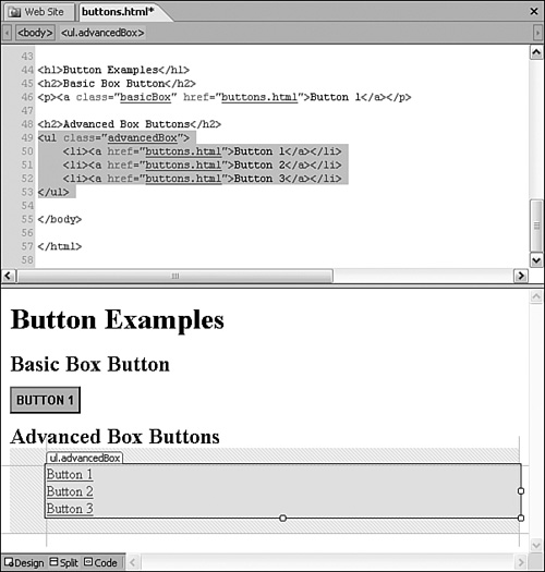
2. Make a new class called .advancedBox by using the New Style dialog. Under the List category set the list-style-type to none. Click OK to create the class and apply it to the <ul> tag using the Quick Tag Selector (see Figure 15.9).
3. Import the images named blueButtonUp.gif and blueButtonOver.gif from the lesson files and save them in a new folder called buttonGraphics.
4. Make a new style and give it the selector name .advancedBox a. In the Font category, set font-family to Arial, Helvetica, sans-serif, font-size to 0.8em, font-weight to bold, text-transform to uppercase, font-color to white (#FFFFFF), and check the None box under text-decoration to get rid of the line under the text.
Figure 15.10 The .advancedBox a style is applied to the new buttons, but they are covering each other because the list item style has not been modified yet.
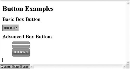
5. In the Background category, set background-image to the blueButtonUp.gif image you just imported and set background-repeat to no-repeat. Because the image is larger than the text and you want it to surround the text, go to the Box category and set padding to 13px on all sides. Click OK to apply the style (see Figure 15.10).
6. In Design view, you can see that the new button background is applied but the buttons are covering each other. This is because the list items have not yet been styled and the browser is assuming that the list items are the height of the text without the padding. To fix this problem create a new style with the selector name .advancedBox li and set the padding-top and padding-bottom attributes to 13px to match the link style you just created. Click OK to apply the new style and the buttons no longer overlap.
7. To create a hover-over effect, copy and paste the .advancedBox a style in Code view and give the new style the selector name .advancedBox a:hover. Open the Modify Style dialog for the new style and change background-image to blueButtonOver.gif. Click OK, and then save and preview in your browser.
Now instead of the background color changing when the mouse hovers over the button, the background image swaps out. And because the background image is part of the a style, the entire image is clickable, not just the text itself.
The problem with this technique is that it requires two images to work. This might not seem like a big deal, but if the user is on a slow connection, the page is on a slow server, or there is something else that slows the system down, the user might experience noticeable lag between hovering over the button and the new background image being loaded. One way around this problem is to preload the images using behaviors, but this requires JavaScript to work properly.
Create Text Free Buttons with Sliding Doors
Figure 15.11 The name sliding doors refers to the action of sliding the background image so that only half of it is visible depending on how the mouse interacts with the button.
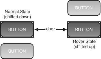
The problem of preloading content has become more prevalent with the emergence of blogs because many blogs have a lot of scripts running at the same time, and it is important to reduce the load on both the network and the computer as much as possible to make things work smoothly. A technique often referred to as sliding doors was developed to enable the designer to use one image file as two different backgrounds (see Figure 15.11. This is done by creating a file that has two versions of the background, either on top of or to the side of one another. The name sliding doors refers to the action of literally sliding the background from one side to the other to display only half of the image at a time.
You can use a similar technique to hide text content. As you have seen, the regular method of creating buttons requires there to be text superimposed on the background. If you don’t want the text to appear, the quick answer is to simply swap out the text for an image and use it as a button. But if you do this, the link is not visible if the image doesn’t load or the visitor uses a text-only browser. The way to solve this is to push the text out of the way so that only the background image appears. Another reason to use this technique is that designers often want to use custom fonts or font effects in their buttons. To do this and retain full accessibility, they have to hide the regular HTML text first. In this example, you create a button that uses the sliding doors technique and hides the text at the same time.
1. Import the file named slidingButtons.gif into the buttonGraphics folder from the lesson files. Under the three buttons you just created, add a new sub-heading and call it Sliding Doors Button with Hidden Text. Below it, add a paragraph with the text Button and make it into a hyperlink pointing back to the current page.
Figure 15.12 The new button text is wrapped in a <span> tag and the .slider class is applied.

2. Make a new class called .slider. Create a span around the new button text using the Toolbox task pane, and apply the .slider class to it using the Quick Tag Selector (see Figure 15.12).
3. Make a new style and give it the selector name .slider a. Because you are going to hide the text you don’t need change any of the Font attributes. In the Background category, set background-image to slidingButtons.gif and background-repeat to no-repeat.
4. To create the sliding effect, you need to change the position of the background image as well as define the visible area within the page. The image has two buttons on it: the top one is for the regular state and the bottom one is for the :hover state. Set the (x) background-position to 0px and the (y) background-position to 0px. This locks the image in place.
5. To define the visible area of the button, you need to first set the display attribute under the Layout category to block to create an independent box in which to display the content and then change the size of the box under the Position category. The height of the image is 88px and because you will be displaying half of it at once, the height attribute should therefore be 44px. To contain the active area of the button to the area of the image, set the width attribute to 92px, which is the width of the image. Click OK to apply the style as shown in Figure 15.13.
Figure 15.13 After styling, the button appears as it should but the text is still visible.
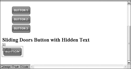
Figure 15.14 Setting the text-indent attribute to - 9999px places the text of the button 9999 pixels to the left of the screen, making it invisible to the visitor.

6. As you can see, the button looks the way it should but the text is still visible. To hide the text, open the Modify Style dialog for the style, go to the Block category, and set the text-indent attribute to -9999px (see Figure 15.14). Click OK to save the change.
7. Finally create a new style with the selector name .slider a:hover. Because of the cascade, any pseudoclass will inherit all the styling from its parent unless the style is changed. Therefore you need to make changes to only the background-position attributes and the rest of the attributes will stay the same. Set (x) background-position to 0px and (y) background-position to -44px. This shifts the background image up 44 pixels and the bottom half is shown in place of the top half. Click OK, and then save and preview in your browser.
Designers frequently use the sliding doors technique to create eye-catching roll-overs without load times getting in the way. In this example, the background image only had two versions, but you could have an image with more instances. Likewise you can place the images next to one another instead of on top of each other and change the (x) background-position value instead.
You can find more information and tutorials on how to use the sliding doors technique at the A List Apart website: www.alistapart.com.
Summary
Buttons are an integral part of a website, both as navigational tools and as design elements. Knowing how to make and when to use different styles of buttons will make your life easier as a designer and your sites easier to navigate for the visitors.
Buttons can be anything from simple colored boxes with text inside them to advanced image-based elements with different graphics for each state. The layout and design of the page, and what the designer wants out of it, drive the choice of what kind of button to use.
To simplify the process of creating interactive buttons, Expression Web 2 has a built-in Interactive Buttons function that lets you choose a design and set properties for a wide range of prepackaged buttons. In this hour, you learned how to create and customize these interactive buttons and insert them into your page. The major benefit of the interactive buttons is that even after inserting them in your page, you can always go back to the Interactive Buttons dialog and change the design and font attributes of the button without creating a new one. This high level of flexibility is great when you are designing pages on the fly and you’re not sure what the end product will look like. The downside of interactive buttons is that they are limited in the button design.
If you want to move beyond the designs of the prepackaged interactive buttons, the best way to go is to create CSS buttons instead. The advantages of CSS buttons are that they are text based and standards compliant, and a visitor who uses a text-only browser can still see the hyperlinks within the buttons. In this hour, you learned how to create simple box-type buttons with interactive features using CSS. You also learned how to take these buttons to the next level by replacing the solid color backgrounds with images. Finally you learned how to use the sliding doors technique to use one image as the base for multiple different button states by sliding it in the background to show different versions of the same button image.
Q&A
Q. I inserted an interactive button in my page but all I see is a small box with a red X in it. What is wrong?
A. When you make an interactive button, Expression Web 2 creates a series of images to correspond to the different button states. If you are seeing a red X, the link to the image or images is broken, probably because you deleted the images accidentally, didn’t save them when you saved the page before closing the application, or moved them to a different folder outside of Expression Web 2. To fix the problem, simply right-click the interactive button in Design view and select Button Properties from the context menu. From here you can make changes to the button or, if you just want to re-establish the images, simply click OK and the button will show up as it is supposed to.
Q. I created a second copy of the sliding doors button but it shows up underneath the first one no matter what I do. Why can’t I make these buttons show up next to each other?
A. Although sliding doors buttons can easily be lined up next to one another, the one you made in this example cannot do so without putting each of the buttons in a separate table cell. The reason for this has to do with the hiding of the button text, not the sliding doors function. In the next hour, you will learn how to make a functional horizontal menu using the sliding doors function without using tables.
Workshop
The Workshop has quiz questions and exercises to help you put to use what you just learned. If you get stuck, the answers to the quiz questions are in the next section. But try to answer them first. Otherwise you’ll only be cheating yourself.
Quiz
1. What is the advantage of using Interactive Buttons generated by Expression Web 2?
2. When creating the basic and advanced box buttons, do you need to create separate styles for each of the buttons?
Answers
1. The Interactive Buttons created by Expression Web 2 are accompanied by macros that help the application remember their settings. That means you can completely change the look and functionality of the buttons from the Interactive Button Properties dialog even after they have been inserted.
2. No, not unless you want to. The idea of using CSS to create box buttons is that you can apply the same styling and background (either color or image) to multiple buttons with one set of styles. That way you can make quick changes to multiple buttons throughout your site by changing only a few styles rather than having to change each individual button separately. You can however make individualized buttons with individual backgrounds or styles by wrapping each button instance in a <span> tag.
Exercise
Using the Interactive Buttons feature, create a series of new buttons with different designs and layouts. After inserting them, pick one design you really like and change all the buttons to that look by changing their button properties.
To give the visitor a visual cue that the button has been pressed before, make styles for the :active and :visited pseudoclasses for all the different CSS buttons you created. The :active style usually has a bold appearance (bright colors and dark font), whereas the :visited pseudoclass is usually more muted than the other styles.